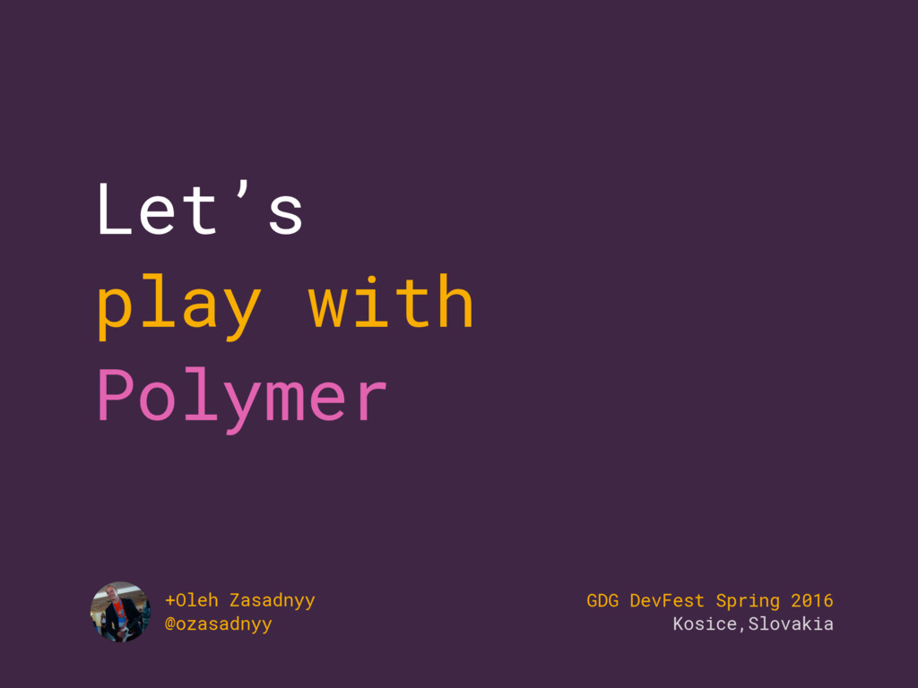
A quick overview of Web Components and Polymer library with basic examples. Also, you can find information about available tools for the Polymer development.
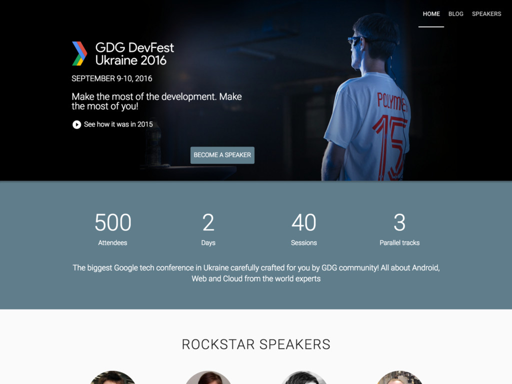
Presented at GDG DevFest Spring 2016 in Kosice, Slovakia.
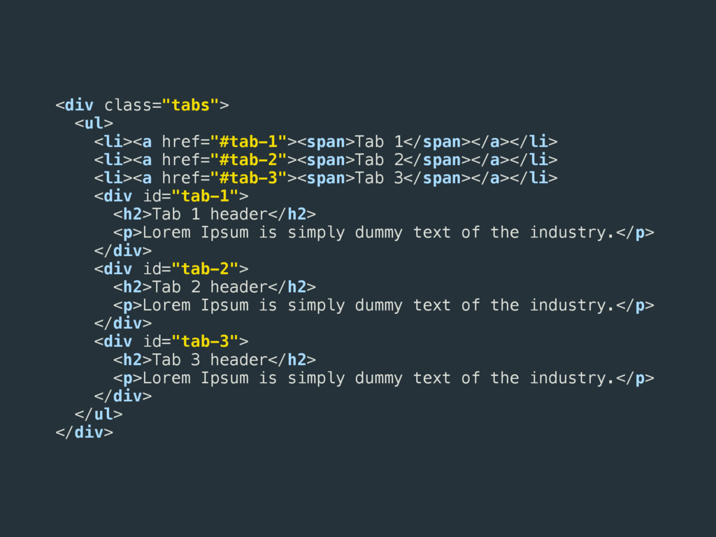
href="#tab-3"><span>Tab 3</span></a></li> <div id="tab-1"> <h2>Tab 1 header</h2> <p>Lorem Ipsum is simply dummy text of the industry.</p> </div> <div id="tab-2"> <h2>Tab 2 header</h2> <p>Lorem Ipsum is simply dummy text of the industry.</p> </div> <div id="tab-3"> <h2>Tab 3 header</h2> <p>Lorem Ipsum is simply dummy text of the industry.</p> </div> </ul> </div>
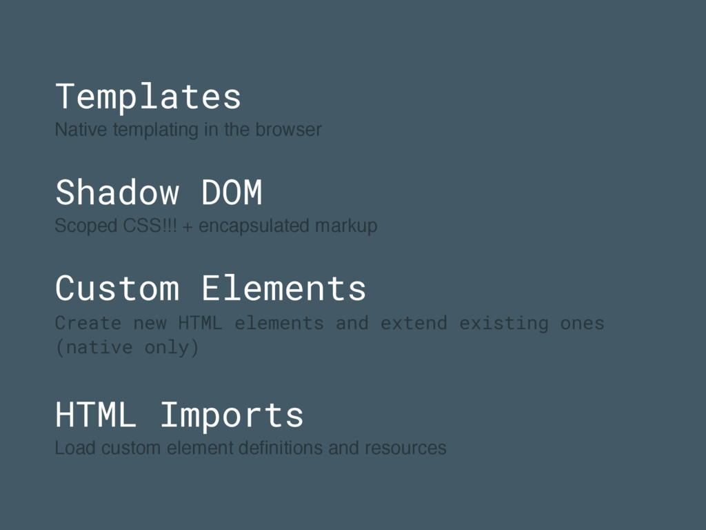
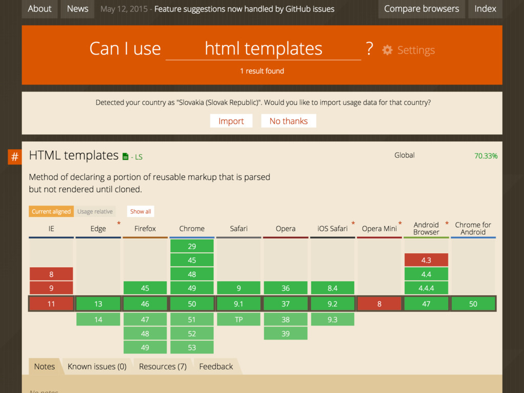
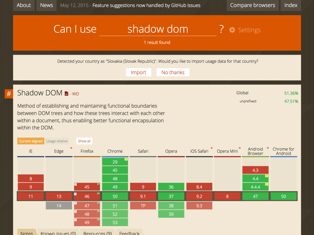
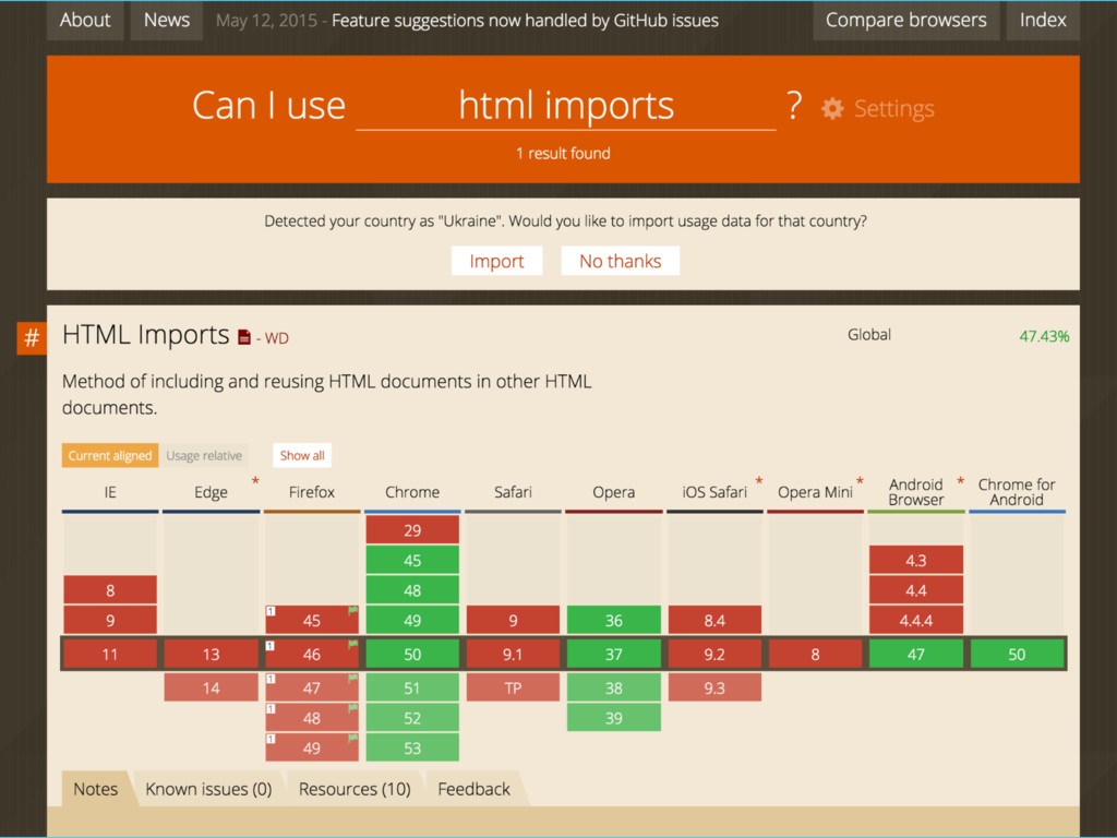
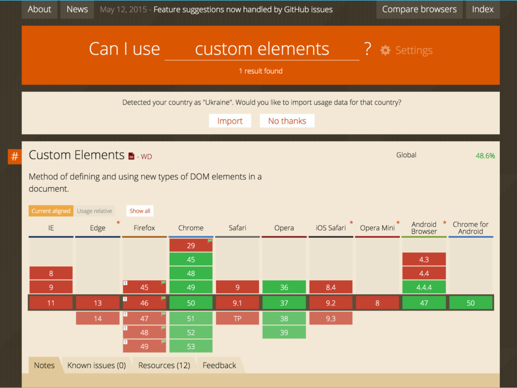
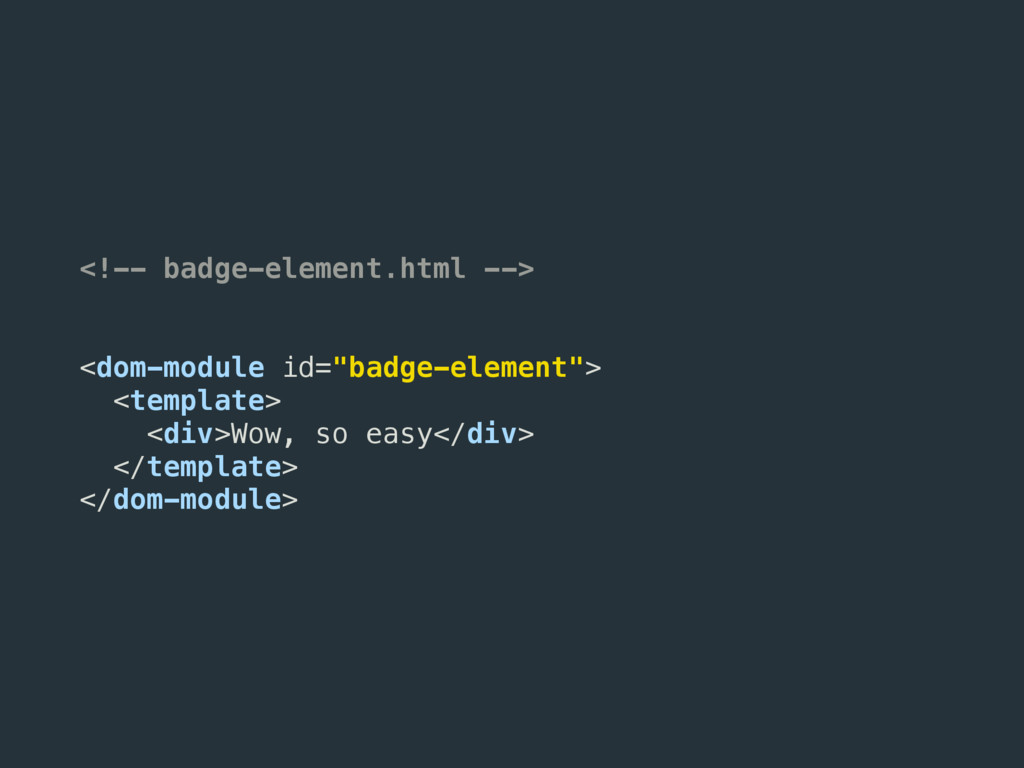
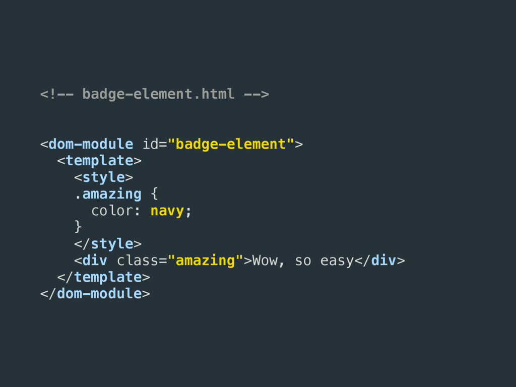
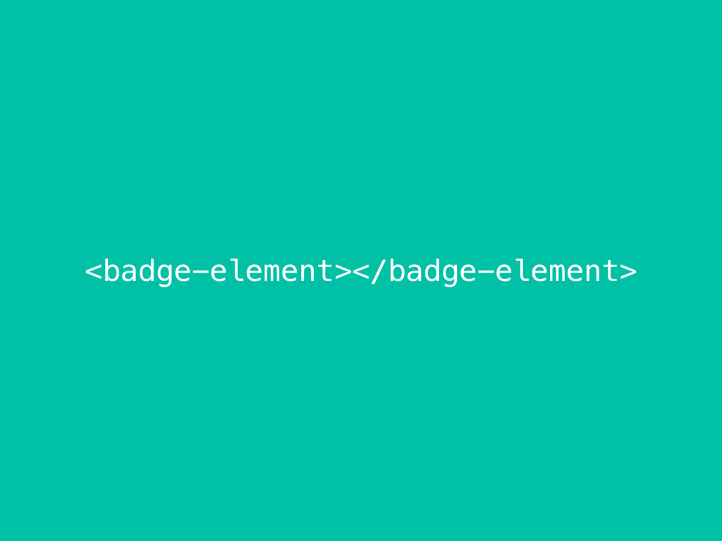
+ encapsulated markup Custom Elements Create new HTML elements and extend existing ones (native only) HTML Imports Load custom element definitions and resources
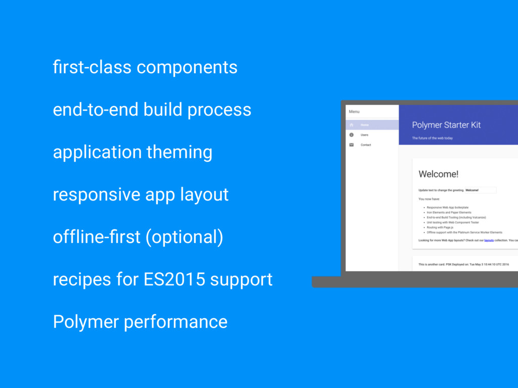
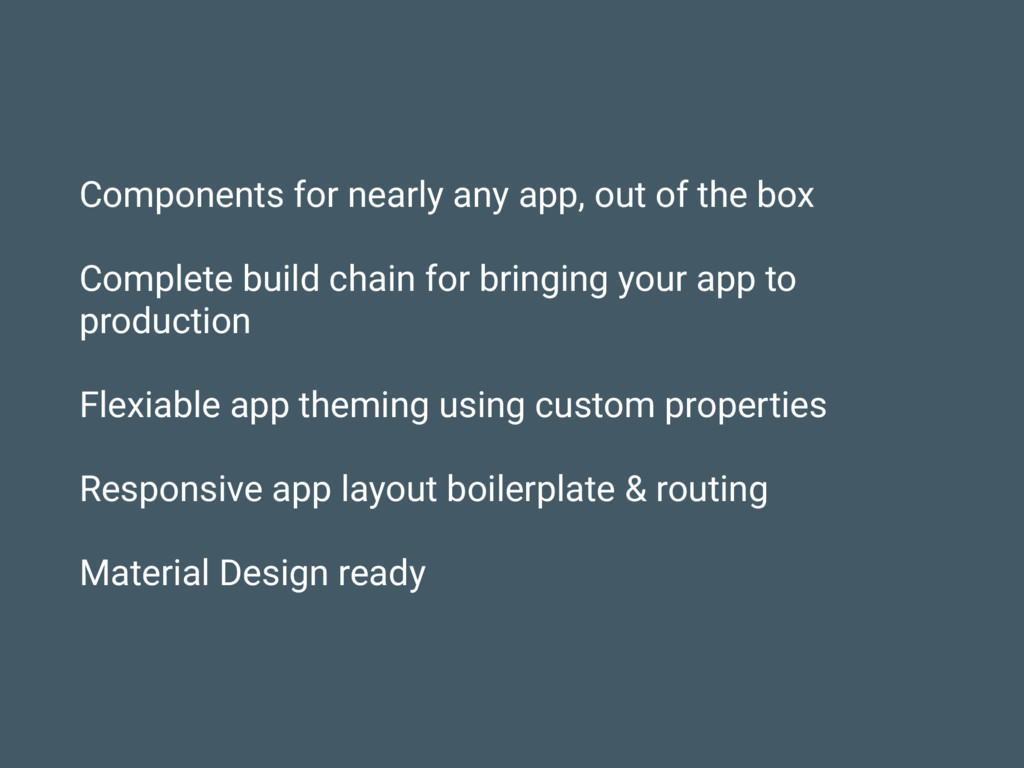
build chain for bringing your app to production Flexiable app theming using custom properties Responsive app layout boilerplate & routing Material Design ready
 ozasadnyy
 o0h
o0h
 vinceamstoutz
 kajitack
 koic
koic
 kishida
 jinwatanabe
 akihisaikeda
 hjmkth
 16bitidol
 macha64
 simas
simas
 holman
 palkan
 stuffmc
 rkendrick25
 thoeni
 jonoalderson
 lauravandoore
 soudai
 427marketing
 tmiket
 mojombo
 swwweet
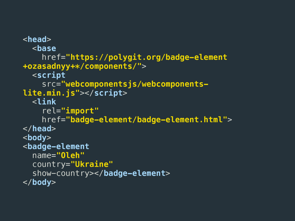
![<component> [+<org>] + <ver>|:<branch>|* badge-element +ozasadnyy +* *Fetch the latest](https://files.speakerdeck.com/presentations/916ed8137d4141f6a0b0dc5c23f841f2/slide_50.jpg)