Upgrade to Pro
— share decks privately, control downloads, hide ads and more …
Speaker Deck
Features
Speaker Deck
PRO
Sign in
Sign up for free
Search
Search
Responsive use of <img>
Search
Juga Paazmaya
February 10, 2015
Technology
210
0
Share
Embed
Copy iframe code
Copy JS code
Copy link
Start on current slide
Responsive use of <img>
A presentation held at [****] for Siili Solutions responsive design and prototyping team
Juga Paazmaya
February 10, 2015
More Decks by Juga Paazmaya
See All by Juga Paazmaya
Accessibility - Presented at TEKOS Workshop in 1st Sep 2022
paazmaya
0
110
CasperJS Workshop 2015-01-23
paazmaya
0
210
Windows Live sähköpostin käyttäminen Gmail-palvelun kautta
paazmaya
0
2.8k
jQuery - The new wave of JavaScript
paazmaya
0
120
Finland – Coming here and going there
paazmaya
1
73
Nanbudo - Nanbu Kata Book preview
paazmaya
0
950
Nice day for a walk
paazmaya
0
82
Valkoviiksi 7 makers
paazmaya
2
140
Other Decks in Technology
See All in Technology
見守りエージェントを作ってみた(ローカルLLM + Hermes Agent)
happysamurai294
0
110
Terraform共通モジュールをチーム横断で“変えられる”運用へ ― リリースと適用の分離
kekke_n
1
3.3k
AI Driven AI Governance
pict3
0
480
AI、CDK と協働する Full TypeScript アプリケーション開発 / Full TypeScript Application with AI and CDK
geekplus_tech
2
340
LLMやAIエージェントをソフトウェアに組み込むプラクティス
shibuiwilliam
2
410
Oracle Exadata Database Service on Cloud@Customer X11M (ExaDB-C@C) サービス概要
oracle4engineer
PRO
2
8.4k
「守りたい体験」を渡すだけで E2E を生成させられるようになった話
hinac0
0
160
ソニー銀行におけるビジネスアジリティ向上のためのクラウドシフト戦略
srenext
0
670
Claude Code公式skillで 自分の仕事を少しずつ手放そう!(Claude Code開発ノウハウ大公開スペシャル by クラスメソッド)
kaym
1
480
2年前に削除したPHPクラスが、 ある日突然決済をエラーにした
ykagano
1
260
脱金融のフューチャー・デザイン / Future Design Beyond Finance
ks91
PRO
0
150
関数型の考えを TypeScript に持ち込んで、テストしやすい純粋関数を増やす / Pure at the Core, Effects at the Edge: Bringing Functional Thinking into TypeScript
kaminashi
2
130
Featured
See All Featured
Design and Strategy: How to Deal with People Who Don’t "Get" Design
morganepeng
133
19k
The innovator’s Mindset - Leading Through an Era of Exponential Change - McGill University 2025
jdejongh
PRO
1
220
SERP Conf. Vienna - Web Accessibility: Optimizing for Inclusivity and SEO
sarafernandez
2
1.5k
Jamie Indigo - Trashchat’s Guide to Black Boxes: Technical SEO Tactics for LLMs
techseoconnect
PRO
0
360
Embracing the Ebb and Flow
colly
88
5.1k
[RailsConf 2023 Opening Keynote] The Magic of Rails
eileencodes
31
10k
The SEO Collaboration Effect
kristinabergwall1
1
500
Ethics towards AI in product and experience design
skipperchong
2
330
Facilitating Awesome Meetings
lara
57
7k
jQuery: Nuts, Bolts and Bling
dougneiner
66
8.5k
Ruling the World: When Life Gets Gamed
codingconduct
0
280
Helping Users Find Their Own Way: Creating Modern Search Experiences
danielanewman
31
3.3k
Transcript
Responsive use of
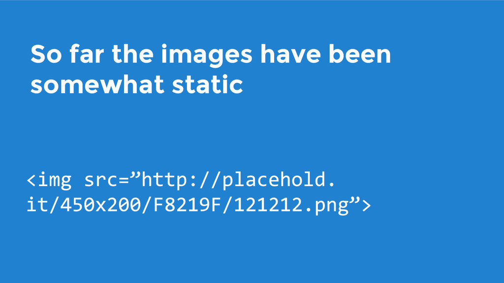
So far the images have been somewhat static
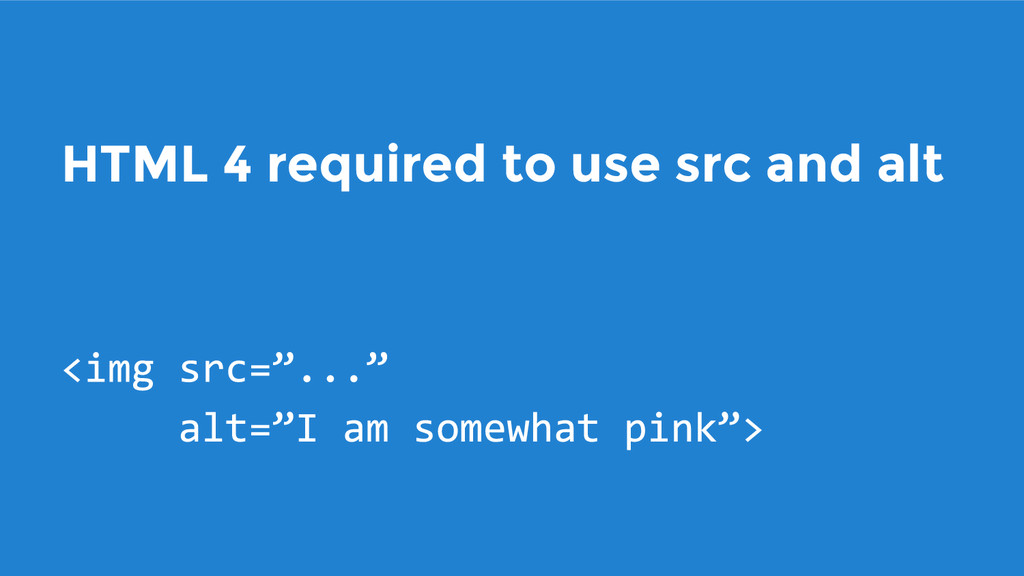
HTML 4 required to use src and alt
XHTML required a closure
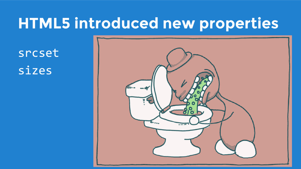
HTML5 introduced new properties
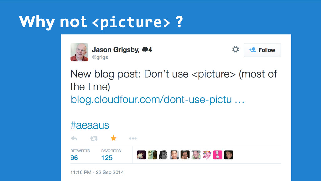
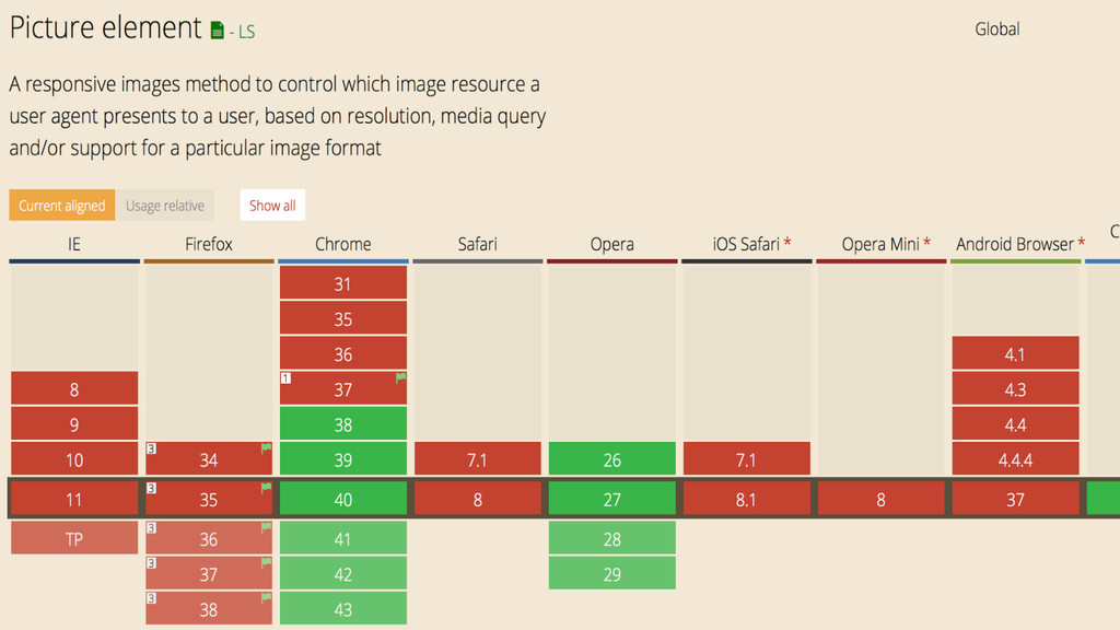
Why not ?
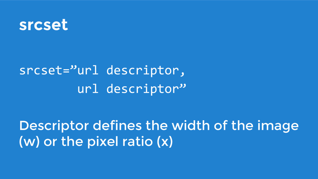
srcset Descriptor defines the width of the image (w) or
the pixel ratio (x)
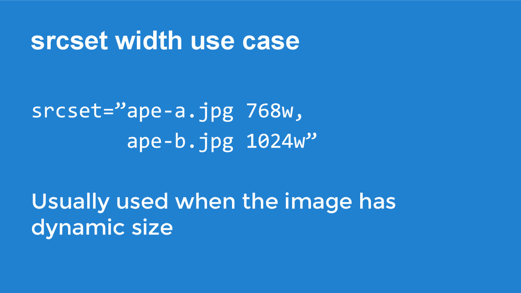
srcset width use case Usually used when the image has
dynamic size
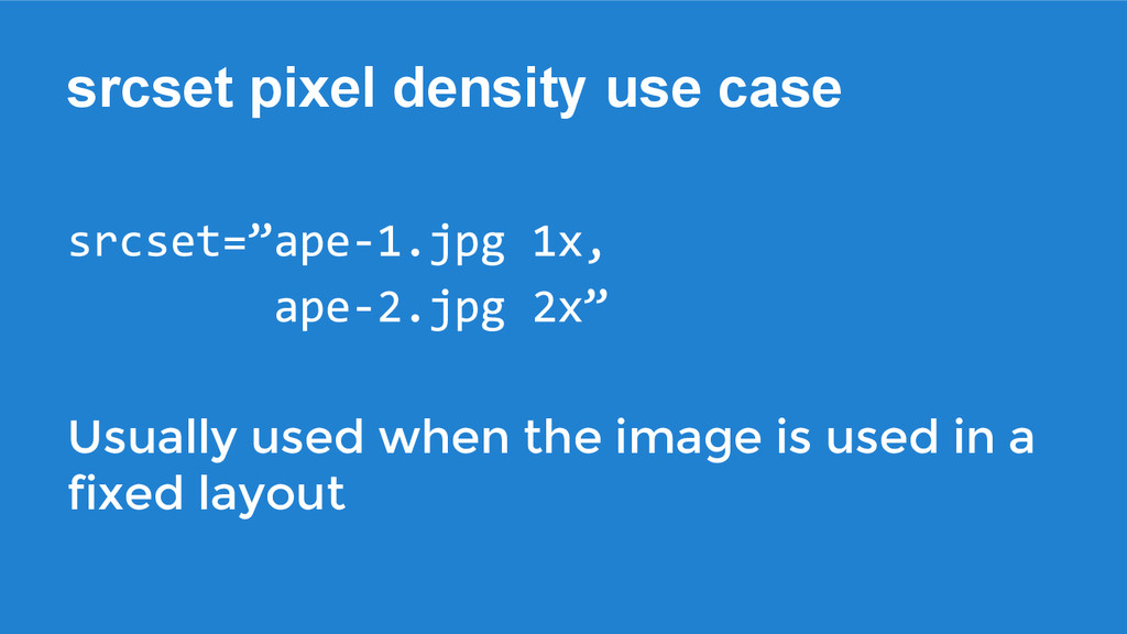
srcset pixel density use case Usually used when the image
is used in a fixed layout
None
None
None
srcset - benefit & problem
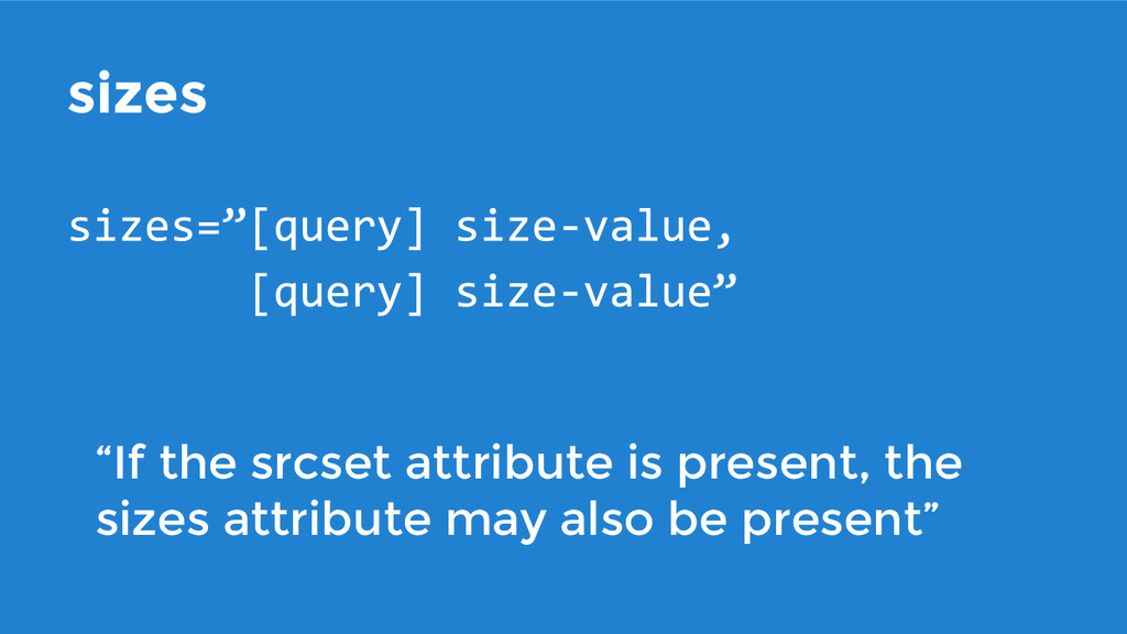
sizes “If the srcset attribute is present, the sizes attribute
may also be present”
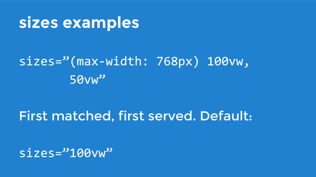
sizes examples First matched, first served. Default:
None
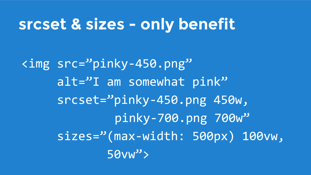
srcset & sizes - only benefit
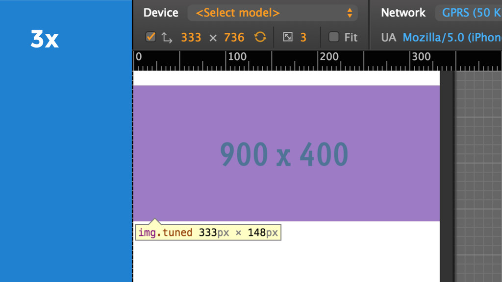
Pixel density matters
3x
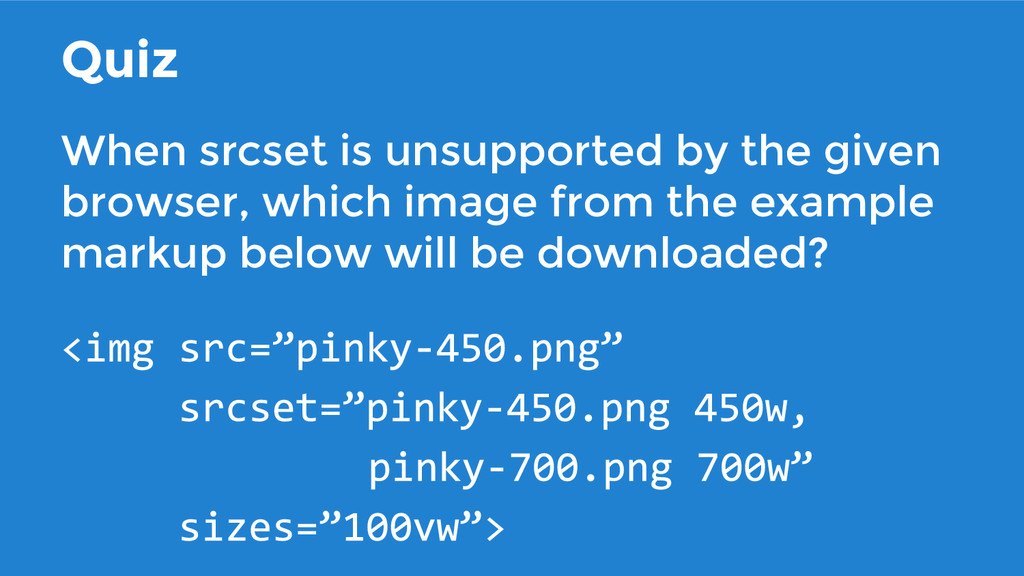
Quiz When srcset is unsupported by the given browser, which
image from the example markup below will be downloaded?
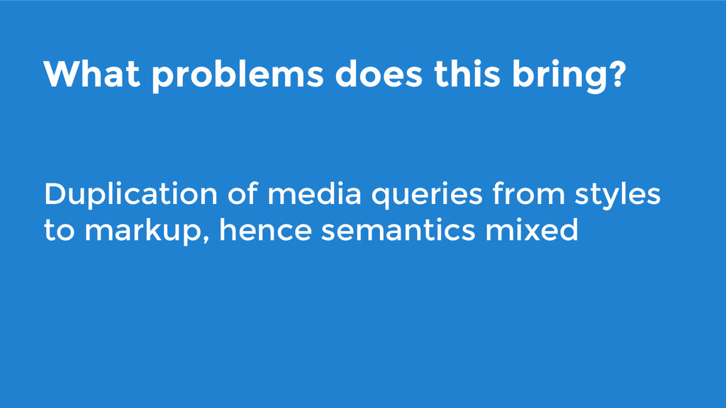
What problems does this bring? Duplication of media queries from
styles to markup, hence semantics mixed
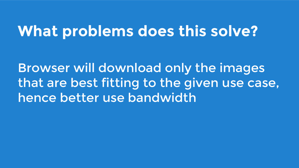
What problems does this solve? Browser will download only the
images that are best fitting to the given use case, hence better use bandwidth
What problems does this solve? Developer can leave the calculations
of which image to use in a given case to the browser
Would you like to know more? Please see the talk
“Responsive images are coming to a browser near you” by Yoav Weiss at VelocityConf 2014 youtube.com/watch?v=GC3VgcltKKI
More further reading Please also see the in depth post
by Eric Portis about the topic: ericportis.com/posts/2014/srcset-sizes
Thank you I am Jukka Paasonen, a Responsive Consultant at
Siili Solutions
 paazmaya
 happysamurai294
 kekke_n
 pict3
pict3
 geekplus_tech
 shibuiwilliam
 oracle4engineer
 hinac0
 srenext
 kaym
kaym
 ykagano
 ks91
ks91
 kaminashi
 morganepeng
 jdejongh
 sarafernandez
 techseoconnect
 colly
colly
 eileencodes
 kristinabergwall1
 skipperchong
 lara
lara
 dougneiner
 codingconduct
 danielanewman