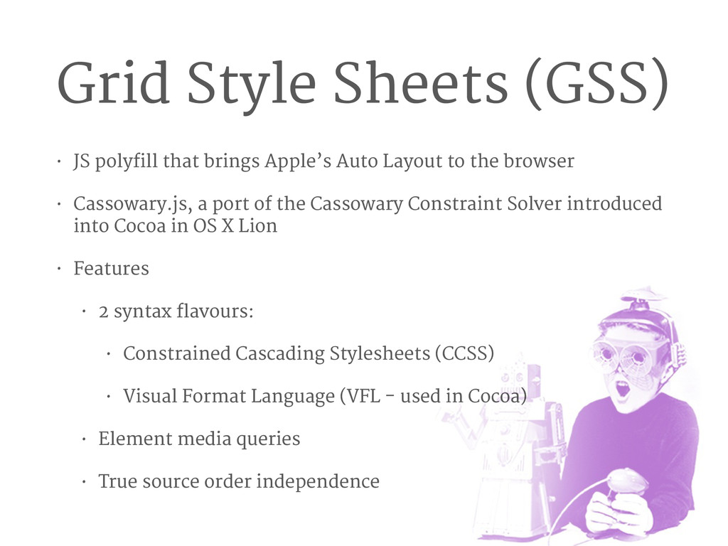
Auto Layout to the browser • Cassowary.js, a port of the Cassowary Constraint Solver introduced into Cocoa in OS X Lion • Features • 2 syntax flavours: • Constrained Cascading Stylesheets (CCSS) • Visual Format Language (VFL - used in Cocoa) • Element media queries • True source order independence
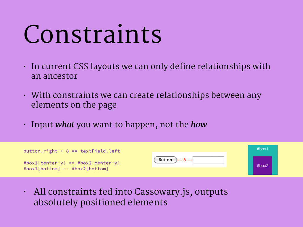
relationships with an ancestor • With constraints we can create relationships between any elements on the page • Input what you want to happen, not the how button.right + 8 == textField.left ! #box1[center-y] == #box2[center-y] #box1[bottom] == #box2[bottom] • All constraints fed into Cassowary.js, outputs absolutely positioned elements #box1 #box2
with a numerical value to be constrained • CSS-style nested Rulesets. Can be mixed with regular CSS properties • Pseudo Selectors: ::parent, ::this (or ::) and ::window /* Approach 1: At the root-level of the stylesheet */ #modal[z-index] >= #main-content[z-index]; #modal[center-x] == ::window[center-x]; #modal[center-y] == ::window[center-y]; #modal[width] == ::window[width] / 3; /* Approach 2: Mixed in with CSS */ #modal { z-index: >= #main-content[z-index] + 1; ::[center-x] == ::window[center-x]; center-y: == ::window[center-y]; width: == ::window[width] / 3; } We want #modal to: ! A. always sit on top of #main- content B. be vertically and horizontally centred with the viewport C. have its width be 1/3 the width of the viewport
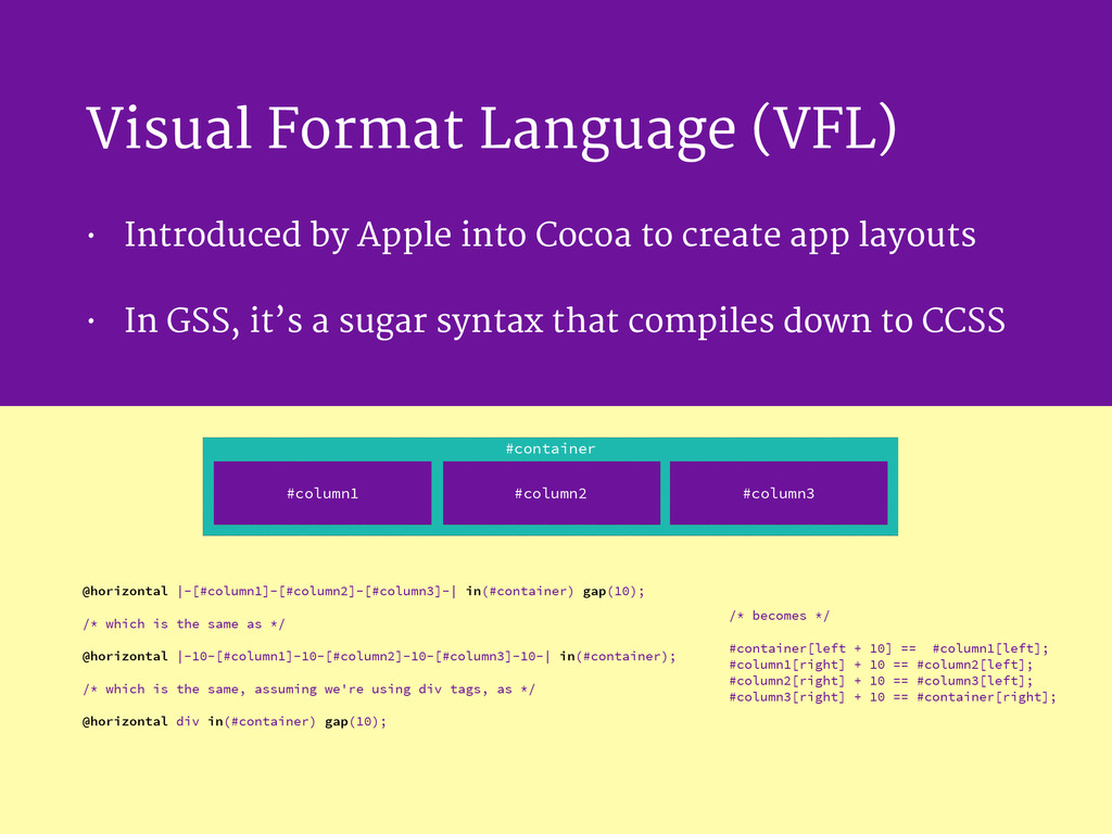
to create app layouts • In GSS, it’s a sugar syntax that compiles down to CCSS /* becomes */ ! #container[left + 10] == #column1[left]; #column1[right] + 10 == #column2[left]; #column2[right] + 10 == #column3[left]; #column3[right] + 10 == #container[right]; #column1 #column3 #column2 #container @horizontal |-[#column1]-[#column2]-[#column3]-| in(#container) gap(10); ! /* which is the same as */ ! @horizontal |-10-[#column1]-10-[#column2]-10-[#column3]-10-| in(#container); ! /* which is the same, assuming we're using div tags, as */ ! @horizontal div in(#container) gap(10);
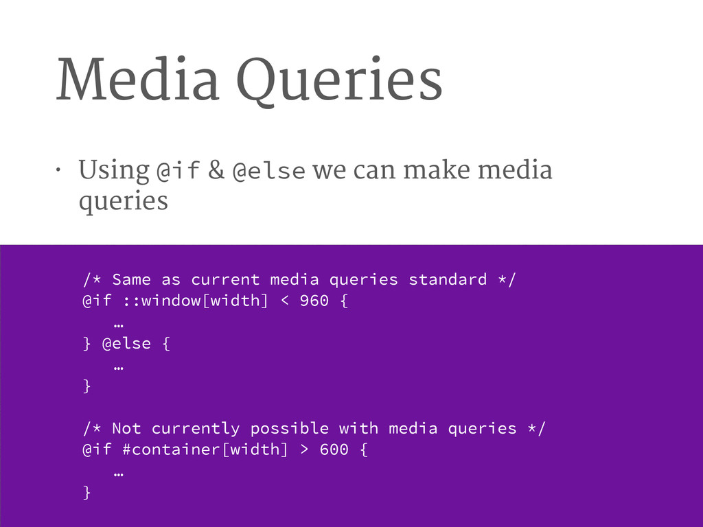
media queries /* Same as current media queries standard */ @if ::window[width] < 960 { … } @else { … } ! /* Not currently possible with media queries */ @if #container[width] > 600 { … }
can be a bit infuriating when things aren’t working as errors can be cryptic • Needs Web Workers to be performant. • Works in IE11, Firefox, Safari 6+ & Chrome. • Their future plans include: • generating multiple CSS stylesheets during build time allowing you to serve them depending on the client • polyfilling the W3C’s Grid Layout Template Module soon
 patocallaghan
 nrslib
 wakana0222
 suguruooki
 kajitack
 manfredsteyer
 mshibuya
 kotaminato
 ochtum
 naoya
naoya
 mototakatsu
 rkaga
rkaga
 mogamit
 bluesmoon
 inesmontani
 livdayseo
 tammyeverts
 szymonslowik
 marcduiker
 thekraken
 62gerente
 eileencodes
 3n
3n
 jacobtomlinson
 joshbly