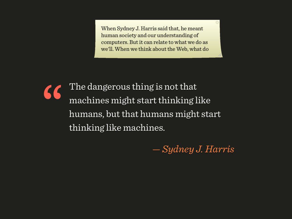
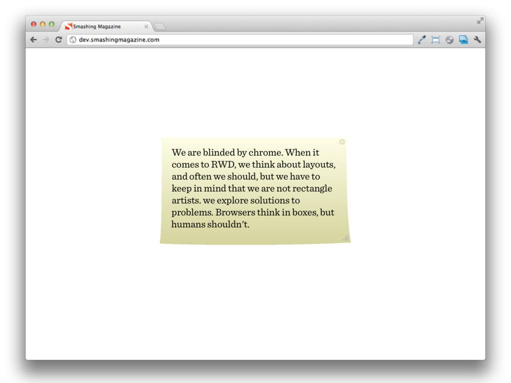
like humans, but that humans might start thinking like machines. — Sydney J. Harris “ When Sydney J. Harris said that, he meant human society and our understanding of computers. But it can relate to what we do as we'll. When we think about the Web, what do
we think about layouts, and often we should, but we have to keep in mind that we are not rectangle artists. we explore solutions to problems. Browsers think in boxes, but humans shouldn't.
wir uns oft als Pixel-Pusher oder Rectangle Zeichner. So sieht das Web aber nicht aus When it comes to responsive design, we think about layouts, and sometimes we should, but we have to keep in mind that we aren’t rectangle artists. We explore solutions to problems.
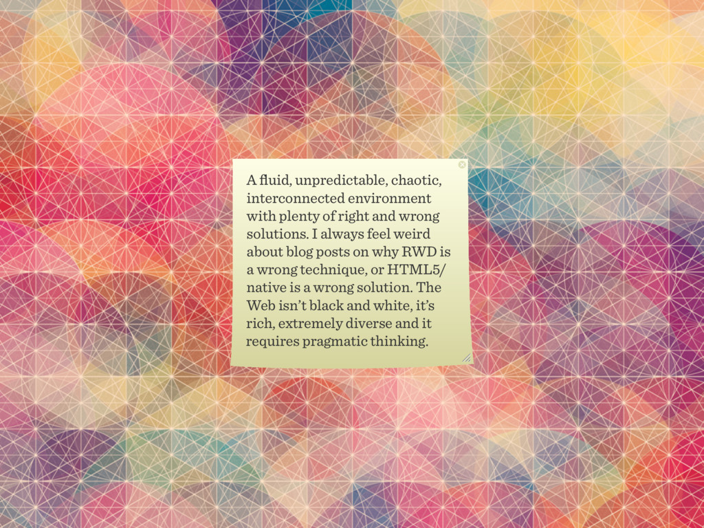
and wrong solutions. I always feel weird about blog posts on why RWD is a wrong technique, or HTML5/ native is a wrong solution. The Web isn’t black and white, it’s rich, extremely diverse and it requires pragmatic thinking.
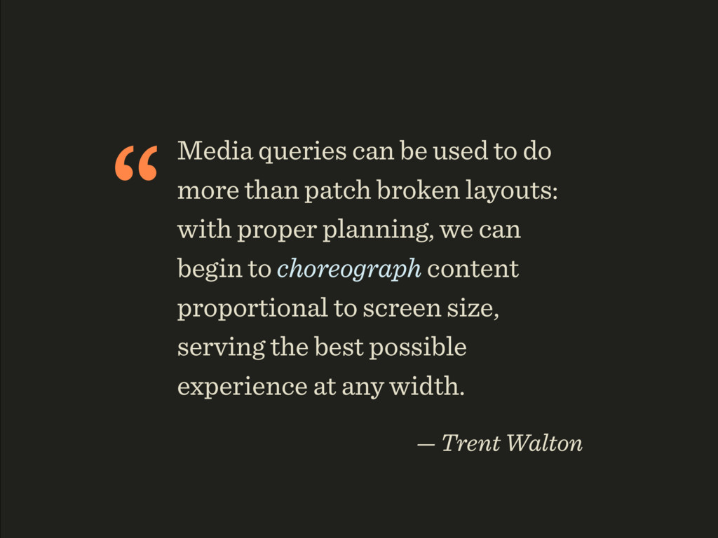
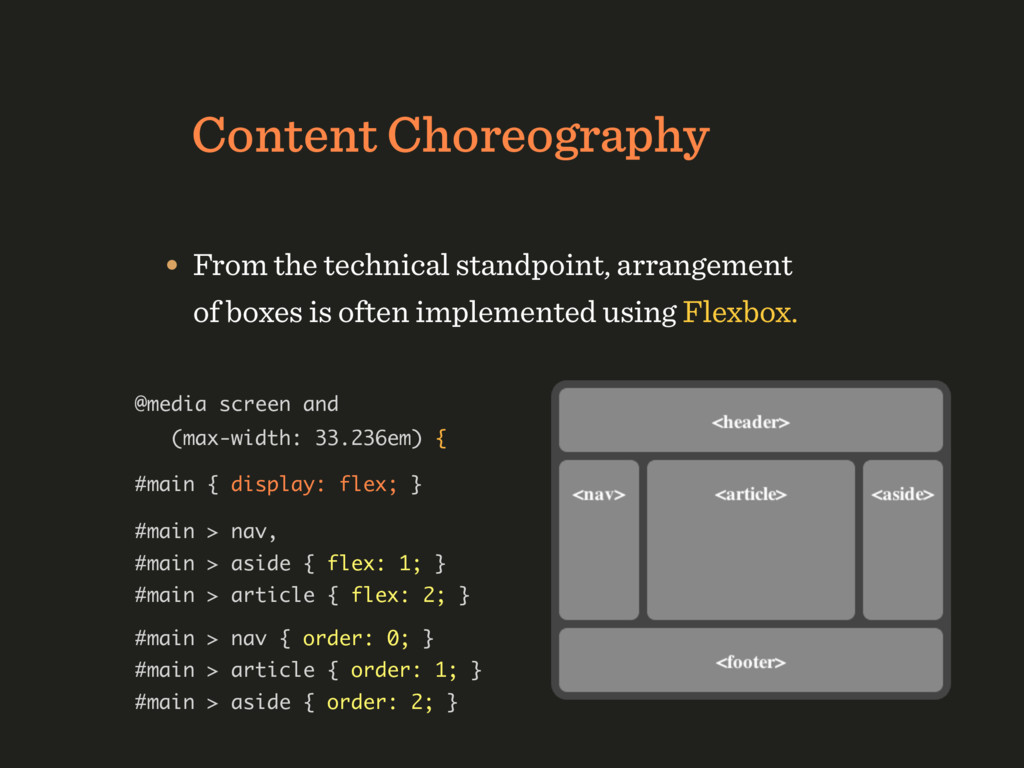
broken layouts: with proper planning, we can begin to choreograph content proportional to screen size, serving the best possible experience at any width. — Trent Walton
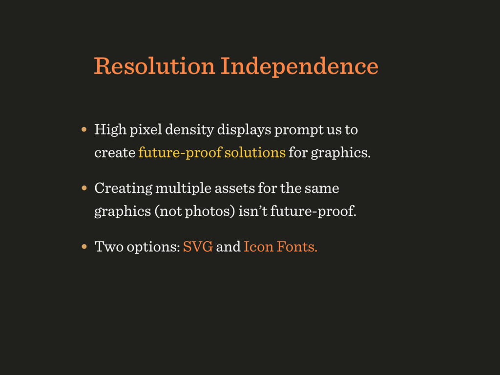
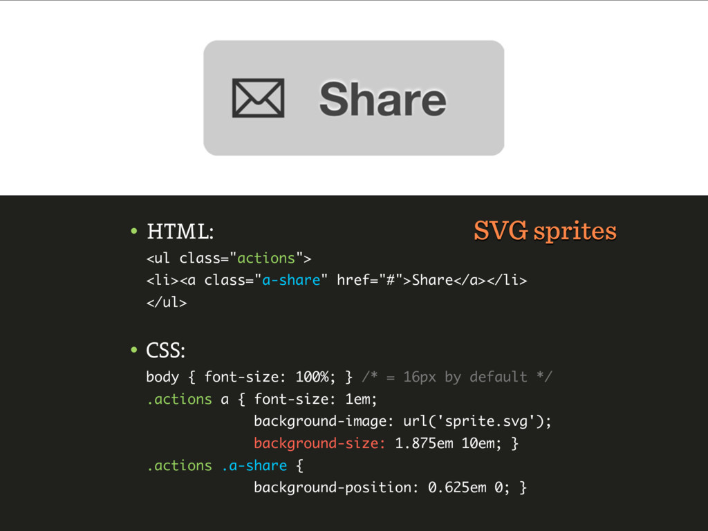
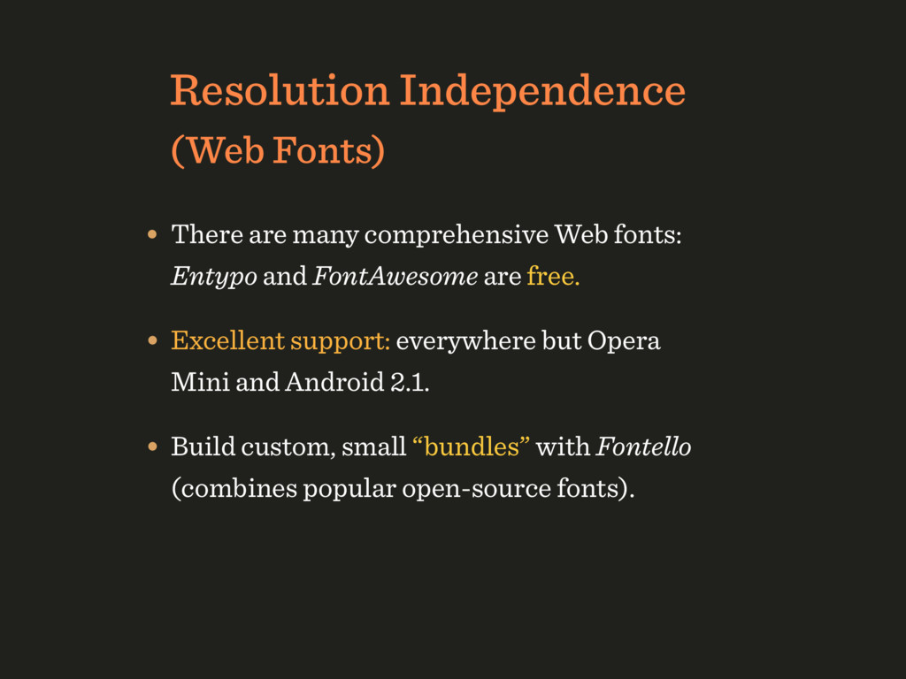
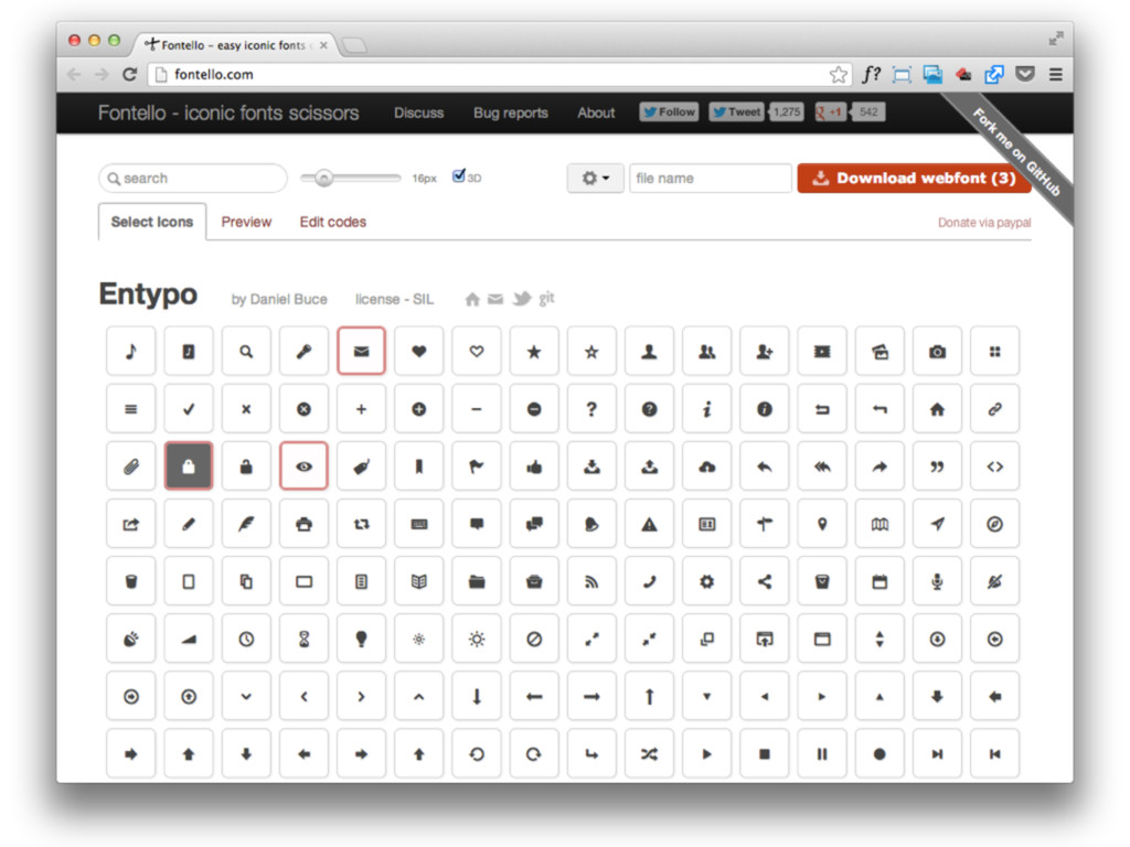
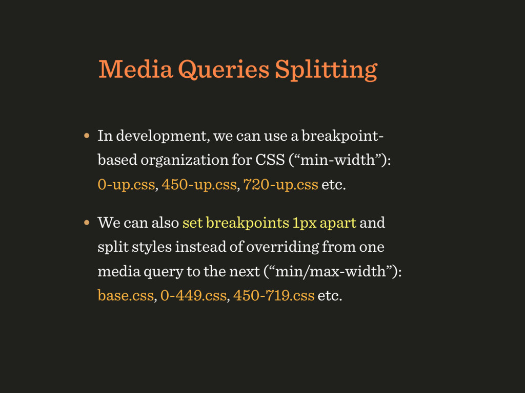
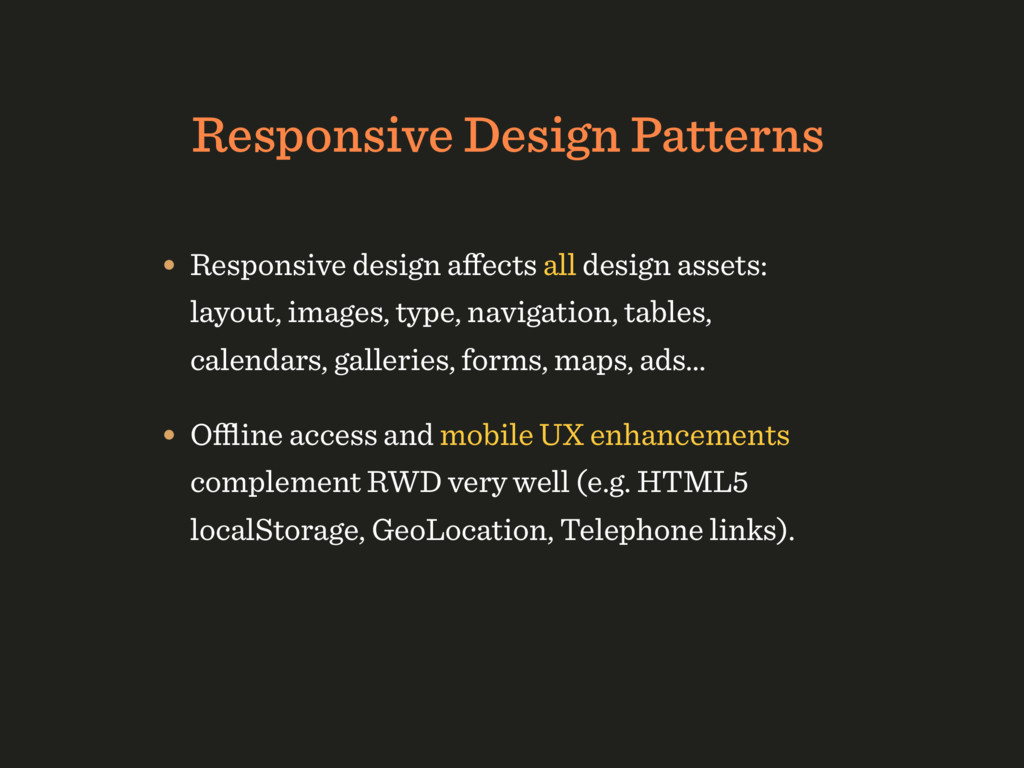
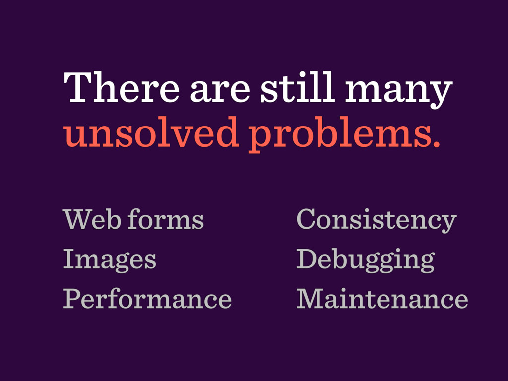
create future-proof solutions for graphics. • Creating multiple assets for the same graphics (not photos) isn’t future-proof. • Two options: SVG and Icon Fonts.
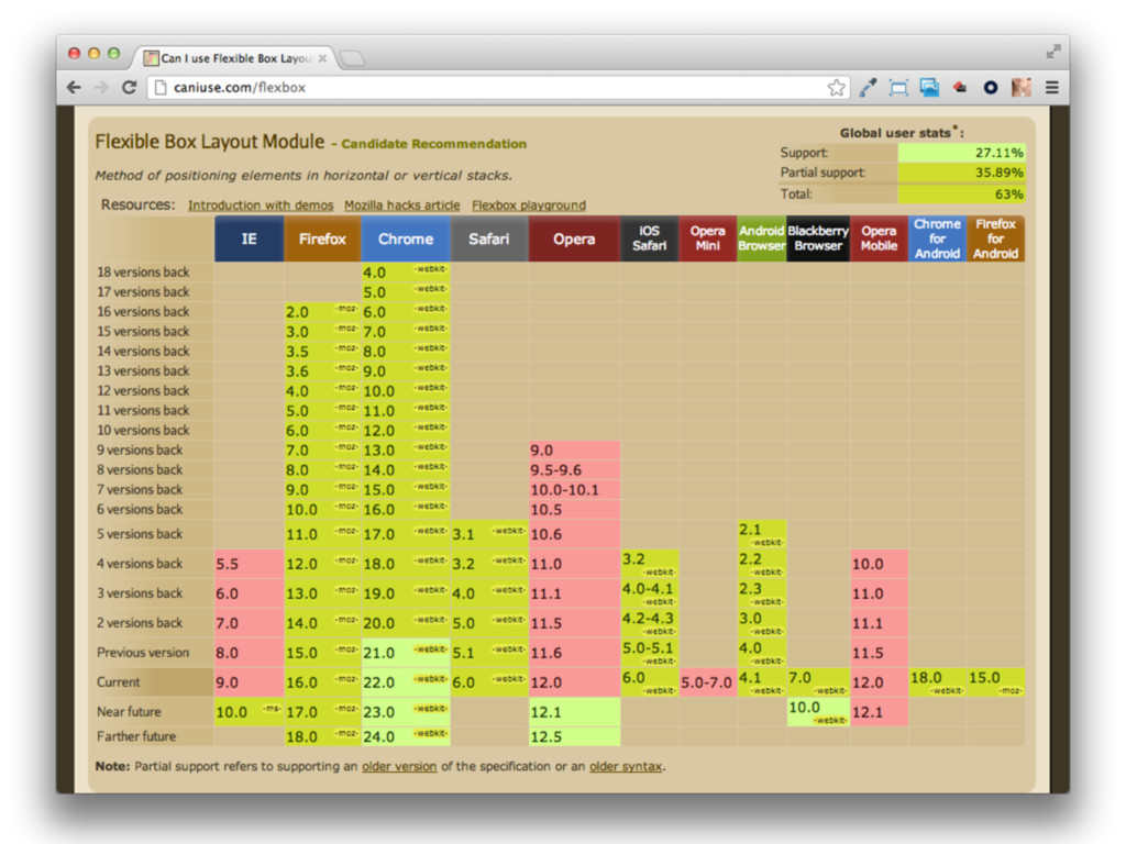
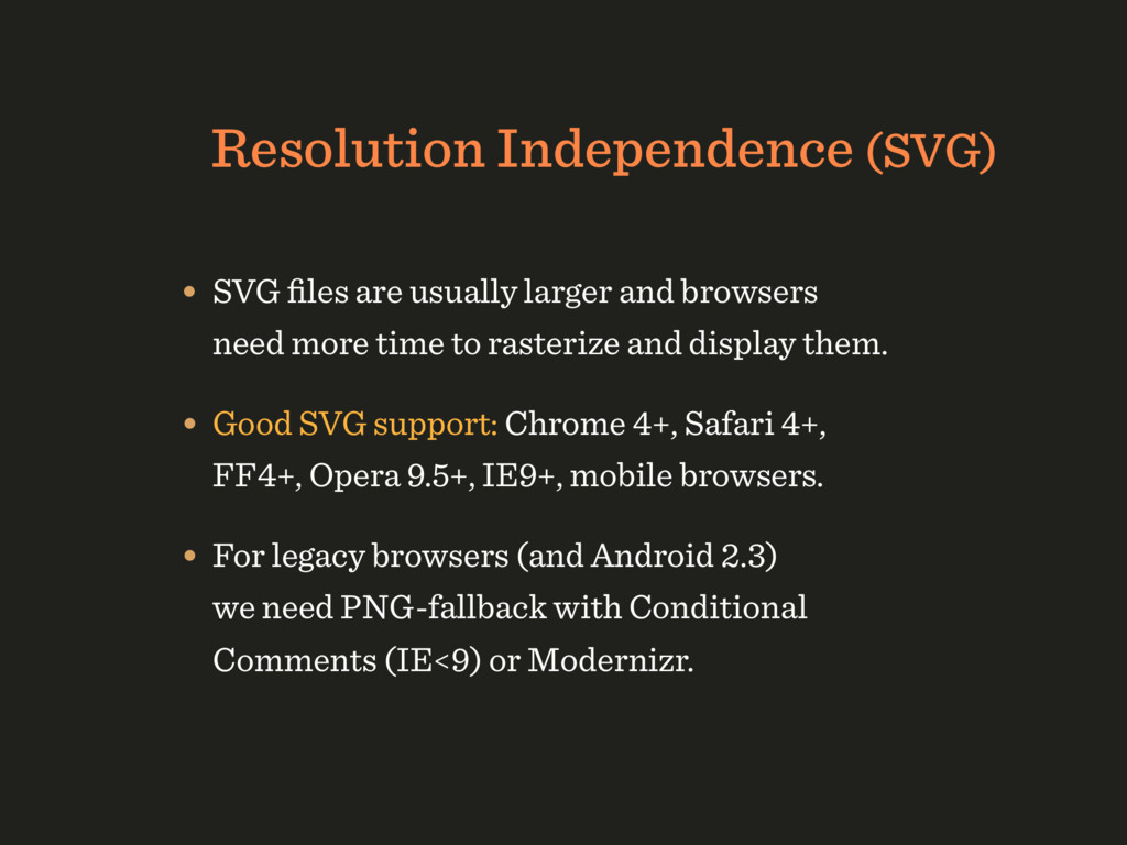
browsers need more time to rasterize and display them. • Good SVG support: Chrome 4+, Safari 4+, FF4+, Opera 9.5+, IE9+, mobile browsers. • For legacy browsers (and Android 2.3) we need PNG-fallback with Conditional Comments (IE<9) or Modernizr.
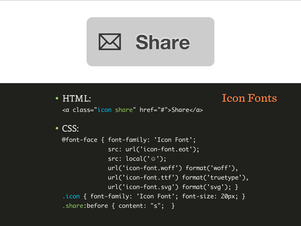
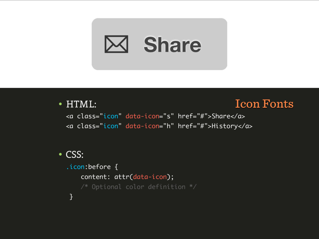
fonts: Entypo and FontAwesome are free. • Excellent support: everywhere but Opera Mini and Android 2.1. • Build custom, small “bundles” with Fontello (combines popular open-source fonts).
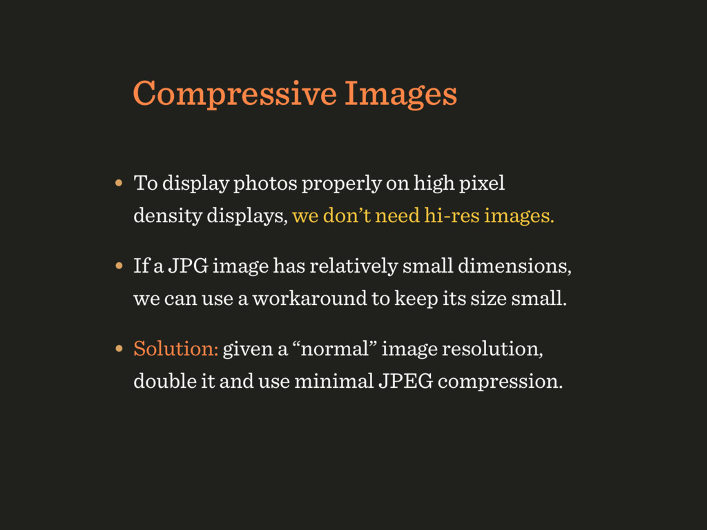
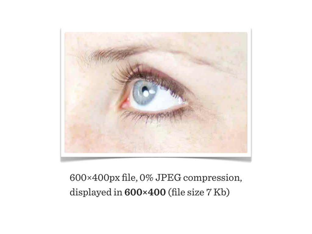
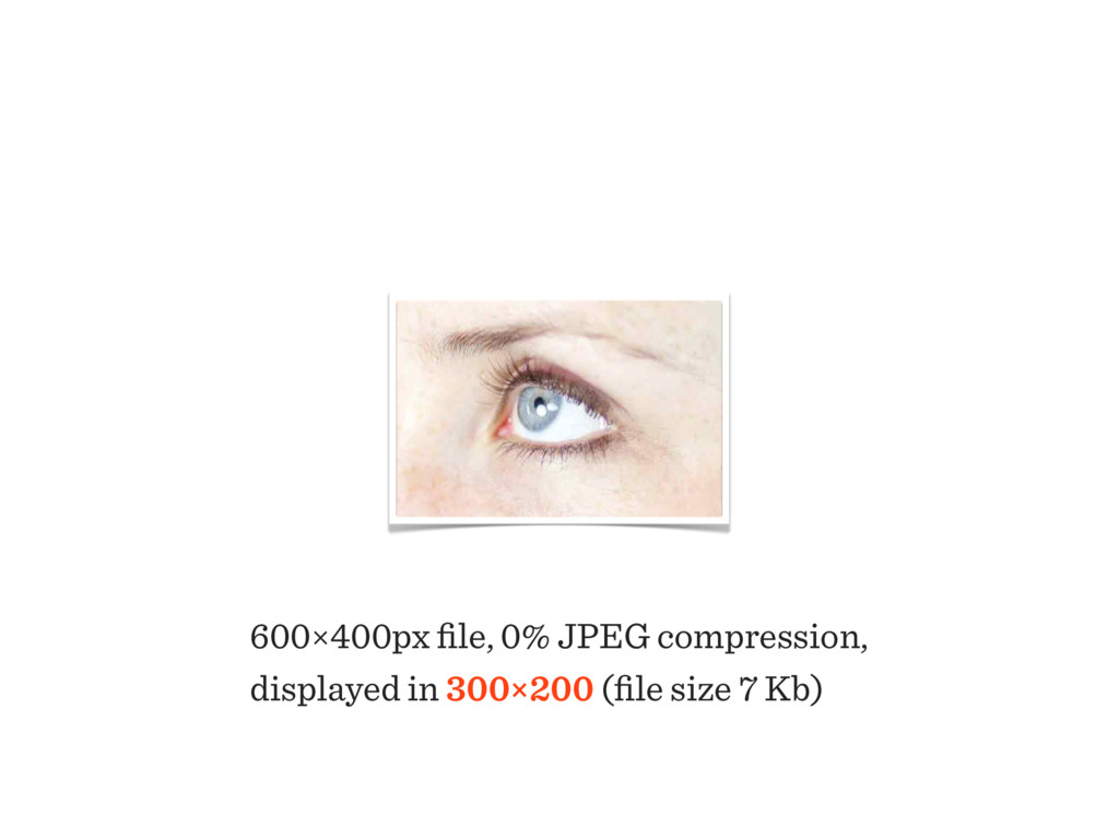
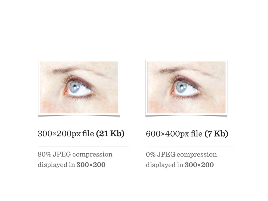
density displays, we don’t need hi-res images. • If a JPG image has relatively small dimensions, we can use a workaround to keep its size small. • Solution: given a “normal” image resolution, double it and use minimal JPEG compression.
size on a website, one can be dramatically smaller than the other in file size if it’s highly compressed and dramatically larger in dimensions than it is displayed. — Daan Jobsis
to make the design look good on a mobile device or optimizing the site for performance, you would be better served by making the desktop site blazingly fast. — Jason Grigsby
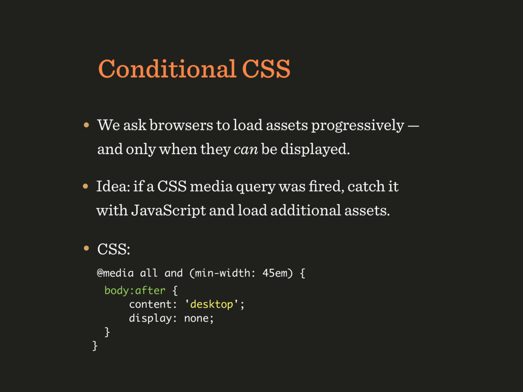
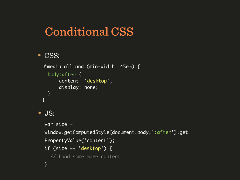
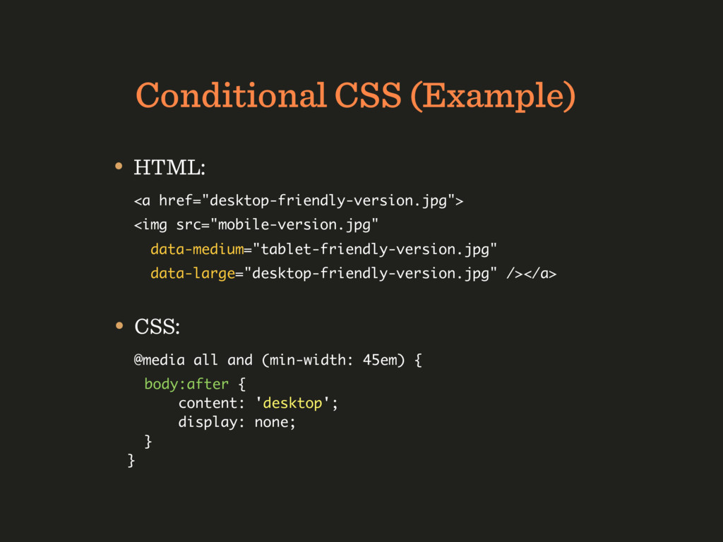
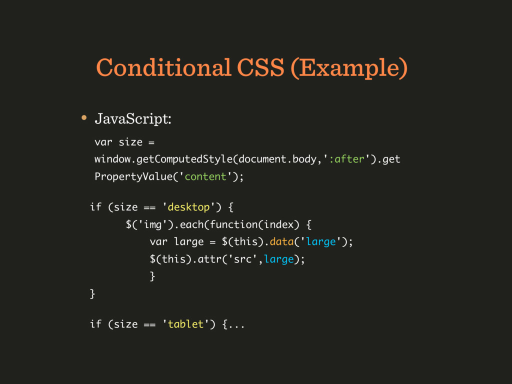
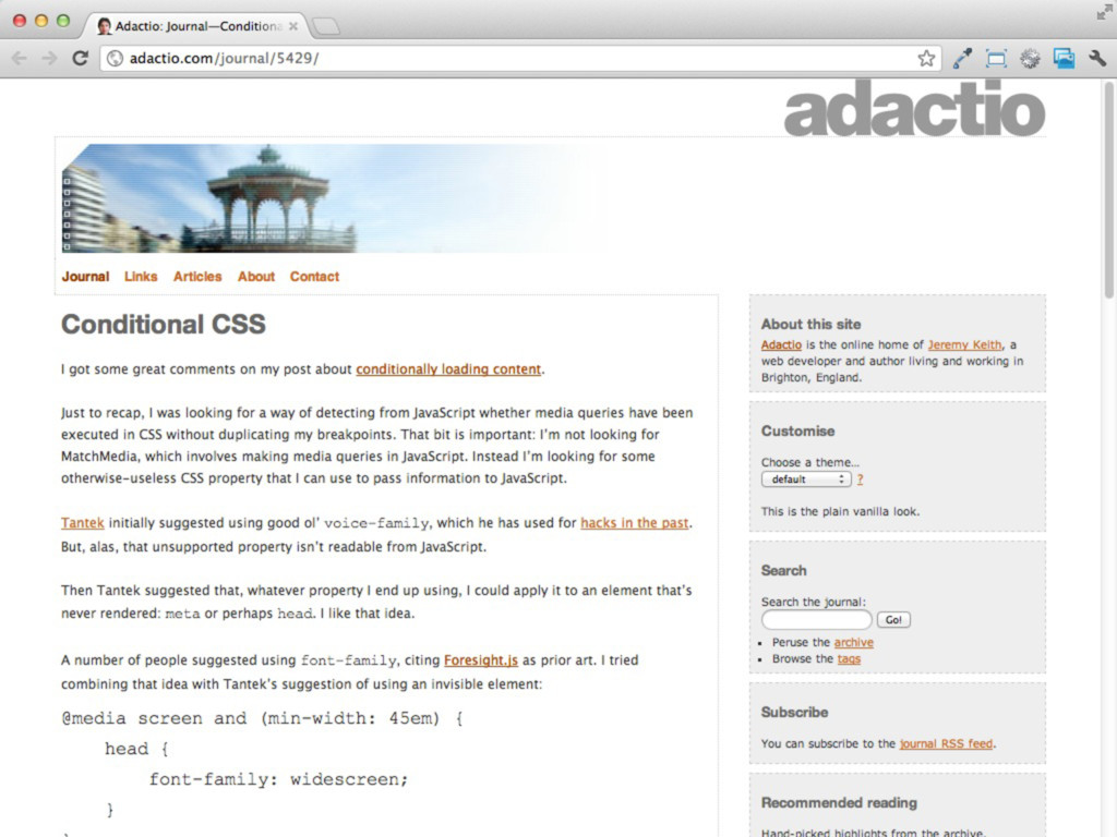
— and only when they can be displayed. • Idea: if a CSS media query was fired, catch it with JavaScript and load additional assets. • CSS: @media all and (min-width: 45em) { body:after { content: 'desktop'; display: none; } }
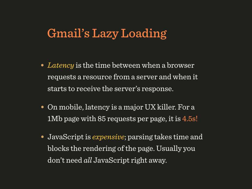
a browser requests a resource from a server and when it starts to receive the server’s response. • On mobile, latency is a major UX killer. For a 1Mb page with 85 requests per page, it is 4.5s! • JavaScript is expensive; parsing takes time and blocks the rendering of the page. Usually you don’t need all JavaScript right away.
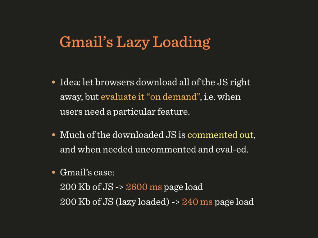
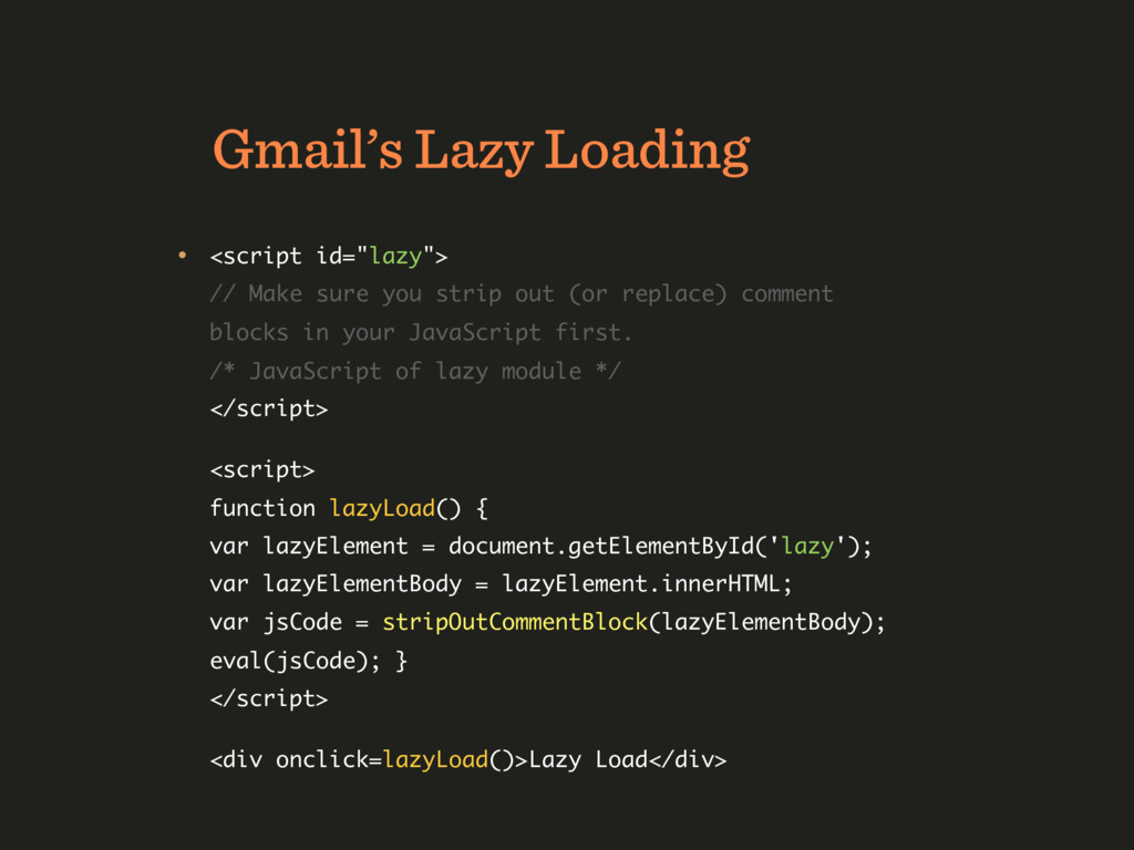
the JS right away, but evaluate it “on demand”, i.e. when users need a particular feature. • Much of the downloaded JS is commented out, and when needed uncommented and eval-ed. • Gmail’s case: 200 Kb of JS -> 2600 ms page load 200 Kb of JS (lazy loaded) -> 240 ms page load
strip out (or replace) comment blocks in your JavaScript first. /* JavaScript of lazy module */ </script> <script> function lazyLoad() { var lazyElement = document.getElementById('lazy'); var lazyElementBody = lazyElement.innerHTML; var jsCode = stripOutCommentBlock(lazyElementBody); eval(jsCode); } </script> <div onclick=lazyLoad()>Lazy Load</div>
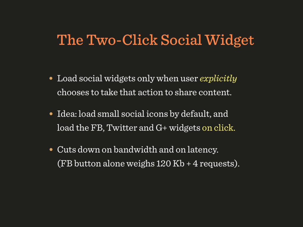
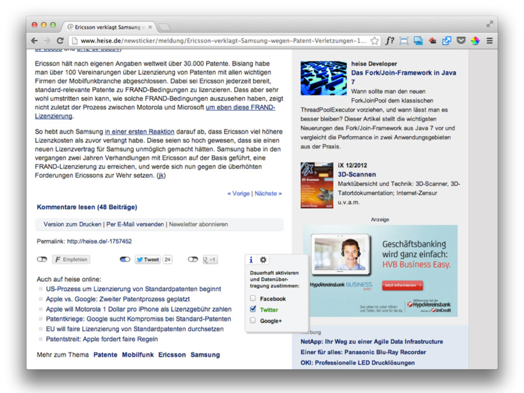
user explicitly chooses to take that action to share content. • Idea: load small social icons by default, and load the FB, Twitter and G+ widgets on click. • Cuts down on bandwidth and on latency. (FB button alone weighs 120 Kb + 4 requests).
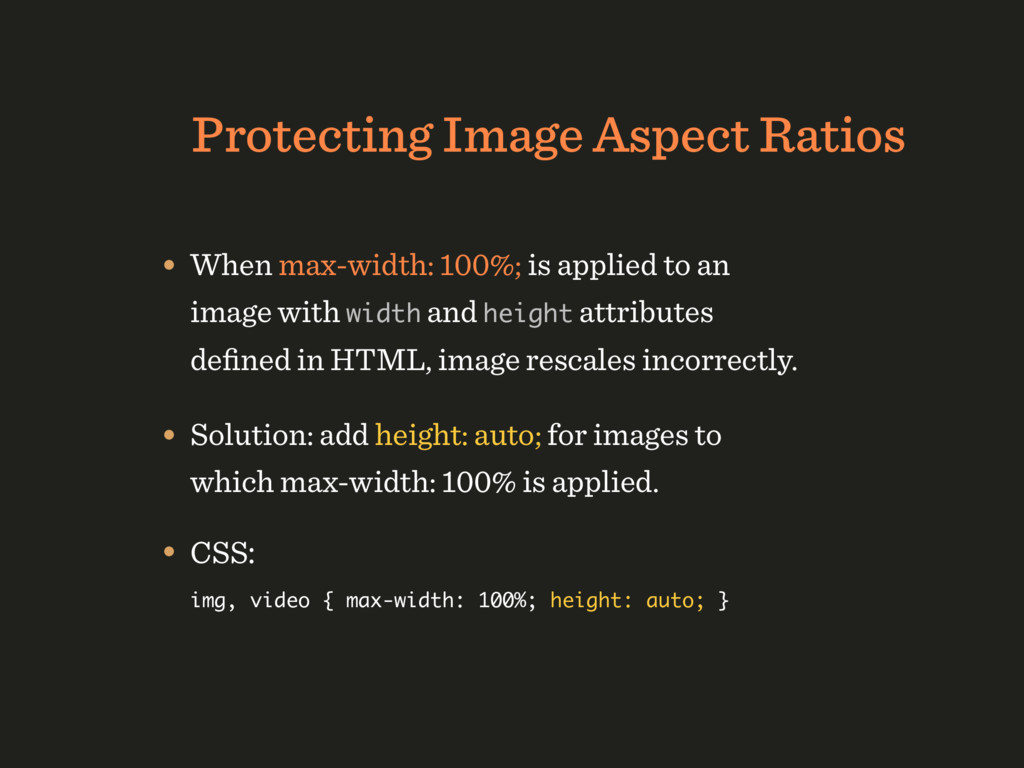
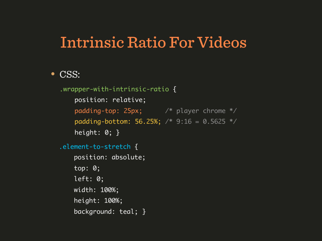
to an image with width and height attributes defined in HTML, image rescales incorrectly. • Solution: add height: auto; for images to which max-width: 100% is applied. • CSS: img, video { max-width: 100%; height: auto; }
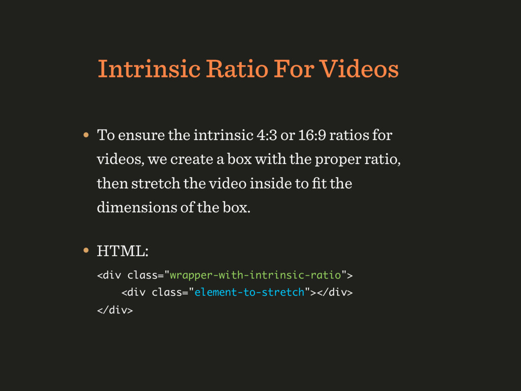
or 16:9 ratios for videos, we create a box with the proper ratio, then stretch the video inside to fit the dimensions of the box. • HTML: <div class="wrapper-with-intrinsic-ratio"> <div class="element-to-stretch"></div> </div>
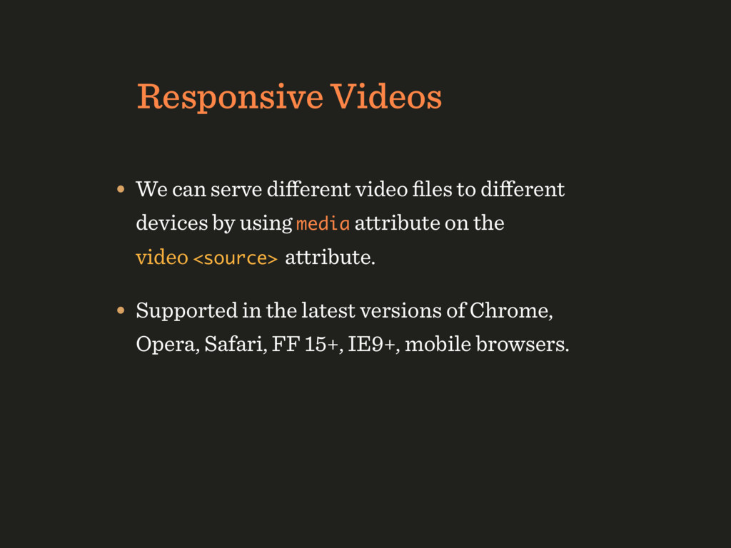
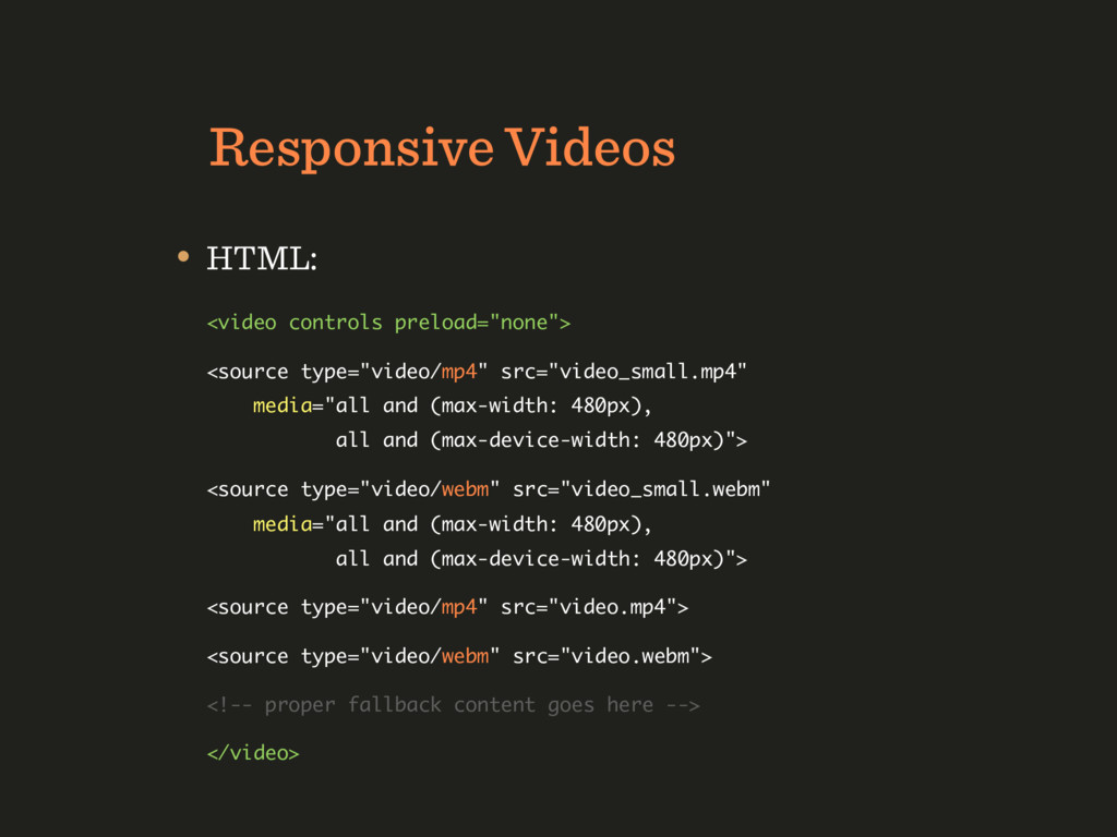
different devices by using media attribute on the video <source> attribute. • Supported in the latest versions of Chrome, Opera, Safari, FF 15+, IE9+, mobile browsers.
media="all and (max-width: 480px), all and (max-device-width: 480px)"> <source type="video/webm" src="video_small.webm" media="all and (max-width: 480px), all and (max-device-width: 480px)"> <source type="video/mp4" src="video.mp4"> <source type="video/webm" src="video.webm"> <!-- proper fallback content goes here --> </video>
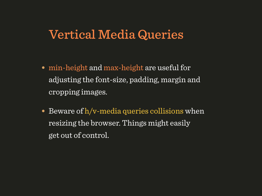
adjusting the font-size, padding, margin and cropping images. • Beware of h/v-media queries collisions when resizing the browser. Things might easily get out of control.
breakpoint- based organization for CSS (“min-width”): 0-up.css, 450-up.css, 720-up.css etc. • We can also set breakpoints 1px apart and split styles instead of overriding from one media query to the next (“min/max-width”): base.css, 0-449.css, 450-719.css etc.
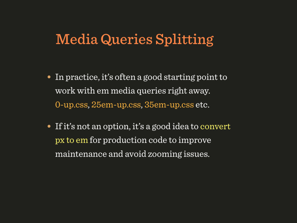
starting point to work with em media queries right away. 0-up.css, 25em-up.css, 35em-up.css etc. • If it’s not an option, it’s a good idea to convert px to em for production code to improve maintenance and avoid zooming issues.
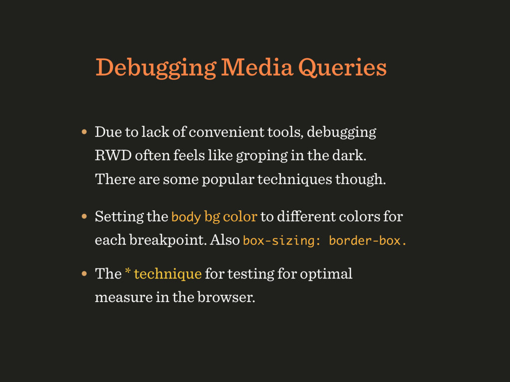
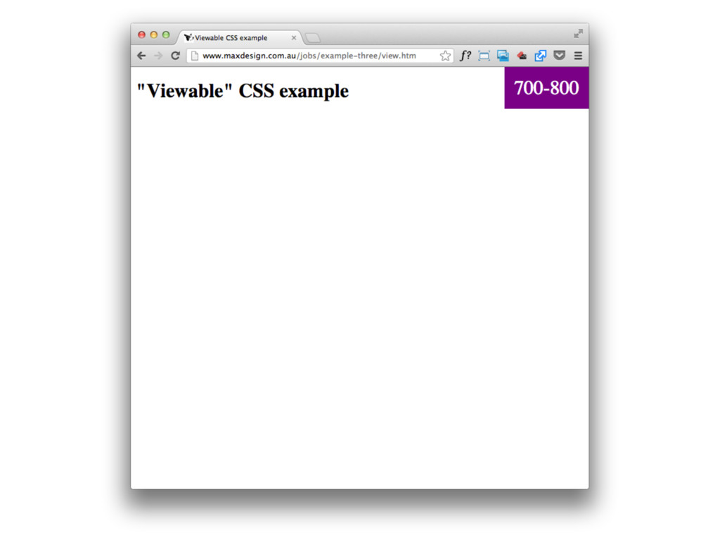
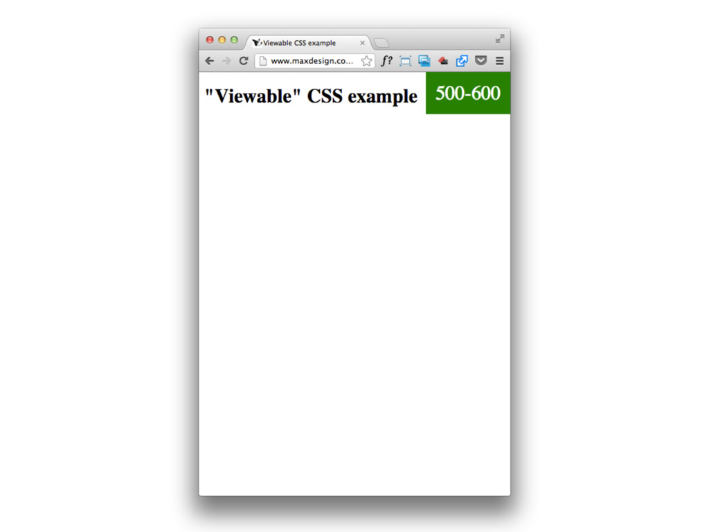
debugging RWD often feels like groping in the dark. There are some popular techniques though. • Setting the body bg color to different colors for each breakpoint. Also box-sizing: border-box. • The * technique for testing for optimal measure in the browser.
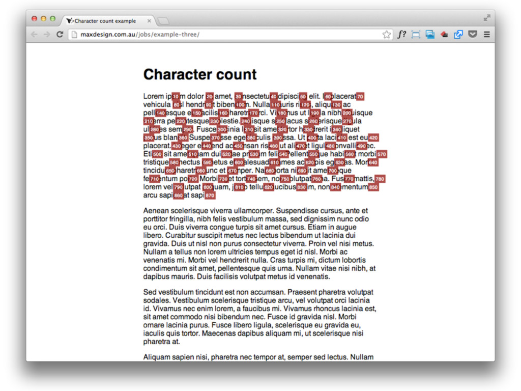
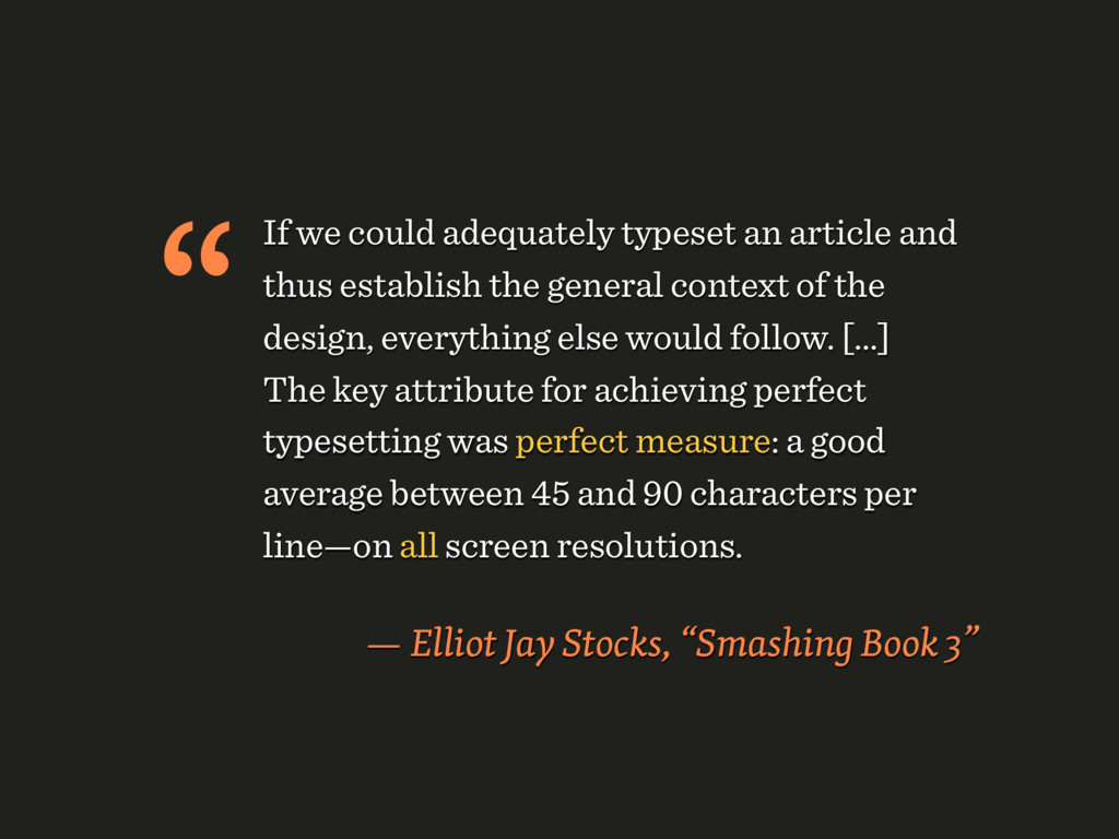
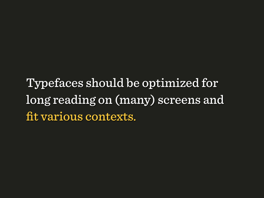
the general context of the design, everything else would follow. [...] The key attribute for achieving perfect typesetting was perfect measure: a good average between 45 and 90 characters per line—on all screen resolutions. — Elliot Jay Stocks, “Smashing Book 3” “
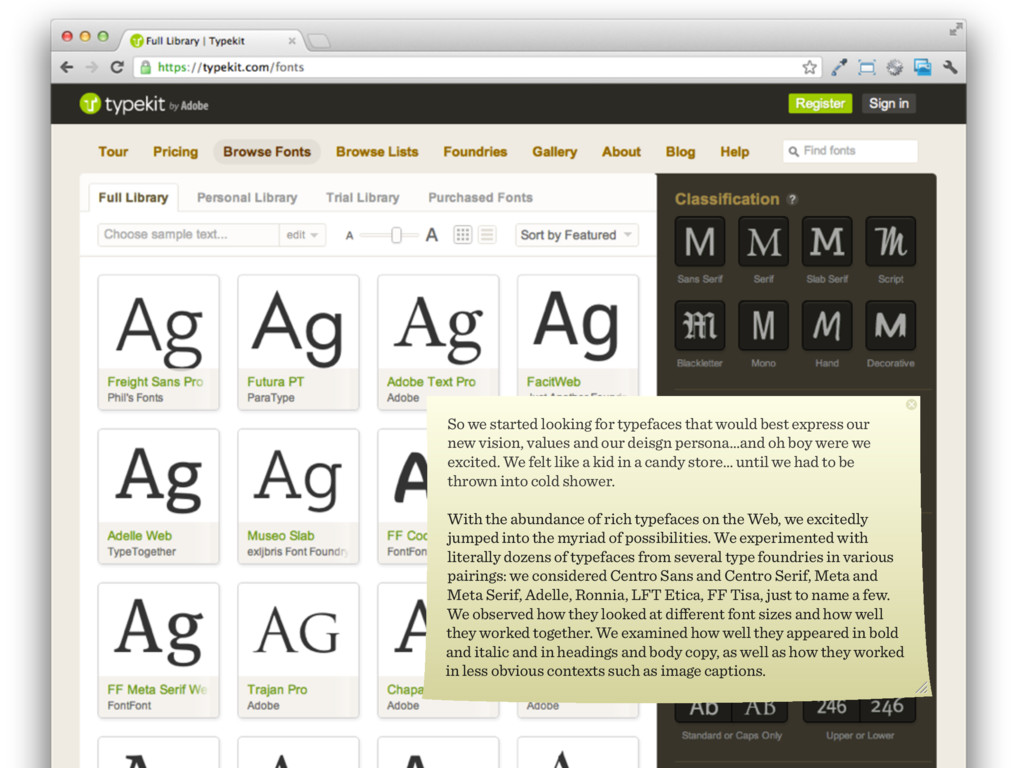
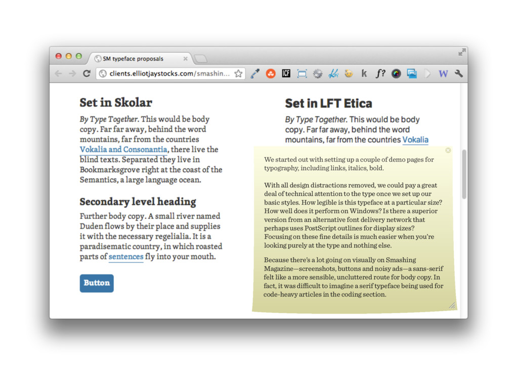
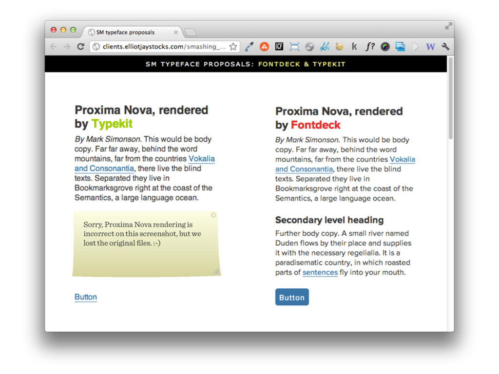
our new vision, values and our deisgn persona...and oh boy were we excited. We felt like a kid in a candy store... until we had to be thrown into cold shower. With the abundance of rich typefaces on the Web, we excitedly jumped into the myriad of possibilities. We experimented with literally dozens of typefaces from several type foundries in various pairings: we considered Centro Sans and Centro Serif, Meta and Meta Serif, Adelle, Ronnia, LFT Etica, FF Tisa, just to name a few. We observed how they looked at different font sizes and how well they worked together. We examined how well they appeared in bold and italic and in headings and body copy, as well as how they worked in less obvious contexts such as image captions.
pages for typography, including links, italics, bold. With all design distractions removed, we could pay a great deal of technical attention to the type once we set up our basic styles. How legible is this typeface at a particular size? How well does it perform on Windows? Is there a superior version from an alternative font delivery network that perhaps uses PostScript outlines for display sizes? Focusing on these fine details is much easier when you’re looking purely at the type and nothing else. Because there’s a lot going on visually on Smashing Magazine—screenshots, buttons and noisy ads—a sans-serif felt like a more sensible, uncluttered route for body copy. In fact, it was difficult to imagine a serif typeface being used for code-heavy articles in the coding section.
with a nested unordered list. and switches them on and off with CSS. The keywords were carefully chosen and tested. We kned that it would take too much space, but we decided to test it and it performed fairly well. We’ve developed a toggle menu here as well, it is currently in the queue for testing. We had drop-down... initially here...
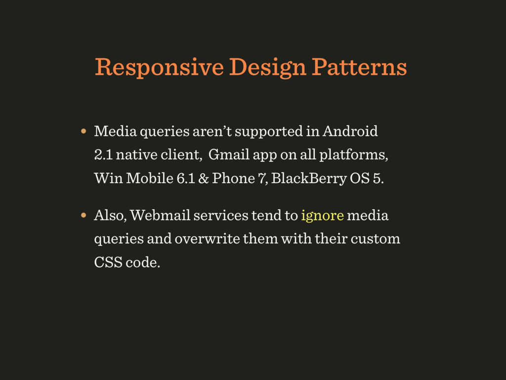
2.1 native client, Gmail app on all platforms, Win Mobile 6.1 & Phone 7, BlackBerry OS 5. • Also, Webmail services tend to ignore media queries and overwrite them with their custom CSS code.
 presportal
 garyuten
 karad
karad
 centou
 videlvequio
 webnaut
 happy_ferret153
 yuri_ohashi
 kaikou
 lynteo
 vivion
 kspace
 takanorip
 rocio
rocio
 techseoconnect
 stephaniewalter
 afnizarnur
 varn
varn
 maggiecrowley
 chriscoyier
 reverentgeek
 popppiees
 aleyda
 chikuwait
 axbom
axbom
![“If you [...] had to choose between employing media queries](https://files.speakerdeck.com/presentations/c0cc23377c404c1fa95d0eb787628617/slide_45.jpg)