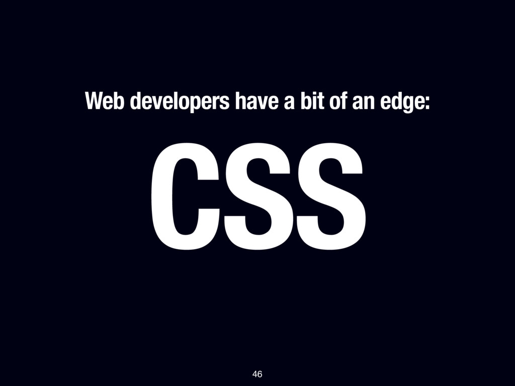
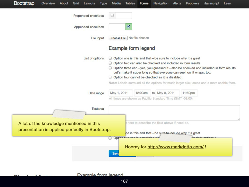
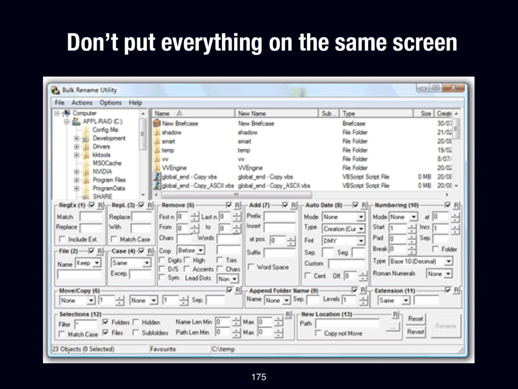
interface design as a set of rules: there are some good default values for a lot of design decisions that you should remember, there is a “scientific” way of approaching things like alignment, even though many designers will tell you it’s something you should “feel”.
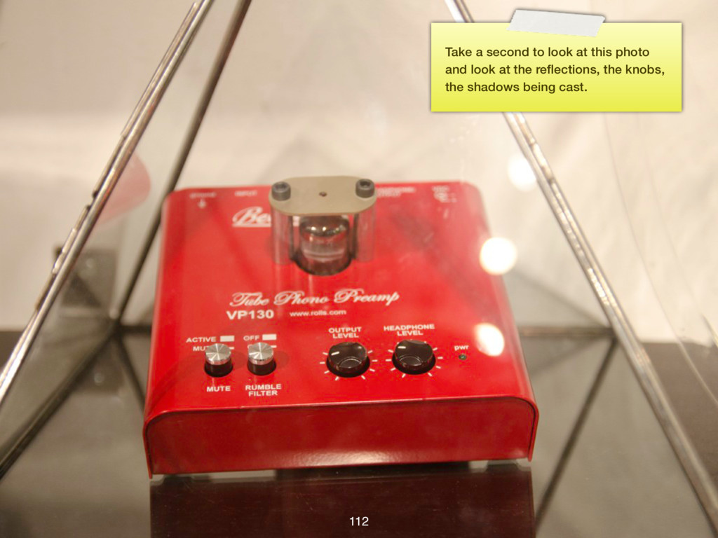
so the slides don’t distract from what is being said. Since you are probably viewing this online, I reworked the entire presentation and added these sticky notes to add what I talked about when displaying the slide. They look like this.
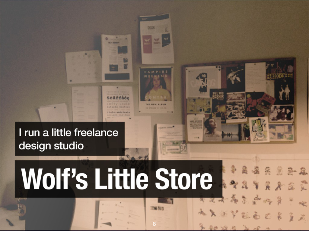
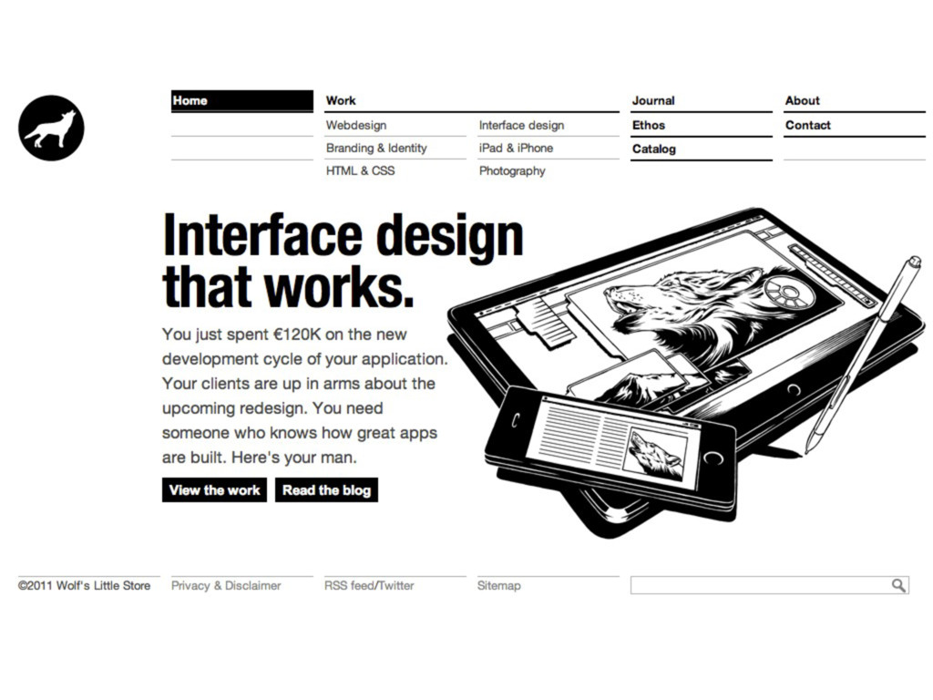
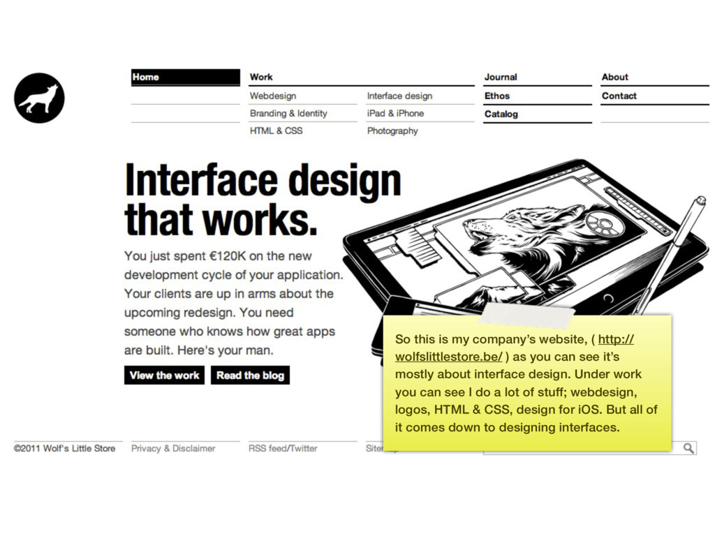
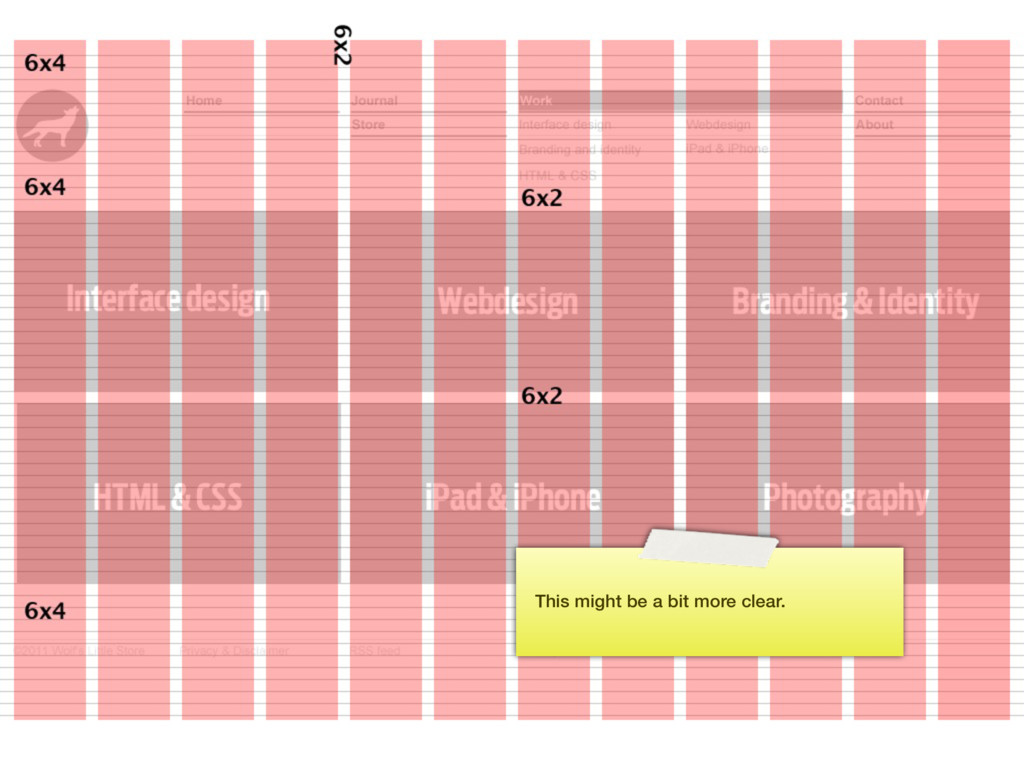
) as you can see it’s mostly about interface design. Under work you can see I do a lot of stuff; webdesign, logos, HTML & CSS, design for iOS. But all of it comes down to designing interfaces.
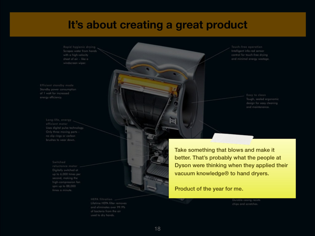
blows and make it better. That’s probably what the people at Dyson were thinking when they applied their vacuum knowledge® to hand dryers. Product of the year for me.
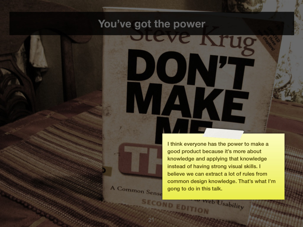
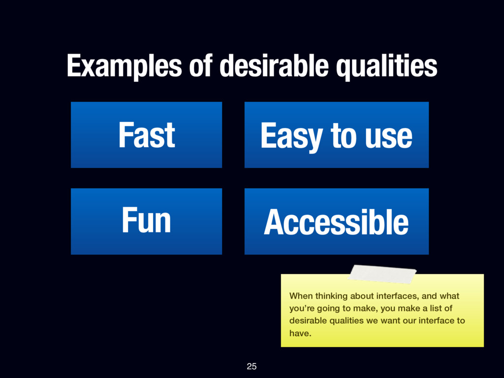
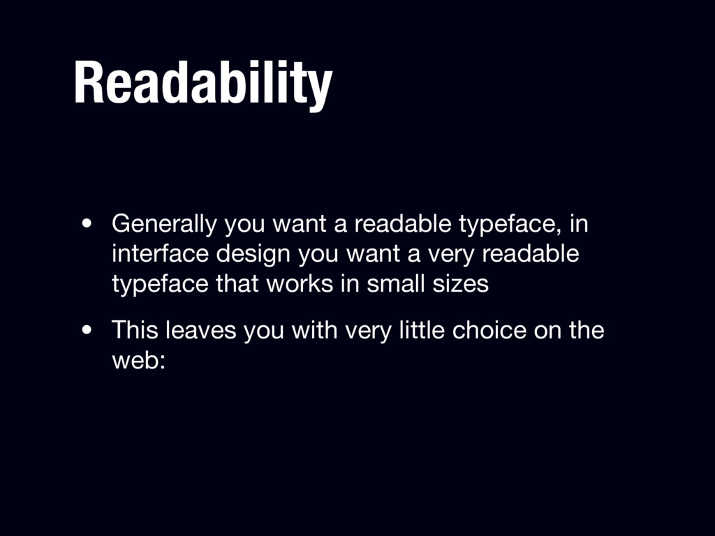
power to make a good product because it’s more about knowledge and applying that knowledge instead of having strong visual skills. I believe we can extract a lot of rules from common design knowledge. That’s what I’m gong to do in this talk.
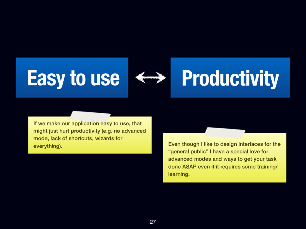
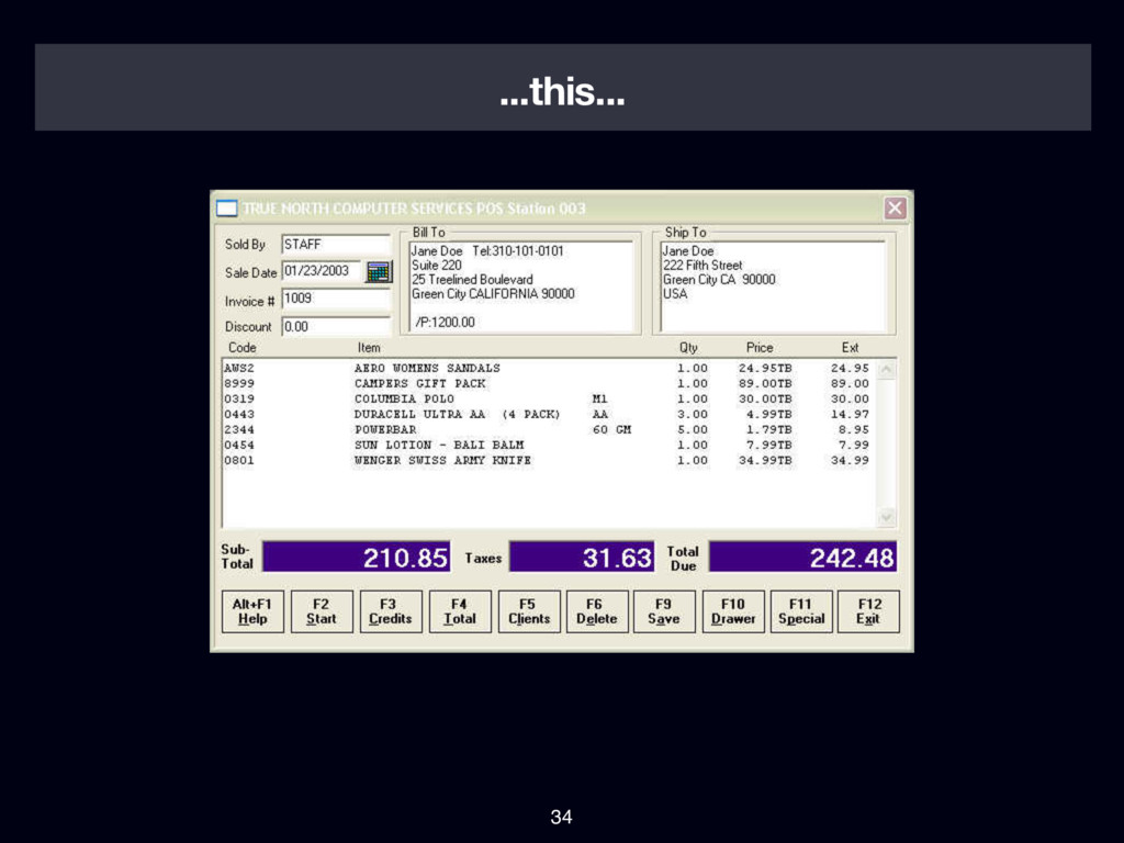
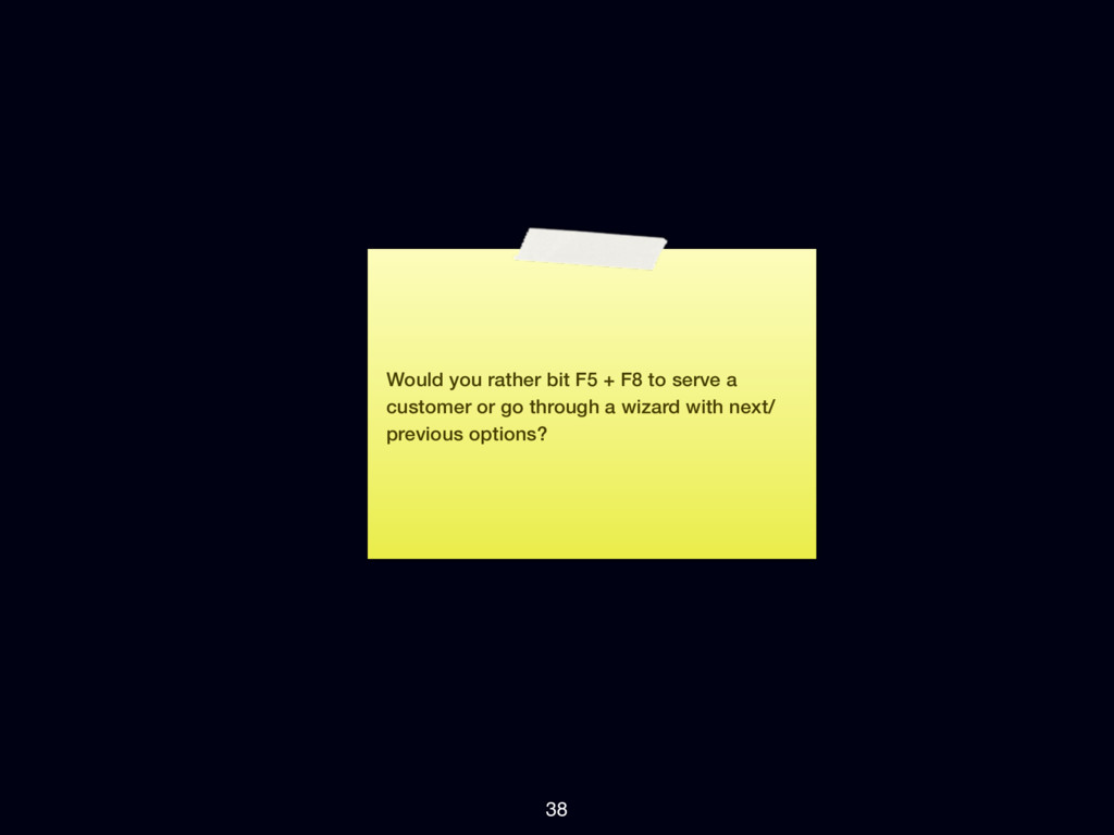
easy to use, that might just hurt productivity (e.g. no advanced mode, lack of shortcuts, wizards for everything). Even though I like to design interfaces for the “general public” I have a special love for advanced modes and ways to get your task done ASAP even if it requires some training/ learning.
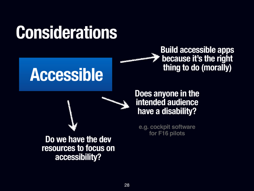
to do (morally) Does anyone in the intended audience have a disability? e.g. cockpit software for F16 pilots Do we have the dev resources to focus on accessibility? 28
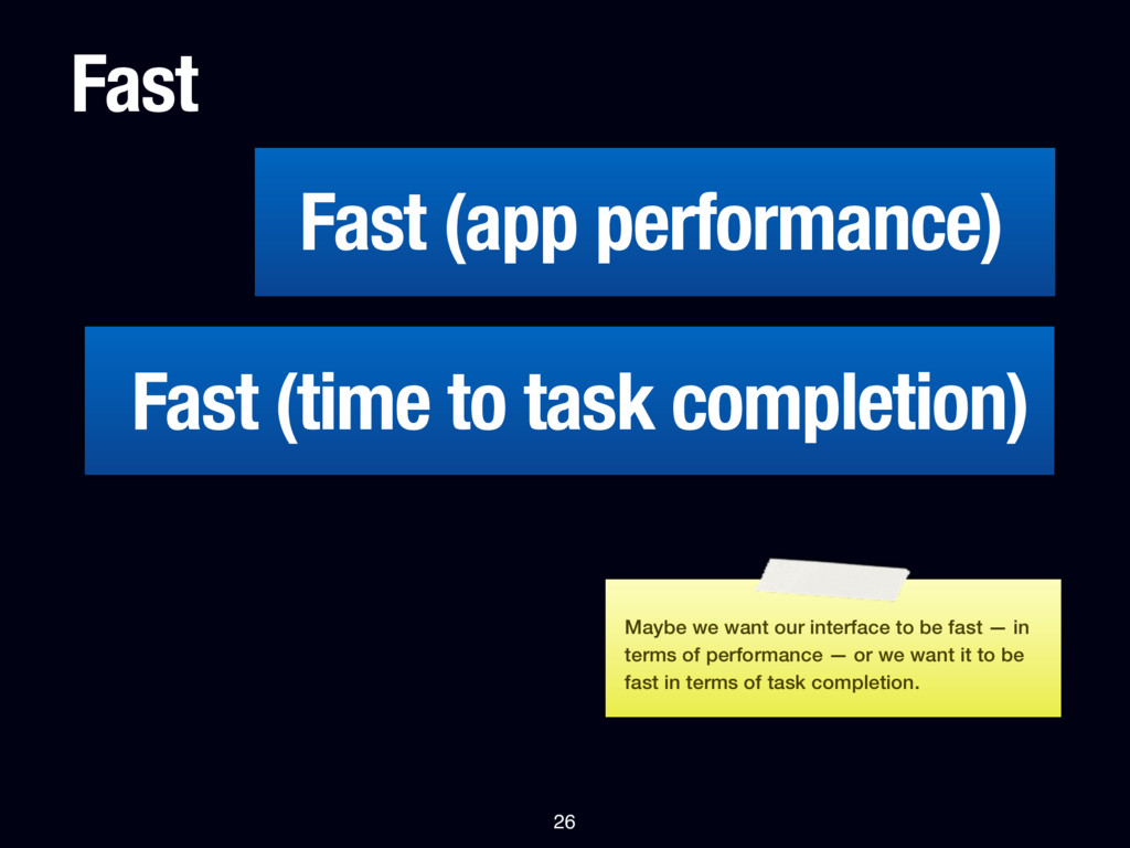
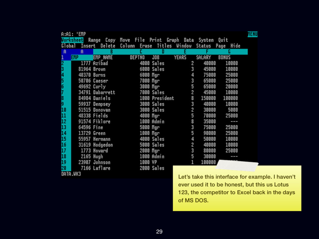
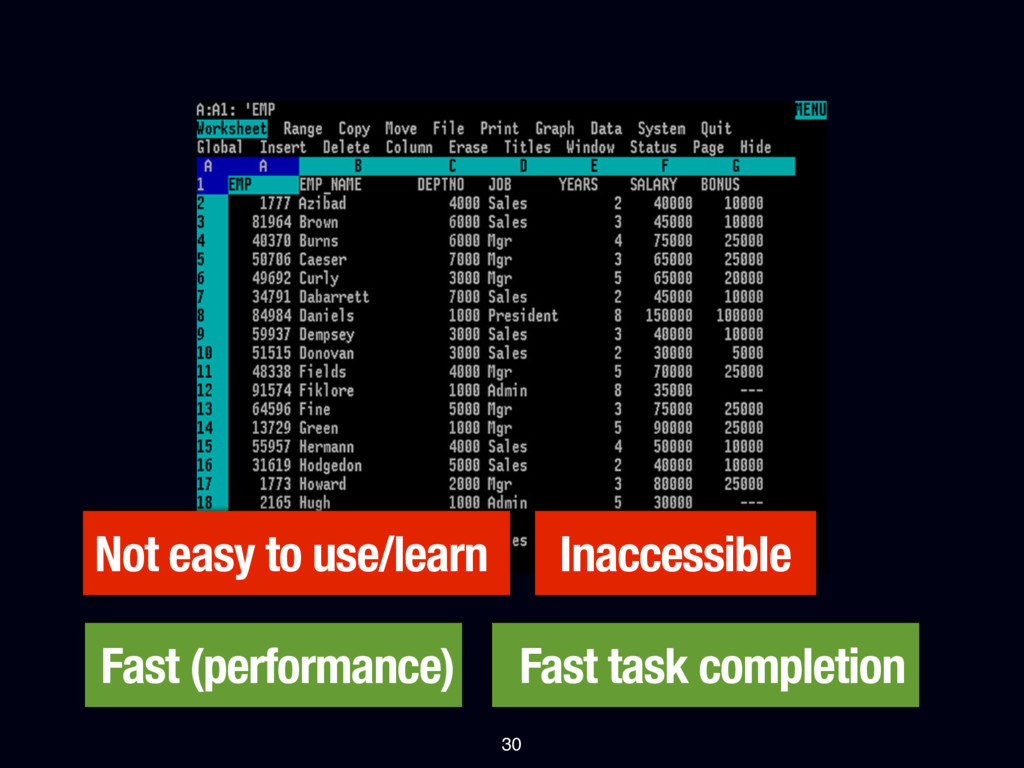
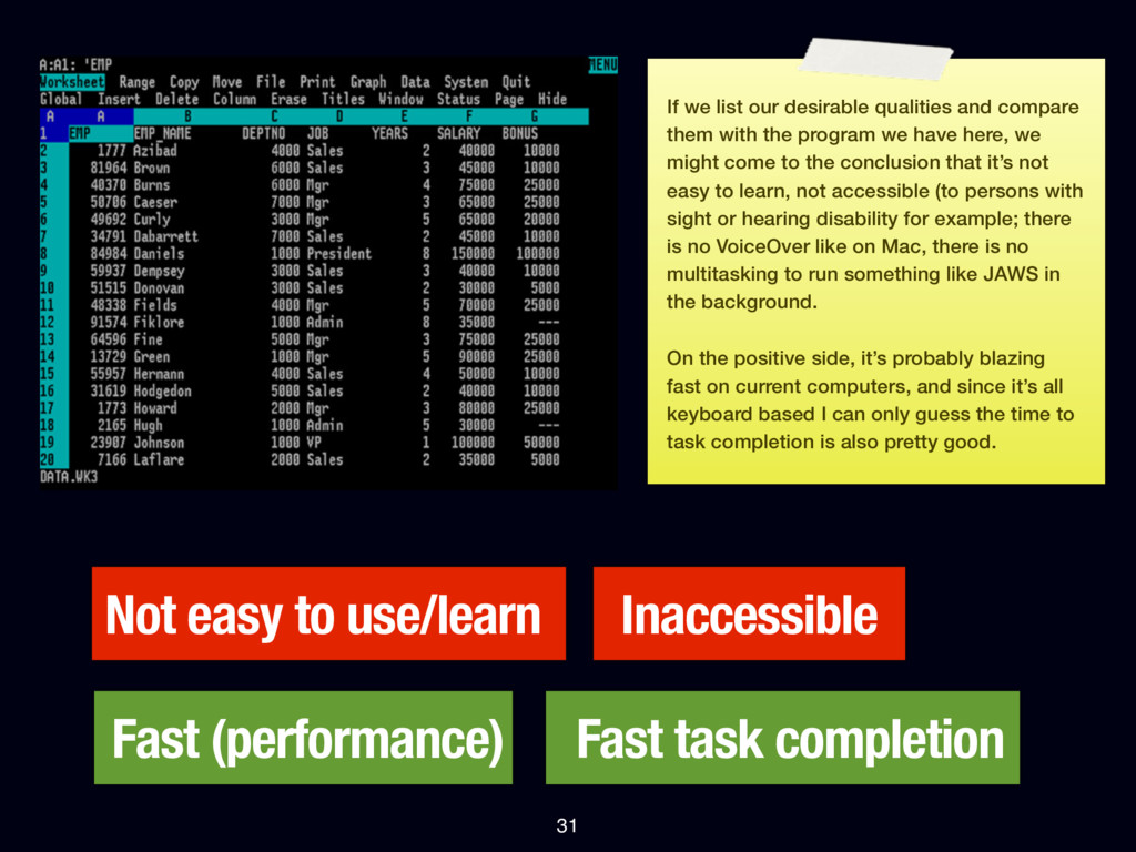
31 If we list our desirable qualities and compare them with the program we have here, we might come to the conclusion that it’s not easy to learn, not accessible (to persons with sight or hearing disability for example; there is no VoiceOver like on Mac, there is no multitasking to run something like JAWS in the background. On the positive side, it’s probably blazing fast on current computers, and since it’s all keyboard based I can only guess the time to task completion is also pretty good.
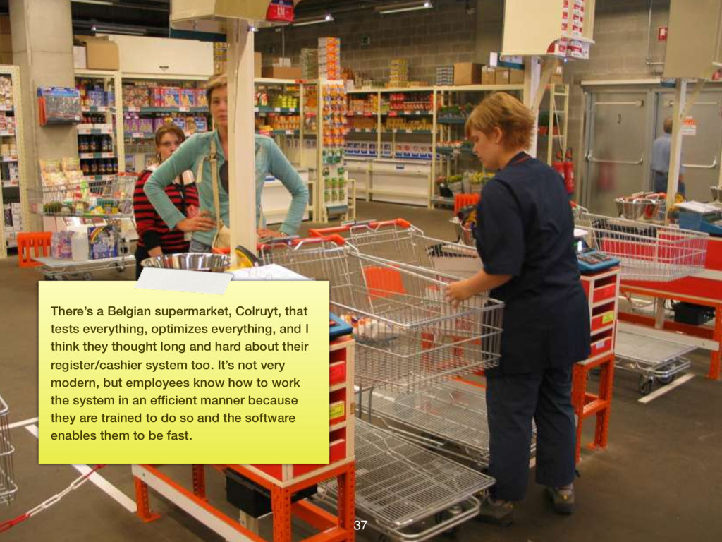
vs. making it so you can complete your task quickly becomes clear here... since the employees in our imaginary shop all get trained do we really want to use the slick “Easy to use” system when maybe we want the system that enables us to do our task as fast as possible?
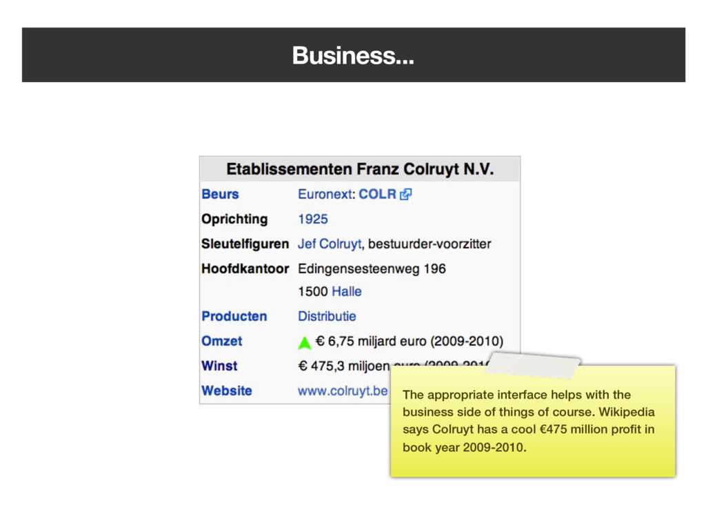
everything, and I think they thought long and hard about their register/cashier system too. It’s not very modern, but employees know how to work the system in an efficient manner because they are trained to do so and the software enables them to be fast.
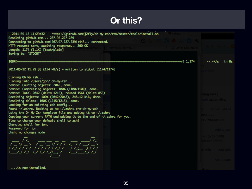
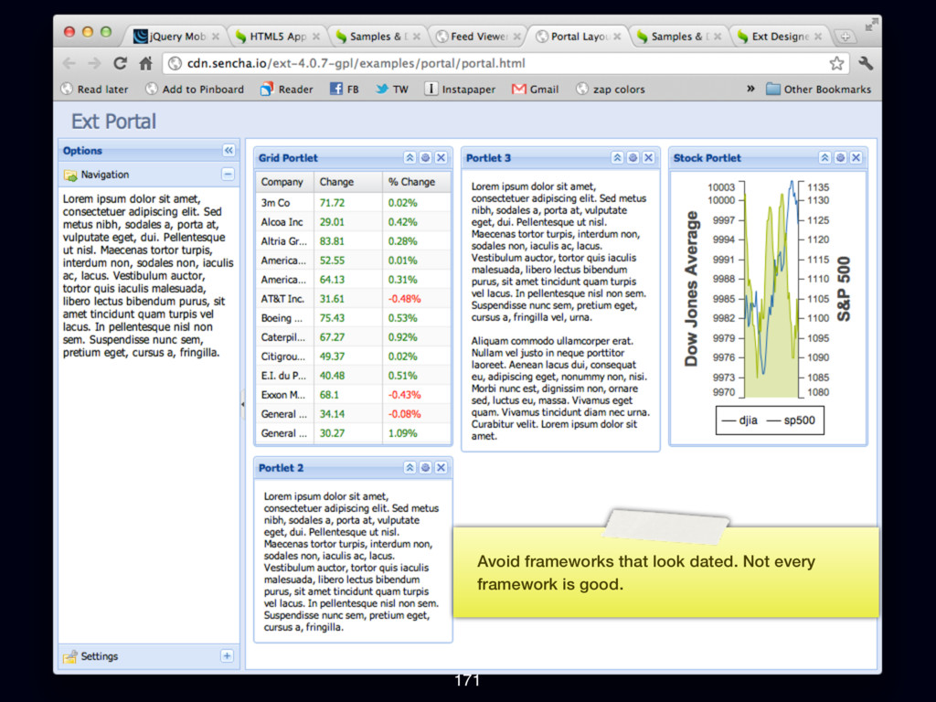
presentation? I want everyone to think about what they’re building and for who they’re building it. Even though kids are growing up with computers these days, the current generation of software is becoming flat and less usable to expert users. While I <3 Apple software a lot of what they do feels dumbed down. I’m very frustrated making this 150+ slides presentation in Keynote because there is no automation whatsoever. I can’t align things automatically, I have to copy paste this note thing from slide to slide manually.
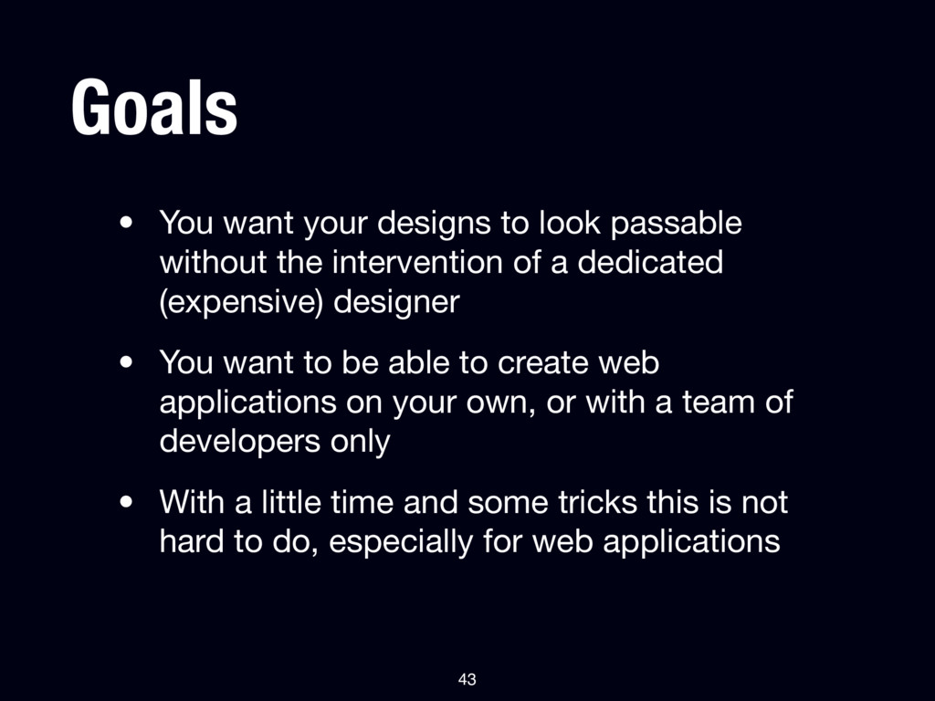
the intervention of a dedicated (expensive) designer • You want to be able to create web applications on your own, or with a team of developers only • With a little time and some tricks this is not hard to do, especially for web applications 43
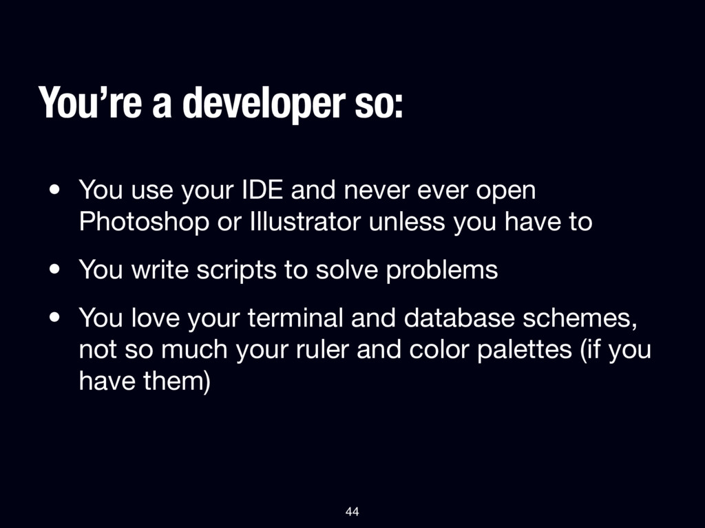
or Illustrator unless you have to • You write scripts to solve problems • You love your terminal and database schemes, not so much your ruler and color palettes (if you have them) You’re a developer so: 44
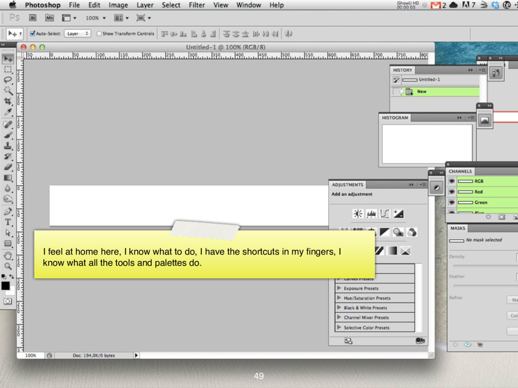
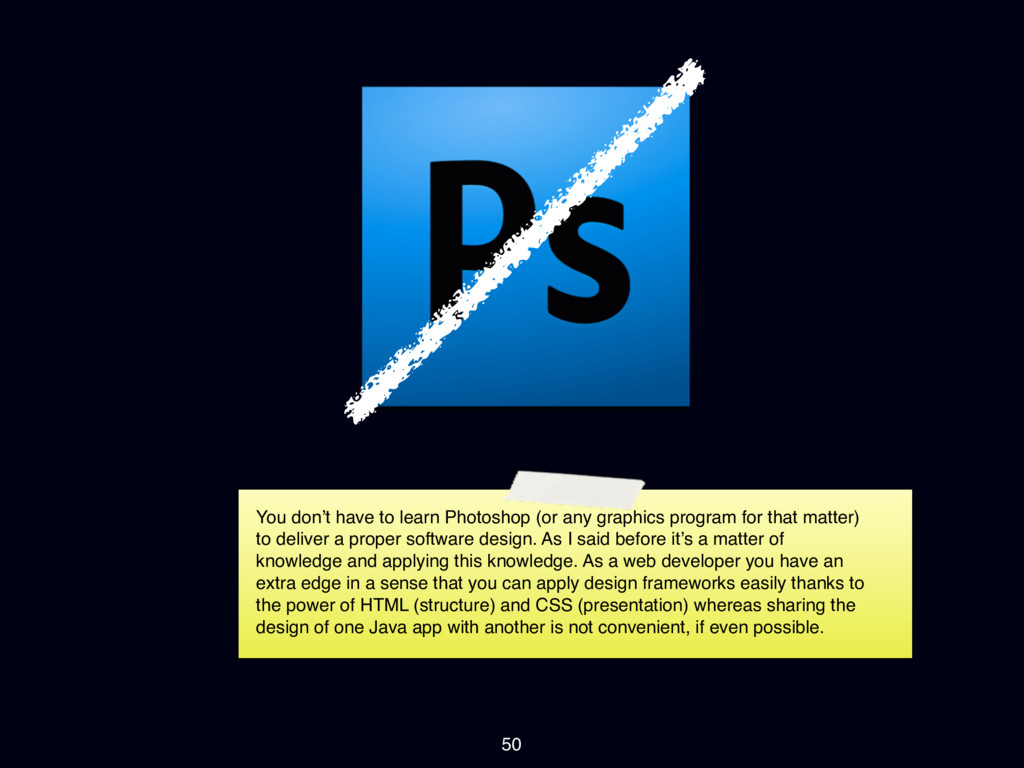
Photoshop? It’s big and vast... there’s many tools and palettes and it’s easy to get lost. I took me years to become productive in Photoshop and I understand why people are advocating designing in the browser.
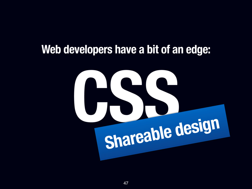
program for that matter) to deliver a proper software design. As I said before it’s a matter of knowledge and applying this knowledge. As a web developer you have an extra edge in a sense that you can apply design frameworks easily thanks to the power of HTML (structure) and CSS (presentation) whereas sharing the design of one Java app with another is not convenient, if even possible.
C Practical tips & tricks (1) 52 I divided this up in sections, first up are typography, alignment and light and shadow. These are the most important parts.
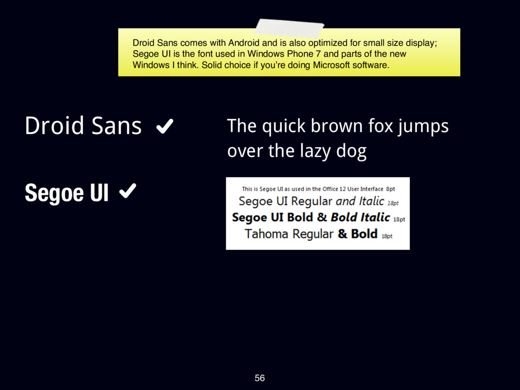
over the lazy dog Droid Sans comes with Android and is also optimized for small size display; Segoe UI is the font used in Windows Phone 7 and parts of the new Windows I think. Solid choice if you’re doing Microsoft software.
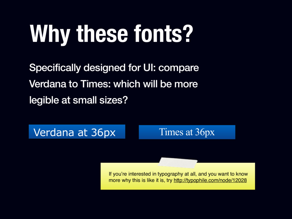
Times: which will be more legible at small sizes? Verdana at 36px Times at 36px If you’re interested in typography at all, and you want to know more why this is like it is, try http://typophile.com/node/12028
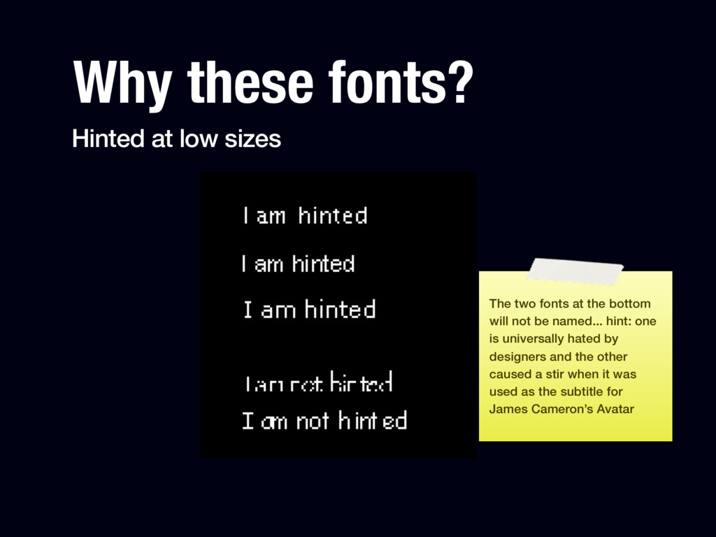
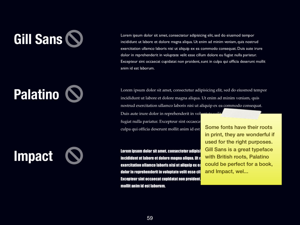
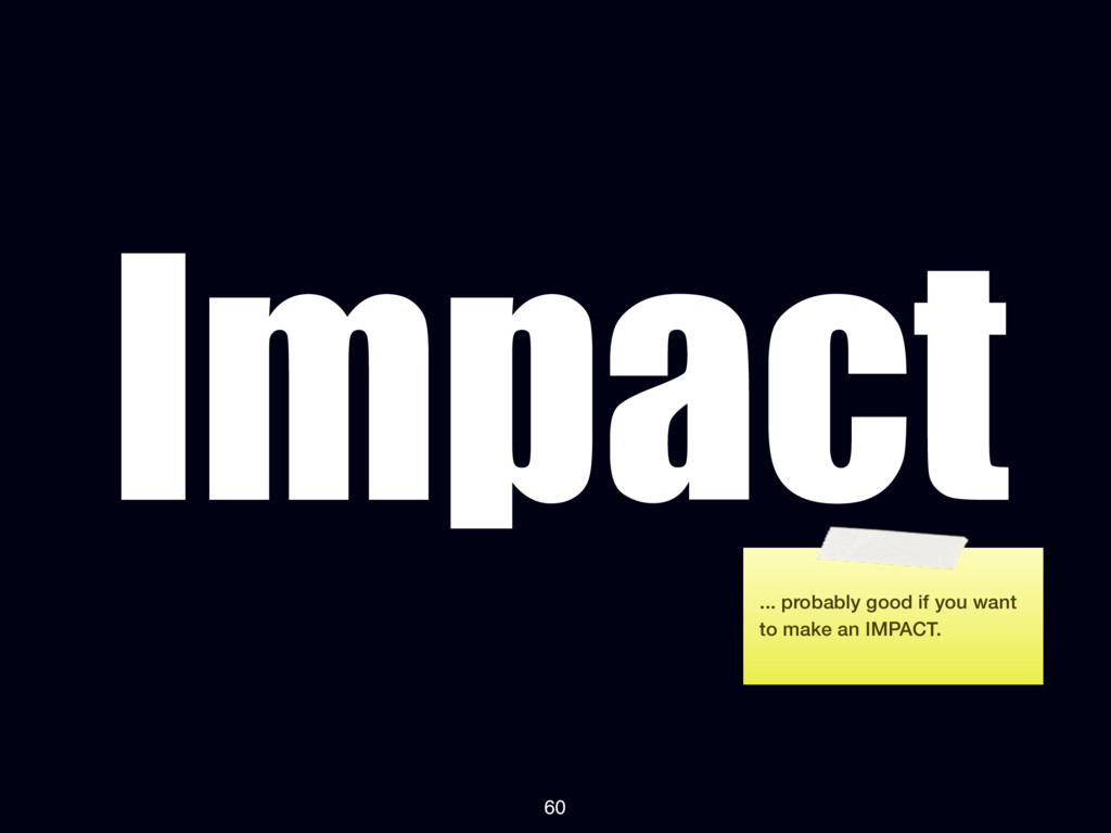
at the bottom will not be named... hint: one is universally hated by designers and the other caused a stir when it was used as the subtitle for James Cameron’s Avatar
elit, sed do eiusmod tempor incididunt ut labore et dolore magna aliqua. Ut enim ad minim veniam, quis nostrud exercitation ullamco laboris nisi ut aliquip ex ea commodo consequat. Duis aute irure dolor in reprehenderit in voluptate velit esse cillum dolore eu fugiat nulla pariatur. Excepteur sint occaecat cupidatat non proident, sunt in culpa qui officia deserunt mollit anim id est laborum. Lorem ipsum dolor sit amet, consectetur adipisicing elit, sed do eiusmod tempor incididunt ut labore et dolore magna aliqua. Ut enim ad minim veniam, quis nostrud exercitation ullamco laboris nisi ut aliquip ex ea commodo consequat. Duis aute irure dolor in reprehenderit in voluptate velit esse cillum dolore eu fugiat nulla pariatur. Excepteur sint occaecat cupidatat non proident, sunt in culpa qui officia deserunt mollit anim id est laborum. Lorem ipsum dolor sit amet, consectetur adipisicing elit, sed do eiusmod tempor incididunt ut labore et dolore magna aliqua. Ut enim ad minim veniam, quis nostrud exercitation ullamco laboris nisi ut aliquip ex ea commodo consequat. Duis aute irure dolor in reprehenderit in voluptate velit esse cillum dolore eu fugiat nulla pariatur. Excepteur sint occaecat cupidatat non proident, sunt in culpa qui officia deserunt mollit anim id est laborum. Impact 59 Some fonts have their roots in print, they are wonderful if used for the right purposes. Gill Sans is a great typeface with British roots, Palatino could be perfect for a book, and Impact, wel...
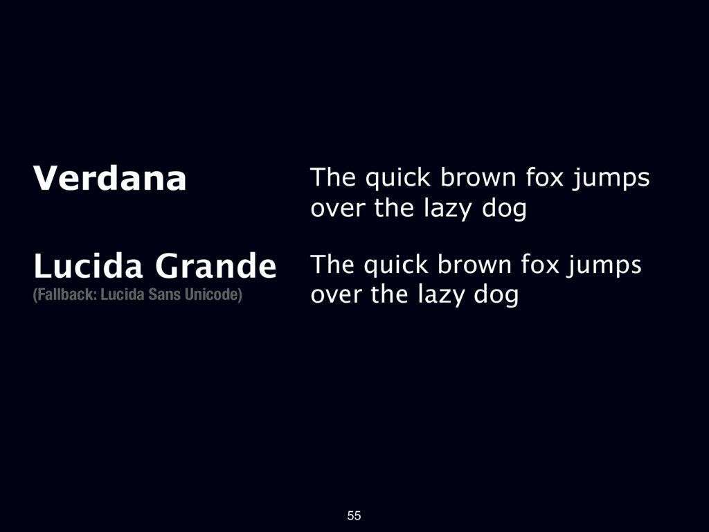
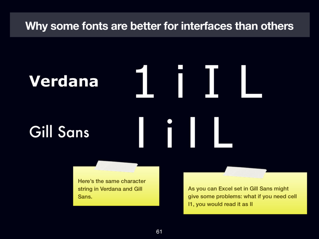
L Why some fonts are better for interfaces than others 61 Here’s the same character string in Verdana and Gill Sans. As you can Excel set in Gill Sans might give some problems: what if you need cell I1, you would read it as II
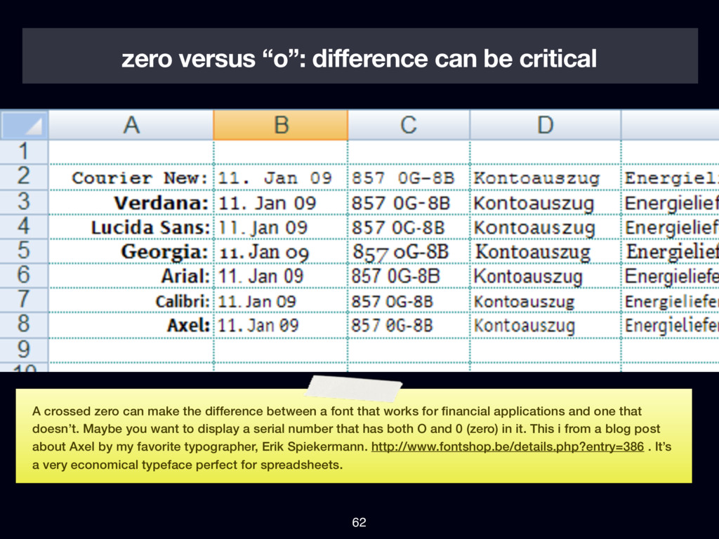
zero can make the difference between a font that works for financial applications and one that doesn’t. Maybe you want to display a serial number that has both O and 0 (zero) in it. This i from a blog post about Axel by my favorite typographer, Erik Spiekermann. http://www.fontshop.be/details.php?entry=386 . It’s a very economical typeface perfect for spreadsheets.
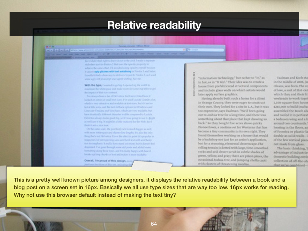
among designers, it displays the relative readability between a book and a blog post on a screen set in 16px. Basically we all use type sizes that are way too low. 16px works for reading. Why not use this browser default instead of making the text tiny?
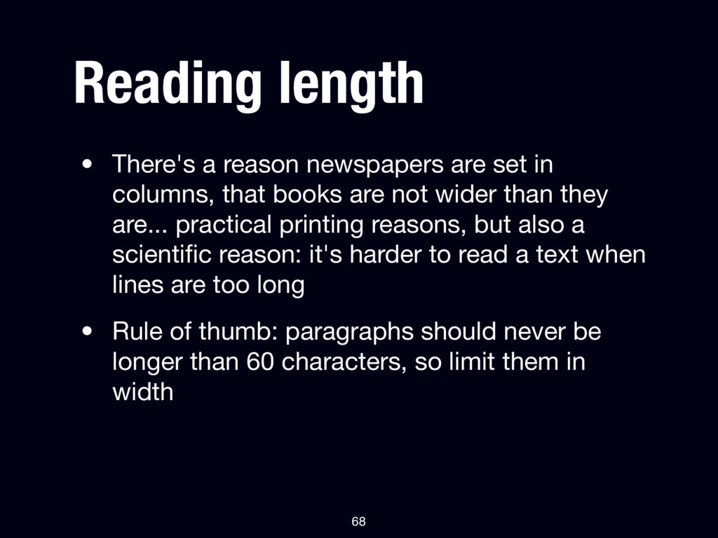
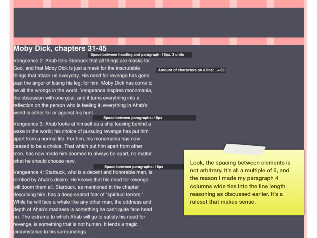
columns, that books are not wider than they are... practical printing reasons, but also a scientific reason: it's harder to read a text when lines are too long • Rule of thumb: paragraphs should never be longer than 60 characters, so limit them in width 68
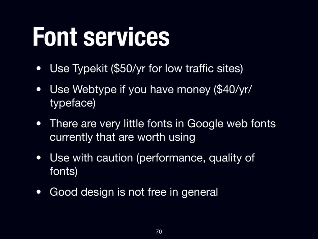
• Use Webtype if you have money ($40/yr/ typeface) • There are very little fonts in Google web fonts currently that are worth using • Use with caution (performance, quality of fonts) • Good design is not free in general 70
Wolf’s Little Store website were kind of cancelled out by using 2 fonts from an external web provider. If you care about performance at all, don’t use @font-face.
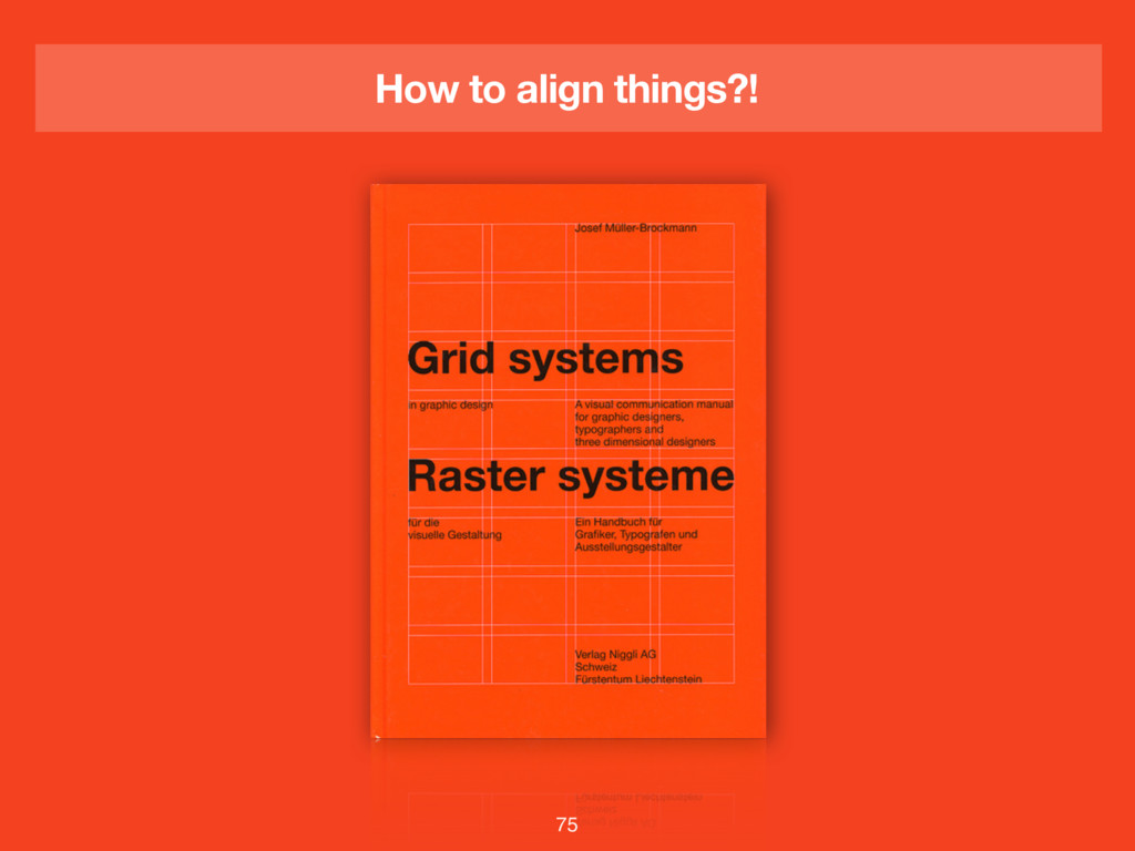
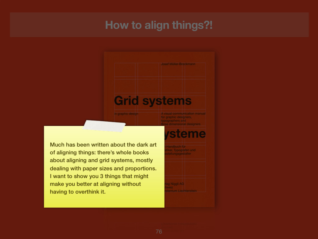
the dark art of aligning things: there’s whole books about aligning and grid systems, mostly dealing with paper sizes and proportions. I want to show you 3 things that might make you better at aligning without having to overthink it.
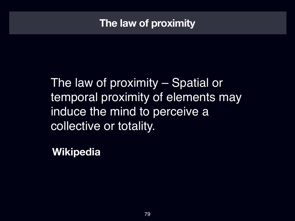
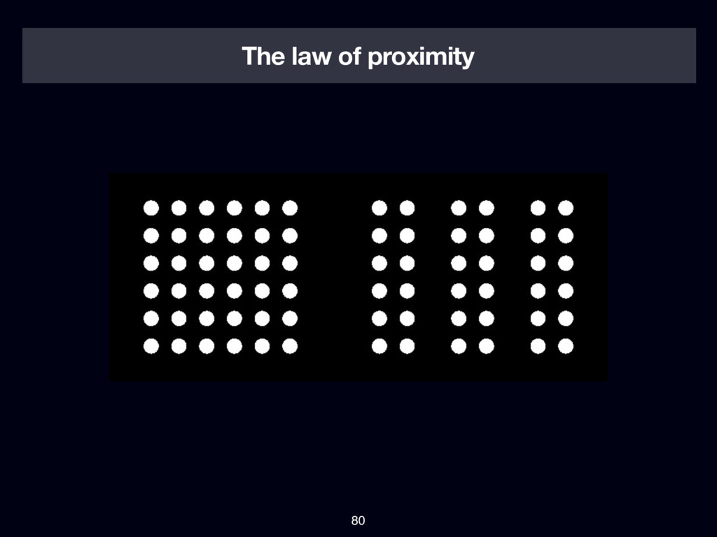
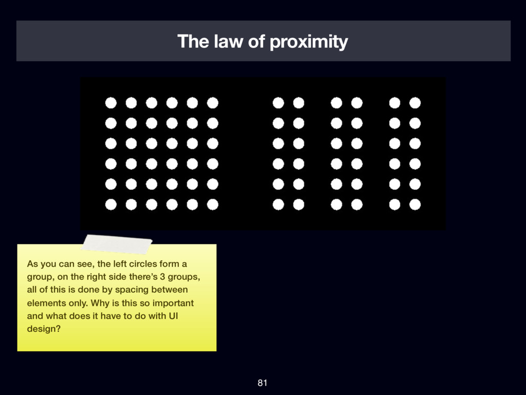
left circles form a group, on the right side there’s 3 groups, all of this is done by spacing between elements only. Why is this so important and what does it have to do with UI design?
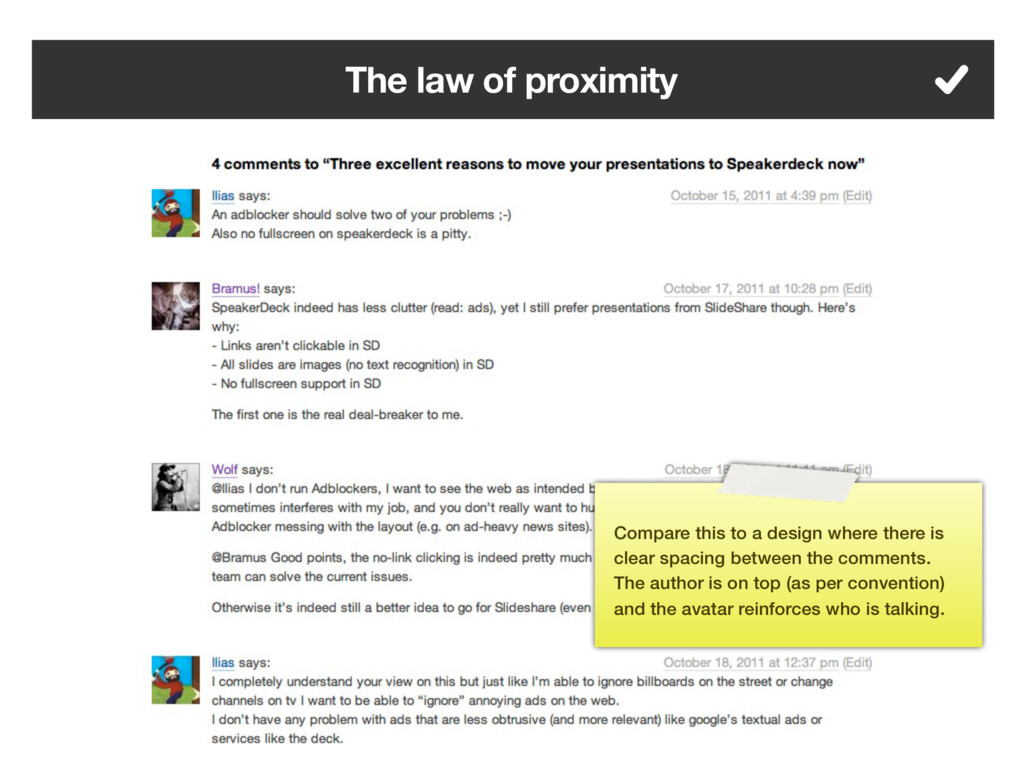
that elements that are closer together will be perceived as a group. Since the spacing is even between every comment here it’s hard to find out who wrote which comment.
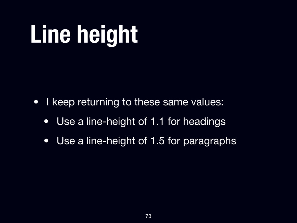
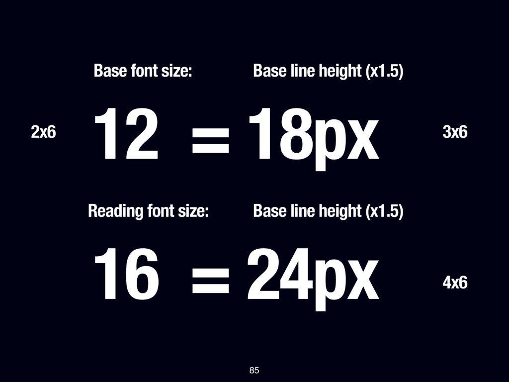
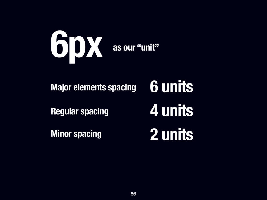
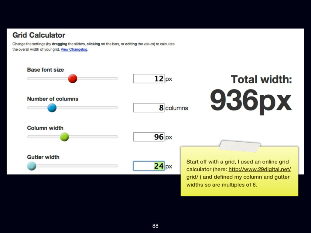
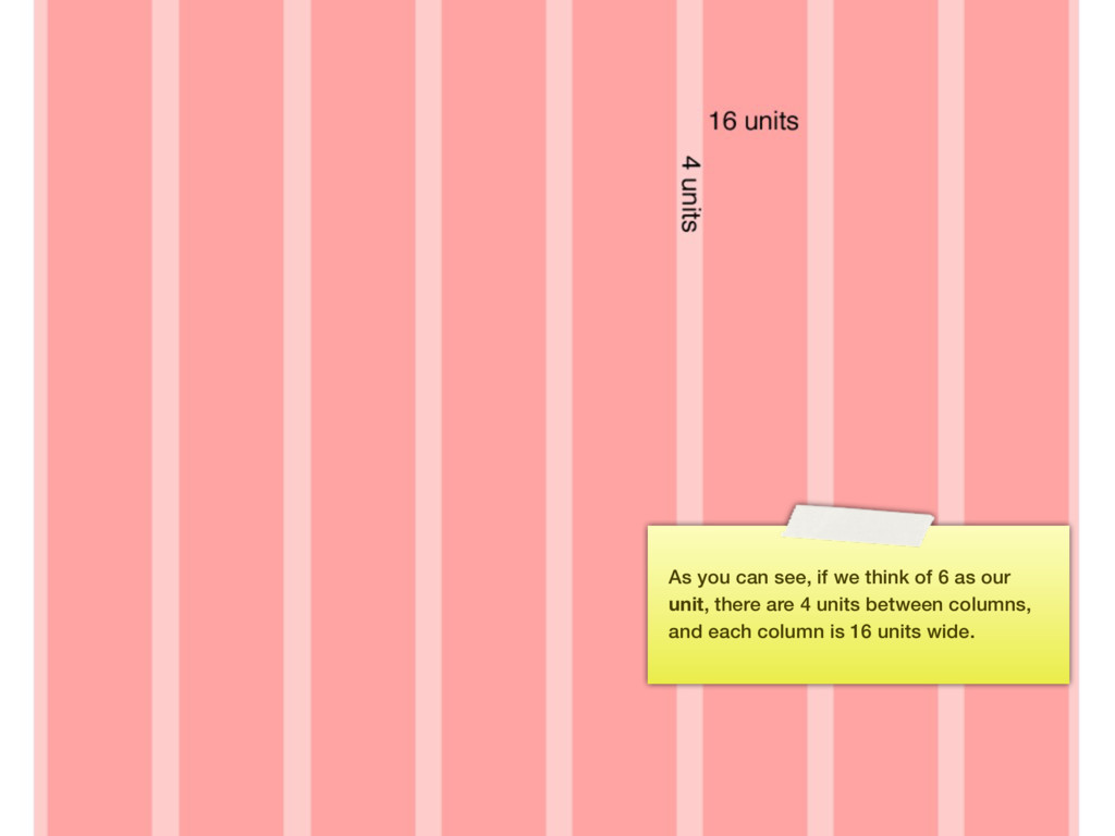
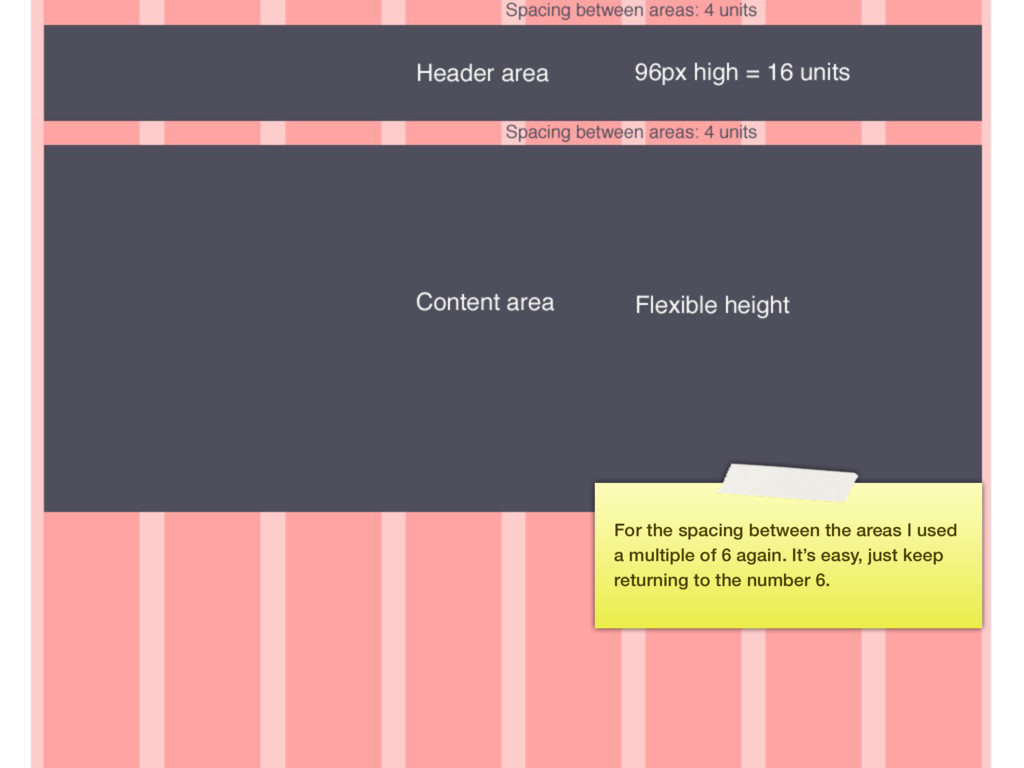
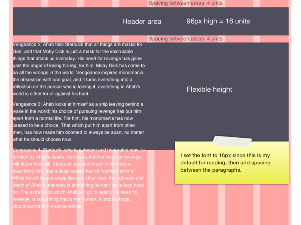
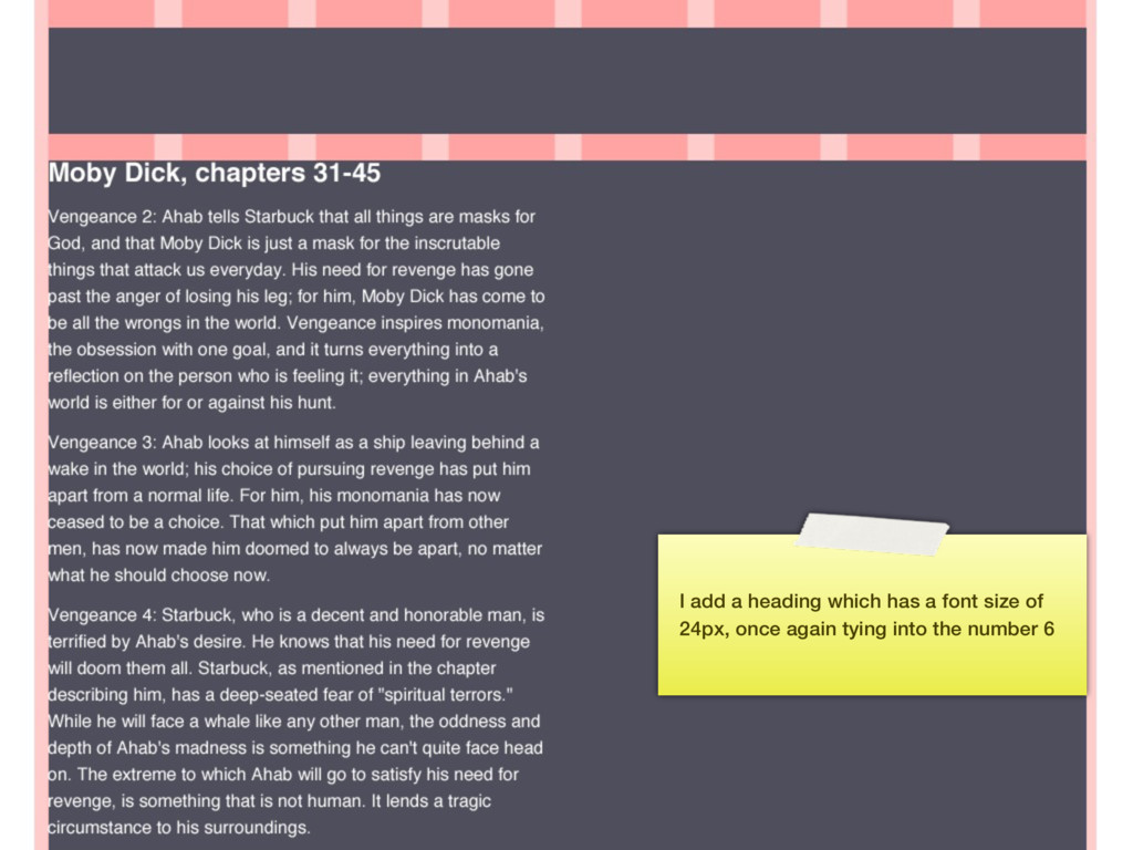
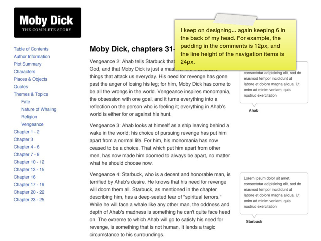
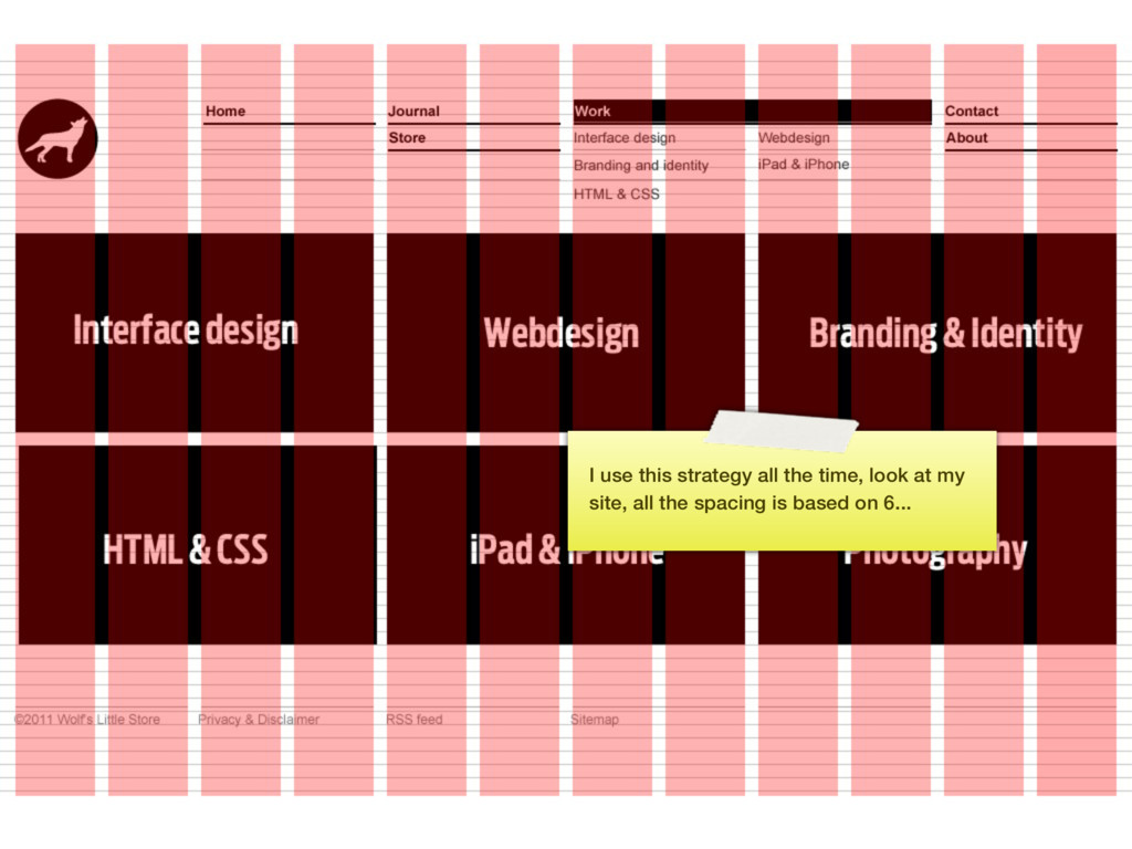
I keep returning to the number 6 for aligning and spacing UI elements. It makes sense: all the numbers we use for our defaults (1.5 line height, 16px font size for reading, etc.) form multiples of 6 when used in simple calculations: 12, 18, 24, 36, ...
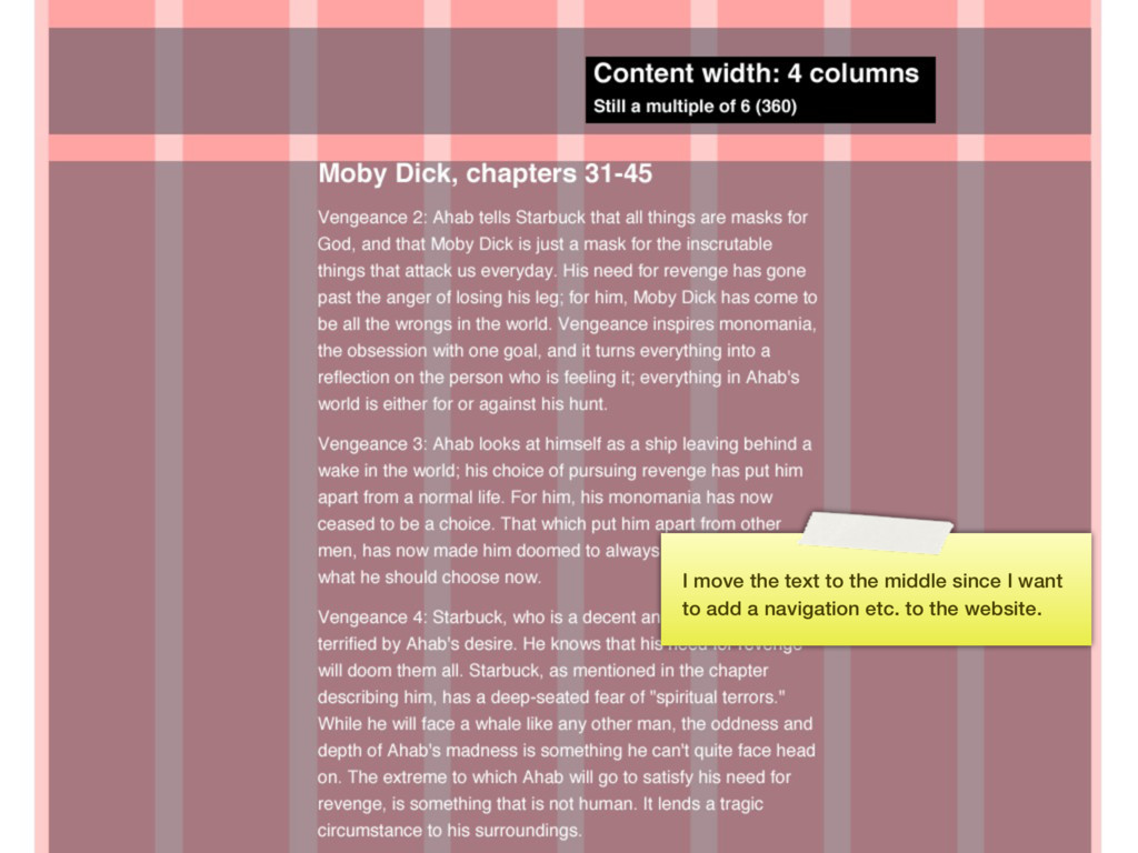
all a multiple of 6, and the reason I made my paragraph 4 columns wide ties into the line length reasoning as discussed earlier. It’s a ruleset that makes sense.
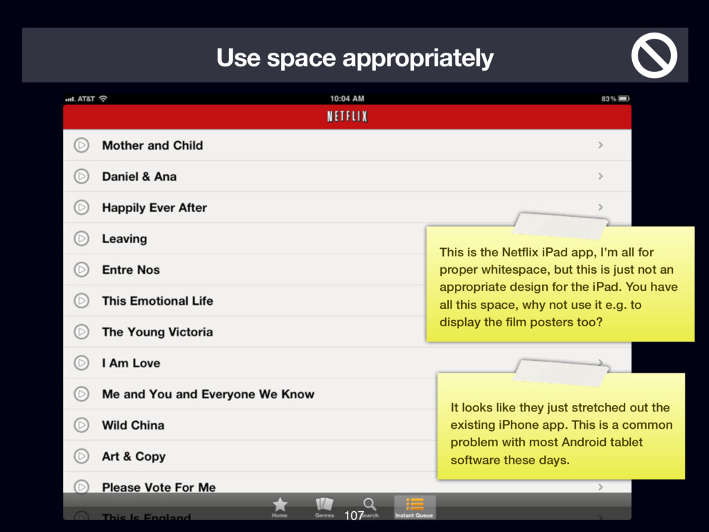
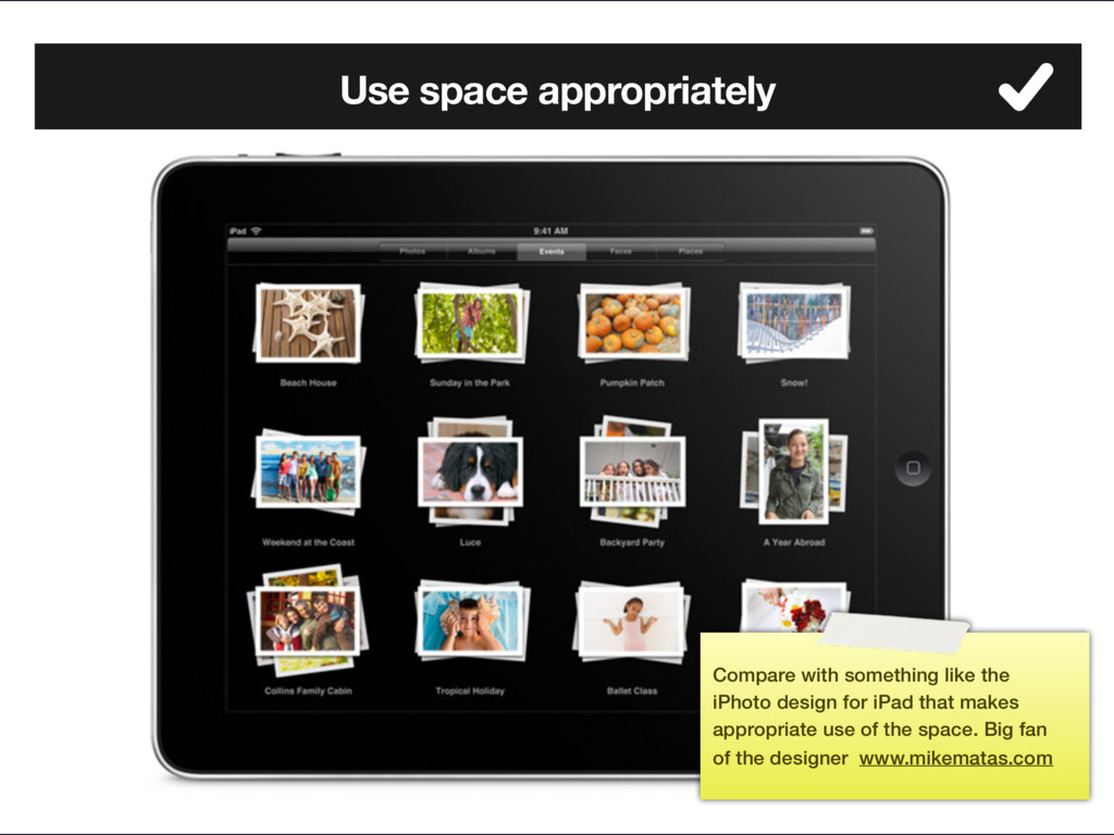
I’m all for proper whitespace, but this is just not an appropriate design for the iPad. You have all this space, why not use it e.g. to display the film posters too? It looks like they just stretched out the existing iPhone app. This is a common problem with most Android tablet software these days.
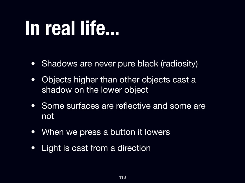
• Objects higher than other objects cast a shadow on the lower object • Some surfaces are reflective and some are not • When we press a button it lowers • Light is cast from a direction 113
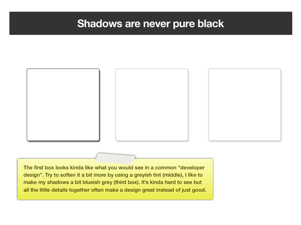
kinda like what you would see in a common “developer design”. Try to soften it a bit more by using a greyish tint (middle), I like to make my shadows a bit blueish grey (third box). It’s kinda hard to see but all the little details together often make a design great instead of just good.
it right. Things should be right up against their surface which means using a 1-3px Drop Shadow size. And 0-3px distance. This isn't WordArt. Mike Rundle, flyosity.com 115
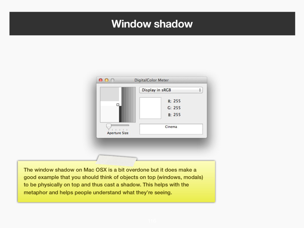
a bit overdone but it does make a good example that you should think of objects on top (windows, modals) to be physically on top and thus cast a shadow. This helps with the metaphor and helps people understand what they’re seeing.
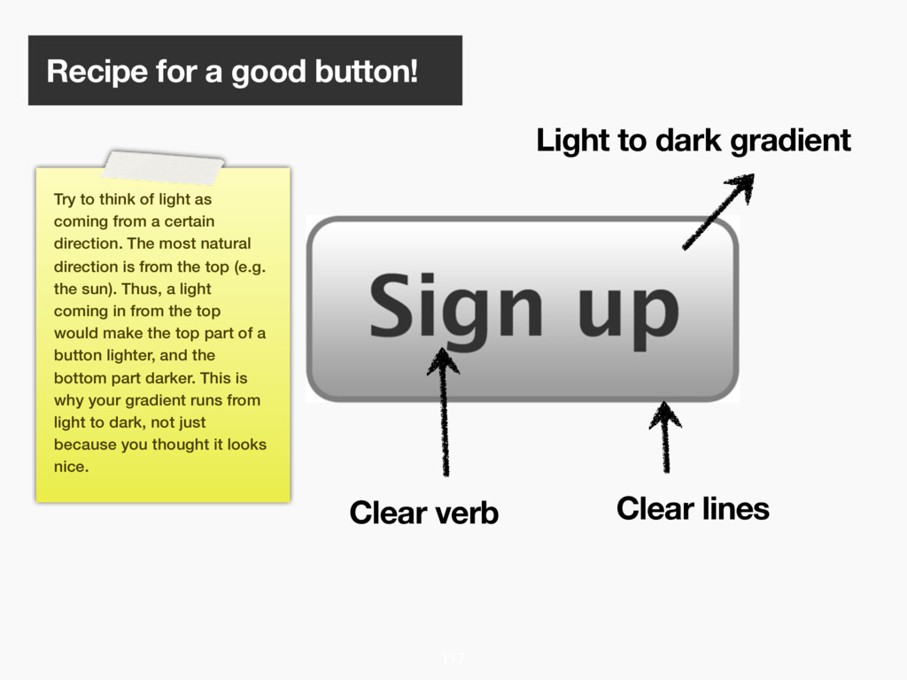
verb Clear lines 117 Try to think of light as coming from a certain direction. The most natural direction is from the top (e.g. the sun). Thus, a light coming in from the top would make the top part of a button lighter, and the bottom part darker. This is why your gradient runs from light to dark, not just because you thought it looks nice.
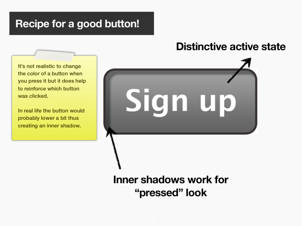
work for “pressed” look 118 It’s not realistic to change the color of a button when you press it but it does help to reinforce which button was clicked. In real life the button would probably lower a bit thus creating an inner shadow.
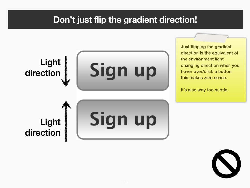
119 Just flipping the gradient direction is the equivalent of the environment light changing direction when you hover over/click a button, this makes zero sense. It’s also way too subtle.
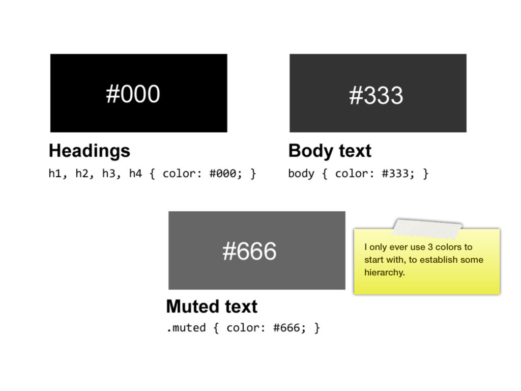
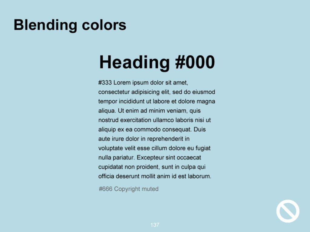
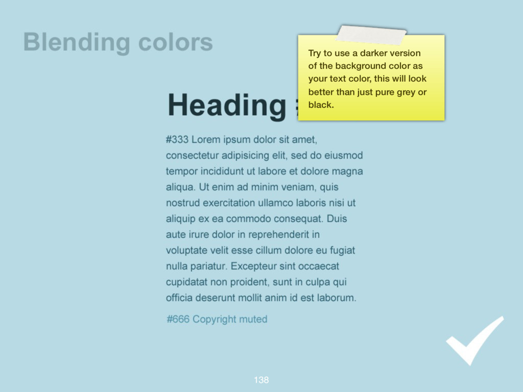
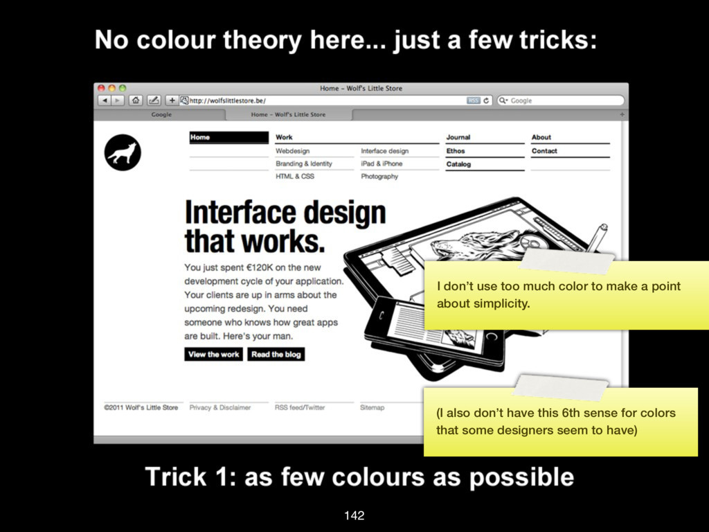
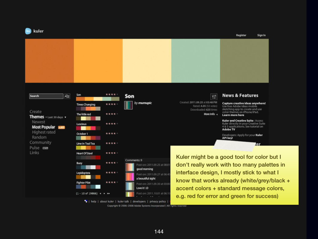
I don’t really work with too many palettes in interface design, I mostly stick to what I know that works already (white/grey/black + accent colors + standard message colors, e.g. red for error and green for success)
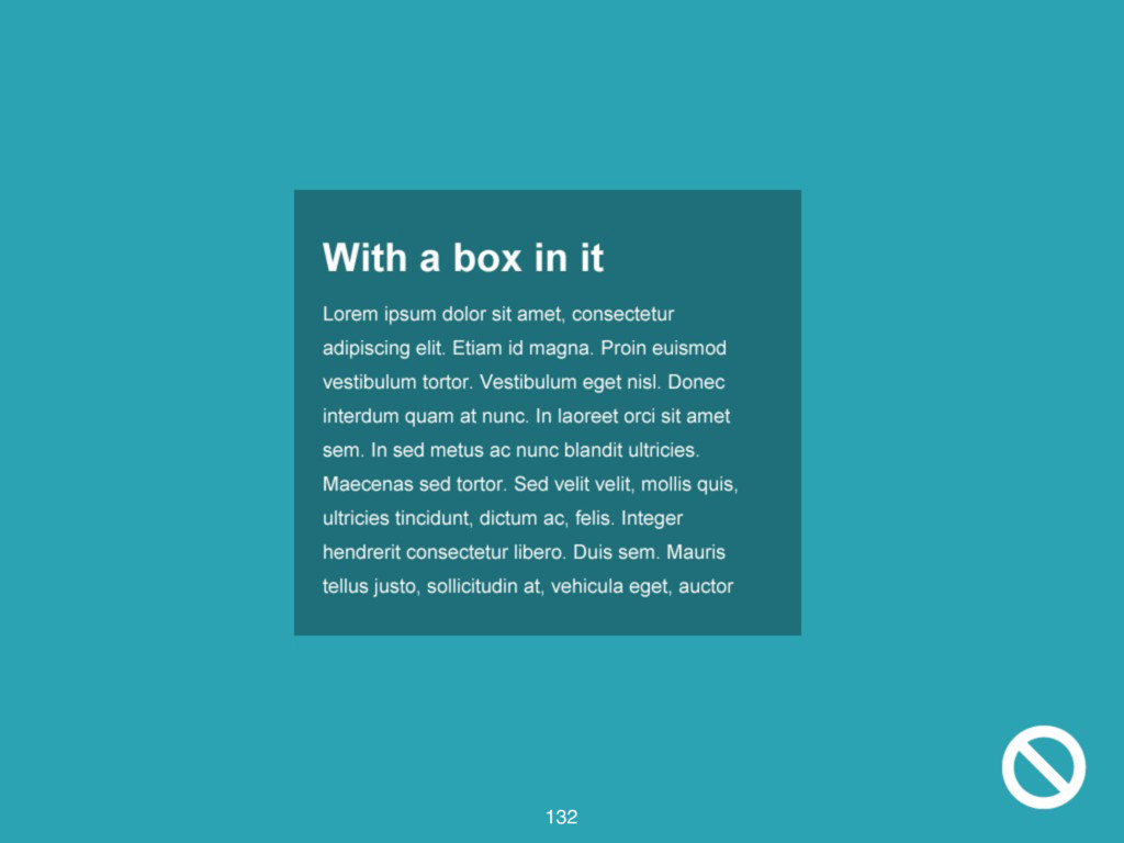
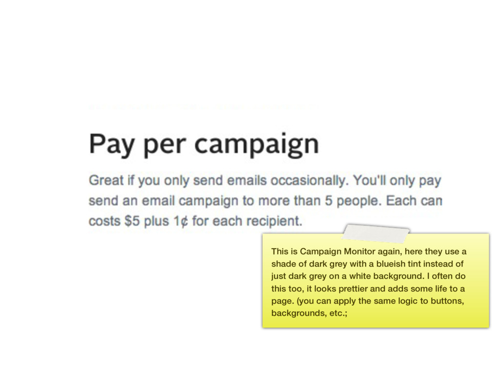
shade of dark grey with a blueish tint instead of just dark grey on a white background. I often do this too, it looks prettier and adds some life to a page. (you can apply the same logic to buttons, backgrounds, etc.;
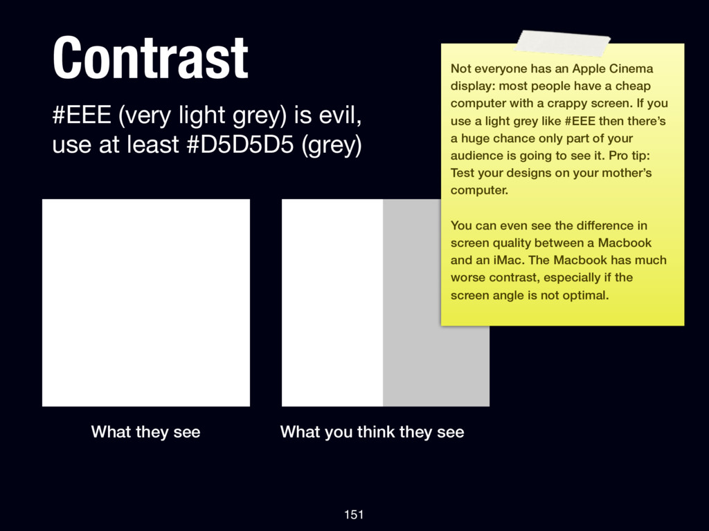
#D5D5D5 (grey) What they see What you think they see 151 Not everyone has an Apple Cinema display: most people have a cheap computer with a crappy screen. If you use a light grey like #EEE then there’s a huge chance only part of your audience is going to see it. Pro tip: Test your designs on your mother’s computer. You can even see the difference in screen quality between a Macbook and an iMac. The Macbook has much worse contrast, especially if the screen angle is not optimal.
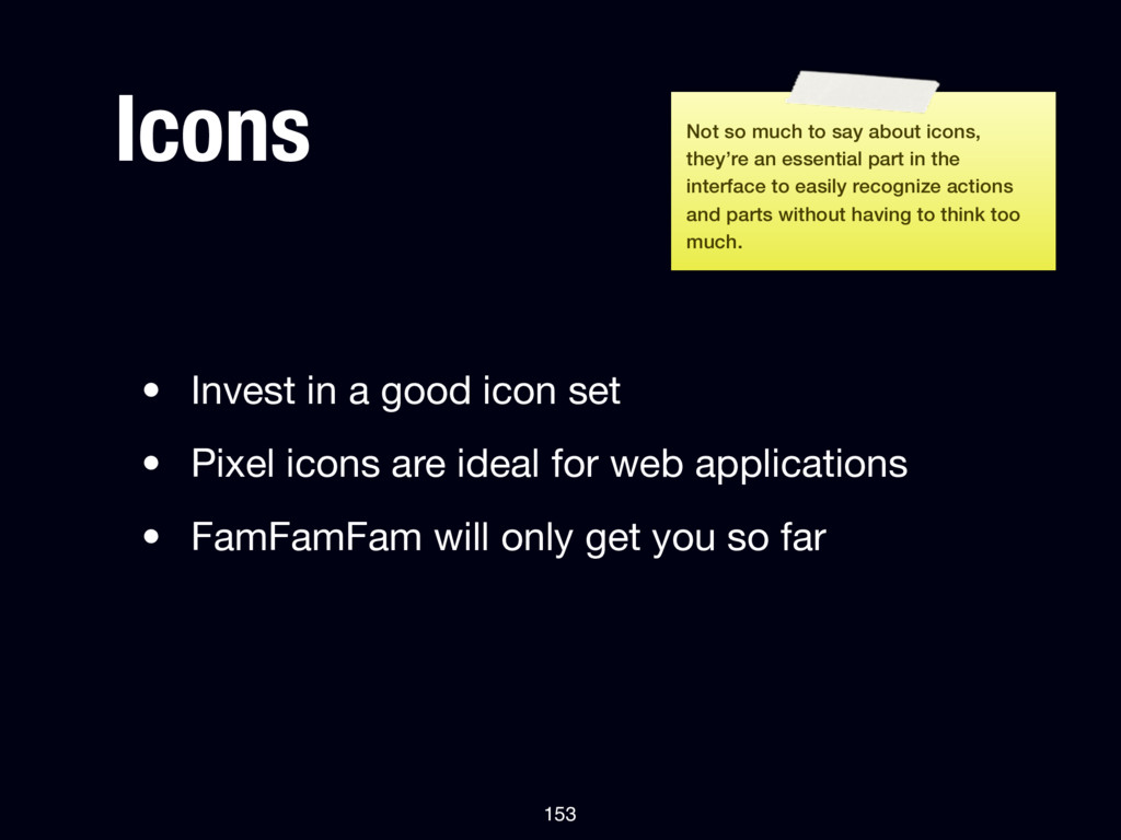
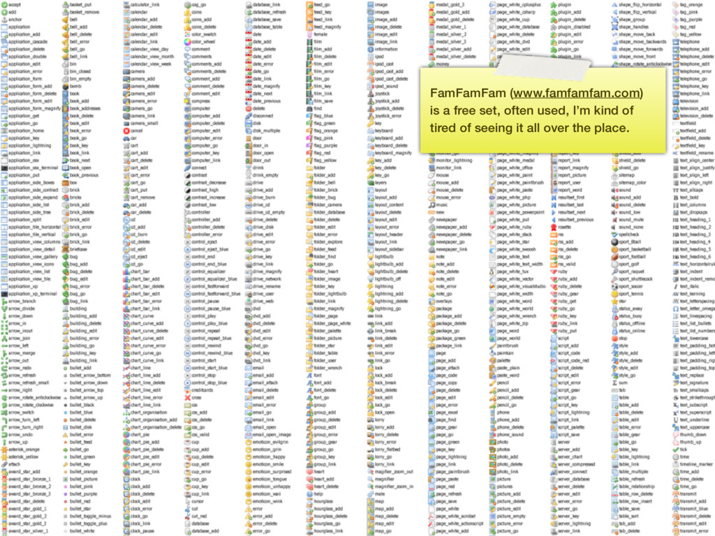
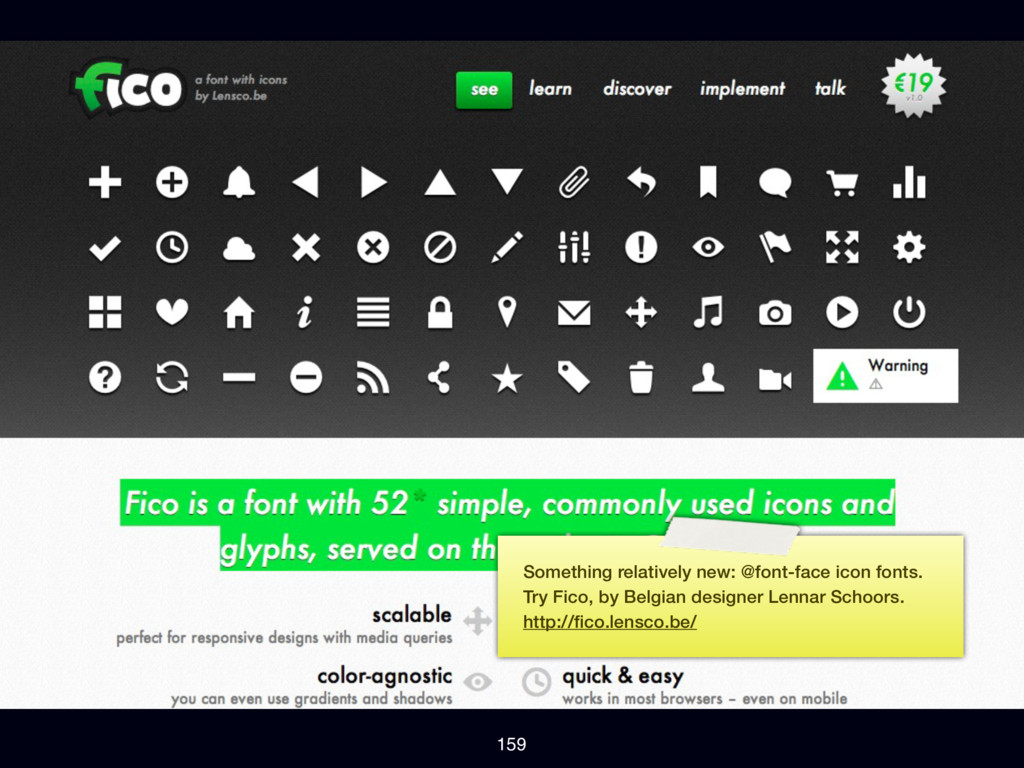
icons are ideal for web applications • FamFamFam will only get you so far 153 Not so much to say about icons, they’re an essential part in the interface to easily recognize actions and parts without having to think too much.
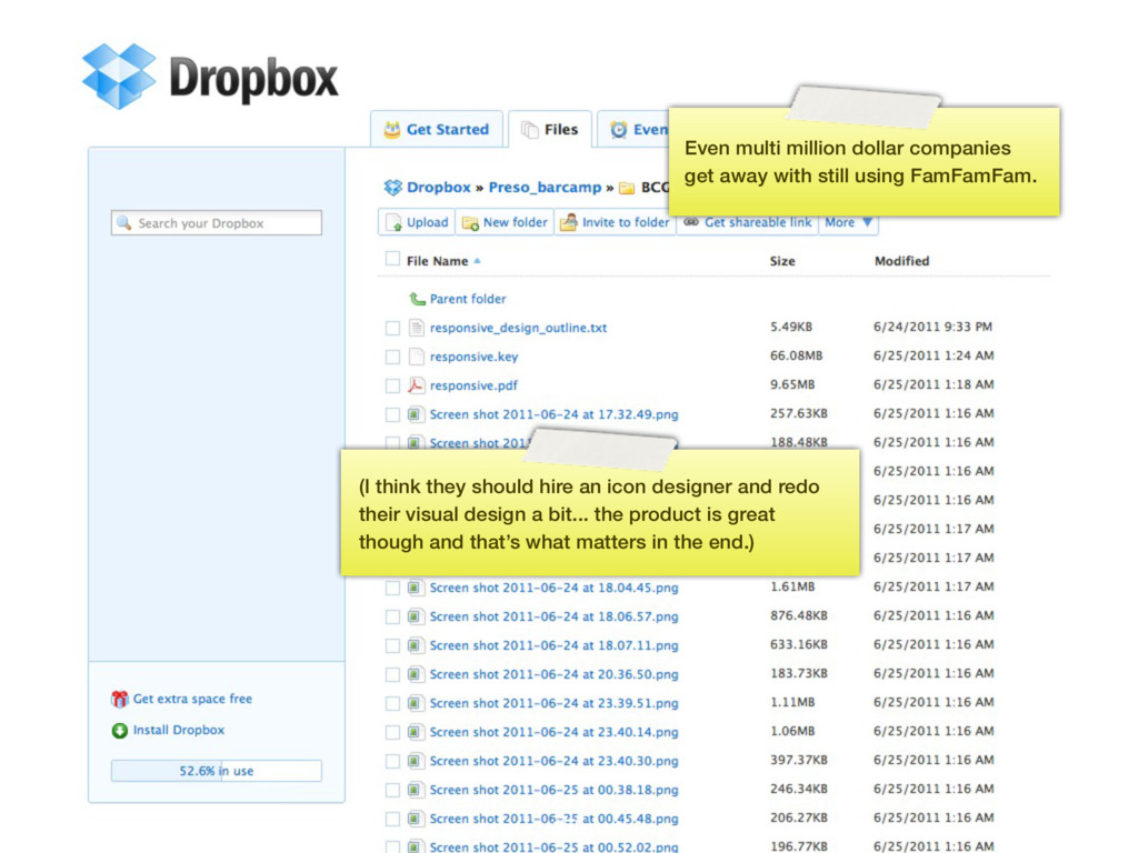
using FamFamFam. (I think they should hire an icon designer and redo their visual design a bit... the product is great though and that’s what matters in the end.)
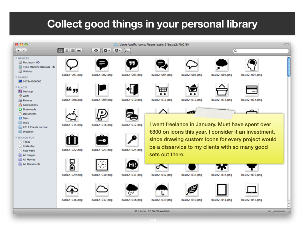
freelance in January. Must have spent over €800 on icons this year. I consider it an investment, since drawing custom icons for every project would be a disservice to my clients with so many good sets out there.
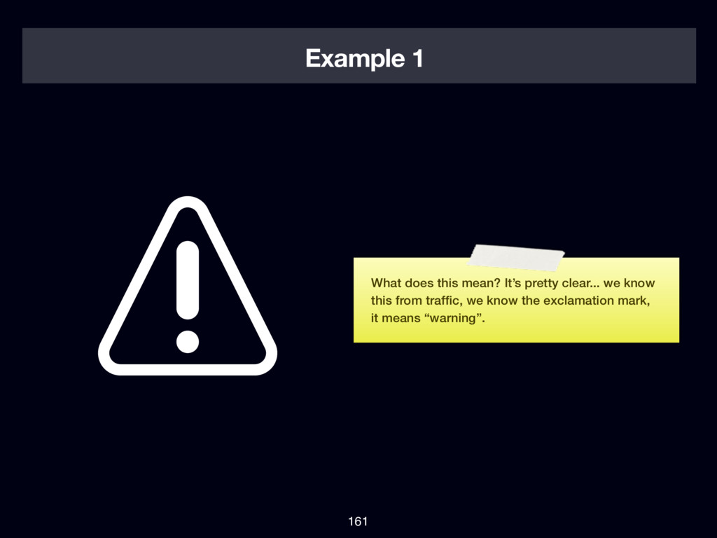
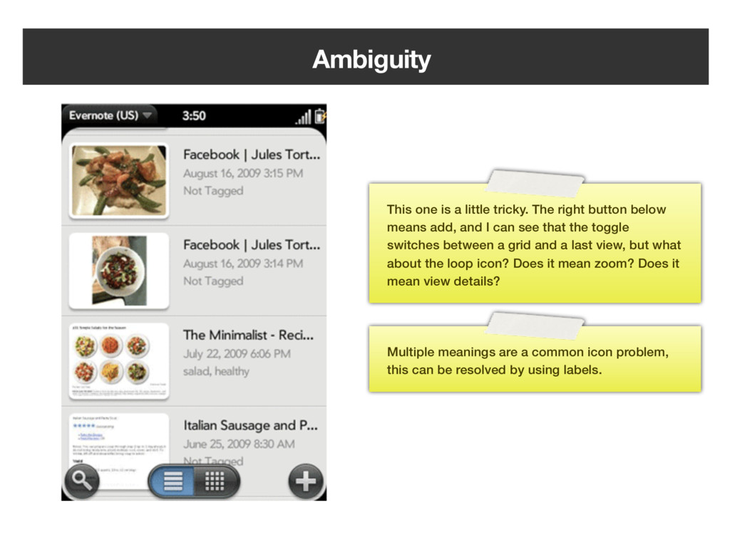
button below means add, and I can see that the toggle switches between a grid and a last view, but what about the loop icon? Does it mean zoom? Does it mean view details? Multiple meanings are a common icon problem, this can be resolved by using labels.
we walked through typography, alignment, light & shadow, color, icon usage and reusable design I hope you learned something new that you can apply to your work to make it better. There’s certain parts of designing that we can make into guidelines and rules of thumb. Applying these rules will make your design better and in many cases good enough. Nothing beats a dedicated designer though!
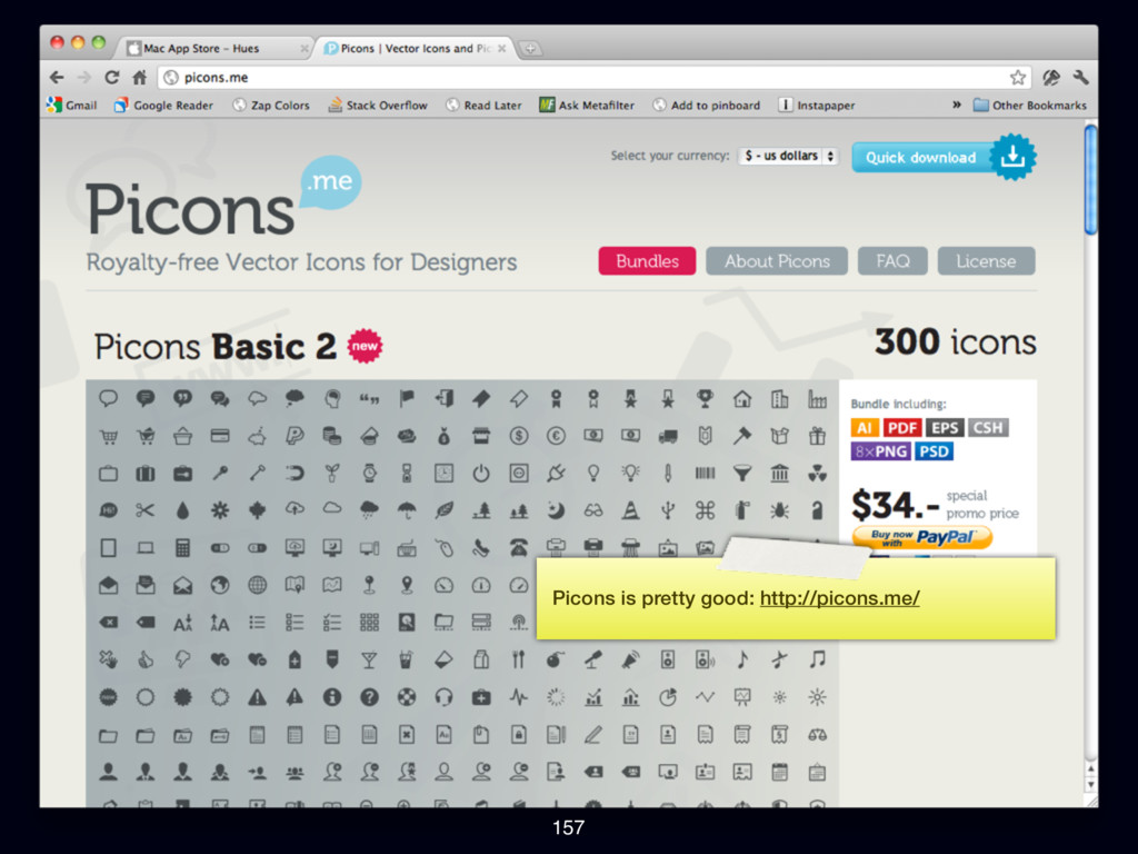
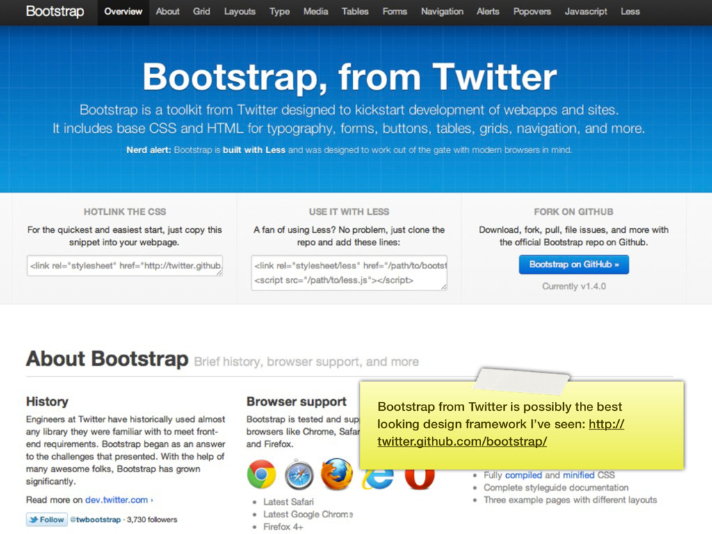
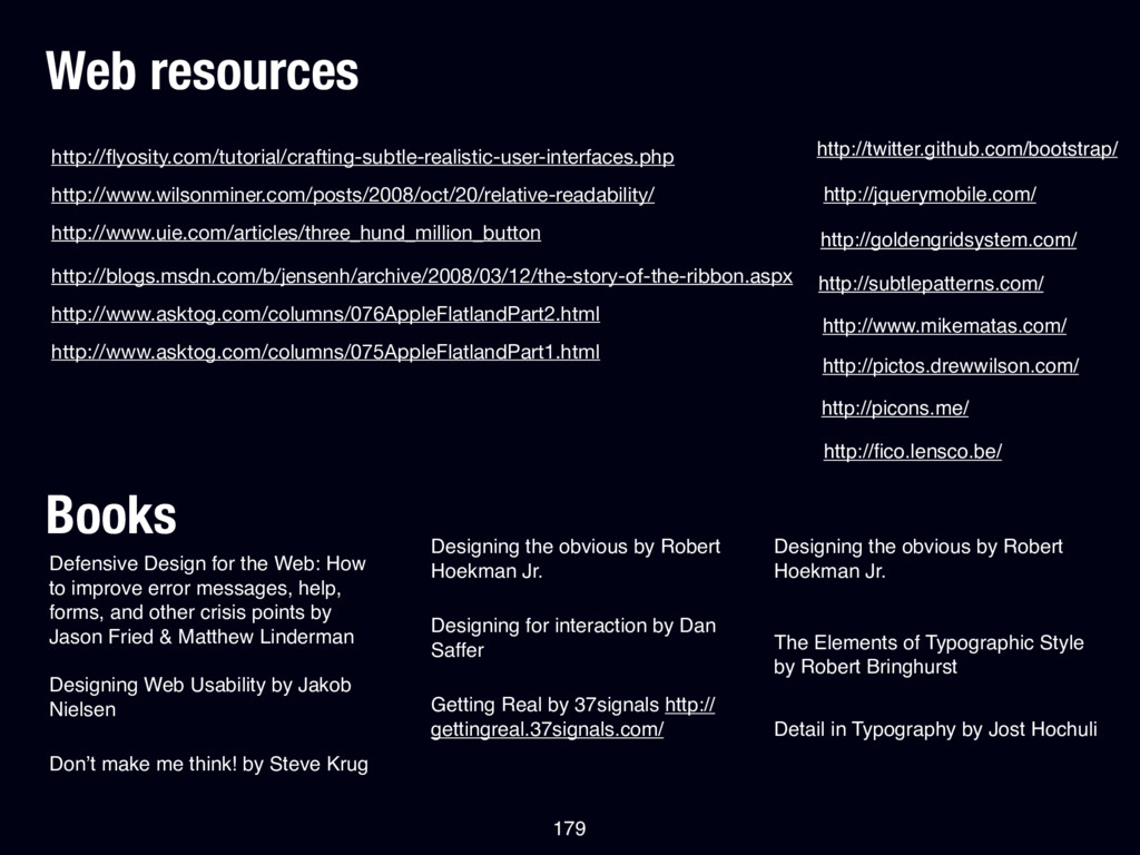
How to improve error messages, help, forms, and other crisis points by Jason Fried & Matthew Linderman Designing Web Usability by Jakob Nielsen Don’t make me think! by Steve Krug Designing the obvious by Robert Hoekman Jr. Designing for interaction by Dan Saffer Getting Real by 37signals http:// gettingreal.37signals.com/ Designing the obvious by Robert Hoekman Jr. http://www.uie.com/articles/three_hund_million_button The Elements of Typographic Style by Robert Bringhurst Detail in Typography by Jost Hochuli http://blogs.msdn.com/b/jensenh/archive/2008/03/12/the-story-of-the-ribbon.aspx 179 http://subtlepatterns.com/ http://goldengridsystem.com/ http://jquerymobile.com/ http://twitter.github.com/bootstrap/ http://www.mikematas.com/ http://pictos.drewwilson.com/ http://picons.me/ http://fico.lensco.be/ http://www.asktog.com/columns/076AppleFlatlandPart2.html http://www.asktog.com/columns/075AppleFlatlandPart1.html
 presportal
 chorkaichan
 spacemarket
 vivion
 godlingkogami
 webnaut
 nishame
 madoka_portfolio
 aonomasahiro
 visional_engineering_and_design
 takaikanako
 nbkouhou
 kspace
 aleyda
 akosma
 samtorres
 davidcarrasco
 codingconduct
 sferik
 mclloyd
 csswizardry
 letsgokoyo
 cassininazir
 jct
jct