words or images so the slides won’t distract from what is being said. This “web” version contains sticky notes (like this one) that summarize what I talked about when displaying the slide during the original talk.
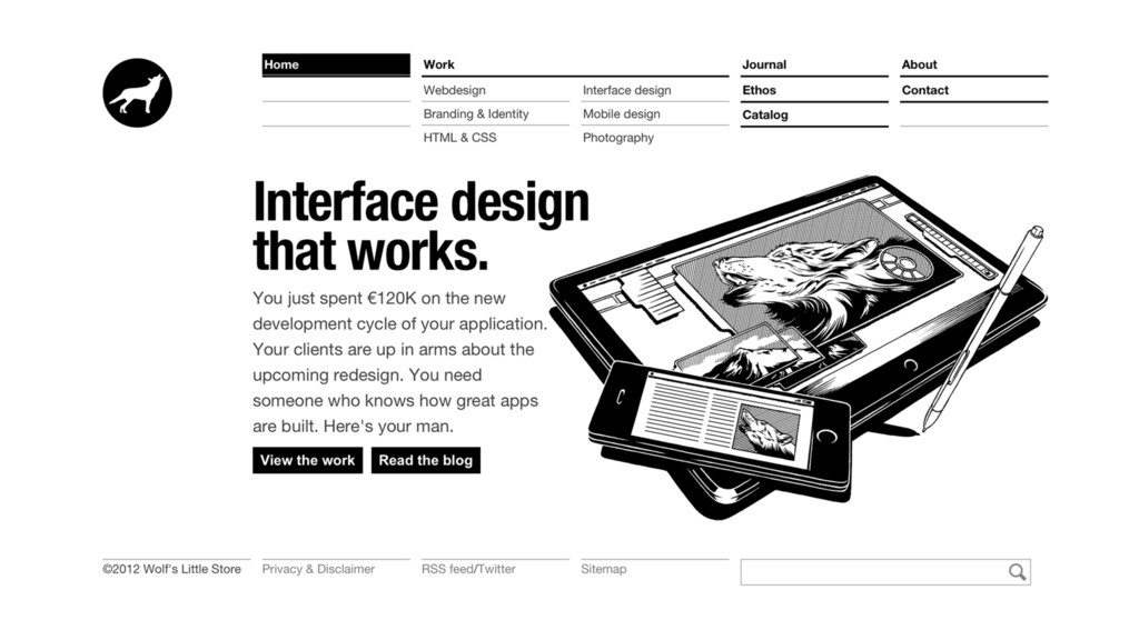
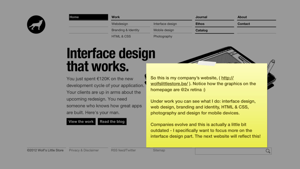
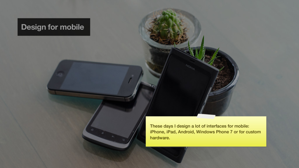
Notice how the graphics on the homepage are @2x retina :) Under work you can see what I do: interface design, web design, branding and identity, HTML & CSS, photography and design for mobile devices. Companies evolve and this is actually a little bit outdated - I specifically want to focus more on the interface design part. The next website will reflect this!
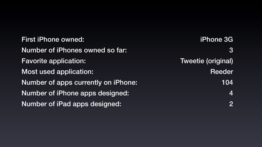
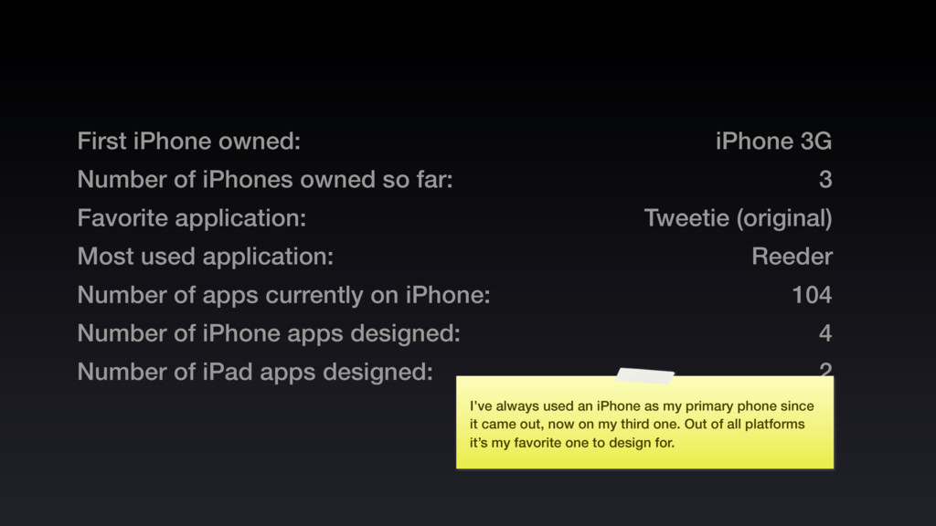
application: Most used application: Number of apps currently on iPhone: Number of iPhone apps designed: Number of iPad apps designed: iPhone 3G 3 Tweetie (original) Reeder 104 4 2
application: Most used application: Number of apps currently on iPhone: Number of iPhone apps designed: Number of iPad apps designed: iPhone 3G 3 Tweetie (original) Reeder 104 4 2 I’ve always used an iPhone as my primary phone since it came out, now on my third one. Out of all platforms it’s my favorite one to design for.
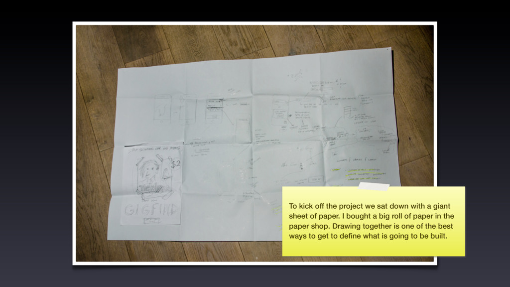
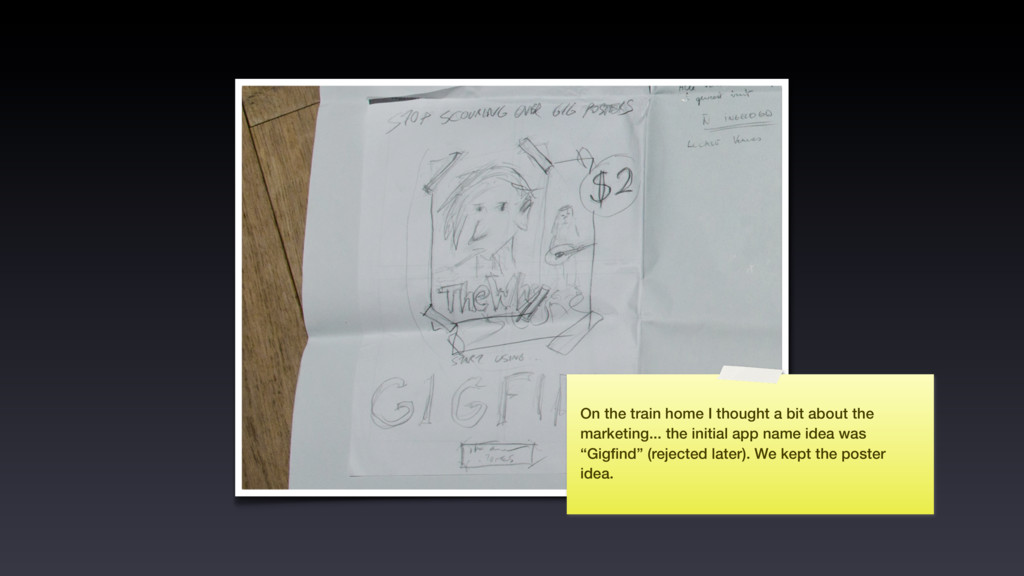
giant sheet of paper. I bought a big roll of paper in the paper shop. Drawing together is one of the best ways to get to define what is going to be built.
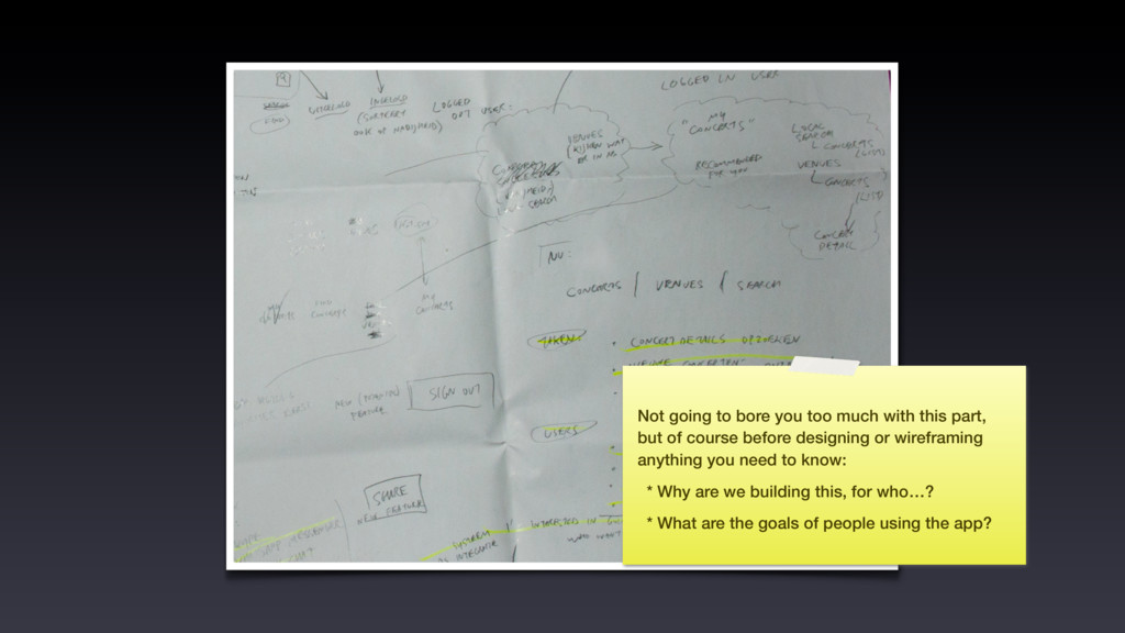
but of course before designing or wireframing anything you need to know: * Why are we building this, for who…? * What are the goals of people using the app?
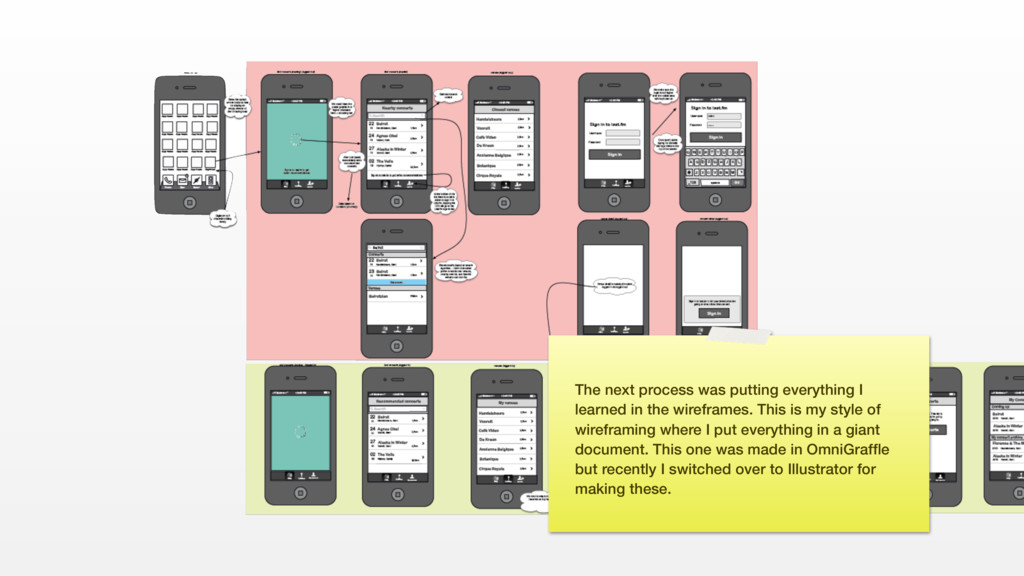
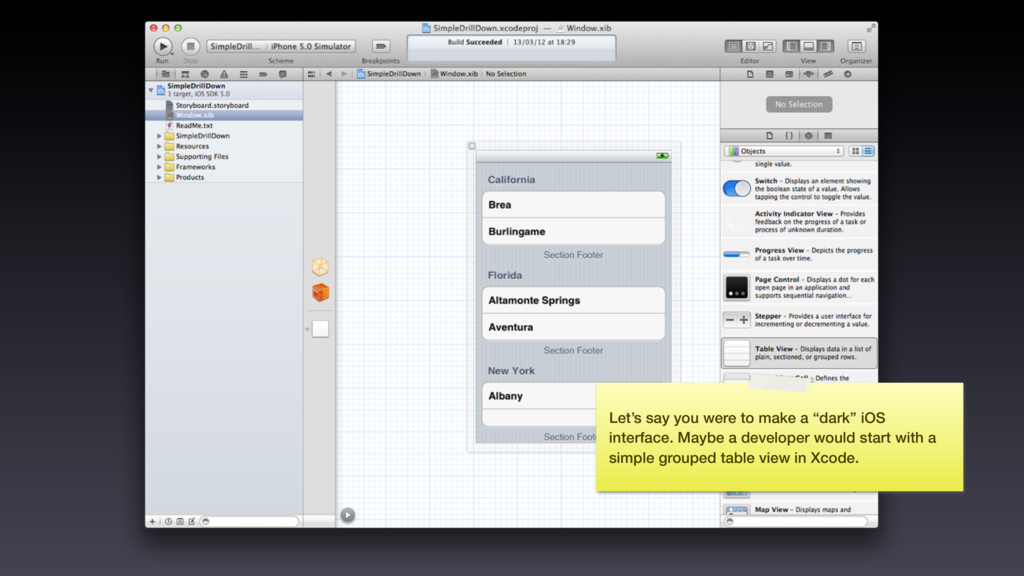
wireframes. This is my style of wireframing where I put everything in a giant document. This one was made in OmniGraffle but recently I switched over to Illustrator for making these.
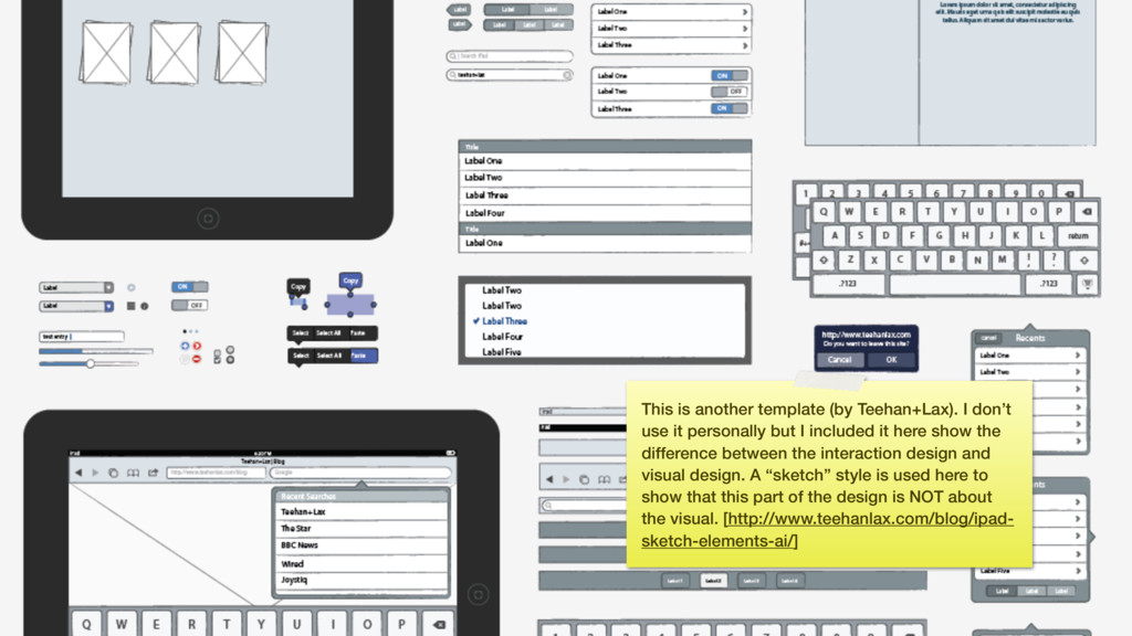
personally but I included it here show the difference between the interaction design and visual design. A “sketch” style is used here to show that this part of the design is NOT about the visual. [http://www.teehanlax.com/blog/ipad- sketch-elements-ai/]
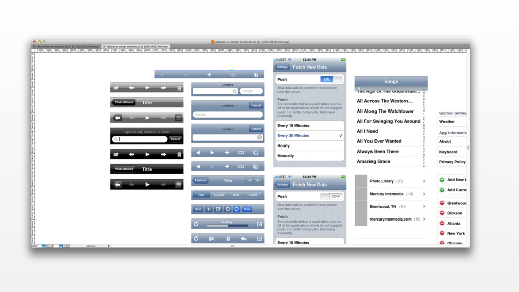
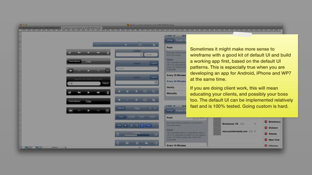
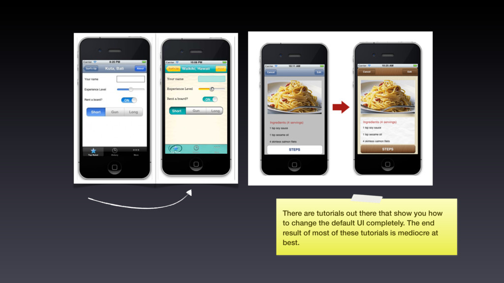
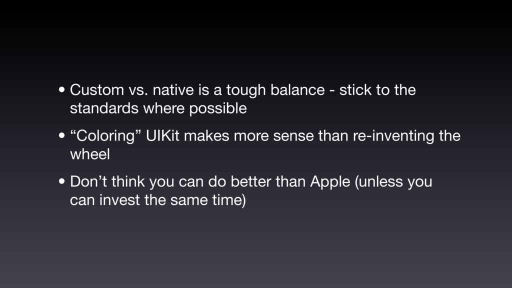
good kit of default UI and build a working app first, based on the default UI patterns. This is especially true when you are developing an app for Android, iPhone and WP7 at the same time. If you are doing client work, this will mean educating your clients, and possibly your boss too. The default UI can be implemented relatively fast and is 100% tested. Going custom is hard.
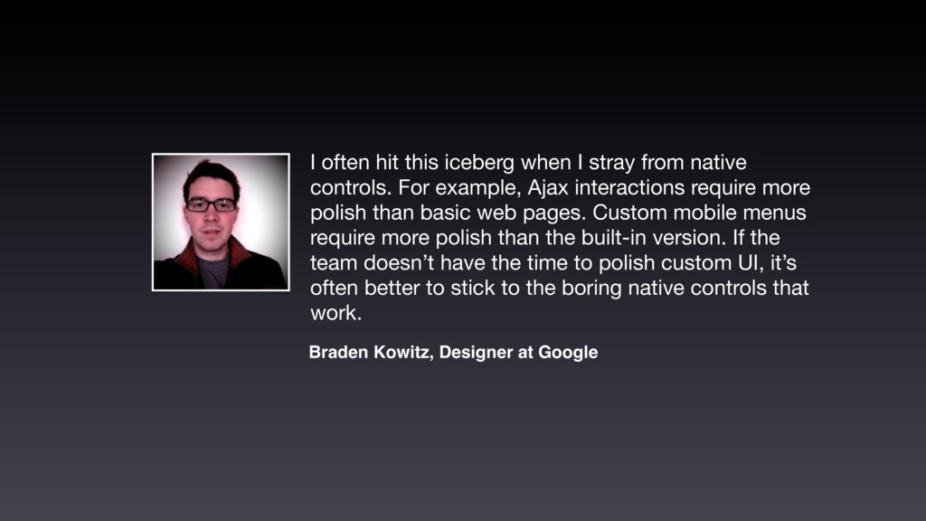
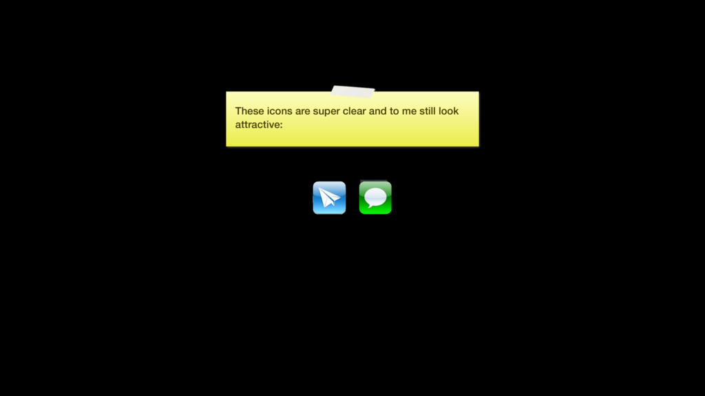
controls. For example, Ajax interactions require more polish than basic web pages. Custom mobile menus require more polish than the built-in version. If the team doesn’t have the time to polish custom UI, it’s often better to stick to the boring native controls that work. Braden Kowitz, Designer at Google
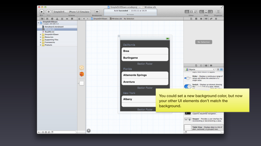
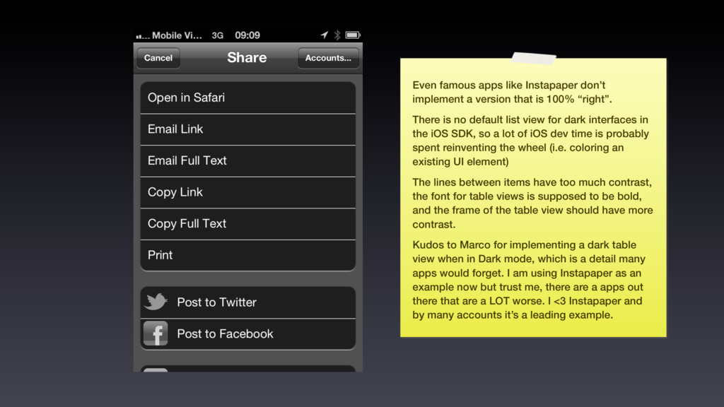
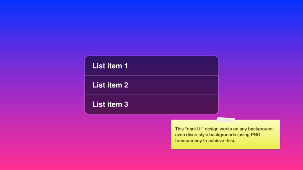
is 100% “right”. There is no default list view for dark interfaces in the iOS SDK, so a lot of iOS dev time is probably spent reinventing the wheel (i.e. coloring an existing UI element) The lines between items have too much contrast, the font for table views is supposed to be bold, and the frame of the table view should have more contrast. Kudos to Marco for implementing a dark table view when in Dark mode, which is a detail many apps would forget. I am using Instapaper as an example now but trust me, there are a apps out there that are a LOT worse. I <3 Instapaper and by many accounts it’s a leading example.
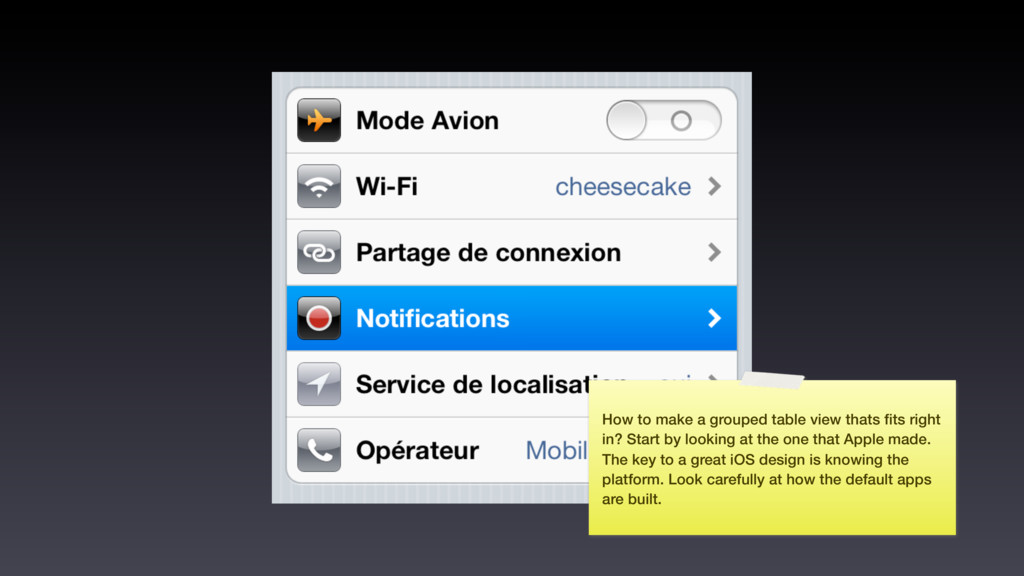
in? Start by looking at the one that Apple made. The key to a great iOS design is knowing the platform. Look carefully at how the default apps are built.
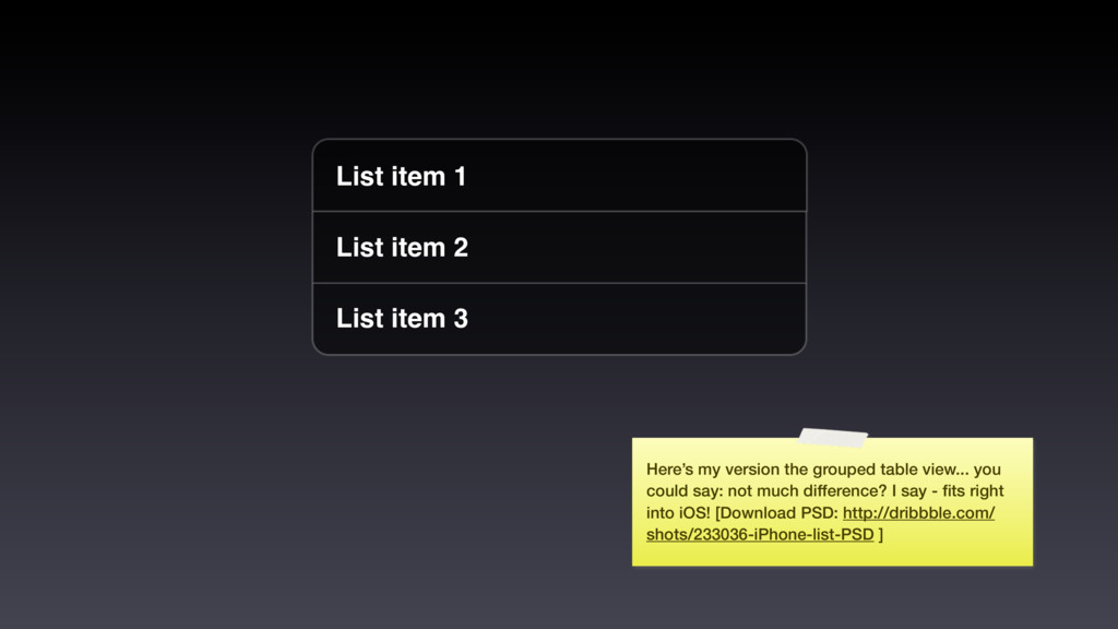
my version the grouped table view... you could say: not much difference? I say - fits right into iOS! [Download PSD: http://dribbble.com/ shots/233036-iPhone-list-PSD ]
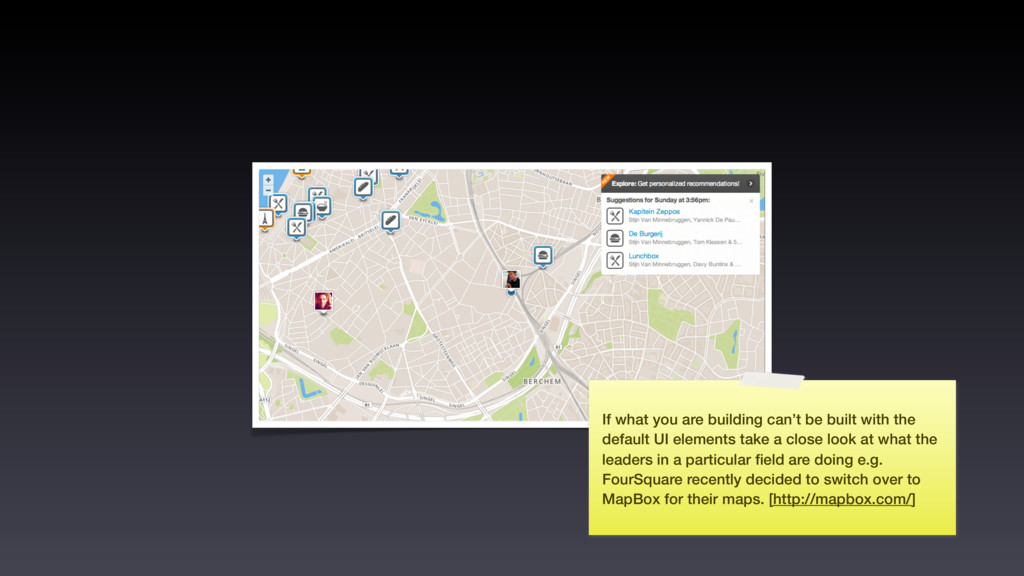
default UI elements take a close look at what the leaders in a particular field are doing e.g. FourSquare recently decided to switch over to MapBox for their maps. [http://mapbox.com/]
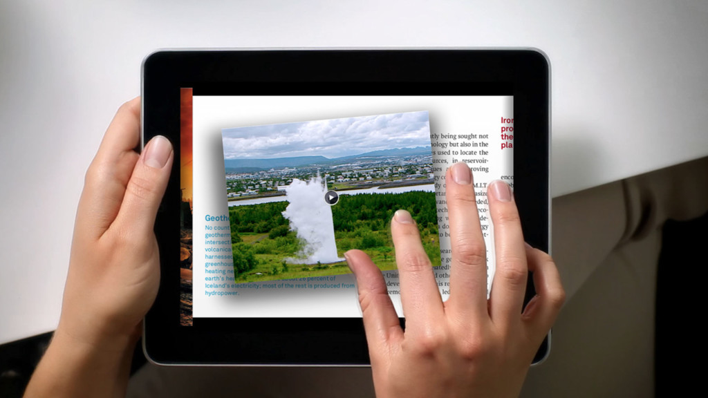
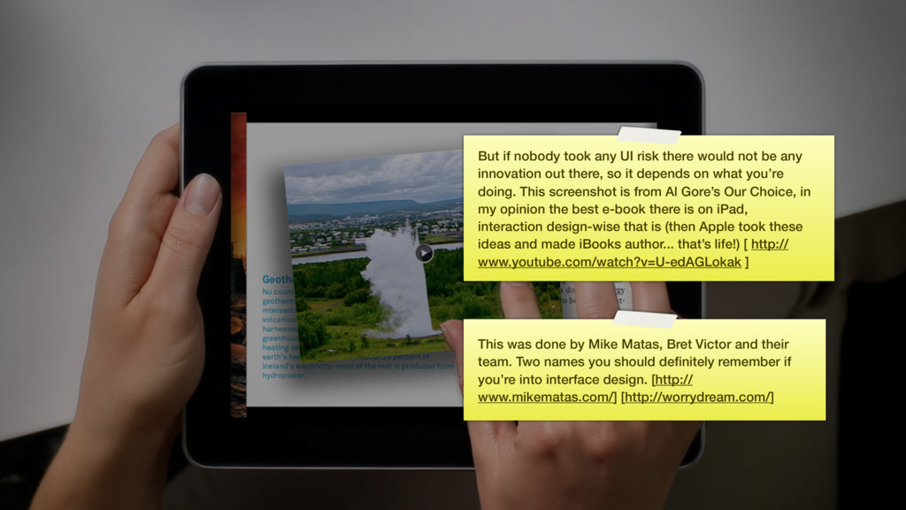
team. Two names you should definitely remember if you’re into interface design. [http:// www.mikematas.com/] [http://worrydream.com/] But if nobody took any UI risk there would not be any innovation out there, so it depends on what you’re doing. This screenshot is from Al Gore’s Our Choice, in my opinion the best e-book there is on iPad, interaction design-wise that is (then Apple took these ideas and made iBooks author... that’s life!) [ http:// www.youtube.com/watch?v=U-edAGLokak ]
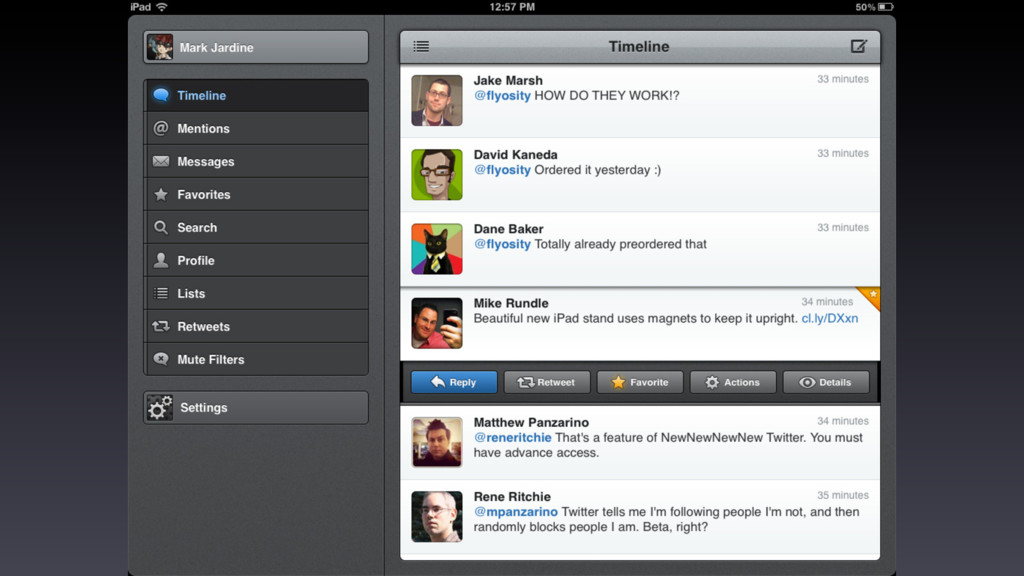
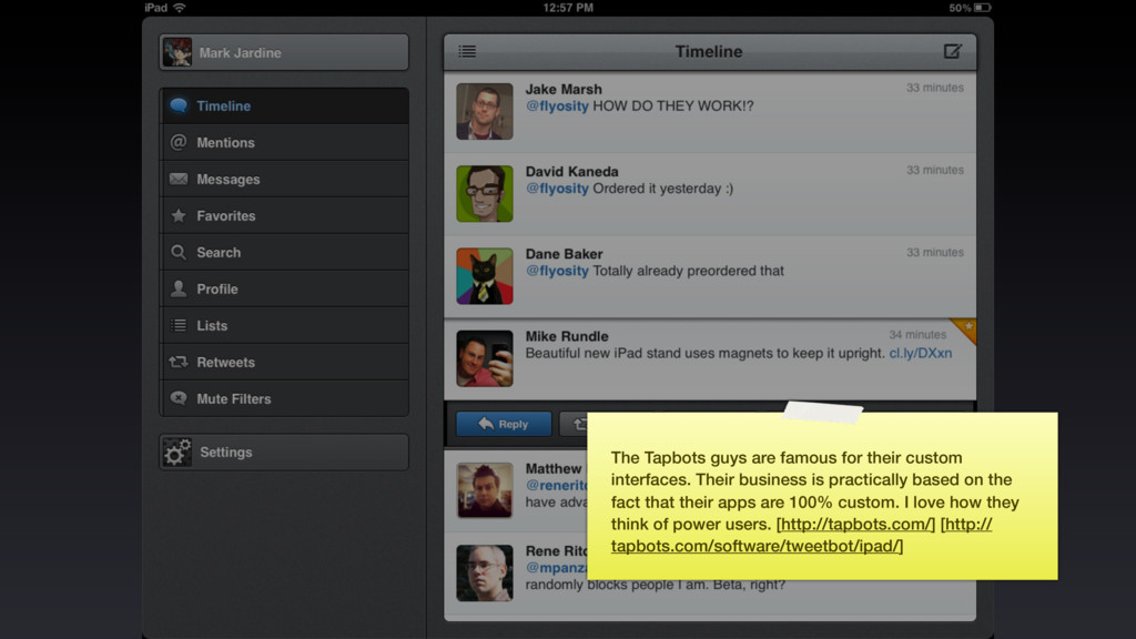
business is practically based on the fact that their apps are 100% custom. I love how they think of power users. [http://tapbots.com/] [http:// tapbots.com/software/tweetbot/ipad/]
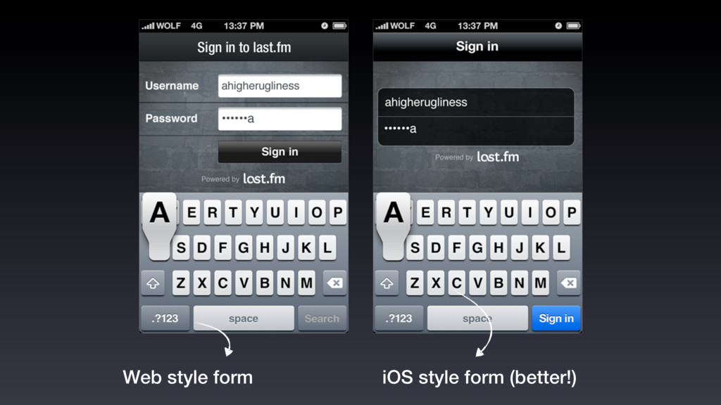
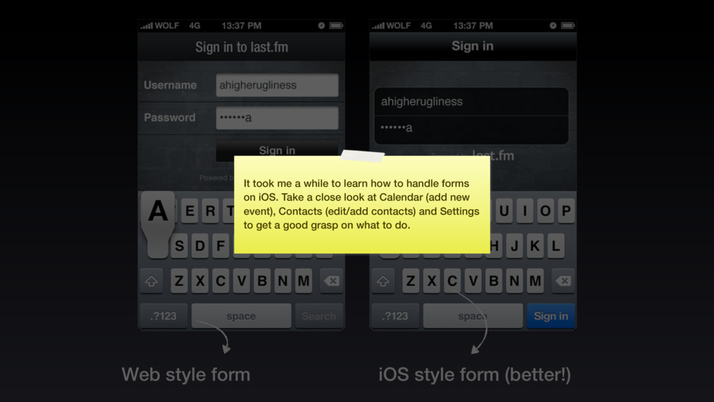
a while to learn how to handle forms on iOS. Take a close look at Calendar (add new event), Contacts (edit/add contacts) and Settings to get a good grasp on what to do.
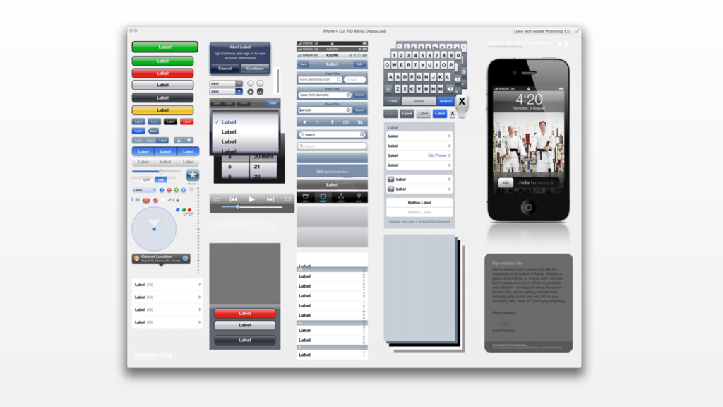
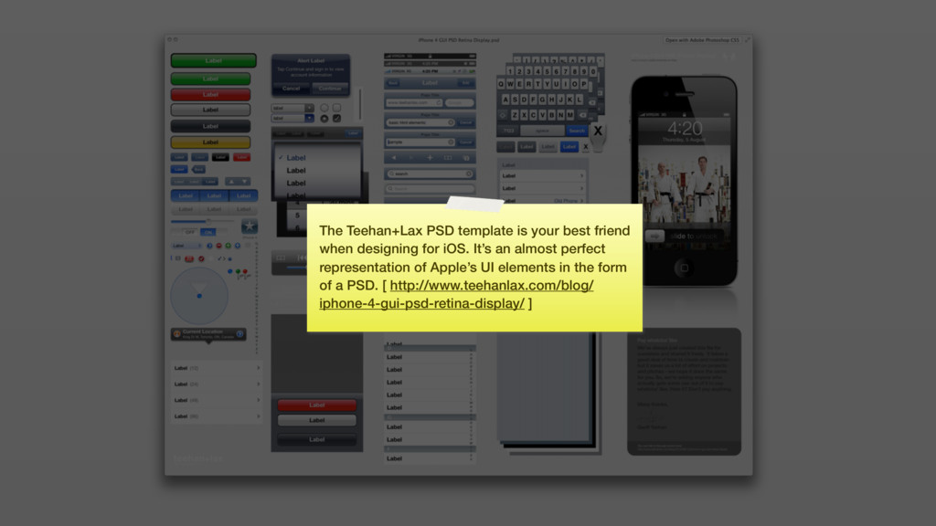
for iOS. It’s an almost perfect representation of Apple’s UI elements in the form of a PSD. [ http://www.teehanlax.com/blog/ iphone-4-gui-psd-retina-display/ ]
to the standards where possible • “Coloring” UIKit makes more sense than re-inventing the wheel • Don’t think you can do better than Apple (unless you can invest the same time)
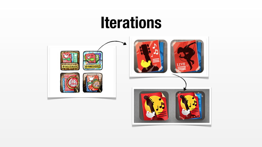
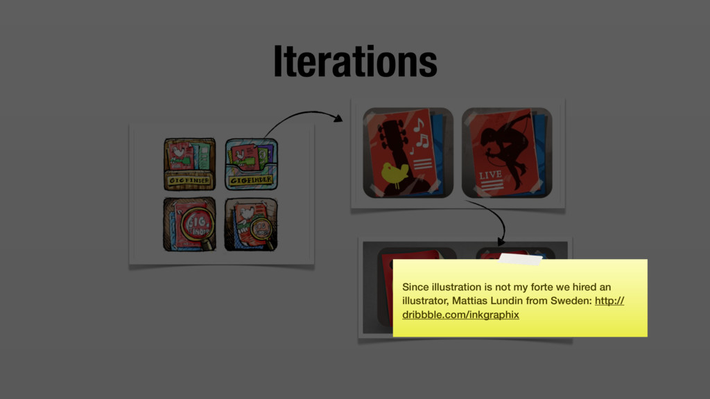
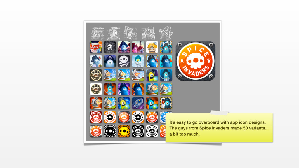
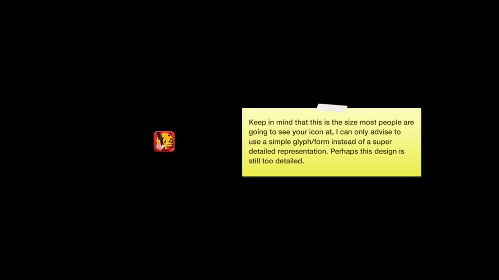
are going to see your icon at, I can only advise to use a simple glyph/form instead of a super detailed representation. Perhaps this design is still too detailed.
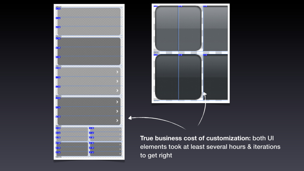
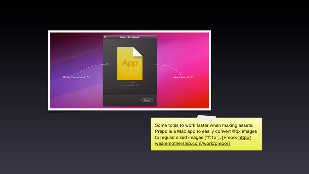
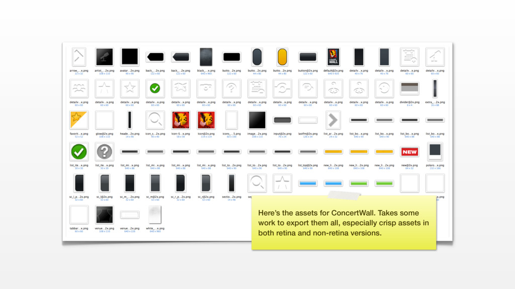
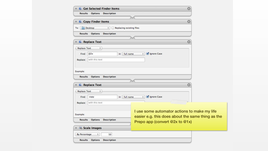
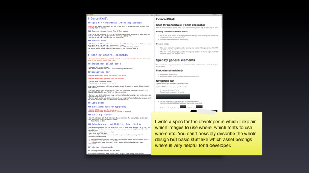
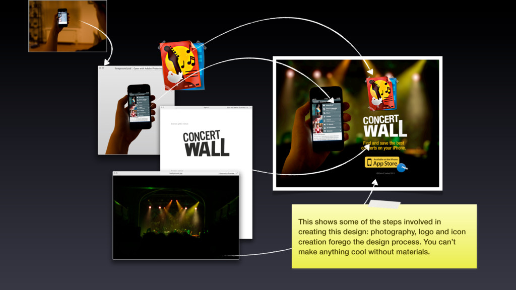
explain which images to use where, which fonts to use where etc. You can’t possibly describe the whole design but basic stuff like which asset belongs where is very helpful for a developer.
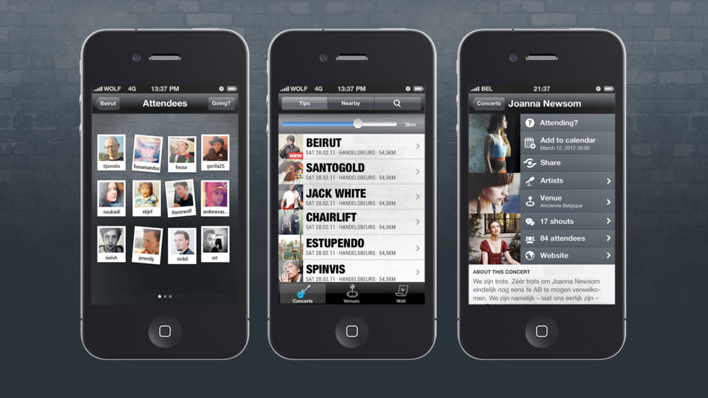
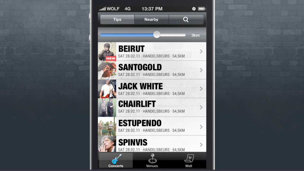
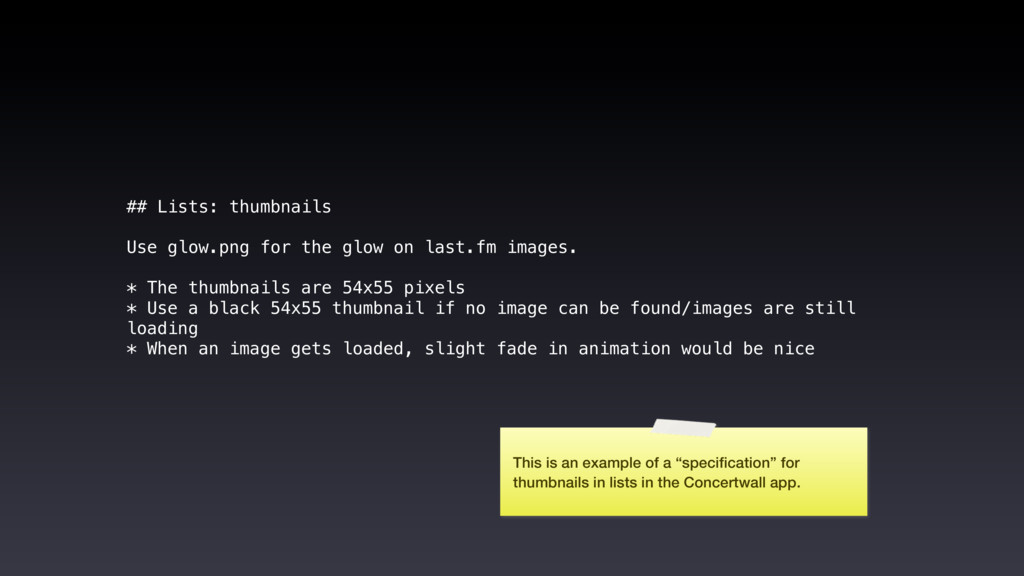
images. * The thumbnails are 54x55 pixels * Use a black 54x55 thumbnail if no image can be found/images are still loading * When an image gets loaded, slight fade in animation would be nice This is an example of a “specification” for thumbnails in lists in the Concertwall app.
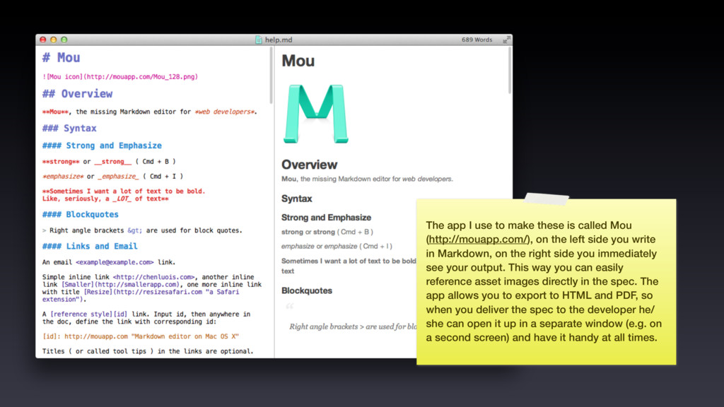
(http://mouapp.com/), on the left side you write in Markdown, on the right side you immediately see your output. This way you can easily reference asset images directly in the spec. The app allows you to export to HTML and PDF, so when you deliver the spec to the developer he/ she can open it up in a separate window (e.g. on a second screen) and have it handy at all times.
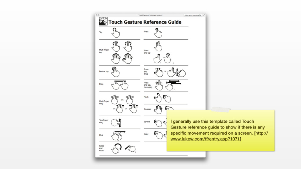
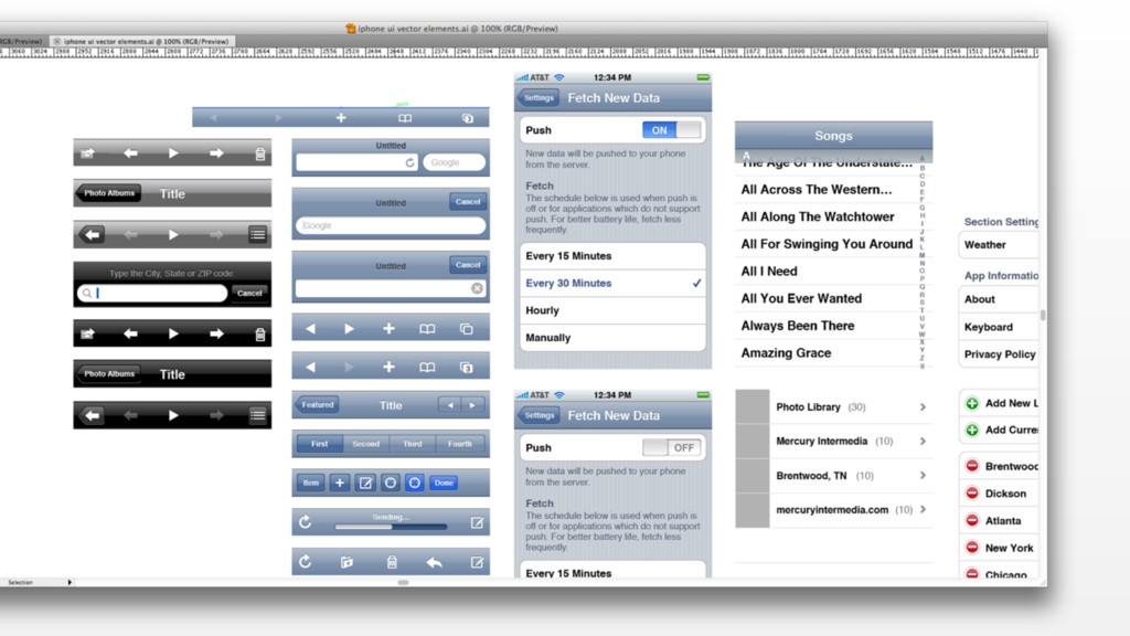
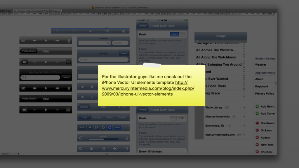
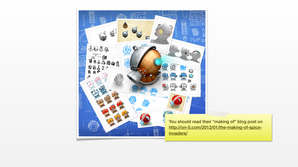
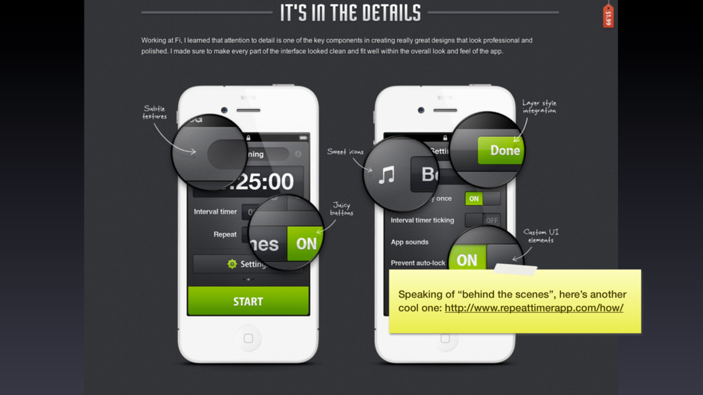
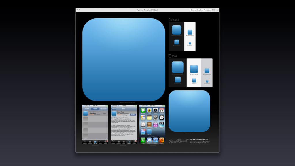
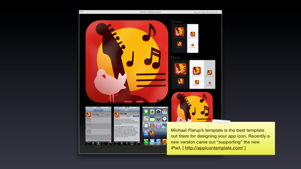
gesture reference guide: http://www.lukew.com/ff/entry.asp?1071 The making of Spice Invaders http://on-5.com/2012/01/the-making-of-spice-invaders/ Repeat timer pro case study http://www.repeattimerapp.com/how/ App icon template pixel resort http://appicontemplate.com/ Teehan + Lax iPhone 4 GUI PSD http://www.teehanlax.com/blog/iphone-4-gui-psd-retina-display/ Teehan + Lax iPad sketch elements http://www.teehanlax.com/blog/ipad-sketch-elements-ai/ Teehan + Lax iPhone sketch elements http://www.teehanlax.com/blog/iphone-sketch-elements-ai/ iPhone UI Vector Elements http://www.mercuryintermedia.com/blog/index.php/2009/03/iphone-ui-vector-elements/ Skala preview http://bjango.com/mac/skalapreview/ Prepo app http://itunes.apple.com/us/app/prepo/id476533227?mt=12 Automator (continued) http://wolfslittlestore.be/2012/03/07/automator-continued/ Designing for iOS http://wolfslittlestore.be/2012/02/29/designing-for-ios-continued/ Mou app http://mouapp.com/ List view PSD on Dribbble http://dribbble.com/shots/233036-iPhone-list-PSD Mapbox http://mapbox.com/ Other essential web content around the subject Apple iOS HIG http://developer.apple.com/library/mac/#documentation/UserExperience/Conceptual/AppleHIGuidelines/Intro/Intro.html Design then Code http://designthencode.com/ Almost everything on the Bjango blog: http://bjango.com/articles/
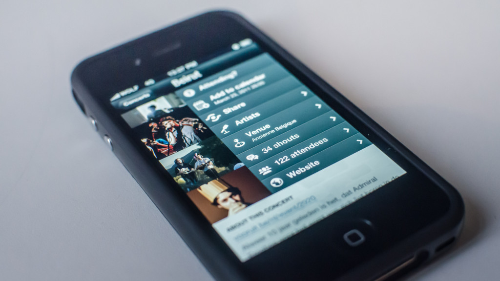
![This is the old Last Concerts website. [http:// www.lastconcerts.com/]](https://files.speakerdeck.com/presentations/c7bb64a3899f418494ddc450b1eb736f/slide_21.jpg)
![[email protected] [email protected] [email protected]](https://files.speakerdeck.com/presentations/c7bb64a3899f418494ddc450b1eb736f/slide_48.jpg)
![Thank you! Follow me: @wolfr_ on Twitter E-mail me: [email protected]](https://files.speakerdeck.com/presentations/c7bb64a3899f418494ddc450b1eb736f/slide_106.jpg)