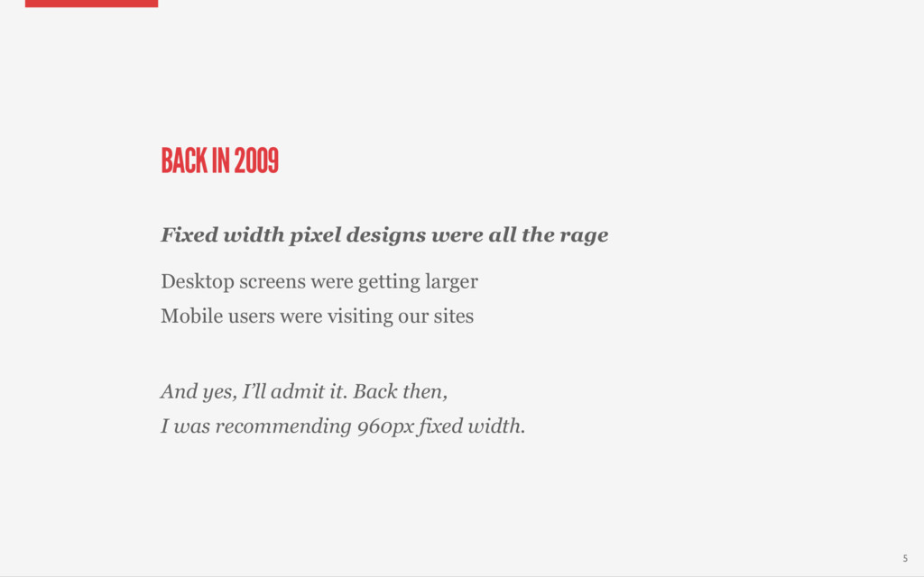
I was recommending 960px fixed width. Fixed width pixel designs were all the rage Desktop screens were getting larger Mobile users were visiting our sites 5
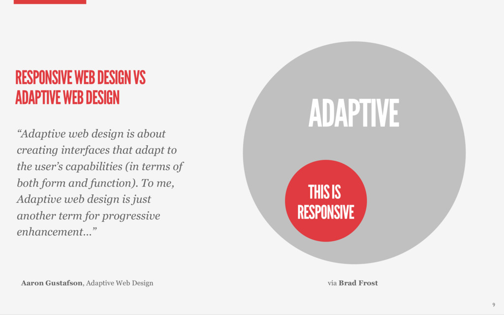
DESIGN “Adaptive web design is about creating interfaces that adapt to the user’s capabilities (in terms of both form and function). To me, Adaptive web design is just another term for progressive enhancement…” THIS IS RESPONSIVE Aaron Gustafson, Adaptive Web Design 9
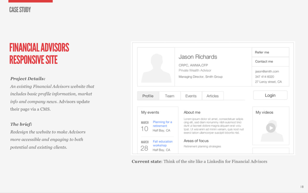
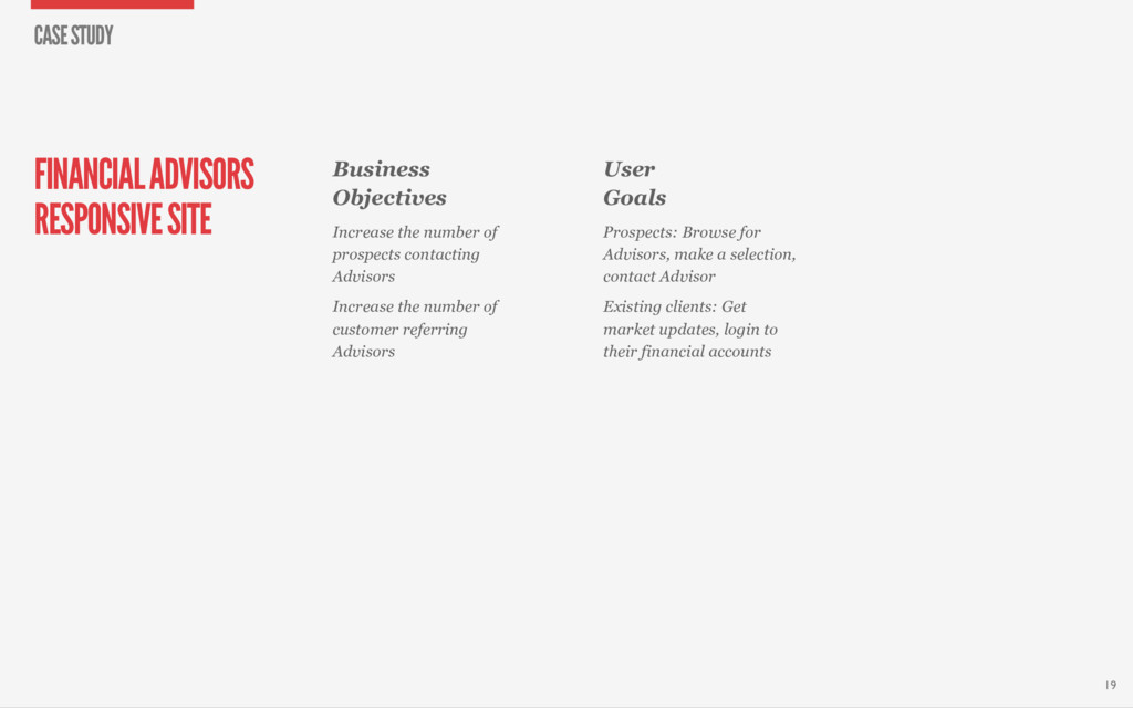
website that includes basic profile information, market info and company news. Advisors update their page via a CMS. The brief: Redesign the website to make Advisors more accessible and engaging to both potential and existing clients. 18 CASE STUDY Current state: Think of the site like a Linkedin for Financial Advisors
prospects contacting Advisors Increase the number of customer referring Advisors 19 CASE STUDY User Goals Prospects: Browse for Advisors, make a selection, contact Advisor Existing clients: Get market updates, login to their financial accounts
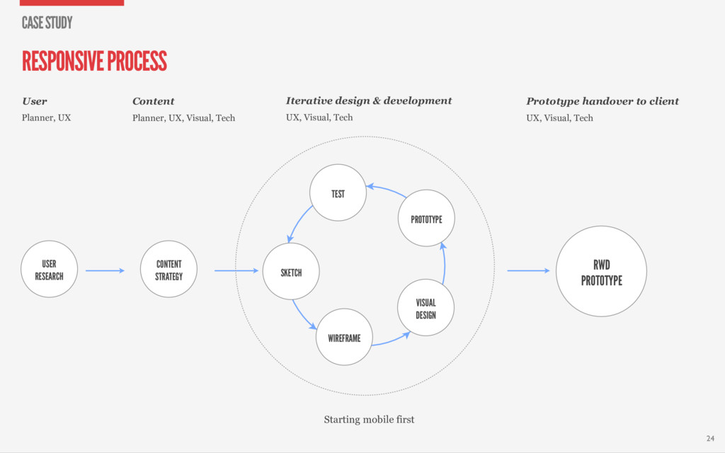
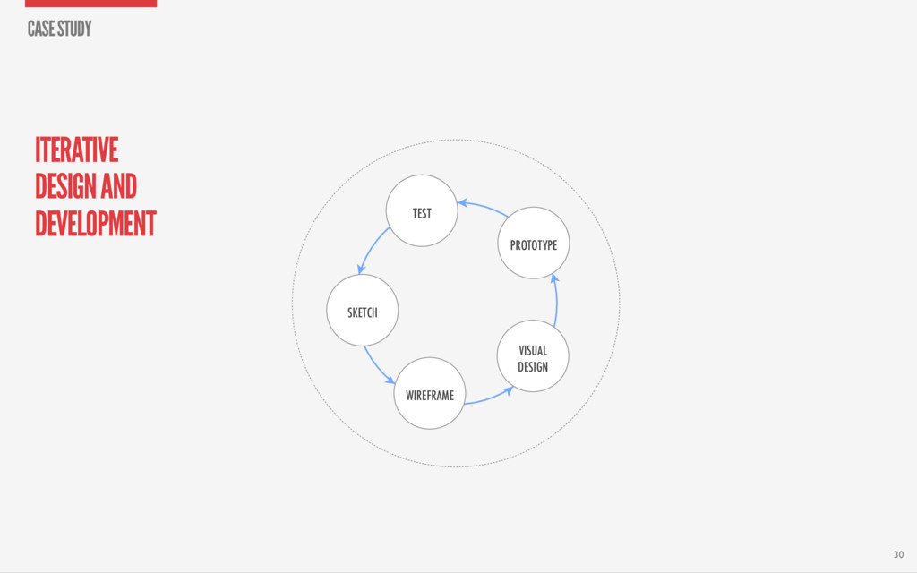
TEST SKETCH Iterative design & development User Content Starting mobile first Prototype handover to client Planner, UX Planner, UX, Visual, Tech UX, Visual, Tech UX, Visual, Tech 24 RESPONSIVE PROCESS CASE STUDY
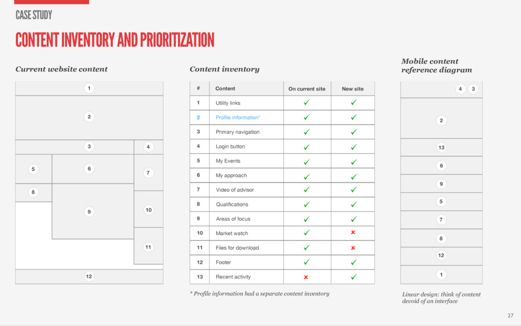
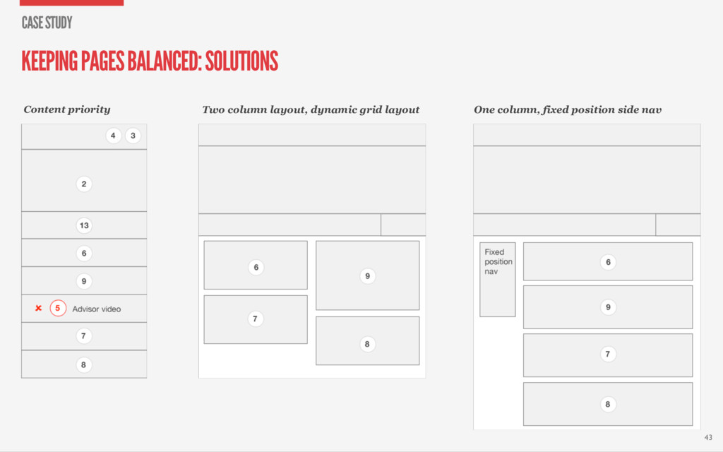
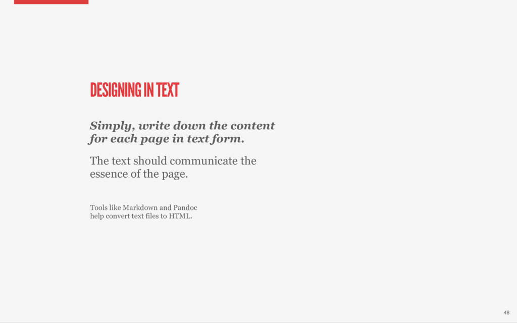
Profile information had a separate content inventory Linear design: think of content devoid of an interface CONTENT INVENTORY AND PRIORITIZATION CASE STUDY 27
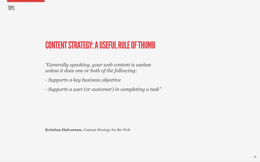
web content is useless unless it does one or both of the following: - Supports a key business objective - Supports a user (or customer) in completing a task” 28 Kristina Halvorson, Content Strategy for the Web TIPS
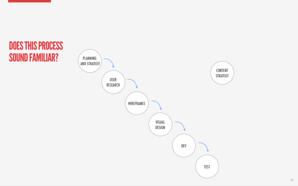
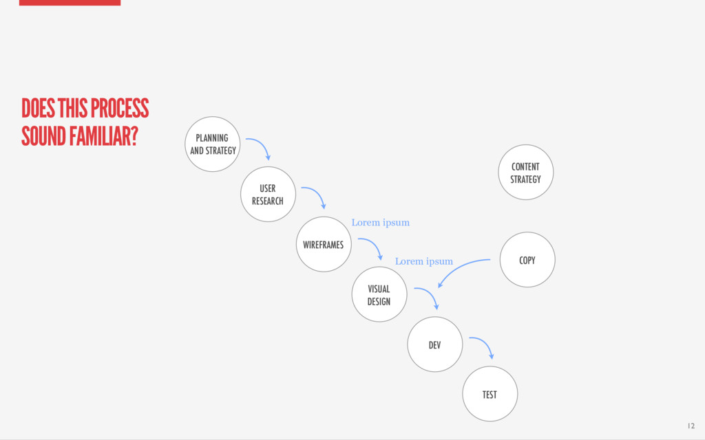
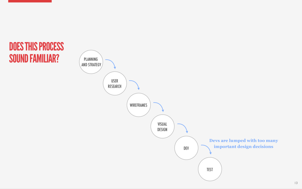
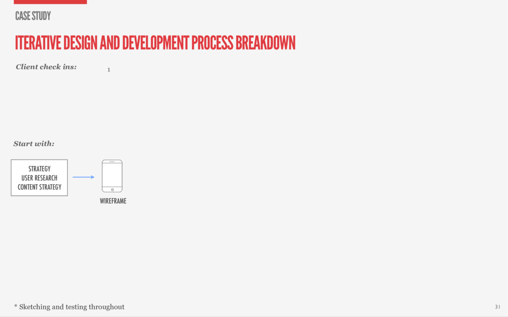
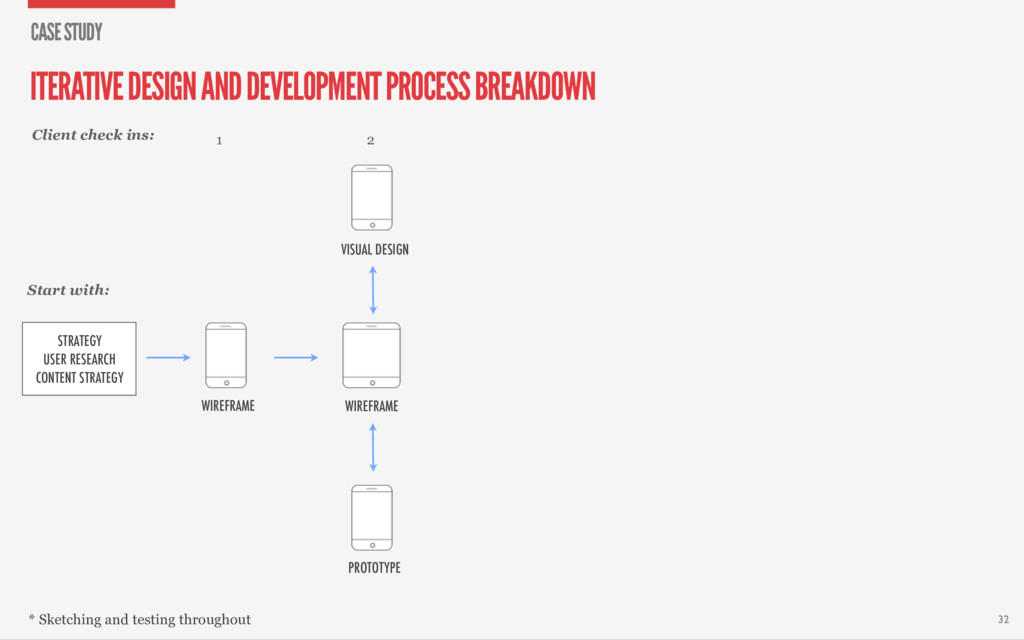
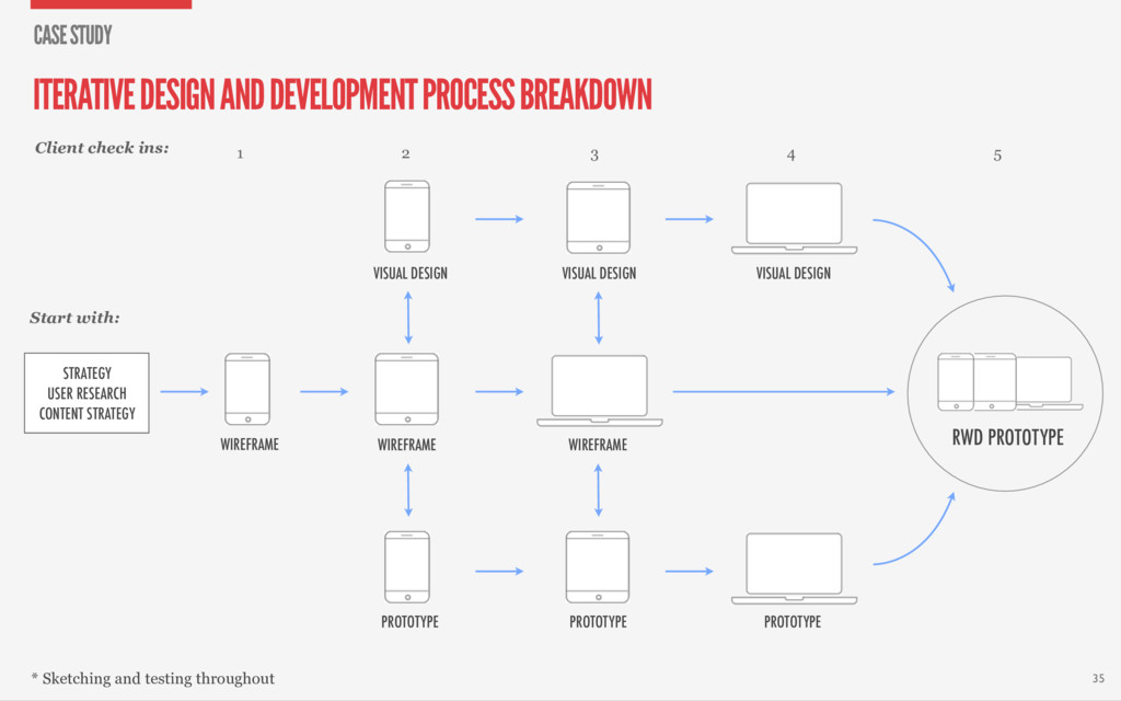
* Sketching and testing throughout Start with: 32 STRATEGY USER RESEARCH CONTENT STRATEGY ITERATIVE DESIGN AND DEVELOPMENT PROCESS BREAKDOWN CASE STUDY
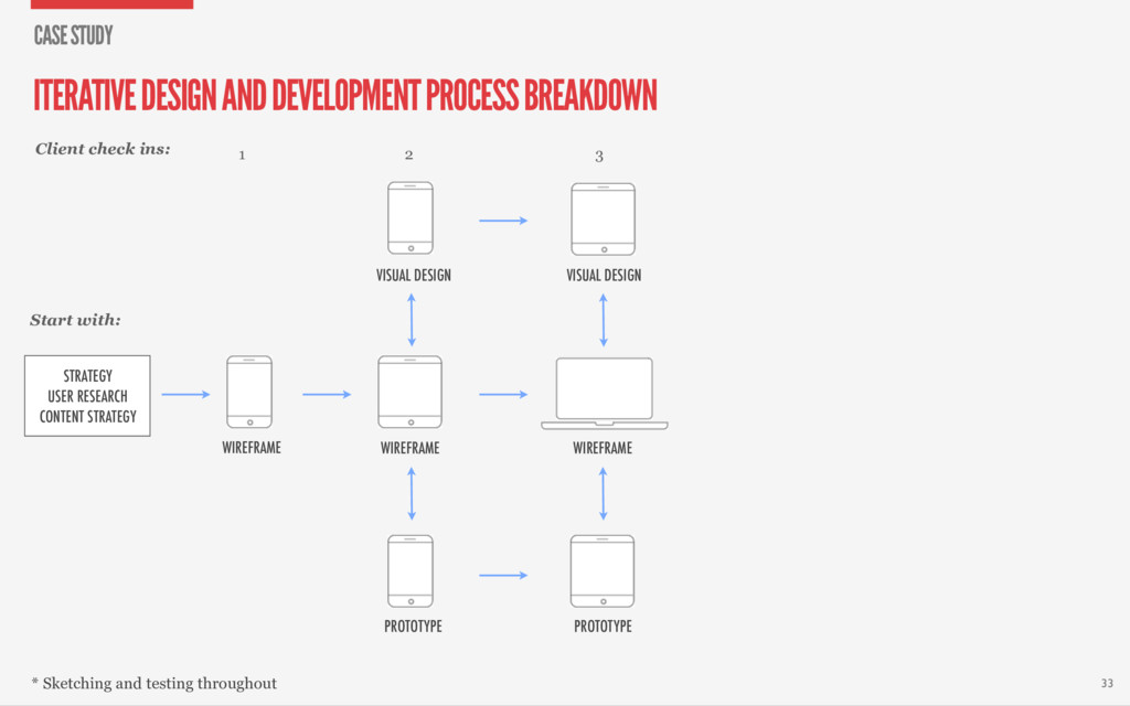
* Sketching and testing throughout Start with: 33 3 VISUAL DESIGN PROTOTYPE WIREFRAME STRATEGY USER RESEARCH CONTENT STRATEGY ITERATIVE DESIGN AND DEVELOPMENT PROCESS BREAKDOWN CASE STUDY
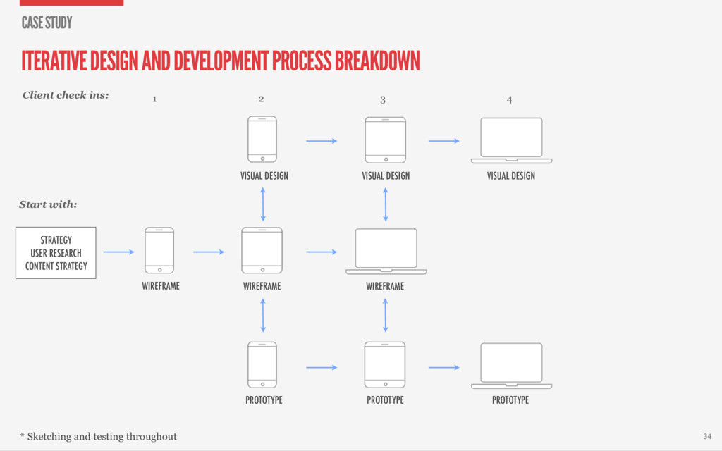
* Sketching and testing throughout Start with: 34 4 PROTOTYPE VISUAL DESIGN 3 VISUAL DESIGN PROTOTYPE WIREFRAME STRATEGY USER RESEARCH CONTENT STRATEGY ITERATIVE DESIGN AND DEVELOPMENT PROCESS BREAKDOWN CASE STUDY
* Sketching and testing throughout Start with: 35 4 PROTOTYPE VISUAL DESIGN 5 RWD PROTOTYPE 3 VISUAL DESIGN PROTOTYPE WIREFRAME STRATEGY USER RESEARCH CONTENT STRATEGY ITERATIVE DESIGN AND DEVELOPMENT PROCESS BREAKDOWN CASE STUDY
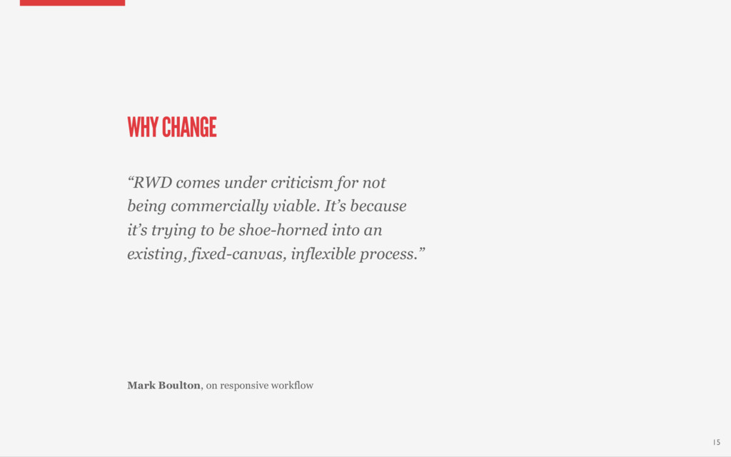
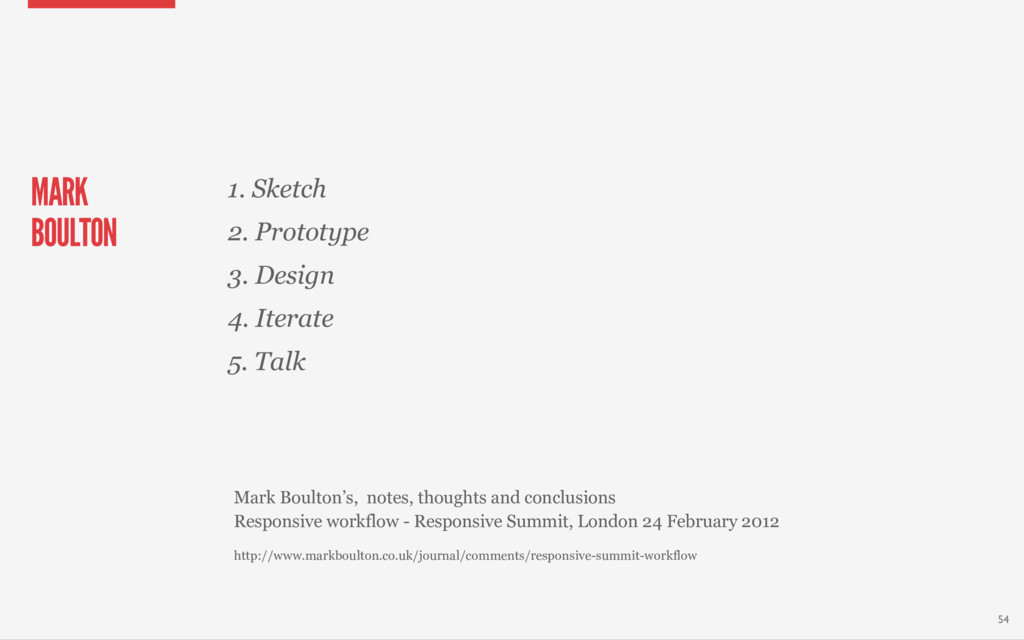
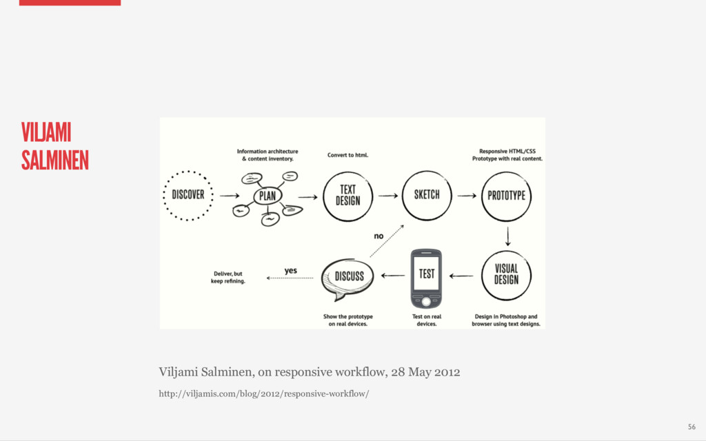
“The most important part here is to use a tool which doesn’t restrain your creativity. It can be the browser, Photoshop, Fireworks, InDesign or anything else that feels right.” Viljami Salminen, on responsive workflow 51
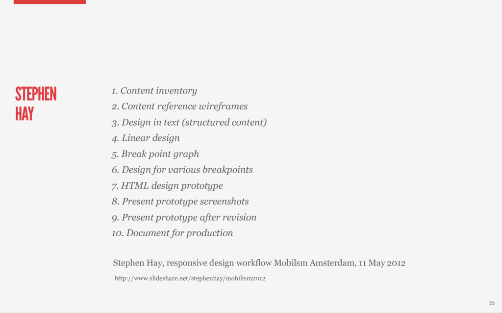
2012 STEPHEN HAY 1. Content inventory 2. Content reference wireframes 3. Design in text (structured content) 4. Linear design 5. Break point graph 6. Design for various breakpoints 7. HTML design prototype 8. Present prototype screenshots 9. Present prototype after revision 10. Document for production 55
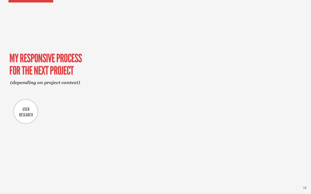
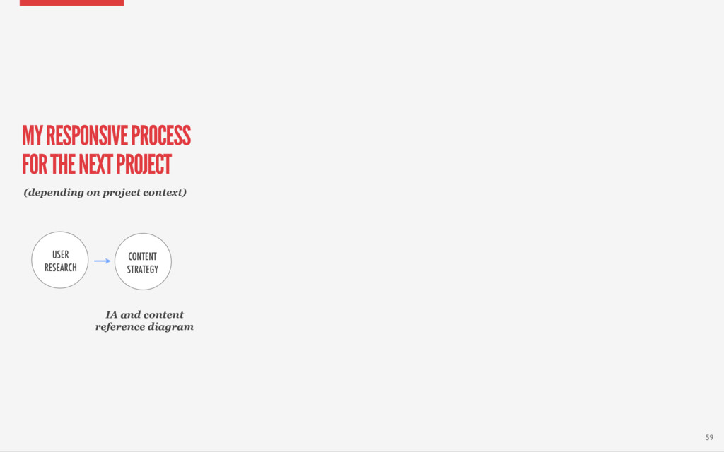
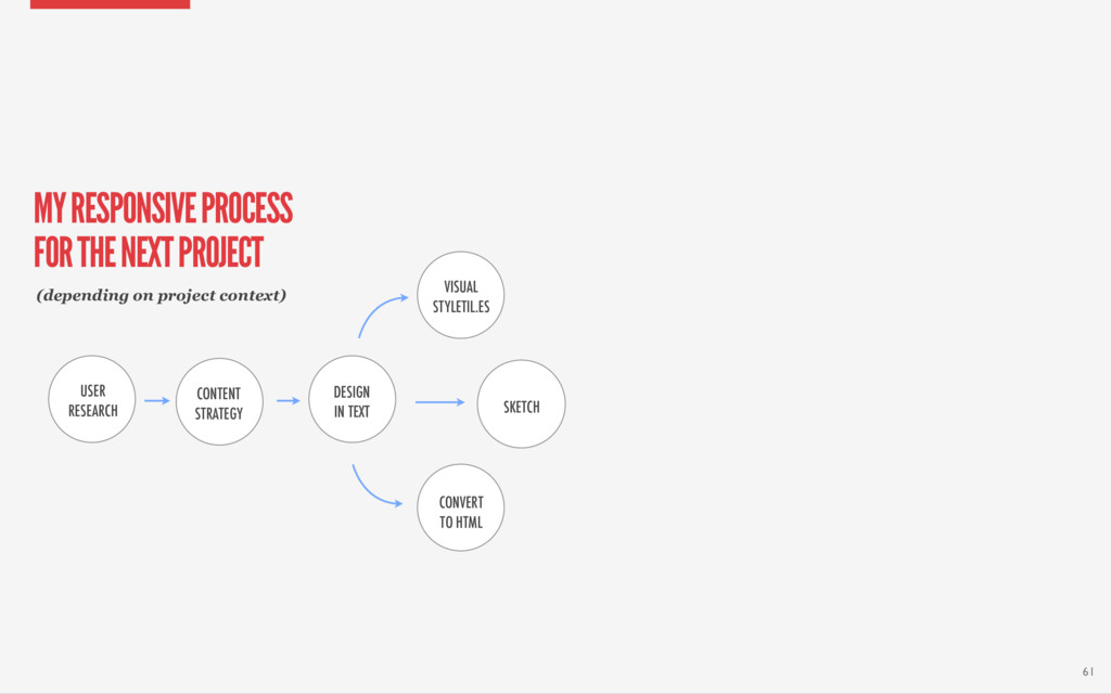
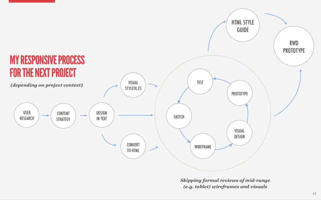
USER RESEARCH CONTENT STRATEGY DESIGN IN TEXT VISUAL STYLETIL.ES CONVERT TO HTML (depending on project context) WIREFRAME VISUAL DESIGN PROTOTYPE TEST SKETCH 62 MY RESPONSIVE PROCESS FOR THE NEXT PROJECT
HTML STYLE GUIDE RWD PROTOTYPE USER RESEARCH CONTENT STRATEGY DESIGN IN TEXT VISUAL STYLETIL.ES CONVERT TO HTML (depending on project context) WIREFRAME VISUAL DESIGN PROTOTYPE TEST SKETCH 63 MY RESPONSIVE PROCESS FOR THE NEXT PROJECT
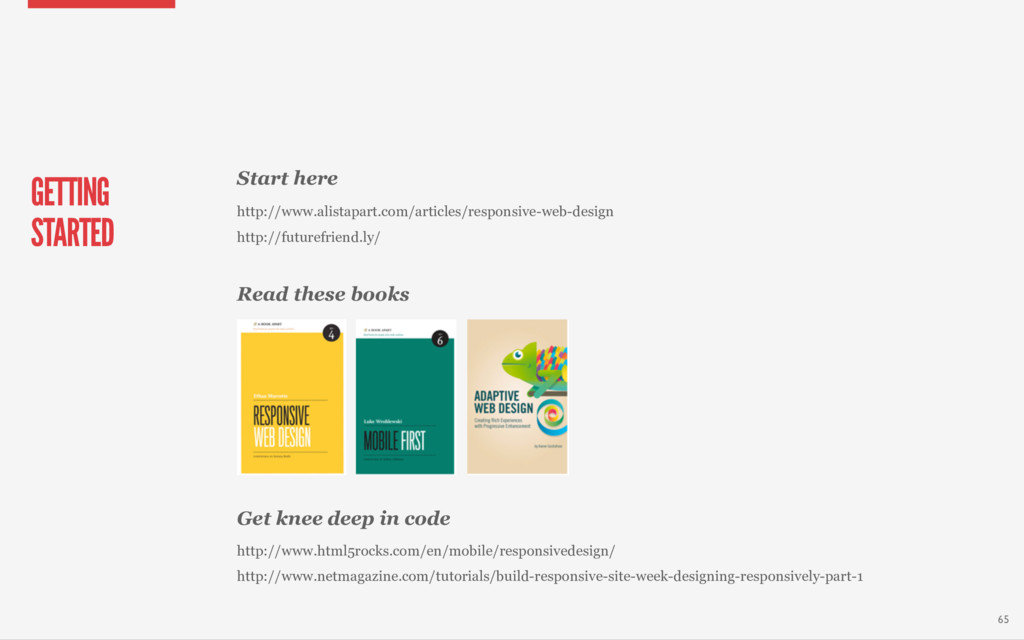
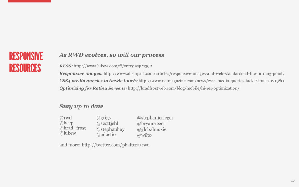
knee deep in code http://www.html5rocks.com/en/mobile/responsivedesign/ http://www.netmagazine.com/tutorials/build-responsive-site-week-designing-responsively-part-1 65
responsive workflow http://viljamis.com/blog/2012/responsive-workflow/ Mark Boulton’s Responsive workflow notes from the Responsive Summit: http://www.markboulton.co.uk/journal/comments/responsive-summit-workflow Drew Clemen’s Design Process in the Responsive Age http://uxdesign.smashingmagazine.com/2012/05/30/design-process-responsive-age/ Ben Callahan’s Hands-on Responsive Web Design https://speakerdeck.com/u/bencallahan/p/hands-on-responsive-web-design?slide=12 Yellow Pencil’s Responsive web design process http://responsiveprocess.com/ 66
 presportal
 kitanosirokuma
 yuri_ohashi
 kspace
 rezaline
 chiilog
 teba_eleven
 videlvequio
 yamamotoyuta
 mhand01
 saka2jp
.jpg) rwang05
rwang05
 tammyeverts
 matthewcrist
 cromwellryan
 addyosmani
 marcduiker
 tmiket
 baasie
 jonrohan
 sugarenia
 orderedlist
 raygrieselhuber
 thoeni
![PROTOTYPE: LOW FIDELITY CASE STUDY 45 Fast Focus Cheap [DEMO]](https://files.speakerdeck.com/presentations/9d01ad9940914593837f68515871df69/slide_44.jpg)