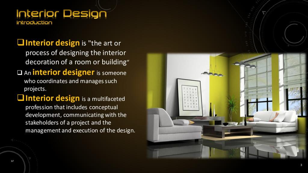
designing the interior decoration of a room or building“ An interior designer is someone who coordinates and manages such projects. Interior design is a multifaceted profession that includes conceptual development, communicating with the stakeholders of a project and the management and execution of the design.
instinctively as a part of the process of building. The profession of interior design has been a consequence of the development of society and the complex architecture that has resulted from the development of industrial processes. In ancient India, architects used to work as interior designers. This can be seen from the references of Vishwakarma the architect - one of the gods in Indian mythology. The interior design profession became more established after World War II.
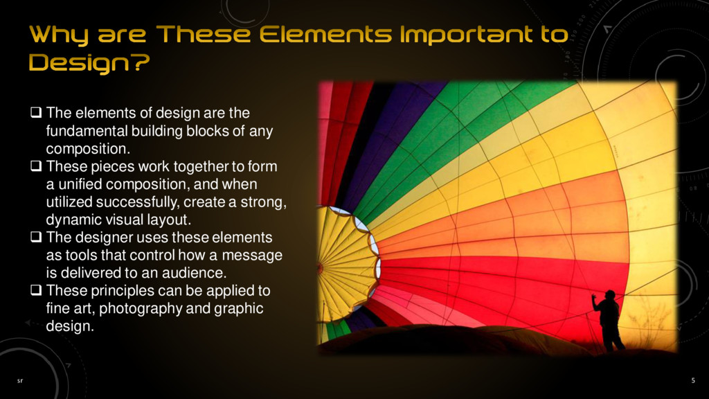
building blocks of any composition. These pieces work together to form a unified composition, and when utilized successfully, create a strong, dynamic visual layout. The designer uses these elements as tools that control how a message is delivered to an audience. These principles can be applied to fine art, photography and graphic design.
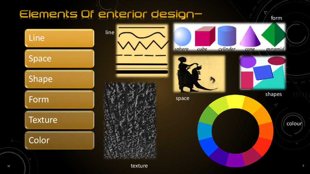
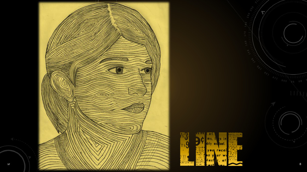
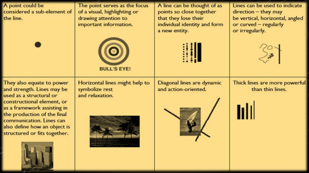
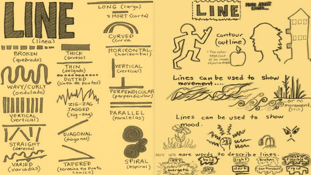
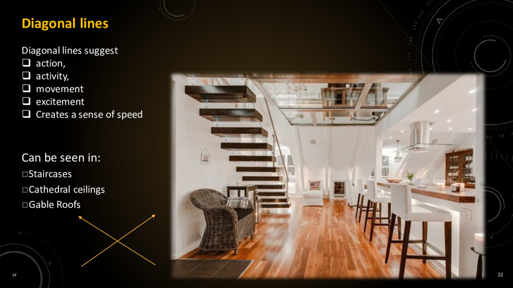
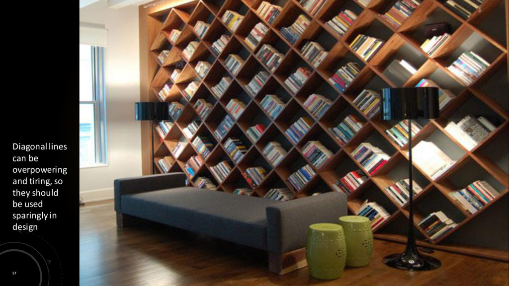
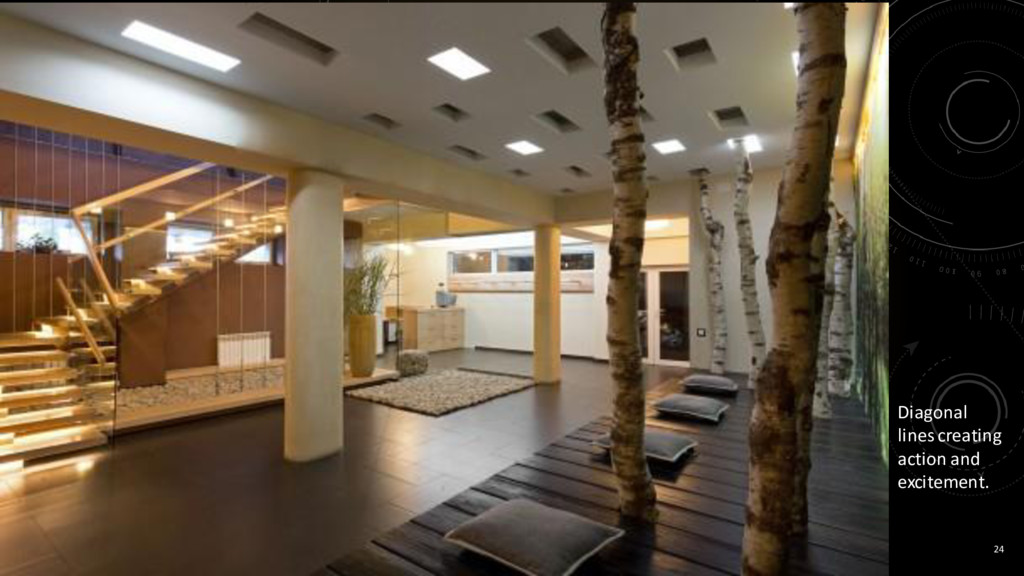
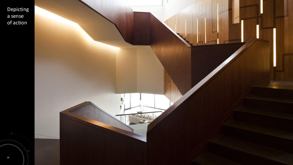
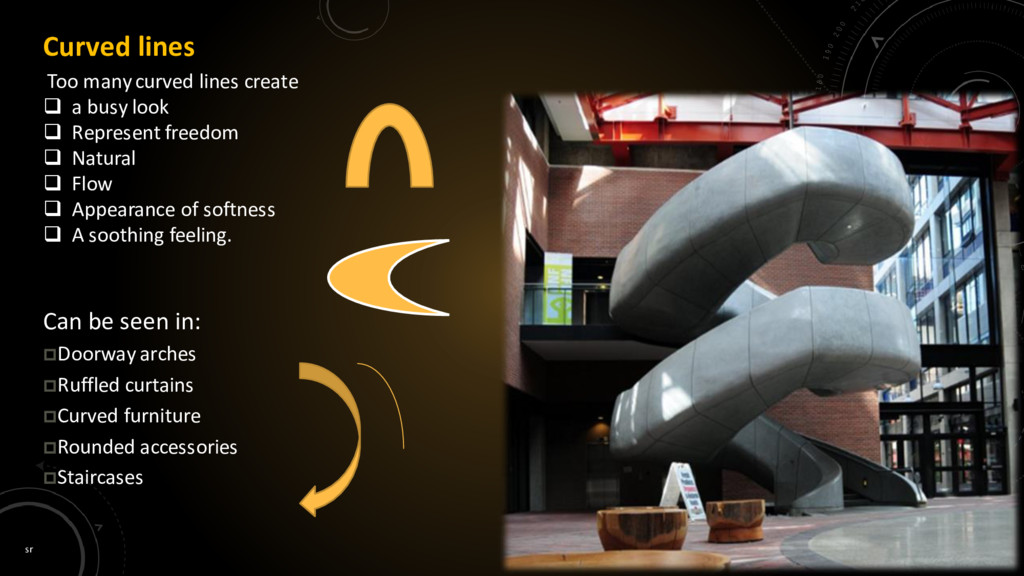
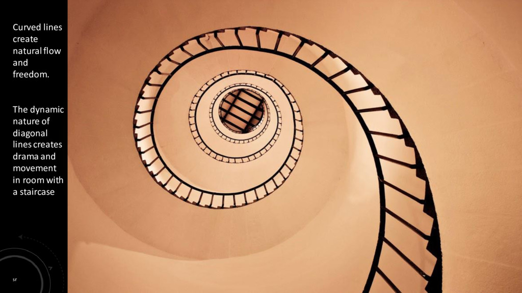
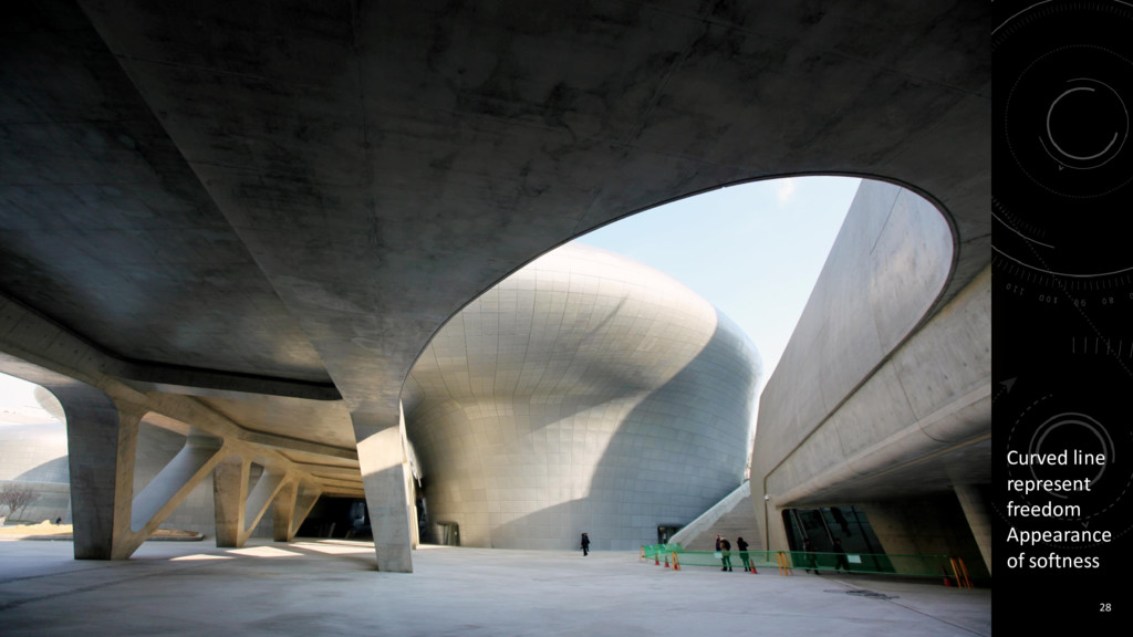
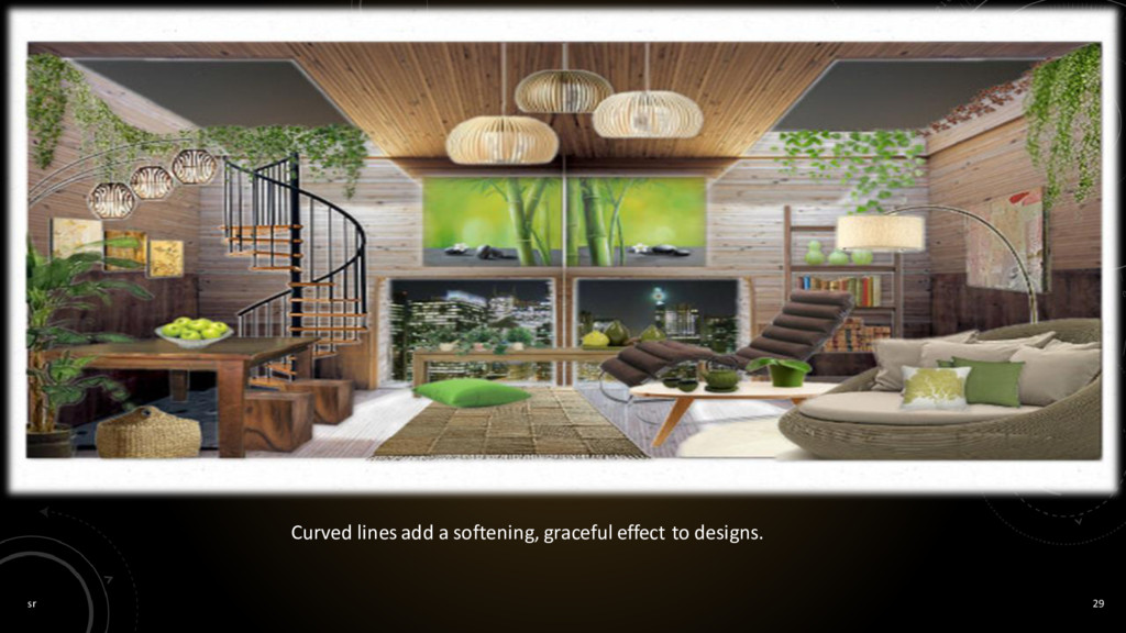
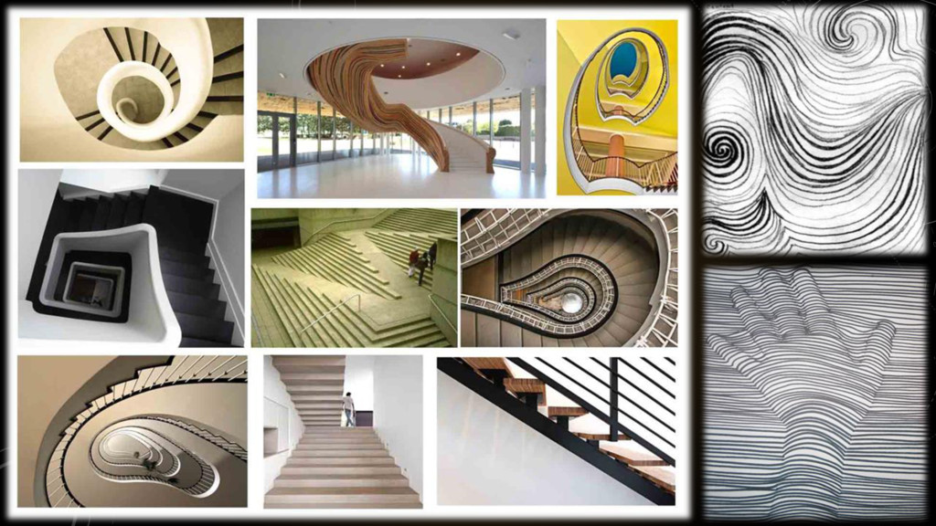
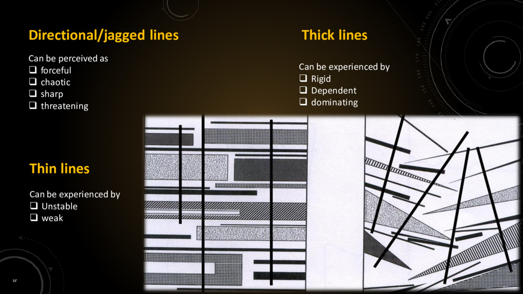
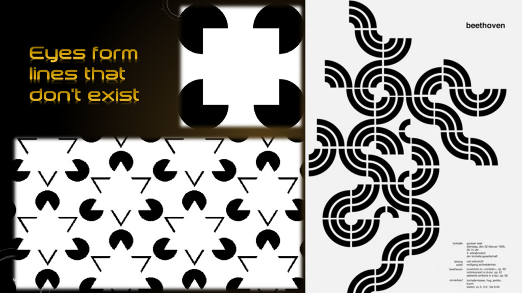
a subjectʼs form or shape on a flat, two- dimensional surface. Lines can be thick or thin, smooth or jagged, rigid and mechanical or organic and hand drawn. When discussing line as it applies to interior design, we mean the lines created by the furnishings and architecture of a room. Line sets form and shape. Line is responsible for harmony, contrast and unity in interior design. Line can be used to show movement and guides the eye throughout a room. Line can be used to show mood. Lines can be used to convey a sense of strength, serenity, gracefulness, or action. Combining lines and placing them in a design in certain ways can create specific effects and feelings. The use of line can also have an effect on how space is perceived. Different types of lines have different effects on design.
it is wide. It is the path of a point moving in space. Objects and things are perceived by the line that describes them. Characteristics of line include: Width - thick, thin, tapering, uneven Length - long, short, continuous, broken Direction - horizontal, vertical, diagonal, curving, perpendicular, oblique, parallel, radial, zig-zag Focus - sharp, blurry, fuzzy, choppy Feeling - sharp, jagged, graceful, smooth ... can you think of others?
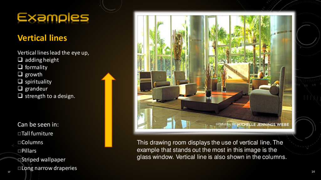
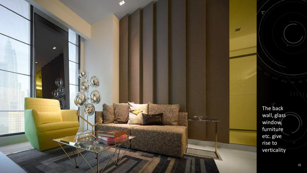
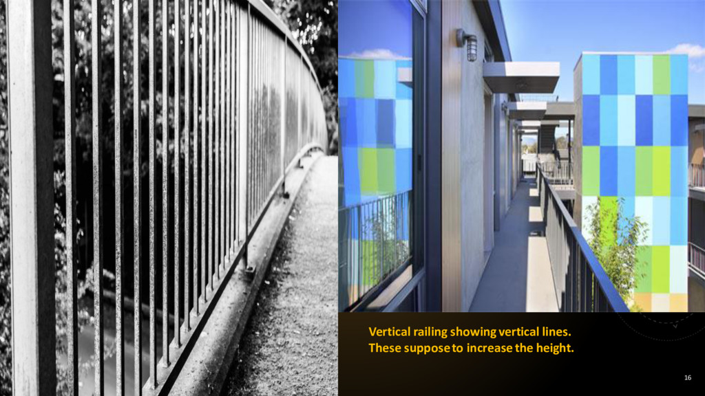
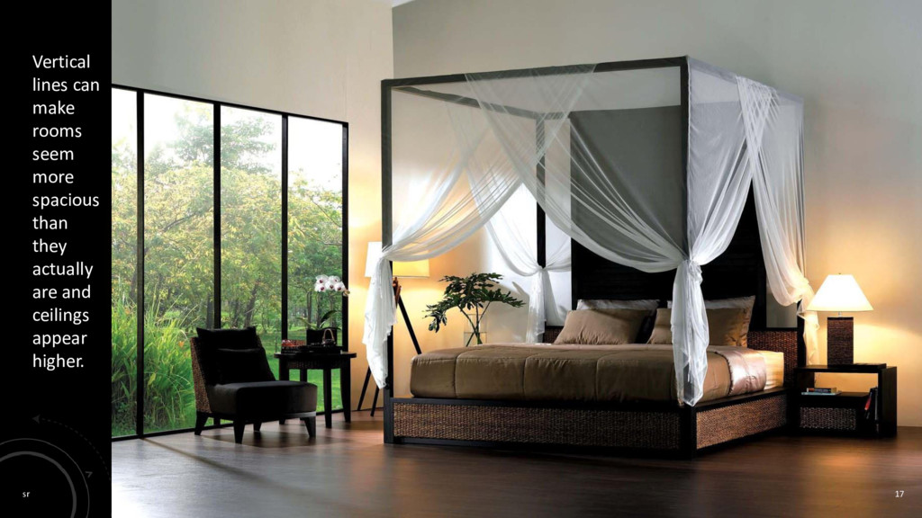
adding height formality growth spirituality grandeur strength to a design. Can be seen in: Tall furniture Columns Pillars Striped wallpaper Long narrow draperies This drawing room displays the use of vertical line. The example that stands out the most in this image is the glass window. Vertical line is also shown in the columns.
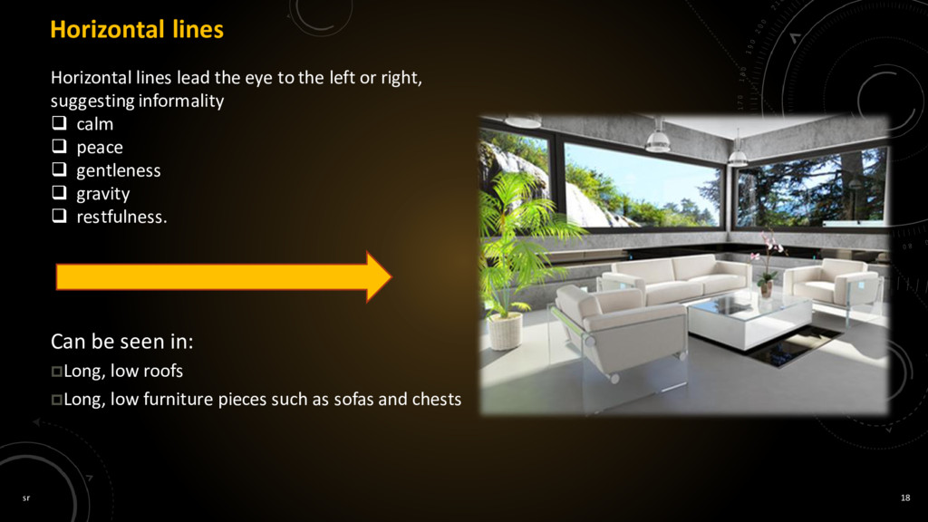
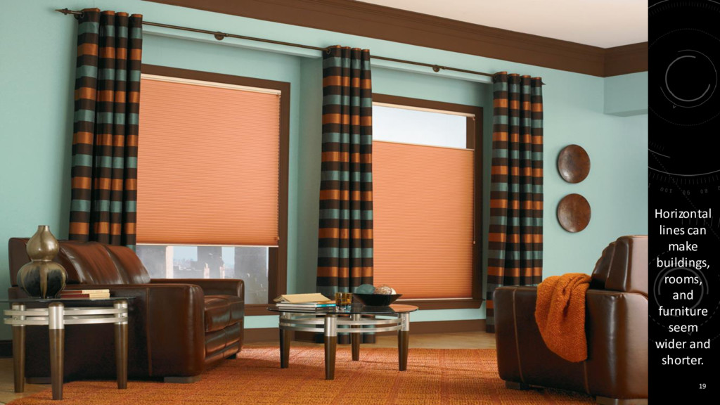
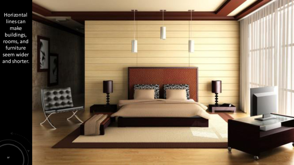
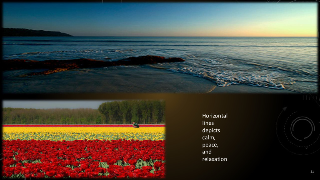
the left or right, suggesting informality calm peace gentleness gravity restfulness. Can be seen in: Long, low roofs Long, low furniture pieces such as sofas and chests
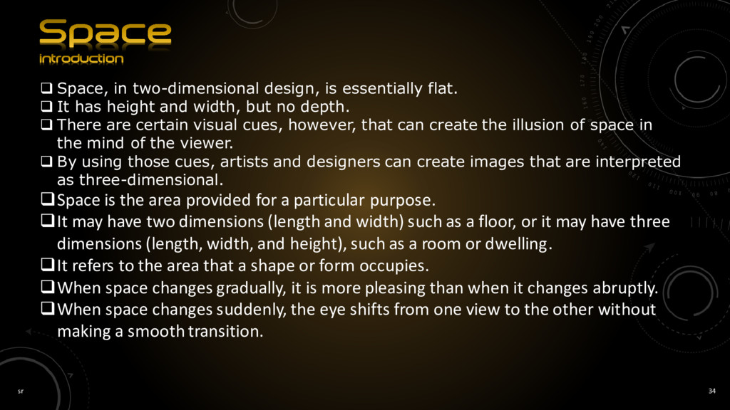
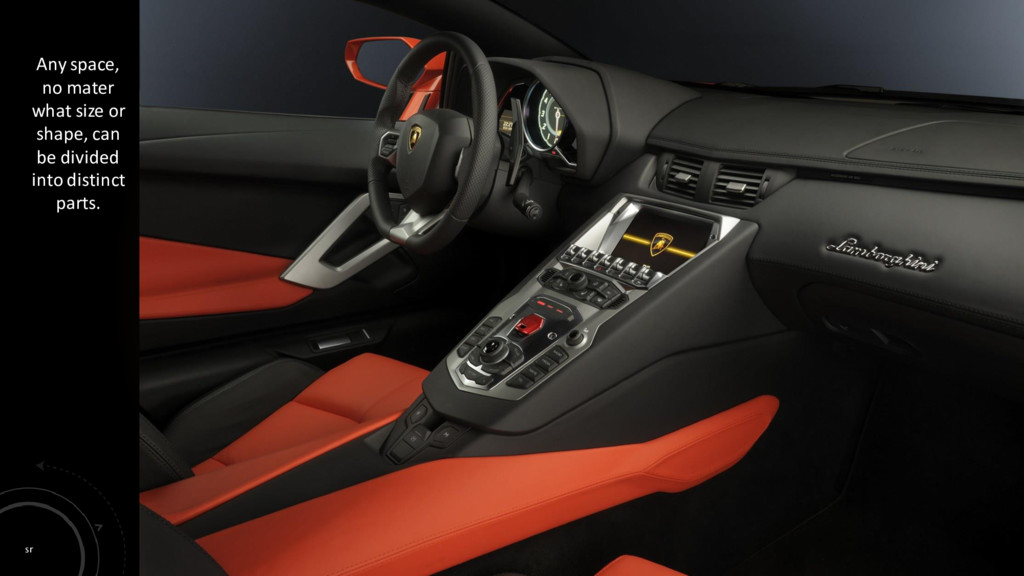
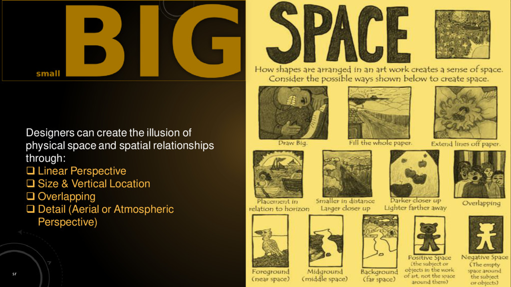
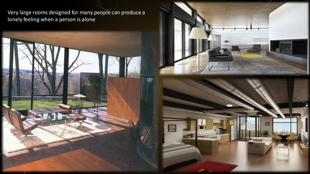
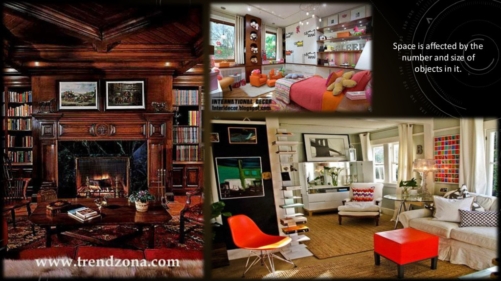
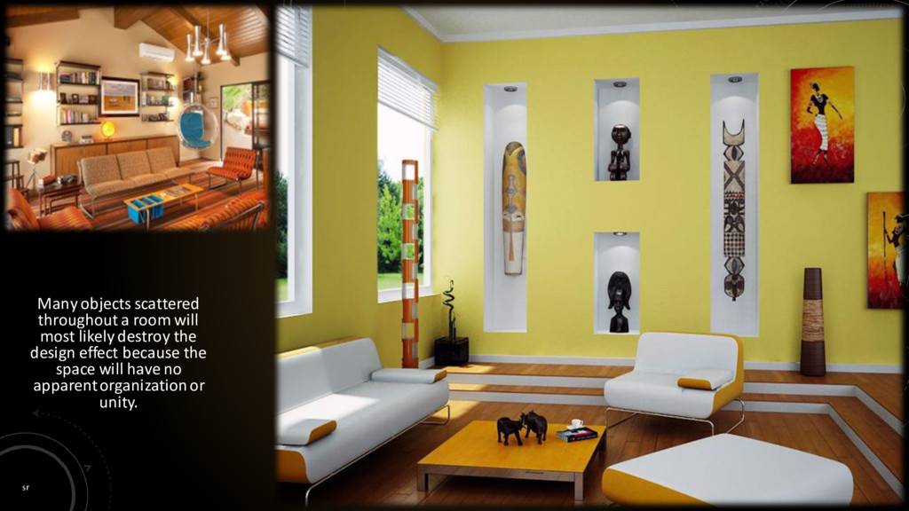
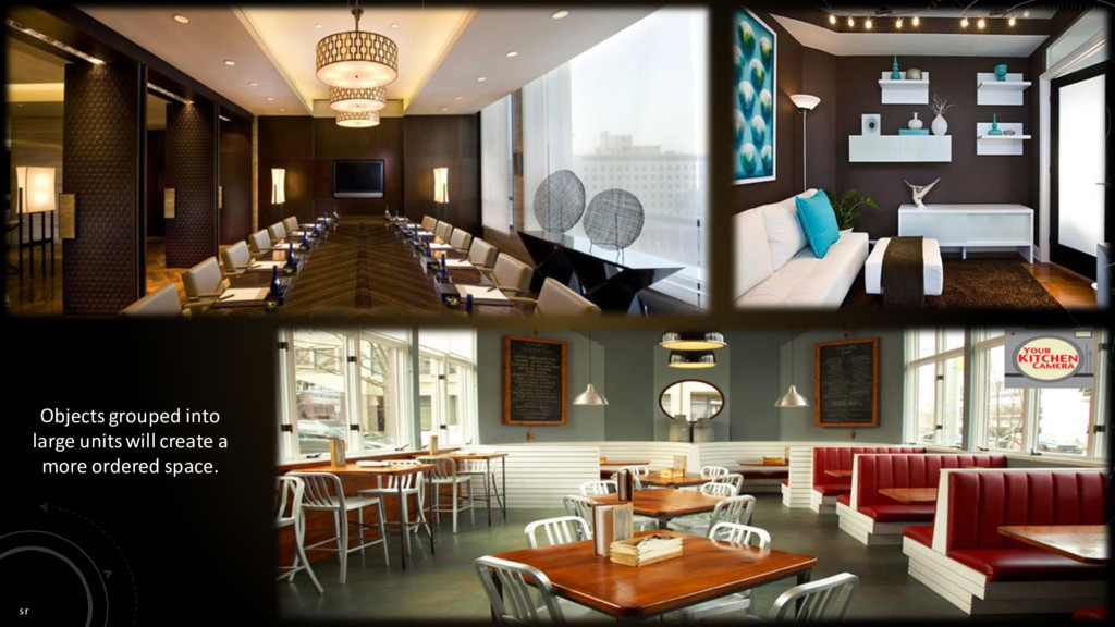
It has height and width, but no depth. There are certain visual cues, however, that can create the illusion of space in the mind of the viewer. By using those cues, artists and designers can create images that are interpreted as three-dimensional. Space is the area provided for a particular purpose. It may have two dimensions (length and width) such as a floor, or it may have three dimensions (length, width, and height), such as a room or dwelling. It refers to the area that a shape or form occupies. When space changes gradually, it is more pleasing than when it changes abruptly. When space changes suddenly, the eye shifts from one view to the other without making a smooth transition.
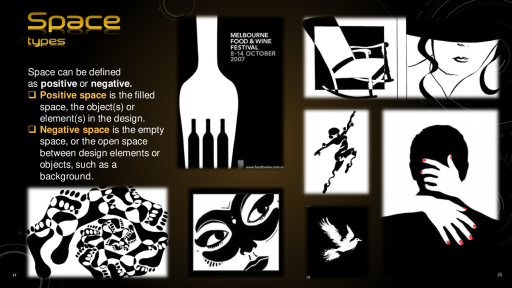
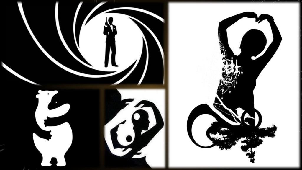
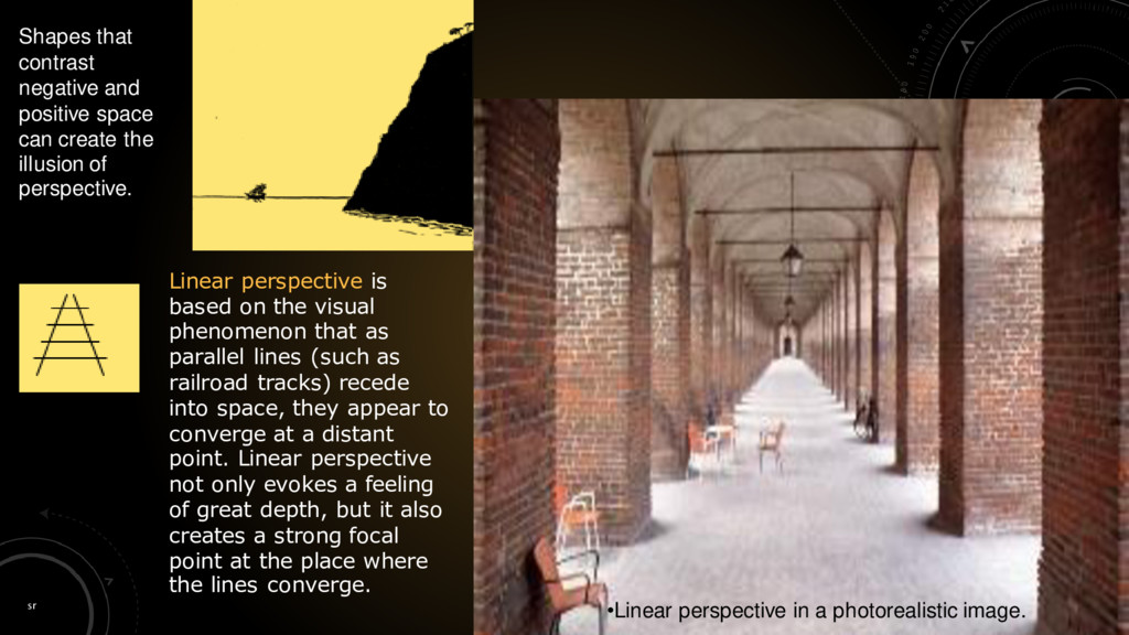
Positive space is the filled space, the object(s) or element(s) in the design. Negative space is the empty space, or the open space between design elements or objects, such as a background.
create the illusion of perspective. •Linear perspective in a photorealistic image. Linear perspective is based on the visual phenomenon that as parallel lines (such as railroad tracks) recede into space, they appear to converge at a distant point. Linear perspective not only evokes a feeling of great depth, but it also creates a strong focal point at the place where the lines converge.
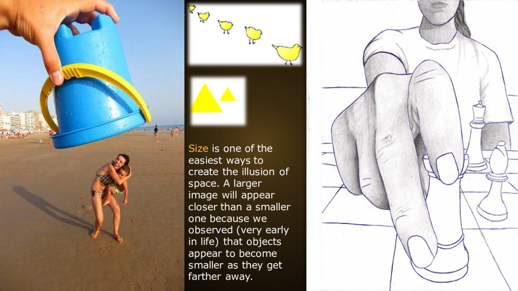
create the illusion of space. A larger image will appear closer than a smaller one because we observed (very early in life) that objects appear to become smaller as they get farther away.
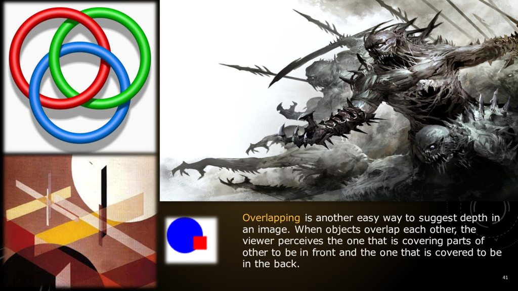
in an image. When objects overlap each other, the viewer perceives the one that is covering parts of other to be in front and the one that is covered to be in the back.
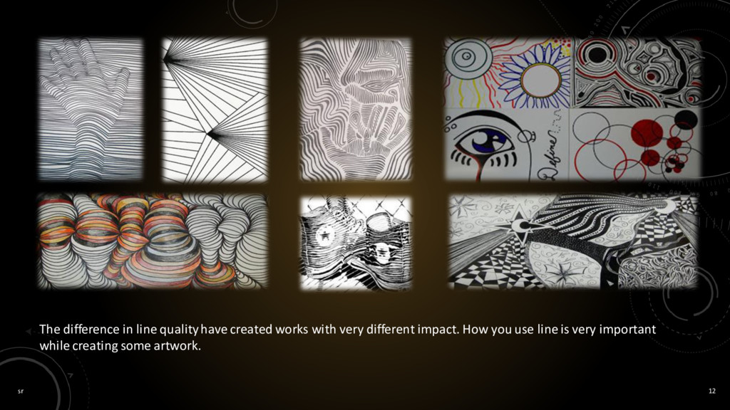
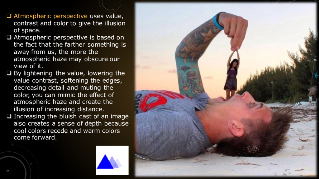
to give the illusion of space. Atmospheric perspective is based on the fact that the farther something is away from us, the more the atmospheric haze may obscure our view of it. By lightening the value, lowering the value contrast, softening the edges, decreasing detail and muting the color, you can mimic the effect of atmospheric haze and create the illusion of increasing distance. Increasing the bluish cast of an image also creates a sense of depth because cool colors recede and warm colors come forward.
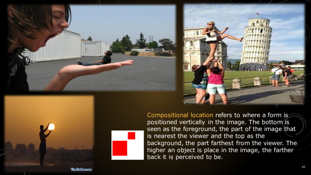
positioned vertically in the image. The bottom is seen as the foreground, the part of the image that is nearest the viewer and the top as the background, the part farthest from the viewer. The higher an object is place in the image, the farther back it is perceived to be.
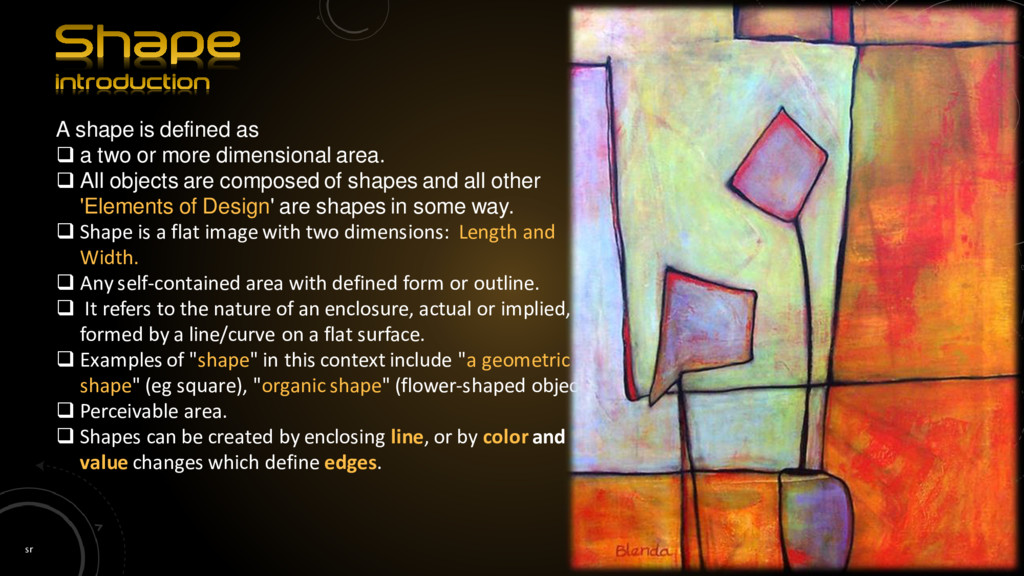
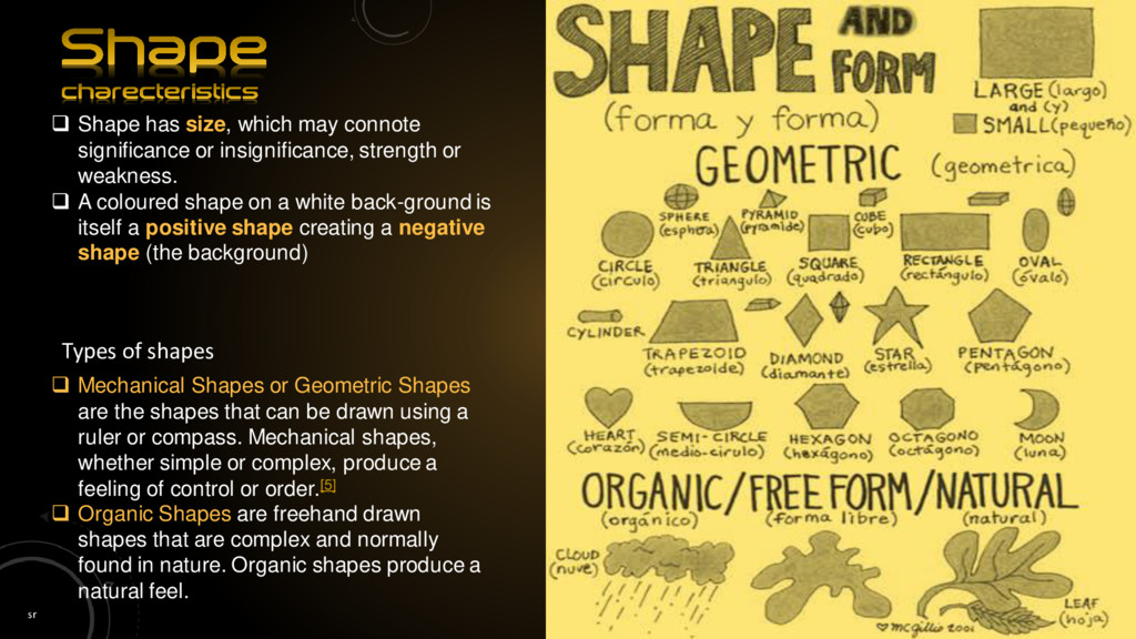
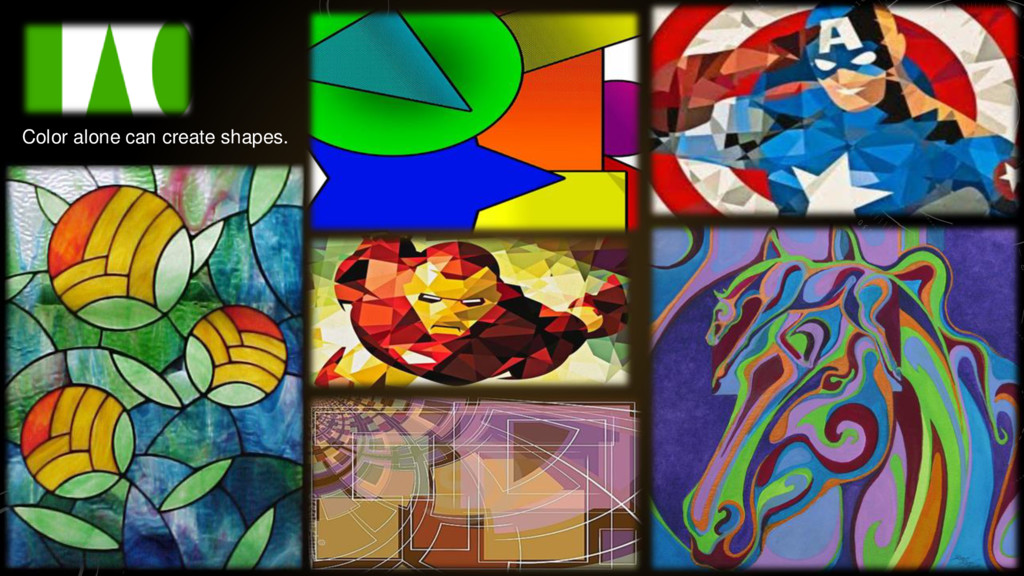
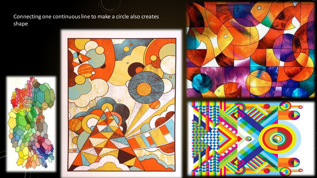
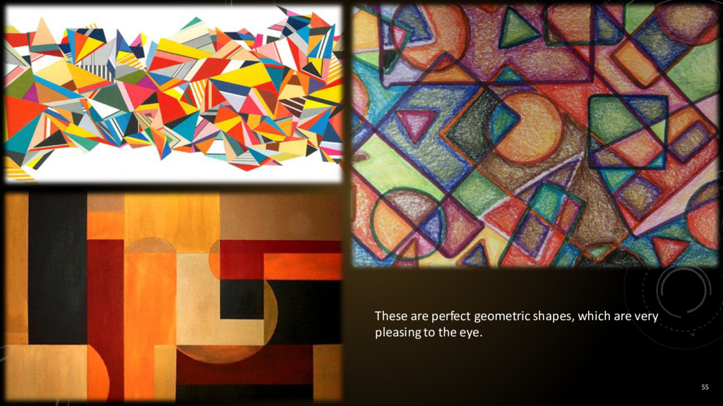
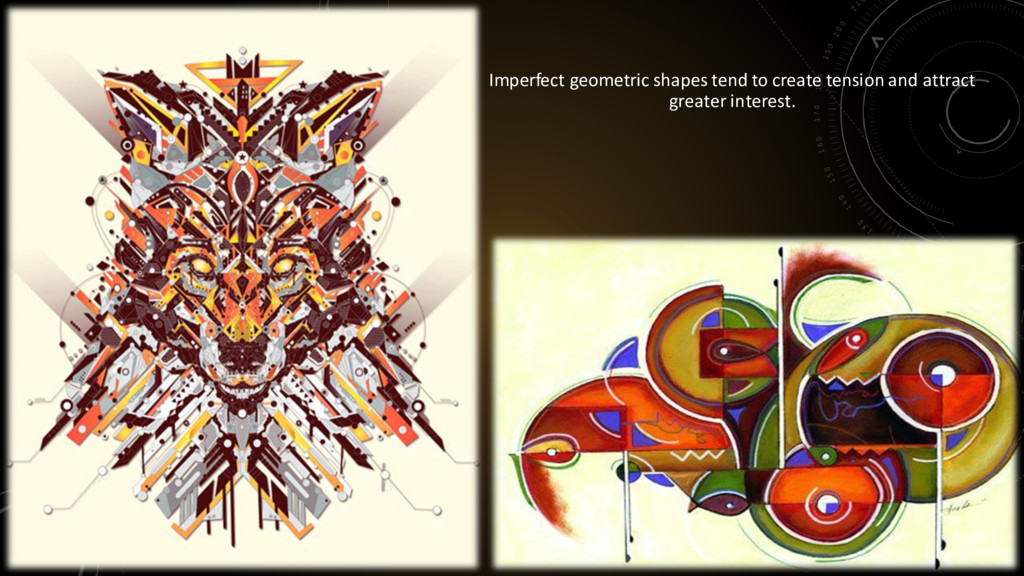
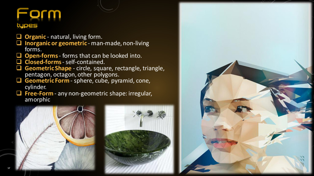
or more dimensional area. All objects are composed of shapes and all other 'Elements of Design' are shapes in some way. Shape is a flat image with two dimensions: Length and Width. Any self-contained area with defined form or outline. It refers to the nature of an enclosure, actual or implied, formed by a line/curve on a flat surface. Examples of "shape" in this context include "a geometric shape" (eg square), "organic shape" (flower-shaped object). Perceivable area. Shapes can be created by enclosing line, or by color and value changes which define edges.
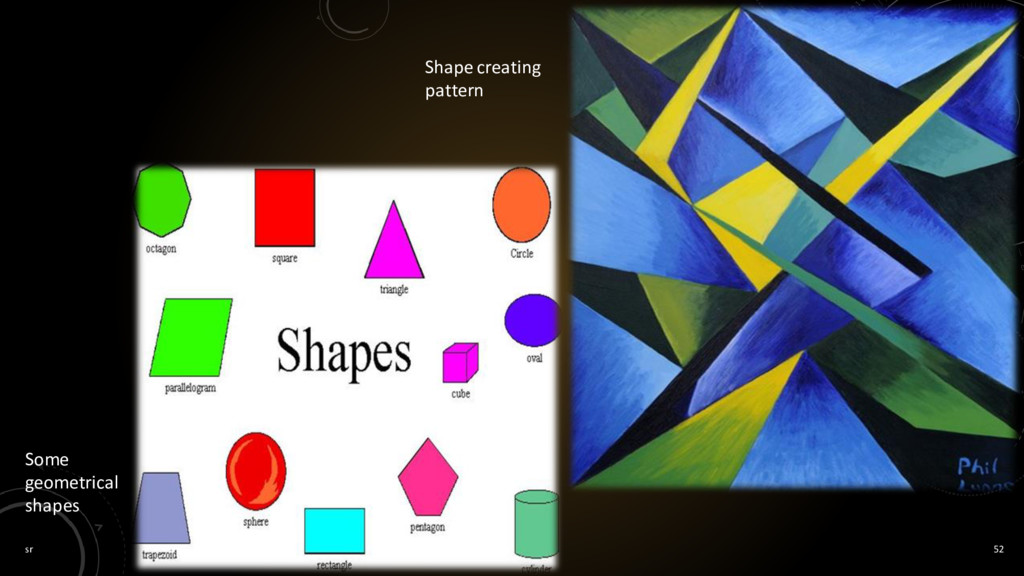
shapes that can be drawn using a ruler or compass. Mechanical shapes, whether simple or complex, produce a feeling of control or order.[5] Organic Shapes are freehand drawn shapes that are complex and normally found in nature. Organic shapes produce a natural feel. Shape has size, which may connote significance or insignificance, strength or weakness. A coloured shape on a white back-ground is itself a positive shape creating a negative shape (the background) Types of shapes
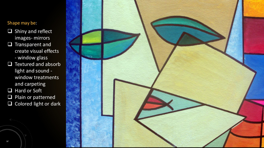
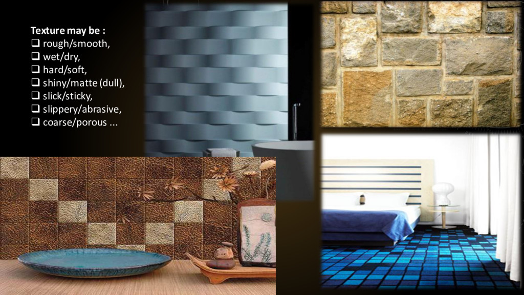
and create visual effects - window glass Textured and absorb light and sound - window treatments and carpeting Hard or Soft Plain or patterned Colored light or dark Shape may be:
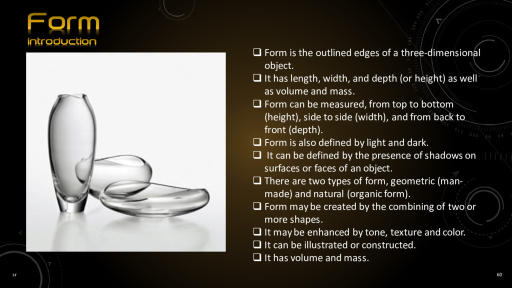
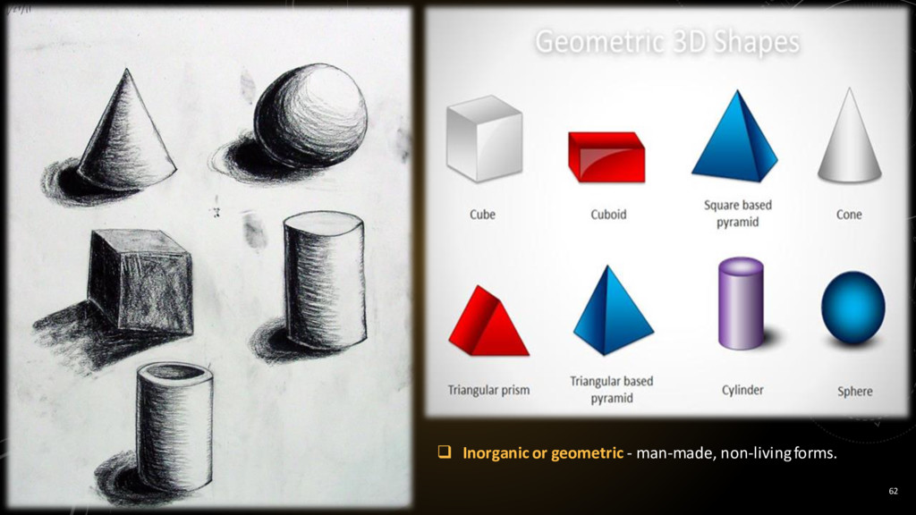
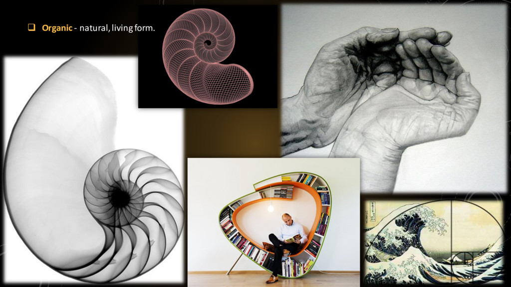
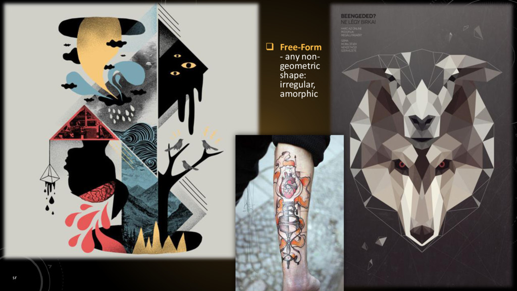
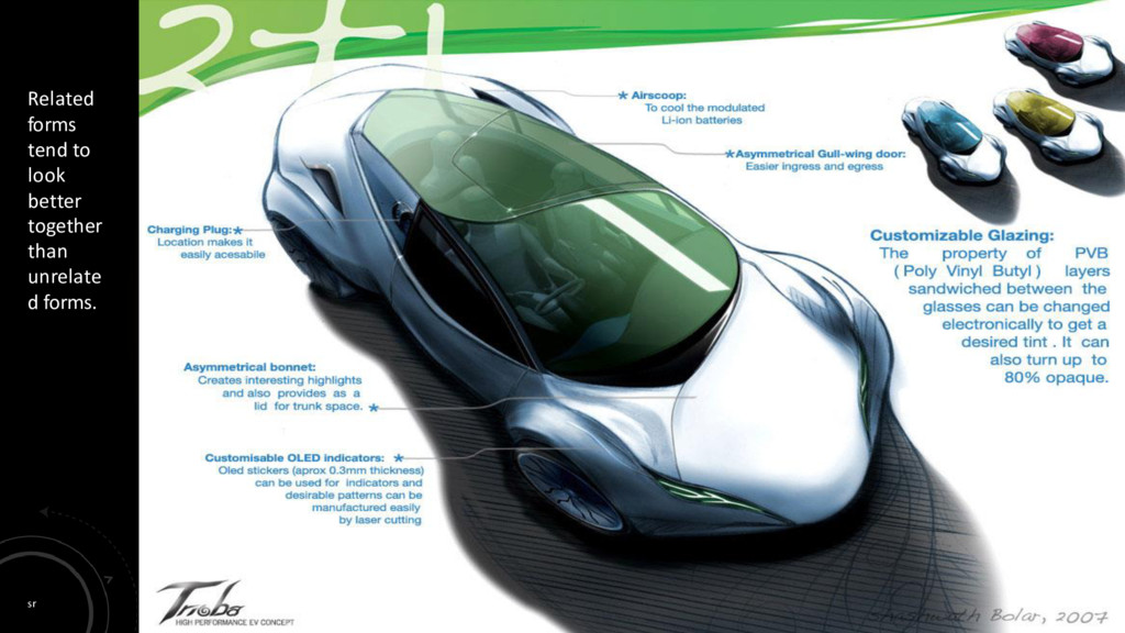
three-dimensional object. It has length, width, and depth (or height) as well as volume and mass. Form can be measured, from top to bottom (height), side to side (width), and from back to front (depth). Form is also defined by light and dark. It can be defined by the presence of shadows on surfaces or faces of an object. There are two types of form, geometric (man- made) and natural (organic form). Form may be created by the combining of two or more shapes. It may be enhanced by tone, texture and color. It can be illustrated or constructed. It has volume and mass.
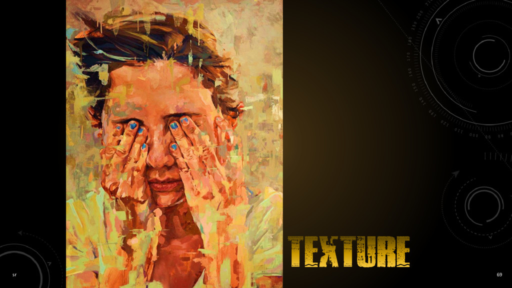
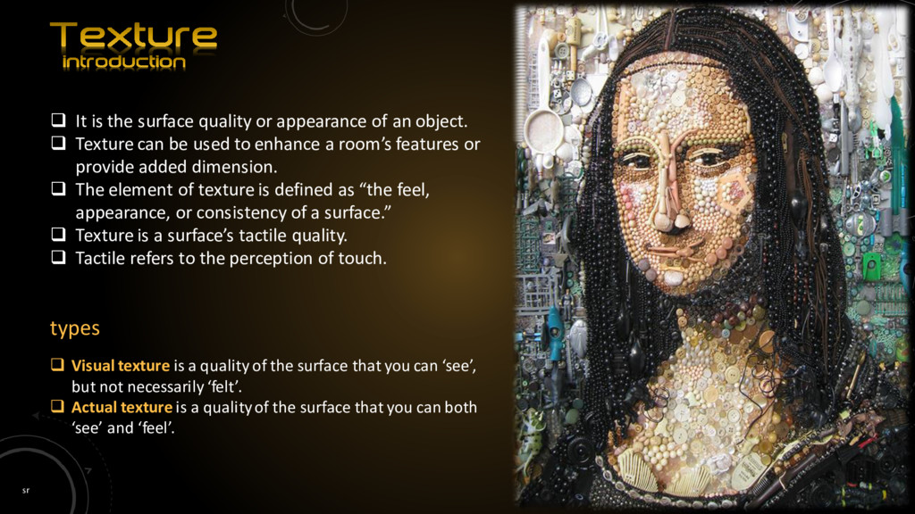
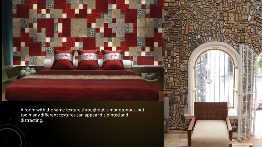
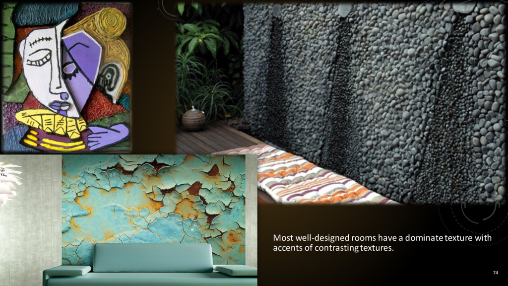
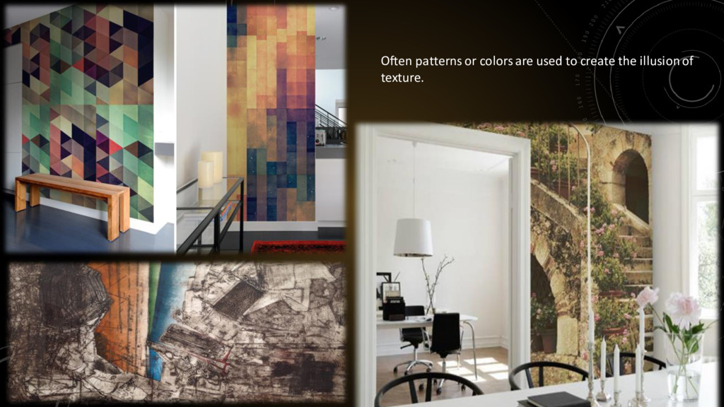
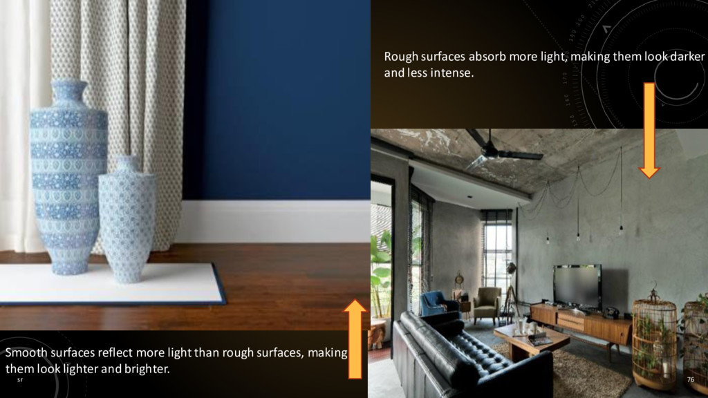
of an object. Texture can be used to enhance a room’s features or provide added dimension. The element of texture is defined as “the feel, appearance, or consistency of a surface.” Texture is a surface’s tactile quality. Tactile refers to the perception of touch. types Visual texture is a quality of the surface that you can ‘see’, but not necessarily ‘felt’. Actual texture is a quality of the surface that you can both ‘see’ and ‘feel’.
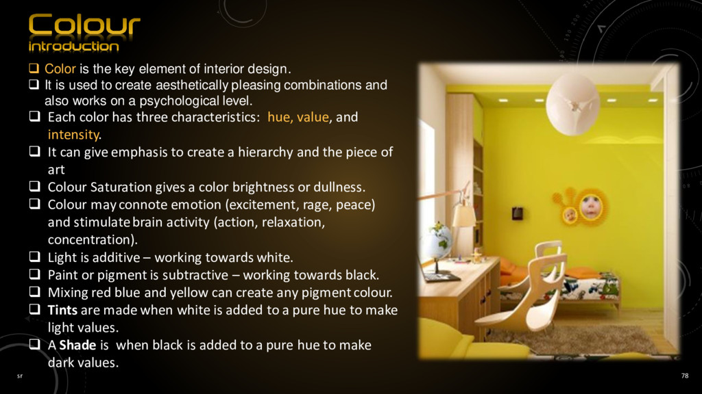
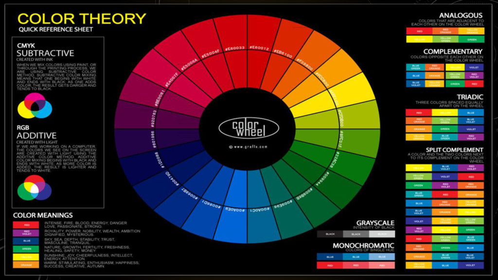
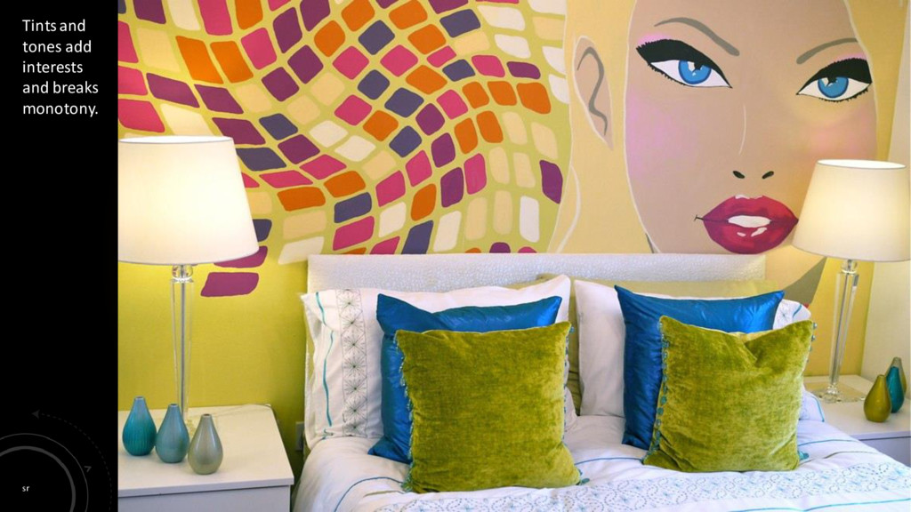
design. It is used to create aesthetically pleasing combinations and also works on a psychological level. Each color has three characteristics: hue, value, and intensity. It can give emphasis to create a hierarchy and the piece of art Colour Saturation gives a color brightness or dullness. Colour may connote emotion (excitement, rage, peace) and stimulate brain activity (action, relaxation, concentration). Light is additive – working towards white. Paint or pigment is subtractive – working towards black. Mixing red blue and yellow can create any pigment colour. Tints are made when white is added to a pure hue to make light values. A Shade is when black is added to a pure hue to make dark values.
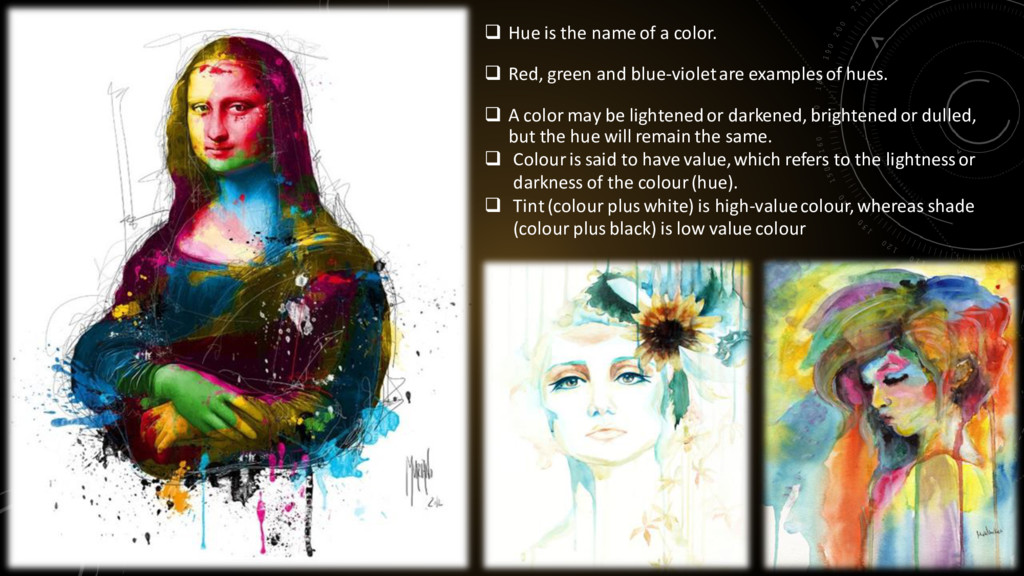
Red, green and blue-violet are examples of hues. A color may be lightened or darkened, brightened or dulled, but the hue will remain the same. Colour is said to have value, which refers to the lightness or darkness of the colour (hue). Tint (colour plus white) is high-value colour, whereas shade (colour plus black) is low value colour
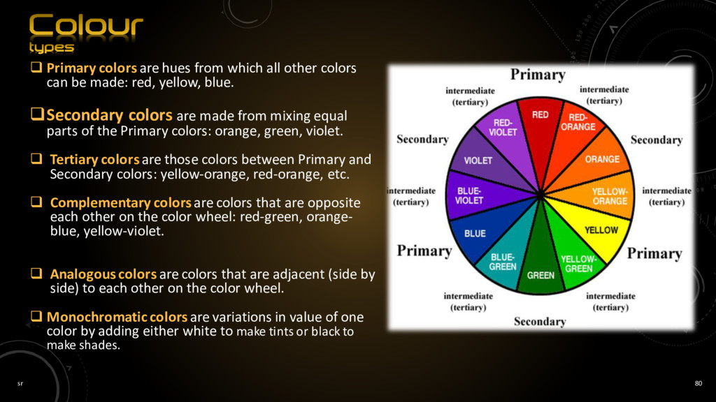
other colors can be made: red, yellow, blue. Secondary colors are made from mixing equal parts of the Primary colors: orange, green, violet. Tertiary colors are those colors between Primary and Secondary colors: yellow-orange, red-orange, etc. Complementary colors are colors that are opposite each other on the color wheel: red-green, orange- blue, yellow-violet. Analogous colors are colors that are adjacent (side by side) to each other on the color wheel. Monochromaticcolors are variations in value of one color by adding either white to make tints or black to make shades.
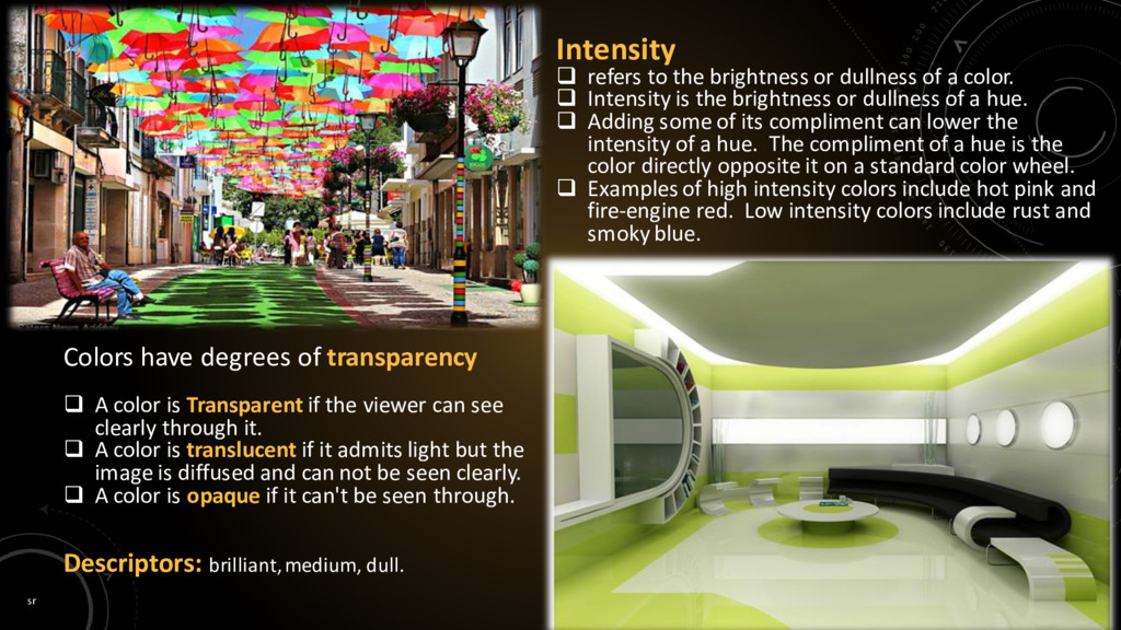
of a color. Intensity is the brightness or dullness of a hue. Adding some of its compliment can lower the intensity of a hue. The compliment of a hue is the color directly opposite it on a standard color wheel. Examples of high intensity colors include hot pink and fire-engine red. Low intensity colors include rust and smoky blue. A color is Transparent if the viewer can see clearly through it. A color is translucent if it admits light but the image is diffused and can not be seen clearly. A color is opaque if it can't be seen through. Colors have degrees of transparency Descriptors: brilliant, medium, dull.
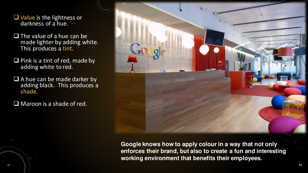
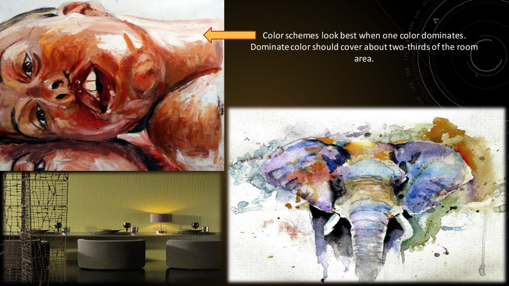
a hue. The value of a hue can be made lighter by adding white. This produces a tint. Pink is a tint of red, made by adding white to red. A hue can be made darker by adding black. This produces a shade. Maroon is a shade of red. Google knows how to apply colour in a way that not only enforces their brand, but also to create a fun and interesting working environment that benefits their employees.
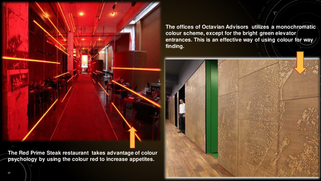
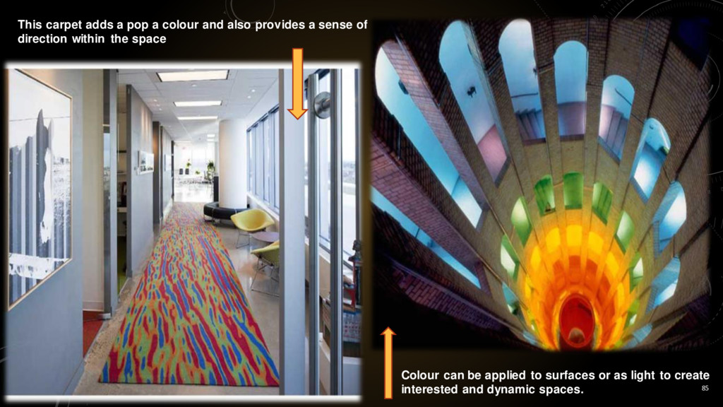
colour psychology by using the colour red to increase appetites. The offices of Octavian Advisors utilizes a monochromatic colour scheme, except for the bright green elevator entrances. This is an effective way of using colour for way finding.