Upgrade to Pro — share decks privately, control downloads, hide ads and more …

My approach to a component-based CSS

My approach to a component-based CSS

Slides to my talk at the c't conference in Cologne about my approach to a functional, component-based CSS architecture.

Mirjam Aulbach

February 07, 2019
Tweet

More Decks by Mirjam Aulbach

Other Decks in Programming

Transcript

  1. 3. Just don't write CSS CSS-in-JS: ... JSS & Styled

    Components & Emotion & Radium & ...
  2. We’re not designing pages, we’re designing systems of components.1 —

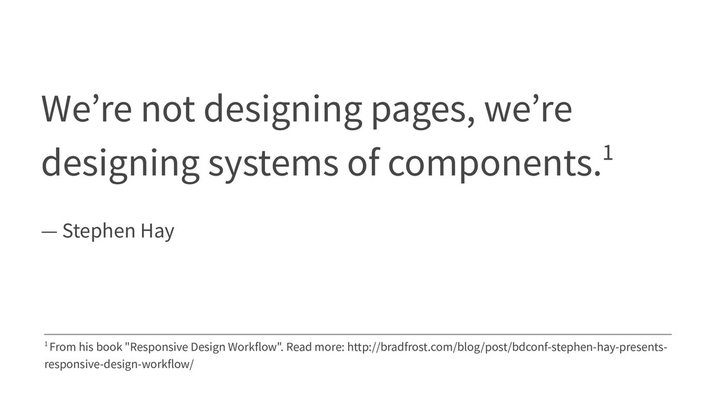
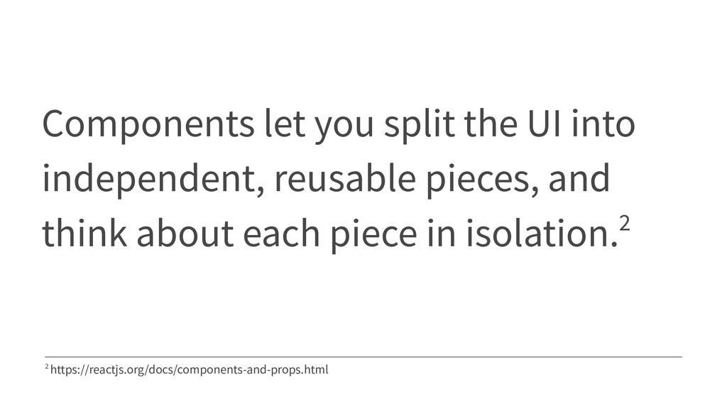
    Stephen Hay 1 From his book "Responsive Design Workflow". Read more: http://bradfrost.com/blog/post/bdconf-stephen-hay-presents- responsive-design-workflow/
  3. Components let you split the UI into independent, reusable pieces,

    and think about each piece in isolation.2 2 https://reactjs.org/docs/components-and-props.html
  4. Style every component separately • components are easily reusable •

    easy to delete components • no side-effects when adding or removing styles
  5. .component-one { position: relative; font-family: 'Fancy Font'; font-weight: 500; font-size:

    20px; color: var(--color-blue); margin-bottom: 2rem; padding: 1rem 1.5rem; background-color: var(--color-black); } .component-two { position: relative; font-family: 'Fancy Font'; font-weight: 700; font-size: 15px; color: var(--color-blue); margin-top: 2rem; padding: 1rem 1.5rem; background-color: var(--color-black); }
  6. .arial { font-family: Arial; } .font-1rem { font-size: 1rem; }

    .font-1.5rem { font-size: 1.5rem; } .font-color-primary { color: var(--color-primary) } .font-color-highlight { color: yellow; } <h2 class="font-1.5-rem font-color-primary arial">Headline</h2>
  7. First try: content-specific classes <p class="profil-lead"> I'm Mirjam and I'm

    a cat AND dog person! </p> .profil-lead { font-size: 150%; color: yellow; }
  8. Second try: style-specific classes <p class="text-highlight text-big"> I'm Mirjam and

    I'm a cat AND dog person! </p> .text-big { font-size: 150%; } .text-highlight { color: yellow; }
  9. My current approach for separation Basic general styles like: font

    styles, colors Utility (functional) classes repeating styles that can be used universally CSS Component Counterpart to our website component
  10. Basic - Characteristics • They are like a styleguide. •

    They tell you how your brand looks and behaves.
  11. :root { --font-headline: 'Domine', serif; --font-standard: 'Roboto', sans-serif; } html

    { font-size: 16px; } body { font-family: var(--font-standard); font-weight: 200; } h1,h2,h3,h4,h5,h6 { font-family: var(--font-headline); } .h1 { font-size: 3.5rem; }
  12. Utility - Characteristics • They help you with all styles

    you would write over and over again. • They support you - and your team! - with a consistent style.
  13. .display-flex { display: flex; } .display-inline-flex { display: inline-flex; }

    .flex-direction-row { flex-direction: row; } .flex-direction-column { flex-direction: column; } .text-center { text-align: center; } .text-left { text-align: left; }
  14. .margin-0 { margin: var(--spacer-0); } .margin-1 { margin: var(--spacer-1); }

    .margin-2 { margin: var(--spacer-2); } .padding-bottom-0 { padding-bottom: var(--spacer-0); } .padding-bottom-1 { padding-bottom: var(--spacer-1); } .padding-bottom-2 { padding-bottom: var(--spacer-2); }
  15. CSS Component - Characteristics • They determine the rules how

    a specific website component has to look like. • This component style will work in every place of the markup.
  16. .Button { display: inline-block; font-weight: 500; text-align: center; vertical-align: middle;

    border: 1px solid transparent; padding: 0.375rem 0.75rem; font-size: 1rem; line-height: 1.5; border-radius: 0.25rem; transition: color 0.15s ease-in-out, background-color 0.15s ease-in-out, border-color 0.15s ease-in-out, box-shadow 0.15s ease-in-out; } .Button:hover { border: 1px solid var(--color-black); } .Button.Button-primary { background-color: var(--color-primary); } .Button.Button-secondary { color: var(--color-white); background-color: var(--color-secondary); }
  17. .App { display: grid; width: 100%; min-height: 100vh; grid-template-columns: 1fr

    5fr 4fr 4fr 1fr; grid-template-rows: 1fr 5fr 0.5fr; grid-template-areas: "...... header header header ......" "...... sidebar content content ......." "footer footer footer footer footer"; } .App .App-header { grid-area: header; } .App .App-login-notice { grid-column: sidebar / content; } .App .App-note-options { grid-area: sidebar; } .App .App-note-section { grid-area: content / content; }
  18. 1. Use classes • use classes to define styles •

    use styles on elements very carefully • don't use IDs to style
  19. 2. Naming: consistent and clear • use speaking class names

    • use semantic class names • don't generate unexpected results (side effects) • mirror website components name
  20. Basic and Utility: Naming approach .text-lg { font-size: 150%; }

    .d-flex { display-flex; } .background-warning { background-color: var(--color-warning) } // ( ᐛ )و
  21. CSS Component: Naming approach .Quote { width: 75%; margin-left: auto;

    margin-right: auto; } .Quote .Quote-text { margin-top: 2rem; margin-bottom: 2rem; border-left: 10px solid var(--color-primary); padding-top: 1rem; padding-bottom: 1rem; padding-left: 2rem; font-size: 1.25rem; } .Quote .Quote-cite { font-style: italic; padding-left: 2rem; } .Quote .Quote-cite:before { content: '– '; }
  22. Compositions Use composition to define appearance. <div class="col-2 borderd border-dark

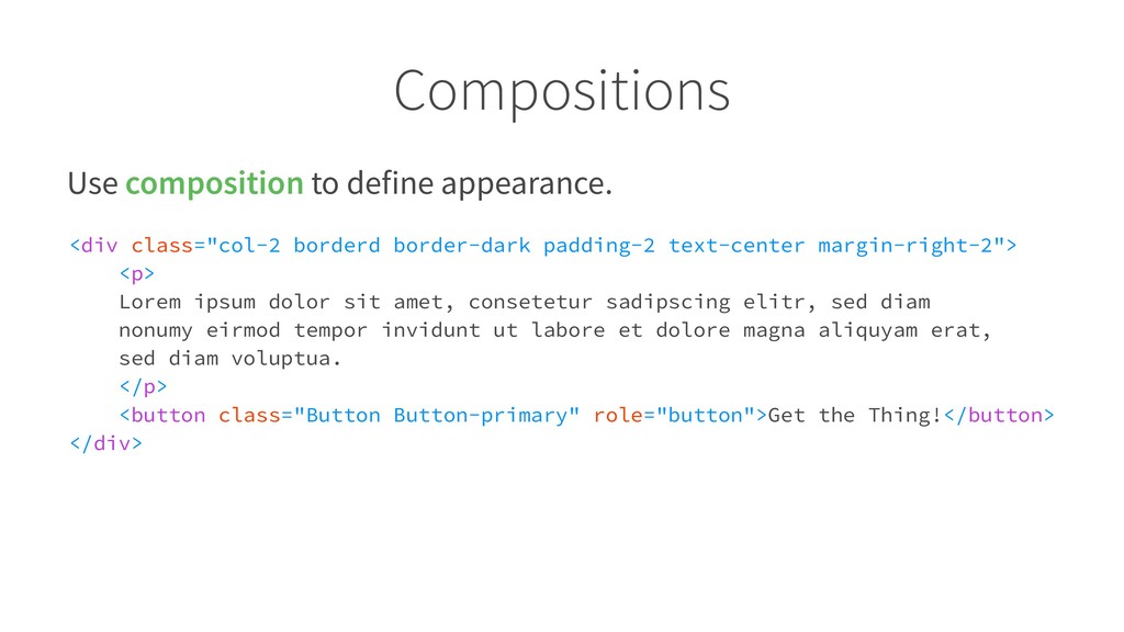
    padding-2 text-center margin-right-2"> <p> Lorem ipsum dolor sit amet, consetetur sadipscing elitr, sed diam nonumy eirmod tempor invidunt ut labore et dolore magna aliquyam erat, sed diam voluptua. </p> <button class="Button Button-primary" role="button">Get the Thing!</button> </div>
  23. Build CSS components when it's useful • its style can't

    be accomplished easily with utility and basic classes • it's is a piece of content • it will be used in the same manner at least thrice
  24. Build independent components Style components should only contain styles that

    define their unique appearance. They're independent from their environment. You should be able to put them anywhere in the markup.
  25. How to use it - summary • Use compositions •

    Duplication cheaper than wrong abstraction • Discipline
  26. Nest components, not styles Components can be nested in other

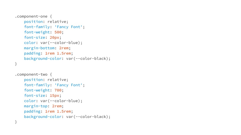
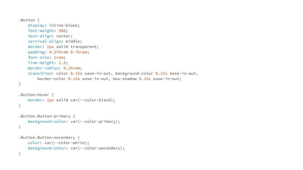
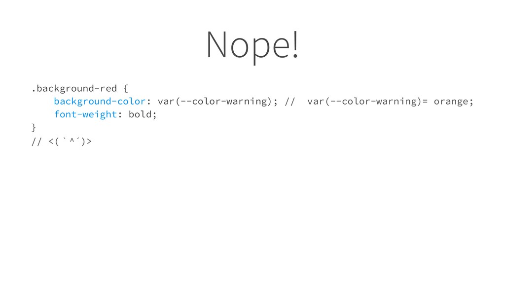
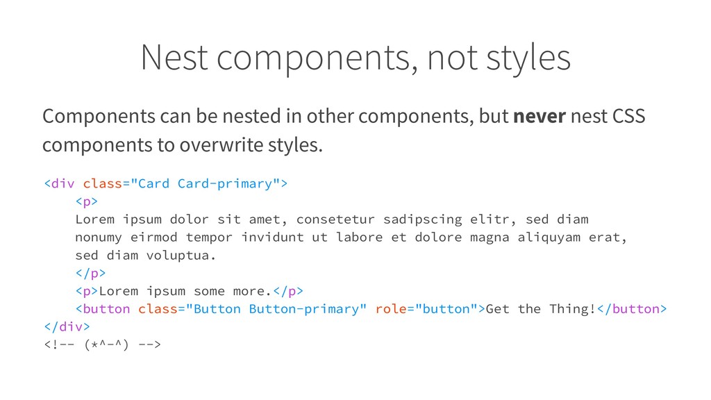
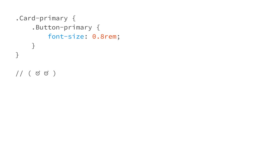
    components, but never nest CSS components to overwrite styles. <div class="Card Card-primary"> <p> Lorem ipsum dolor sit amet, consetetur sadipscing elitr, sed diam nonumy eirmod tempor invidunt ut labore et dolore magna aliquyam erat, sed diam voluptua. </p> <p>Lorem ipsum some more.</p> <button class="Button Button-primary" role="button">Get the Thing!</button> </div> <!-- (*^-^) -->
  27. My #LPT so far Don't write CSS on the side,

    think about an useful architecture.
  28. My #LPT so far Refactor early and o!en - we

    all know CSS grows rampart if you don't look at it for 5 minutes.
  29. My #LPT so far If you add the third variation

    of a style to a (dynamic) website component, think about creating a new one.