Upgrade to Pro — share decks privately, control downloads, hide ads and more …

Pretty Pictures Please - Hannah Aizenmann

Pretty Pictures Please - Hannah Aizenmann

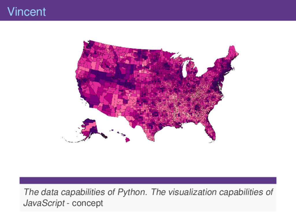
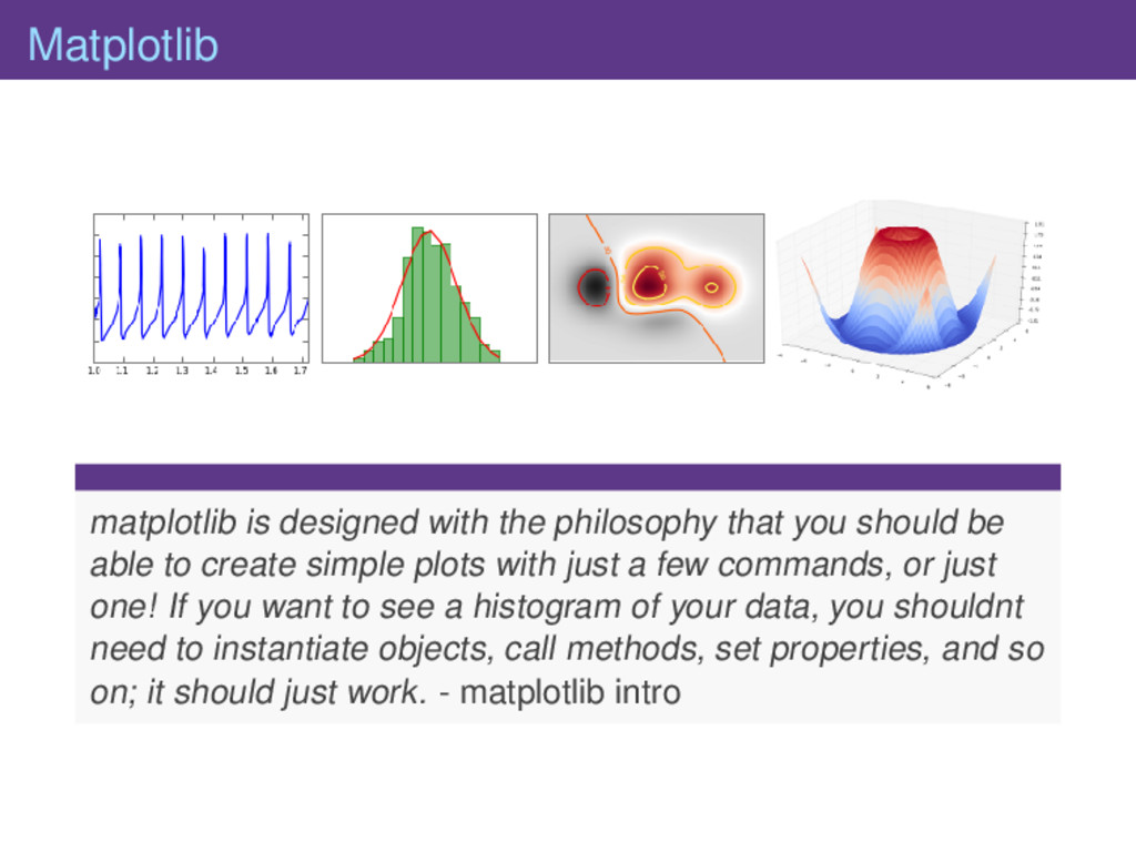
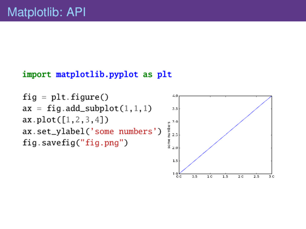
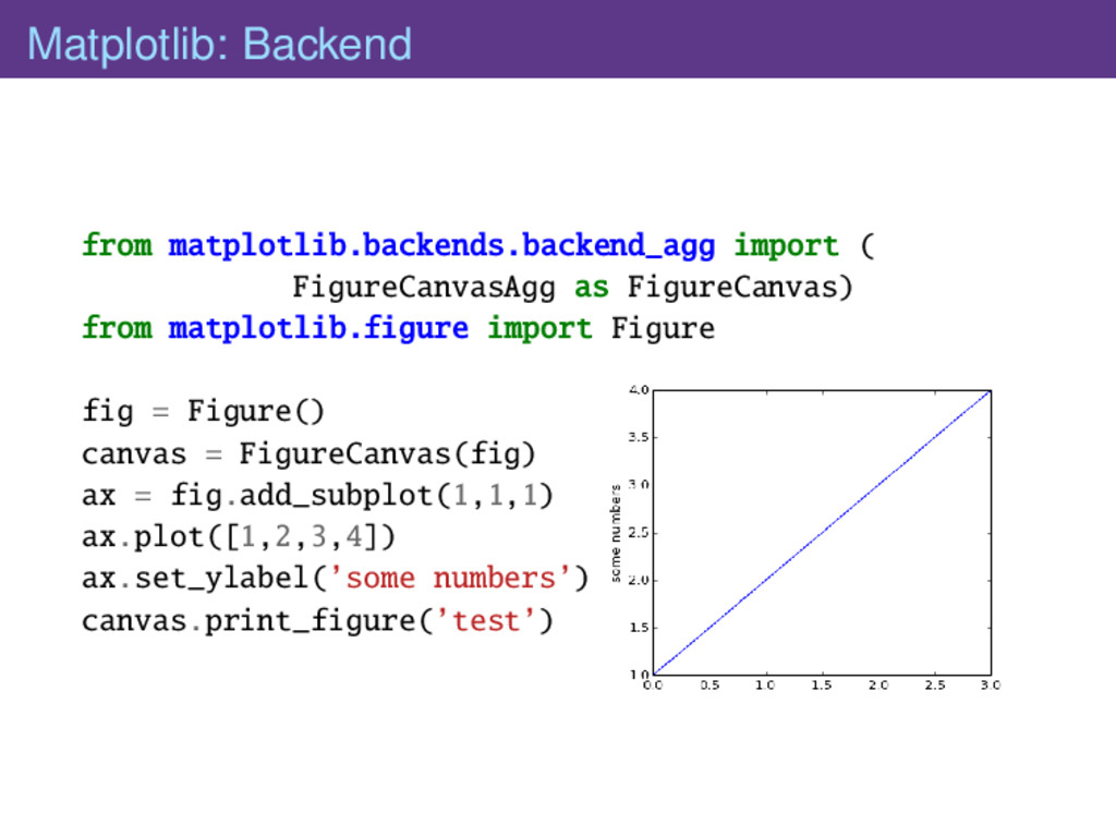
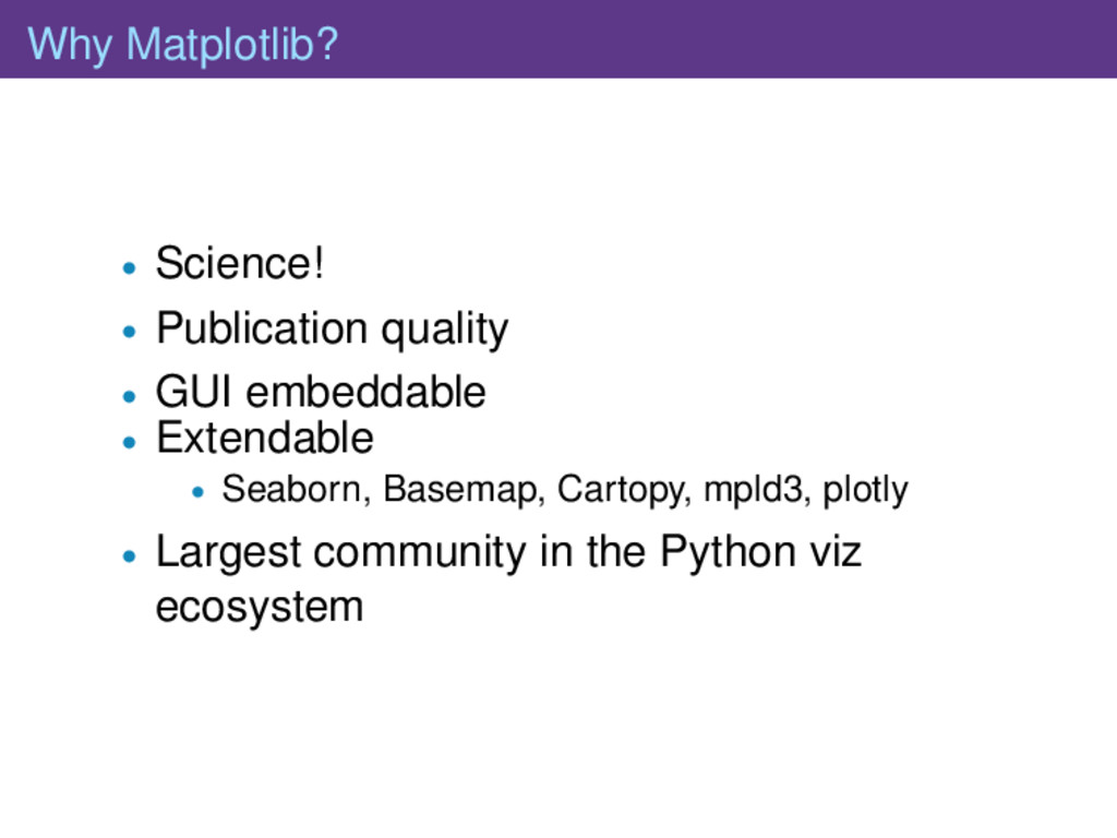
The Python visualization landscape has a couple of really great libraries for doing data visualization, but most everyone defaults to always using the same library for all their pictures. This talk will give an overview of the philosophies underpinning matplotlib, chaco, bokeh, vispy, vincent, and d3py and discuss what sort of applications each library is best suited for.

PyGotham 2014

August 17, 2014
Tweet

More Decks by PyGotham 2014

Other Decks in Programming

Transcript

  1. ggplot ggplot is not a good fit for people trying

    to make highly customized data visualizations. While you can make some very intricate, great looking plots, ggplot sacrifices highly customization in favor of generally doing ”what you’d expect”. - how it works
  2. Mayavi # Create the data. #..trunc # View it. from

    mayavi import mlab s = mlab.mesh(x, y, z) mlab.show()
  3. Vispy Vispy is a high-performance interactive 2D/3D data visualization library.

    Vispy leverages the computational power of modern Graphics Processing Units (GPUs) through the OpenGL library to display very large datasets....As of today (July 2014), using Vispy requires knowing OpenGL. - homepage
  4. vispy VERT_SHADER = """ // simple vertex shader attribute vec3

    a_position; void main (void) { gl_Position = vec4(a_position, 1.0);}""" FRAG_SHADER = """ // simple fragment shader uniform vec4 u_color; void main(){gl_FragColor = u_color;}""" class Canvas(app.Canvas): def __init__(self): app.Canvas.__init__(self, close_keys=’escape’) # Create program self._program = gloo.Program(VERT_SHADER, FRAG_SHADER) # Set uniform and attribute self._program[’u_color’] = 0.2, 1.0, 0.4, 1 self._program[’a_position’] = gloo.VertexBuffer(vPosition) def on_initialize(self, event): gloo.set_clear_color((1, 1, 1, 1)) def on_resize(self, event): width, height = event.size gloo.set_viewport(0, 0, width, height) def on_draw(self, event): gloo.clear() self._program.draw(’triangle_strip’)
  5. chaco Chaco is a plotting application toolkit. This means that

    it can build both static plots and dynamic data visualizations that let you interactively explore your data. - tutorial
  6. chaco class PlotExample(HasTraits): plot = Instance(Plot) traits_view = View(UItem(’plot’, editor=ComponentEditor()),

    width=400, height=400, resizable=True,) def __init__(self, index, series_a, **kw): super(PlotExample, self).__init__(**kw) plot_data = ArrayPlotData(index=index) plot_data.set_data(’series_a’, series_a) #...trunc self.plot = Plot(plot_data) self.plot.plot((’index’, ’series_a’), type=’bar’, bar_width=0.8, color=’auto’) #..trunc self.plot.value_range.low = 0 # replace the index values with some nicer labels #..trunc index = numpy.array([1,2,3,4,5]) demo = PlotExample(index, index*10, index*5, index*2) if __name__ == "__main__": demo.configure_traits()
  7. Bokeh however the main goal of Bokeh is to provide

    approachable capability for novel interactive visualizations in the browser. If you would like to have the benefits of HTML canvas rendering, dynamic downsampling, abstract rendering, server plot hosting, and the possibility of interacting from languages besides python, please consider Bokeh for your project. - Bokeh FAQ
  8. Bokeh import numpy as np from bokeh.plotting import * N

    = 100 x = np.linspace(0, 4*np.pi, N) y = np.sin(x) output_file("legend.html", title="legend.py example") figure(tools="pan,wheel_zoom, box_zoom,reset,previewsave,select") scatter(x, y, legend="sin(x)", name="legend_example") line(x, y, legend="sin(x)") line(x, 2*y, line_dash=[4, 4], line_color="orange", line_width=2, legend="2*sin(x)") square(x, 3*y, fill_color=None, line_color="green", legend="3*sin(x)") line(x, 3*y, fill_color=None, line_color="green", legend="3*sin(x)") show() # open a browser
  9. d3py You probably don’t want to stop reading here, though.

    Instead, you should go check out vincent which is a much nicer take on this idea, created using vega, and is in general a much more gentlemanly way to go about this sort of thing. It’s also being properly updated and developed, unlike the code below. - d3py
  10. Vincent cats = [’y1’, ’y2’, ’y3’, ’y4’] index = range(1,

    21, 1) multi_iter1 = {’index’: index} for cat in cats: multi_iter1[cat] = [random.randint(10, 100) for x in index] lines = vincent.Line( multi_iter1, iter_idx=’index’) lines.legend( title=’Categories’) lines.axis_titles( x=’Index’, y=’Data Value’)
  11. Matplotlib matplotlib is designed with the philosophy that you should

    be able to create simple plots with just a few commands, or just one! If you want to see a histogram of your data, you shouldnt need to instantiate objects, call methods, set properties, and so on; it should just work. - matplotlib intro
  12. Matplotlib: API import matplotlib.pyplot as plt fig = plt.figure() ax

    = fig.add_subplot(1,1,1) ax.plot([1,2,3,4]) ax.set_ylabel(’some numbers’) fig.savefig("fig.png")
  13. Matplotlib: Backend from matplotlib.backends.backend_agg import ( FigureCanvasAgg as FigureCanvas) from

    matplotlib.figure import Figure fig = Figure() canvas = FigureCanvas(fig) ax = fig.add_subplot(1,1,1) ax.plot([1,2,3,4]) ax.set_ylabel(’some numbers’) canvas.print_figure(’test’)
  14. seaborn If matplotlib tries to make easy things easy and

    hard things possible, seaborn aims to make a well-defined set of hard things easy too. - intro
  15. seaborn import seaborn as sns sns.set(style="ticks") df = sns.load_dataset( "anscombe")

    sns.lmplot("x", "y", col="dataset", hue="dataset", data=df, col_wrap=2, ci=None, palette="muted", size=4, scatter_kws={"s": 50, "alpha": 1})
  16. Basemap Basemap is geared toward the needs of earth scientists,

    particular oceanographers and meteorologists... Over the years, the capabilities of Basemap have evolved as scientists in other disciplines (such as biology, geology and geophysics) requested and contributed new features. - Jeff Whitaker (intro)
  17. Basemap ax = fig.add_subplot(1,1,1) m = Basemap(projection=’cyl’, ax=ax, resolution =

    ’l’, llcrnrlat=10,urcrnrlat=40, llcrnrlon=100,urcrnrlon=140) m.drawcoastlines(color=’.8’) m.drawcountries(color=’.8’) m.drawmapboundary(color=’.8’) m.drawrivers(color=’lightblue’, linewidth=.5) x, y = m(113.7333, 22.5333) m.scatter(x,y, s=50, c=’red’, zorder=100) ax.text(x+2, y, "Pearl")
  18. Cartopy Cartopy was originally developed at the UK Met Office

    to allow scientists to visualize their data on maps quickly, easily and most importantly, accurately. - intro
  19. Cartopy ax = fig.add_subplot(111, projection=cartopy.crs.PlateCarree()) ax.add_feature( cartopy.feature.LAND) ax.add_feature( cartopy.feature.OCEAN) ax.add_feature(

    cartopy.feature.COASTLINE) ax.add_feature( cartopy.feature.BORDERS, linestyle=’:’) ax.add_feature( cartopy.feature.LAKES, alpha=0.5) ax.add_feature( cartopy.feature.RIVERS) ax.set_extent([-20, 60, -40, 40])
  20. mpld3 The mpld3 project brings together Matplotlib, the popular Python-based

    graphing library, and D3js, the popular Javascript library for creating interactive data visualizations for the web. The result is a simple API for exporting your matplotlib graphics to HTML code - intro
  21. mpld3 scatter = ax.scatter(np.random.normal(size=100), np.random.normal(size=100), s=1000*np.random.random(size=100), c=np.random.random(size=100), alpha=0.3, cmap=plt.cm.jet) ax.grid(color=’white’,

    linestyle=’solid’) ax.set_title("Scatter Plot (with tooltips!)", size=20) labels = [’point {0}’.format(i + 1) for i in range(100)] tooltip = mpld3.plugins.PointLabelTooltip(scatter, labels=labels) mpld3.plugins.connect(fig, tooltip) mpld3.show()
  22. plotly import plotly.plotly as py py.sign_in(’story645’, ’abcd’) n = 50

    x,y,z,s,ew = np.random.rand(5, n) c, ec = np.random.rand(2, n, 4) area_scale, width_scale = 500, 5 fig, ax = plt.subplots() sc = ax.scatter(x, y, c=c, s=np.square(s)*area_scale, edgecolor=ec, linewidth=ew*width_scale) ax.grid() plot_url = py.plot_mpl(fig)
  23. Why Matplotlib? • Science! • Publication quality • GUI embeddable

    • Extendable • Seaborn, Basemap, Cartopy, mpld3, plotly • Largest community in the Python viz ecosystem
  24. Acknowledgments %99 of the figures, code and descriptions came from

    the various project’s pages, so thank you to all their authors and contributers for providing documentation and examples.