Upgrade to Pro — share decks privately, control downloads, hide ads and more …

Developing For All Screen Sizes

Developing For All Screen Sizes

WordCamp Chicago 2012

Rachel Baker

August 25, 2012
Tweet

More Decks by Rachel Baker

Other Decks in Programming

Transcript

  1. Developing
    for all
    screen
    sizes
    http://www.flickr.com/photos/kalexanderson/7698971490/

    View Slide

  2. Hi.
    My name is Rachel Baker.
    http://www.flickr.com/photos/isherwoodchris/7389146556/
    @rachelbaker

    View Slide

  3. http://bootstrapwp.rachelbaker.me

    View Slide

  4. http://bakedWP.com

    View Slide

  5. Relax.
    http://www.flickr.com/photos/kalexanderson/7741607008/

    View Slide

  6. What screen
    size can you
    target?
    http://www.flickr.com/photos/brad_frost/7387823392/

    View Slide

  7. “Good on-screen design targeting this caliber
    of display cannot embrace the pixel...”
    - John Gruber
    http://coding.smashingmagazine.com/2012/08/20/towards-retina-web/

    View Slide

  8. Text
    Everything
    is
    Relative.

    View Slide

  9. Mastering
    Media Queries
    http://www.flickr.com/photos/simononly/4926314162/

    View Slide

  10. Know Device Sizes
    http://nmsdvid.com/snippets/#

    View Slide

  11. content="width=device-
    width">
    content="width=device-
    width, initial-
    scale=1.0"> Forces same text size when orientation
    changes from landscape to portrait,
    BUT it leads to another bug.
    Mobile Friendly Meta

    View Slide

  12. @media (min-width : 480px) {
    .box {
    background:yellow;
    }
    }
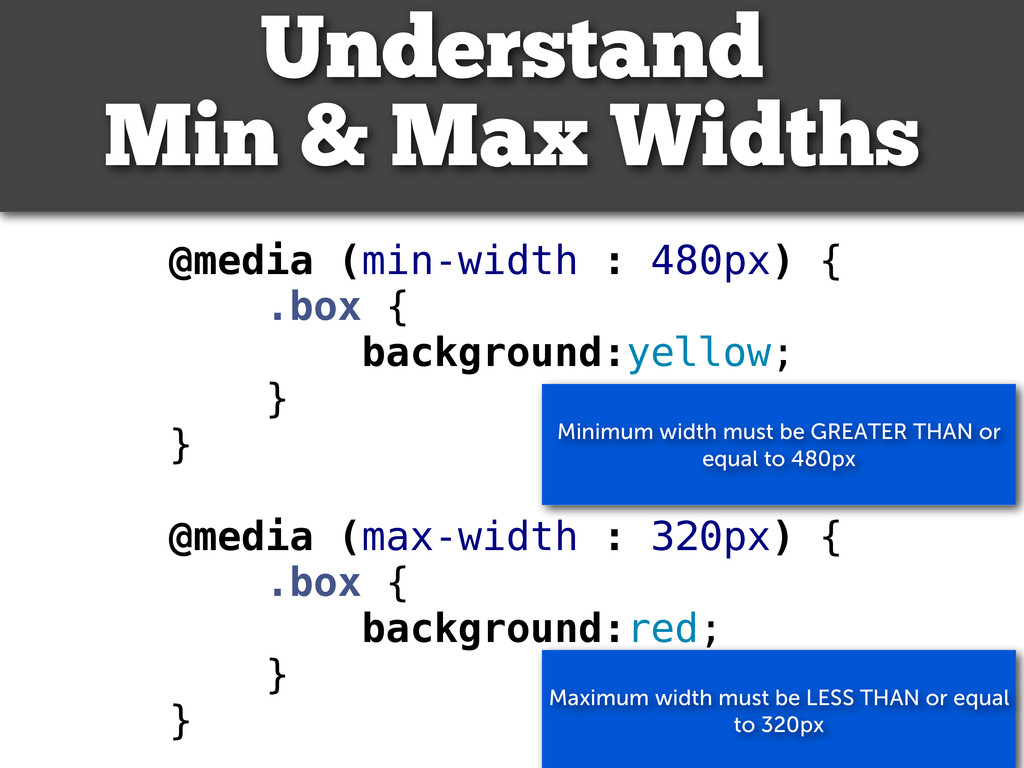
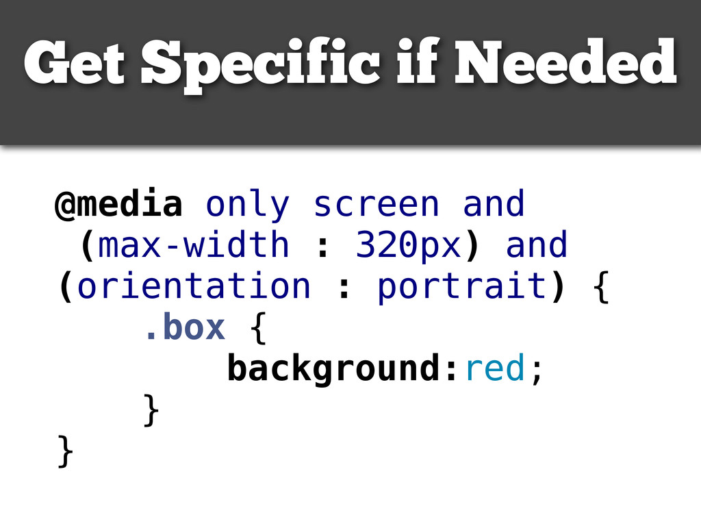
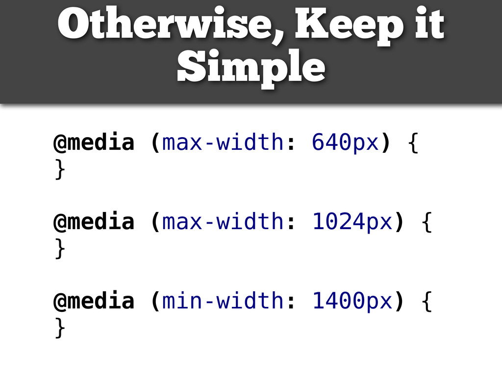
    @media (max-width : 320px) {
    .box {
    background:red;
    }
    }
    Understand
    Min & Max Widths
    Maximum width must be LESS THAN or equal
    to 320px
    Minimum width must be GREATER THAN or
    equal to 480px

    View Slide

  13. View Slide

  14. @media only screen and
    (max-width : 320px) and
    (orientation : portrait) {
    .box {
    background:red;
    }
    }
    Get Specific if Needed

    View Slide

  15. @media (max-width: 640px) {
    }
    @media (max-width: 1024px) {
    }
    @media (min-width: 1400px) {
    }
    Otherwise, Keep it
    Simple

    View Slide

  16. @media only screen and (-
    webkit-min-device-pixel-ratio:
    1.5),
    only screen and (min--moz-
    device-pixel-ratio: 1.5),
    only screen and (min-device-
    pixel-ratio: 1.5) {
    /* Image Styles */
    }
    But Don’t Forget About
    Retina Graphics

    View Slide

  17. “The most popular size is every size”
    -- Jeffery Zeldman
    The “Mobile
    First”
    philosophy.

    View Slide

  18. Take Command
    with jQuery
    http://www.flickr.com/photos/bobsfever/6741716051/

    View Slide

  19. Fix Mobile Safari
    Zoom Bug
    See Demo: http://scottjehl.github.com/iOS-
    Orientationchange-Fix/

    View Slide

  20. Forces same text size when orientation
    changes from landscape to portrait
    Getting Along with
    Older Browsers.

    View Slide

  21. Forces same text size when orientation
    changes from landscape to 
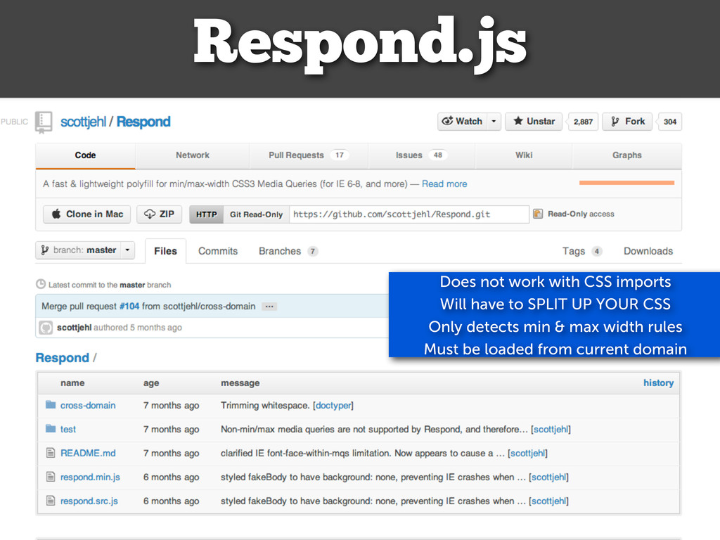
portrait
    Respond.js
    Does not work with CSS imports
    Will have to SPLIT UP YOUR CSS
    Only detects min & max width rules
    Must be loaded from current domain

    View Slide

  22. Use a Preproccesor

    View Slide

  23. Adjust
    Navigation.

    View Slide

  24. Forces same text size when orientation
    changes from landscape to portrait
    TinyNav.js
    Does not work with CSS imports
    Only detects min & max width rules
    Must be loaded from current domain

    View Slide

  25. Forces same text size when orientation
    changes from landscape to portrait
    HorizontalNav.js
    Does not work with CSS imports
    Only detects min & max width rules
    Must be loaded from current domain

    View Slide

  26. 18
    19
    20
    21
    22
    23
    24
    jQuery(document).ready(function($) {
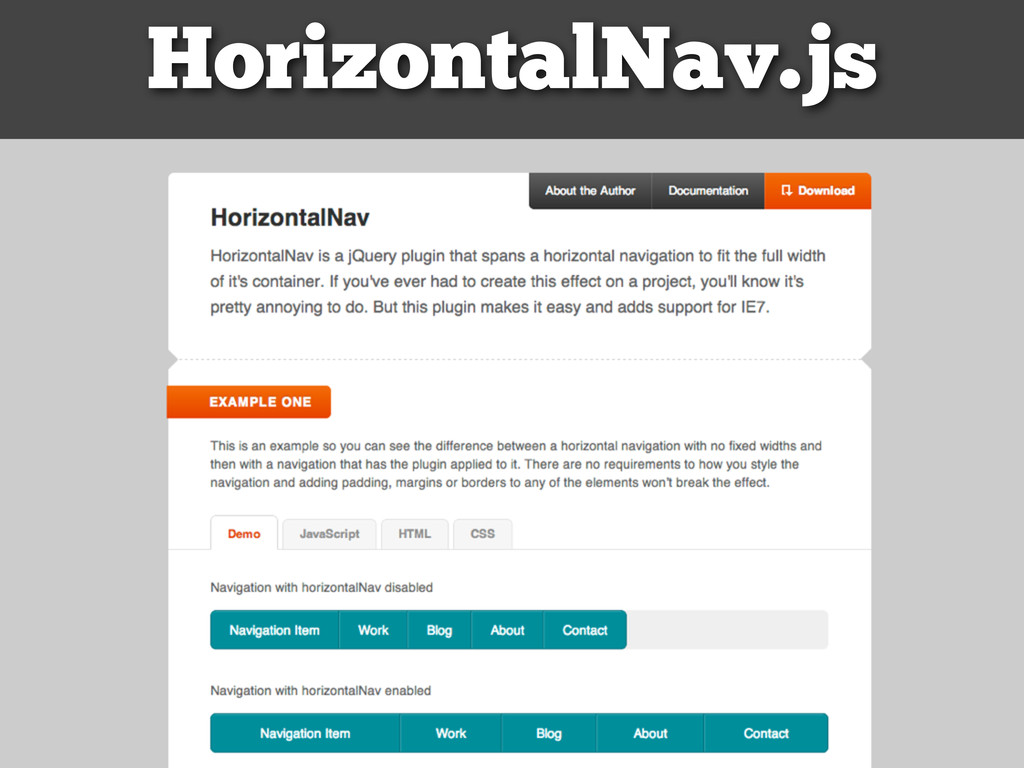
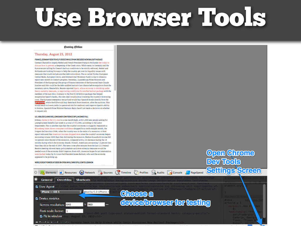
    // loading responsive nav
    $('#access .menu').Touchdown();
    // media query event handler
    if (matchMedia) {
    var responsiveViewport = window.matchMedia("(min-width: 769px)");
    responsiveViewport.addListener(WidthChange);
    WidthChange(responsiveViewport);
    }
    // media query change
    function WidthChange(responsiveViewport) {
    if (responsiveViewport.matches) {
    // window width is at least 769px
    $('#access .menu').horizontalNav({});
    /* load anything else you like */
    }
    else {
    // window width is less than 769px
    }
    }
    })(window.jQuery);
    Conditionally Use Scripts
    https://gist.github.com/3453300

    View Slide

  27. Scale
    Images
    and
    Videos.

    View Slide

  28. Scale Videos
    http://fitvidsjs.com/

    View Slide

  29. Scale Images
    https://github.com/stowball/jQuery-rwdImages
    For a more robust solution check out
    the PHP solution: Adaptive Images (http://
    adaptive-images.com/)

    View Slide

  30. Serve High Resolution
    Images to Retina
    Displays
    http://retinajs.com/

    View Slide

  31. Testing.
    http://www.flickr.com/photos/activars/5251722610/

    View Slide

  32. Use Browser Tools

    View Slide

  33. Matt Kersley’s
    Testing Tool
    Also check out Responsinator
    http://www.responsinator.com/
    http://mattkersley.com/responsive/

    View Slide

  34. http://www.flickr.com/photos/activars/5251722610/
    When All Else
    Fails.
    http://www.flickr.com/photos/fhke/3342905901/

    View Slide

  35. Load a Completely
    Different Theme!
    https://gist.github.com/3454745
    class UnpluggedMobile{
    var $unplugged;
    function UnpluggedMobile(){
    $this->unplugged = false;
    add_action('plugins_loaded',array(&$this,'detectunplugged'));
    add_filter('stylesheet',array(&$this,'get_stylesheet'));
    add_filter('template',array(&$this,'get_template'));
    }
    function detectunplugged($query){
    if(preg_match('/(alcatel|amoi|android|avantgo|blackberry|benq|cell|cricket|docomo|elaine|htc|iemobile|iphone|ipad|ipaq|ipod|j2me|
    java|midp|mini|mmp|mobi|motorola|nec-|nokia|palm|panasonic|philips|phone|sagem|sharp|sie-|smartphone|sony|symbian|t-mobile|telus|up
    \.browser|up\.link|vodafone|wap|webos|wireless|xda|xoom|zte)/i', $_SERVER['HTTP_USER_AGENT'])) {
    $this->unplugged = true;
    }
    }
    function get_stylesheet($stylesheet) {
    if($this->unplugged){
    return 'unplugged-mobile-theme';
    }else{
    return $stylesheet;
    }
    }
    function get_template($template) {
    if($this->unplugged){
    return 'unplugged-mobile-theme';
    }else{
    return $template;
    }
    }
    }
    $wp_unplugged = new UnpluggedMobile();

    View Slide

  36. Thank
    you.
    Questions?

    View Slide