Upgrade to Pro
— share decks privately, control downloads, hide ads and more …
Speaker Deck
Features
Speaker Deck
PRO
Sign in
Sign up for free
Search
Search
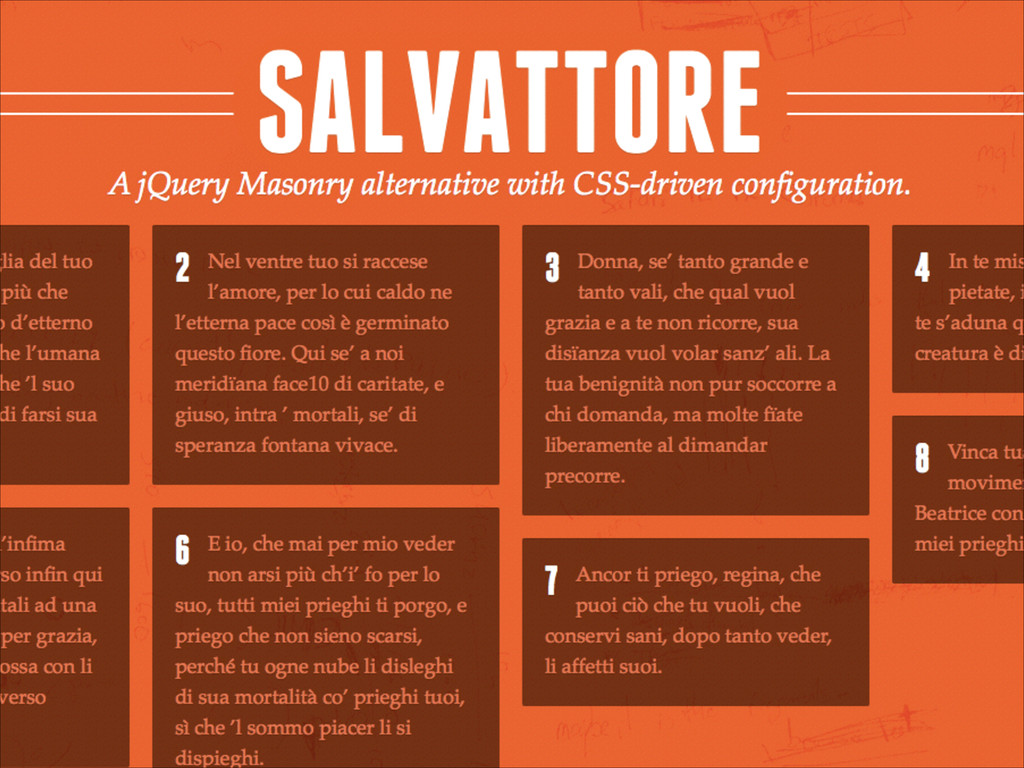
Salvattore
Search
Rolando Murillo
October 26, 2013
Design
63
0
Share
Embed
Copy iframe code
Copy JS code
Copy link
Start on current slide
Salvattore
Presented today at Startech by Giorgio Leveroni.
Rolando Murillo
October 26, 2013
Other Decks in Design
See All in Design
開発・制作におけるUI・UXデザインの重要性について~UI・UXデザインってなんだろう~
yamasaku
0
140
JBUG大阪#9_登壇資料_引き継ぎで困らないためのBacklogWikiの整え方_ミスと属人化を防ぐために、 “次の人が動ける状態”をどう残すか
webnaut
1
190
「使いやすさ」だけでは、「勝てる」サービスにはならない。〜KPIとUXの分断を埋める、サービス戦略という「指針」〜
nbkouhou
2
490
TUNAG BOOK 2024
stmn
PRO
0
1.6k
decksh object reference
ajstarks
2
1.7k
Figma MCPを活用するためのデザインハンドブック
vivion
8
19k
速く作れるかではなく、速く学べるか ― 学習ループを回すパイロットの途中報告
nagata03
0
550
富山デザイン勉強会_デザイントレンド2026.pdf
keita_yoshikawa
3
270
kintone開発におけるライターの役割の変化〜AI活用を添えて〜 / Changes in the Role of Writers in Kintone Development
keroyama
0
140
hicard_credential_202601
hicard
0
260
Mandalyn_DT5001_FinalAssignment.pdf
lynteo
0
240
「ツール」から「パートナー」へ。AI伴走時代のUXデザインとは?~操作を減らし、成果を最大にするための設計~
ncdc
1
700
Featured
See All Featured
Everyday Curiosity
cassininazir
0
250
Visual Storytelling: How to be a Superhuman Communicator
reverentgeek
2
590
How to build an LLM SEO readiness audit: a practical framework
nmsamuel
1
800
職位にかかわらず全員がリーダーシップを発揮するチーム作り / Building a team where everyone can demonstrate leadership regardless of position
madoxten
63
55k
Digital Projects Gone Horribly Wrong (And the UX Pros Who Still Save the Day) - Dean Schuster
uxyall
1
2k
Navigating the Design Leadership Dip - Product Design Week Design Leaders+ Conference 2024
apolaine
1
370
CoffeeScript is Beautiful & I Never Want to Write Plain JavaScript Again
sstephenson
162
16k
世界の人気アプリ100個を分析して見えたペイウォール設計の心得
akihiro_kokubo
PRO
72
40k
A Modern Web Designer's Workflow
chriscoyier
698
190k
How to Create Impact in a Changing Tech Landscape [PerfNow 2023]
tammyeverts
55
3.4k
コードの90%をAIが書く世界で何が待っているのか / What awaits us in a world where 90% of the code is written by AI
rkaga
62
45k
Stop Working from a Prison Cell
hatefulcrawdad
274
21k
Transcript
None
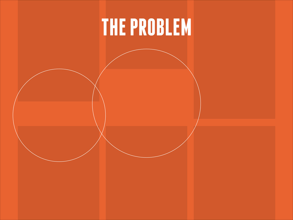
THE PROBLEM
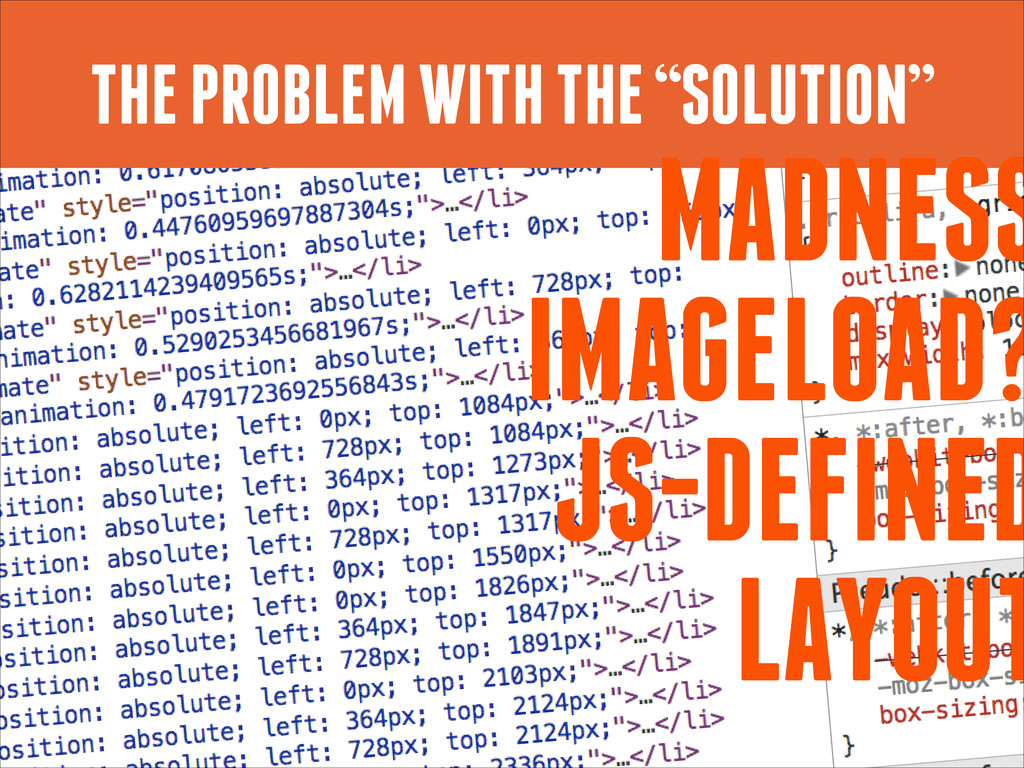
THE “SOLUTION”
THE PROBLEM WITH THE “SOLUTION” MADNESS IMAGELOAD? JS-DEFINED LAYOUT
None
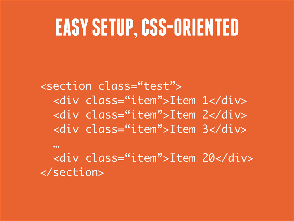
EASY SETUP, CSS-ORIENTED <section class=“test”> <div class=“item”>Item 1</div> <div class=“item”>Item
2</div> <div class=“item”>Item 3</div> … <div class=“item”>Item 20</div> </section>
EASY SETUP, CSS-ORIENTED <div class=“item”> Item 1 </div> <div class=“item”>
Item 2 </div> <div class=“item”> Item 3 </div> <div class=“item”> Item 4 </div> <div class=“item”> Item 5 </div> <div class=“item”> Item 6 </div>
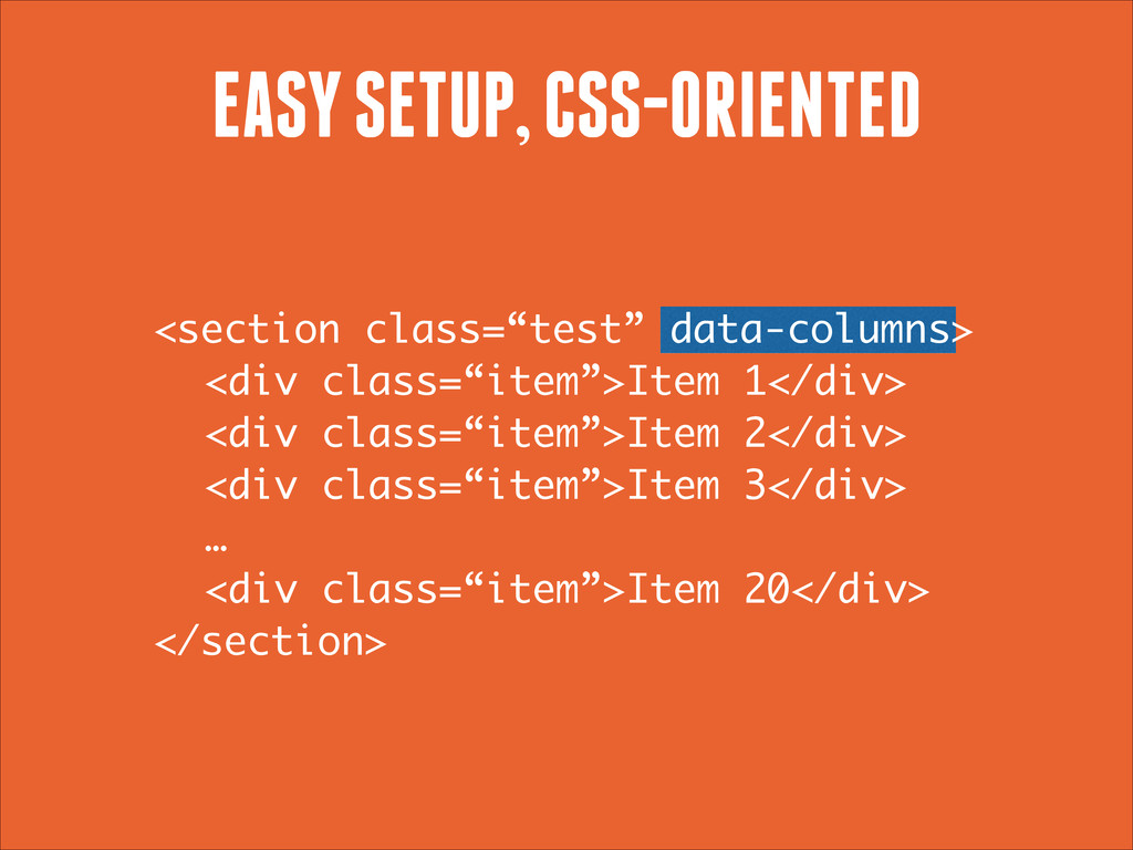
EASY SETUP, CSS-ORIENTED <section class=“test” data-columns> <div class=“item”>Item 1</div> <div
class=“item”>Item 2</div> <div class=“item”>Item 3</div> … <div class=“item”>Item 20</div> </section>
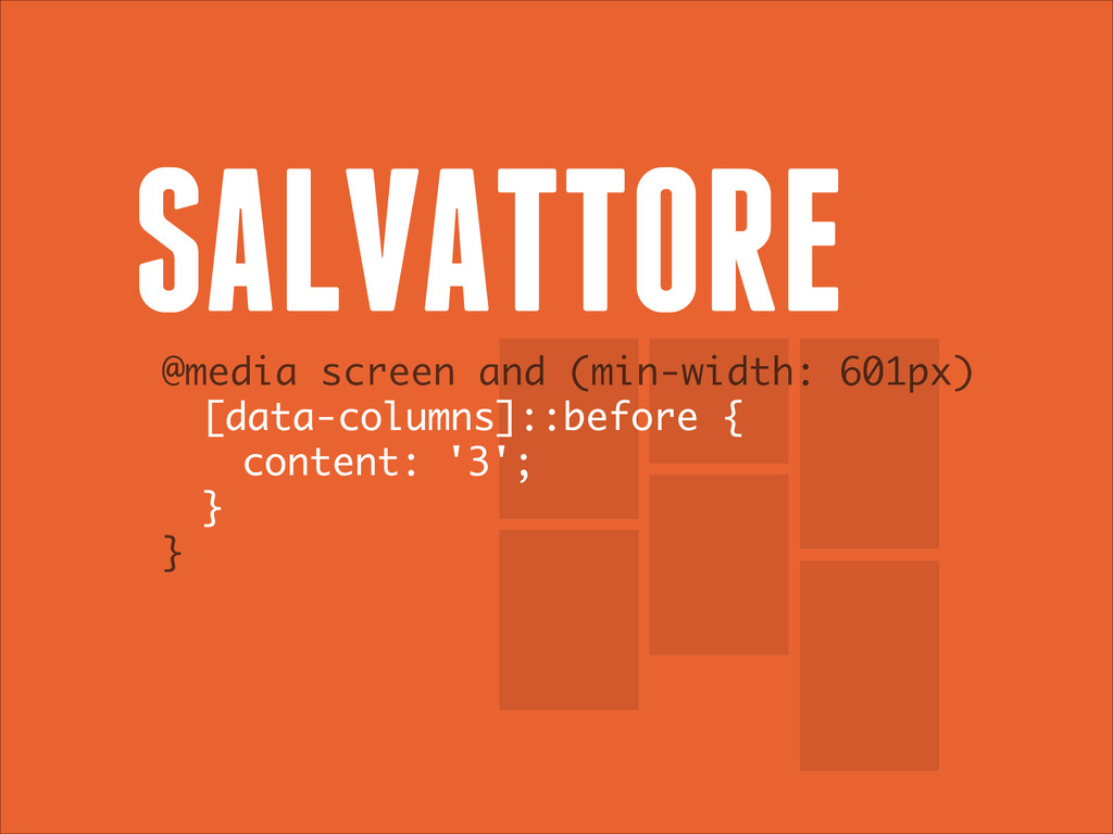
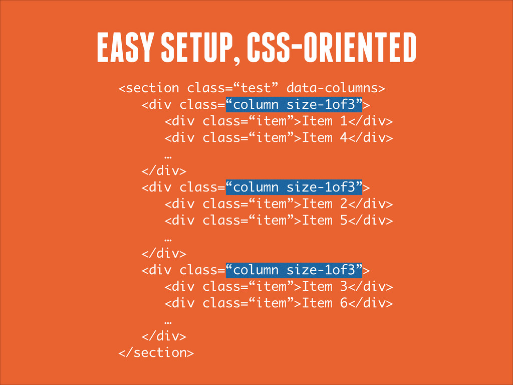
.test[data-columns]::before { content: ‘3 .column.size-1of3’ } EASY SETUP, CSS-ORIENTED .column
{ float: left; } .size-1of3 { width: 33.333%; }
<section class=“test” data-columns> <div class=“column size-1of3”> <div class=“item”>Item 1</div> <div
class=“item”>Item 4</div> … </div> <div class=“column size-1of3”> <div class=“item”>Item 2</div> <div class=“item”>Item 5</div> … </div> <div class=“column size-1of3”> <div class=“item”>Item 3</div> <div class=“item”>Item 6</div> … </div> </section> EASY SETUP, CSS-ORIENTED
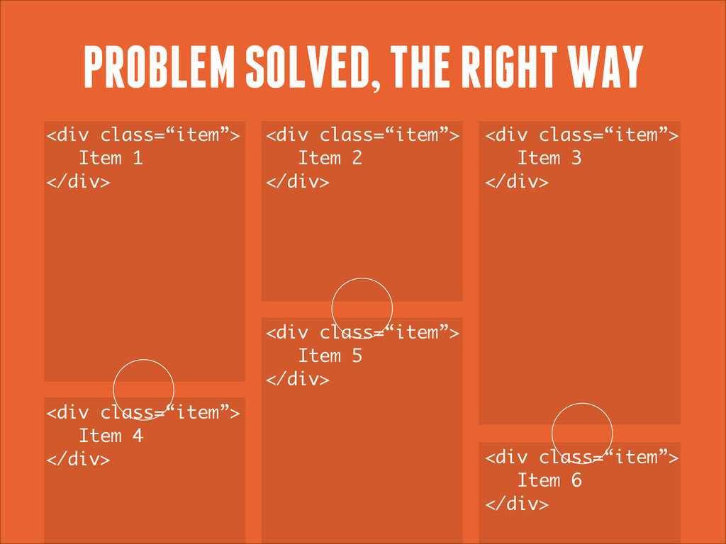
PROBLEM SOLVED, THE RIGHT WAY <div class=“item”> Item 1 </div>
<div class=“item”> Item 2 </div> <div class=“item”> Item 3 </div> <div class=“item”> Item 4 </div> <div class=“item”> Item 5 </div> <div class=“item”> Item 6 </div>
@media screen and (min-width: 481px) and .test[data-columns]::before { content: ‘2
.column.size-1of2’ } } @media screen and (min-width: 601px) and .test[data-columns]::before { content: ‘3 .column.size-1of3’ } } MEDIA QUERIES COMPATIBLE
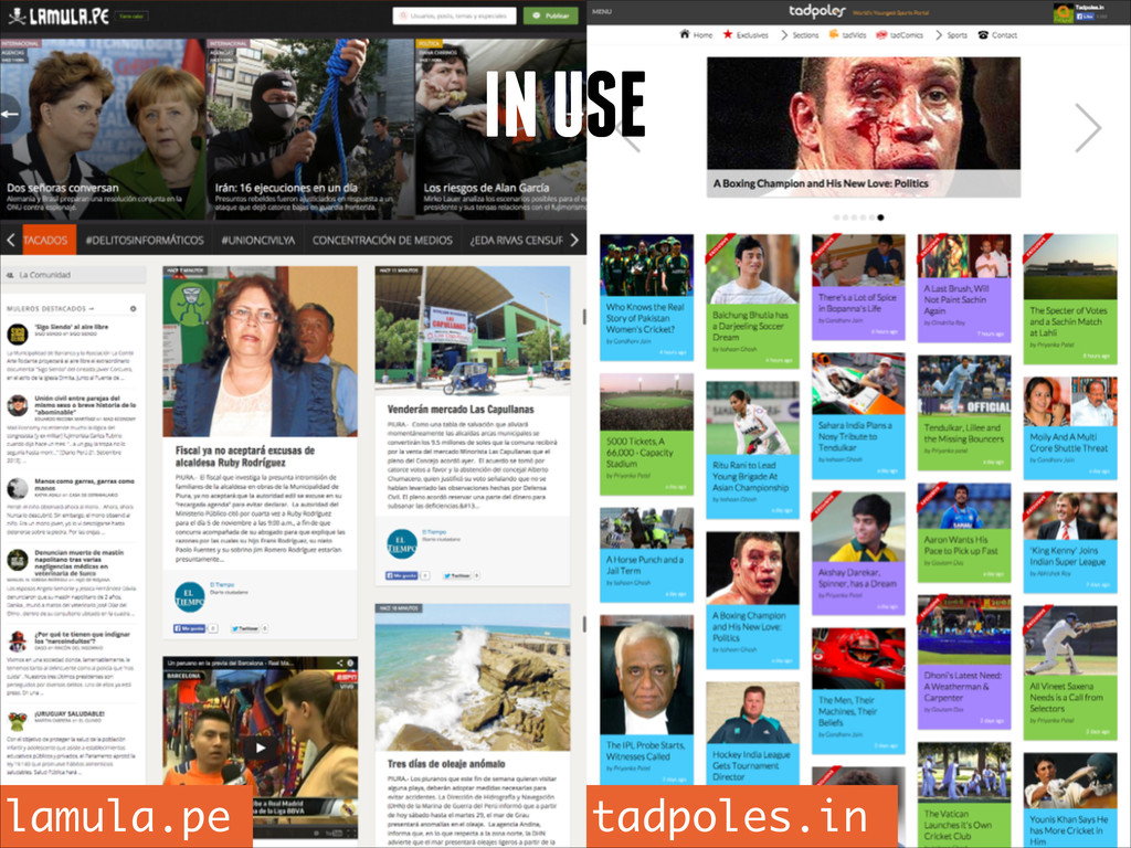
IN USE lamula.pe tadpoles.in
GIVE IT A TRY salvattore.com by @rnmp and @ppold
 yamasaku
 webnaut
 nbkouhou
 stmn
stmn
 ajstarks
 vivion
 nagata03
 keita_yoshikawa
 keroyama
 hicard
 lynteo
 ncdc
ncdc
 cassininazir
 reverentgeek
 nmsamuel
 madoxten
 uxyall
 apolaine
 sstephenson
 akihiro_kokubo
 chriscoyier
 tammyeverts
 rkaga
rkaga
 hatefulcrawdad
![.test[data-columns]::before { content: ‘3 .column.size-1of3’ } EASY SETUP, CSS-ORIENTED .column](https://files.speakerdeck.com/presentations/20f8ca5020950131063f72abddee51e1/slide_8.jpg)
![@media screen and (min-width: 481px) and .test[data-columns]::before { content: ‘2](https://files.speakerdeck.com/presentations/20f8ca5020950131063f72abddee51e1/slide_11.jpg)