Upgrade to Pro — share decks privately, control downloads, hide ads and more …

Accessible Information Architecture

Sarah Auvil
March 14, 2016

Accessible Information Architecture

An IA talk on how to feel more confident about organizing your app, knowing how interactions should work with some tidbits on user psychology.

Sarah Auvil

March 14, 2016
Tweet

Other Decks in Design

Transcript

  1. The Problem “Nothing has plagued humanity through the ages more

    than the simple problem of getting from here to there.” - Jared Spool
  2. Familiar Scenario? “Should the product page go here or here?”

    “Um…I think either way would work.”
  3. Where this stems from: - We tend to design and

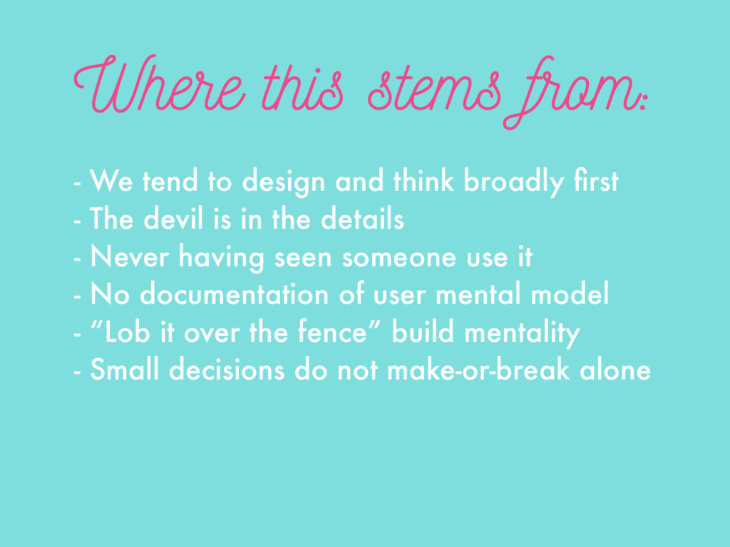
    think broadly first - The devil is in the details - Never having seen someone use it - No documentation of user mental model - “Lob it over the fence” build mentality - Small decisions do not make-or-break alone
  4. Focus on the Tasks The key to a successful navigation

    system is a clear understanding of what your users are trying to accomplish. 1. 2. 3. 4. 5.
  5. Navigation is for Tasks Even informational content is task based.

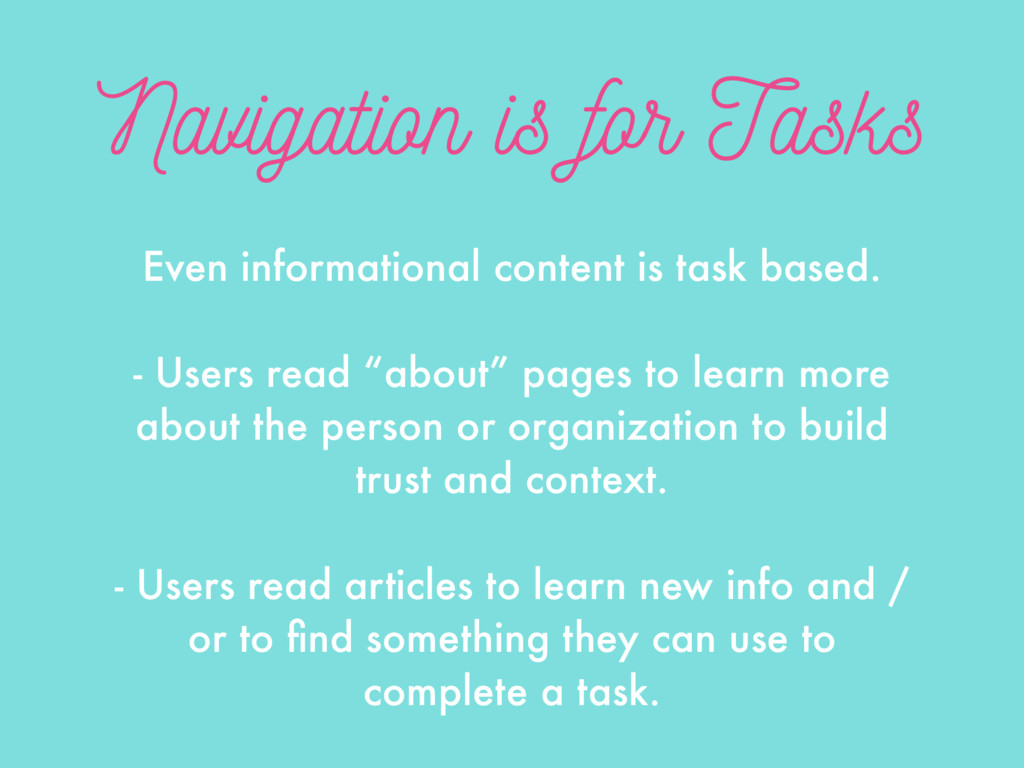
    - Users read “about” pages to learn more about the person or organization to build trust and context. - Users read articles to learn new info and / or to find something they can use to complete a task.
  6. Flat or Deep? Flat works well for small navigation systems

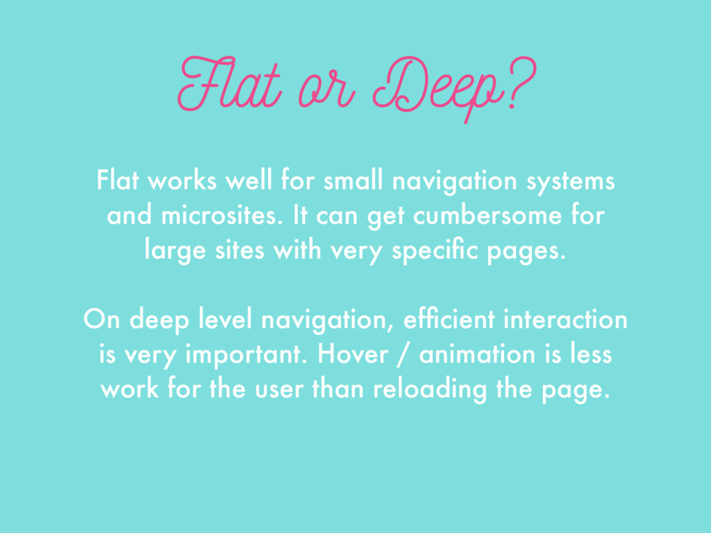
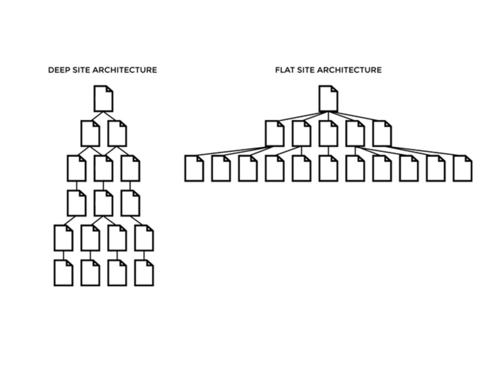
    and microsites. It can get cumbersome for large sites with very specific pages. On deep level navigation, efficient interaction is very important. Hover / animation is less work for the user than reloading the page.
  7. Discovery or Shortcuts? “You need to be able to learn

    it. You need to be able to discover stuff in it. The whole features of your application will live or die by whether or not users find them in the navigation.” - Hagan Rivers
  8. The Answer Not much. 7-27% of users looked at a

    sitemap when asked to learn about the site’s navigation structure.
  9. Why Use Them? - Search engines - Accessibility - Aren’t

    a big effort - Some do use them - No harm to others - Can provide context
  10. Card Sorting This discovery activity to find out how your

    users think about things is really easy - all you need is something to write with, notecards or sticky notes. products orders
  11. Open Card Sort “Open” card sorts mean you show the

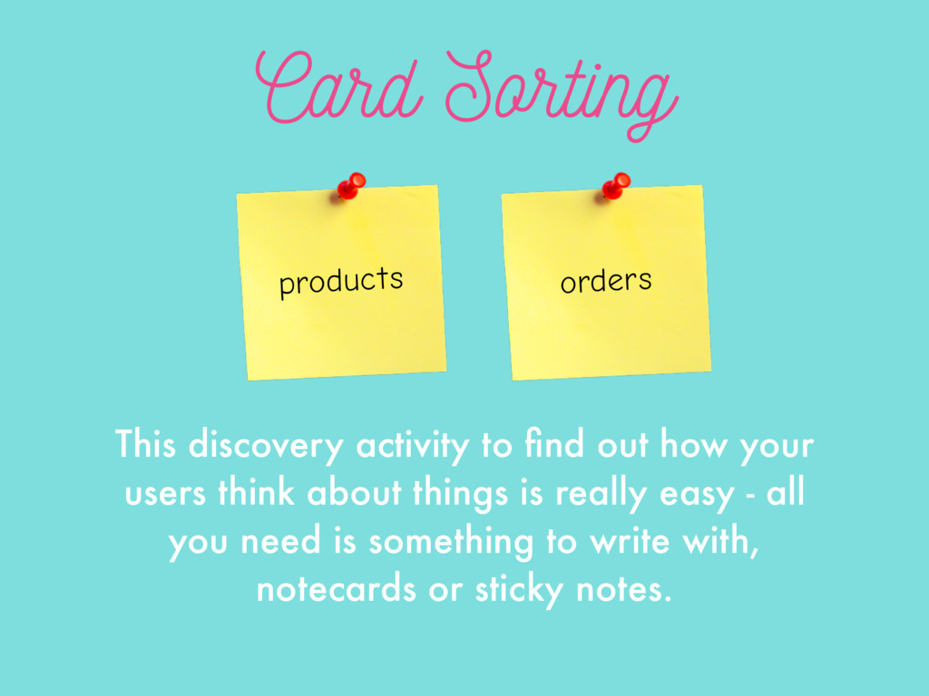
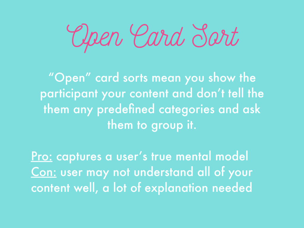
    participant your content and don’t tell the them any predefined categories and ask them to group it. Pro: captures a user’s true mental model Con: user may not understand all of your content well, a lot of explanation needed
  12. Closed Card Sort “Closed” means you already have the categories

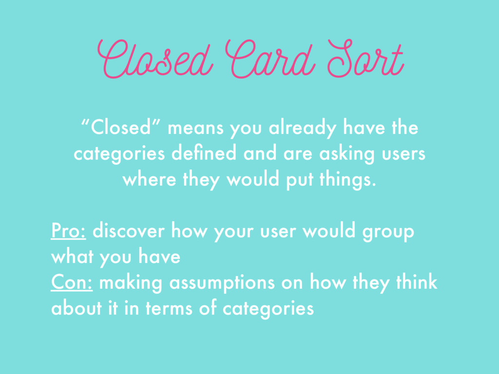
    defined and are asking users where they would put things. Pro: discover how your user would group what you have Con: making assumptions on how they think about it in terms of categories
  13. Conducting + Findings You’re looking for patterns, not to have

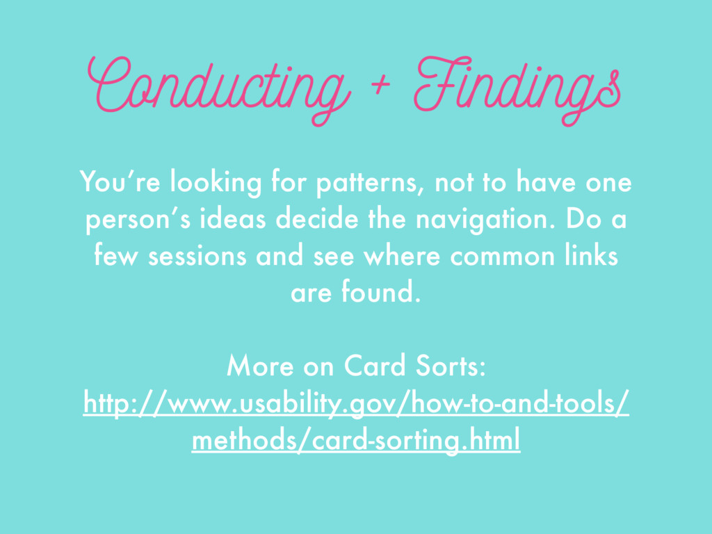
    one person’s ideas decide the navigation. Do a few sessions and see where common links are found. More on Card Sorts: http://www.usability.gov/how-to-and-tools/ methods/card-sorting.html
  14. Check yoself If you get these questions during a card

    sort, you should probably re-evaluate things. “What does that mean?” “Why would someone need to see that?”
  15. Need Content of Value Caveat: there’s no navigational replacement for

    product value. Efficient travel from A to B is useless if no one cares about B.
  16. Mindless Choices “It doesn’t matter how many times I have

    to click, as long as each click is a mindless, unambiguous choice.” - Steve Krug’s 2nd Law of Usability
  17. Bad at Multitasking Cognitive performance greatly slows in these two

    scenarios: - Trying to do multiple tasks at once (50%) - Switching between tasks (40%)
  18. How Memory Works Practice: how many times it has been

    used in the past Recency: how recently it has been used Context: what is present in the person’s focus of attention
  19. Attentional Blink Attentional blink is the inability to notice a

    second visual target in close proximity to the first visual cue. For half a second, your brain is functionally blind.
  20. Change Blindness Change blindness is the tendency to overlook visual

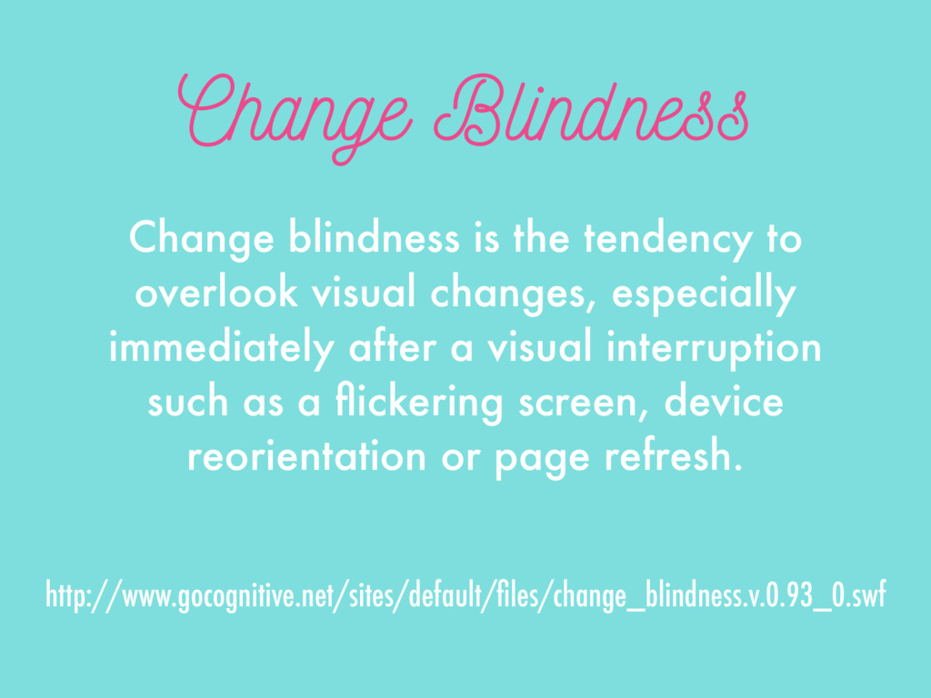
    changes, especially immediately after a visual interruption such as a flickering screen, device reorientation or page refresh. http://www.gocognitive.net/sites/default/files/change_blindness.v.0.93_0.swf
  21. Eliminate Distractions Human brains are great at ignoring and filtering

    out information. This helps us accomplish tasks better and not get distracted by things in the way.
  22. Doing Navigation First “Designing your navigation system first is like

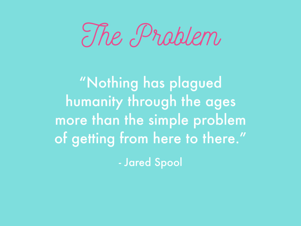
    installing the elevator before knowing how many floors the building will have. Without knowing the inner workings of your app, you can’t possibly know the optimal path to guide your users through it.” - Jared Spool
  23. Getting Cute Research shows calling the shopping cart something else

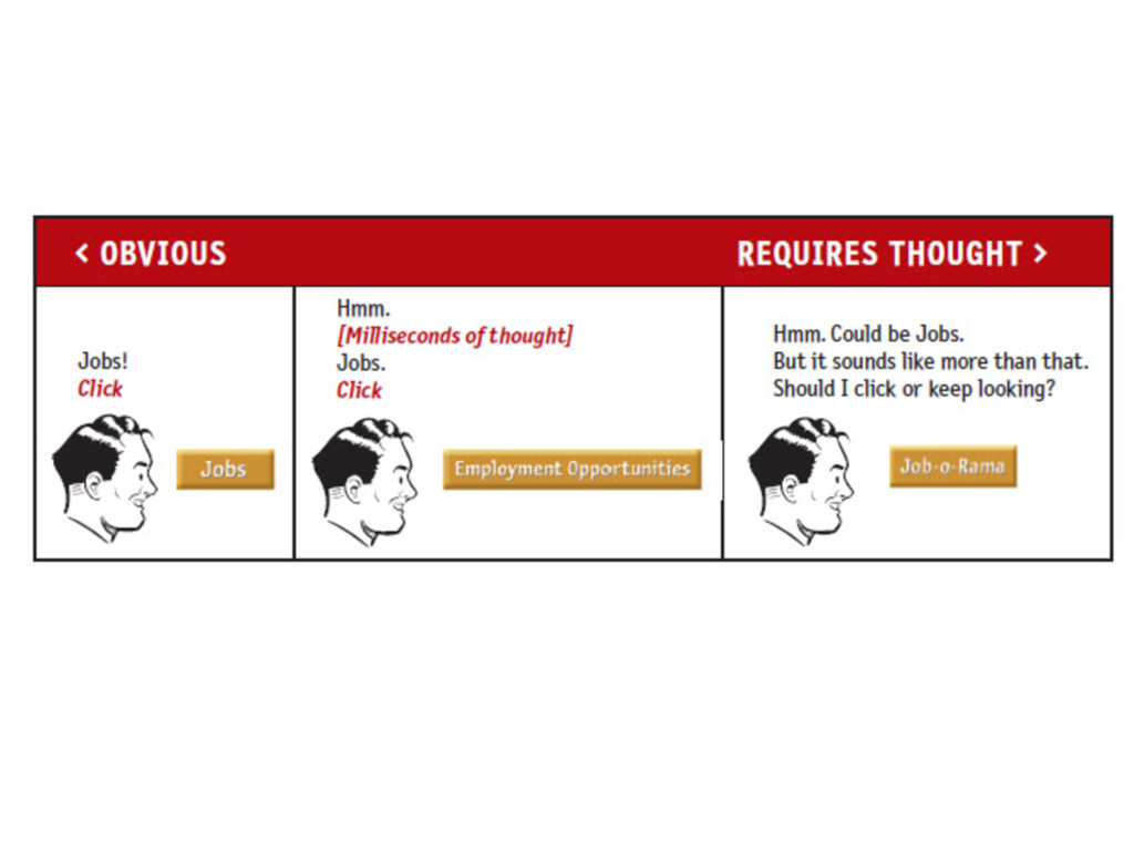
    creates longer search times and user confusion. Designers and businesses want to be creative, but for usability, using standard designs actually can be better, because…
  24. Jakob’s Laws 1. Users spend most of their time on

    other websites 2. Users have several thousand times more experience with standard GUI controls than with any individual new design
  25. Unclear Naming Using a phrase for a label that’s not

    clear what content will appear can create problems. Listen to what your users call it and stick to the simplest word.
  26. This or That? Since navigation and user mental models are

    task based, having two links that seem to lead to the same thing lowers user confidence. Settings? Preferences?