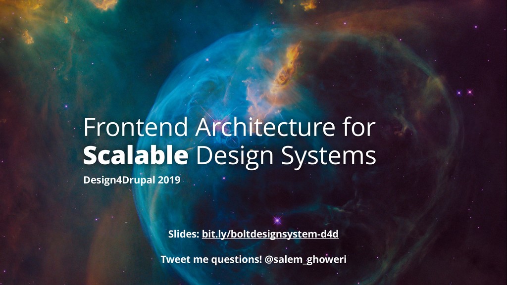
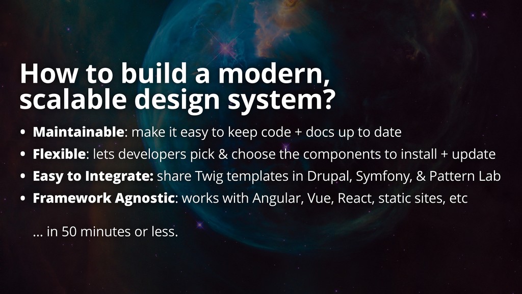
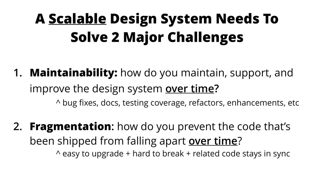
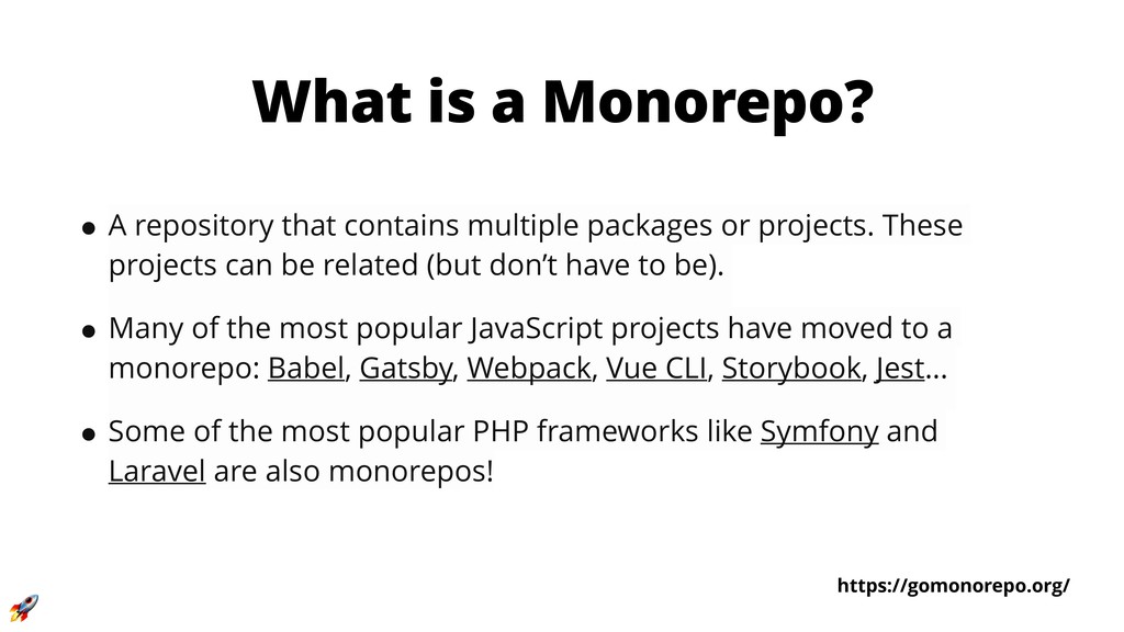
How do you build and manage a design system’s frontend architecture that is both scalable and maintainable?
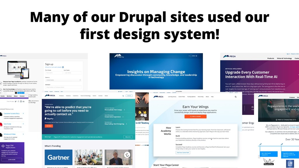
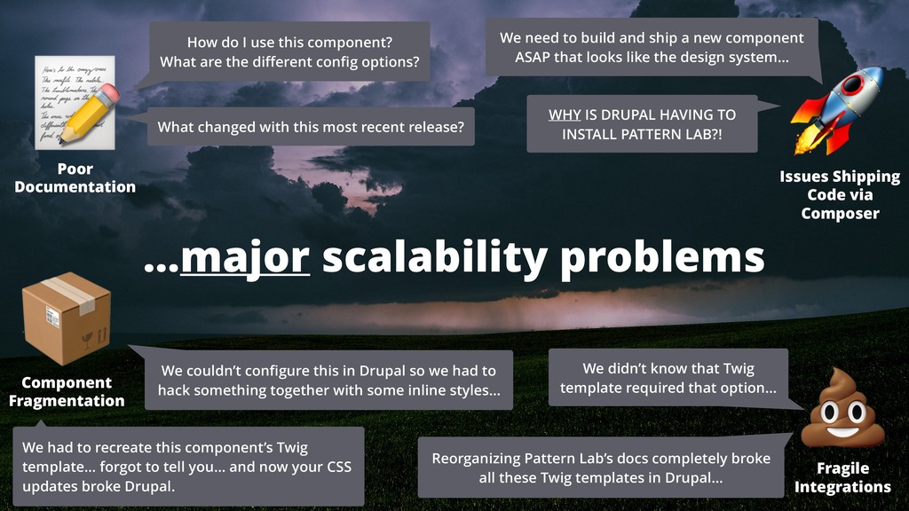
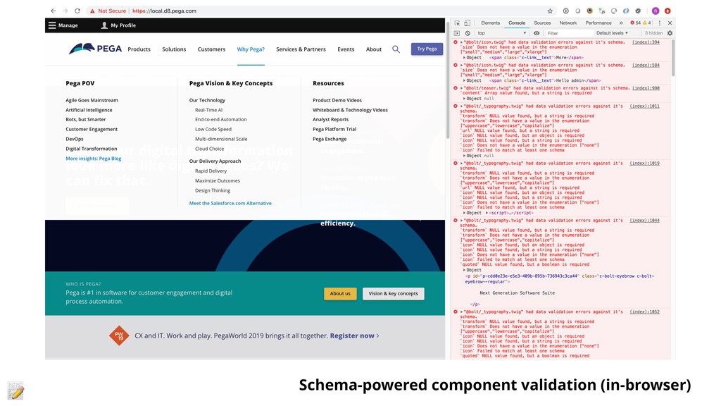
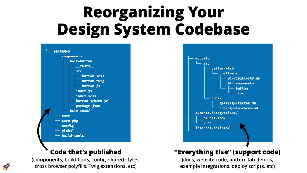
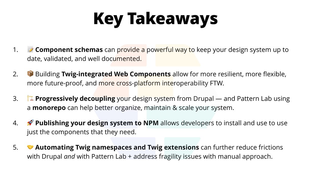
The typical tools and techniques for approaching design systems often break down when trying to scale across multiple sites, integrate with dynamically injected content, or keep the system up to date. Many of these technical boobytraps aren't discovered till late in development, but can be avoided through progressively decoupled components.
This session is most appropriate for frontend developers & architects or teams building and maintaining a design system. You will learn:
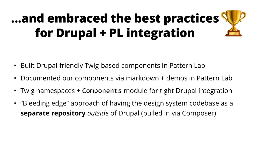
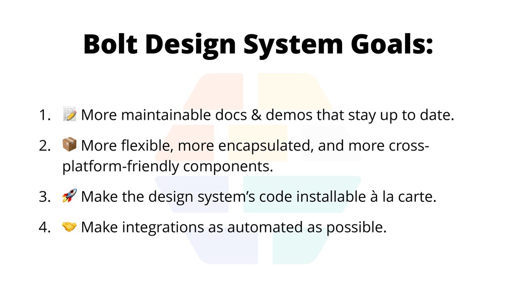
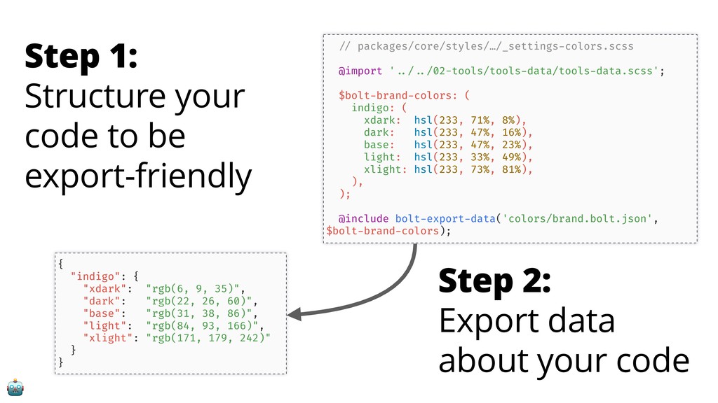
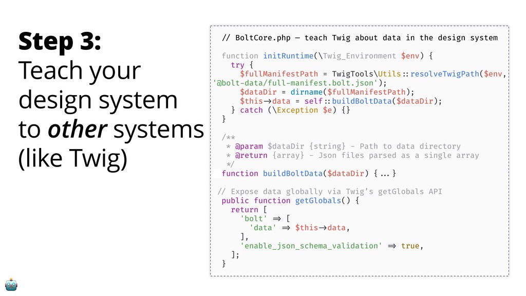
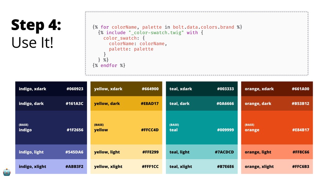
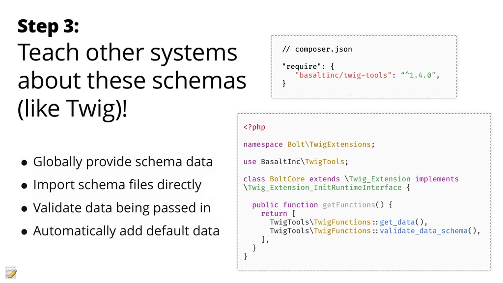
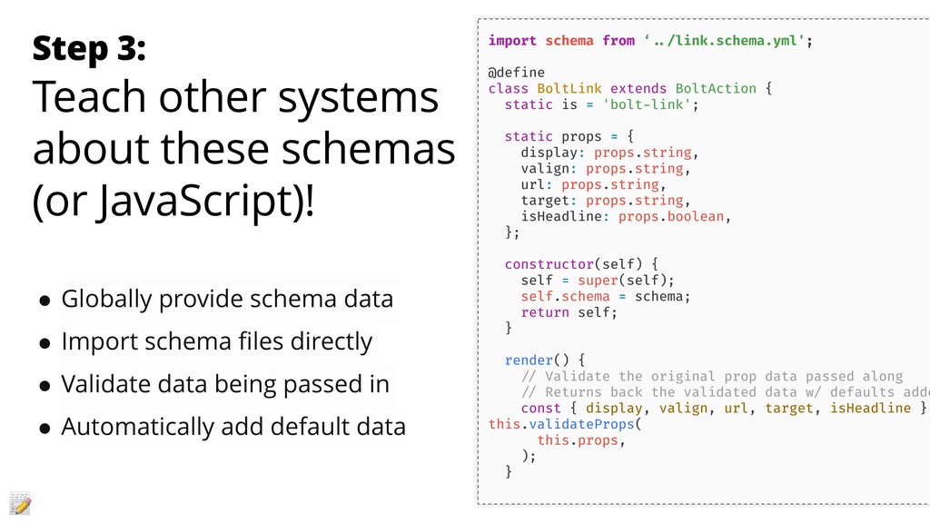
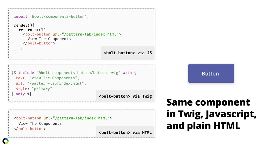
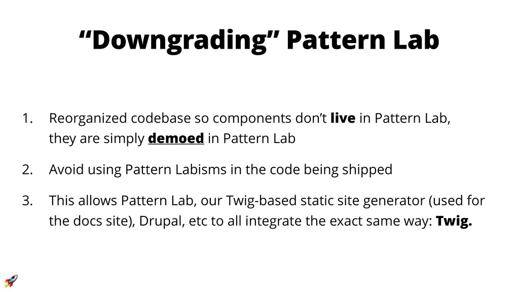
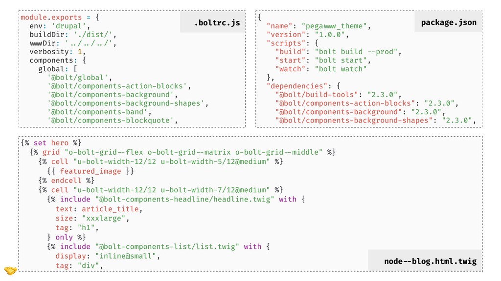
- Why and how to decouple a design system from Pattern Lab and Drupal
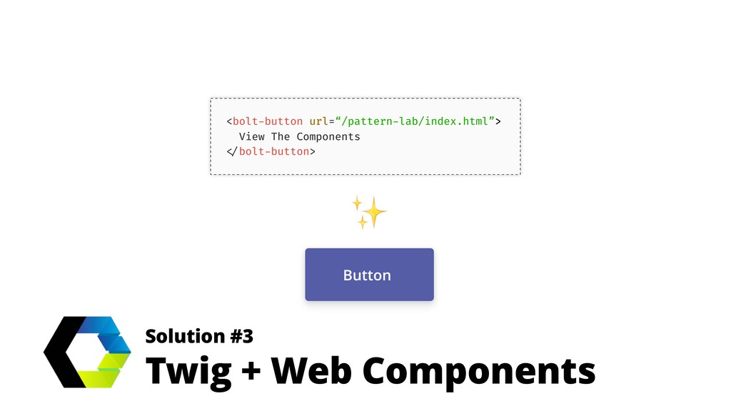
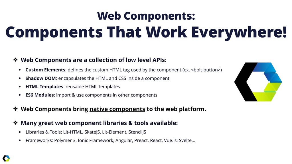
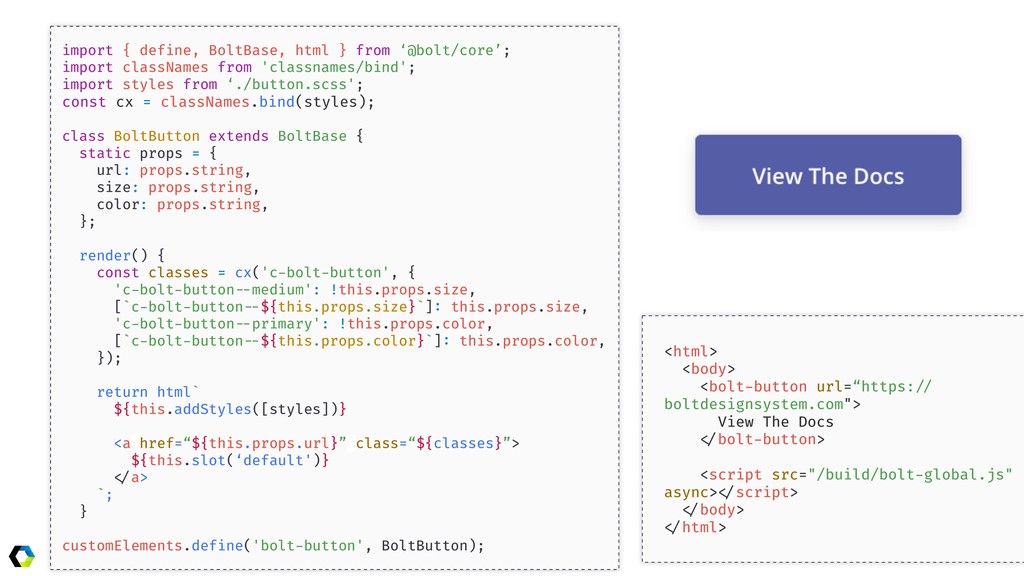
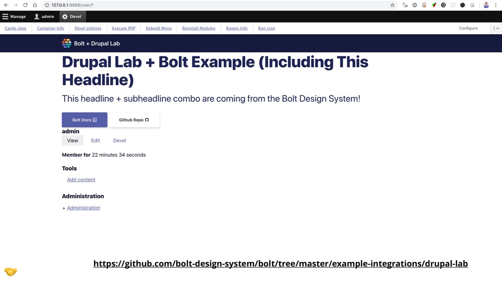
- Preventing component fragmentation in Drupal through the use of web components
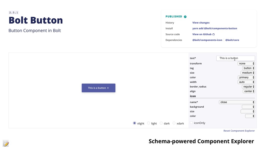
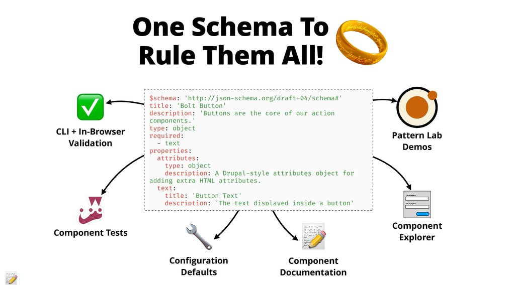
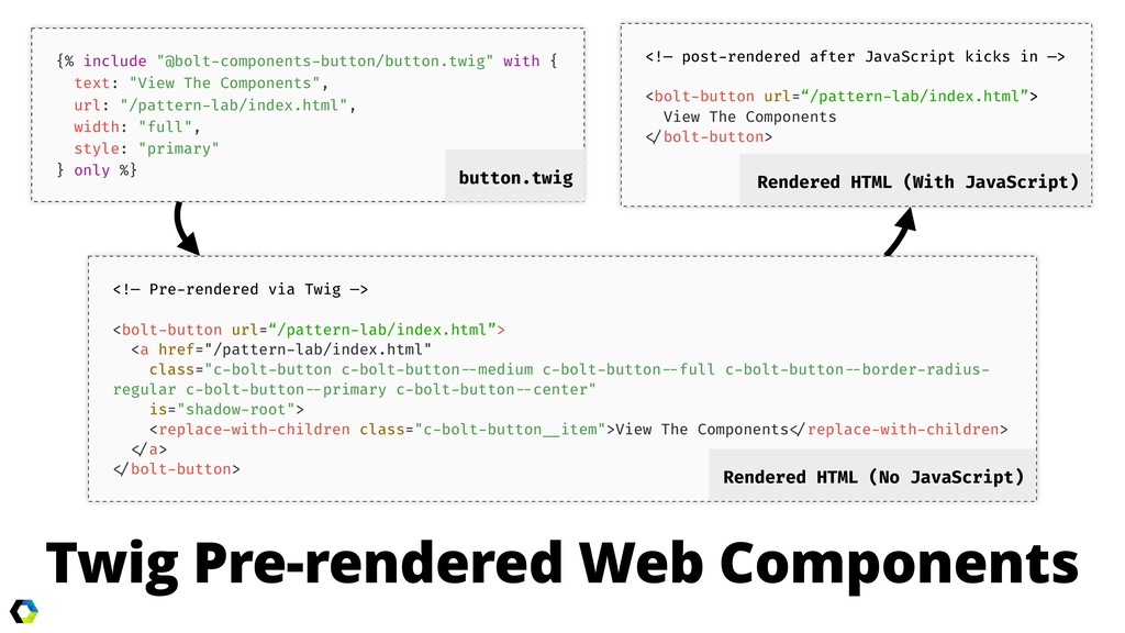
- Pattern Lab improvements and techniques to reduce rework and ease Twig-based component integration
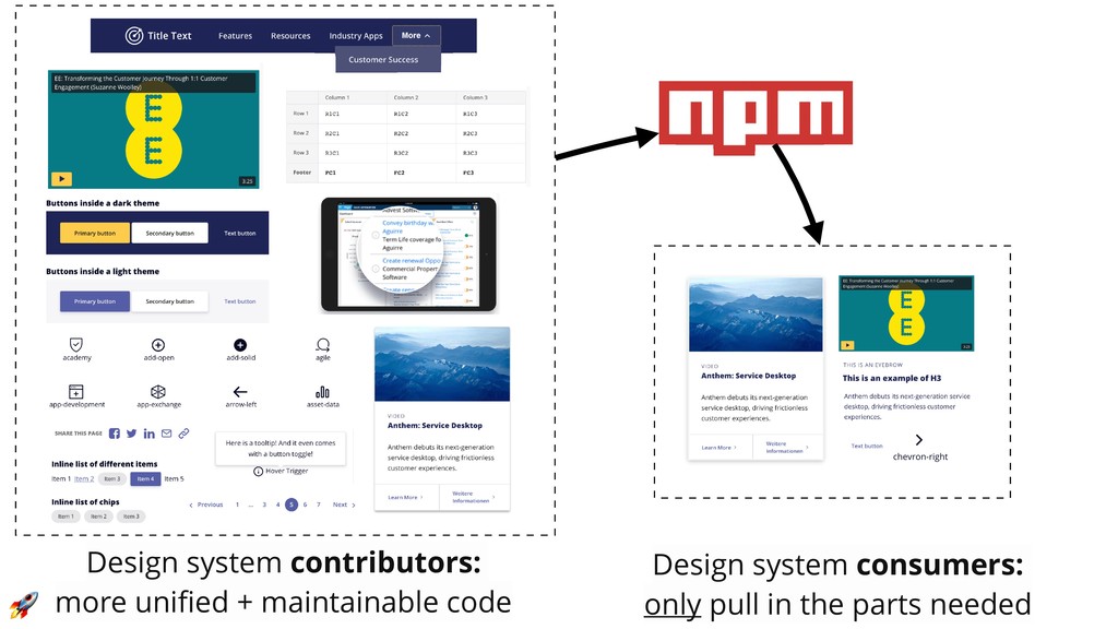
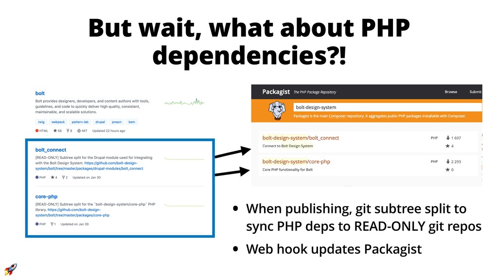
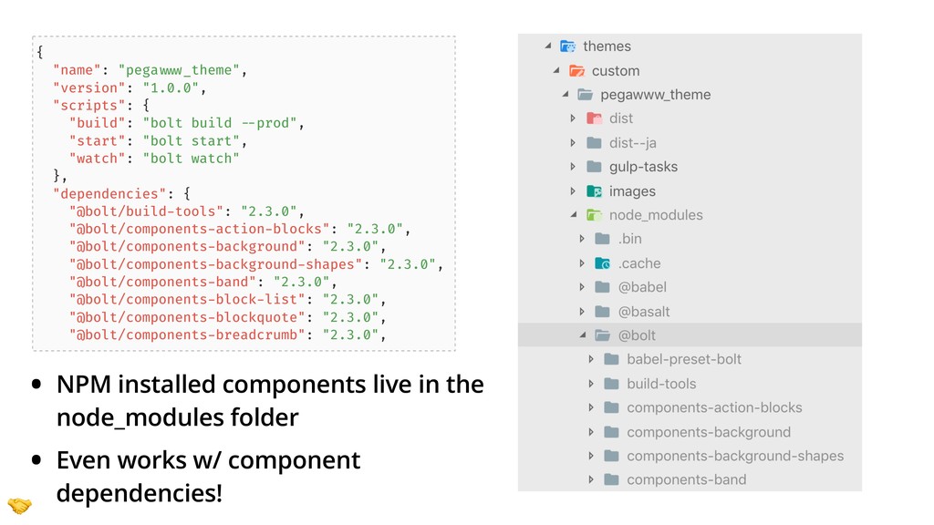
- How distributing a design system via NPM (yes, NPM) can help teams overcome technical hurdles with Composer
 sghoweri
 codeegg
 kotetuco
 har1101
 monochromegane
 tomoyk
 codmoninc
 athug
athug
 ganchiku
 guvalif
 kishida
 mshibuya
 yusukebe
 jonyablonski
 tammyeverts
 mayunak
 aleyda
 geoffreycrofte
 ipullrank
 auna
auna
 lemiorhan
 soysaucechin
 sergeychernyshev
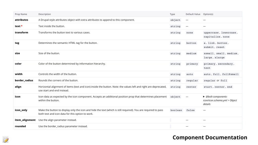
![{% set schema = bolt.data.components['@bolt-components-button'].schema %} {% for size in](https://files.speakerdeck.com/presentations/1e6e0dbb052946f7825bec685fe05123/slide_27.jpg)