Upgrade to Pro — share decks privately, control downloads, hide ads and more …

Frontend Architecture for Scalable Design Systems: Drupalcamp Poland

Frontend Architecture for Scalable Design Systems: Drupalcamp Poland

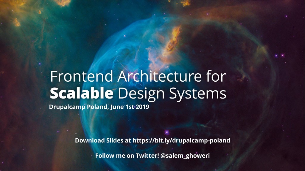
How do you build and manage a design system’s frontend architecture that is both scalable and maintainable?

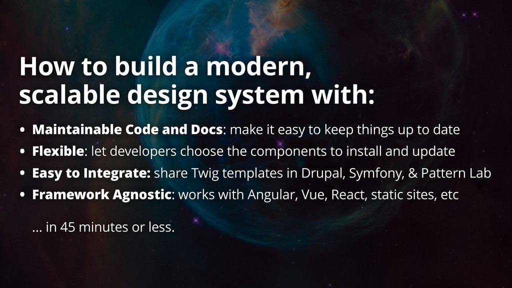
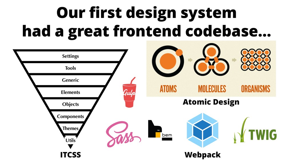
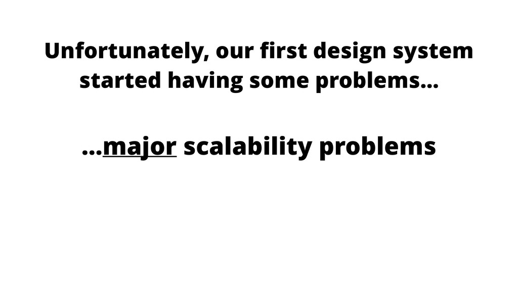
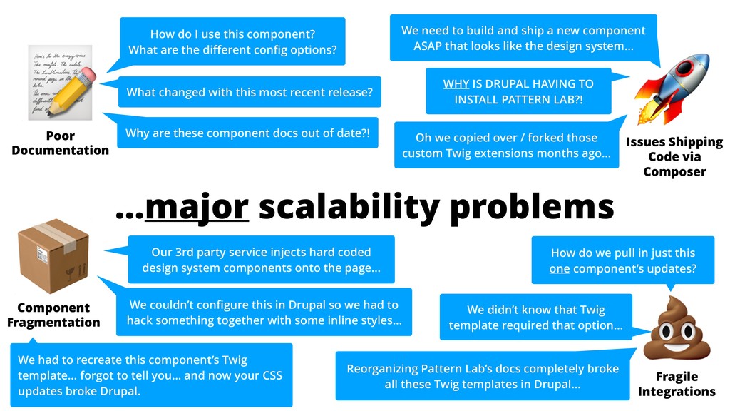
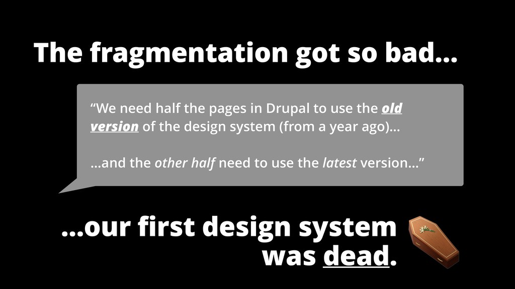
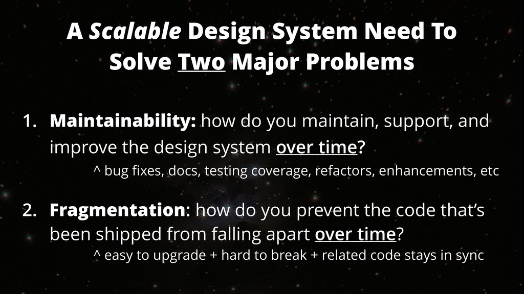
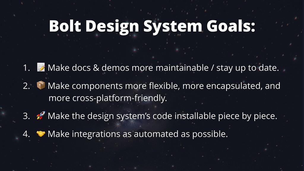
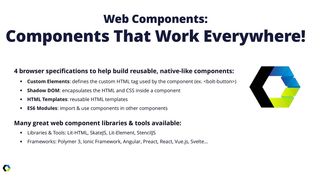
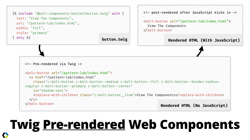
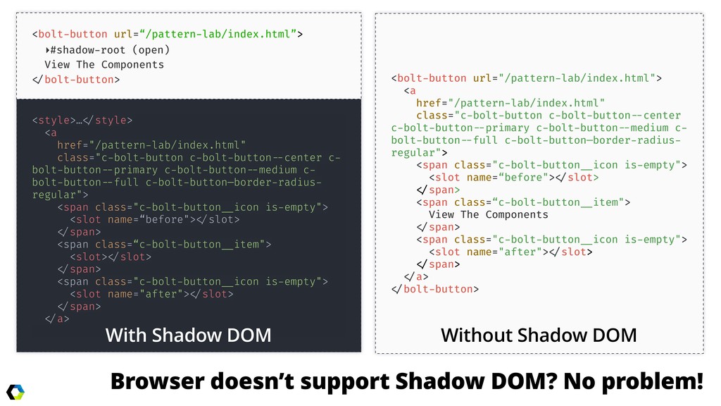
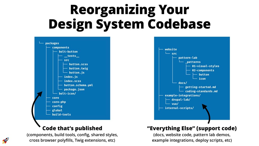
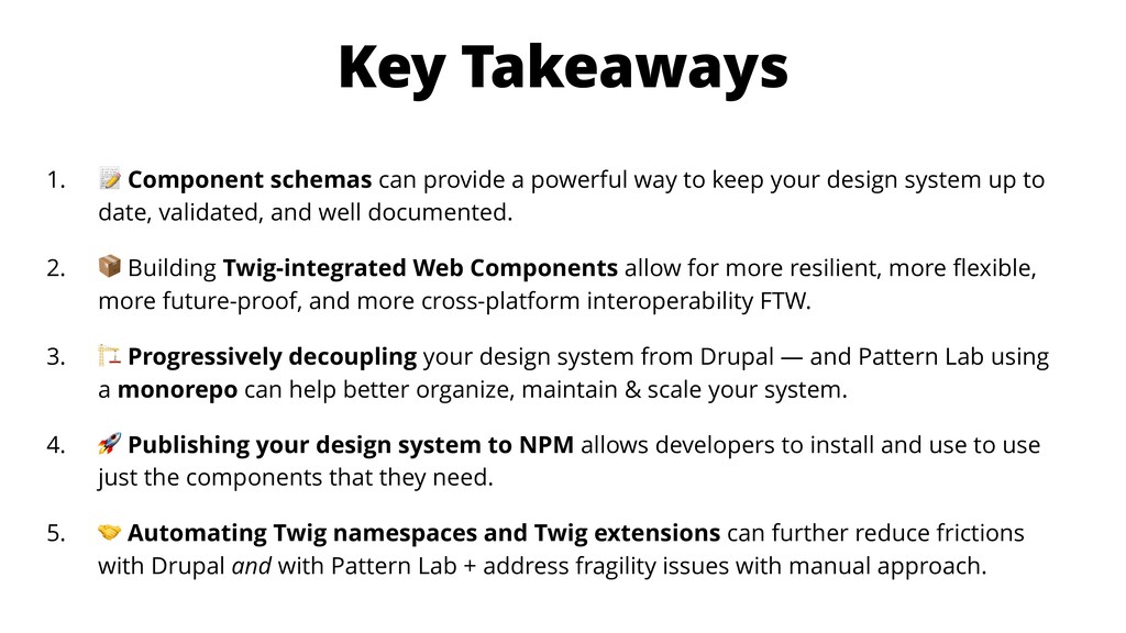
The typical tools and techniques for approaching design systems often break down when trying to scale across multiple sites, integrate with dynamically injected content, or keep the system up to date. Many of these technical boobytraps aren't discovered till late in development, but can be avoided through progressively decoupled components.

This session is most appropriate for frontend developers & architects or teams building and maintaining a design system. You will learn:

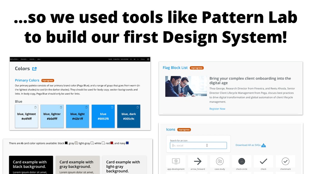
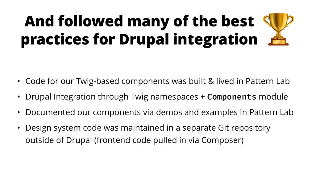
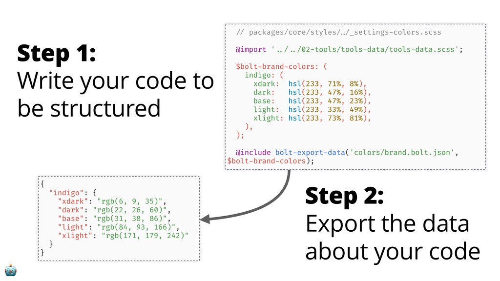
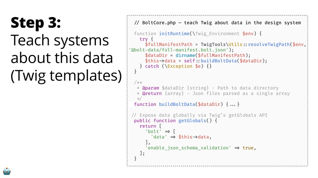
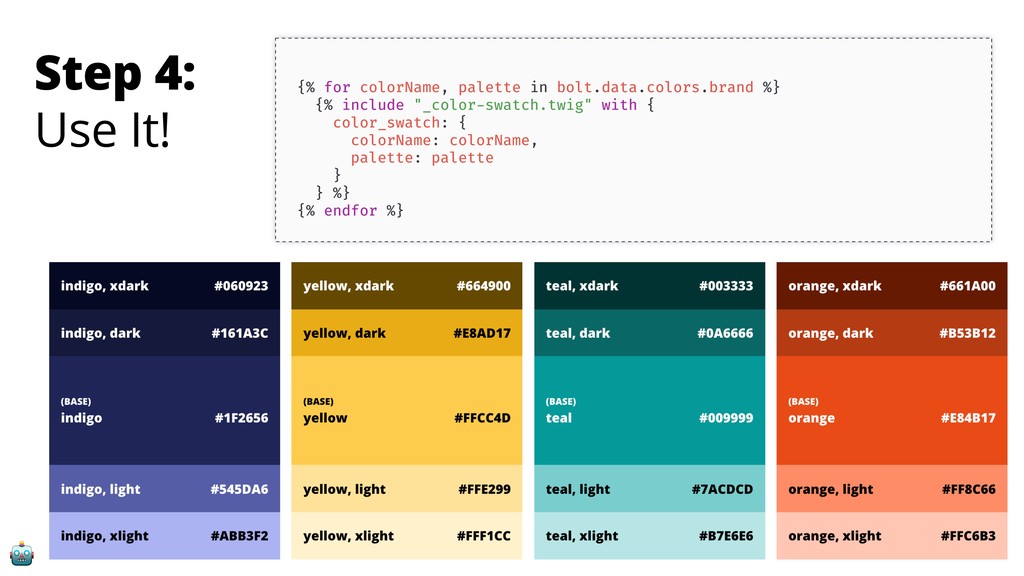
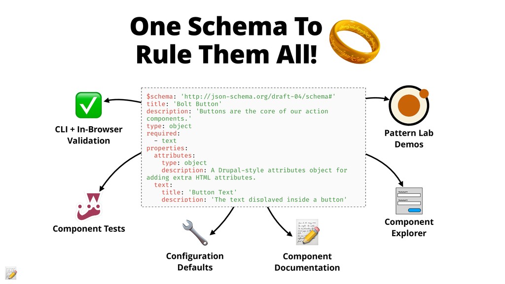
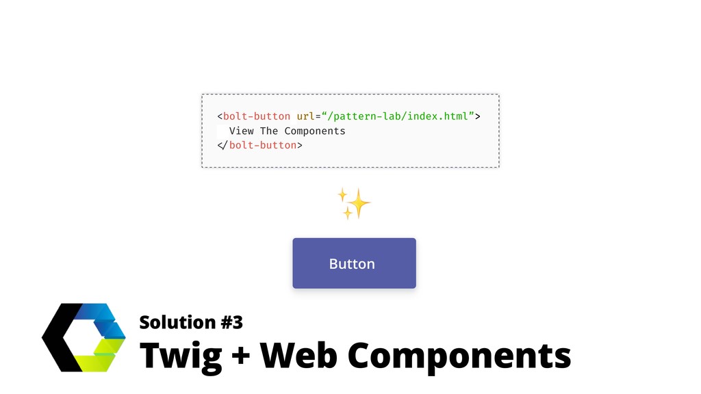
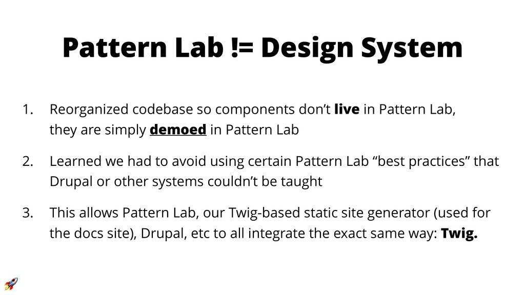
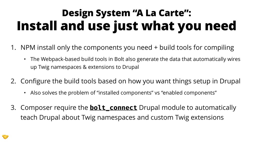
- Why and how to decouple a design system from Pattern Lab and Drupal
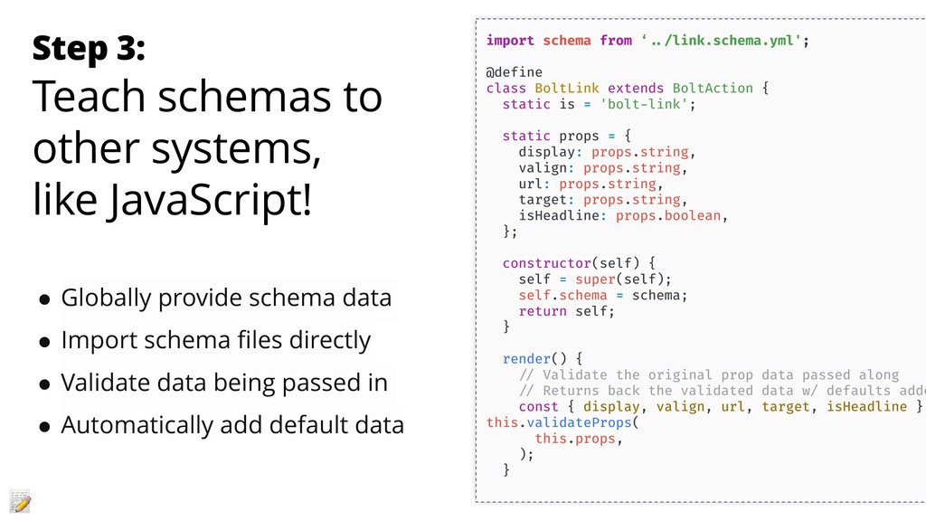
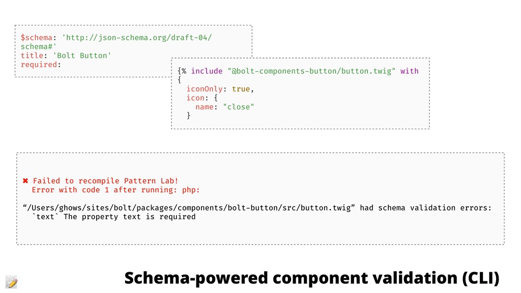
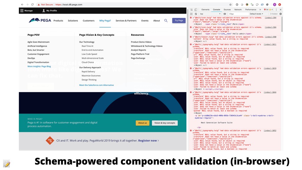
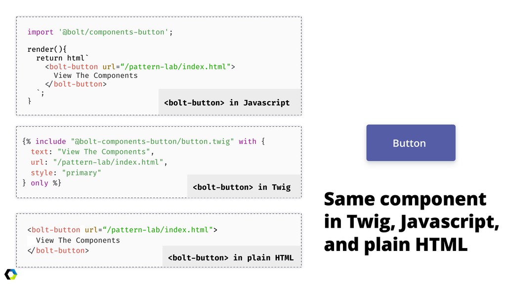
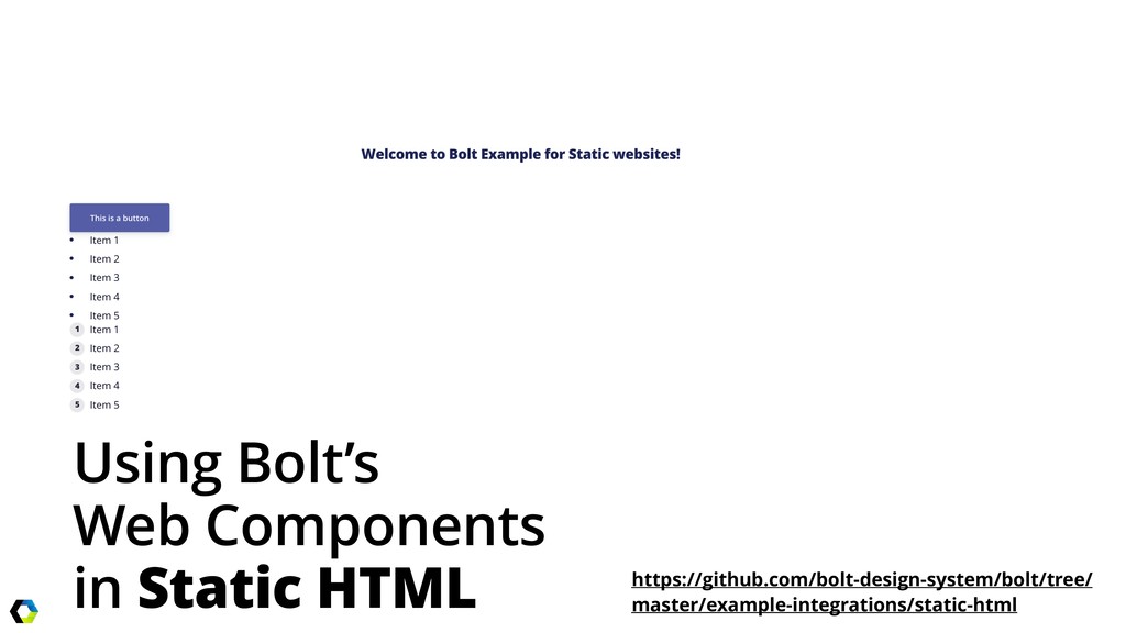
- Preventing component fragmentation in Drupal through the use of web components
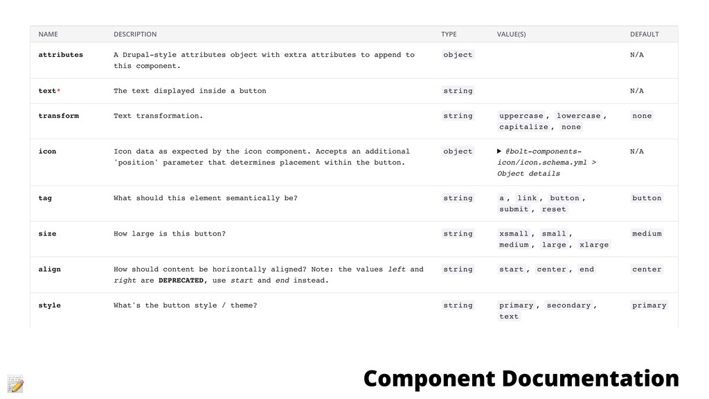
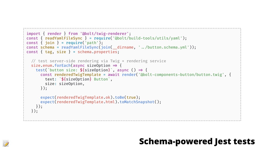
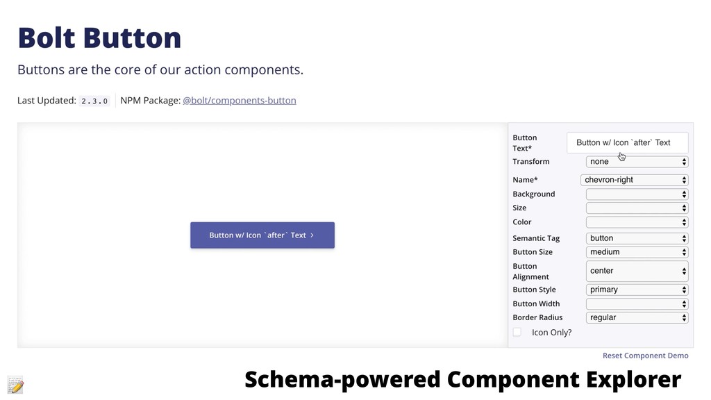
- Pattern Lab improvements and techniques to reduce rework and ease Twig-based component integration
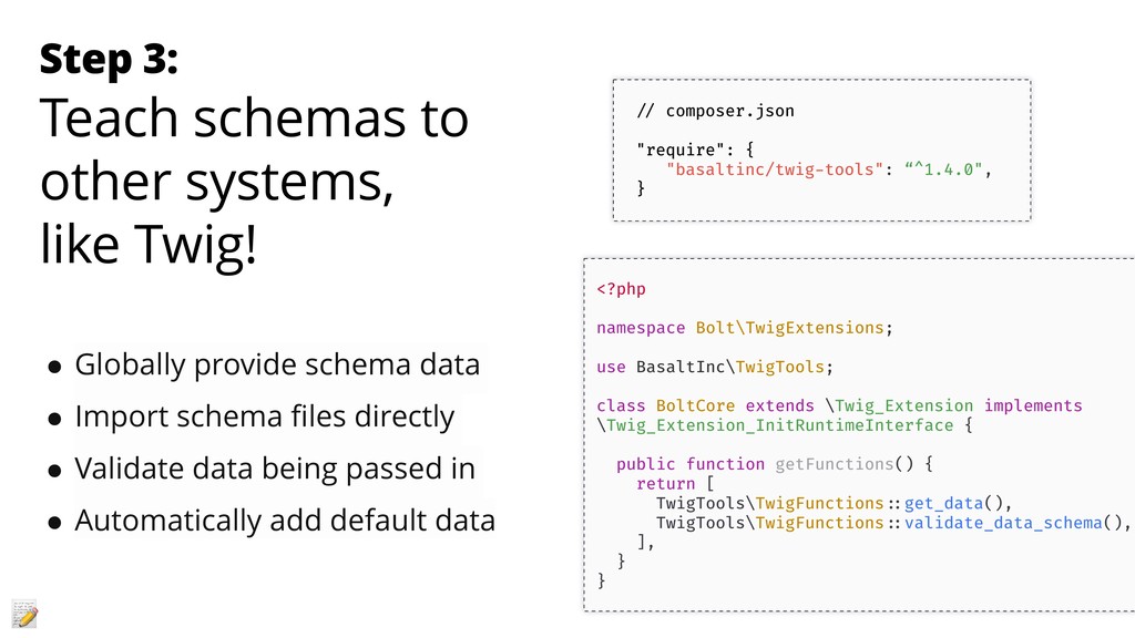
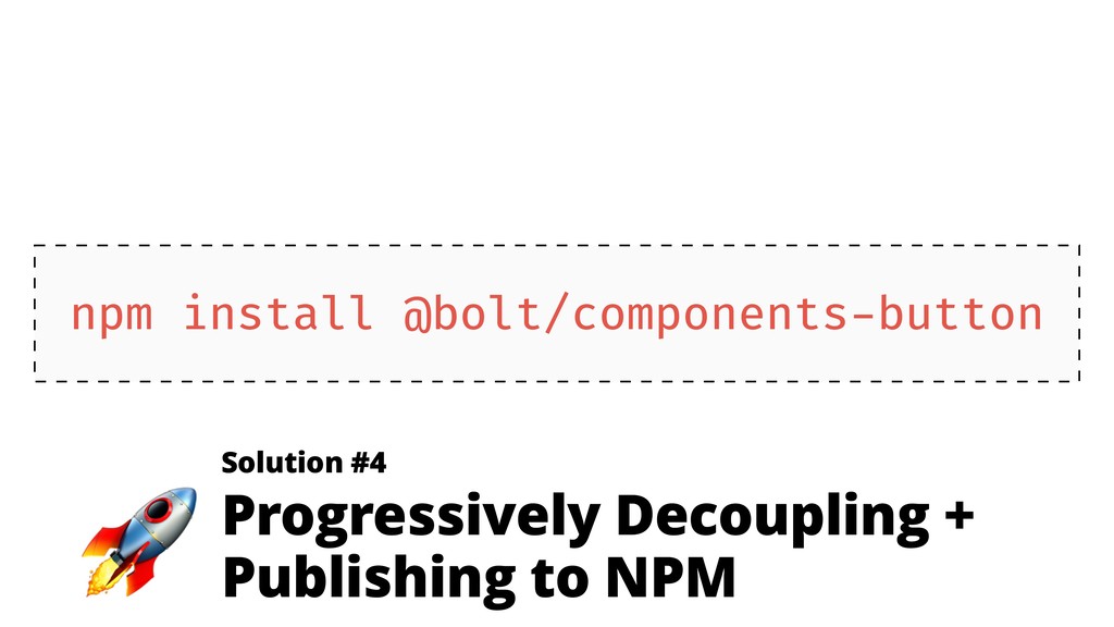
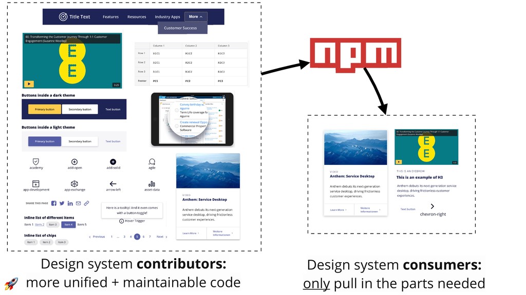
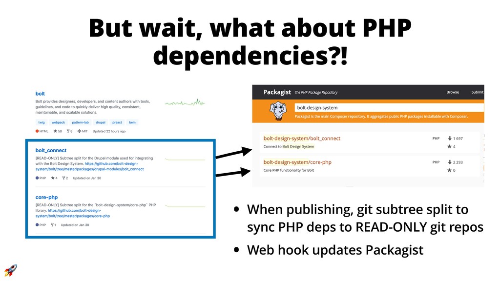
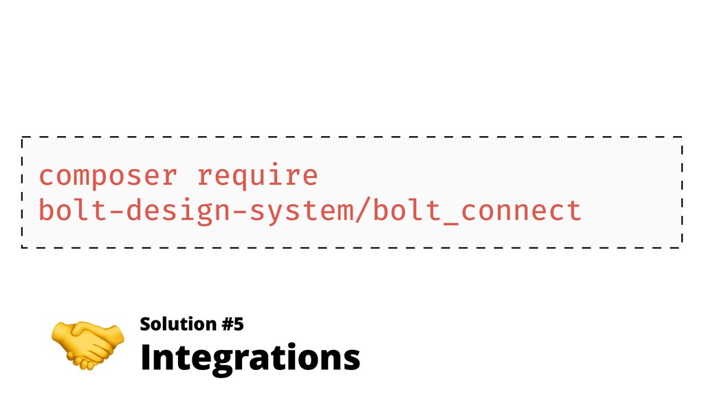
- How distributing a design system via NPM (yes, NPM) can help teams overcome technical hurdles with Composer

Salem

June 01, 2019
Tweet

More Decks by Salem

Other Decks in Programming

Transcript

  1. Frontend Architecture for Scalable Design Systems Follow me on Twitter!

    @salem_ghoweri Download Slides at https://bit.ly/drupalcamp-poland Drupalcamp Poland, June 1st 2019
  2. How to build a modern, 
 scalable design system with:

    • Maintainable Code and Docs: make it easy to keep things up to date • Flexible: let developers choose the components to install and update • Easy to Integrate: share Twig templates in Drupal, Symfony, & Pattern Lab • Framework Agnostic: works with Angular, Vue, React, static sites, etc
 
 … in 45 minutes or less.
  3. Salem Ghoweri • Twitter @salem_ghoweri • Lead Frontend Architect at

    Pegasystems (Cambridge, Massachusetts, United States) • Building design systems, pattern libraries for over 4 years • Creator and lead developer of the Bolt Design System • Core contributor on the open source Pattern Lab projects (PHP and Node)
  4. Our first design system 
 had a great frontend codebase…

    Tools Generic Elements Settings Objects Components Themes Utils ITCSS Webpack Atomic Design
  5. • Code for our Twig-based components was built & lived

    in Pattern Lab • Drupal Integration through Twig namespaces + Components module • Documented our components via demos and examples in Pattern Lab • Design system code was maintained in a separate Git repository outside of Drupal (frontend code pulled in via Composer) And followed many of the best practices for Drupal integration
  6. …major scalability problems How do I use this component? 


    What are the different config options? What changed with this most recent release? How do we pull in just this one component’s updates? Reorganizing Pattern Lab’s docs completely broke all these Twig templates in Drupal… Component
 Fragmentation Issues Shipping Code via Composer Fragile
 Integrations Why are these component docs out of date?! We had to recreate this component’s Twig template… forgot to tell you… and now your CSS updates broke Drupal. WHY IS DRUPAL HAVING TO INSTALL PATTERN LAB?! We couldn’t configure this in Drupal so we had to hack something together with some inline styles… Our 3rd party service injects hard coded design system components onto the page… We didn’t know that Twig template required that option… Oh we copied over / forked those custom Twig extensions months ago… We need to build and ship a new component ASAP that looks like the design system… Poor Documentation
  7. The fragmentation got so bad… “We need half the pages

    in Drupal to use the old version of the design system (from a year ago)…
 
 …and the other half need to use the latest version…” …our first design system was dead. ⚰
  8. 1. Maintainability: how do you maintain, support, and improve the

    design system over time? ^ bug fixes, docs, testing coverage, refactors, enhancements, etc
 
 2. Fragmentation: how do you prevent the code that’s been shipped from falling apart over time? ^ easy to upgrade + hard to break + related code stays in sync A Scalable Design System Need To Solve Two Major Problems
  9. 1. Make docs & demos more maintainable / stay up

    to date. 2. Make components more flexible, more encapsulated, and more cross-platform-friendly. 3. Make the design system’s code installable piece by piece. 4. Make integrations as automated as possible. Bolt Design System Goals:
  10. Step 1: Write your code to be structured // packages/core/styles/…/_settings-colors.scss

    @import ' ../ ../02-tools/tools-data/tools-data.scss'; $bolt-brand-colors: ( indigo: ( xdark: hsl(233, 71%, 8%), dark: hsl(233, 47%, 16%), base: hsl(233, 47%, 23%), light: hsl(233, 33%, 49%), xlight: hsl(233, 73%, 81%), ), ); @include bolt-export-data('colors/brand.bolt.json', $bolt-brand-colors); { "indigo": { "xdark": "rgb(6, 9, 35)", "dark": "rgb(22, 26, 60)", "base": "rgb(31, 38, 86)", "light": "rgb(84, 93, 166)", "xlight": "rgb(171, 179, 242)" } } Step 2: Export the data about your code
  11. // BoltCore.php — teach Twig about data in the design

    system function initRuntime(\Twig_Environment $env) { try { $fullManifestPath = TwigTools\Utils ::resolveTwigPath($env, '@bolt-data/full-manifest.bolt.json'); $dataDir = dirname($fullManifestPath); $this ->data = self ::buildBoltData($dataDir); } catch (\Exception $e) {} } /** * @param $dataDir {string} - Path to data directory * @return {array} - Json files parsed as a single array */ function buildBoltData($dataDir) { ...} // Expose data globally via Twig’s getGlobals API public function getGlobals() { return [ 'bolt' => [ 'data' => $this ->data, ], 'enable_json_schema_validation' => true, ]; } Step 3: Teach systems about this data 
 (Twig templates)
  12. {% for colorName, palette in bolt.data.colors.brand %} {% include "_color-swatch.twig"

    with { color_swatch: { colorName: colorName, palette: palette } } %} {% endfor %} Step 4: Use It!
  13. Solution #2 
 Component Schemas $schema: 'http: //json-schema.org/draft-04/schema#' title: 'Bolt

    Button' description: 'Buttons are the core of our action components.' type: object required: - text properties: attributes: type: object description: A Drupal-style attributes object for adding extra HTML attributes. text: title: 'Button Text' description: 'The text displayed inside a button' type: string icon: type: object description: Nested icon component. Accepts an extra 'position' prop for placement. ref: '@bolt-components-icon/icon.schema.yml'
  14. • A schema describes the API for your components. •

    Provides easy to read documentation for humans and computers. • Validates the data being used. This is really helpful for: ◦ Automatically testing for regressions ◦ Enforcing what data is allowed to be passed into a component ◦ Managing your design system’s API + making changes over time What’s a schema? https://json-schema.org/
  15. Step 1: Write schemas # button.schema.yml $schema: 'http: //json-schema.org/draft-04/schema#' title:

    'Bolt Button' description: 'Buttons are the core of our action components.' type: object required: - text properties: attributes: type: object description: Drupal attributes object text: // package.json "schema": "button.schema.yml"
  16. // bolt-button/package.json "schema": "button.schema.yml" // www/build/data/full-manifest.bolt.json { "name": "@bolt/components-button", “basicName":

    "bolt-components-button", "dir": "/Users/ghows/sites/bolt-release/packages/components/bolt-button", "assets": { "style": "/Users/ghows/sites/bolt-release/packages/components/bolt-button/index.scss", "main": "/Users/ghows/sites/bolt-release/packages/components/bolt-button/index.js" }, "deps": ["@bolt/core"], "twigNamespace": “@bolt-components-button", "schema": { "$schema": "http: //json-schema.org/draft-04/schema#", "title": "Bolt Button", “description": "Buttons are the core of our action components.", "type": "object", "properties": { "attributes": { Step 2: Aggregate the data // bolt-link/package.json "schema": “link.schema.yml"
  17. <?php namespace Bolt\TwigExtensions; use BasaltInc\TwigTools; class BoltCore extends \Twig_Extension implements

    \Twig_Extension_InitRuntimeInterface { public function getFunctions() { return [ TwigTools\TwigFunctions ::get_data(), TwigTools\TwigFunctions ::validate_data_schema(), ], } } // composer.json "require": { "basaltinc/twig-tools": “^1.4.0", } • Globally provide schema data • Import schema files directly • Validate data being passed in • Automatically add default data Step 3: Teach schemas to other systems,
 like Twig!
  18. Step 3: Teach schemas to other systems,
 like JavaScript! import

    schema from ‘ ../link.schema.yml'; @define class BoltLink extends BoltAction { static is = 'bolt-link'; static props = { display: props.string, valign: props.string, url: props.string, target: props.string, isHeadline: props.boolean, }; constructor(self) { self = super(self); self.schema = schema; return self; } render() { // Validate the original prop data passed along // Returns back the validated data w/ defaults adde const { display, valign, url, target, isHeadline } this.validateProps( this.props, ); } • Globally provide schema data • Import schema files directly • Validate data being passed in • Automatically add default data
  19. {% set schema = bolt.data.components['@bolt-components-button'].schema %} {% for size in

    schema.properties.size.enum %} <p>Button Size Variation: {{ size }} </p> {% include "@bolt-components-button/button.twig" with { "size": size, "text": "Example " ~ size ~" Button" } %} {% endfor %} Pattern Lab Demos Step 4: Use schemas to power everything!
  20. import { render } from '@bolt/twig-renderer'; const { readYamlFileSync }

    = require('@bolt/build-tools/utils/yaml'); const { join } = require('path'); const schema = readYamlFileSync(join( __dirname, ' ../button.schema.yml')); const { tag, size } = schema.properties; // test server-side rendering via Twig + rendering service size.enum.forEach(async sizeOption => { test(`button size: ${sizeOption}`, async () => { const renderedTwigTemplate = await render('@bolt-components-button/button.twig', { text: `${sizeOption} Button`, size: sizeOption, }); expect(renderedTwigTemplate.ok).toBe(true); expect(renderedTwigTemplate.html).toMatchSnapshot(); }); }); Schema-powered Jest tests
  21. Schema-powered component validation (CLI) $schema: 'http: //json-schema.org/draft-04/ schema#' title: 'Bolt

    Button' required: ✖ Failed to recompile Pattern Lab! Error with code 1 after running: php: “/Users/ghows/sites/bolt/packages/components/bolt-button/src/button.twig” had schema validation errors: `text` The property text is required {% include "@bolt-components-button/button.twig" with { iconOnly: true, icon: { name: "close" }
  22. $schema: 'http: //json-schema.org/draft-04/schema#' title: 'Bolt Button' description: 'Buttons are the

    core of our action components.' type: object required: - text properties: attributes: type: object description: A Drupal-style attributes object for adding extra HTML attributes. text: title: 'Button Text' description: 'The text displayed inside a button' One Schema To Rule Them All! Component 
 Documentation Configuration 
 Defaults ✅ CLI + In-Browser 
 Validation Component Tests Component 
 Explorer Label Label Pattern Lab 
 Demos
  23. 4 browser specifications to help build reusable, native-like components: •

    Custom Elements: defines the custom HTML tag used by the component (ex. <bolt-button>) • Shadow DOM: encapsulates the HTML and CSS inside a component • HTML Templates: reusable HTML templates • ES6 Modules: import & use components in other components Many great web component libraries & tools available: • Libraries & Tools: Lit-HTML, SkateJS, Lit-Element, StencilJS • Frameworks: Polymer 3, Ionic Framework, Angular, Preact, React, Vue.js, Svelte… Web Components:
 Components That Work Everywhere!
  24. {% include "@bolt-components-button/button.twig" with { text: "View The Components", url:

    "/pattern-lab/index.html", style: "primary" } only %} <bolt-button> in Twig <bolt-button url=“/pattern-lab/index.html"> View The Components </bolt-button> <bolt-button> in plain HTML import '@bolt/components-button'; render(){ return html` <bolt-button url=“/pattern-lab/index.html"> View The Components </bolt-button> `; } <bolt-button> in Javascript Same component 
 in Twig, Javascript, and plain HTML
  25. Twig Pre-rendered Web Components {% include "@bolt-components-button/button.twig" with { text:

    "View The Components", url: "/pattern-lab/index.html", width: "full", style: "primary" } only %} button.twig <!— Pre-rendered via Twig —> <bolt-button url=“/pattern-lab/index.html”> <a href="/pattern-lab/index.html" class="c-bolt-button c-bolt-button --medium c-bolt-button --full c-bolt-button --border-radius- regular c-bolt-button --primary c-bolt-button --center" is="shadow-root"> <replace-with-children class="c-bolt-button __item">View The Components </replace-with-children> </a> </bolt-button> Rendered HTML (No JavaScript) <!— post-rendered after JavaScript kicks in —> <bolt-button url=“/pattern-lab/index.html”> View The Components </bolt-button> Rendered HTML (With JavaScript)
  26. <style>… </style> <a href="/pattern-lab/index.html" class="c-bolt-button c-bolt-button --center c- bolt-button --primary

    c-bolt-button --medium c- bolt-button --full c-bolt-button—border-radius- regular"> <span class="c-bolt-button __icon is-empty"> <slot name=“before"> </slot> </span> <span class=“c-bolt-button __item"> <slot> </slot> </span> <span class="c-bolt-button __icon is-empty"> <slot name="after"> </slot> </span> </a> Browser doesn’t support Shadow DOM? No problem! <bolt-button url="/pattern-lab/index.html"> <a href="/pattern-lab/index.html" class="c-bolt-button c-bolt-button --center c-bolt-button --primary c-bolt-button --medium c- bolt-button --full c-bolt-button—border-radius- regular"> <span class="c-bolt-button __icon is-empty"> <slot name=“before"> </slot> </span> <span class=“c-bolt-button __item"> View The Components </span> <span class="c-bolt-button __icon is-empty"> <slot name="after"> </slot> </span> </a> </bolt-button> <bolt-button url=“/pattern-lab/index.html”> ▸#shadow-root (open) View The Components </bolt-button> With Shadow DOM Without Shadow DOM
  27. • A repository that contains multiple packages or projects. These

    projects can be related (but don’t have to be). • Many of the most popular JavaScript projects have moved to a monorepo: Babel, Gatsby, Webpack, Vue CLI, Storybook, Jest... • Some of the most popular PHP frameworks like Symfony and Laravel are also monorepos! What is a Monorepo? https://gomonorepo.org/
  28. • More maintainable codebase • Simplifies sharing and reusing code

    in the design system • Easier to coordinate related updates across components • Unified process for checking code quality, building, testing, deploying, and publishing • One place to report issues / publish release notes • Allows for testing multiple components used together • One place for making any changes to the code, demos, tools, or documentation Monorepo Benefits
  29. Design system contributors: 
 more unified + maintainable code Design

    system consumers: 
 only pull in the parts needed
  30. # publish packages w/ changes since last publishing $ lerna

    publish { "lerna": "3.13.1", "npmClient": "yarn", "useWorkspaces": true, "version": “2.3.0", } lerna.json "dependencies": { "lerna": "^3.13.1", }, "workspaces": { "packages": [ "packages /*", "packages/config-presets /*", "docs-site" ] } package.json Publishing a Monorepo
  31. 1. Reorganized codebase so components don’t live in Pattern Lab,

    
 they are simply demoed in Pattern Lab 2. Learned we had to avoid using certain Pattern Lab “best practices” that Drupal or other systems couldn’t be taught 3. This allows Pattern Lab, our Twig-based static site generator (used for the docs site), Drupal, etc to all integrate the exact same way: Twig. Pattern Lab != Design System
  32. Reorganizing Your 
 Design System Codebase └── packages ├── components


    │ ├── bolt-button │ │ ├── __tests __ │ │ ├── src │ │ │ ├── button.scss │ │ │ ├── button.twig │ │ │ └── button.js │ │ ├── index.js │ │ ├── index.scss │ │ ├── button.schema.yml │ │ └── package.json │ └── bolt-icon/ ├── core ├── core-php ├── config ├── global └── build-tools ├── website │ └── src │ ├── pattern-lab │ │ └── _patterns │ │ ├── 01-visual-styles │ │ ├── 02-components │ │ └── ├── button │ │ └── icon │ └── docs/ │ ├── getting-started.md │ └── coding-standards.md ├── example-integrations/ │ ├── drupal-lab/ │ └── vue/ ├── internal-scripts/ Code that’s published
 (components, build tools, config, shared styles, cross browser polyfills, Twig extensions, etc) “Everything Else” (support code)
 (docs, website code, pattern lab demos, example integrations, deploy scripts, etc)
  33. But wait, what about PHP dependencies?! • When publishing, git

    subtree split to sync PHP deps to READ-ONLY git repos • Web hook updates Packagist
  34. Design System “A La Carte”:
 Install and use just what

    you need 1. NPM install only the components you need + build tools for compiling • The Webpack-based build tools in Bolt also generate the data that automatically wires up Twig namespaces & extensions to Drupal 2. Configure the build tools based on how you want things setup in Drupal • Also solves the problem of “installed components” vs “enabled components” 3. Composer require the bolt_connect Drupal module to automatically teach Drupal about Twig namespaces and custom Twig extensions
  35. { "name": "pega www_theme", "version": "1.0.0", "scripts": { "build": "bolt

    build --prod", "start": "bolt start", "watch": "bolt watch" }, "dependencies": { "@bolt/build-tools": "2.3.0", "@bolt/components-action-blocks": "2.3.0", "@bolt/components-background": "2.3.0", "@bolt/components-background-shapes": "2.3.0", "@bolt/components-band": "2.3.0", "@bolt/components-block-list": "2.3.0", "@bolt/components-blockquote": "2.3.0", "@bolt/components-breadcrumb": "2.3.0", • NPM installed components live in the node_modules folder • Even works w/ component dependencies!
  36. module.exports = { env: 'drupal', buildDir: './dist/', wwwDir: ' ../

    ../ ../', verbosity: 1, components: { global: [ '@bolt/global', '@bolt/components-action-blocks', '@bolt/components-background', '@bolt/components-background-shapes', '@bolt/components-band', '@bolt/components-blockquote', .boltrc.js {% set hero %} {% grid "o-bolt-grid --flex o-bolt-grid --matrix o-bolt-grid --middle" %} {% cell "u-bolt-width-12/12 u-bolt-width-5/12@medium" %} {{ featured_image }} {% endcell %} {% cell "u-bolt-width-12/12 u-bolt-width-7/12@medium" %} {% include "@bolt-components-headline/headline.twig" with { text: article_title, size: "xxxlarge", tag: "h1", } only %} {% include "@bolt-components-list/list.twig" with { display: "inline@small", tag: "div", node --blog.html.twig { "name": "pega www_theme", "version": "1.0.0", "scripts": { "build": "bolt build --prod", "start": "bolt start", "watch": "bolt watch" }, "dependencies": { "@bolt/build-tools": "2.3.0", "@bolt/components-action-blocks": "2.3.0", "@bolt/components-background": "2.3.0", "@bolt/components-background-shapes": "2.3.0", package.json
  37. 1. Component schemas can provide a powerful way to keep

    your design system up to date, validated, and well documented. 2. Building Twig-integrated Web Components allow for more resilient, more flexible, more future-proof, and more cross-platform interoperability FTW. 3. Progressively decoupling your design system from Drupal — and Pattern Lab using a monorepo can help better organize, maintain & scale your system. 4. Publishing your design system to NPM allows developers to install and use to use just the components that they need. 5. Automating Twig namespaces and Twig extensions can further reduce frictions with Drupal and with Pattern Lab + address fragility issues with manual approach. Key Takeaways