 SiteGround - Reliable hosting with speed, security, and support you can count on.
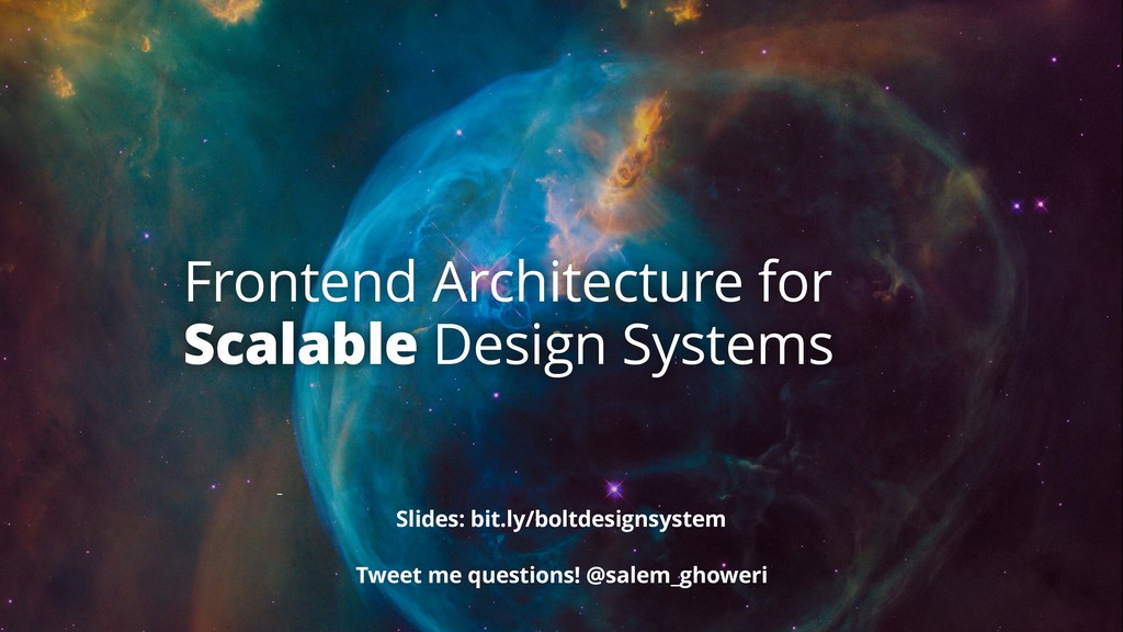
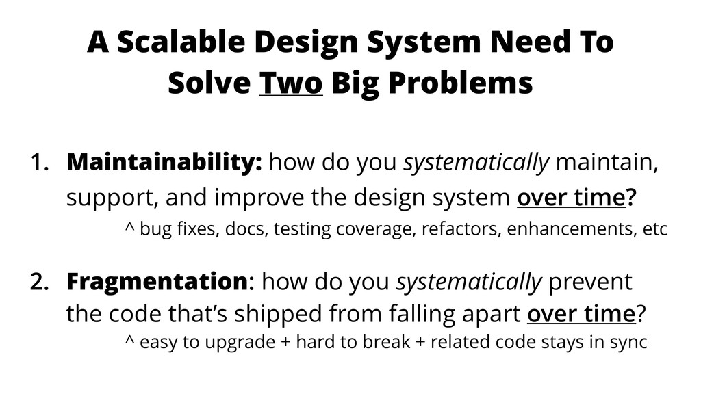
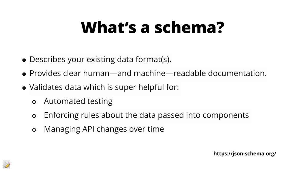
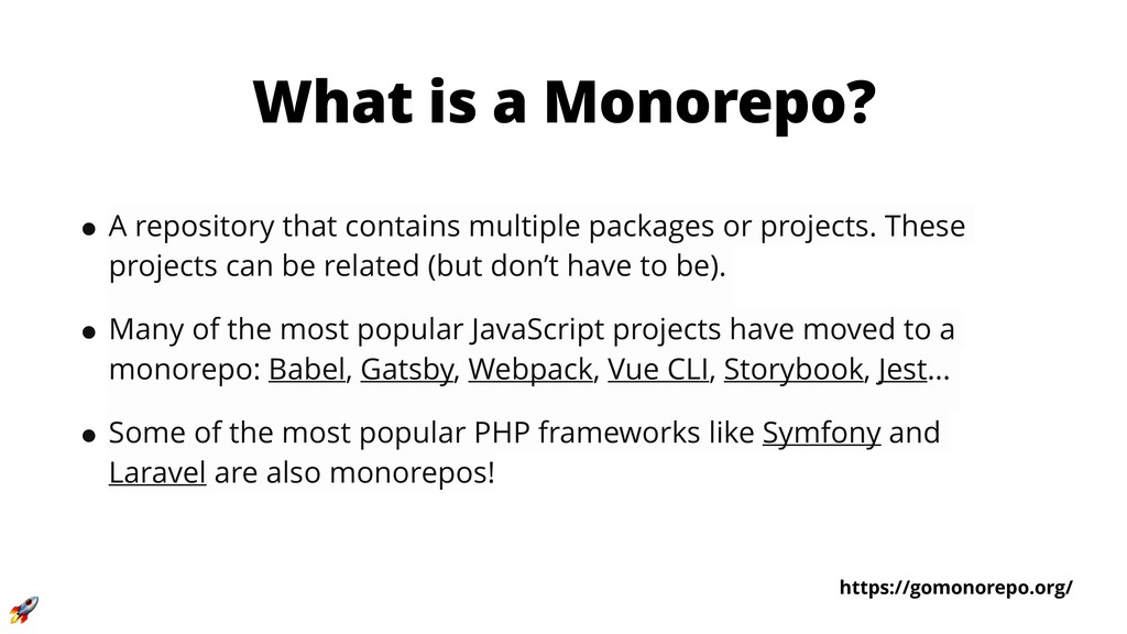
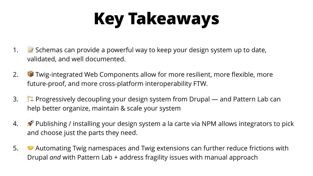
How do you build and manage a design system’s frontend architecture that is both scalable and maintainable?
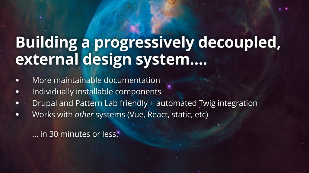
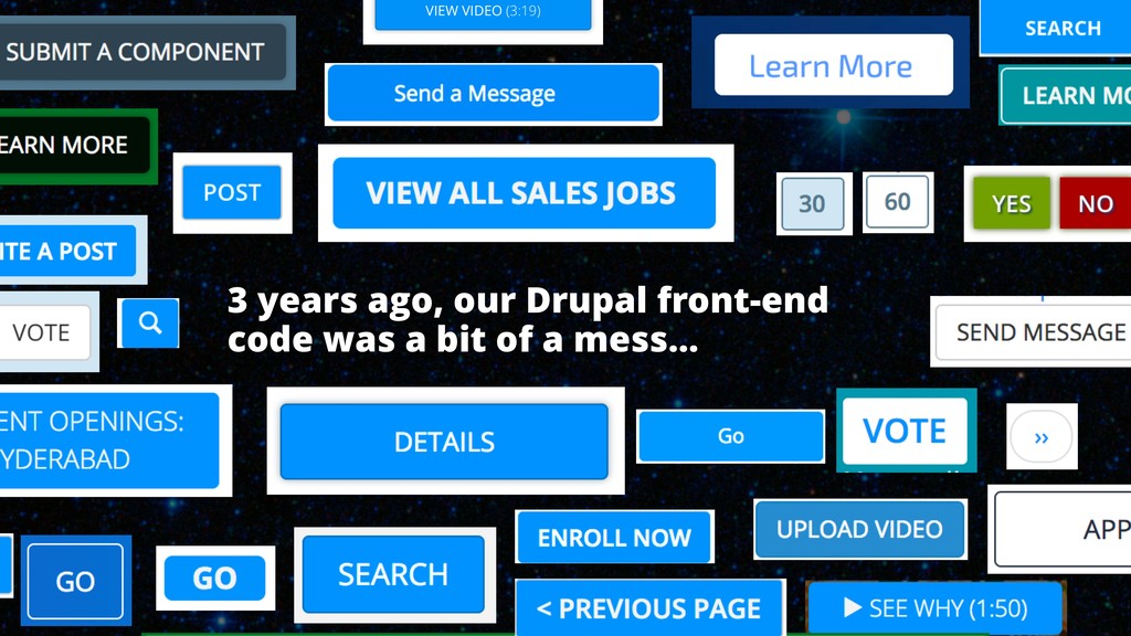
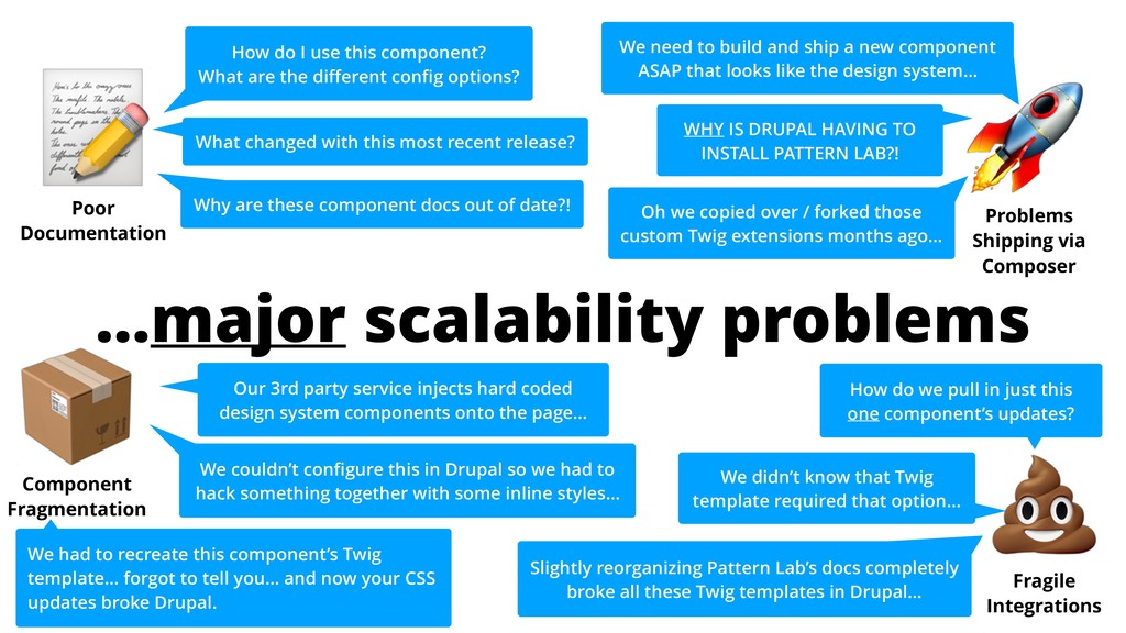
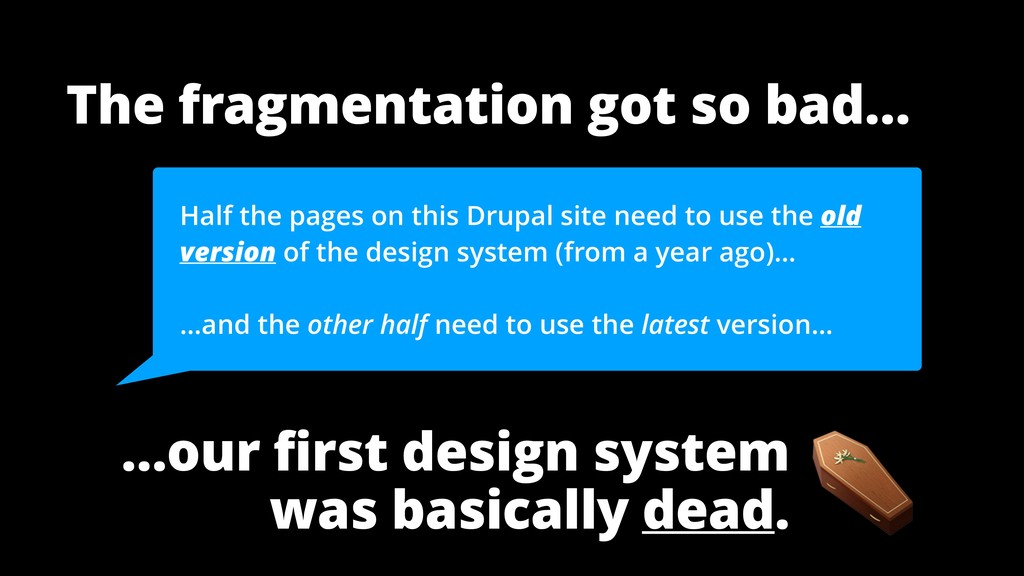
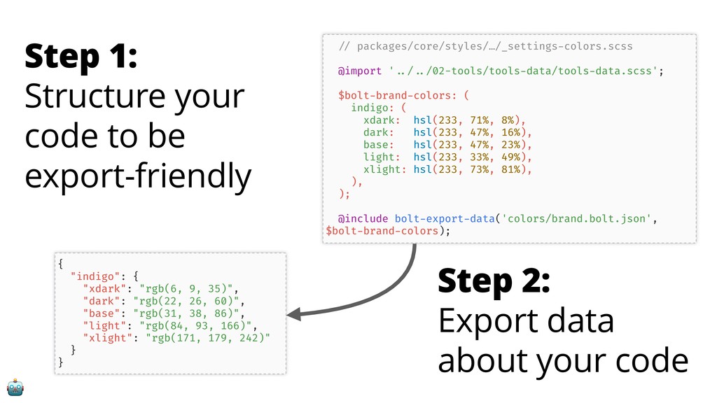
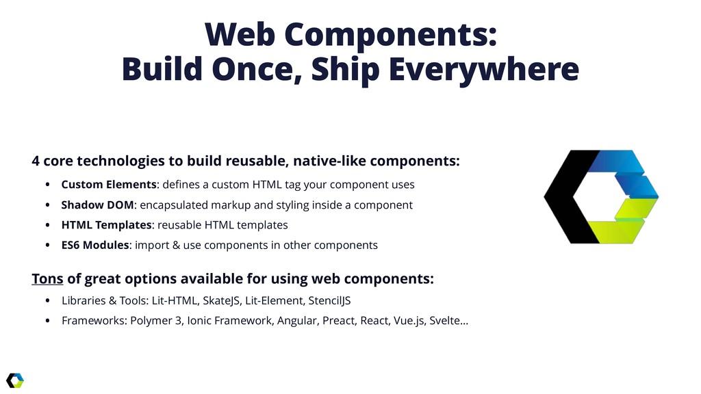
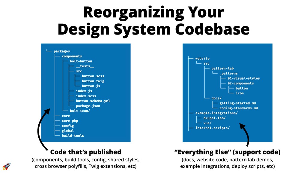
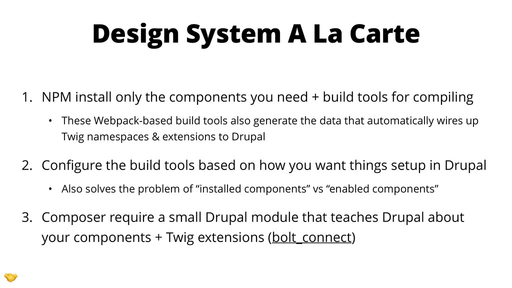
The typical tools and techniques for approaching design systems often break down when trying to scale across multiple sites, integrate with dynamically injected content, or keep the system up to date. Many of these technical boobytraps aren't discovered till late in development, but can be avoided through progressively decoupled components.
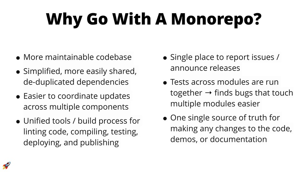
This session is most appropriate for frontend developers & architects or teams building and maintaining a design system. You will learn:
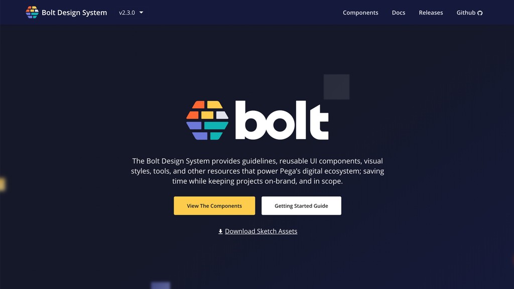
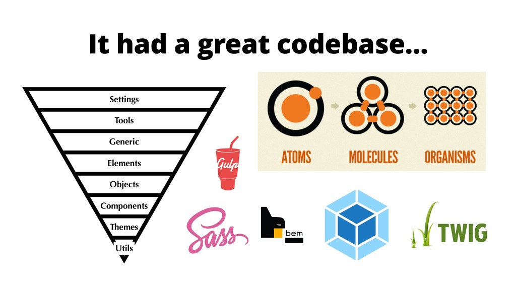
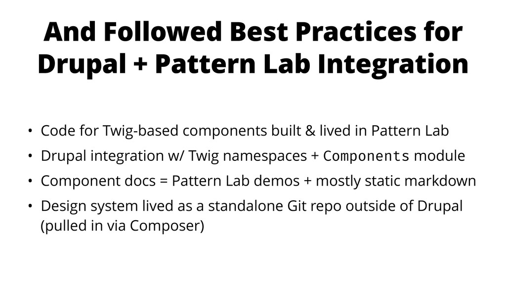
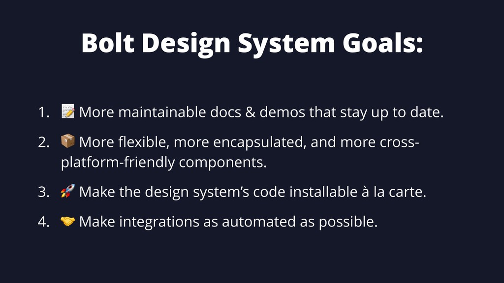
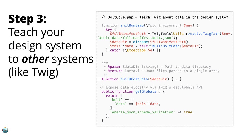
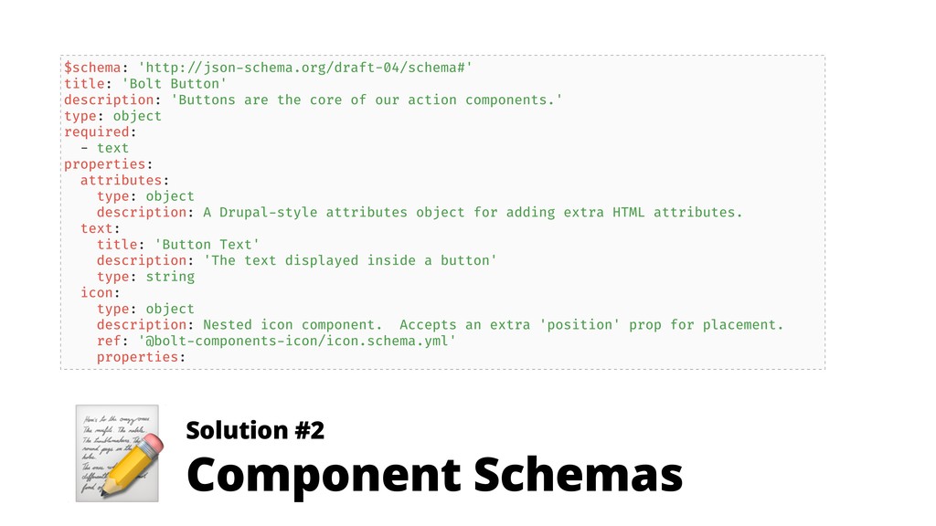
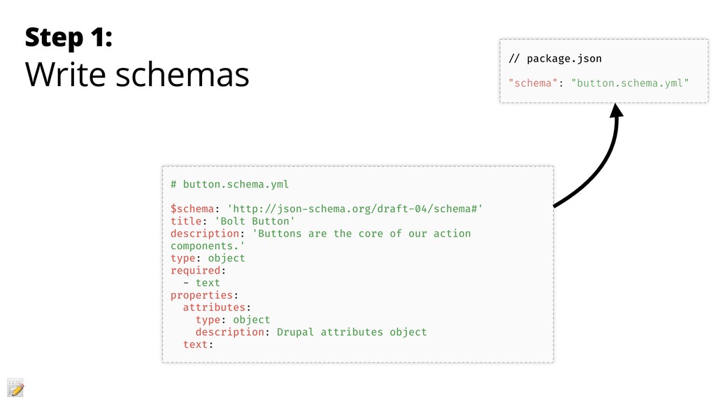
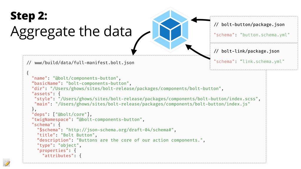
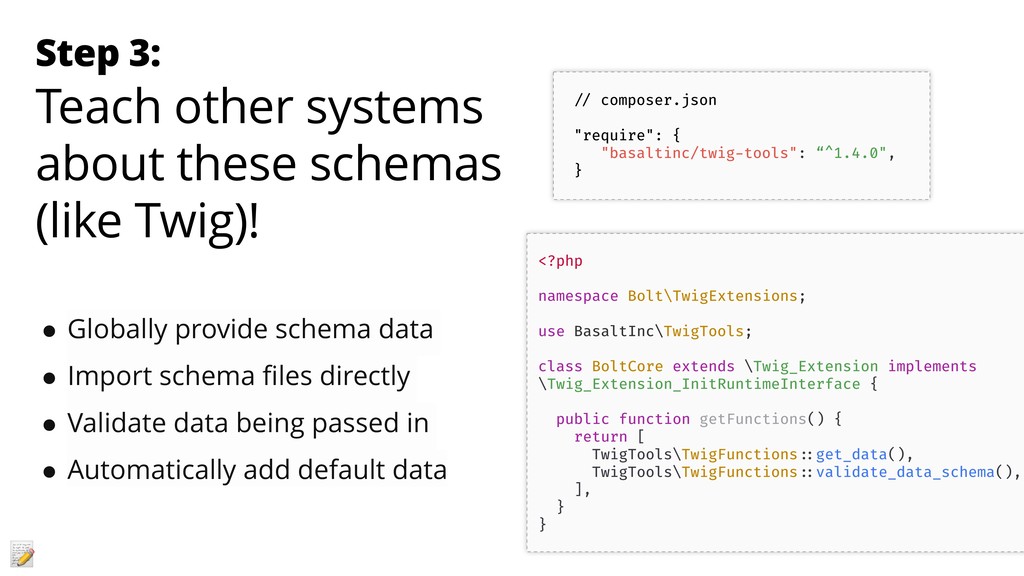
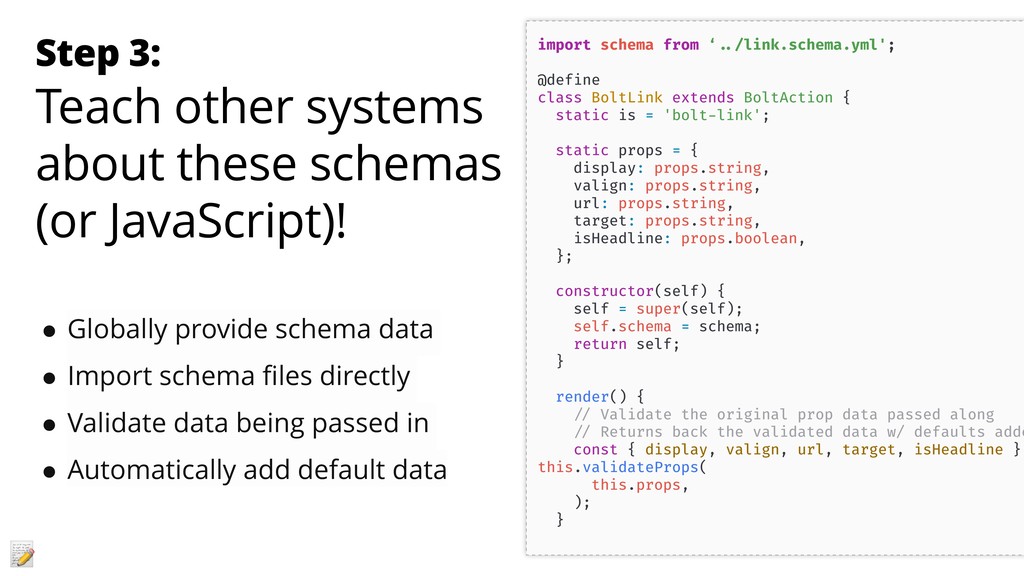
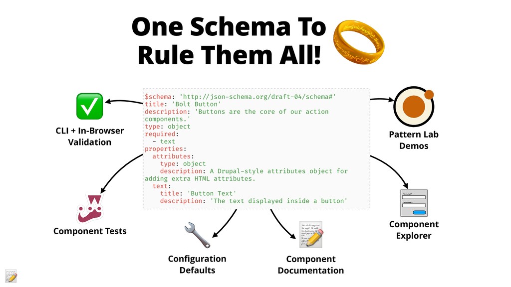
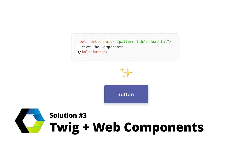
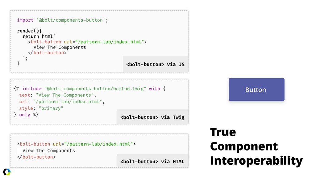
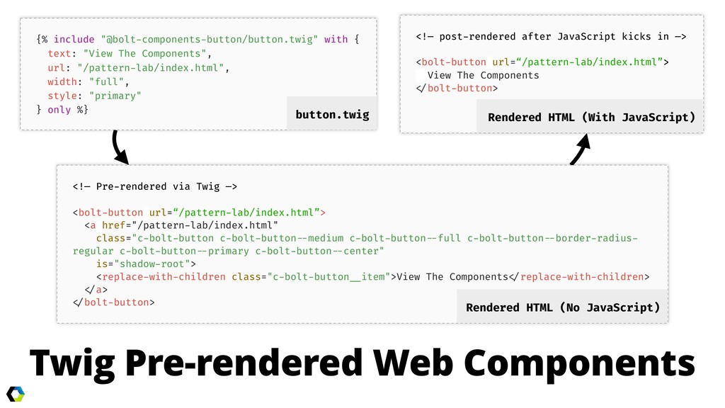
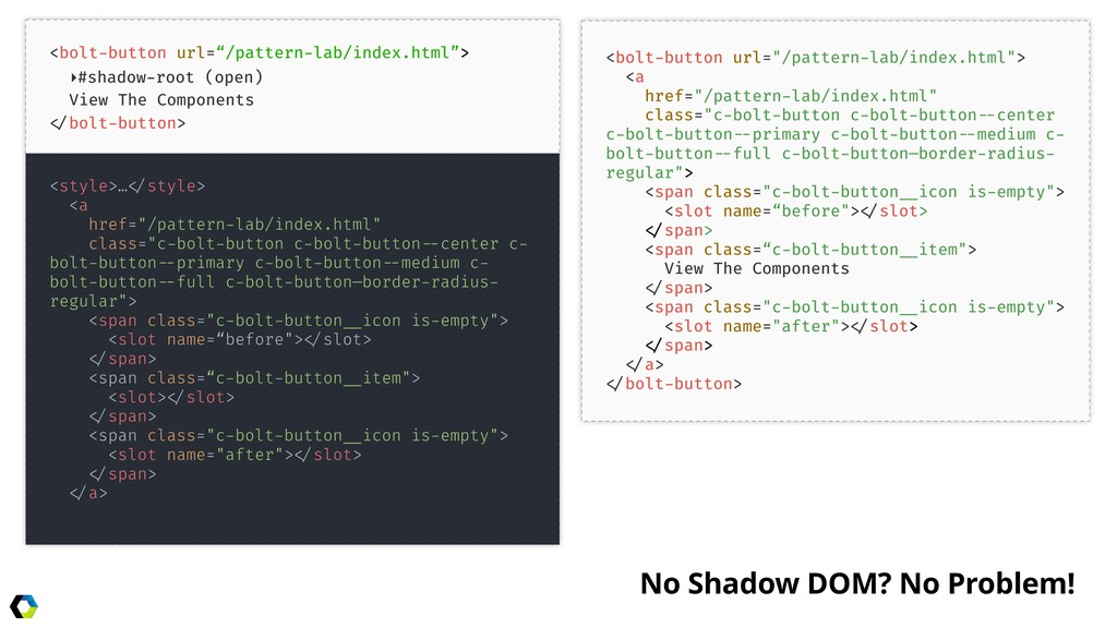
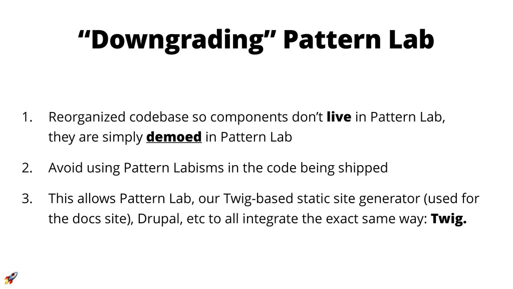
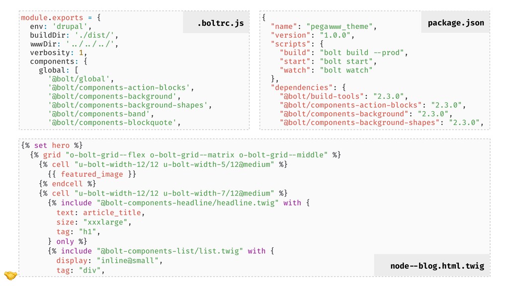
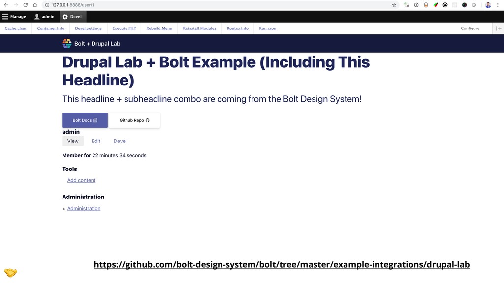
- Why and how to decouple a design system from Pattern Lab and Drupal
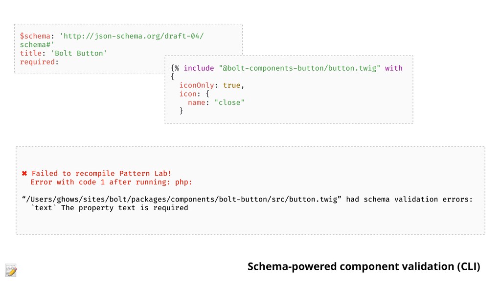
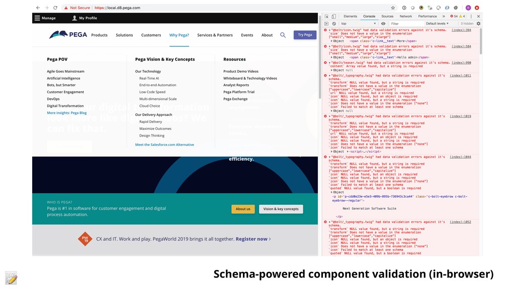
- Preventing component fragmentation in Drupal through the use of web components
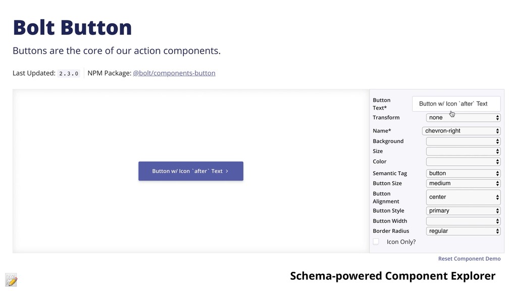
- Pattern Lab improvements and techniques to reduce rework and ease Twig-based component integration
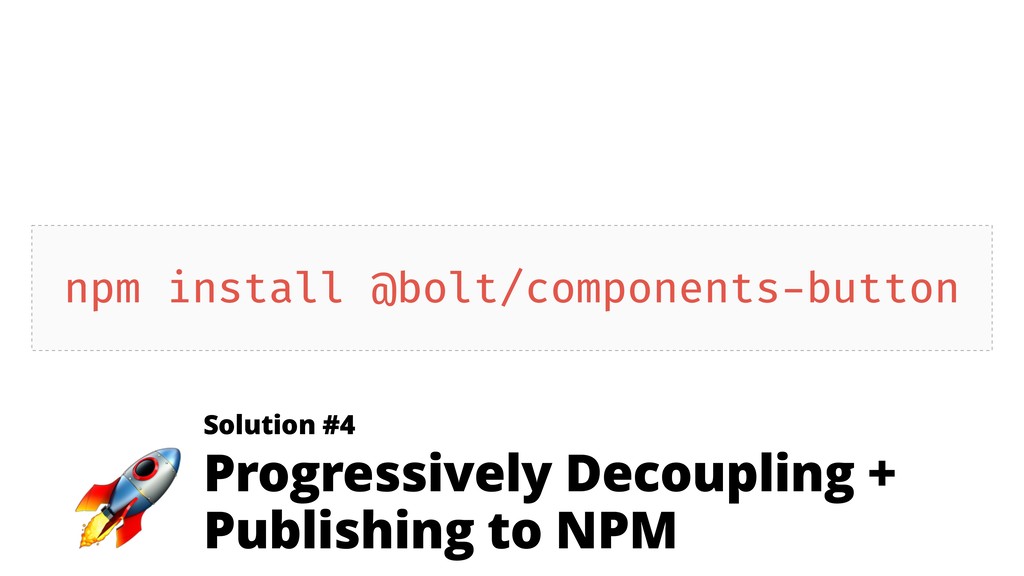
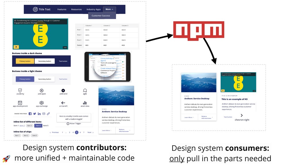
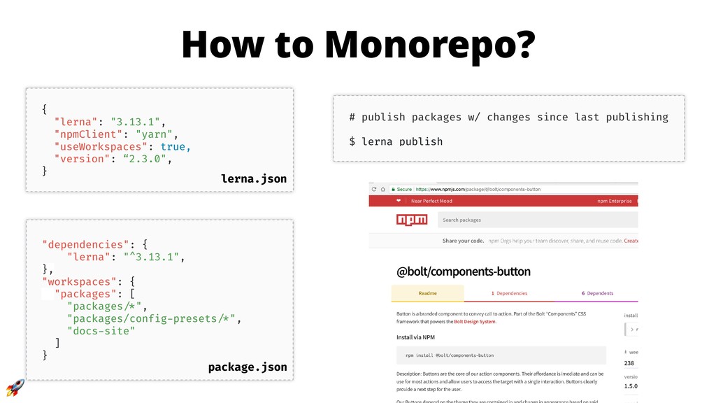
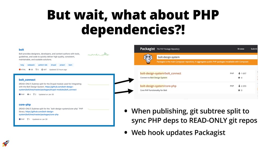
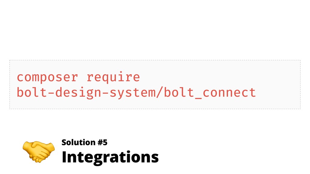
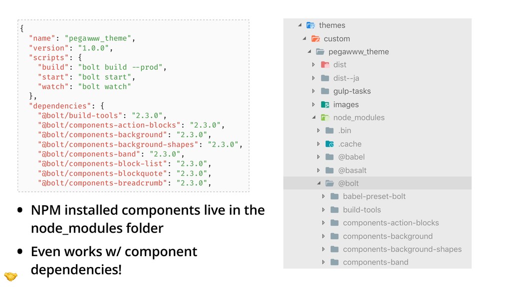
- How distributing a design system via NPM (yes, NPM) can help teams overcome technical hurdles with Composer
 sghoweri
 ike002jp
 kentaroutakeda
 niftycorp
.png) yuriko1211
yuriko1211
 athug
athug
 suguruooki
 raiga0310
 tk3fftk
 panda728
 cottpan
 har1101
 mogamit
 mkilby
 kristinabergwall1
 tamaranovitovic
 reverentgeek
 kimpetersen
 andyhume
 cassininazir
 skoyamalab
 tammyeverts
 katarinadahlin
 tanoku
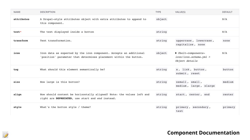
![{% set schema = bolt.data.components['@bolt-components-button'].schema %} {% for size in](https://files.speakerdeck.com/presentations/93ed1e84a4f34784ba2c55b95d8c425c/slide_27.jpg)