Upgrade to Pro — share decks privately, control downloads, hide ads and more …

Grid Systems And Android: DroidKaigi 2019

Soham Mondal
February 07, 2019

Grid Systems And Android: DroidKaigi 2019

This talk was delivered at DroidKaigi 2019, a link to the video will be shared once it is ready.

Description:
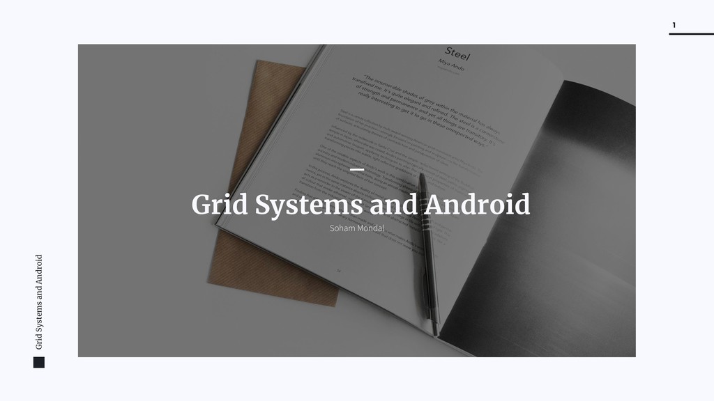
A grid system is at core of any standard, objective design and yet most android applications (and mobile applications in general) fail to pick up on this. In this talk, I talk about the grid system and why its so important for design in general and on android in particular.

Talk structure
- What is the grid?
- Why is it so important for design?
- Evolution of the grid
- Grid in print design, on the web and elsewhere
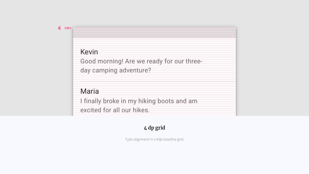
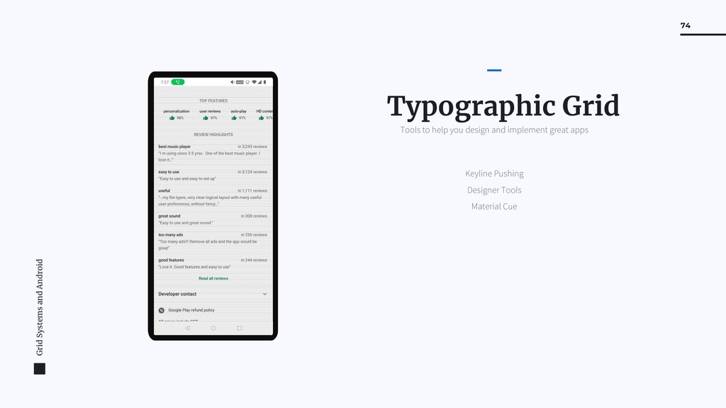
- The typographic grid
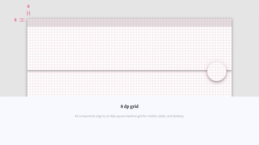
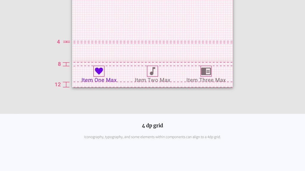
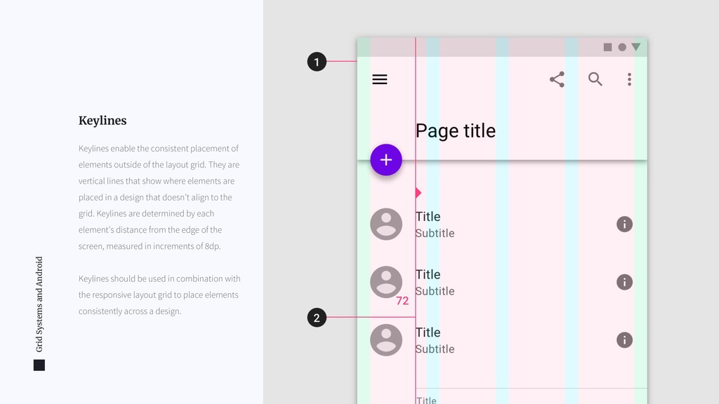
- Grid on mobile and android
- Material design guidelines
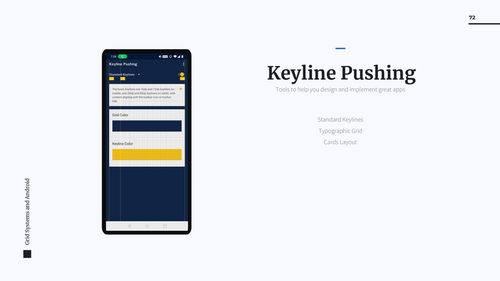
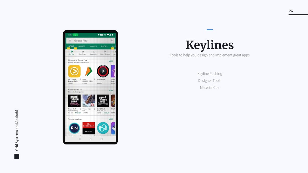
- Material design keylines, metrics, typographic grid
- Examples: With and without the grid
- Key takeaways for android/mobile designers, best practice on android
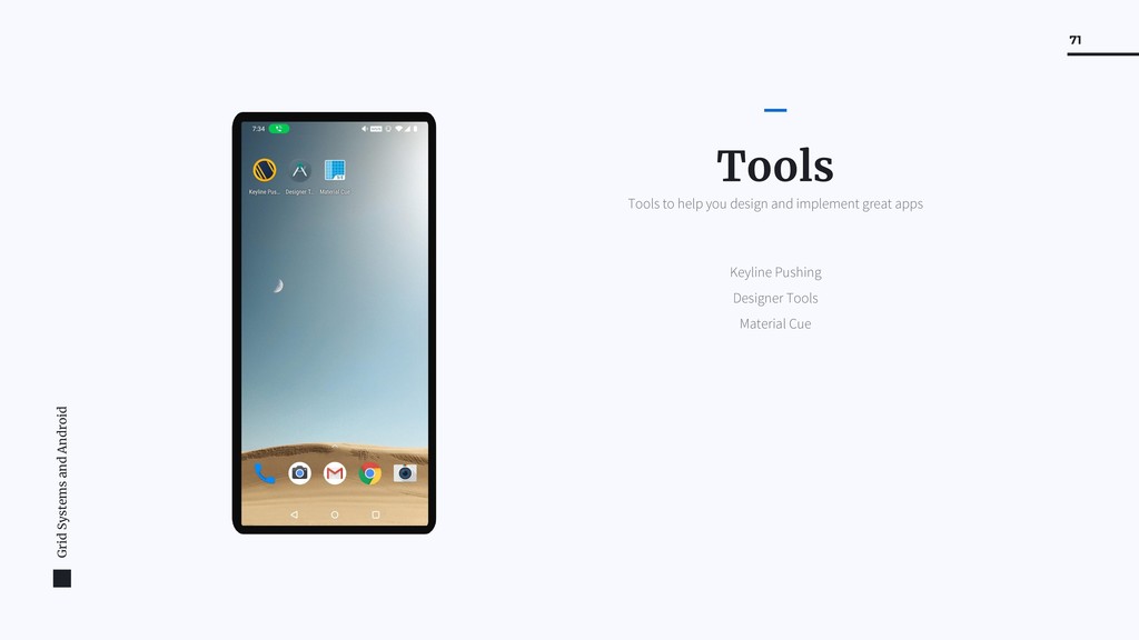
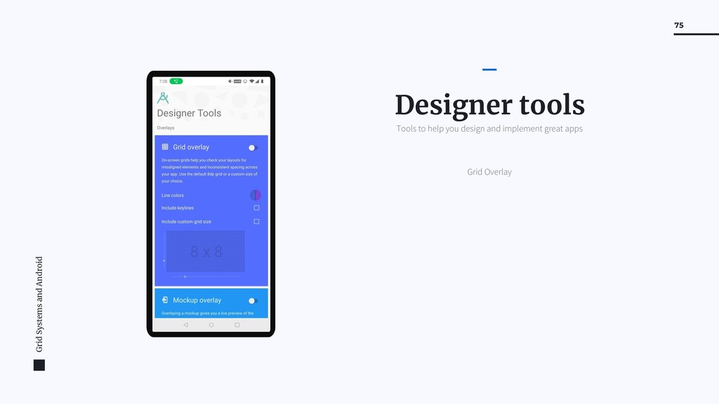
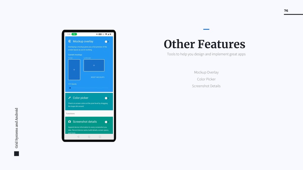
- Some tools to help with your design: keyline pushing, designer tools

Soham Mondal

February 07, 2019
Tweet

More Decks by Soham Mondal

Other Decks in Design

Transcript

  1. Grid Systems and Android 2 Soham Mondal Founder, Triveous Google

    Developer Expert, UX Organizer, GDG Blrdroid Android and UX consultant
  2. Grid Systems and Android 4 "a structure (usually two-dimensional) made

    up of a series of intersecting straight (vertical,horizontal, and angular) or curved guide lines used to structure content. The grid serves as an armature or framework on which a designer can organize graphic elements (images, glyphs, paragraphs, etc.) in a rational, easy-to-absorb manner.” Grid System What is a Grid System? (Wikipedia)
  3. Grid Systems and Android 5 "a structure (usually two-dimensional) made

    up of a series of intersecting straight (vertical,horizontal, and angular) or curved guide lines used to structure content. The grid serves as an armature or framework on which a designer can organize graphic elements (images, glyphs, paragraphs, etc.) in a rational, easy-to-absorb manner.” Grid System What is a Grid System? (Wikipedia)
  4. Grid Systems and Android 6 "a structure (usually two-dimensional) made

    up of a series of intersecting straight (vertical,horizontal, and angular) or curved guide lines used to structure content. The grid serves as an armature or framework on which a designer can organize graphic elements (images, glyphs, paragraphs, etc.) in a rational, easy-to-absorb manner.” Grid System What is a Grid System? (Wikipedia)
  5. Grid Systems and Android 8 A Word document or a

    presentation template will always have a manuscript grid. Sometimes these grids are invisible, although they can be toggled to show up on documents editors like Word. Manuscript grids in a text document separate the header, the footer and the space on the edges (margins). The manuscript layout creates a rectangle inside the page (format), like a bounding box for text. Manuscript grid
  6. Grid Systems and Android 9 Column grids are used to

    organize elements into columns. Magazines use column grids to place the text in easy-to-read sections. Some academic textbooks also use them. Column grids are used inside websites as well, like in online newspapers or blogs. Column grids can have as little as two columns or as many as six or more, but that is not very common. Column Grid
  7. Grid Systems and Android 10 A great example of an

    asymmetric column grid is the general layout of a blog post (beneath the header) Column Grid
  8. Grid Systems and Android 11 The magazine example below uses

    a three column grid with proportional widths. The title and subtitle take up the space of all three columns while some highlighted text takes up the space of two columns. Three Column Grid
  9. Grid Systems and Android 12 A modular grid is similar

    to a column grid in that it has columns, but it also has rows. This kind of grid is used when there are more elements to organize and a column grid isn’t enough. Newspapers use column and modular grids to organize the stories comfortably and easy to read. Modular grids have equal size modules. This makes it easier to “break the rules” and use the spatial zones in different ways. Modular Grid
  10. Grid Systems and Android 13 A modular grid is similar

    to a column grid in that it has columns, but it also has rows. This kind of grid is used when there are more elements to organize and a column grid isn’t enough. Newspapers use column and modular grids to organize the stories comfortably and easy to read. Modular grids have equal size modules. This makes it easier to “break the rules” and use the spatial zones in different ways. Modular Grid
  11. Grid Systems and Android 14 A baseline is the line

    where text sits. Leading is the spacing between baselines. A baseline grid can be applied to any of the grids mentioned above. Using a baseline grid will give a flowing rhythm to the text. It will also give the headings and subheadings a proportional space in relation to the body text, making them more pleasing to the reader. Baseline Grid
  12. Grid Systems and Android 15 A baseline is the line

    where text sits. Leading is the spacing between baselines. A baseline grid can be applied to any of the grids mentioned above. Using a baseline grid will give a flowing rhythm to the text. It will also give the headings and subheadings a proportional space in relation to the body text, making them more pleasing to the reader. Baseline Grid
  13. Grid Systems and Android 16 Hierarchical grids are mostly used

    in web design. The purpose of a hierarchical grid design is to organize elements in order of importance. It is still called a grid because the modules are still set up inside a measured manuscript grid. A hierarchical grid can be set up freestyle, or with a modular grid as a guide. Having the knowledge to set up a balanced hierarchical grid without a guiding modular grid, takes years of practice. This is why designers create website templates for non-designers to simply place their information in. Even seasoned designers use already built templates to save precious time. Hierarchical Grid
  14. Grid Systems and Android 18 Bootstrap is a free and

    open-source front-end framework for developing websites and web applications. It contains HTML and CSS-based design templates for typography, forms, buttons, navigation and other interface components, as well as optional JavaScript extensions. Bootstrap Grids on the web
  15. Grid Systems and Android 20 Systematic Systematic presentation of facts,

    construct the text, illustrations systematically, uniformly and logically
  16. Grid Systems and Android 21 Economical Use of design resource

    should be meaningful and honest, problem can be solved quicker and at lower cost
  17. Grid Systems and Android 22 Readable Sense of compact planning,

    intelligibility and clarity, orderliness of design, content is better understood and retained in memory
  18. Grid Systems and Android 23 Constructing a Grid System What

    goes into the creation of a Grid System?
  19. Grid Systems and Android 24 - Legibility - Viewing Distance

    - Column width - Number of columns Considerations
  20. Grid Systems and Android 26 In the 13th century, French

    architect Villard de Honnecourt created a diagram in an attempt to achieve “harmonious design”. The diagram merged the grid system with the golden ratio in order to produce page layouts with margins based on fixed ratios. 13th Century, Renaissance Because printed publications had to be set in the three official languages — German, French and Italian — designers needed a new grid system that would allow for that. Typographers such as Jan Tschichold and Herbert Bayer addressed it with a modular approach. World War I: Swiss School With rare exceptions, type was generally set in one justified column per page and placed symmetrically on the spread. 15th Century
  21. Grid Systems and Android 27 first examples of printer matter

    with the help of a grid: Paul Rand, disposition of text and illustrations based on strict principles, by uniformity of layout of all pages, objective attitude in presentation of subject 1940s 2019 Grid Systems in Graphic Design – Josef Müller-Brockmann 1968
  22. Grid Systems and Android 29 All components align to an

    8dp square baseline grid for mobile, tablet, and desktop. 8 dp grid
  23. Grid Systems and Android 30 Iconography, typography, and some elements

    within components can align to a 4dp grid. 4 dp grid
  24. Grid Systems and Android 32 Keylines enable the consistent placement

    of elements outside of the layout grid. They are vertical lines that show where elements are placed in a design that doesn’t align to the grid. Keylines are determined by each element’s distance from the edge of the screen, measured in increments of 8dp. Keylines should be used in combination with the responsive layout grid to place elements consistently across a design. Keylines
  25. Grid Systems and Android 33 Keylines enable the consistent placement

    of elements outside of the layout grid. They are vertical lines that show where elements are placed in a design that doesn’t align to the grid. Keylines are determined by each element’s distance from the edge of the screen, measured in increments of 8dp. Keylines should be used in combination with the responsive layout grid to place elements consistently across a design. Keylines
  26. Grid Systems and Android 34 Padding refers to the space

    between UI elements. It’s an alternative spacing method to keylines, measured in increments of 8dp or 4dp. Padding should be used in combination with the responsive layout grid to place elements consistently across a design. Padding
  27. Grid Systems and Android 35 Vertical spacing refers to the

    height of a standard element, such as an app bar or list item. The heights of these elements should align to the 8dp grid. 1. Status bar: 24dp 2. App bar: 56dp 3. List item: 88dp Vertical Spacing
  28. Grid Systems and Android 36 An increment is a measurement

    used to measure the size and placement of elements in your app. It has equal height and width. It can be any number, but it’s recommended to use the height of a standard element (such as the app bar) as your increment. Increment
  29. Grid Systems and Android 37 Adapting to screen size and

    orientation changes How to use the grid while designing interfaces for different screen sizes and orientations
  30. Grid Systems and Android 38 These contain the content of

    the application 1. Columns These are the spaces between columns 2. Gutters Spaces between content and the edge of the screen 3. Margins
  31. Grid Systems and Android 39 Column width is defined using

    percentages, rather than fixed values, to allow content to flexibly adapt to any screen size. The number of columns displayed in the grid is determined by the breakpoint range (a range of predetermined screen sizes) at which a screen is viewed, whether it’s a breakpoint for mobile, tablet, or another size. Column Width and Breakpoints
  32. Grid Systems and Android 40 On tablet, at a breakpoint

    of 600dp, this layout grid uses 8 columns. Tablet Layout
  33. Grid Systems and Android 41 Each breakpoint range determines the

    number of columns, and recommended margins and gutters, for each display size. Breakpoints Material design breakpoints on android Breakpoint Range (dp) Portrait Landscape Window Columns Margins / Gutters* 0 – 359 small handset xsmall 4 16 360 – 399 medium handset xsmall 4 16 400 – 479 large handset xsmall 4 16 480 – 599 large handset small handset xsmall 4 16 600 – 719 small tablet medium handset small 8 16 720 – 839 large tablet large handset small 8 24 840 – 959 large tablet large handset small 12 24 960 – 1023 small tablet small 12 24 1024 – 1279 large tablet medium 12 24 1280 – 1439 large tablet medium 12 24 1440 – 1599 large 12 24 1600 – 1919 large 12 24 1920 + xlarge 12 24
  34. Grid Systems and Android 42 Material Design provides responsive layouts

    based on the following column structures. Layouts using 4-column, 8-column, and 12-column grids are available for use across different screens, devices, and orientations. Each breakpoint range determines the number of columns, and recommended margins and gutters, for each display size. Breakpoints
  35. Grid Systems and Android 43 Gutters are the spaces between

    columns. They help separate content. Gutter widths are fixed values at each breakpoint range. To better adapt to the screen, gutter width can change at different breakpoints. Wider gutters are more appropriate for larger screens, as they create more whitespace between columns. On mobile, at a breakpoint of 360dp, this layout grid uses 16dp gutters. Gutters
  36. Grid Systems and Android 44 On tablet, at a breakpoint

    of 600dp, this layout grid uses 24dp gutters. Tablet Layout
  37. Grid Systems and Android 45 Margins are the space between

    content and the left and right edges of the screen. Margin widths are defined as fixed values at each breakpoint range. To better adapt to the screen, the margin width can change at different breakpoints. Wider margins are more appropriate for larger screens, as they create more whitespace around the perimeter of content. On mobile, at a breakpoint of 360dp, this layout grid uses 16dp margins. Margins
  38. Grid Systems and Android 46 On a small tablet, at

    a breakpoint of 600dp, this layout grid uses 24dp margins. Tablet Layout
  39. Grid Systems and Android 48 This layout grid uses 8dp

    gutters. The tighter spacing may suggest the images are closely related to one another, so that they are perceived as part of a collection. Customising Gutters: Tight Spacing
  40. Grid Systems and Android 49 This layout grid uses larger,

    32dp gutters to create more separation between columns. The extra space helps each album to be perceived as an individual entity within a collection. Customising Gutters: Extra Spacing
  41. Grid Systems and Android 50 This layout grid uses small,

    8dp margins to allow images to take up more space in the layout. Customising Margins: Tight Spacing
  42. Grid Systems and Android 51 This layout grid uses large,

    64dp margins to limit the width of content. Customising Margins: Extra Spacing
  43. Grid Systems and Android 53 Whether to increase your UI’s

    density can be determined by how users interact with a component. Components with high density enable users to process and take action against large amounts of information in a more manageable way. List, tables, and long forms are components that benefit from increased density. Applying Density
  44. Grid Systems and Android 54 High-density component row height, with

    wide margins and gutters Applying Density: High
  45. Grid Systems and Android 55 Default density component row height,

    with narrow margins and gutters Applying Density: Default
  46. Grid Systems and Android 57 The baseline is the invisible

    line upon which a line of text rests. In Material Design, the baseline is an important specification in measuring the vertical distance between text and an element. Baseline
  47. Grid Systems and Android 58 Regardless of pt / sp

    size, a text’s baseline must sit on the 4dp grid. Line-height must be a value divisible by 4 to maintain the grid. 4dp baseline Grid
  48. Grid Systems and Android 59 Line height is the space

    between lines of text. Line height can be used as a way to create density in typographic layouts. When tightening line height be sure to still use the 4dp baseline grid. Applying Density in Type
  49. Grid Systems and Android 61 When creating an icon, view

    and edit it at 400% (192 x 192 dp), which will display edges at 4dp. By maintaining this ratio, any changes to the original will be scaled up or down proportionally, which preserves sharp edges and correct alignment when the scale is returned to 100% (48dp). Keyline shapes are based on the grid. By using these core shapes as a baseline, you can maintain consistent visual proportions throughout your product icons. Icons How do Icons align with the grid?
  50. Grid Systems and Android 63 Basil uses a responsive grid

    system, which has flexible columns and padding that can resize depending on the screen width (such as mobile, tablet, or desktop). Basil center-aligns type to sections of its layout grid. Basil Recipe App
  51. Grid Systems and Android 64 Crane uses a responsive grid

    system, which has flexible columns and padding that can resize depending on the screen width (such as mobile, tablet, and desktop). Content is stacked in columns, which vertically expand and contract upon user interaction. Crane Travel App
  52. Grid Systems and Android 65 Fortnightly combines a variety of

    information together, particularly in places such as the landing page. In other places, such as an individual article, there is generous whitespace for content. All pages use the same responsive grid, allowing content to reflow into the screen space available, after certain breakpoints are reached. Fortnightly News app
  53. Grid Systems and Android 66 Owl uses a responsive grid

    system, which has flexible columns and padding that can resize depending on the screen width (such as mobile, tablet, or desktop). Owl Educational App
  54. Grid Systems and Android 67 Rally uses a responsive grid

    system, which has flexible columns and padding that can resize to accommodate any screen width. Rally Personal Finance App
  55. Grid Systems and Android 68 Reply uses a responsive grid,

    allowing padding and column size to change across mobile, tablet, and desktop. Content is placed in a column, where messages expand and contract upon interaction. Reply Email App
  56. Grid Systems and Android 69 Shrine uses a responsive grid

    system, allowing padding and column size to change between mobile, tablet, and desktop. Shrine Retail App
  57. Grid Systems and Android 70 Tools Tools to help you

    design and implement grids easily
  58. Grid Systems and Android 71 Keyline Pushing Designer Tools Material

    Cue Tools Tools to help you design and implement great apps
  59. Grid Systems and Android 72 Standard Keylines Typographic Grid Cards

    Layout Keyline Pushing Tools to help you design and implement great apps
  60. Grid Systems and Android 73 Keyline Pushing Designer Tools Material

    Cue Keylines Tools to help you design and implement great apps
  61. Grid Systems and Android 74 Keyline Pushing Designer Tools Material

    Cue Typographic Grid Tools to help you design and implement great apps
  62. Grid Systems and Android 75 Grid Overlay Designer tools Tools

    to help you design and implement great apps
  63. Grid Systems and Android 76 Mockup Overlay Color Picker Screenshot

    Details Other Features Tools to help you design and implement great apps
  64. Grid Systems and Android 78 https://material.io/design Material Design Josef Müller-Brockmann

    Grid Systems in Graphic Design https://visme.co/blog/layout-design/ A Quick Look at Types of Grids