Upgrade to Pro — share decks privately, control downloads, hide ads and more …

Flex

 Flex

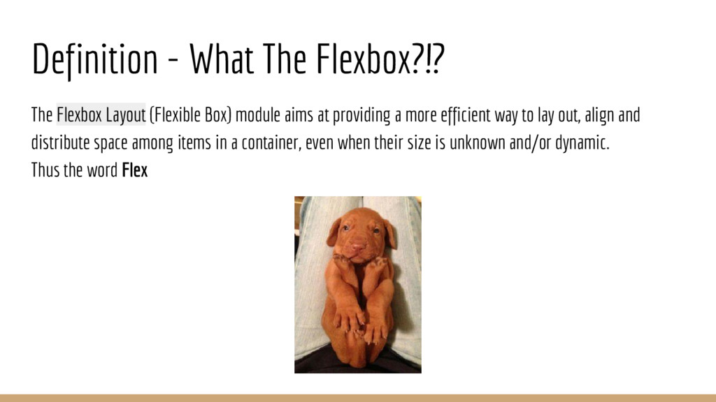
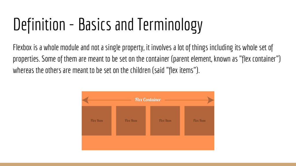
The Flexbox Layout (CSS3 Flexible Box) module aims at providing a more efficient way to lay out, align and distribute space among items in a container, even when their size is unknown and/or dynamic (thus the word "flex").

Created and presented by Yosi Konigsberg

Avatar for Spectory.

Spectory.

March 01, 2016
Tweet

More Decks by Spectory.

Other Decks in Programming

Transcript

  1. Agenda • Intro - problems with float layout & how

    flex box solves this issues • Definition - what is Flexbox? • Basics And Terminology • learn Flexbox properties with demos • Responsive Design with FlexBox - example
  2. Intro: How Flexbox cures these issues • flex items grow

    to fill available space for or shrink to avoid overflow. • It gives flex items a proportional dimensions. • Flex items inside the flex containers can be laid out in any direction. *It makes the visual content order to be independent of the HTML markup order thereby helping in the responsive theming of sites.
  3. Definition - What The Flexbox?!? The Flexbox Layout (Flexible Box)

    module aims at providing a more efficient way to lay out, align and distribute space among items in a container, even when their size is unknown and/or dynamic. Thus the word Flex
  4. Agenda • Intro - problems with float layout & how

    flex box solves this issues • Definition - what is Flexbox? • Basics And Terminology • learn Flexbox properties with demos • Responsive Design with FlexBox - example
  5. Definition - Basics and Terminology Flexbox is a whole module

    and not a single property, it involves a lot of things including its whole set of properties. Some of them are meant to be set on the container (parent element, known as "flex container") whereas the others are meant to be set on the children (said "flex items").
  6. Basics and Terminology main axis - The main axis of

    a flex container is the primary axis along which flex items are laid out main-start | main-end - The flex items are placed within the container starting from main-start and going to main-end. main size - A flex item's width or height, whichever is in the main dimension, is the item's main size.
  7. Basics and Terminology cross axis - The axis perpendicular to

    the main axis. Its direction depends on the main axis direction. cross-start | cross-end - Flex lines are filled with items and placed into the container starting on the cross- start side of the flex container and going toward the cross-end side. cross size - The width or height of a flex item, whichever is in the cross dimension, is the item's cross size.
  8. Learn Flex Properties with Demos Basic properties for setting the

    flex layout display: flex - This defines a flex container It enables a flex context for all its direct children. flex-grow – This defines the ability for a flex item to grow if necessary. It dictates what amount of the available space inside the flex container the item should take up. Demo: http://codepen.io/YKonigsberg/pen/WrPwYB
  9. Agenda • Intro - problems with float layout & how

    flex box solves this issues • Definition - what is Flexbox? • Basics And Terminology • learn Flexbox properties with demos • Responsive Design with FlexBox - example
  10. Learn Flex Properties with Demos Basic properties for setting direction

    and elements order flex-direction – Specify if the items to be in a row or column and if the markup should be in order or reversed. order – By default, flex items are laid out in the source order. However, the order property controls the order in which they appear in the flex container. Demo: http://codepen.io/YKonigsberg/pen/yeZJKM
  11. Learn Flex Properties with Demos flex-wrap - By default, flex

    items will all try to fit onto one line. You can change that and allow the items to wrap as needed with this property. Demo: http://codepen.io/YKonigsberg/pen/RrzwOM
  12. Learn Flex Properties with Demos Alignment with justify-content justify-content -

    This defines the alignment along the main axis. It helps distribute extra free space left over when either all the flex items on a line are inflexible, or are flexible but have reached their maximum size. Demo: http://codepen.io/YKonigsberg/pen/mVZdQX
  13. Agenda • Intro - problems with float layout & how

    flex box solves this issues • Definition - what is Flexbox? • Basics And Terminology • learn Flexbox properties with demos • Responsive Design with FlexBox - example
  14. Responsive Layout Demo Using only the flexbox and media queries,

    using less to create a better stylesheet code. Demo: http://codepen.io/YKonigsberg/pen/WrLKOw
  15. Agenda • Intro - problems with float layout & how

    flex box solves this issues • Definition - what is Flexbox? • Basics And Terminology • learn Flexbox properties with demos • Responsive Design with FlexBox - example