Upgrade to Pro — share decks privately, control downloads, hide ads and more …

Elements of Responsive Web Design

George White
September 10, 2012

Elements of Responsive Web Design

The basics of Responsive Web Design, for my talk at Mobile Monday Boston.

George White

September 10, 2012
Tweet

More Decks by George White

Other Decks in Technology

Transcript

  1. – Ethan Marcotte, Responsive Web Design “We can embrace the

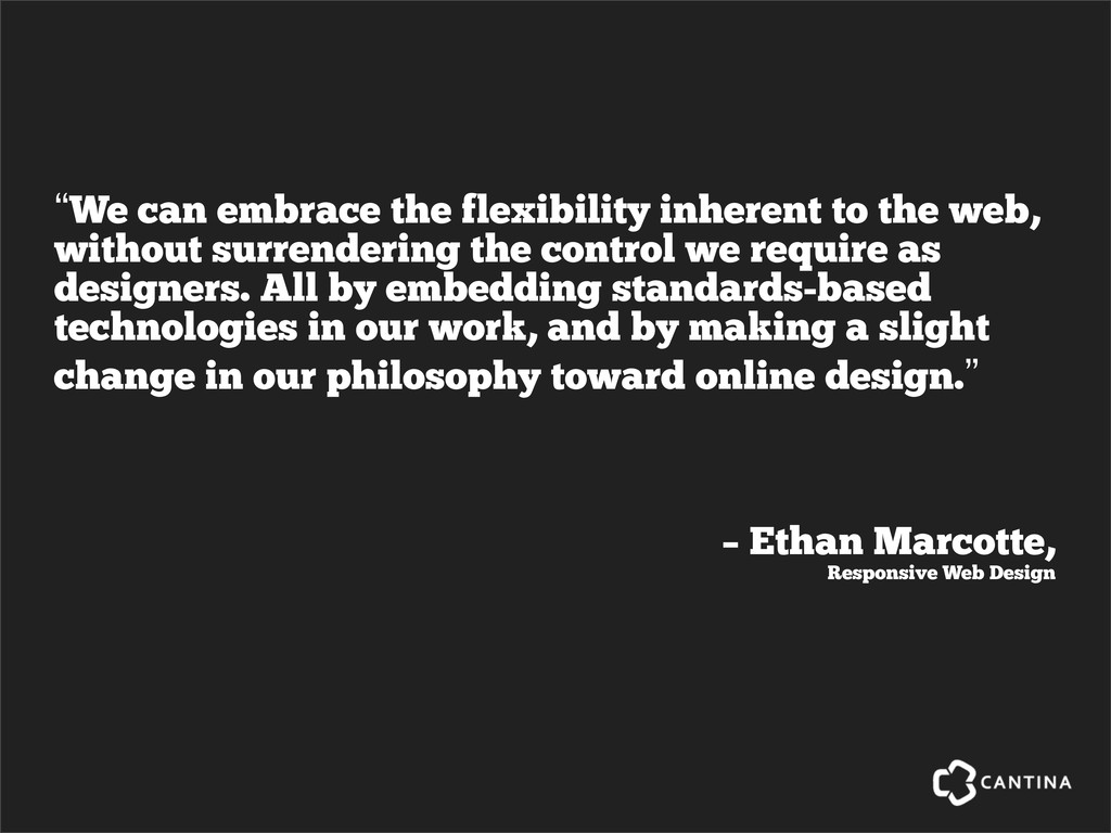
    flexibility inherent to the web, without surrendering the control we require as designers. All by embedding standards-based technologies in our work, and by making a slight change in our philosophy toward online design.”
  2. We can use the fluidity of HTML, CSS and Javascript

    to create designs that provide optimal experiences by responding to device context.
  3. Responsive Web Design gives us the tools to handle the

    ever-increasing number of devices in the wild in a future-friendly* fashion. * http://futurefriend.ly/
  4. Here’s some basic, responsive boilerplate <!DOCTYPE  html>   <html> <head>

    <meta  charset="utf-­‐8"> <meta  name="viewport"  content="width=device-­‐width,  initial-­‐scale=1.0">   </head> <body> … </body> </html>
  5. Let’s add a simple grid <!DOCTYPE  html>   <html> <head>

    <meta  charset="utf-­‐8"> <meta  name="viewport"  content="width=device-­‐width,  initial-­‐scale=1.0"> <link  rel="stylesheet"  href="grid.css"> </head> <body> <div  class="grid"> <div  class="col-­‐2-­‐3"> … </div> <div  class="col-­‐1-­‐3"> … </div> </div> </body> </html> Hat tip to @chriscoyier and http://css-tricks.com/dont-overthink-it-grids/
  6. And now some styles to make the grid work *,

     *:after,  *:before  {        -­‐webkit-­‐box-­‐sizing:  border-­‐box;        -­‐moz-­‐box-­‐sizing:  border-­‐box;        box-­‐sizing:  border-­‐box; } .grid  {  padding:  1em  0  1em  1em  } .grid:after  {        content:  "";        display:  table;        clear:  both; } [class*='col-­‐']  {        float:  left;        padding-­‐right:  1em; } .col-­‐2-­‐3  {  width:  66.66%  } .col-­‐1-­‐3  {  width:  33.33%  } Hat tip to @chriscoyier and http://css-tricks.com/dont-overthink-it-grids/
  7. Let’s use a media query to refine the layout. *,

     *:after,  *:before  {        -­‐webkit-­‐box-­‐sizing:  border-­‐box;        -­‐moz-­‐box-­‐sizing:  border-­‐box;        box-­‐sizing:  border-­‐box; } .grid  {  padding:  1em  0  1em  1em  } .grid:after  {        content:  "";        display:  table;        clear:  both; } [class*='col-­‐']  {        float:  left;        padding-­‐right:  1em; } @media  screen  and  (min-­‐device-­‐width:  480px  )  {        .col-­‐2-­‐3  {  width:  66.66%  }        .col-­‐1-­‐3  {  width:  33.33%  } } Hat tip to @chriscoyier and http://css-tricks.com/dont-overthink-it-grids/
  8. And now the layout responds accordingly. Two columns about @

    480px and above Single column below 480px
  9. Now, let’s make our images flex. *,  *:after,  *:before  {

           -­‐webkit-­‐box-­‐sizing:  border-­‐box;        -­‐moz-­‐box-­‐sizing:  border-­‐box;        box-­‐sizing:  border-­‐box; } .grid  {  padding:  1em  0  1em  1em  } .grid:after  {        content:  "";        display:  table;        clear:  both; } [class*='col-­‐']  {        float:  left;        padding-­‐right:  1em; } img  {  max-­‐width:  100%  }  //  yep,  that’s  it @media  screen  and  (min-­‐device-­‐width:  480px  )  {        .col-­‐2-­‐3  {  width:  66.66%  }        .col-­‐1-­‐3  {  width:  33.33%  } }
  10. And now our images can flex with the layout. Two

    columns about @ 480px and above Single column below 480px
  11. Of course, this requires scaling a single, larger image. There’s

    a lot of work going on to find better solutions for flexible images, such as the <picture> element.
  12. There’s a lot more to it, but that covers the

    basics* of Responsive Web Design. *Your mileage may vary. Support for IE quirks will require more work!
  13. Buzz phrases to consider when thinking responsively Mobile First Design

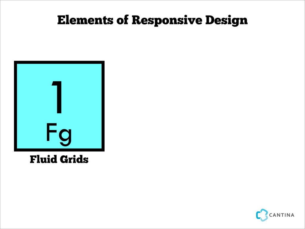
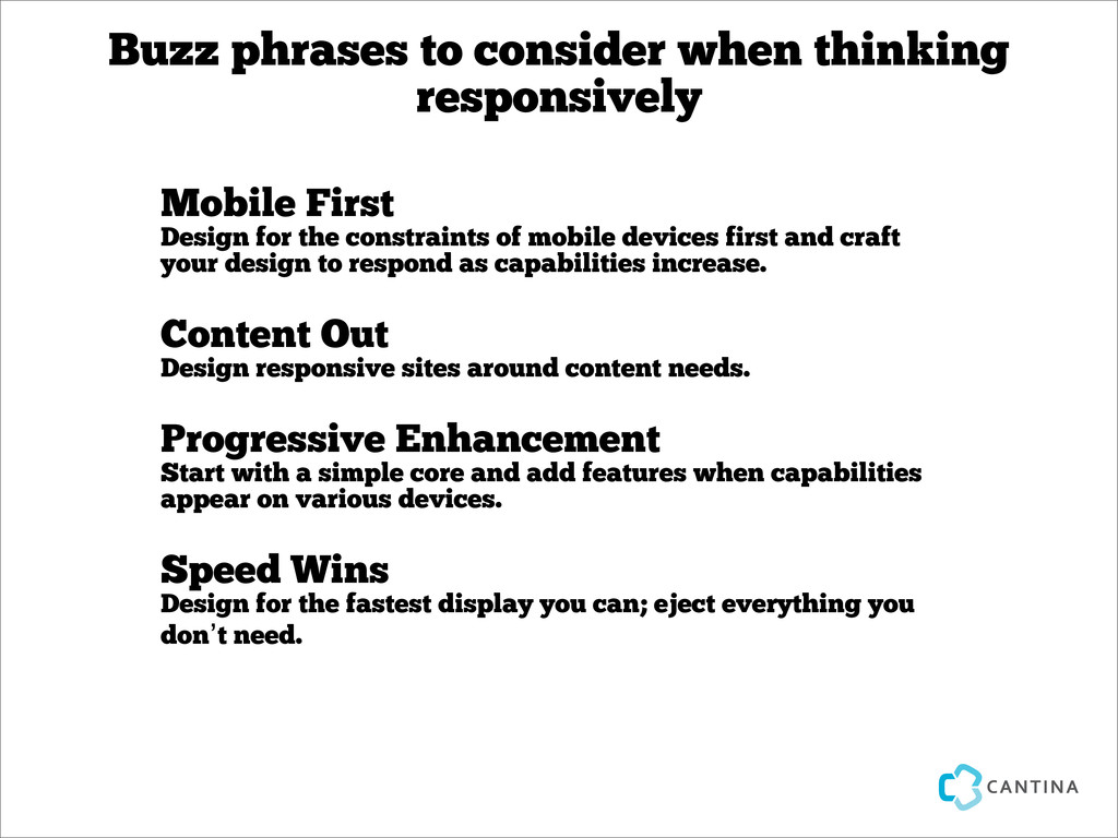
    for the constraints of mobile devices first and craft your design to respond as capabilities increase. Content Out Design responsive sites around content needs. Progressive Enhancement Start with a simple core and add features when capabilities appear on various devices. Speed Wins Design for the fastest display you can; eject everything you don’t need.
  14. Jeffrey Zeldman, Responsive Design. I don’t think that word means

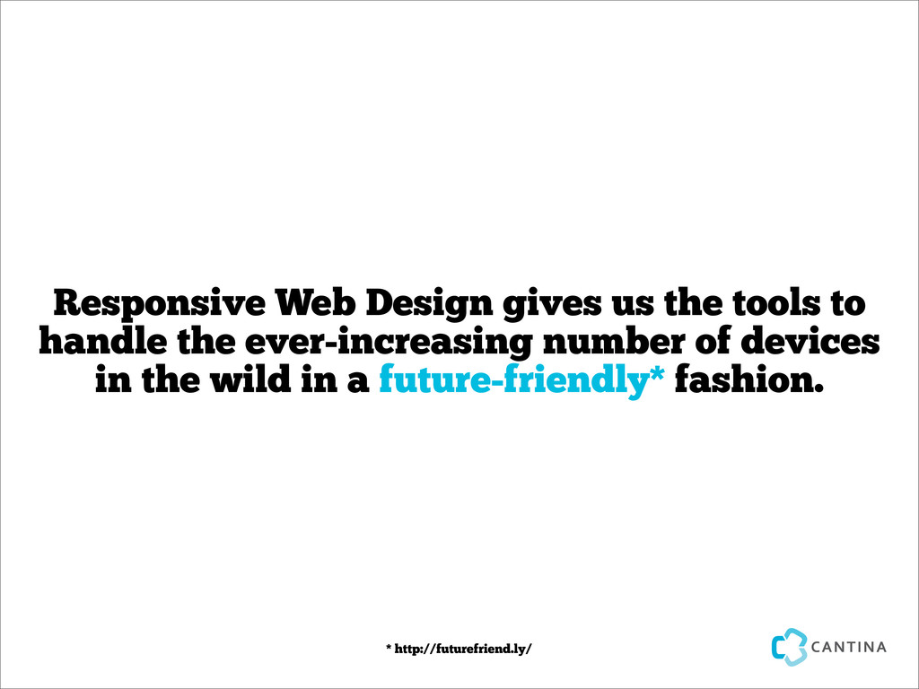
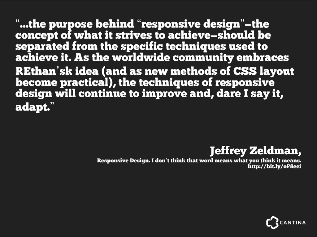
    what you think it means. http://bit.ly/oP8eei “...the purpose behind “responsive design”—the concept of what it strives to achieve—should be separated from the specific techniques used to achieve it. As the worldwide community embraces [Ethan’s] idea (and as new methods of CSS layout become practical), the techniques of responsive design will continue to improve and, dare I say it, adapt.”
  15. The original concept is fine, but it only addresses some

    needs. We need to broaden our notion of ‘responsive’.
  16. Other approaches to being responsive Adaptive Web Design http://www.lullabot.com/articles/responsive-adaptive-web- design

    RESS: Responsive Design + Server Side Components http://www.lukew.com/ff/entry.asp?1392
  17. Some Responsive Design Tools Adobe Shadow labs.adobe.com/technologies/shadow/ Aptus In the

    Mac App Store Firefox 15 getfirefox.com Gridset gridsetapp.com ZURB Foundation foundation.zurb.com
  18. “Ok, I get it! So all of my sites should

    be responsive from now on, right?”
  19. YES