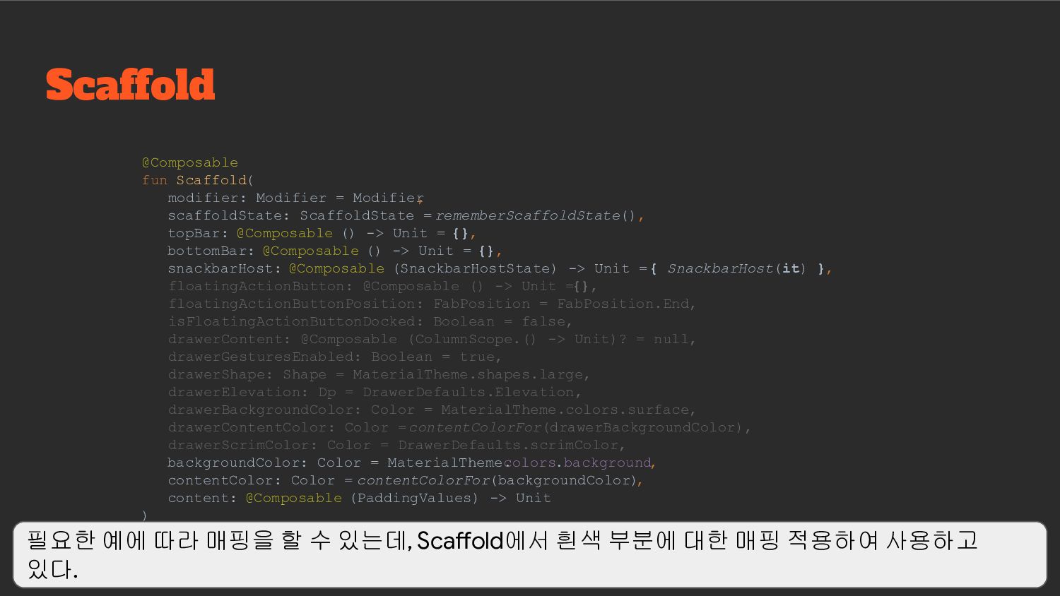
• Scaffold 기반 UI 작업이 가능하도록 만든 Component 구성 Compose Component Mapping 이야기를 하기 전에 Material 2 버전 기반의 Compose Componet 구성에 대한 이야기이며, Scaffold 기반의 UI 작업을 하기 위한 Component 구성에 대한 이야기
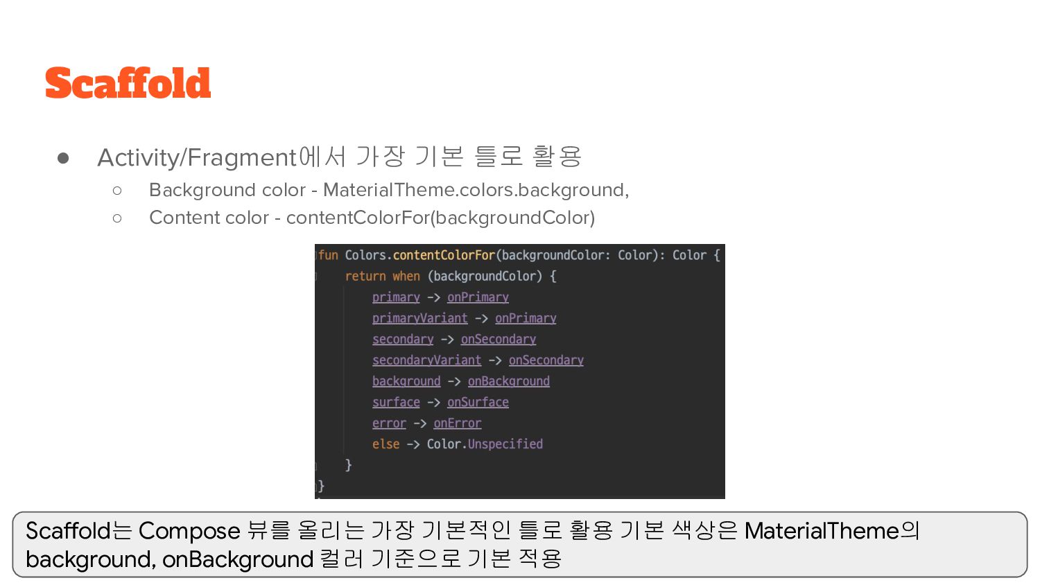
MaterialTheme.colors.background, ◦ Content color - contentColorFor(backgroundColor) Scaffold Scaffold는 Compose 뷰를 올리는 가장 기본적인 틀로 활용 기본 색상은 MaterialTheme의 background, onBackground 컬러 기준으로 기본 적용
ScaffoldState = rememberScaffoldState(), topBar: @Composable () -> Unit = {}, bottomBar: @Composable () -> Unit = {}, snackbarHost: @Composable (SnackbarHostState) -> Unit = { SnackbarHost(it) }, floatingActionButton: @Composable () -> Unit = {}, floatingActionButtonPosition: FabPosition = FabPosition.End, isFloatingActionButtonDocked: Boolean = false, drawerContent: @Composable (ColumnScope.() -> Unit)? = null, drawerGesturesEnabled: Boolean = true, drawerShape: Shape = MaterialTheme.shapes.large, drawerElevation: Dp = DrawerDefaults.Elevation, drawerBackgroundColor: Color = MaterialTheme.colors.surface, drawerContentColor: Color = contentColorFor(drawerBackgroundColor), drawerScrimColor: Color = DrawerDefaults.scrimColor, backgroundColor: Color = MaterialTheme. colors.background, contentColor: Color = contentColorFor(backgroundColor) , content: @Composable (PaddingValues) -> Unit ) 필요한 예에 따라 매핑을 할 수 있는데, Scaffold에서 흰색 부분에 대한 매핑 적용하여 사용하고 있다.
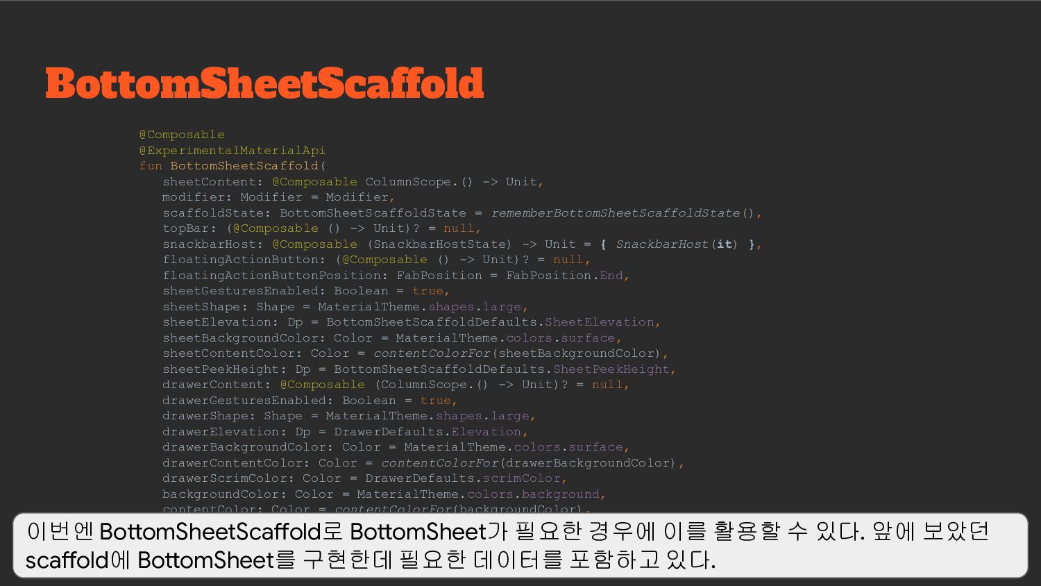
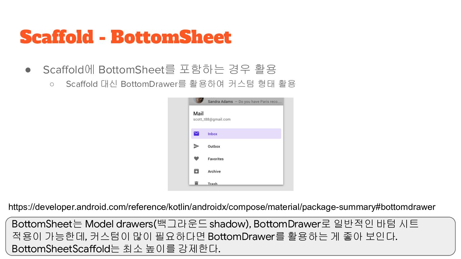
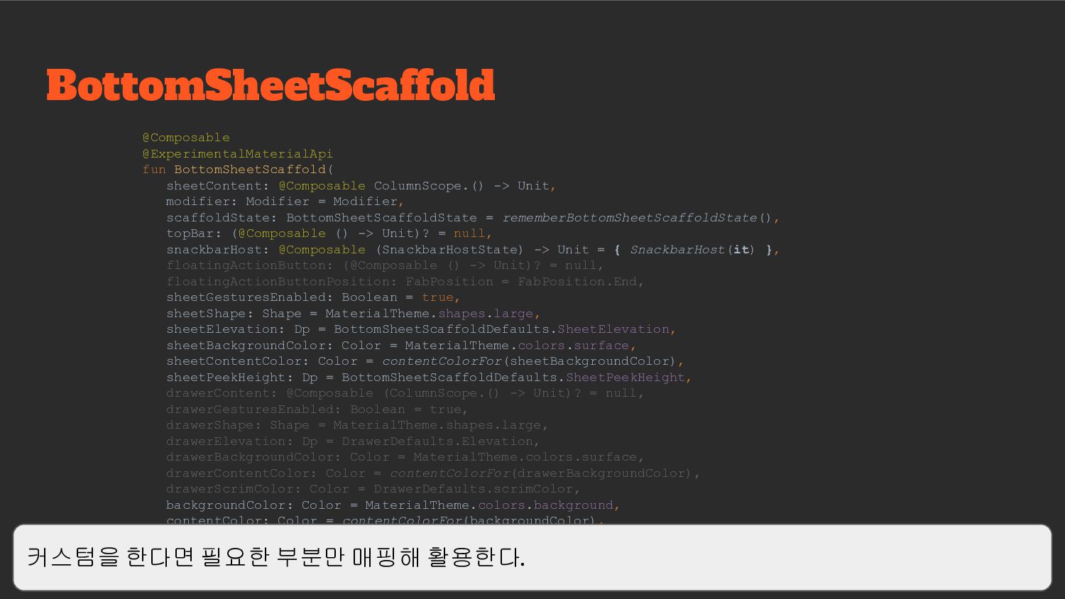
활용하여 커스텀 형태 활용 Scaffold - BottomSheet https://developer.android.com/reference/kotlin/androidx/compose/material/package-summary#bottomdrawer BottomSheet는 Model drawers(백그라운드 shadow), BottomDrawer로 일반적인 바텀 시트 적용이 가능한데, 커스텀이 많이 필요하다면 BottomDrawer를 활용하는 게 좋아 보인다. BottomSheetScaffold는 최소 높이를 강제한다.
시 키보드 및 Focus 날림 처리 • 컬러 셋 지정을 편하게 할 수 있음 Scaffold 매핑 이유 결국 Scaffold 매핑 한 이유는 접근 제한을 한다거나, 기본 색상 정보를 Material을 따르지 않고 싶다면 매핑을 해주는 편이 더 좋다. 포커스 처리를 공통화한다거나, 나만의 UI를 추가한다거나 등이 이유일 수 있다.
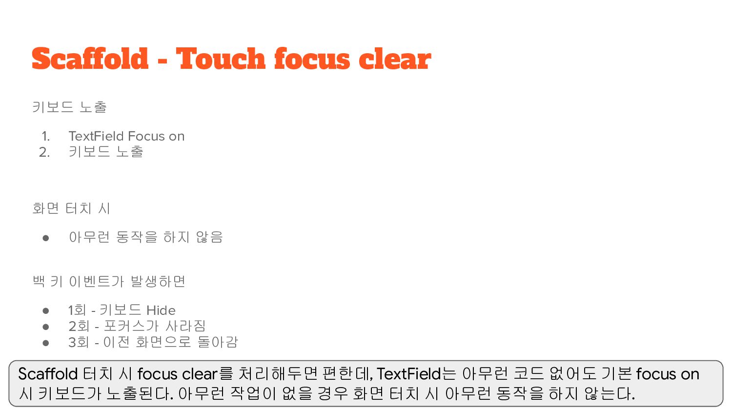
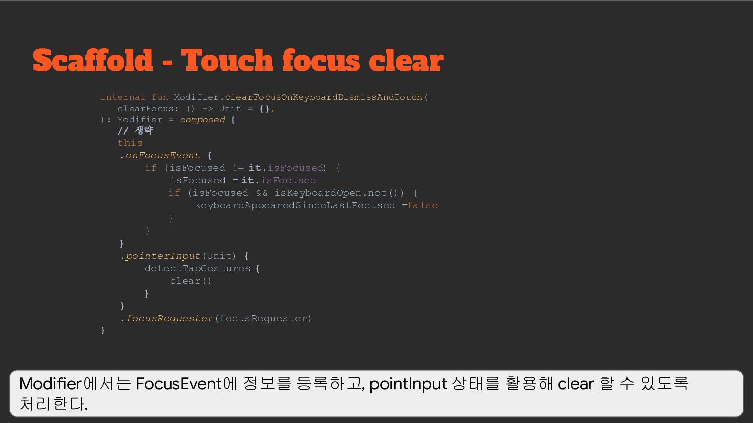
터치 시 • 아무런 동작을 하지 않음 백 키 이벤트가 발생하면 • 1회 - 키보드 Hide • 2회 - 포커스가 사라짐 • 3회 - 이전 화면으로 돌아감 Scaffold - Touch focus clear Scaffold 터치 시 focus clear를 처리해두면 편한데, TextField는 아무런 코드 없어도 기본 focus on 시 키보드가 노출된다. 아무런 작업이 없을 경우 화면 터치 시 아무런 동작을 하지 않는다.
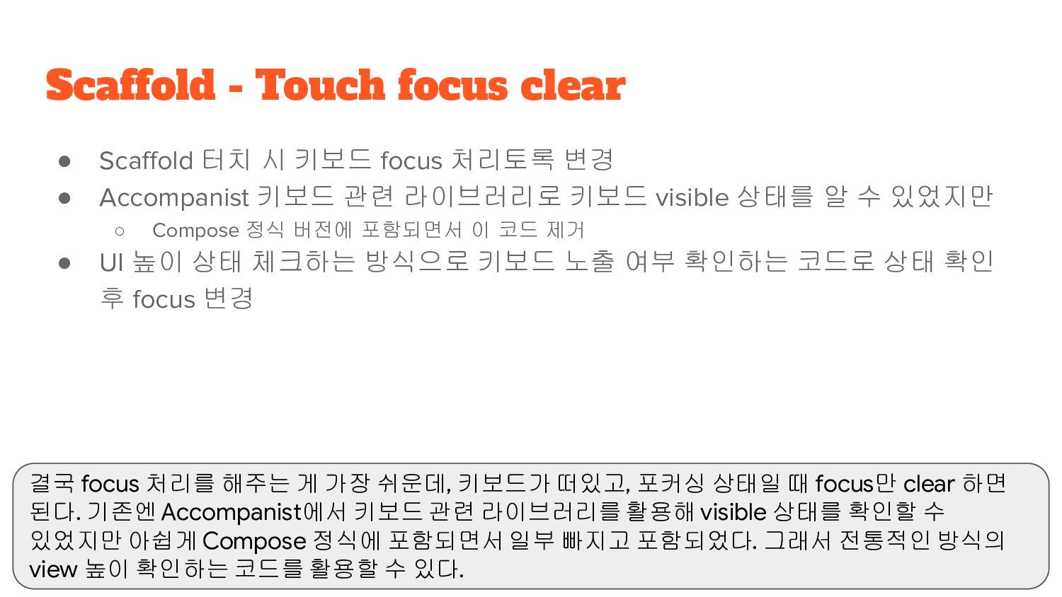
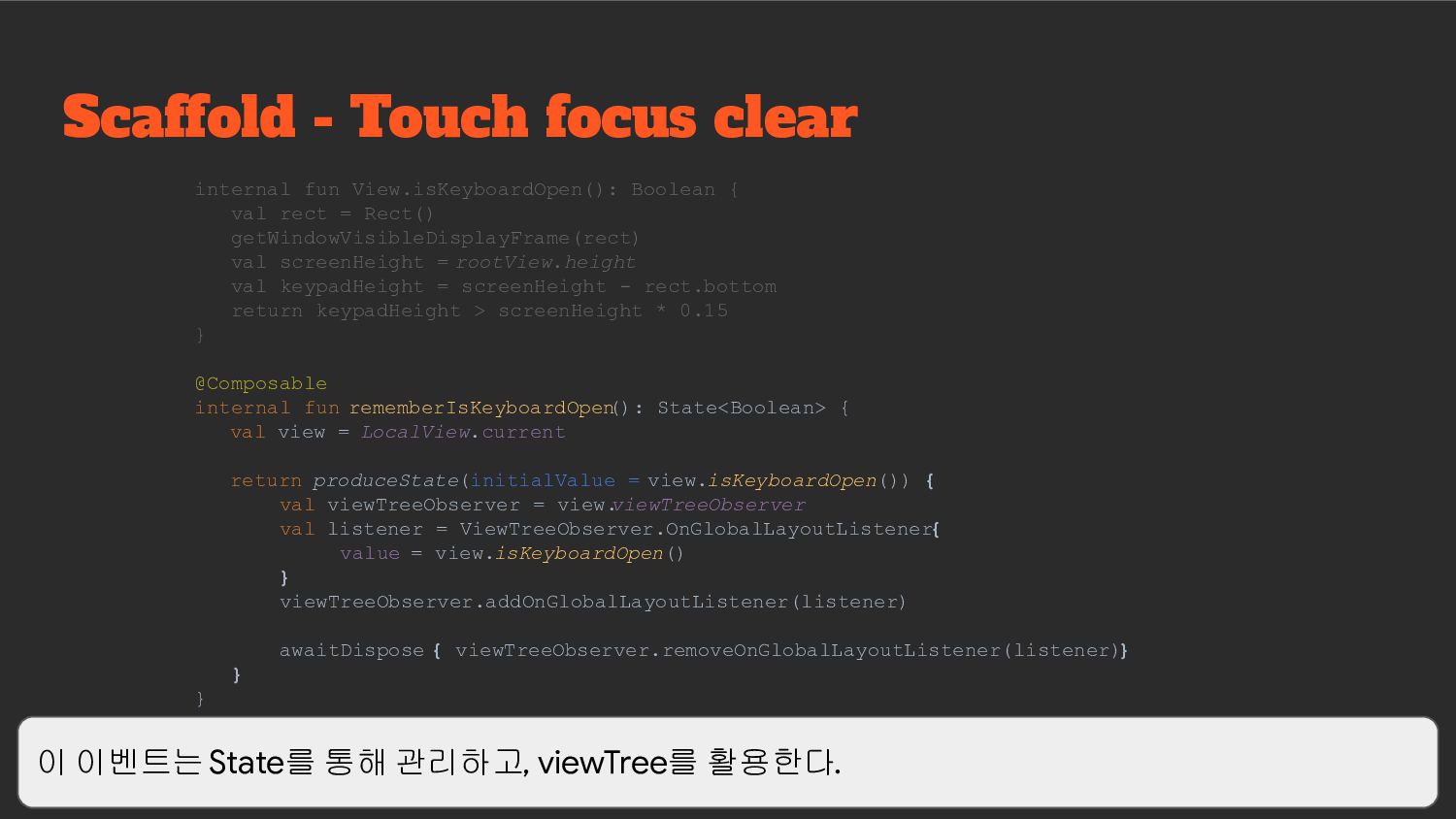
키보드 관련 라이브러리로 키보드 visible 상태를 알 수 있었지만 ◦ Compose 정식 버전에 포함되면서 이 코드 제거 • UI 높이 상태 체크하는 방식으로 키보드 노출 여부 확인하는 코드로 상태 확인 후 focus 변경 Scaffold - Touch focus clear 결국 focus 처리를 해주는 게 가장 쉬운데, 키보드가 떠있고, 포커싱 상태일 때 focus만 clear 하면 된다. 기존엔 Accompanist에서 키보드 관련 라이브러리를 활용해 visible 상태를 확인할 수 있었지만 아쉽게 Compose 정식에 포함되면서 일부 빠지고 포함되었다. 그래서 전통적인 방식의 view 높이 확인하는 코드를 활용할 수 있다.
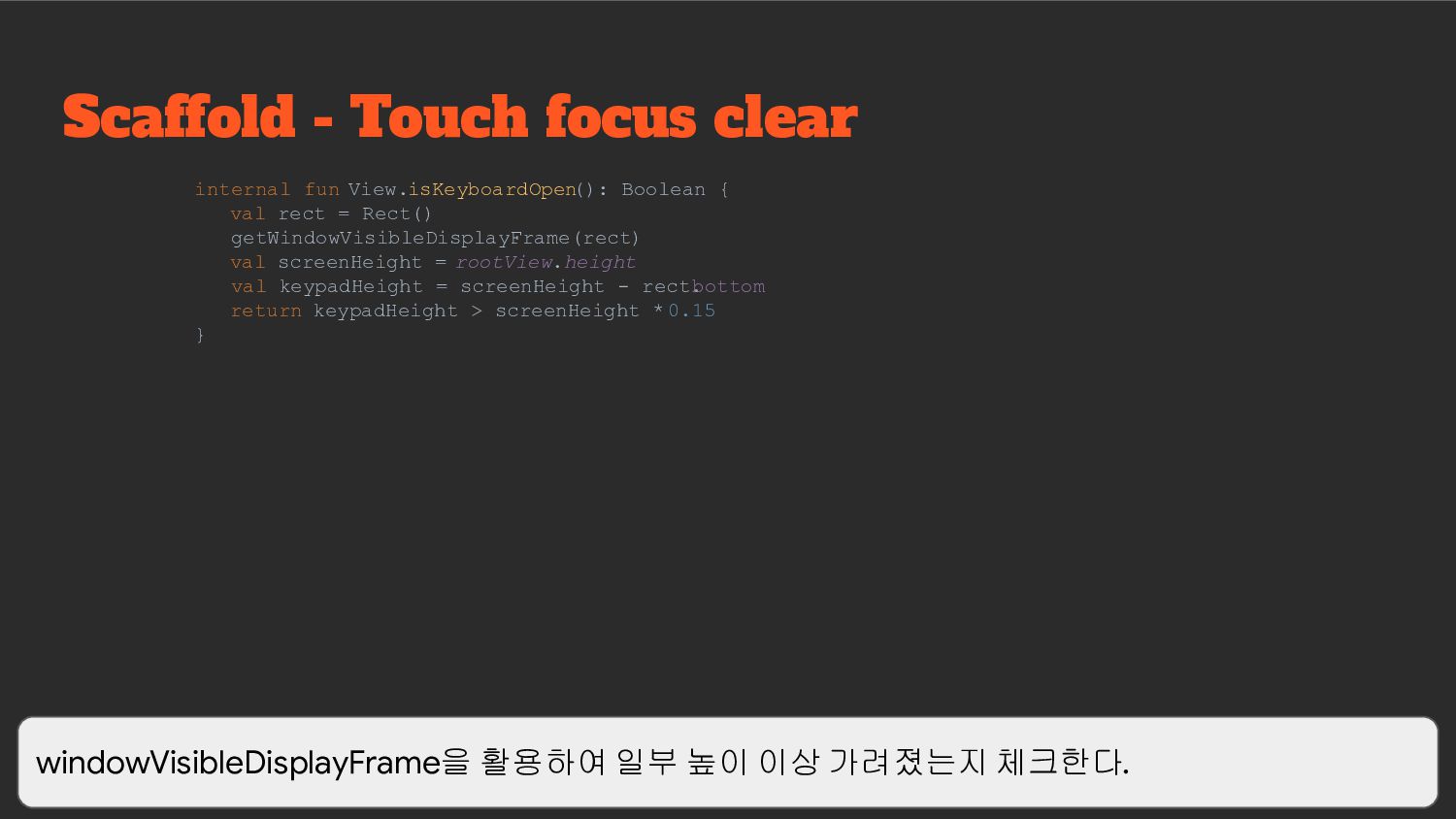
{ val rect = Rect() getWindowVisibleDisplayFrame(rect) val screenHeight = rootView.height val keypadHeight = screenHeight - rect. bottom return keypadHeight > screenHeight * 0.15 } windowVisibleDisplayFrame을 활용하여 일부 높이 이상 가려졌는지 체크한다.
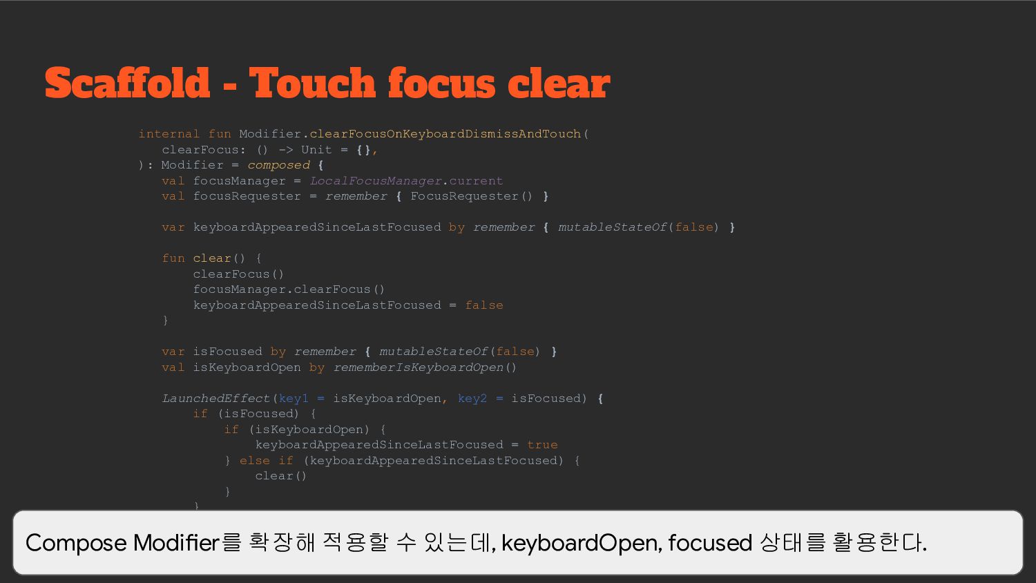
-> Unit = {}, ): Modifier = composed { val focusManager = LocalFocusManager.current val focusRequester = remember { FocusRequester() } var keyboardAppearedSinceLastFocused by remember { mutableStateOf(false) } fun clear() { clearFocus() focusManager.clearFocus() keyboardAppearedSinceLastFocused = false } var isFocused by remember { mutableStateOf(false) } val isKeyboardOpen by rememberIsKeyboardOpen() LaunchedEffect(key1 = isKeyboardOpen, key2 = isFocused) { if (isFocused) { if (isKeyboardOpen) { keyboardAppearedSinceLastFocused = true } else if (keyboardAppearedSinceLastFocused) { clear() } } } Compose Modifier를 확장해 적용할 수 있는데, keyboardOpen, focused 상태를 활용한다.
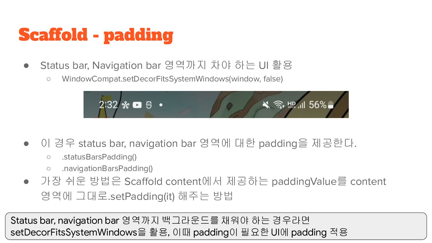
◦ WindowCompat.setDecorFitsSystemWindows(window, false) • 이 경우 status bar, navigation bar 영역에 대한 padding을 제공한다. ◦ .statusBarsPadding() ◦ .navigationBarsPadding() • 가장 쉬운 방법은 Scaffold content에서 제공하는 paddingValue를 content 영역에 그대로.setPadding(it) 해주는 방법 Scaffold - padding Status bar, navigation bar 영역까지 백그라운드를 채워야 하는 경우라면 setDecorFitsSystemWindows을 활용, 이때 padding이 필요한 UI에 padding 적용
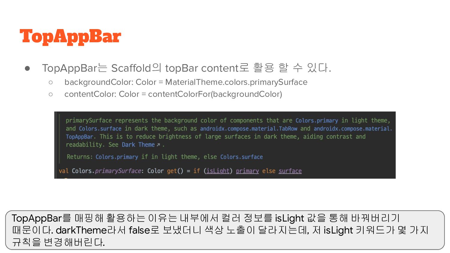
backgroundColor: Color = MaterialTheme.colors.primarySurface ◦ contentColor: Color = contentColorFor(backgroundColor) TopAppBar TopAppBar를 매핑해 활용하는 이유는 내부에서 컬러 정보를 isLight 값을 통해 바꿔버리기 때문이다. darkTheme라서 false로 보냈더니 색상 노출이 달라지는데, 저 isLight 키워드가 몇 가지 규칙을 변경해버린다.
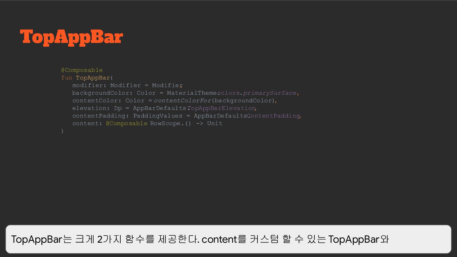
Color = MaterialTheme. colors.primarySurface, contentColor: Color = contentColorFor(backgroundColor) , elevation: Dp = AppBarDefaults. TopAppBarElevation , contentPadding: PaddingValues = AppBarDefaults. ContentPadding , content: @Composable RowScope.() -> Unit ) TopAppBar는 크게 2가지 함수를 제공한다. content를 커스텀 할 수 있는 TopAppBar와
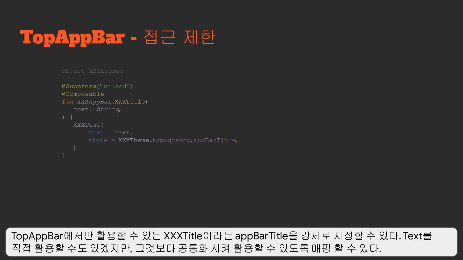
text: String , ) { XXXText( text = text, style = XXXTheme.typography.appBarTitle, ) } TopAppBar에서만 활용할 수 있는 XXXTitle이라는 appBarTitle을 강제로 지정할 수 있다. Text를 직접 활용할 수도 있겠지만, 그것보다 공통화 시켜 활용할 수 있도록 매핑 할 수 있다.
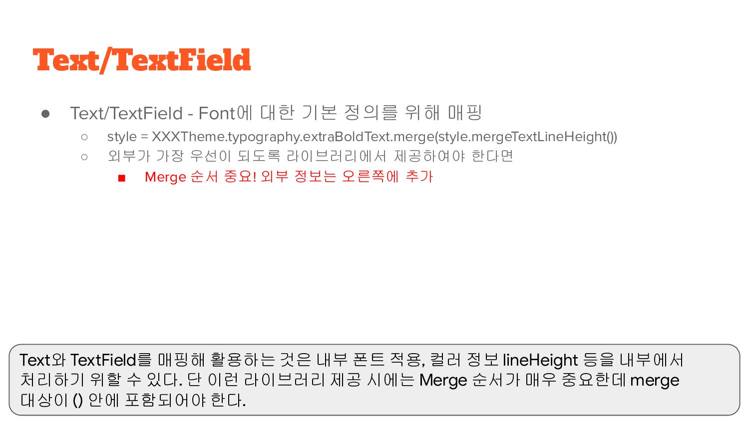
style = XXXTheme.typography.extraBoldText.merge(style.mergeTextLineHeight()) ◦ 외부가 가장 우선이 되도록 라이브러리에서 제공하여야 한다면 ▪ Merge 순서 중요! 외부 정보는 오른쪽에 추가 Text/TextField Text와 TextField를 매핑해 활용하는 것은 내부 폰트 적용, 컬러 정보 lineHeight 등을 내부에서 처리하기 위할 수 있다. 단 이런 라이브러리 제공 시에는 Merge 순서가 매우 중요한데 merge 대상이 () 안에 포함되어야 한다.
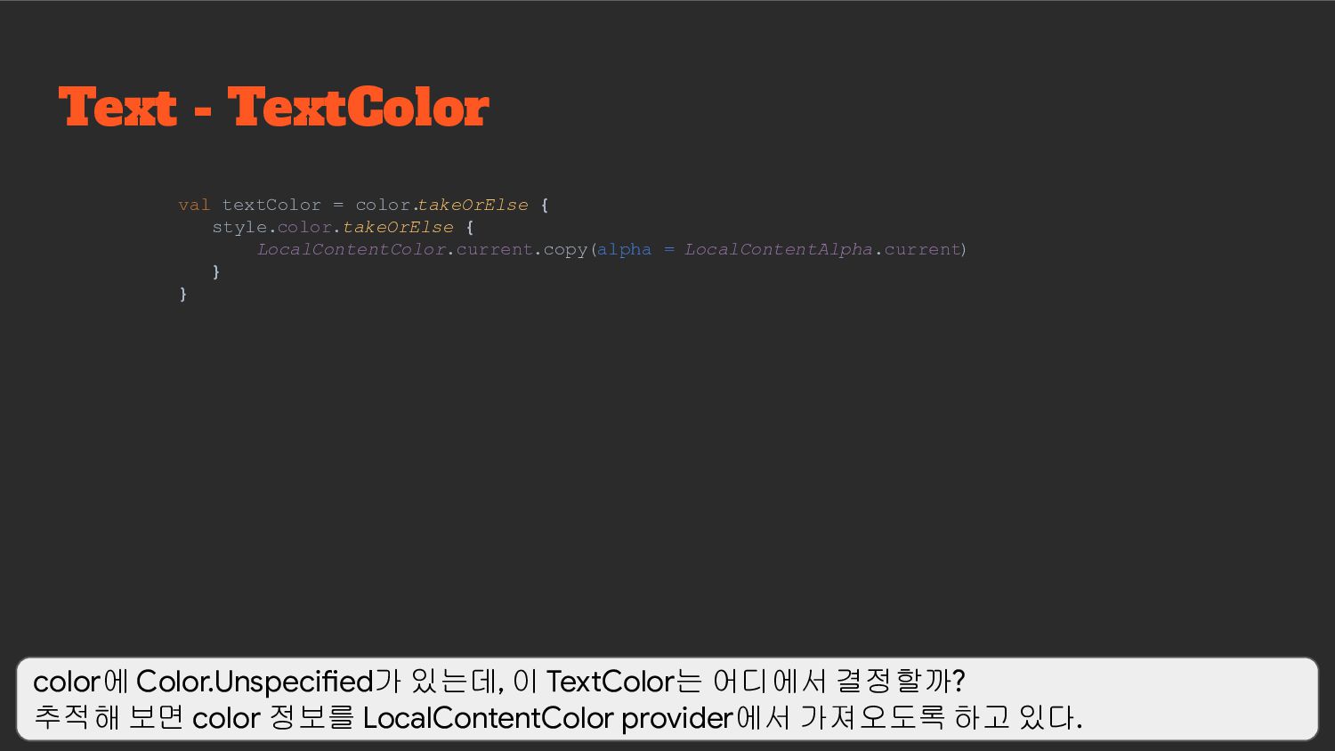
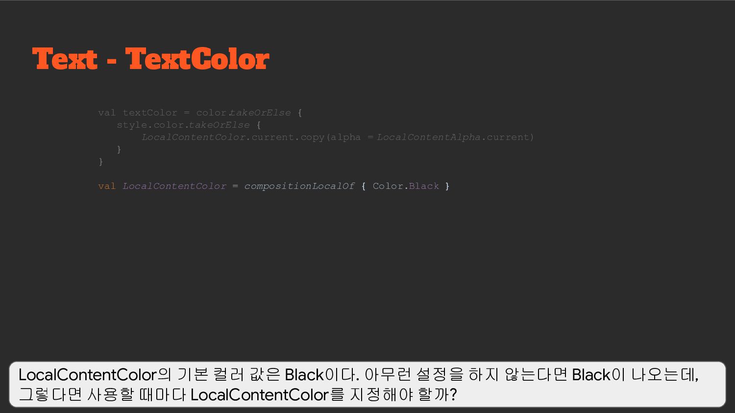
LocalContentAlpha.current) } } Text - TextColor color에 Color.Unspecified가 있는데, 이 TextColor는 어디에서 결정할까? 추적해 보면 color 정보를 LocalContentColor provider에서 가져오도록 하고 있다.
{ LocalContentColor.current.copy(alpha = LocalContentAlpha.current) } } val LocalContentColor = compositionLocalOf { Color.Black } LocalContentColor의 기본 컬러 값은 Black이다. 아무런 설정을 하지 않는다면 Black이 나오는데, 그렇다면 사용할 때마다 LocalContentColor를 지정해야 할까?
{ LocalContentColor.current.copy(alpha = LocalContentAlpha.current) } } val LocalContentColor = compositionLocalOf { Color.Black } @Composable fun Surface( // 생략 ) { CompositionLocalProvider( LocalContentColor provides contentColor , ) } 다행히 그렇지는 않은데 대부분의 Compose Material 코드를 따라가 보면 Surface를 만나게 된다. Surface에서 CompositionLocalProvider를 통해 contentColor를 지정해 주고 있음을 알 수 있다. 결국 Surface 매핑 함수들을 활용하면 contentColor 정보는 자동으로 지정됨을 알 수 있다.
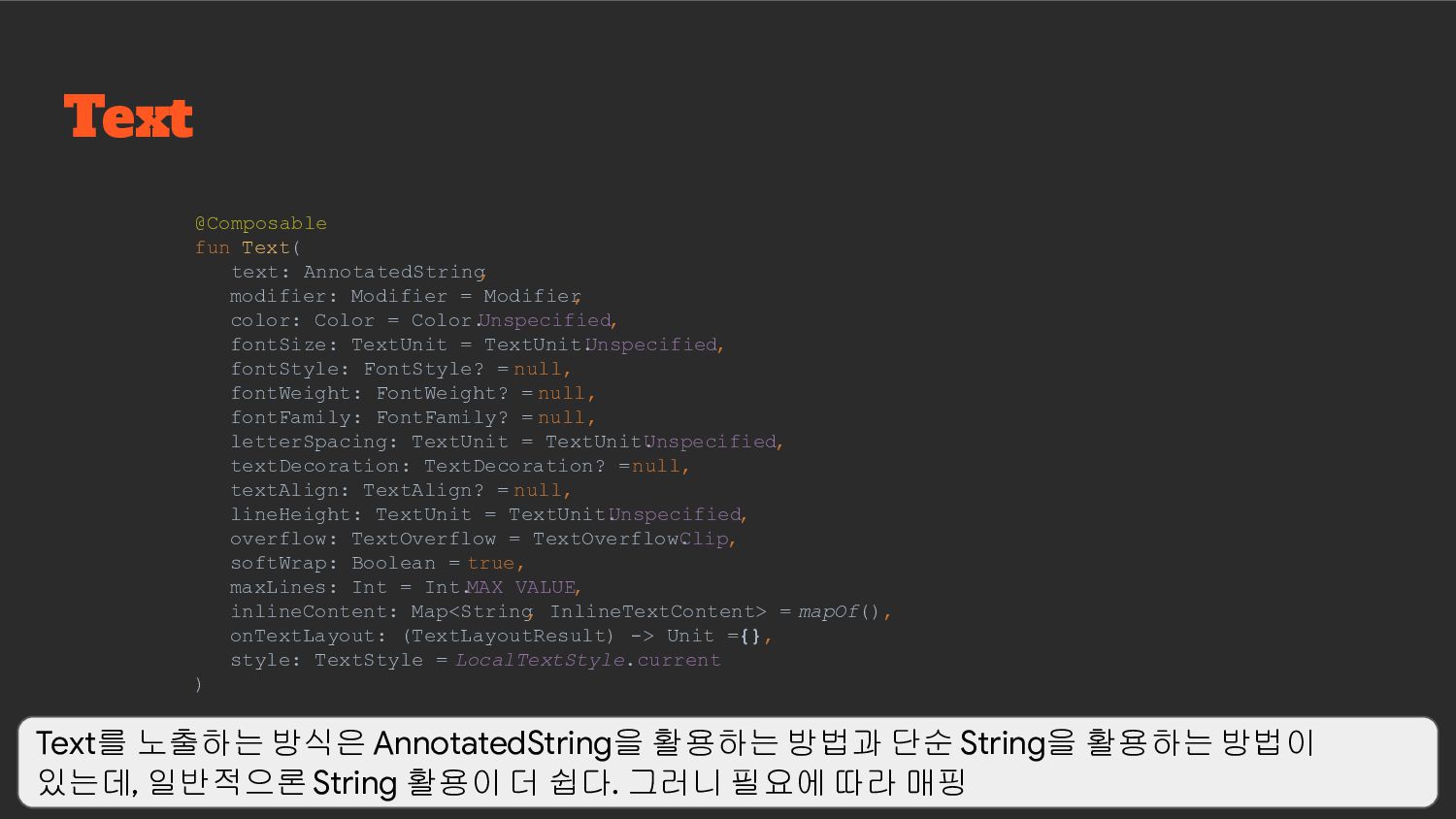
▪ 만약 TextField 형태의 UI가 아니라면 BasicTextField를 활용해 커스텀 ◦ TextField ▪ TextField는 BasicTextField를 매핑하고 있다. ▪ BaiscTextField에 decorationBox를 포함 TextField TextField는 크게 BasicTextField와 TextField로 나눠지는데, TextField는 Material에서 Label과 Border를 가진 가장 기본 Input text를 제공한다. 자동으로 decorationBox를 포함하도록 구현해두었다. 만약 커스텀이 필요하다면 BasicTextField를 활용해 decorationBox를 포함하여 구현하도록 해야 한다.
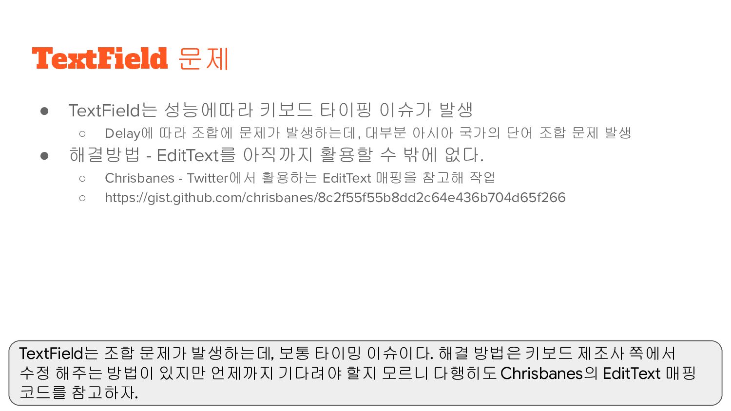
조합에 문제가 발생하는데, 대부분 아시아 국가의 단어 조합 문제 발생 • 해결방법 - EditText를 아직까지 활용할 수 밖에 없다. ◦ Chrisbanes - Twitter에서 활용하는 EditText 매핑을 참고해 작업 ◦ https://gist.github.com/chrisbanes/8c2f55f55b8dd2c64e436b704d65f266 TextField 문제 TextField는 조합 문제가 발생하는데, 보통 타이밍 이슈이다. 해결 방법은 키보드 제조사 쪽에서 수정 해주는 방법이 있지만 언제까지 기다려야 할지 모르니 다행히도 Chrisbanes의 EditText 매핑 코드를 참고하자.
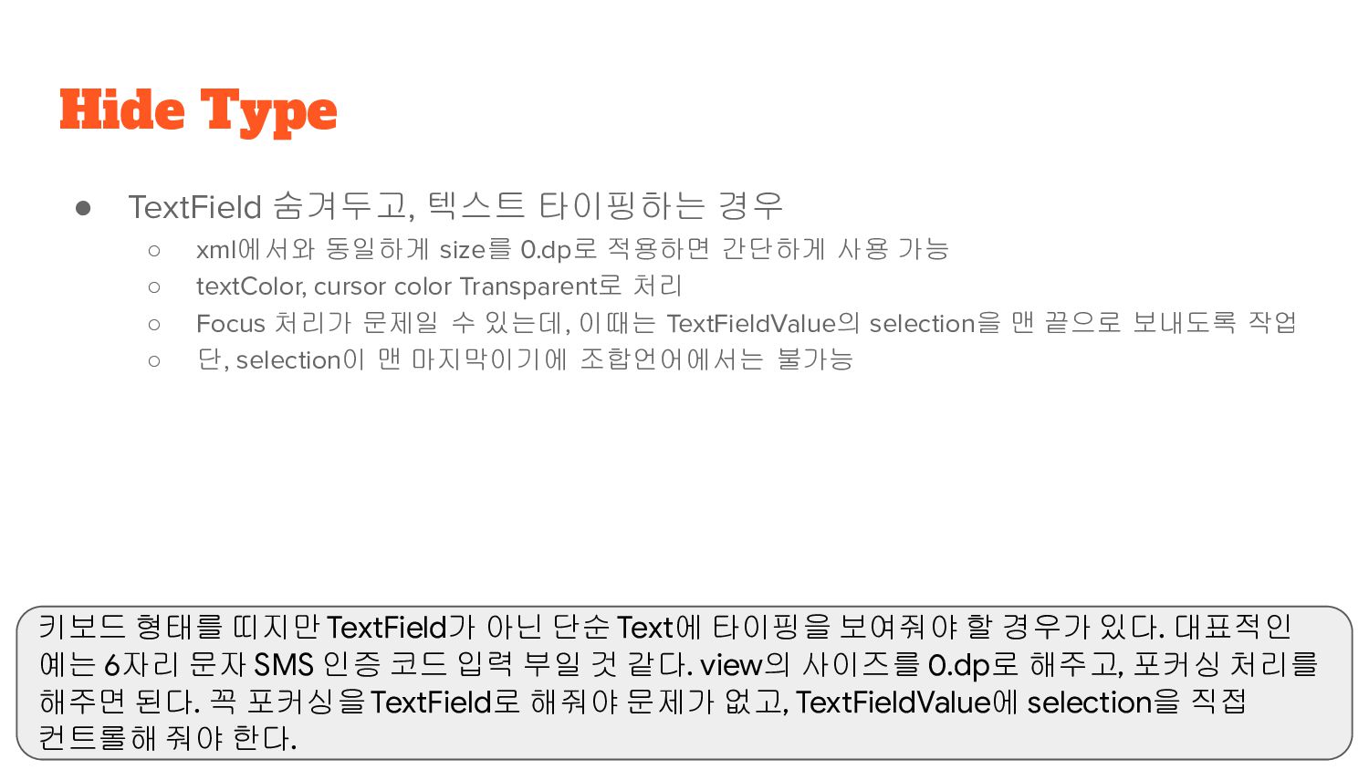
0.dp로 적용하면 간단하게 사용 가능 ◦ textColor, cursor color Transparent로 처리 ◦ Focus 처리가 문제일 수 있는데, 이때는 TextFieldValue의 selection을 맨 끝으로 보내도록 작업 ◦ 단, selection이 맨 마지막이기에 조합언어에서는 불가능 Hide Type 키보드 형태를 띠지만 TextField가 아닌 단순 Text에 타이핑을 보여줘야 할 경우가 있다. 대표적인 예는 6자리 문자 SMS 인증 코드 입력 부일 것 같다. view의 사이즈를 0.dp로 해주고, 포커싱 처리를 해주면 된다. 꼭 포커싱을 TextField로 해줘야 문제가 없고, TextFieldValue에 selection을 직접 컨트롤해 줘야 한다.
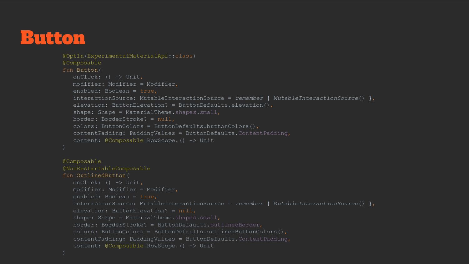
- 일반적인 버튼에 Outlined theme 포함된 Button ◦ TextButton - Button에 Theme 없이 Text 버튼만 가짐 • 모든 버튼의 기본 padding ◦ top/bottom 8.dp ◦ start/end 16.dp • Button UI에 따라 매핑 Button Button은 매우 많이 매핑할 것 같다. 버튼의 종류도 백그라운드 컬러를 가진 Button, outlined만 가진 Button, 마지막으로 Text만을 가진 TextButton을 제공한다. 이 버튼은 모두 padding을 가지고 있는데, 다행히 이 코드의 모든 끝은 Button() 함수이다. paddingValues를 지정해 padding을 변경할 수 있다. minHeight(36.dp), minWidth(64.dp)도 수정이 필요하다면 커스텀을 함께 해야 한다. 내부적으로 이 정보를 강제화하고 있다.
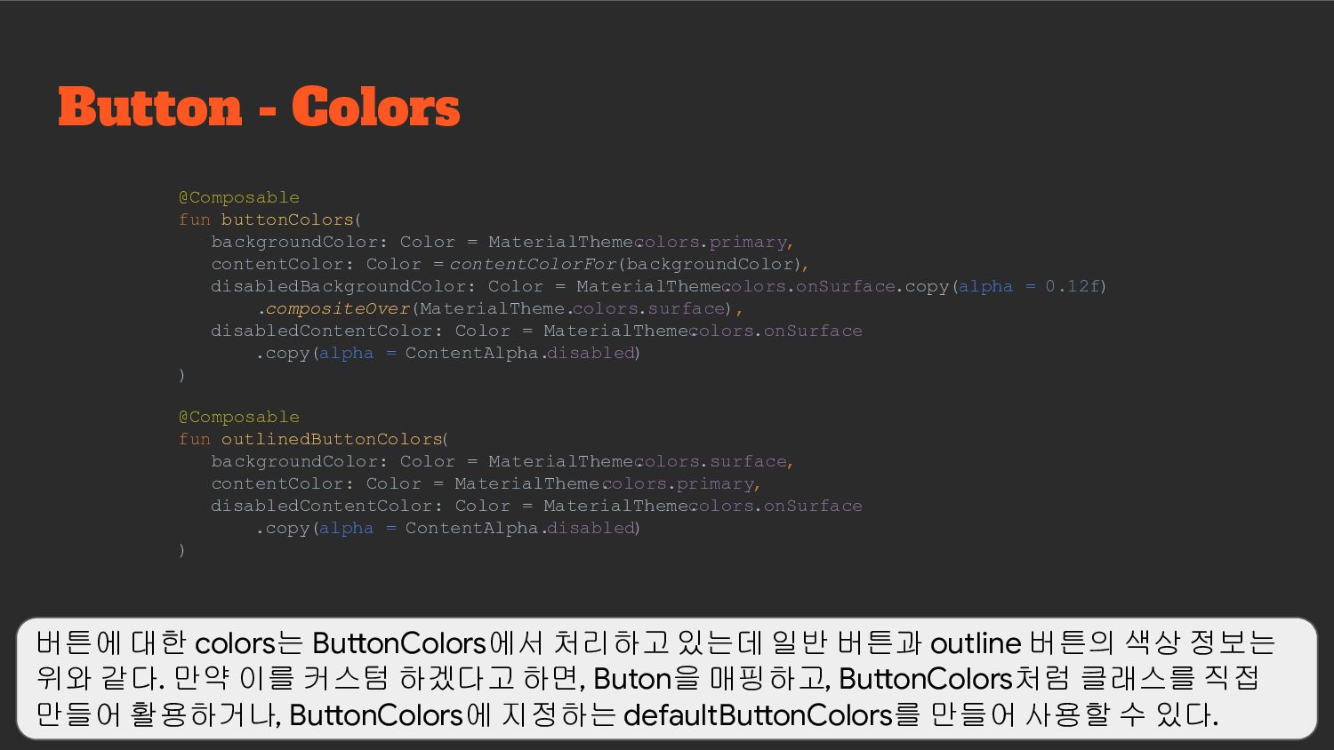
colors.primary, contentColor: Color = contentColorFor(backgroundColor) , disabledBackgroundColor: Color = MaterialTheme. colors.onSurface.copy(alpha = 0.12f) .compositeOver(MaterialTheme. colors.surface), disabledContentColor: Color = MaterialTheme. colors.onSurface .copy(alpha = ContentAlpha.disabled) ) @Composable fun outlinedButtonColors ( backgroundColor: Color = MaterialTheme. colors.surface, contentColor: Color = MaterialTheme. colors.primary, disabledContentColor: Color = MaterialTheme. colors.onSurface .copy(alpha = ContentAlpha.disabled) ) 버튼에 대한 colors는 ButtonColors에서 처리하고 있는데 일반 버튼과 outline 버튼의 색상 정보는 위와 같다. 만약 이를 커스텀 하겠다고 하면, Buton을 매핑하고, ButtonColors처럼 클래스를 직접 만들어 활용하거나, ButtonColors에 지정하는 defaultButtonColors를 만들어 사용할 수 있다.
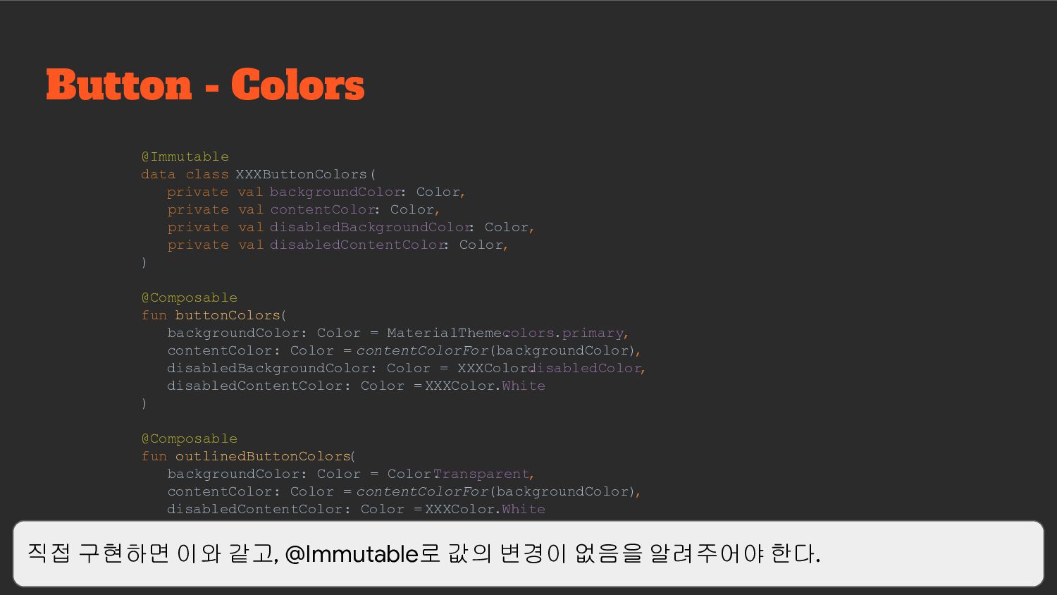
: Color, private val contentColor: Color, private val disabledBackgroundColor : Color, private val disabledContentColor : Color, ) @Composable fun buttonColors( backgroundColor: Color = MaterialTheme. colors.primary, contentColor: Color = contentColorFor(backgroundColor) , disabledBackgroundColor: Color = XXXColor. disabledColor, disabledContentColor: Color = XXXColor.White ) @Composable fun outlinedButtonColors ( backgroundColor: Color = Color. Transparent, contentColor: Color = contentColorFor(backgroundColor) , disabledContentColor: Color = XXXColor.White ) 직접 구현하면 이와 같고, @Immutable로 값의 변경이 없음을 알려주어야 한다.
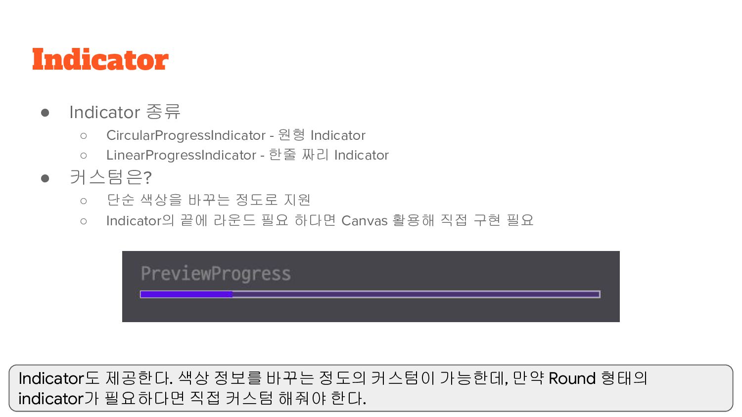
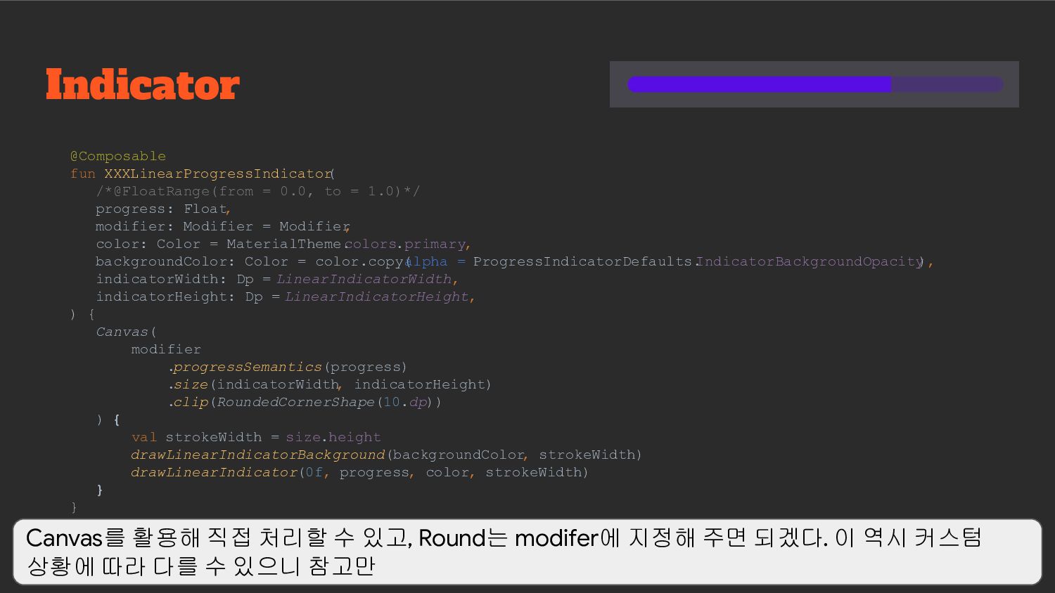
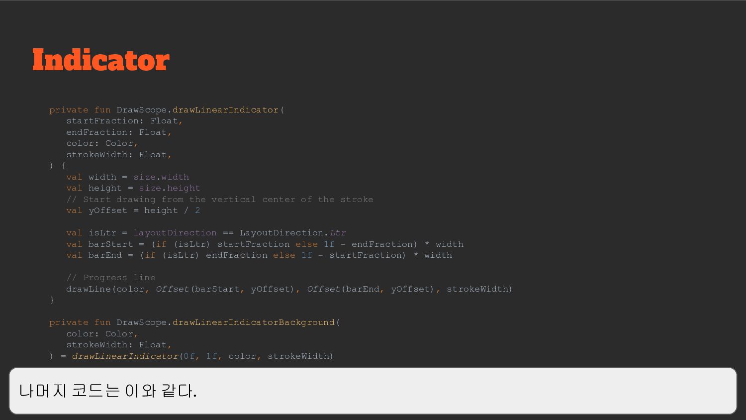
- 한줄 짜리 Indicator • 커스텀은? ◦ 단순 색상을 바꾸는 정도로 지원 ◦ Indicator의 끝에 라운드 필요 하다면 Canvas 활용해 직접 구현 필요 Indicator Indicator도 제공한다. 색상 정보를 바꾸는 정도의 커스텀이 가능한데, 만약 Round 형태의 indicator가 필요하다면 직접 커스텀 해줘야 한다.
strokeWidth: Float, ) { val width = size.width val height = size.height // Start drawing from the vertical center of the stroke val yOffset = height / 2 val isLtr = layoutDirection == LayoutDirection.Ltr val barStart = (if (isLtr) startFraction else 1f - endFraction) * width val barEnd = (if (isLtr) endFraction else 1f - startFraction) * width // Progress line drawLine(color, Offset(barStart, yOffset), Offset(barEnd, yOffset), strokeWidth) } private fun DrawScope.drawLinearIndicatorBackground( color: Color, strokeWidth: Float, ) = drawLinearIndicator(0f, 1f, color, strokeWidth) 나머지 코드는 이와 같다.
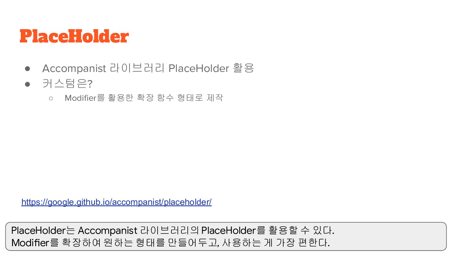
확장 함수 형태로 제작 PlaceHolder https://google.github.io/accompanist/placeholder/ PlaceHolder는 Accompanist 라이브러리의 PlaceHolder를 활용할 수 있다. Modifier를 확장하여 원하는 형태를 만들어두고, 사용하는 게 가장 편한다.
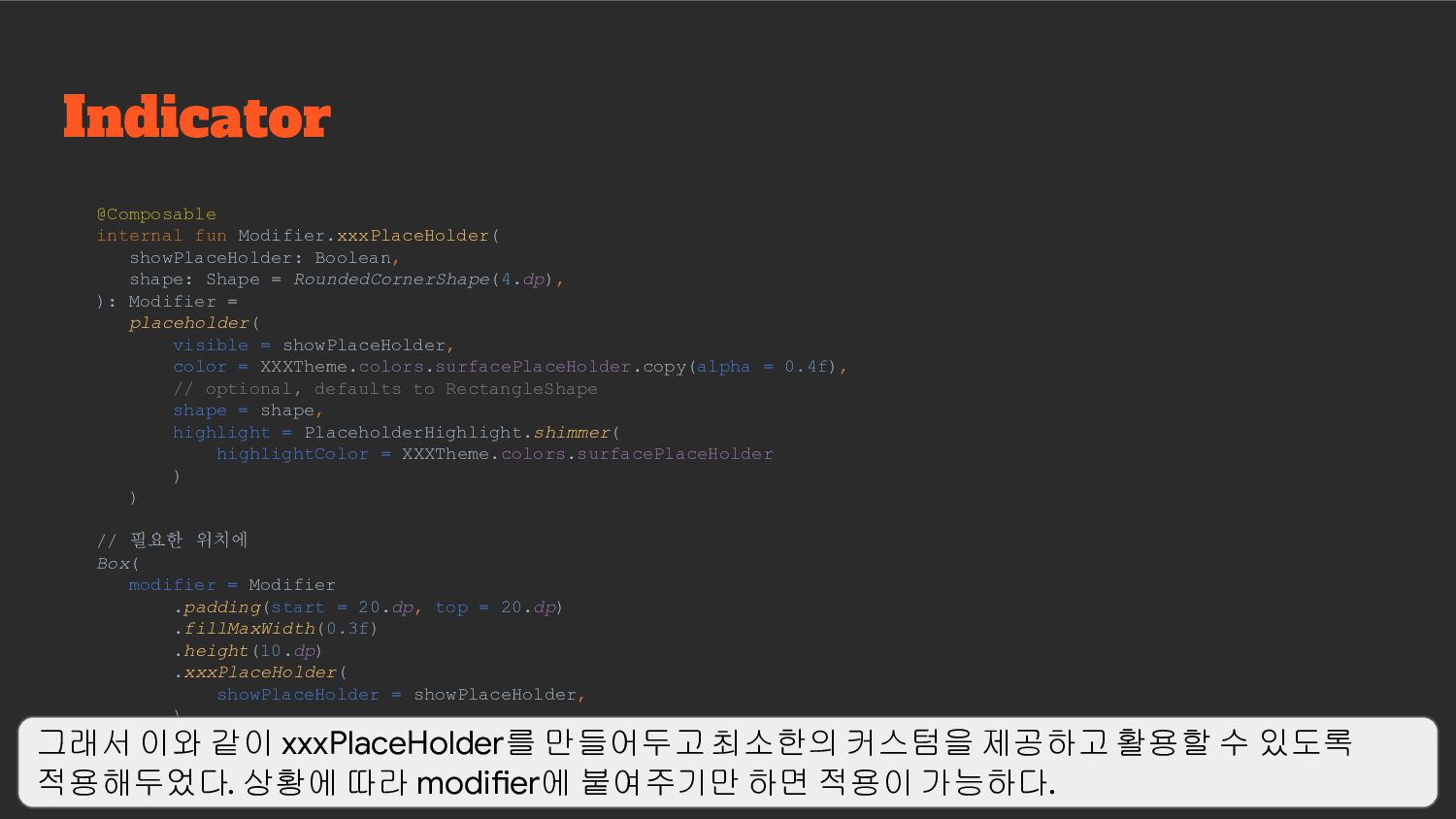
RoundedCornerShape(4.dp), ): Modifier = placeholder( visible = showPlaceHolder, color = XXXTheme.colors.surfacePlaceHolder.copy(alpha = 0.4f), // optional, defaults to RectangleShape shape = shape, highlight = PlaceholderHighlight.shimmer( highlightColor = XXXTheme.colors.surfacePlaceHolder ) ) // 필요한 위치에 Box( modifier = Modifier .padding(start = 20.dp, top = 20.dp) .fillMaxWidth(0.3f) .height(10.dp) .xxxPlaceHolder( showPlaceHolder = showPlaceHolder, ) ) 그래서 이와 같이 xxxPlaceHolder를 만들어두고 최소한의 커스텀을 제공하고 활용할 수 있도록 적용해두었다. 상황에 따라 modifier에 붙여주기만 하면 적용이 가능하다.
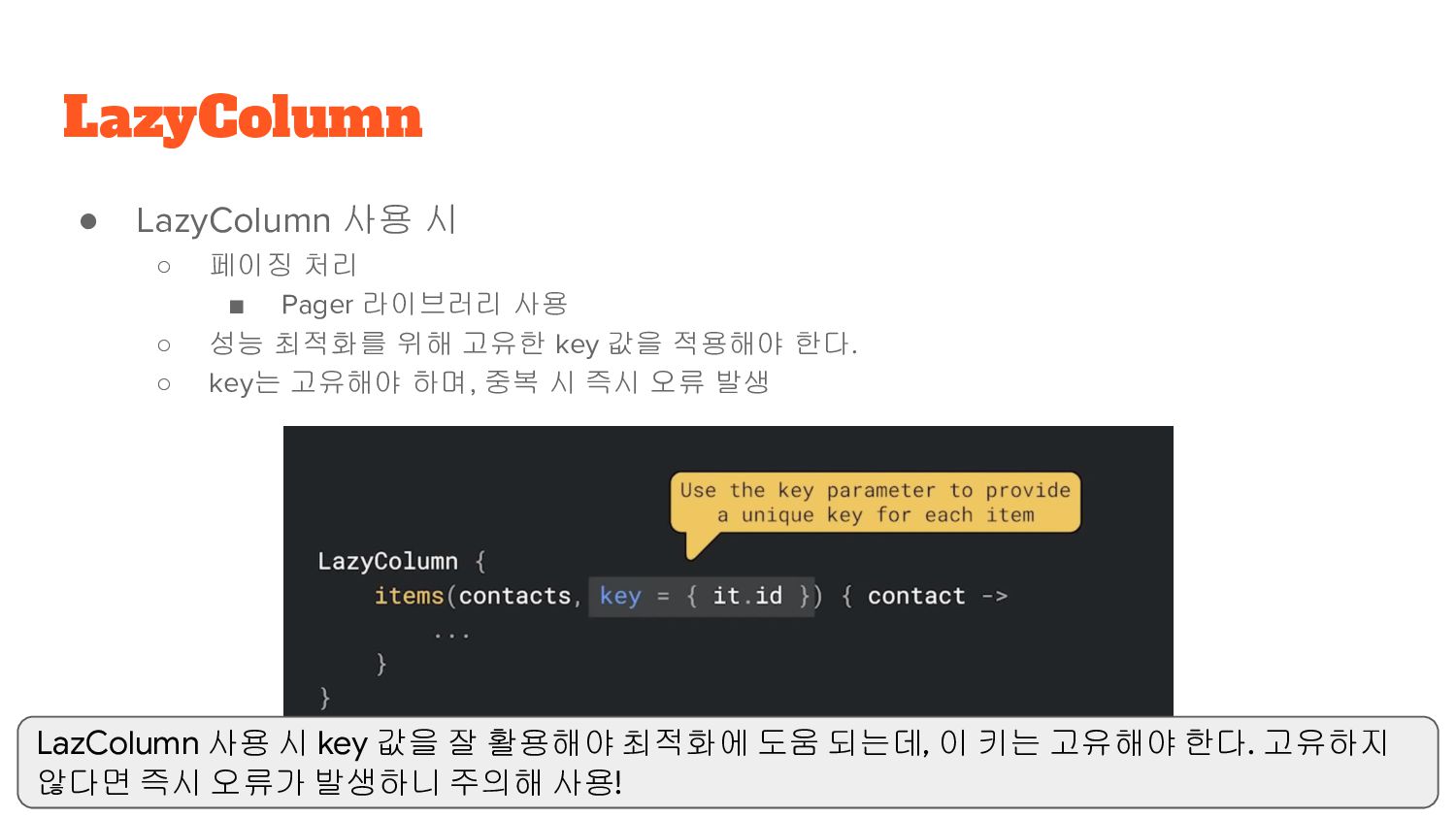
사용 ◦ 성능 최적화를 위해 고유한 key 값을 적용해야 한다. ◦ key는 고유해야 하며, 중복 시 즉시 오류 발생 LazyColumn LazColumn 사용 시 key 값을 잘 활용해야 최적화에 도움 되는데, 이 키는 고유해야 한다. 고유하지 않다면 즉시 오류가 발생하니 주의해 사용!
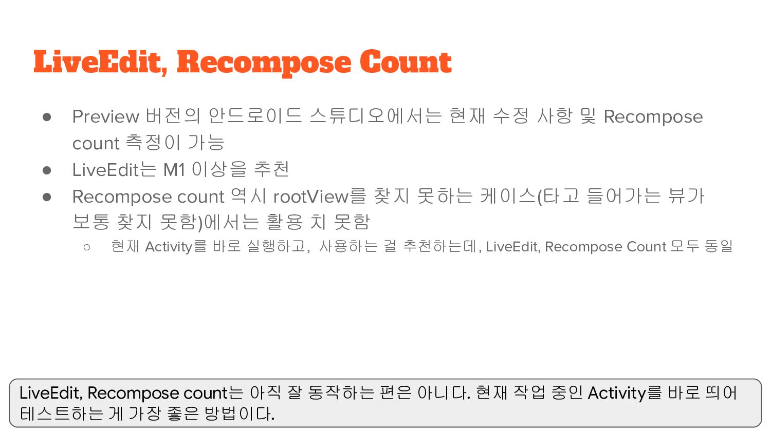
count 측정이 가능 • LiveEdit는 M1 이상을 추천 • Recompose count 역시 rootView를 찾지 못하는 케이스(타고 들어가는 뷰가 보통 찾지 못함)에서는 활용 치 못함 ◦ 현재 Activity를 바로 실행하고, 사용하는 걸 추천하는데, LiveEdit, Recompose Count 모두 동일 LiveEdit, Recompose Count LiveEdit, Recompose count는 아직 잘 동작하는 편은 아니다. 현재 작업 중인 Activity를 바로 띄어 테스트하는 게 가장 좋은 방법이다.
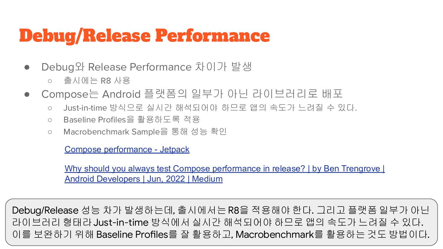
• Compose는 Android 플랫폼의 일부가 아닌 라이브러리로 배포 ◦ Just-in-time 방식으로 실시간 해석되어야 하므로 앱의 속도가 느려질 수 있다. ◦ Baseline Profiles을 활용하도록 적용 ◦ Macrobenchmark Sample을 통해 성능 확인 Debug/Release Performance Compose performance - Jetpack Why should you always test Compose performance in release? | by Ben Trengrove | Android Developers | Jun, 2022 | Medium Debug/Release 성능 차가 발생하는데, 출시에서는 R8을 적용해야 한다. 그리고 플랫폼 일부가 아닌 라이브러리 형태라 Just-in-time 방식에서 실시간 해석되어야 하므로 앱의 속도가 느려질 수 있다. 이를 보완하기 위해 Baseline Profiles를 잘 활용하고, Macrobenchmark를 활용하는 것도 방법이다.
 taehwandev
 manfredsteyer
 rollbear
 nakahara
 har1101
 snhryt
 hyshu
hyshu
 broadleaf
 danielsogl
 blueswen
 kazumax55
 wemra
wemra
 mackee
 davidcarrasco
 szymonslowik
 apolaine
 sergeychernyshev
 minecr
 addyosmani
 jonyablonski
 soudai
 mayatellez
 baasie
 csswizardry
 productmarketing