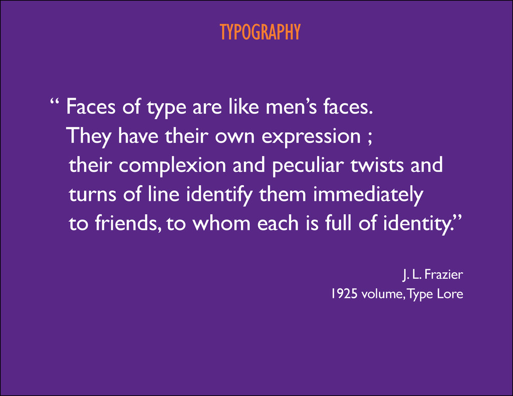
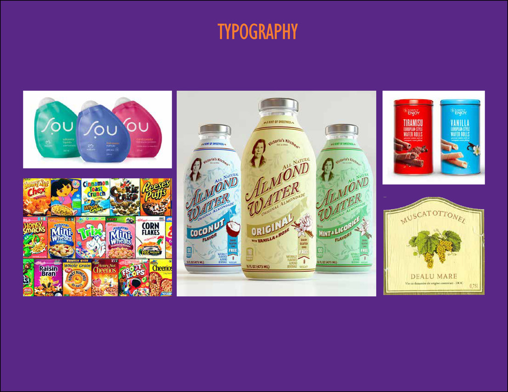
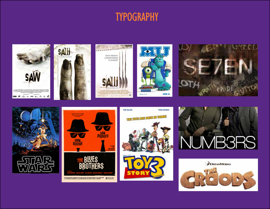
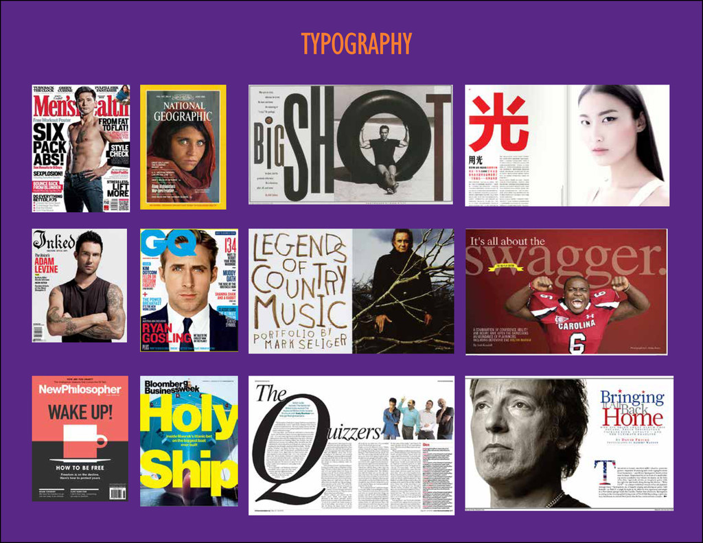
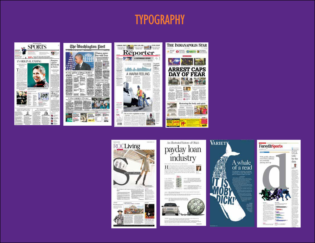
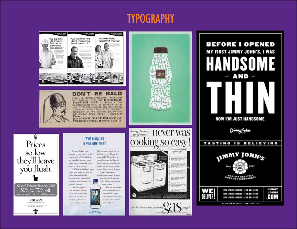
men’s faces. They have their own expression ; their complexion and peculiar twists and turns of line identify them immediately to friends, to whom each is full of identity.” J. L. Frazier 1925 volume, Type Lore
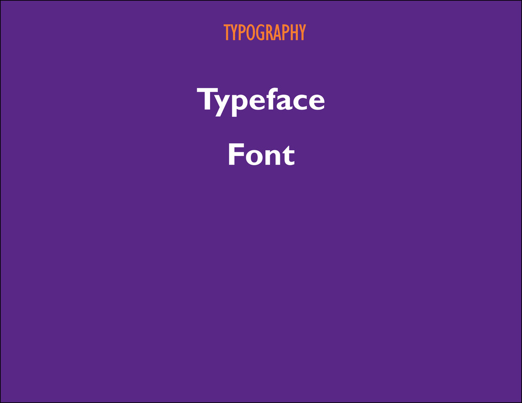
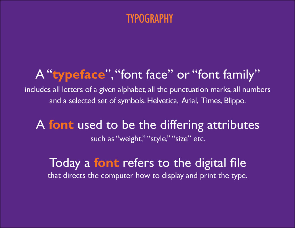
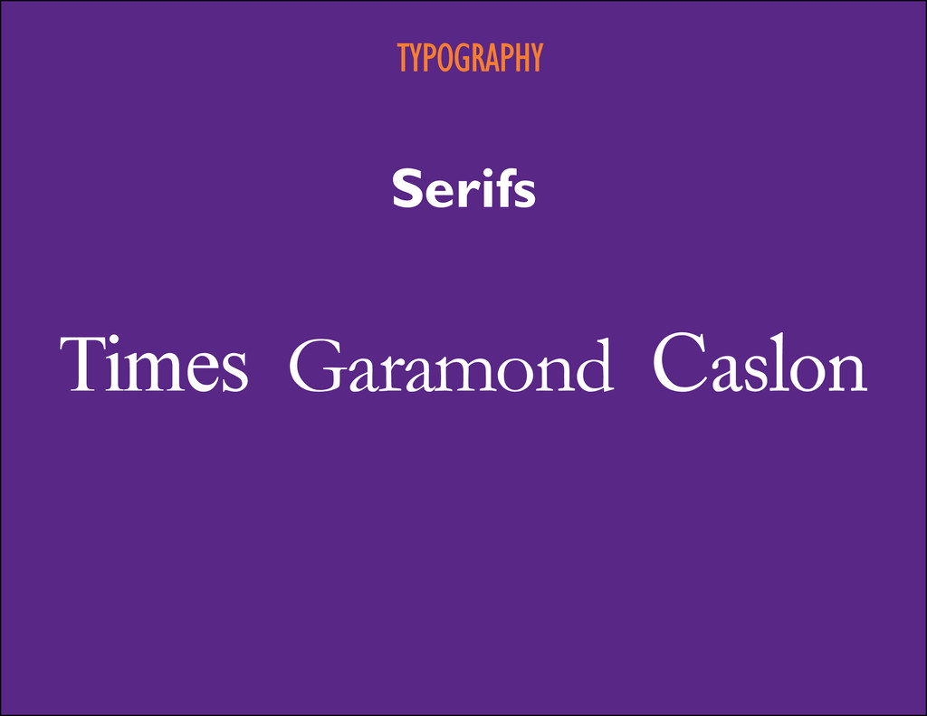
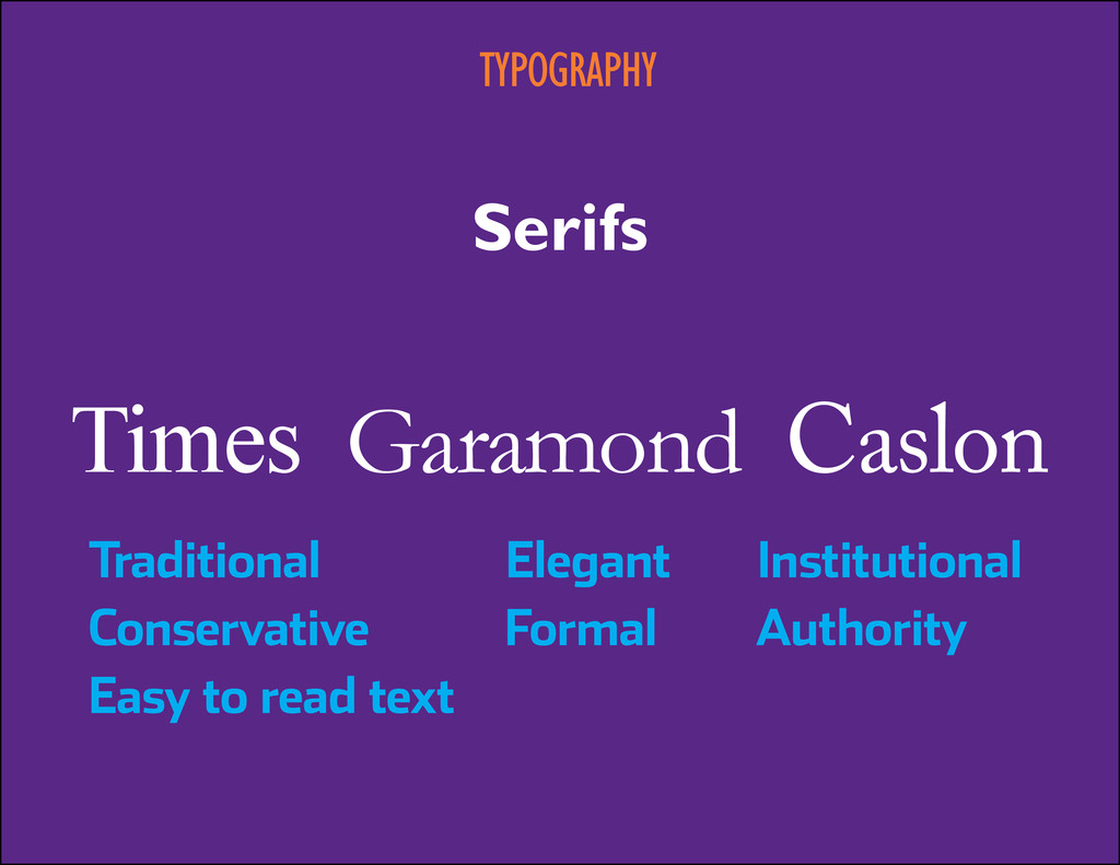
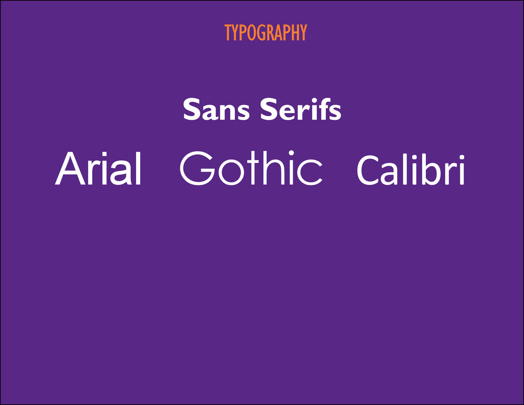
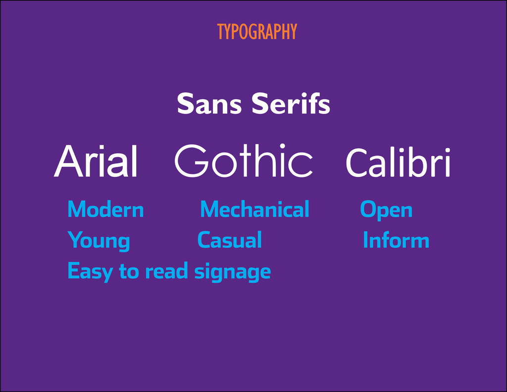
family” includes all letters of a given alphabet, all the punctuation marks, all numbers and a selected set of symbols. Helvetica, Arial, Times, Blippo. A font used to be the differing attributes such as “weight,” “style,” “size” etc. Today a font refers to the digital file that directs the computer how to display and print the type.
What the heck is visual communication? 9:40 Principles and fundamentals 10:40 Break 10:50 Typography 11:40 The creative process 12:30 Lunch 1 10 things you can do to improve advertising 1:50 Break 2 10 things you can do to improve editorial 2:50 Break 3 10 things you can do to improve other stuff 4 Close
What the heck is visual communication? 9:40 Principles and fundamentals 10:40 Break 10:50 Typography 11:40 The creative process 12:30 Lunch 1 10 things you can do to improve advertising 1:50 Break 2 10 things you can do to improve editorial 2:50 Break 3 10 things you can do to improve other stuff 4 Close