Upgrade to Pro
— share decks privately, control downloads, hide ads and more …
Speaker Deck
Sign up for free
Menu
Search
Features
All features
Private URLs
Password Protection
Custom URLS
Scheduled publishing
Remove Branding
Restrict embedding
Deck Collections
Notes
Features
All features
Private URLs
Password Protection
Custom URLS
Scheduled publishing
Remove Branding
Restrict embedding
Deck Collections
Notes
Explore
Featured decks
Featured speakers
Programming
Technology
Storyboards
Explore
Featured decks
Featured speakers
Programming
Technology
Storyboards
Pricing
Search
Sign in
Sign up for free
Material Design 2.0
Search
The Funtasty
February 21, 2019
Technology
200
0
Share
Embed
Copy iframe code
Copy JS code
Copy link
Start on current slide
Material Design 2.0
The Funtasty
February 21, 2019
More Decks by The Funtasty
See All by The Funtasty
Kolik nástrojů umíš, tolikrát jsi designérem
thefuntasty
0
83
Jak jsme redesignovali Kiwi.com appku a snad při tom nikoho nena***li
thefuntasty
0
53
Důležitost brandingu při návrhu webu, aneb jak důležité je poznat ducha značky
thefuntasty
0
68
Live Wallpapers in Processing
thefuntasty
0
84
MVI architektura
thefuntasty
0
290
Other Decks in Technology
See All in Technology
Refining Active Record
shugo
0
150
無理せず続ける、子育てエンジニアの学び
codmoninc
PRO
0
830
Cognition AI Japan - ウェビナー2_テストQA_運用監視
cogakira
0
140
パッチ更新でterraform initが落ちた日
grimoh
1
140
SAENM ~Jupyterで残すPoCの試行錯誤、未来の自分と仲間を助ける記録!~
terapyon
0
110
アウトプット初心者、半年間のふりかえり
4o1sobblue
0
430
今さら理解するウェブフォントver.2026
takanorip
3
740
WasmをRustにする
sansantech
PRO
0
250
パスキーの自動テストはどこまでいけるのか
teamlab
PRO
0
180
フロントエンドカンファレンス関西2026 - 速すぎるUIに、待ち時間を
teamlab
PRO
0
130
Active Record Connection Adaptersにおける長年の課題に再び取り組む
yahonda
0
130
JAWSUG TOHOKU 青森支部 「LoGoチャット」のAWS移行で 乗り越えたこと
taketakekaho
0
320
Featured
See All Featured
Designing Dashboards & Data Visualisations in Web Apps
destraynor
232
55k
Agile Leadership in an Agile Organization
kimpetersen
PRO
0
280
Raft: Consensus for Rubyists
vanstee
142
7.8k
30 Presentation Tips
portentint
PRO
1
430
Information Architects: The Missing Link in Design Systems
soysaucechin
1
1.2k
Keith and Marios Guide to Fast Websites
keithpitt
413
23k
The Spectacular Lies of Maps
axbom
PRO
1
1.1k
Conquering PDFs: document understanding beyond plain text
inesmontani
PRO
4
3.2k
Designing Powerful Visuals for Engaging Learning
tmiket
1
600
Navigating Algorithm Shifts & AI Overviews - #SMXNext
aleyda
1
1.7k
Efficient Content Optimization with Google Search Console & Apps Script
katarinadahlin
PRO
1
930
Game over? The fight for quality and originality in the time of robots
wayneb77
1
300
Transcript
Material Design 2.0 Martin Matejčík
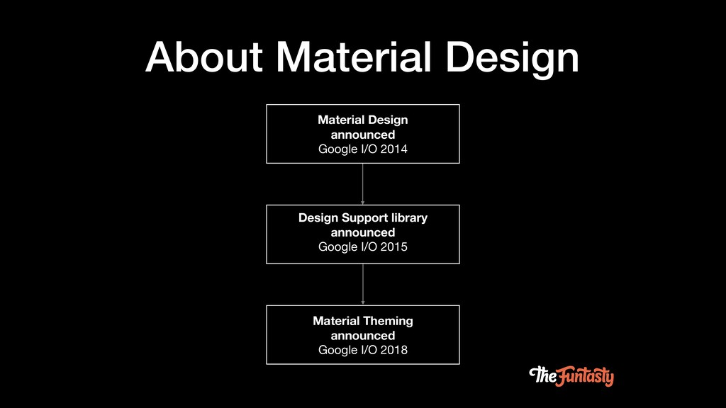
About Material Design Material Design announced Google I/O 2014 Design
Support library announced Google I/O 2015 Material Theming announced Google I/O 2018
None
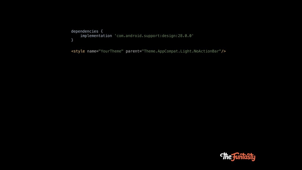
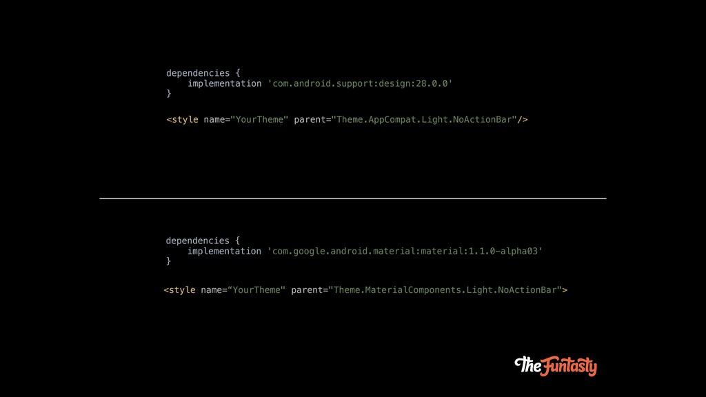
dependencies { implementation 'com.android.support:design:28.0.0' } <style name="YourTheme" parent="Theme.AppCompat.Light.NoActionBar"/>
dependencies { implementation 'com.android.support:design:28.0.0' } dependencies { implementation 'com.google.android.material:material:1.1.0-alpha03' }
<style name="YourTheme" parent="Theme.AppCompat.Light.NoActionBar"/> <style name=“YourTheme" parent="Theme.MaterialComponents.Light.NoActionBar">
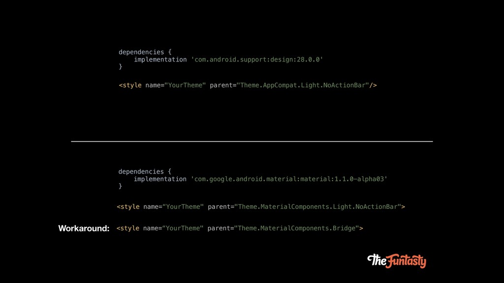
dependencies { implementation 'com.android.support:design:28.0.0' } dependencies { implementation 'com.google.android.material:material:1.1.0-alpha03' }
<style name="YourTheme" parent="Theme.AppCompat.Light.NoActionBar"/> <style name=“YourTheme" parent="Theme.MaterialComponents.Light.NoActionBar"> <style name=“YourTheme" parent="Theme.MaterialComponents.Bridge"> Workaround:
Theming
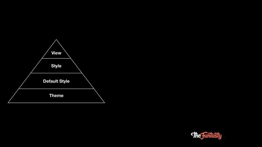
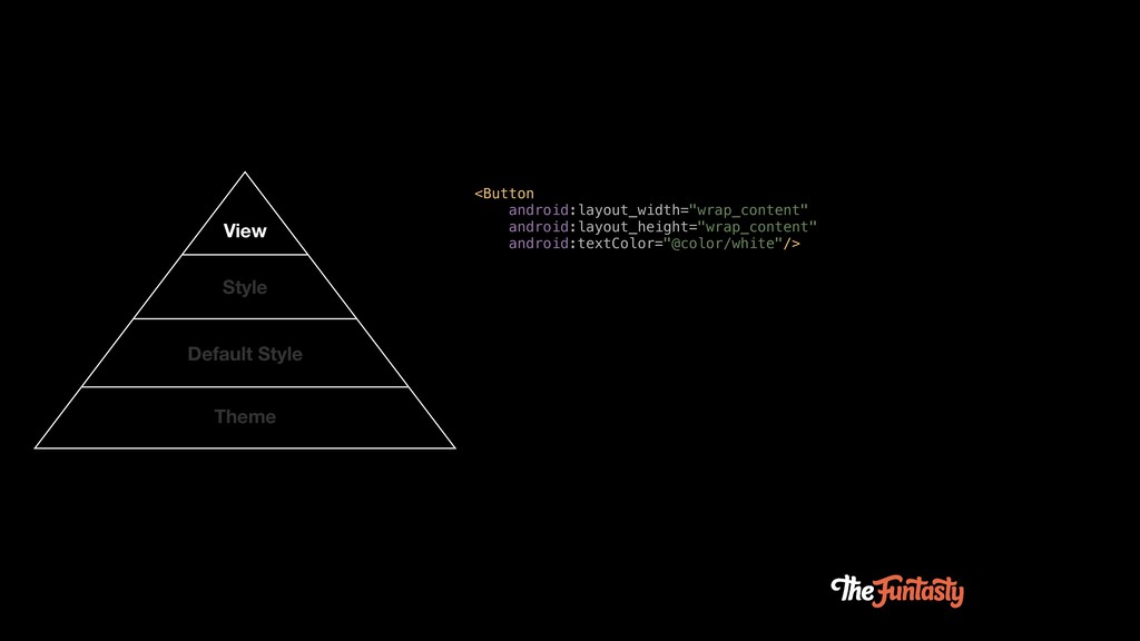
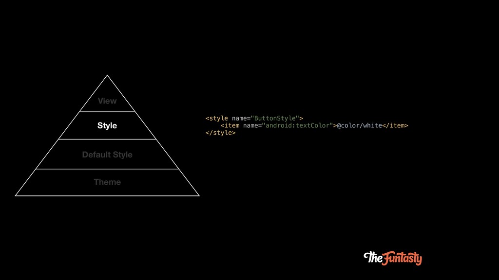
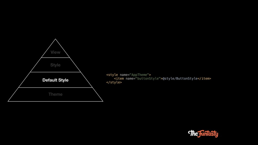
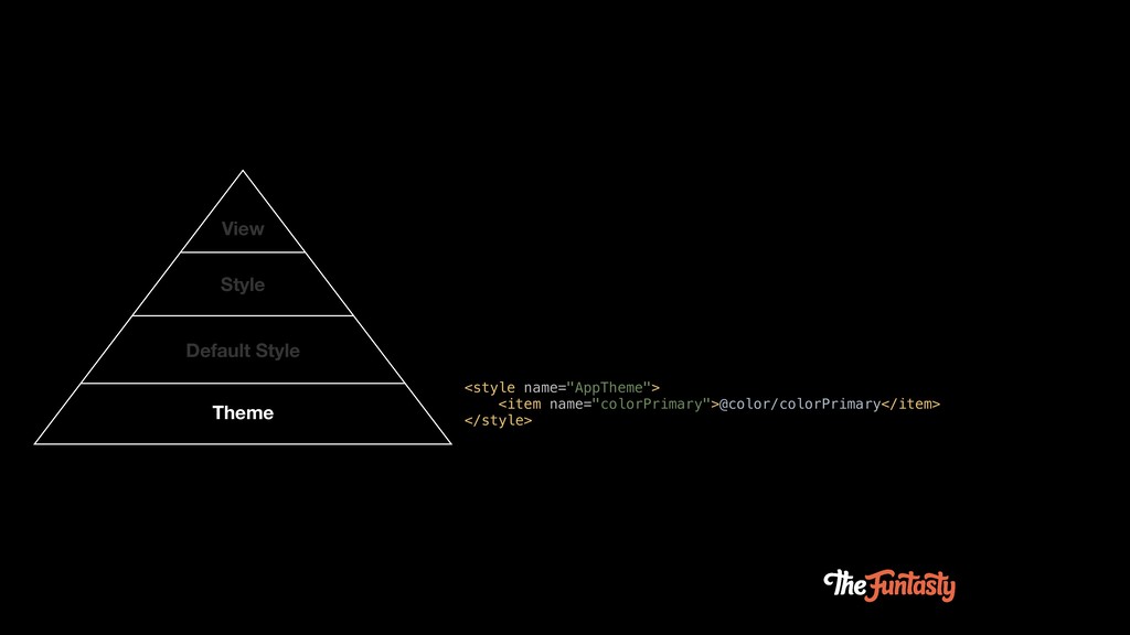
View Style Default Style Theme
View Style Default Style Theme <Button android:layout_width="wrap_content" android:layout_height="wrap_content" android:textColor="@color/white"/>
View Style Default Style Theme <Button android:layout_width="wrap_content" android:layout_height="wrap_content" android:textColor="@color/white"/> <style
name="ButtonStyle"> <item name="android:textColor">@color/white</item> </style>
View Style Default Style Theme <Button android:layout_width="wrap_content" android:layout_height="wrap_content" android:textColor="@color/white"/> <style
name="ButtonStyle"> <item name="android:textColor">@color/white</item> </style> <style name="AppTheme"> <item name="buttonStyle">@style/ButtonStyle</item> </style>
View Style Default Style Theme <Button android:layout_width="wrap_content" android:layout_height="wrap_content" android:textColor="@color/white"/> <style
name="ButtonStyle"> <item name="android:textColor">@color/white</item> </style> <style name="AppTheme"> <item name="buttonStyle">@style/ButtonStyle</item> </style> <style name="AppTheme"> <item name="colorPrimary">@color/colorPrimary</item> </style>
None
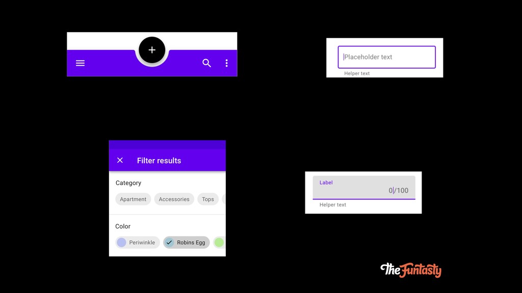
Material Components
None
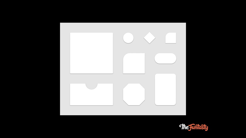
Shape System
None
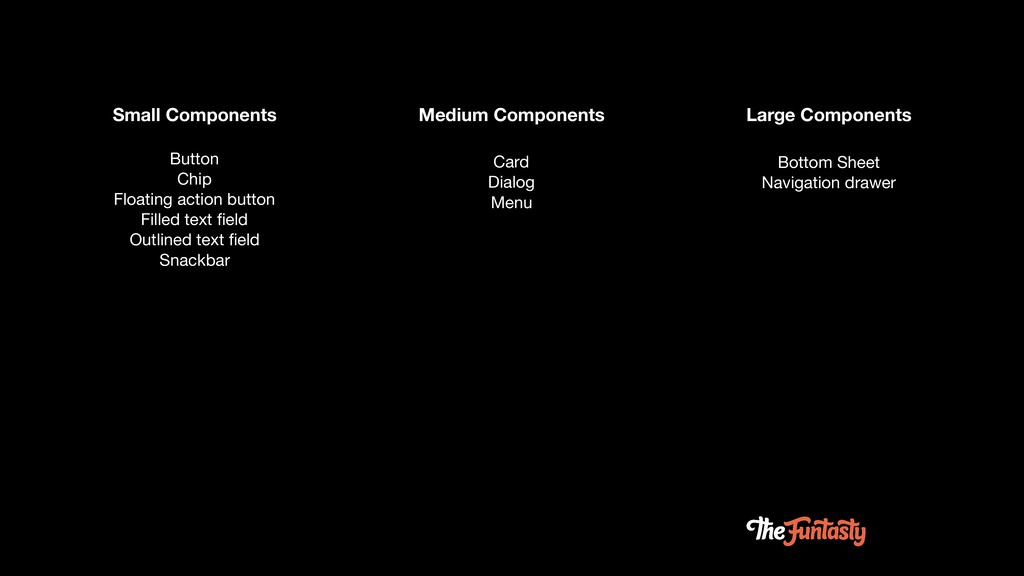
Small Components Medium Components Large Components Button Chip Floating action
button Filled text field Outlined text field Snackbar Card Dialog Menu Bottom Sheet Navigation drawer
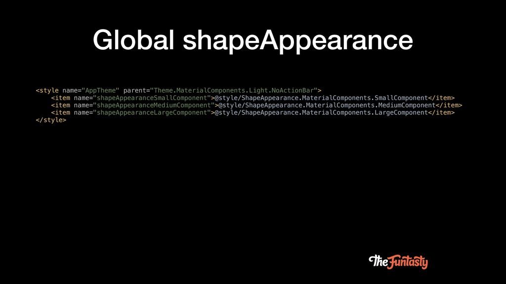
Global shapeAppearance <style name="AppTheme" parent="Theme.MaterialComponents.Light.NoActionBar"> <item name="shapeAppearanceSmallComponent">@style/ShapeAppearance.MaterialComponents.SmallComponent</item> <item name="shapeAppearanceMediumComponent">@style/ShapeAppearance.MaterialComponents.MediumComponent</item> <item
name="shapeAppearanceLargeComponent">@style/ShapeAppearance.MaterialComponents.LargeComponent</item> </style>
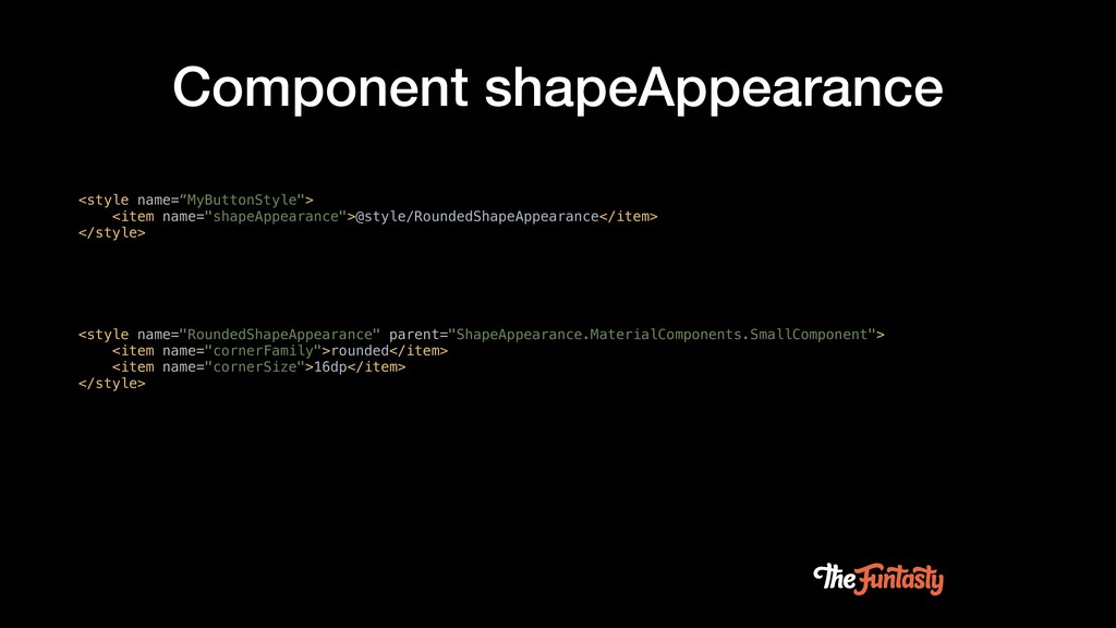
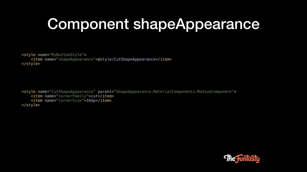
Component shapeAppearance <style name="RoundedShapeAppearance" parent="ShapeAppearance.MaterialComponents.SmallComponent"> <item name="cornerFamily">rounded</item> <item name="cornerSize">16dp</item> </style>
<style name=“MyButtonStyle"> <item name="shapeAppearance">@style/RoundedShapeAppearance</item> </style>
Component shapeAppearance <style name="CutShapeAppearance" parent="ShapeAppearance.MaterialComponents.MediumComponent"> <item name="cornerFamily">cut</item> <item name="cornerSize">16dp</item> </style>
<style name=“MyButtonStyle"> <item name="shapeAppearance">@style/CutShapeAppearance</item> </style>
Demo
None
None
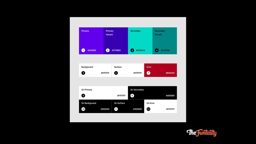
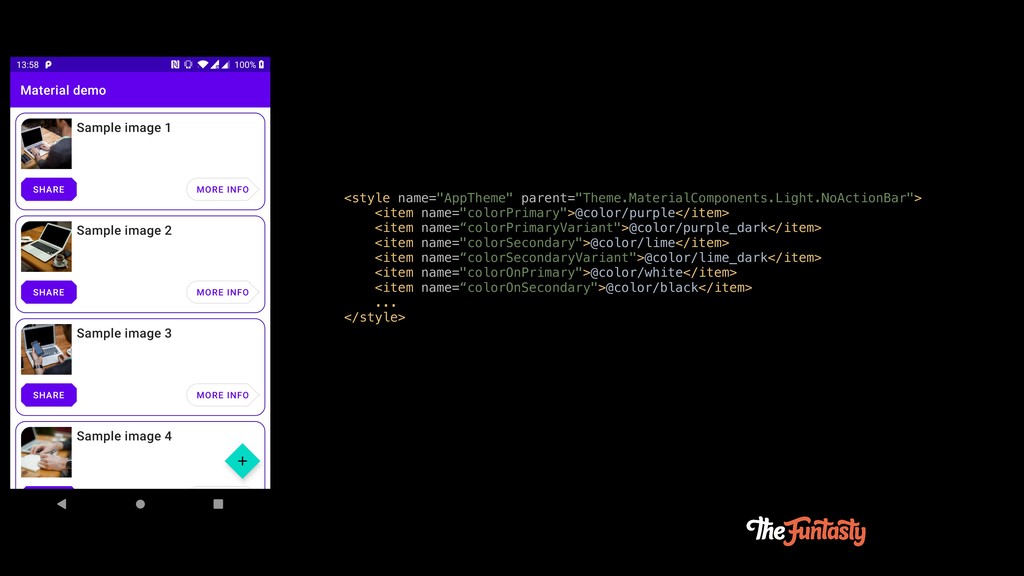
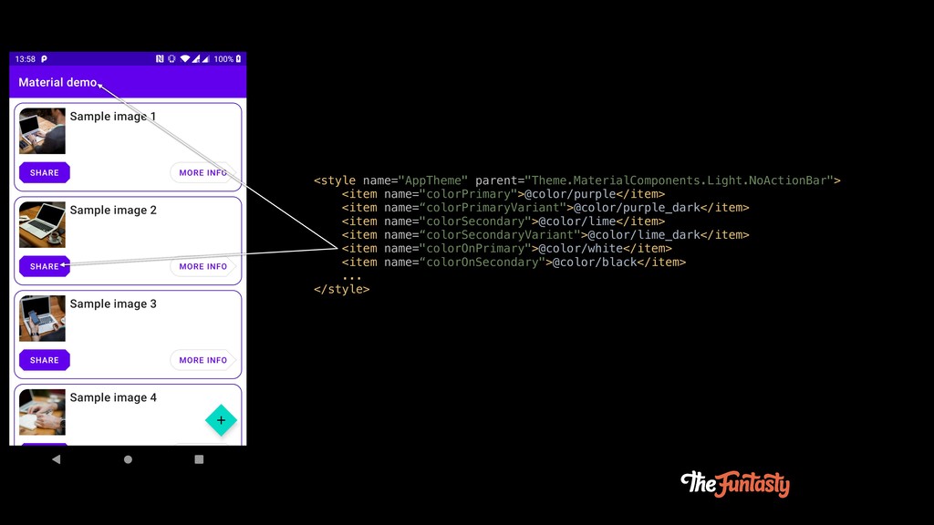
<style name="AppTheme" parent="Theme.MaterialComponents.Light.NoActionBar"> <item name="colorPrimary">@color/purple</item> <item name=“colorPrimaryVariant">@color/purple_dark</item> <item name="colorSecondary">@color/lime</item> <item
name=“colorSecondaryVariant">@color/lime_dark</item> <item name="colorOnPrimary">@color/white</item> <item name=“colorOnSecondary">@color/black</item> ... </style>
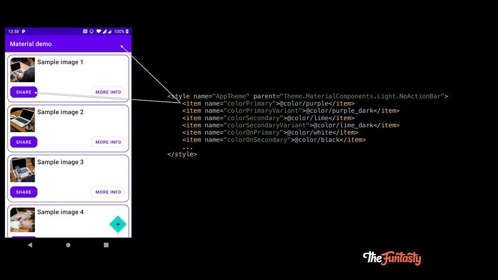
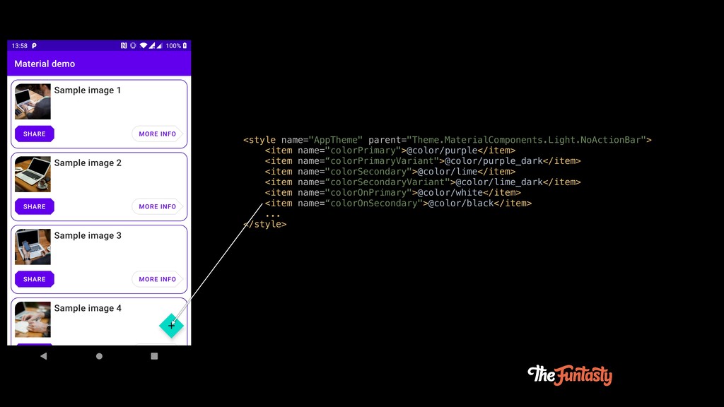
<style name="AppTheme" parent="Theme.MaterialComponents.Light.NoActionBar"> <item name="colorPrimary">@color/purple</item> <item name=“colorPrimaryVariant">@color/purple_dark</item> <item name="colorSecondary">@color/lime</item> <item
name=“colorSecondaryVariant">@color/lime_dark</item> <item name="colorOnPrimary">@color/white</item> <item name=“colorOnSecondary">@color/black</item> ... </style>
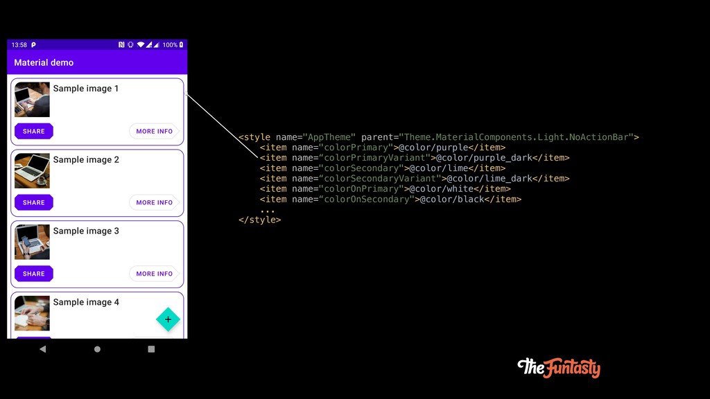
<style name="AppTheme" parent="Theme.MaterialComponents.Light.NoActionBar"> <item name="colorPrimary">@color/purple</item> <item name=“colorPrimaryVariant">@color/purple_dark</item> <item name="colorSecondary">@color/lime</item> <item
name=“colorSecondaryVariant">@color/lime_dark</item> <item name="colorOnPrimary">@color/white</item> <item name=“colorOnSecondary">@color/black</item> ... </style>
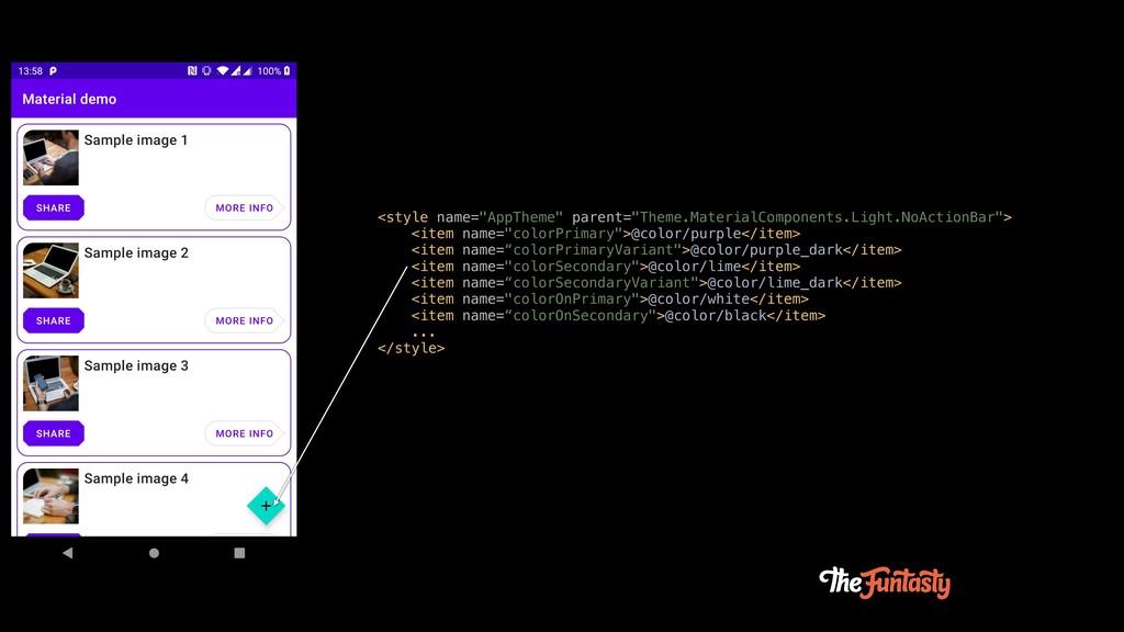
<style name="AppTheme" parent="Theme.MaterialComponents.Light.NoActionBar"> <item name="colorPrimary">@color/purple</item> <item name=“colorPrimaryVariant">@color/purple_dark</item> <item name="colorSecondary">@color/lime</item> <item
name=“colorSecondaryVariant">@color/lime_dark</item> <item name="colorOnPrimary">@color/white</item> <item name=“colorOnSecondary">@color/black</item> ... </style>
<style name="AppTheme" parent="Theme.MaterialComponents.Light.NoActionBar"> <item name="colorPrimary">@color/purple</item> <item name=“colorPrimaryVariant">@color/purple_dark</item> <item name="colorSecondary">@color/lime</item> <item
name=“colorSecondaryVariant">@color/lime_dark</item> <item name="colorOnPrimary">@color/white</item> <item name=“colorOnSecondary">@color/black</item> ... </style>
<style name="AppTheme" parent="Theme.MaterialComponents.Light.NoActionBar"> <item name="colorPrimary">@color/purple</item> <item name=“colorPrimaryVariant">@color/purple_dark</item> <item name="colorSecondary">@color/lime</item> <item
name=“colorSecondaryVariant">@color/lime_dark</item> <item name="colorOnPrimary">@color/white</item> <item name=“colorOnSecondary">@color/black</item> ... </style>
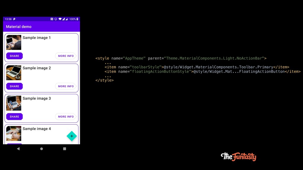
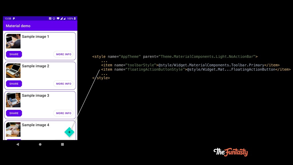
<style name="AppTheme" parent=“Theme.MaterialComponents.Light.NoActionBar"> ... <item name="toolbarStyle">@style/Widget.MaterialComponents.Toolbar.Primary</item> <item name=“floatingActionButtonStyle”>@style/Widget.Mat...FloatingActionButton</item> ... </style>
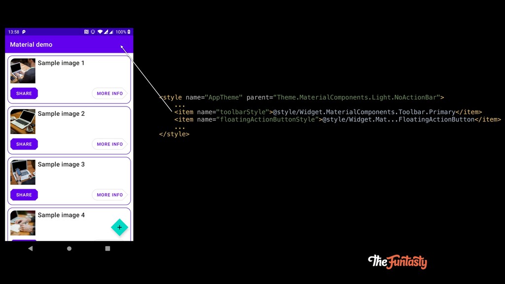
<style name="AppTheme" parent=“Theme.MaterialComponents.Light.NoActionBar"> ... <item name="toolbarStyle">@style/Widget.MaterialComponents.Toolbar.Primary</item> <item name=“floatingActionButtonStyle”>@style/Widget.Mat...FloatingActionButton</item> ... </style>
<style name="AppTheme" parent=“Theme.MaterialComponents.Light.NoActionBar"> ... <item name="toolbarStyle">@style/Widget.MaterialComponents.Toolbar.Primary</item> <item name=“floatingActionButtonStyle”>@style/Widget.Mat...FloatingActionButton</item> ... </style>
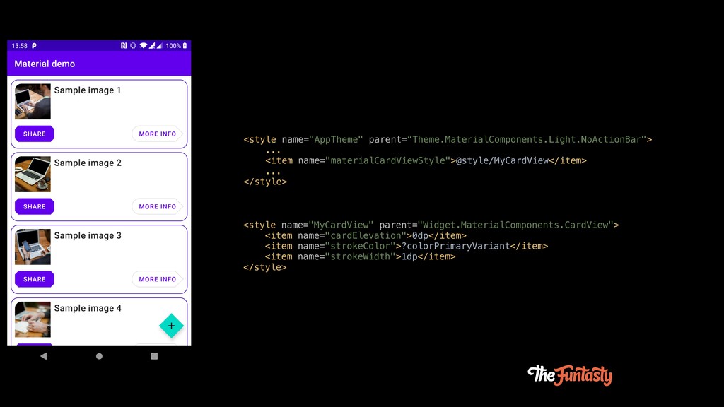
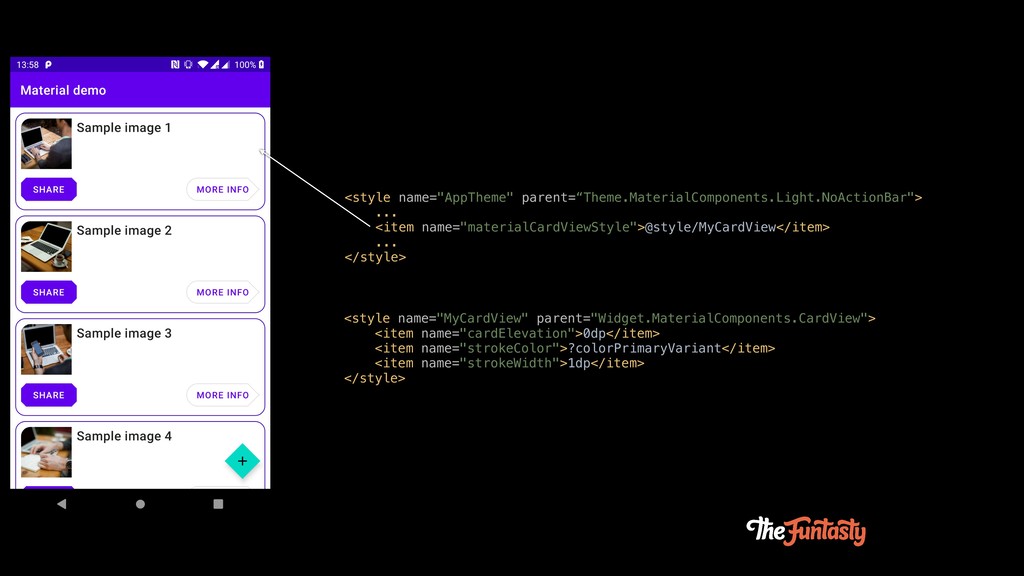
<style name="AppTheme" parent=“Theme.MaterialComponents.Light.NoActionBar"> ... <item name="materialCardViewStyle">@style/MyCardView</item> ... </style> <style name="MyCardView"
parent="Widget.MaterialComponents.CardView"> <item name="cardElevation">0dp</item> <item name="strokeColor">?colorPrimaryVariant</item> <item name="strokeWidth">1dp</item> </style>
<style name="AppTheme" parent=“Theme.MaterialComponents.Light.NoActionBar"> ... <item name="materialCardViewStyle">@style/MyCardView</item> ... </style> <style name="MyCardView"
parent="Widget.MaterialComponents.CardView"> <item name="cardElevation">0dp</item> <item name="strokeColor">?colorPrimaryVariant</item> <item name="strokeWidth">1dp</item> </style>
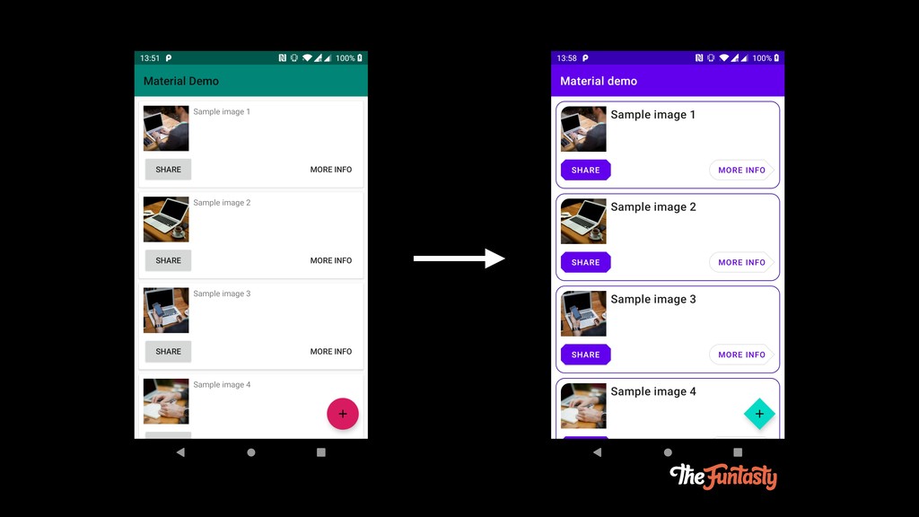
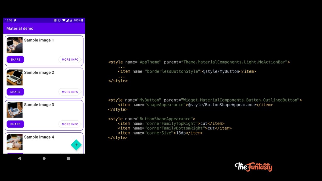
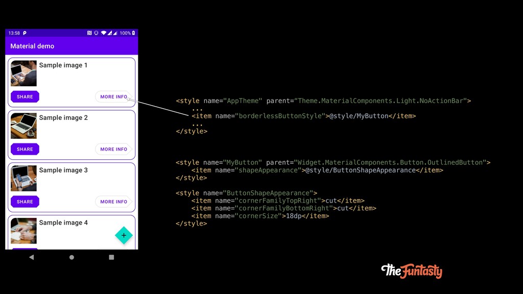
<style name="AppTheme" parent=“Theme.MaterialComponents.Light.NoActionBar"> ... <item name="borderlessButtonStyle">@style/MyButton</item> ... </style> <style name="MyButton"
parent="Widget.MaterialComponents.Button.OutlinedButton"> <item name="shapeAppearance">@style/ButtonShapeAppearance</item> </style> <style name="ButtonShapeAppearance"> <item name="cornerFamilyTopRight">cut</item> <item name="cornerFamilyBottomRight">cut</item> <item name="cornerSize">18dp</item> </style>
<style name="AppTheme" parent=“Theme.MaterialComponents.Light.NoActionBar"> ... <item name="borderlessButtonStyle">@style/MyButton</item> ... </style> <style name="MyButton"
parent="Widget.MaterialComponents.Button.OutlinedButton"> <item name="shapeAppearance">@style/ButtonShapeAppearance</item> </style> <style name="ButtonShapeAppearance"> <item name="cornerFamilyTopRight">cut</item> <item name="cornerFamilyBottomRight">cut</item> <item name="cornerSize">18dp</item> </style>
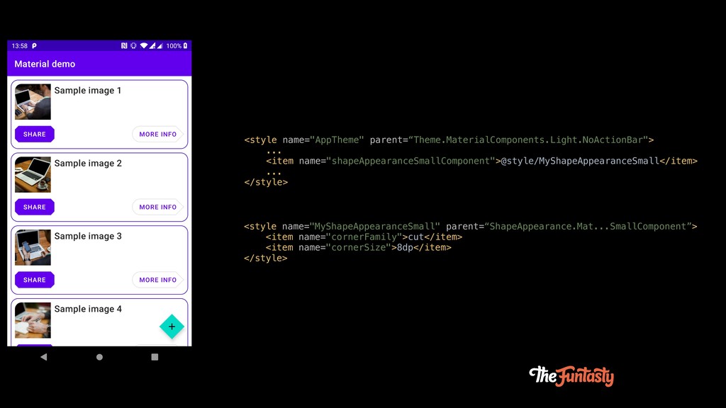
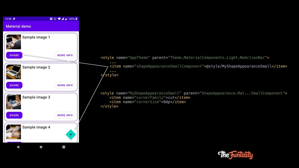
<style name="AppTheme" parent=“Theme.MaterialComponents.Light.NoActionBar"> ... <item name="shapeAppearanceSmallComponent">@style/MyShapeAppearanceSmall</item> ... </style> <style name="MyShapeAppearanceSmall"
parent=“ShapeAppearance.Mat...SmallComponent”> <item name="cornerFamily">cut</item> <item name="cornerSize">8dp</item> </style>
<style name="AppTheme" parent=“Theme.MaterialComponents.Light.NoActionBar"> ... <item name="shapeAppearanceSmallComponent">@style/MyShapeAppearanceSmall</item> ... </style> <style name="MyShapeAppearanceSmall"
parent=“ShapeAppearance.Mat...SmallComponent”> <item name="cornerFamily">cut</item> <item name="cornerSize">8dp</item> </style>
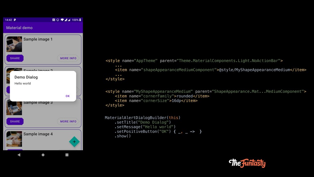
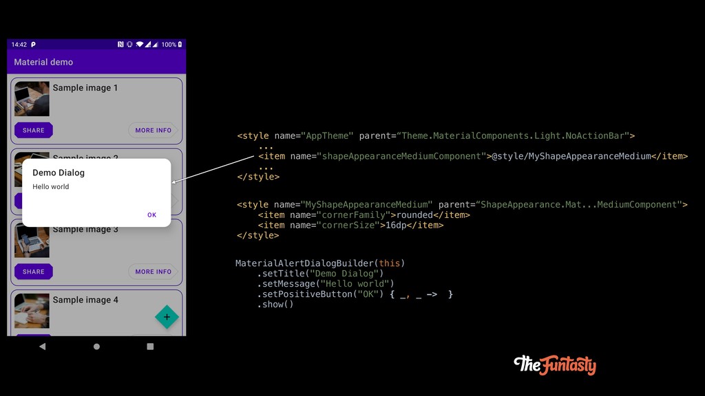
<style name="AppTheme" parent=“Theme.MaterialComponents.Light.NoActionBar"> ... <item name="shapeAppearanceMediumComponent">@style/MyShapeAppearanceMedium</item> ... </style> <style name="MyShapeAppearanceMedium"
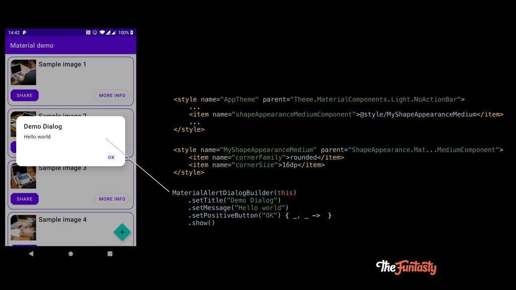
parent=“ShapeAppearance.Mat...MediumComponent"> <item name="cornerFamily">rounded</item> <item name="cornerSize">16dp</item> </style> MaterialAlertDialogBuilder(this) .setTitle("Demo Dialog") .setMessage("Hello world") .setPositiveButton("OK") { _, _ -> } .show()
<style name="AppTheme" parent=“Theme.MaterialComponents.Light.NoActionBar"> ... <item name="shapeAppearanceMediumComponent">@style/MyShapeAppearanceMedium</item> ... </style> <style name="MyShapeAppearanceMedium"
parent=“ShapeAppearance.Mat...MediumComponent"> <item name="cornerFamily">rounded</item> <item name="cornerSize">16dp</item> </style> MaterialAlertDialogBuilder(this) .setTitle("Demo Dialog") .setMessage("Hello world") .setPositiveButton("OK") { _, _ -> } .show()
<style name="AppTheme" parent=“Theme.MaterialComponents.Light.NoActionBar"> ... <item name="shapeAppearanceMediumComponent">@style/MyShapeAppearanceMedium</item> ... </style> <style name="MyShapeAppearanceMedium"
parent=“ShapeAppearance.Mat...MediumComponent"> <item name="cornerFamily">rounded</item> <item name="cornerSize">16dp</item> </style> MaterialAlertDialogBuilder(this) .setTitle("Demo Dialog") .setMessage("Hello world") .setPositiveButton("OK") { _, _ -> } .show()
Docs & tools
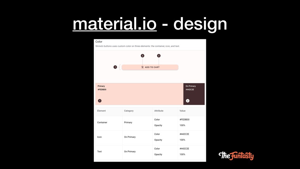
material.io - design
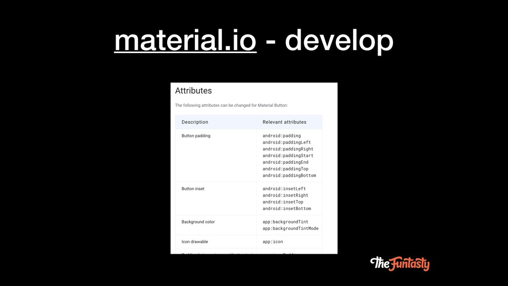
material.io - develop
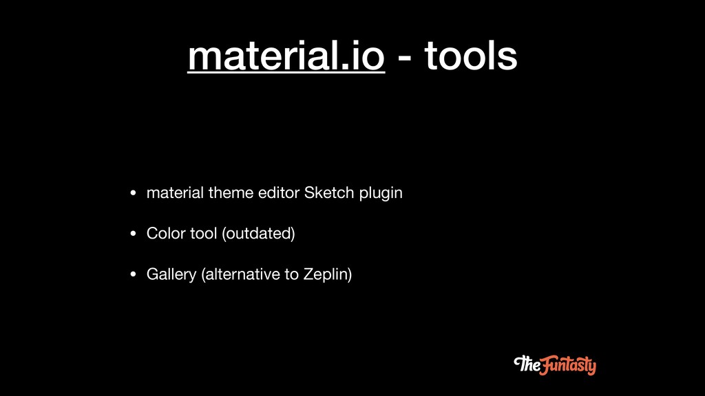
material.io - tools • material theme editor Sketch plugin •
Color tool (outdated) • Gallery (alternative to Zeplin)
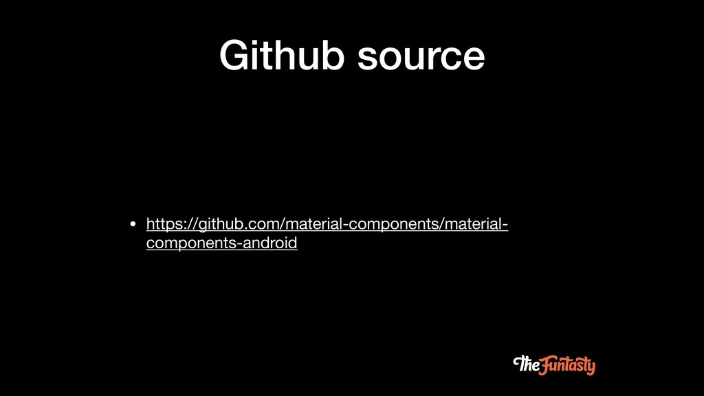
Github source • https://github.com/material-components/material- components-android
Questions?


 thefuntasty
 shugo
shugo
 codmoninc
 cogakira
 grimoh
 terapyon
 4o1sobblue
 takanorip
 sansantech
 teamlab
 yahonda
 taketakekaho
 destraynor
 kimpetersen
 vanstee
 portentint
 soysaucechin
 keithpitt
 axbom
axbom
 inesmontani
 tmiket
 aleyda
 katarinadahlin
 wayneb77