tutorial series for the GDG UNILAG chapter. We’d be having more of this over the coming weeks. If you’d like to join our chapter and enjoy some of the perks we offer, register using the link below and we’d get back to you. http://unilag.gdg.ng/signup Hoping to hear from you soon.
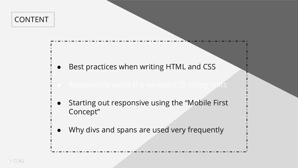
Responsibly using the various CSS sizing units • Starting out responsive using the “Mobile First Concept” • Why divs and spans are used very frequently
non erat sem Most days, we don’t really consider the way we write HTML. This is because HTML aren’t really a thing but standards do exist. One of this is the W3C1 (World Wide Web Consortium) standard. “Nice abbreviation for a bunch of nerds!” They define what standards exist for the entire web community in general. Along side HTML, there are other standards like XML, MathML 2 which is like HTML that does math; no jokes!. So back to standards, What are they then? 1. https://www.w3.org/standards/webdesign/htmlcss 2. https://www.w3.org/Math/
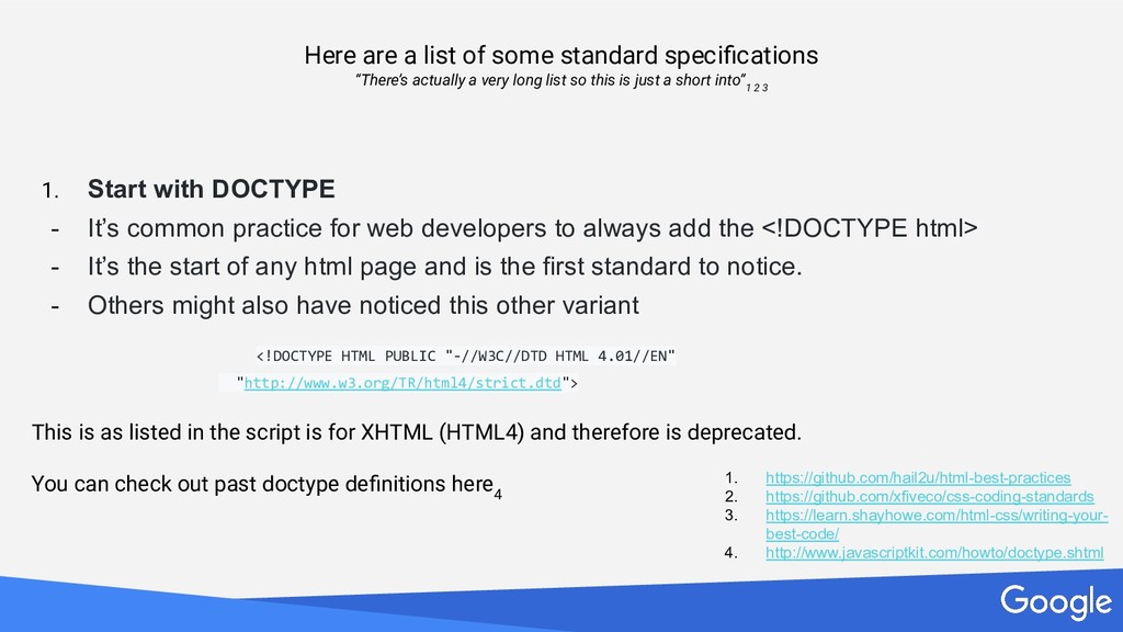
non erat sem Here are a list of some standard specifications “There’s actually a very long list so this is just a short into” 1 2 3 1. Start with DOCTYPE - It’s common practice for web developers to always add the <!DOCTYPE html> - It’s the start of any html page and is the first standard to notice. - Others might also have noticed this other variant <!DOCTYPE HTML PUBLIC "-//W3C//DTD HTML 4.01//EN" "http://www.w3.org/TR/html4/strict.dtd"> This is as listed in the script is for XHTML (HTML4) and therefore is deprecated. You can check out past doctype definitions here 4 1. https://github.com/hail2u/html-best-practices 2. https://github.com/xfiveco/css-coding-standards 3. https://learn.shayhowe.com/html-css/writing-your- best-code/ 4. http://www.javascriptkit.com/howto/doctype.shtml
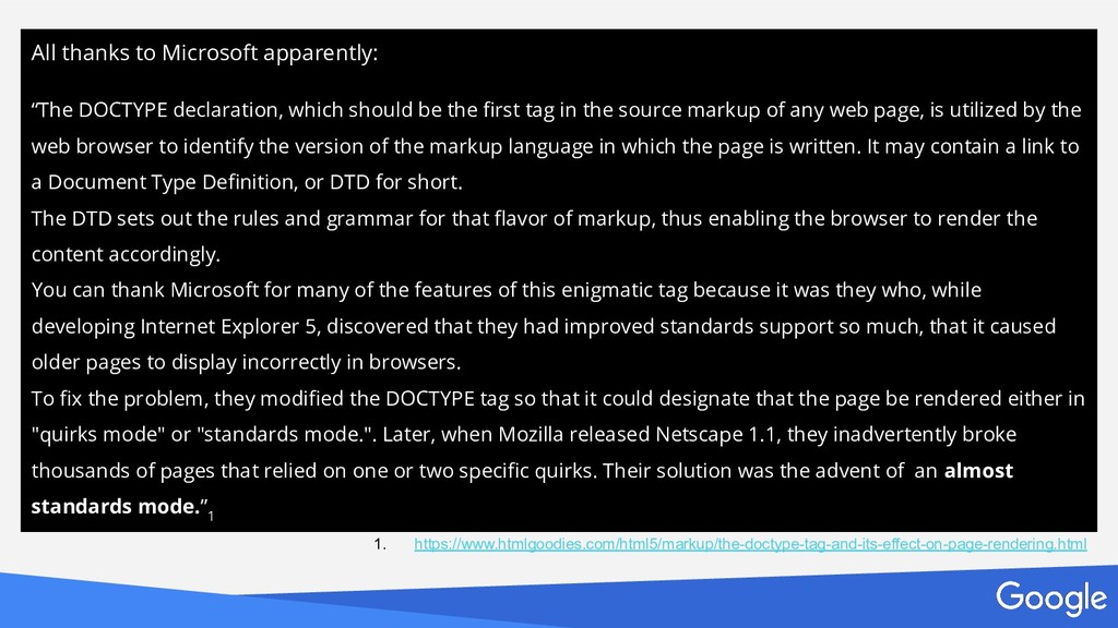
non erat sem All thanks to Microsoft apparently: “The DOCTYPE declaration, which should be the first tag in the source markup of any web page, is utilized by the web browser to identify the version of the markup language in which the page is written. It may contain a link to a Document Type Definition, or DTD for short. The DTD sets out the rules and grammar for that flavor of markup, thus enabling the browser to render the content accordingly. You can thank Microsoft for many of the features of this enigmatic tag because it was they who, while developing Internet Explorer 5, discovered that they had improved standards support so much, that it caused older pages to display incorrectly in browsers. To fix the problem, they modified the DOCTYPE tag so that it could designate that the page be rendered either in "quirks mode" or "standards mode.". Later, when Mozilla released Netscape 1.1, they inadvertently broke thousands of pages that relied on one or two specific quirks. Their solution was the advent of an almost standards mode.” 1 1. https://www.htmlgoodies.com/html5/markup/the-doctype-tag-and-its-effect-on-page-rendering.html
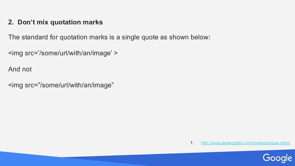
non erat sem 2. Don’t mix quotation marks The standard for quotation marks is a single quote as shown below: <img src=’/some/url/with/an/image’ > And not <img src=”/some/url/with/an/image” 1. http://www.javascriptkit.com/howto/doctype.shtml
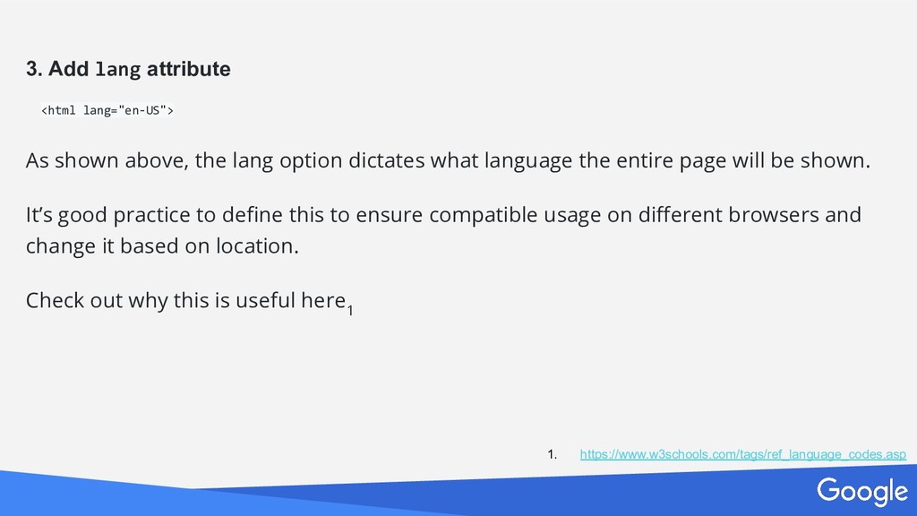
non erat sem 3. Add lang attribute <html lang="en-US"> As shown above, the lang option dictates what language the entire page will be shown. It’s good practice to define this to ensure compatible usage on different browsers and change it based on location. Check out why this is useful here 1 1. https://www.w3schools.com/tags/ref_language_codes.asp
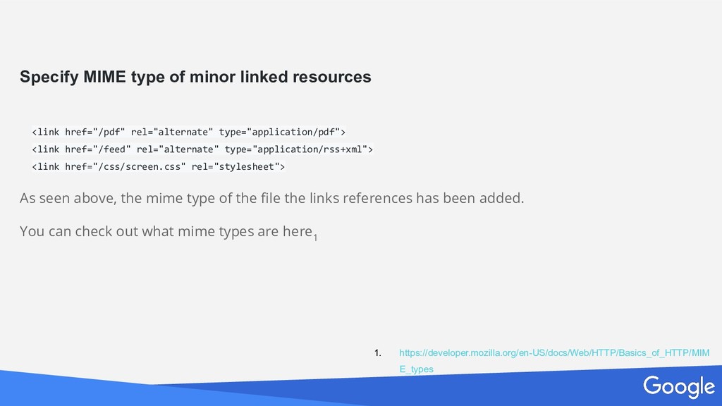
non erat sem Specify MIME type of minor linked resources <link href="/pdf" rel="alternate" type="application/pdf"> <link href="/feed" rel="alternate" type="application/rss+xml"> <link href="/css/screen.css" rel="stylesheet"> As seen above, the mime type of the file the links references has been added. You can check out what mime types are here 1 1. https://developer.mozilla.org/en-US/docs/Web/HTTP/Basics_of_HTTP/MIM E_types
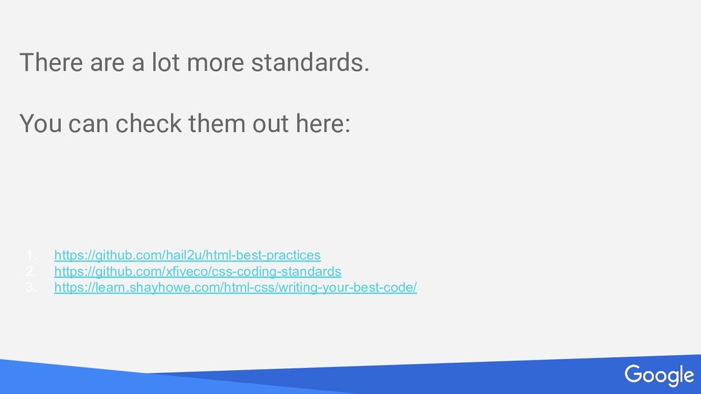
non erat sem There are a lot more standards. You can check them out here: 1. https://github.com/hail2u/html-best-practices 2. https://github.com/xfiveco/css-coding-standards 3. https://learn.shayhowe.com/html-css/writing-your-best-code/
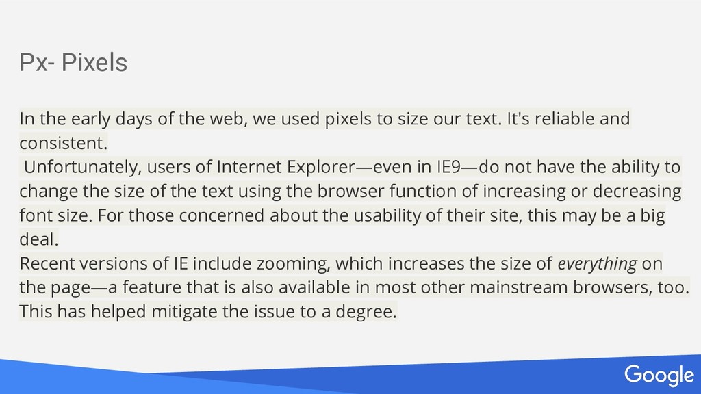
non erat sem Px- Pixels In the early days of the web, we used pixels to size our text. It's reliable and consistent. Unfortunately, users of Internet Explorer—even in IE9—do not have the ability to change the size of the text using the browser function of increasing or decreasing font size. For those concerned about the usability of their site, this may be a big deal. Recent versions of IE include zooming, which increases the size of everything on the page—a feature that is also available in most other mainstream browsers, too. This has helped mitigate the issue to a degree.
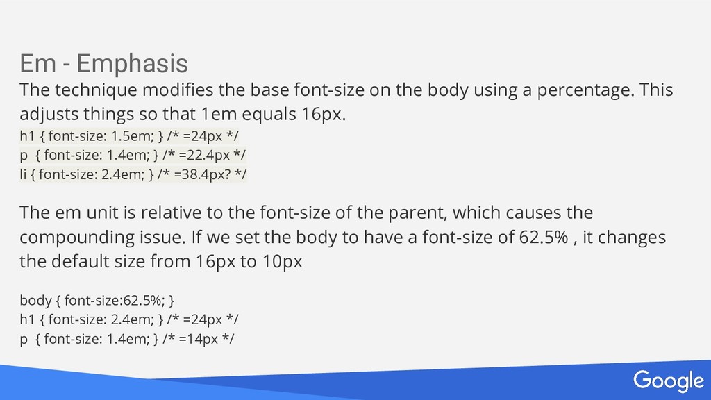
non erat sem Em - Emphasis The technique modifies the base font-size on the body using a percentage. This adjusts things so that 1em equals 16px. h1 { font-size: 1.5em; } /* =24px */ p { font-size: 1.4em; } /* =22.4px */ li { font-size: 2.4em; } /* =38.4px? */ The em unit is relative to the font-size of the parent, which causes the compounding issue. If we set the body to have a font-size of 62.5% , it changes the default size from 16px to 10px body { font-size:62.5%; } h1 { font-size: 2.4em; } /* =24px */ p { font-size: 1.4em; } /* =14px */
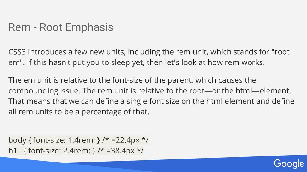
non erat sem Rem - Root Emphasis CSS3 introduces a few new units, including the rem unit, which stands for "root em". If this hasn't put you to sleep yet, then let's look at how rem works. The em unit is relative to the font-size of the parent, which causes the compounding issue. The rem unit is relative to the root—or the html—element. That means that we can define a single font size on the html element and define all rem units to be a percentage of that. body { font-size: 1.4rem; } /* =22.4px */ h1 { font-size: 2.4rem; } /* =38.4px */
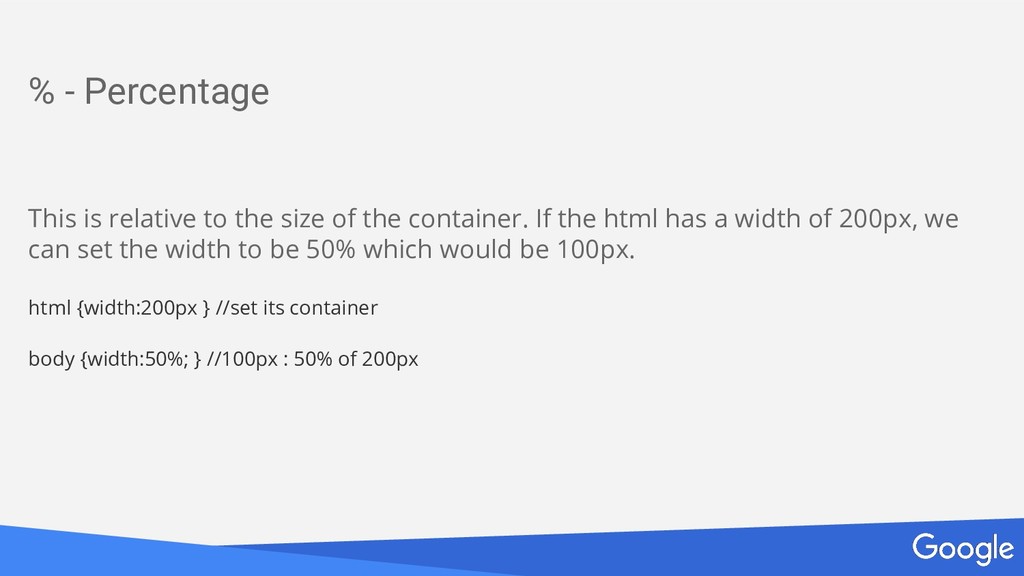
non erat sem % - Percentage This is relative to the size of the container. If the html has a width of 200px, we can set the width to be 50% which would be 100px. html {width:200px } //set its container body {width:50%; } //100px : 50% of 200px
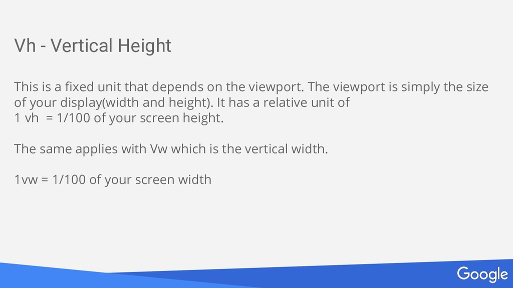
non erat sem Vh - Vertical Height This is a fixed unit that depends on the viewport. The viewport is simply the size of your display(width and height). It has a relative unit of 1 vh = 1/100 of your screen height. The same applies with Vw which is the vertical width. 1vw = 1/100 of your screen width
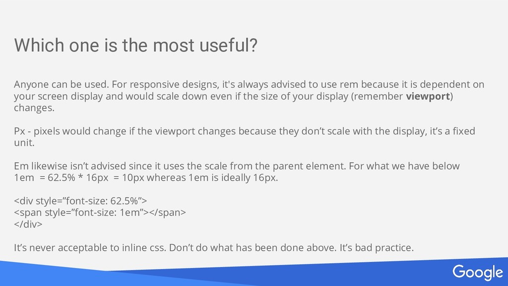
non erat sem Which one is the most useful? Anyone can be used. For responsive designs, it's always advised to use rem because it is dependent on your screen display and would scale down even if the size of your display (remember viewport) changes. Px - pixels would change if the viewport changes because they don’t scale with the display, it’s a fixed unit. Em likewise isn’t advised since it uses the scale from the parent element. For what we have below 1em = 62.5% * 16px = 10px whereas 1em is ideally 16px. <div style=”font-size: 62.5%”> <span style=”font-size: 1em”></span> </div> It’s never acceptable to inline css. Don’t do what has been done above. It’s bad practice.
non erat sem What does “Mobile First” mean? The mobile-first approach is exactly as it sounds: designing for the smallest screen and working your way up. It is one of the best strategies to create either a responsive or adaptive design. Mobile-First = Content-First If your site is good on a mobile device, it translates better to all devices. More important, though, is that the mobile-first approach is also a content-first approach. Mobile has the most limitations, screen size and bandwidth to name a few, and so designing within these parameters force you to prioritize content ruthlessly.
non erat sem What does “Mobile First” mean? The mobile-first approach is exactly as it sounds: designing for the smallest screen and working your way up. It is one of the best strategies to create either a responsive or adaptive design. Mobile-First = Content-First If your site is good on a mobile device, it translates better to all devices. More important, though, is that the mobile-first approach is also a content-first approach. Mobile has the most limitations, screen size and bandwidth to name a few, and so designing within these parameters force you to prioritize content ruthlessly.
non erat sem How do I start off “Mobile First”? The thing is starting off mobile first isn’t easy but it’s not impossible. The way to start off is with media queries. Media queries are done using css and are used as so: @media viewport and (viewport-property : *px){ //your css } You can check out writing media queries here 1 1. https://www.w3schools.com/cssref/css3_pr_mediaquery.asp
non erat sem How do I start off “Mobile First”? The next best thing to do is to use relative units. Rem is a useful relative unit which allows your measurements to work even if the viewport(remember this) changes so your page doesn’t break. It’s always best to start off using rem despite the temptation to use px or %. Percentages aren’t always the best as 40% can be 2px or 4px can change depending on how wide the screen is so it’s never best to use % as your base units if you want a responsive site. Use rem and stay safe!. 1. https://www.w3schools.com/cssref/css3_pr_mediaquery.asp
non erat sem Div and span Divs and spans are the most used tags in the HTML language. Divs are block elements. What this means is that they take up all the space on that line where they are placed. Another block element is the paragraph element P. Spans on the other hand are inline elements. What this means is that they stay on the same line they were placed. Another inline element is the ordered / unordered list (ol ul) Divs and spans are used most times because they are easily customisable and can use most of the css properties we have. Width, Height, Color, Background-color and a couple others can be applied to span and div tags without effort and worry about browser compatibility which is another good thing about them.
non erat sem Div and span Divs and spans are compatible with all browsers. Not all tags can be used on all browsers as not all browsers are fully W3C compatible. An example of this is the NetScape browser from Mozilla. So those are some few reasons why divs and spans are used a lot. You can check out a couple more things here: http://www.iraqtimeline.com/maxdesign/basicdesign/principles/prindiv.html http://htmldog.com/guides/html/intermediate/spandiv/
 tiemma
 naoya
naoya
 har1101
 _fhhmm
 jsoizo
 philipschwarz
 rkaga
rkaga
 mshibuya
 maroon1st
 ganchiku
 panda728
 hayama17
 minodriven
 garrettdimon
 jlugia
 marktimemedia
 bcantrill
 nwiizo
 rasagy
 tmiket
 kimpetersen
 eitanlees
 aleyda
 konakalab
 afnizarnur