Bellevue University's visual brand. Why use this document? A strong visual brand is created through consistent executions and purposeful use. These guidelines are here to help you create and maintain the visual integrity of the Bellevue University brand in order to fulfill the University's mission to effectively engage students in earning awards and degrees that prepare them to thrive in a connected, competitive world. How to use this document. The guidelines in this document serve as a preliminary introduction to the visual brand system for Bellevue University. Always pair common sense with any of the guidelines as not every solution and execution can be accounted for. What if I can't find an answer here? Any questions regarding the University brand system and how to implement it may be directed to Derek Van Horne, Creative Director at Phenomblue. [email protected] or (402) 933-4050 x 220.
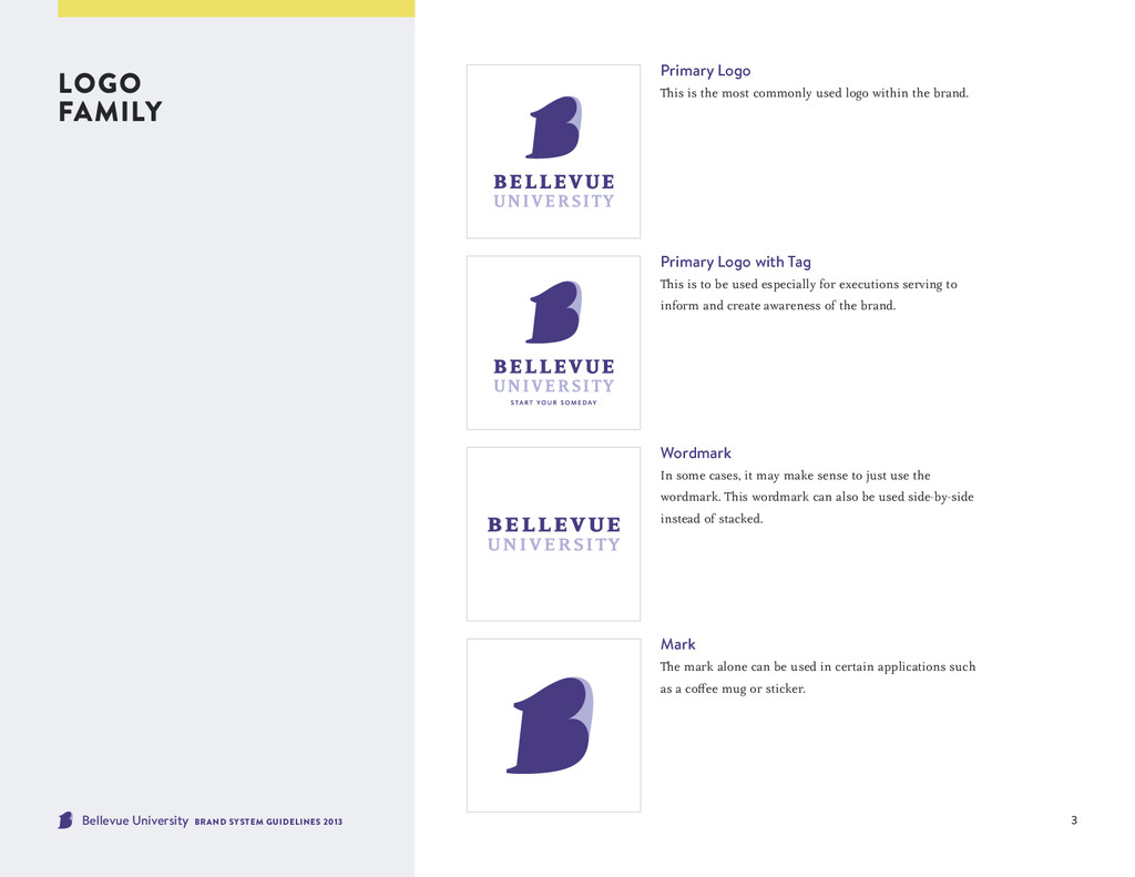
Logo This is the most commonly used logo within the brand. Primary Logo with Tag This is to be used especially for executions serving to inform and create awareness of the brand. Wordmark In some cases, it may make sense to just use the wordmark. This wordmark can also be used side-by-side instead of stacked. Mark The mark alone can be used in certain applications such as a coffee mug or sticker.
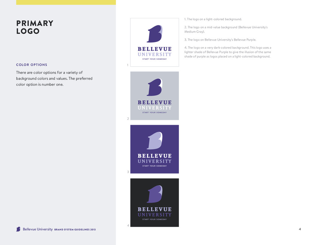
options There are color options for a variety of background colors and values. The preferred color option is number one. 1. The logo on a light-colored background. 2. The logo on a mid-value background (Bellevue University's Medium Gray). 3. The logo on Bellevue University's Bellevue Purple. 4. The logo on a very dark-colored background. This logo uses a lighter shade of Bellevue Purple to give the illusion of the same shade of purple as logos placed on a light-colored background. 1 2 3 4
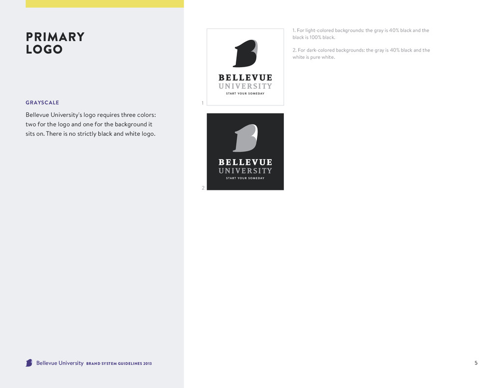
backgrounds: the gray is 40% black and the black is 100% black. 2. For dark-colored backgrounds: the gray is 40% black and the white is pure white. primary logo grayscale Bellevue University's logo requires three colors: two for the logo and one for the background it sits on. There is no strictly black and white logo. 1 2
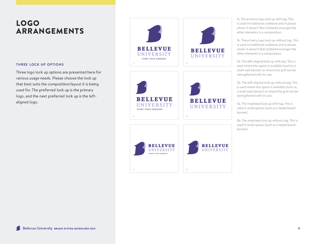
lock up options Three logo lock up options are presented here for various usage needs. Please choose the lock up that best suits the composition/layout it is being used for. The preferred lock up is the primary logo, and the next preferred lock up is the left- aligned logo. 1a 1b 3a 3b 2a 2b 1a. The primary logo lock up with tag. This is used in traditional collateral and in places where it doesn't feel cluttered amongst the other elements in a composition. 1b. The primary logo lock up without tag. This is used in traditional collateral and in places where it doesn't feel cluttered amongst the other elements in a composition. 2a. The left-aligned lock up with tag. This is used where less space is available (such as a small web banner) or where the grid can be strengthened with its use. 2b. The left-aligned lock up without tag. This is used where less space is available (such as a small web banner) or where the grid can be strengthened with its use. 3a. The masthead lock up with tag. This is used in small spaces (such as a leaderboard banner). 3b. The masthead lock up without tag. This is used in small spaces (such as a leaderboard banner).
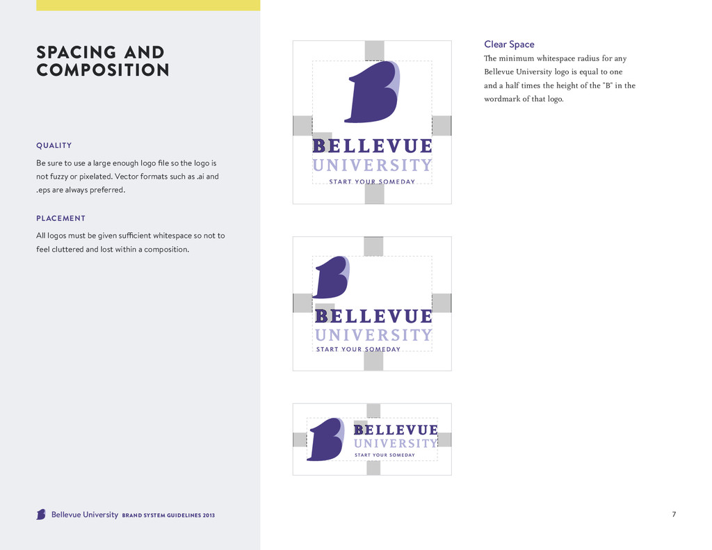
Clear Space The minimum whitespace radius for any Bellevue University logo is equal to one and a half times the height of the "B" in the wordmark of that logo. quality Be sure to use a large enough logo file so the logo is not fuzzy or pixelated. Vector formats such as .ai and .eps are always preferred. placement All logos must be given sufficient whitespace so not to feel cluttered and lost within a composition.
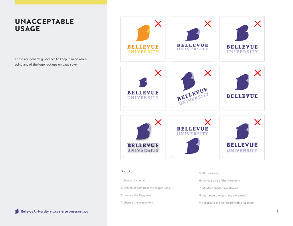
are general guidelines to keep in mind when using any of the logo lock ups on page seven. Do not... 1. change the colors 2. stretch or compress the proportions 3. remove the flag point 4. change the proportions 5. tilt or rotate 6. remove part of the wordmark 7. add drop shadows or strokes 8. rearrange the mark and wordmark 9. substitute the wordmark with a typeface 1 4 7 2 5 8 3 6 9
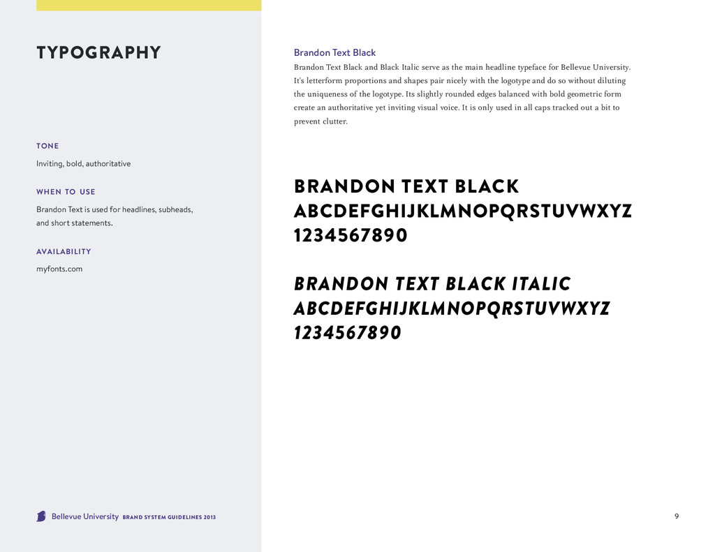
Black Brandon Text Black and Black Italic serve as the main headline typeface for Bellevue University. It's letterform proportions and shapes pair nicely with the logotype and do so without diluting the uniqueness of the logotype. Its slightly rounded edges balanced with bold geometric form create an authoritative yet inviting visual voice. It is only used in all caps tracked out a bit to prevent clutter. Brandon Text Black ABCDEFGHIJKLMNOPQRSTUVWXYZ 1234567890 Brandon Text Black Italic ABCDEFGHIJKLMNOPQRSTUVWXYZ 1234567890 tone Inviting, bold, authoritative when to use Brandon Text is used for headlines, subheads, and short statements. availability myfonts.com
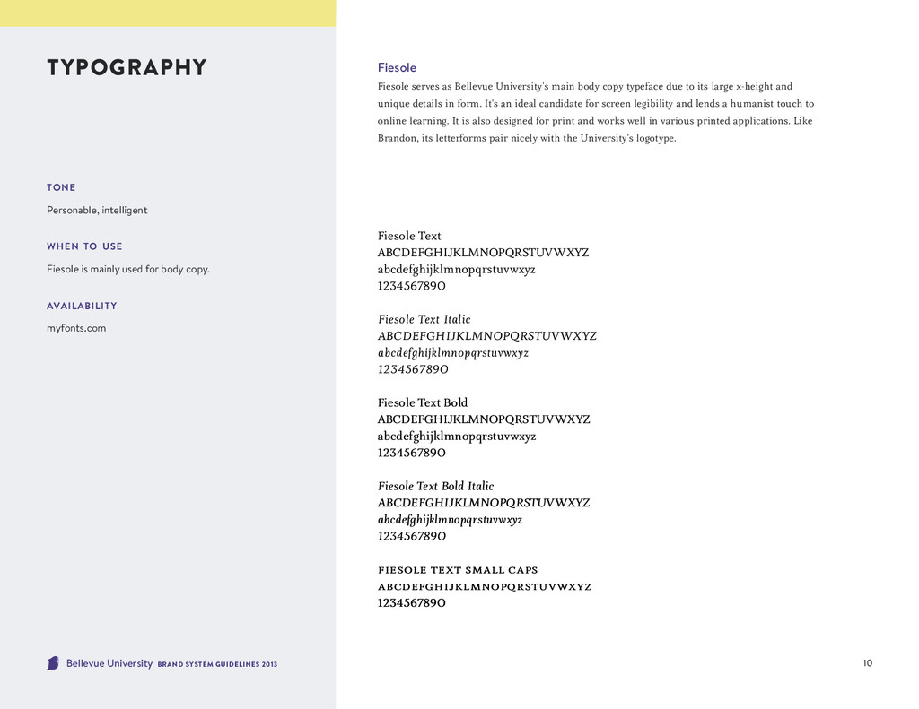
serves as Bellevue University's main body copy typeface due to its large x-height and unique details in form. It's an ideal candidate for screen legibility and lends a humanist touch to online learning. It is also designed for print and works well in various printed applications. Like Brandon, its letterforms pair nicely with the University's logotype. Fiesole Text ABCDEFGHIJKLMNOPQRSTUVWXYZ abcdefghijklmnopqrstuvwxyz 1234567890 Fiesole Text Italic ABCDEFGHIJKLMNOPQRSTUVWXYZ abcdefghijklmnopqrstuvwxyz 1234567890 Fiesole Text Bold ABCDEFGHIJKLMNOPQRSTUVWXYZ abcdefghijklmnopqrstuvwxyz 1234567890 Fiesole Text Bold Italic ABCDEFGHIJKLMNOPQRSTUVWXYZ abcdefghijklmnopqrstuvwxyz 1234567890 f iesole text small caps abcdefghijklmnopqrstuvwxyz 1234567890 tone Personable, intelligent when to use Fiesole is mainly used for body copy. availability myfonts.com
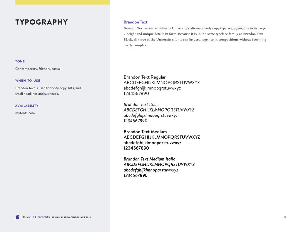
Brandon Text serves as Bellevue University's alternate body copy typeface, again, due to its large x-height and unique details in form. Because it is in the same typeface family as Brandon Text Black, all three of the University's fonts can be used together in compositions without becoming overly complex. Brandon Text Regular ABCDEFGHIJKLMNOPQRSTUVWXYZ abcdefghijklmnopqrstuvwxyz 1234567890 Brandon Text Italic ABCDEFGHIJKLMNOPQRSTUVWXYZ abcdefghijklmnopqrstuvwxyz 1234567890 Brandon Text Medium ABCDEFGHIJKLMNOPQRSTUVWXYZ abcdefghijklmnopqrstuvwxyz 1234567890 Brandon Text Medium Italic ABCDEFGHIJKLMNOPQRSTUVWXYZ abcdefghijklmnopqrstuvwxyz 1234567890 tone Contemporary, friendly, casual when to use Brandon Text is used for body copy, lists, and small headlines and subheads. availability myfonts.com
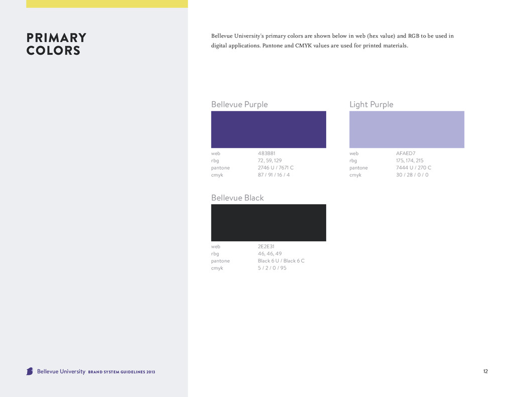
colors are shown below in web (hex value) and RGB to be used in digital applications. Pantone and CMYK values are used for printed materials. primary colors web 483B81 rbg 72, 59, 129 pantone 2746 U / 7671 C cmyk 87 / 91 / 16 / 4 web AFAED7 rbg 175, 174, 215 pantone 7444 U / 270 C cmyk 30 / 28 / 0 / 0 Bellevue Purple Light Purple web 2E2E31 rbg 46, 46, 49 pantone Black 6 U / Black 6 C cmyk 5 / 2 / 0 / 95 Bellevue Black
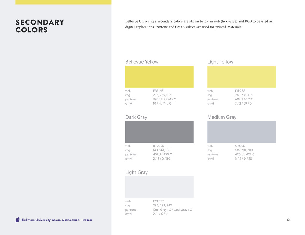
colors are shown below in web (hex value) and RGB to be used in digital applications. Pantone and CMYK values are used for printed materials. secondary colors web EBE166 rbg 235, 225, 102 pantone 3945 U / 3945 C cmyk 10 / 4 / 74 / 0 web F1E988 rbg 241, 233, 136 pantone 601 U / 601 C cmyk 7 / 2 / 59 / 0 Bellevue Yellow Light Yellow web 8F9096 rbg 143, 144, 150 pantone 431 U / 430 C cmyk 2 / 2 / 0 / 50 Dark Gray web C4C9D1 rbg 196, 201, 209 pantone 428 U / 429 C cmyk 5 / 2 / 0 / 20 web ECEEF2 rbg 236, 238, 242 pantone Cool Gray 1 C / Cool Gray 1 C cmyk 2 / 1 / 0 / 4 Medium Gray Light Gray
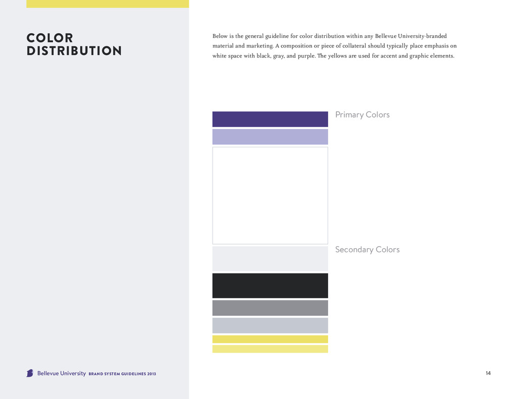
general guideline for color distribution within any Bellevue University-branded material and marketing. A composition or piece of collateral should typically place emphasis on white space with black, gray, and purple. The yellows are used for accent and graphic elements. color distribution Primary Colors Secondary Colors
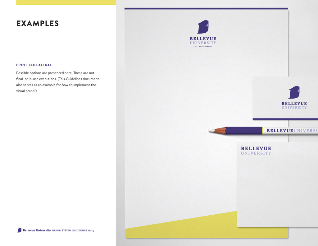
Possible options are presented here. These are not final or in-use executions. (This Guidelines document also serves as an example for how to implement the visual brand.)
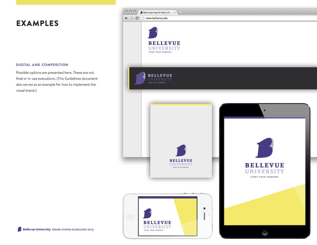
composition Possible options are presented here. These are not final or in-use executions. (This Guidelines document also serves as an example for how to implement the visual brand.)
 tinyxl
 ashapiro
 kspace
 hiro93n
 lynteo
 root_recruit
 rezaline
 kenichiota0711
 centou
 visional_engineering_and_design
 yamasaku
 nishame
 bebe
bebe
 lara
lara
 sergeychernyshev
 letsgokoyo
 axbom
axbom
 reverentgeek
 addyosmani
 katiecoart
 stuffmc
 tammyeverts
 davidcarrasco
 varn
varn