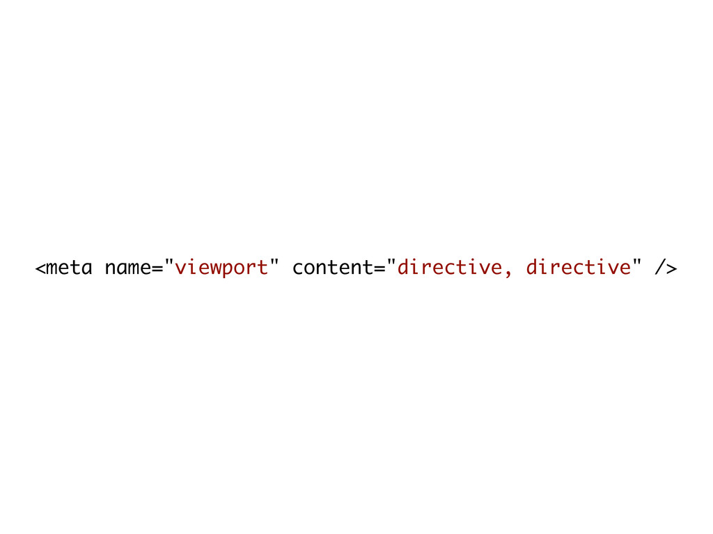
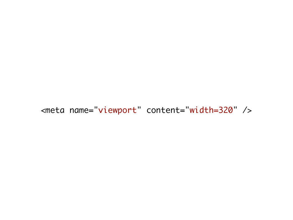
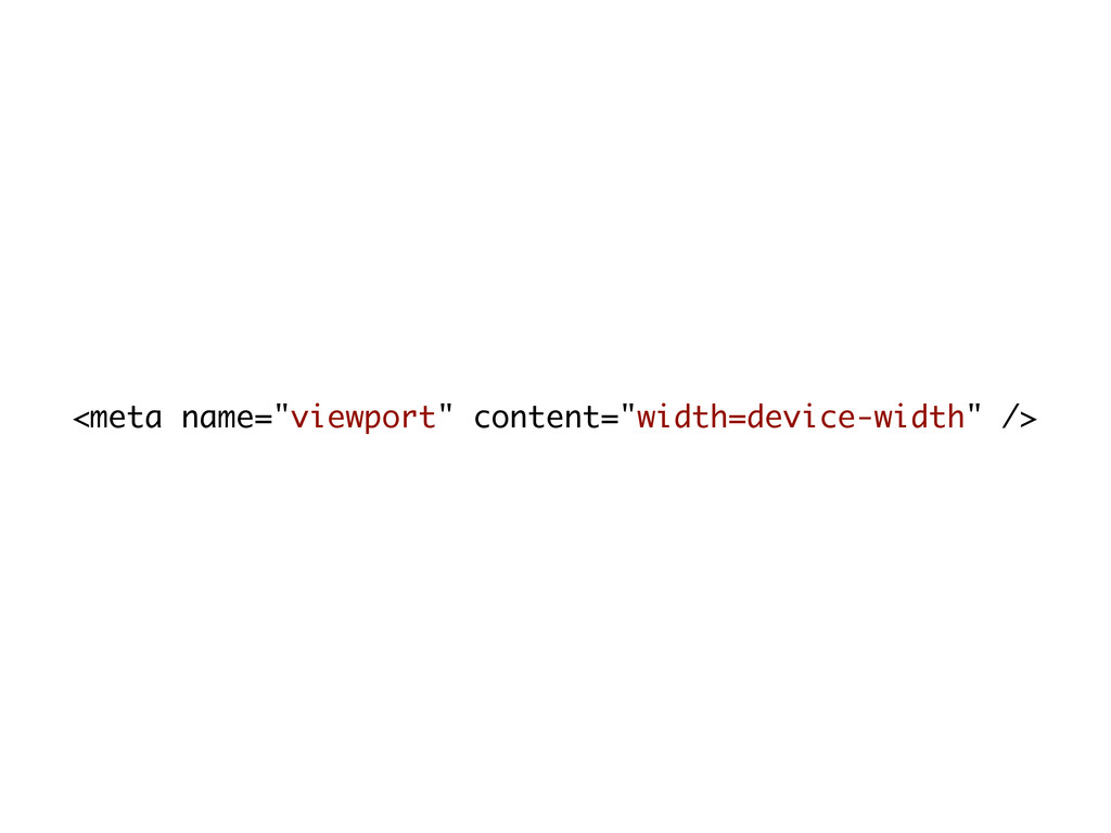
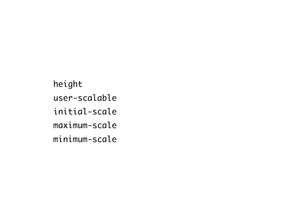
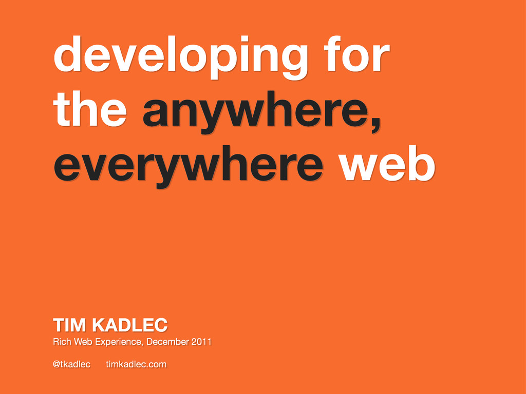
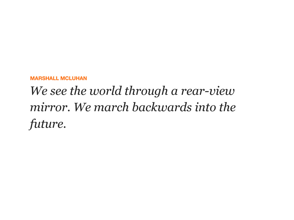
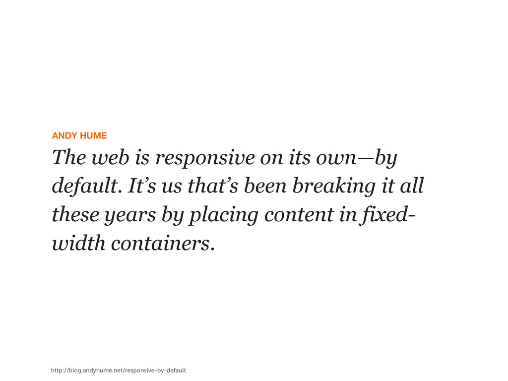
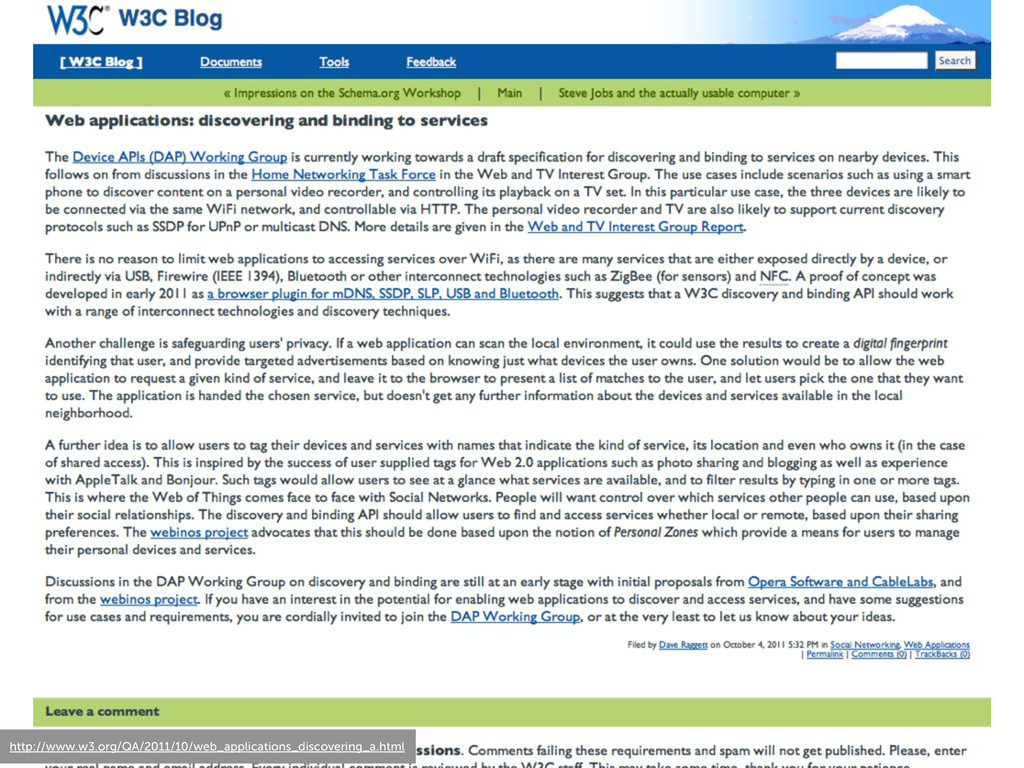
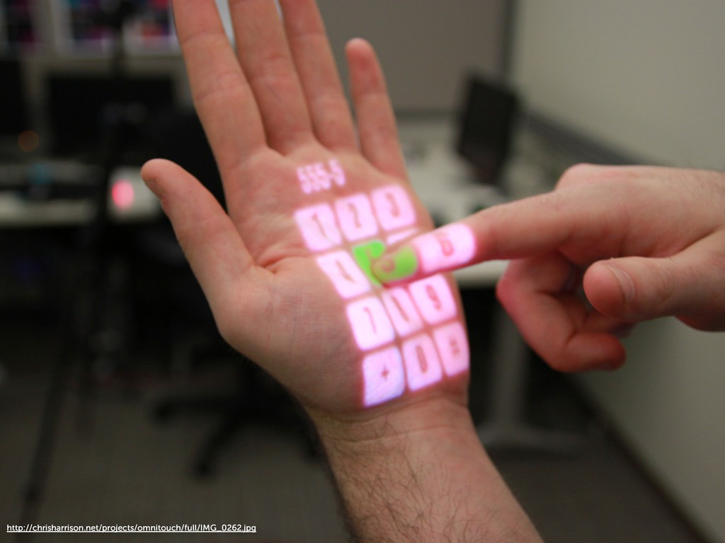
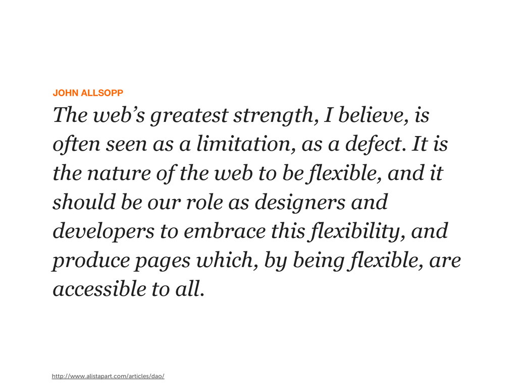
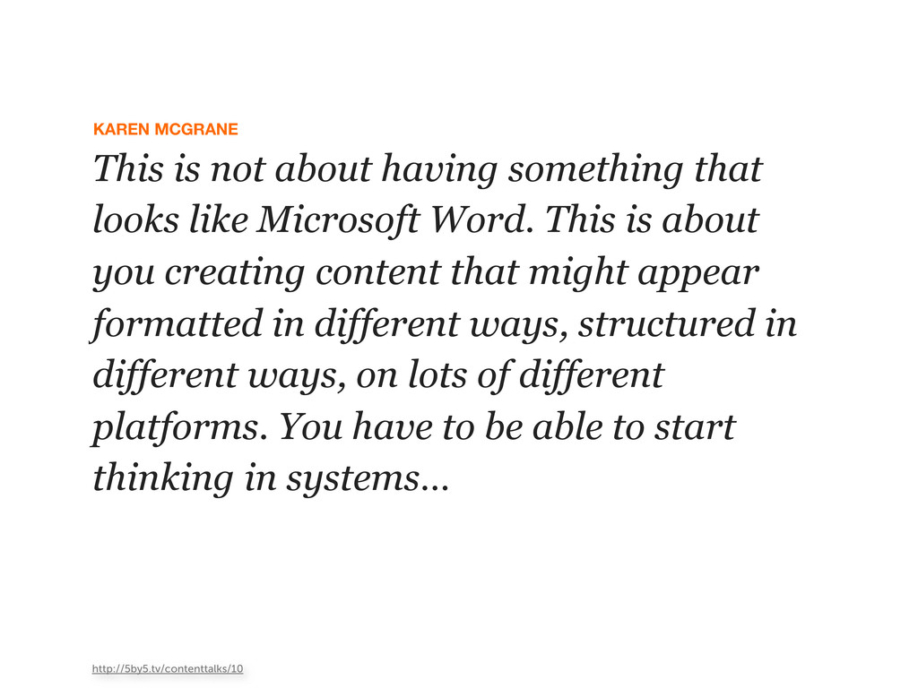
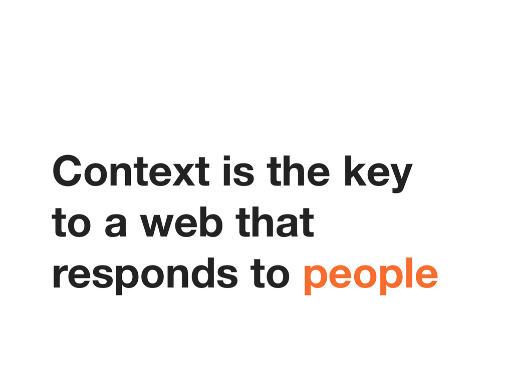
We are just now starting to understand and embrace the web for what it truly is—an inherently flexible and responsive medium. As the number of internet-connected devices explodes, we are forced to reassess how we create our sites and applications. We don't know for certain what device our users will be using or where they'll be using them from. All we know is that they will expect to see meaningful content in a design that is tailored to the constraints of the device, and that this content will be delivered to them quickly—no matter where they are.
This session what it means to embrace the inherent flexibility of the web. We will discuss where our current practices and tools fall short. We'll also take a look at how new techniques like responsive enhancement can help.
 tkadlec
 kishida
 elenatanasoiu
 77web
77web
 guvalif
 naoya
naoya
 minodriven
 jinwatanabe
 vinceamstoutz
 yusukebe
 hananouchi
 auna
auna
 elsirapls
 keavy
keavy
 aleyda
 frankvandijk
 lindahogenes
 skipperchong
 carmenintech
 iamctodd
 codingconduct
 morganepeng
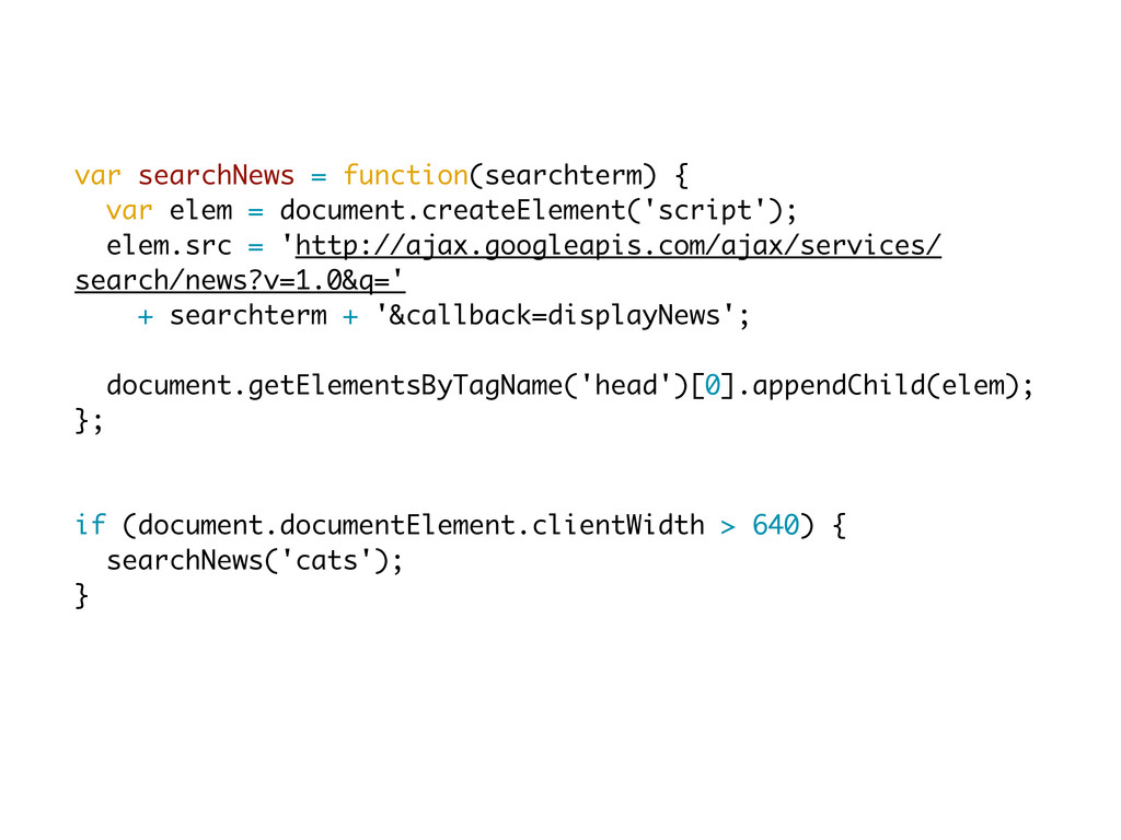
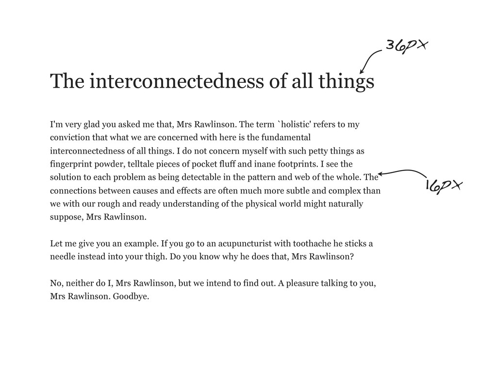
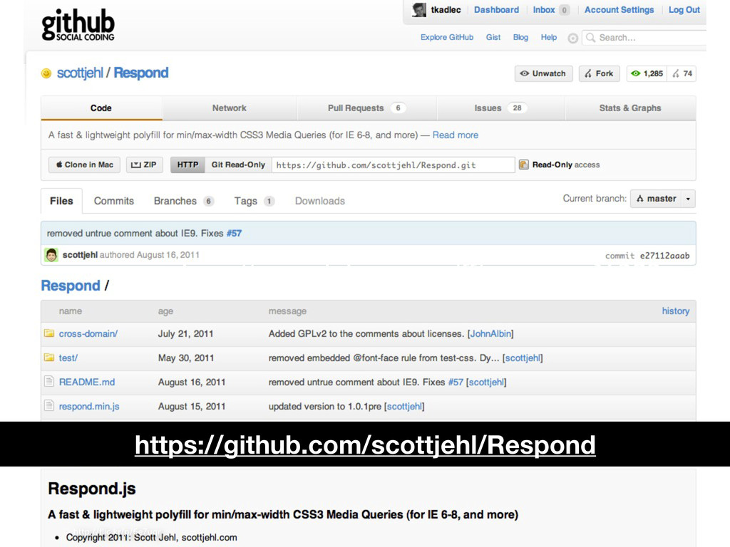
![@media [not|only] type [and] (expression) { ... }](https://files.speakerdeck.com/presentations/4f5f950123adb00672007f9d/slide_52.jpg)
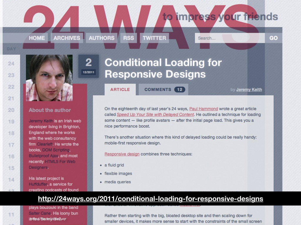
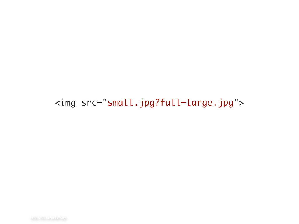
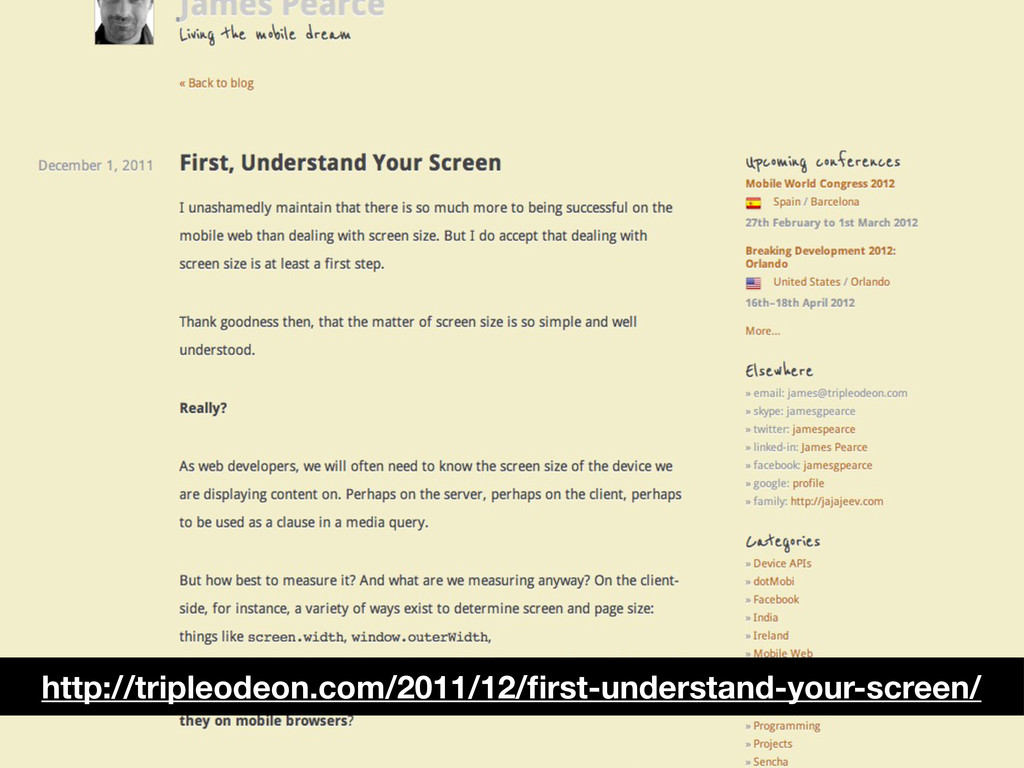
![http://flic.kr/p/6e7uqr <!--[if (lt IE 9)&(!IEMobile)]> <link rel="stylesheet" href="/css/layout.css" media="all"> <![endif]-->](https://files.speakerdeck.com/presentations/4f5f950123adb00672007f9d/slide_62.jpg)
![http://flic.kr/p/6e7uqr <body> {{>header}} [...document content...] {{>footer}} </body> header.html mobile_header.html footer.html](https://files.speakerdeck.com/presentations/4f5f950123adb00672007f9d/slide_100.jpg)
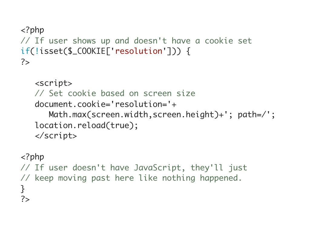
![<?php $res = !empty($_COOKIE['resolution']) ? $_COOKIE['resolution'] : 500; // Arbitrary](https://files.speakerdeck.com/presentations/4f5f950123adb00672007f9d/slide_103.jpg)