Upgrade to Pro — share decks privately, control downloads, hide ads and more …

CSS Pseudo Elements for Fun and Profit!

Chris Coyier
September 19, 2011

CSS Pseudo Elements for Fun and Profit!

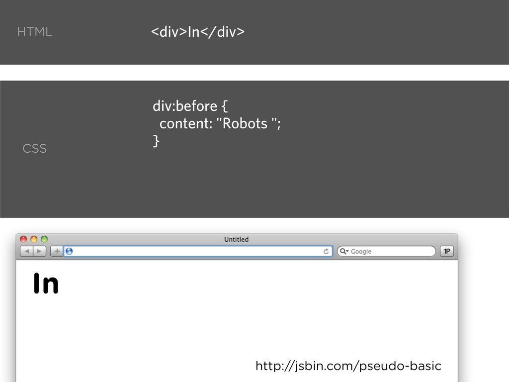
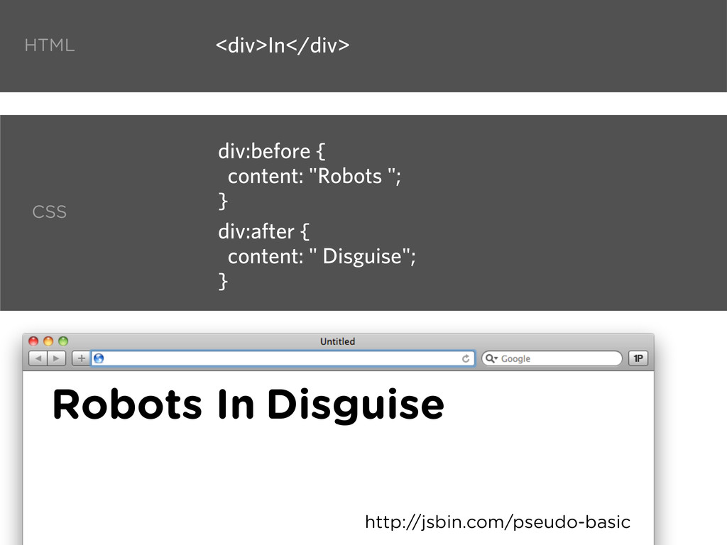
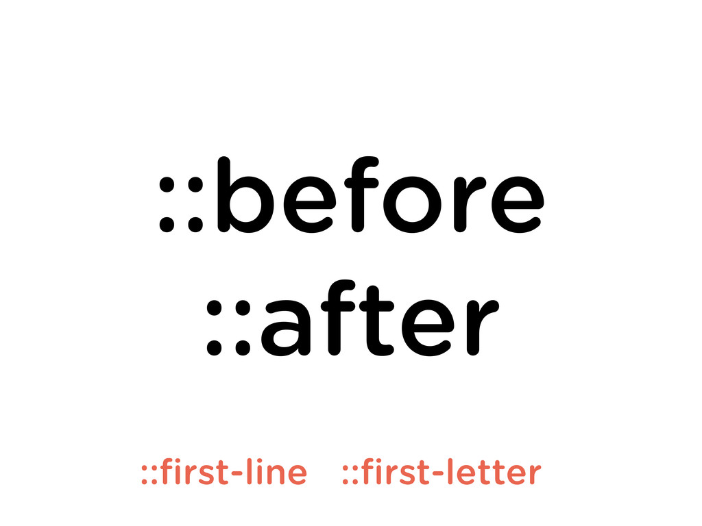
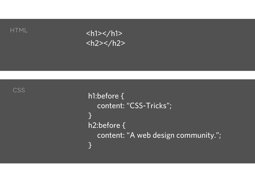
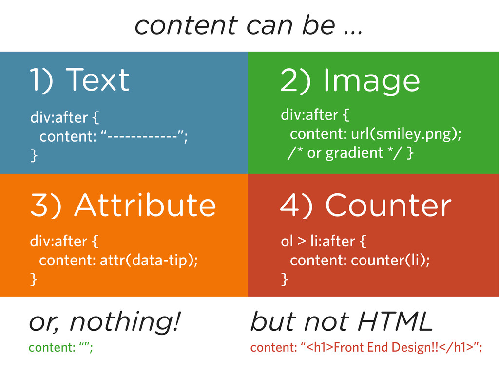
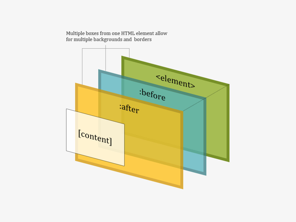
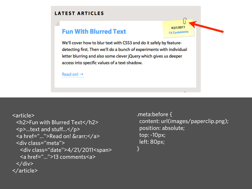
The pseudo elements :before and :after give us the ability to do lots of amazing things with design while not clutting our markup with extra non-semantic, design-specific HTML.

Chris Coyier

September 19, 2011
Tweet

More Decks by Chris Coyier

Other Decks in Design

Transcript

  1. Dude my dude. Another talk about CSS? What’s to know?

    CSS is fraggin easy. Wow that’s so hard. It’s a red box. .box { width: 100px; height: 100px; background: red; }
  2. Here’s what some super smart dude once pontificated about CSS.

    CSS takes a day to learn but a lifetime to master.
  3. Create the navigation tabs below with no images, assuming this

    markup: <ul> <li><a href=”#”>One</a></li> <li><a href=”#”>Two</a></li> <li><a href=”#”>Three</a></li> </ul>
  4. Here’s what we are going to learn: 1) What they

    are 2) How to use them (syntax) 3) Why they are cool (theoretically) 4) Why they are cool (in practice)
  5. You already know how to use them! :visited :hover :active

    :link :first-child :last-child :nth-child() :nth-of-type() :enabled :disabled :checked :indeterminate :focus :target :root :lang() “Pseudo Class Selectors” http://css-tricks.com/pseudo-class-selectors/
  6. So what’s with the different name? Pseudo selectors select elements

    that already exist (perhaps in different states). Pseudo elements create new content that doesn’t exist (yet).
  7. <div> Robots <h1>Blah blah blah</h1> <p>More stuff</p> Nothing to see

    here. Disguise </div> Resulting HTML (sorta)
  8. <img src=”robot.jpg” alt=”Robot”> <input type=”email” name=”email” /> <br> Not for

    “no content” elements • Allows but shouldn’t • Styles as if was inside • Checkboxes • Radio Buttons
  9. HTML CSS Graphic design will save the world right after

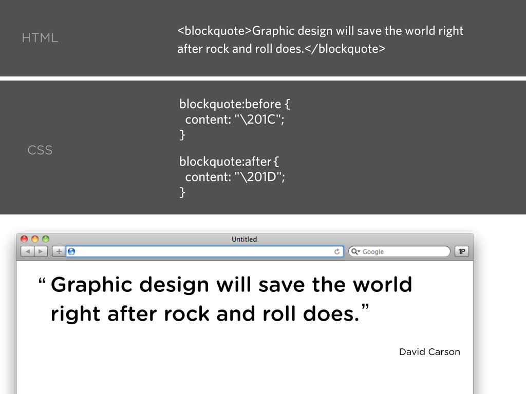
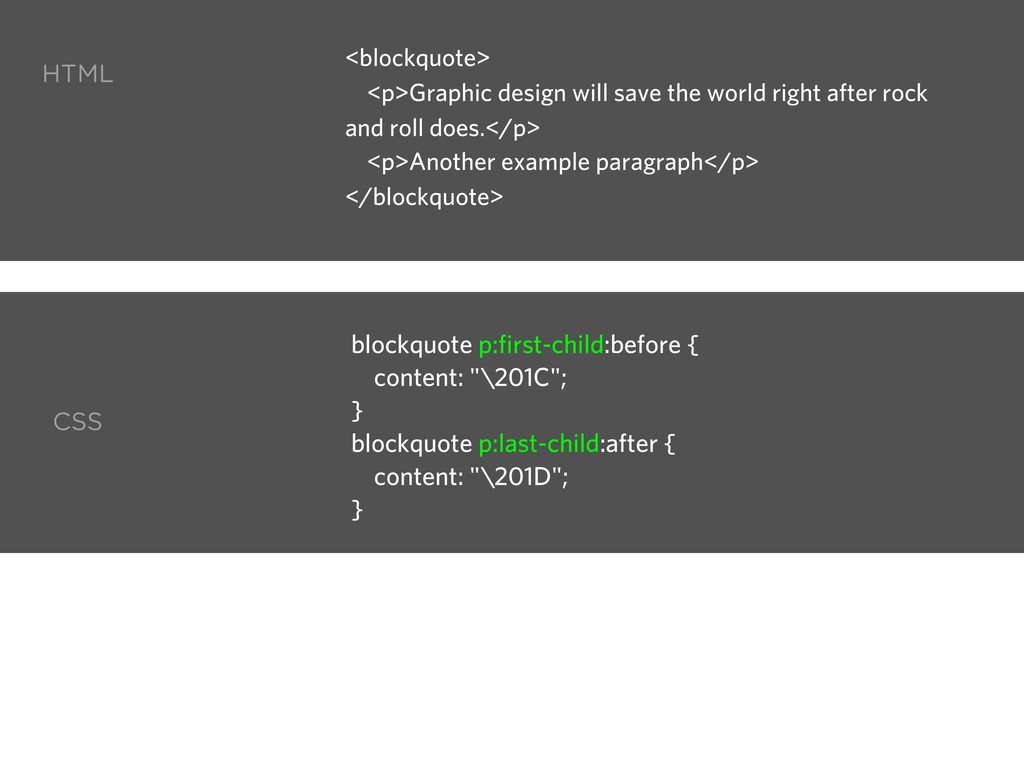
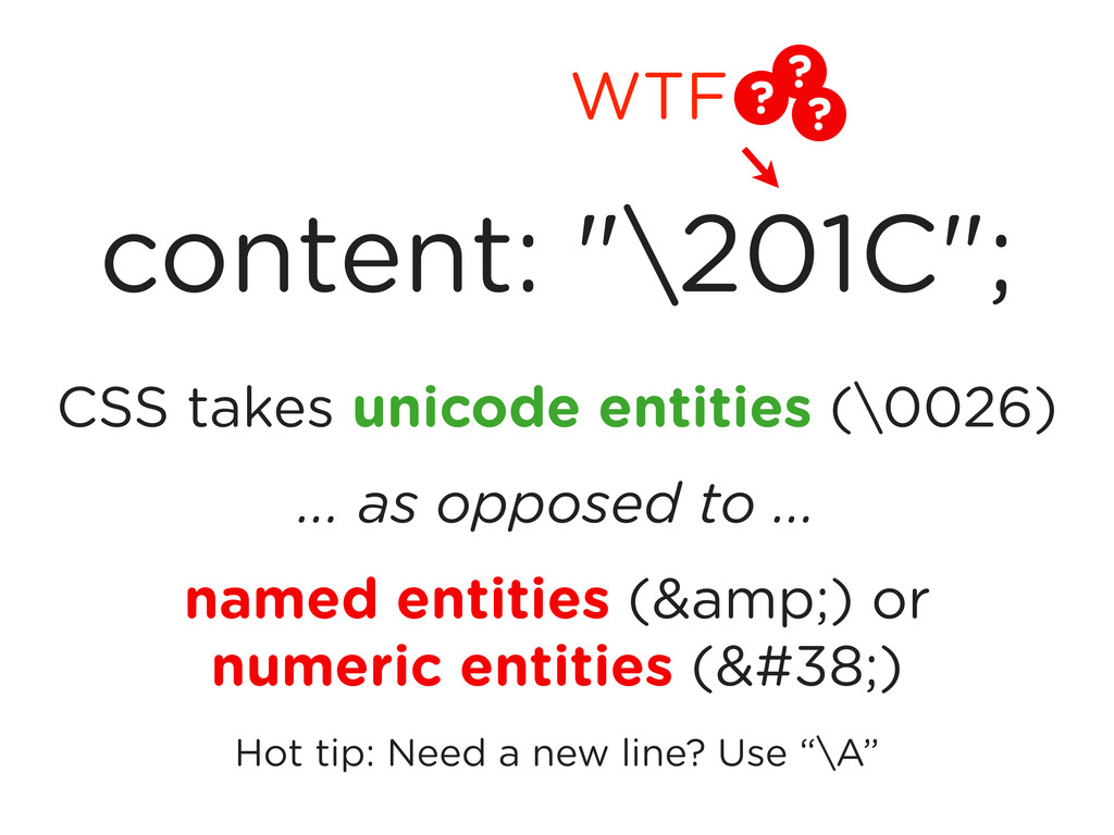
    rock and roll does. “ ” blockquote:before { content: "\201C"; } blockquote:after { content: "\201D"; } <blockquote>Graphic design will save the world right after rock and roll does.</blockquote> David Carson
  10. Graphic design will save the world right after rock and

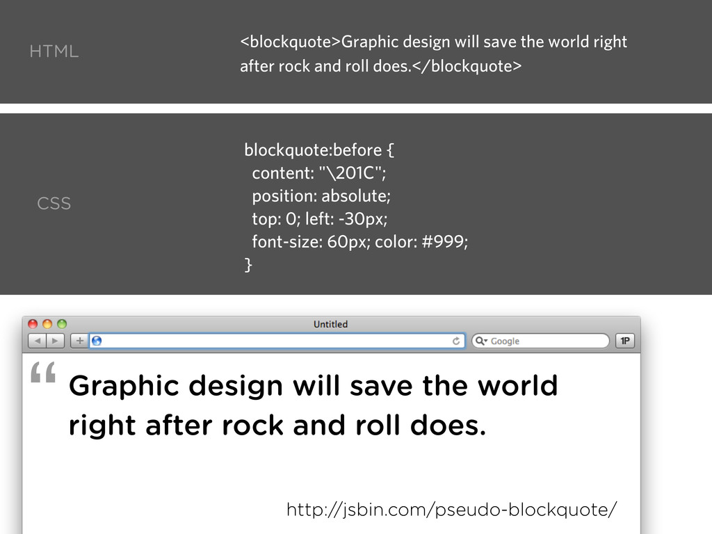
    roll does. blockquote:before { content: "\201C"; position: absolute; top: 0; left: -30px; font-size: 60px; color: #999; } http://jsbin.com/pseudo-blockquote/ HTML CSS “ <blockquote>Graphic design will save the world right after rock and roll does.</blockquote>
  11. blockquote p:first-child:before { content: "\201C"; } blockquote p:last-child:after { content:

    "\201D"; } HTML CSS <blockquote> <p>Graphic design will save the world right after rock and roll does.</p> <p>Another example paragraph</p> </blockquote>
  12. Screen Readers NVDA don’t read Jaws don’t read Window Eyes

    don’t read Testing by Lucica Ibanescu http://cssgallery.info/testing-the-accessibility-of-the-css-generated-content/
  13. CSS takes unicode entities (\0026) ... as opposed to ...

    named entities (&amp;) or numeric entities (&#38;) Hot tip: Need a new line? Use “\A” content: "\201C"; ? ? ? WTF
  14. content can be ... 1) Text div:after { content: “------------”;

    } 3) Attribute div:after { content: attr(data-tip); } 2) Image div:after { content: url(smiley.png); /* or gradient */ } 4) Counter ol > li:after { content: counter(li); } or, nothing! content: “”; but not HTML content: “<h1>Front End Design!!</h1>”;
  15. <ul> <li>Chris Coyier</li> <li>[email protected]</li> <li>@chriscoyier</li> </ul> HTML CSS li:nth-child(1):before {

    content: “Name: “; } li:nth-child(2):before { content: “Email: “; } li:nth-child(3):before { content: “Twitter: “; } li:before { display: inline-block; width: 100px; text-align: right; } http://jsbin.com/pseudo-infotable/ Chris Coyier [email protected] @chriscoyier Name: Email: Twitter:
  16. Combining with media queries CSS @media (min-width: 1024px) { li:nth-child(1):before

    { content: “Name: “; } li:nth-child(2):before { content: “Email: “; } li:nth-child(3):before { content: “Twitter: “; } li:before { display: inline-block; width: 100px; text-align: right; } }
  17. <a href=”#mmm” data-tooltip=”is hot.”> Your mom </a> a:after { content:

    attr(data-tooltip); position: absolute; bottom: 130%; left: 20%; background: #ffcb66; padding: 5px 15px; white-space: nowrap; } http://jsbin.com/pseudotooltip/4/edit HTML CSS
  18. <a href=”#snarf” data-tooltip=”is hot.”> Your mom </a> a:after { content:

    attr(data-tooltip); position: absolute; bottom: 150%; left: 20%; background: #ffcb66; padding: 5px 15px; white-space: nowrap; opacity: 0; -moz-transition: opacity 0.5s ease; -webkit-transition: opacity 0.5s ease; -o-transition: opacity 0.5s ease; } a:hover:after { opacity: 1; bottom: 130%; } HTML CSS
  19. a { position: relative; } a:after { content: attr(data-tooltip); bottom:

    130%; left: 20%; background: #ffcb66; padding: 5px 15px; color: black; -webkit-border-radius: 10px; -moz-border-radius : 10px; border-radius : 10px; white-space: nowrap; } a:after, a:before { position: absolute; -webkit-transition: all 0.4s ease; -moz-transition : all 0.4s ease; -o-transition : all 0.4s ease; opacity: 0; } CSS a:before { content: ""; width: 0; height: 0; border-top: 20px solid #ffcb66; border-left: 20px solid transparent; border-right: 20px solid transparent; left: 30%; bottom: 90%; } a:hover:after { bottom: 100%; } a:hover:before { bottom: 70%; } a:hover:after, a:hover:before { opacity: 1; }
  20. body { background: url(background.png) -15% 0 repeat-x; } body:before {

    background: url(midground.png) 35% 0 repeat-x; } body:after { background: url(foreground.png) 65% 0 repeat-x; } body:after, body:before { content: “”; position: absolute; top: 0; right: 0; left: 0; height: 100px; }
  21. <article> <h2>Fun with Blurred Text</h2> <p>...text and stuff...</p> <a href=”...”>Read

    on! &rarr;</a> <div class=”meta”> <div class=”date”>4/21/2011<span> <a href=”...”>13 comments<a> </div> </article> article:after { content: ""; position: absolute; top: 0; left: 0; width: 0; height: 0; border-top: 10px solid #E6E2DF; border-left: 10px solid #E6E2DF; border-bottom: 10px solid #D9D3CF; border-right: 10px solid #D9D3CF; }
  22. <article> <h2>Fun with Blurred Text</h2> <p>...text and stuff...</p> <a href=”...”>Read

    on! &rarr;</a> <div class=”meta”> <div class=”date”>4/21/2011<span> <a href=”...”>13 comments<a> </div> </article> .meta:before { content: url(images/paperclip.png); position: absolute; top: -10px; left: 80px; }
  23. .star { width: 0; height: 0; border-left: 50px solid transparent;

    border-right: 50px solid transparent; border-bottom: 100px solid red; position: relative; } .star:after { width: 0; height: 0; border-left: 50px solid transparent; border-right: 50px solid transparent; border-top: 100px solid red; position: absolute; content: ""; top: 30px; left: -50px; }
  24. Wouldn’t this be nice? div { background: url(awesome-graphic.jpg) center center

    no-repeat; } div:hover { background-opacity: 0.5; }
  25. Yay! div:after { position: absolute; top: 0; left: 0; right:

    0; bottom: 0; content: url(awesome-graphic.jpg); z-index: -1; opacity: 0.5; }
  26. The W3C spec’d that in 2003. http://www.w3.org/TR/css3-content/ div:after:after { }

    div:before(2) { } div:outside { } div:outside(2):after { } Yay! Want! Reality http://dev.w3.org/csswg/css3-content/
  27. Browser Support 3.5+ 3.0- positioning issues 6+ 9+ 8 ::

    / :hover / z-index 7- 1+ 1.3+ http://css-tricks.com/browser-support-pseudo-elements/ Remember, CSS TWO not THREE 85% CSS-Tricks 97% Other tech 92%
  28. Here’s what we learned: 5) The Future? The CSS3 Spec

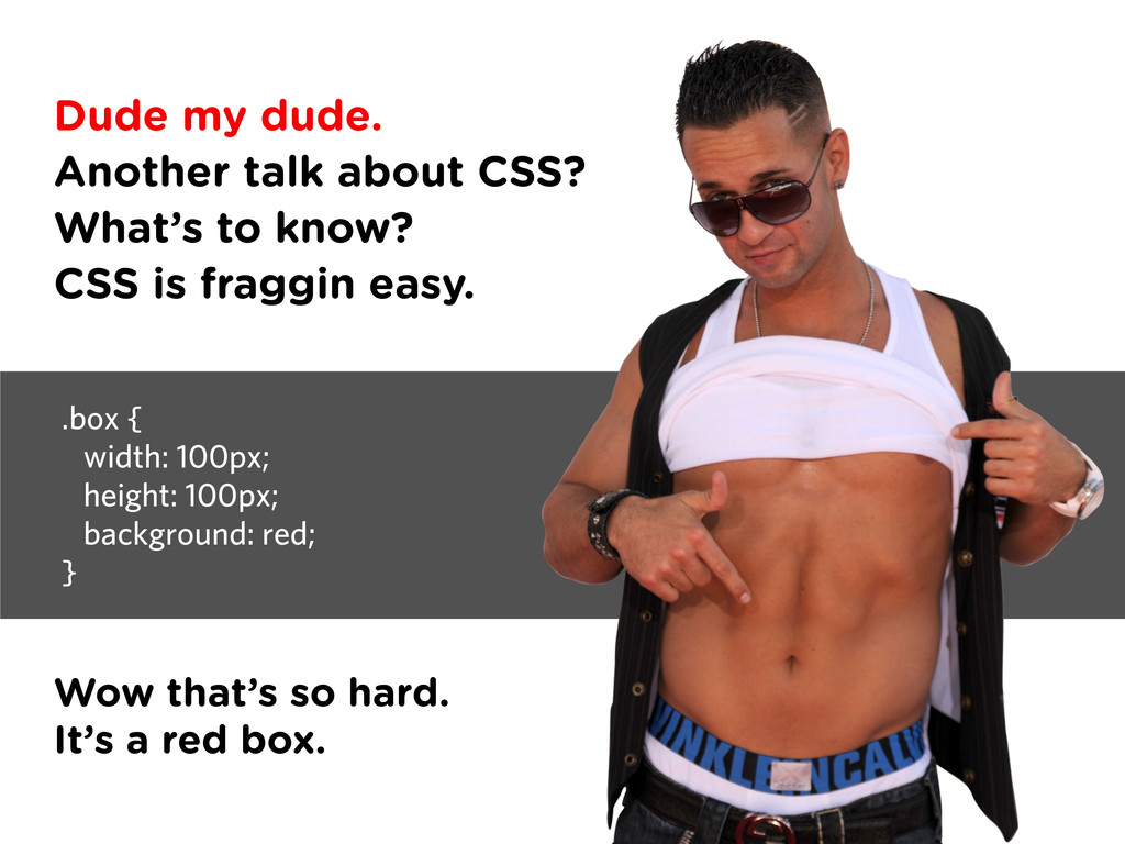
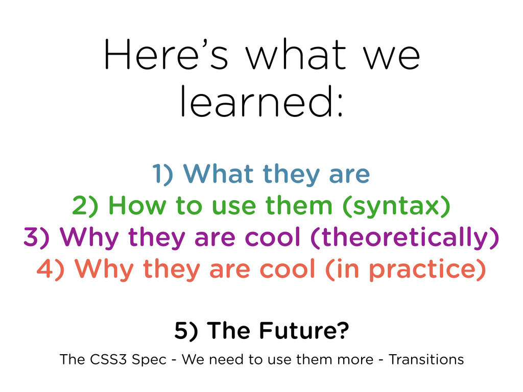
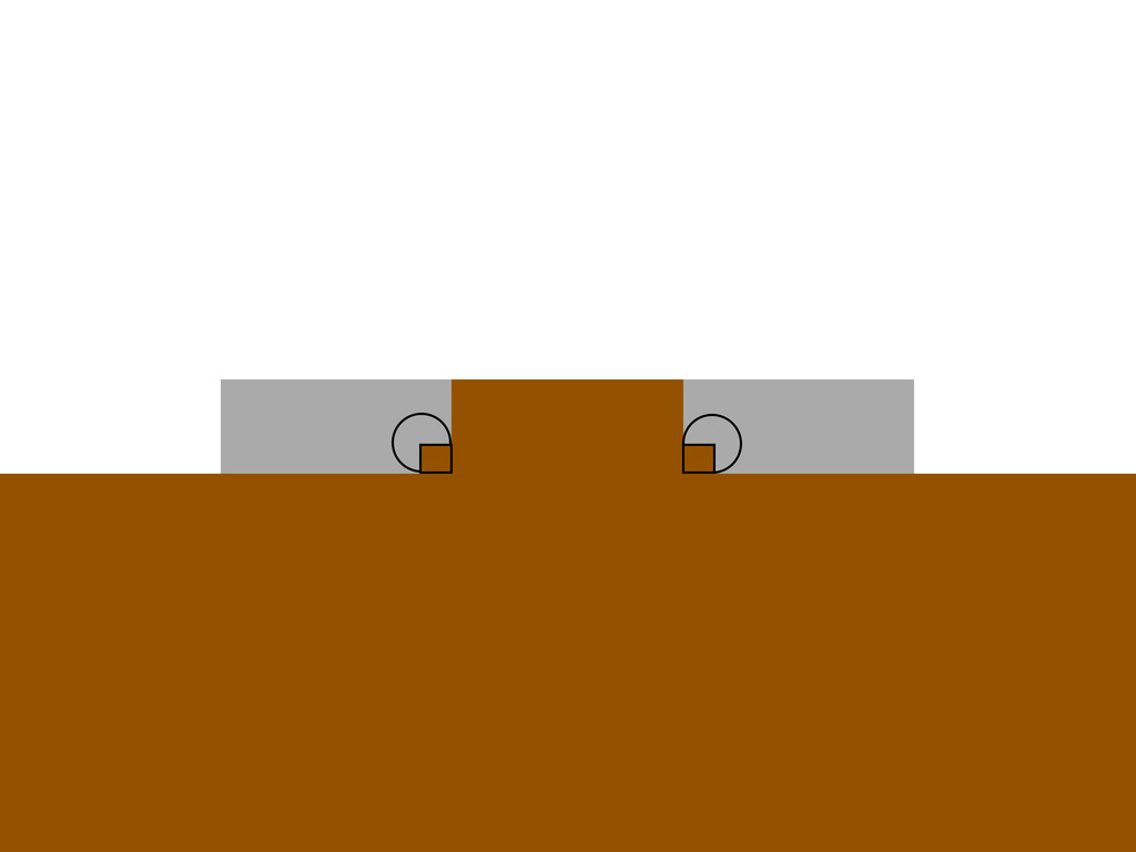
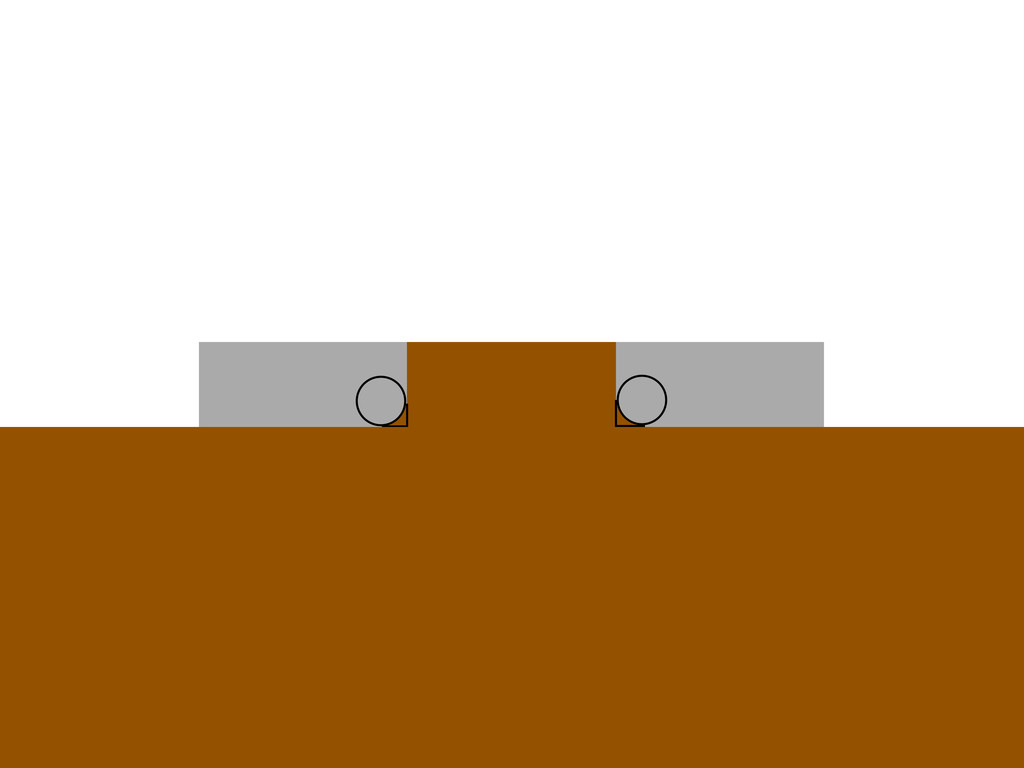
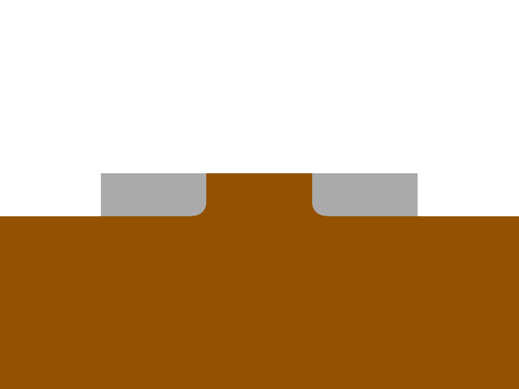
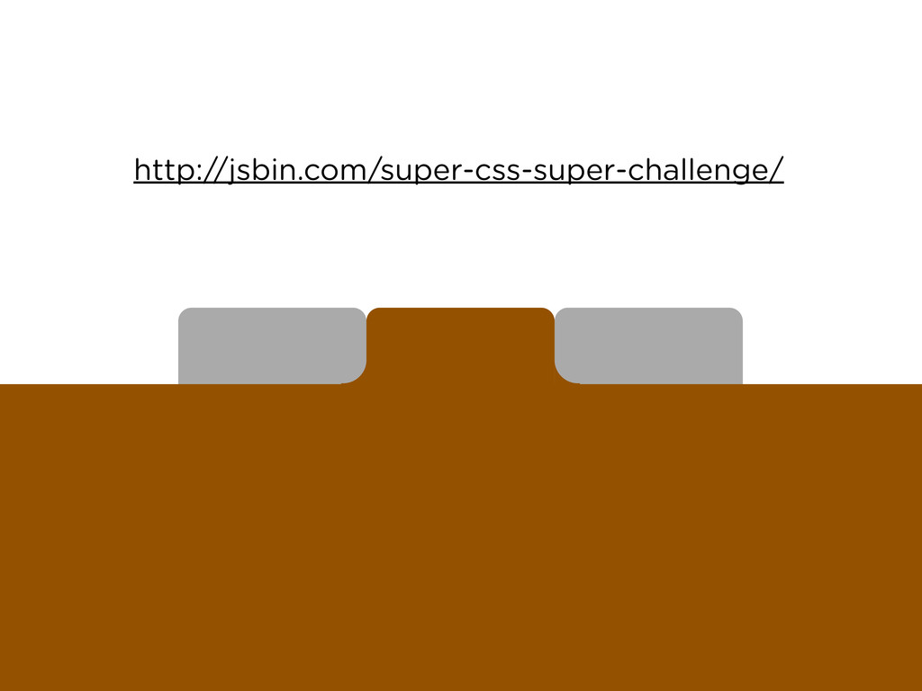
    - We need to use them more - Transitions 1) What they are 2) How to use them (syntax) 3) Why they are cool (theoretically) 4) Why they are cool (in practice)
  29. Create the below navigation with no images, assuming this markup:

    <ul> <li><a href=”#”>One</a></li> <li><a href=”#”>Two</a></li> <li><a href=”#”>Three</a></li> </ul>
  30. http://www.flickr.com/photos/wolfgangstaudt/2252688630/ http://www.flickr.com/photos/webel/347801397/ http://web.archive.org/web/20051111095409/http://wrgis.wr.usgs.gov/dds/dds-39/album.html Photos Type Gotham font family by Hoefler

    & Frere-Jones Other Excellent Relevant Links http://www.merttol.com/articles/web/code/introduction-to-css-escape-sequences.html http://www.viget.com/inspire/css-generated-content/ http://css-tricks.com/video-screencasts/94-intro-to-pseudo-elements/