from one of my recent projects, which was a very data-intensive website. I can’t say more about the kind of data we were dealing with, but what I can say was that one of the design goals was to fit as much data in the screen as possible, and avoid unnecessary whitespace. In fact you can imagine this being the goal in many different websites – for example if you have a shopping site you want to showcase your products, not whitespace, right?
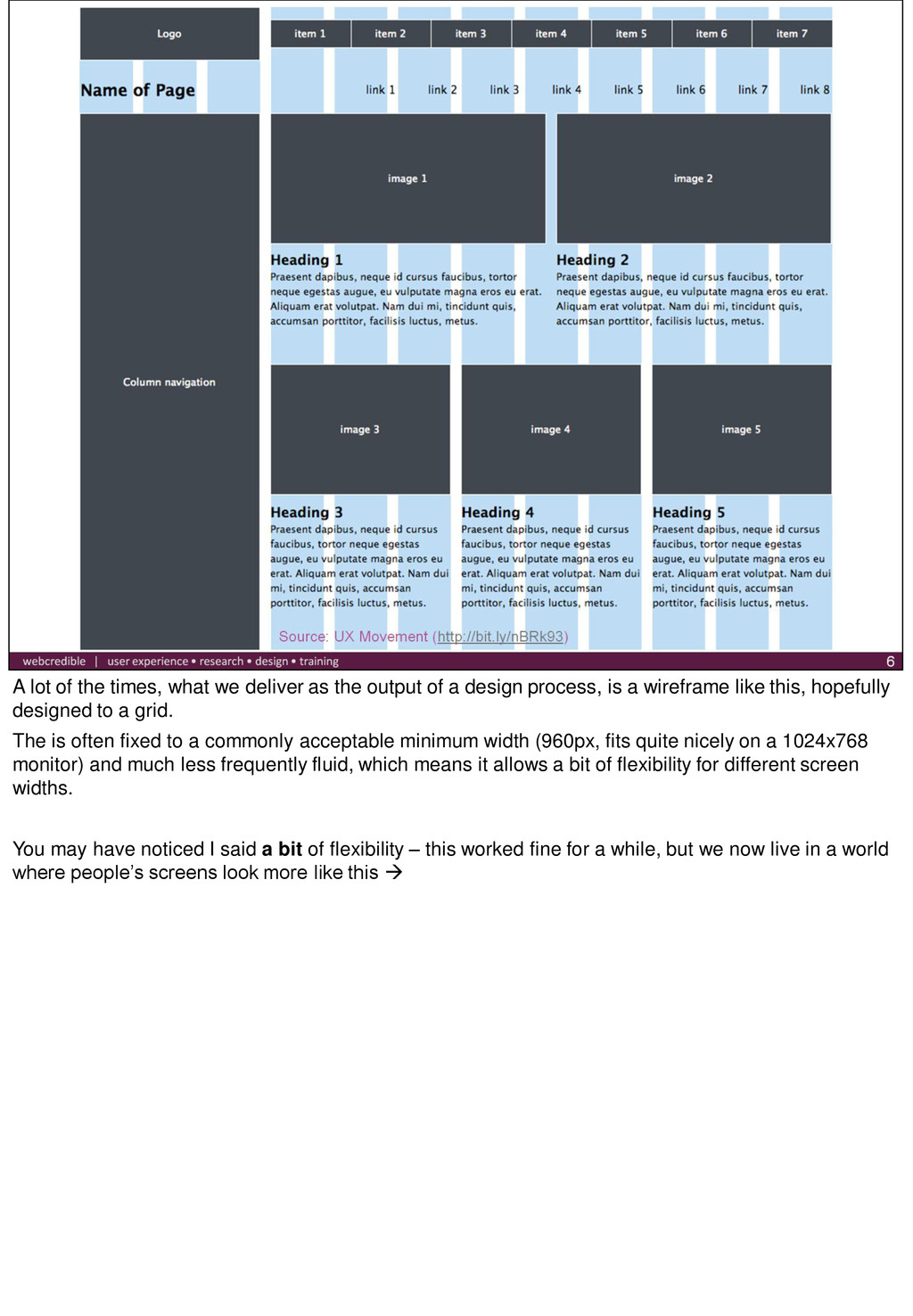
output of a design process, is a wireframe like this, hopefully designed to a grid. The is often fixed to a commonly acceptable minimum width (960px, fits quite nicely on a 1024x768 monitor) and much less frequently fluid, which means it allows a bit of flexibility for different screen widths. You may have noticed I said a bit of flexibility – this worked fine for a while, but we now live in a world where people’s screens look more like this
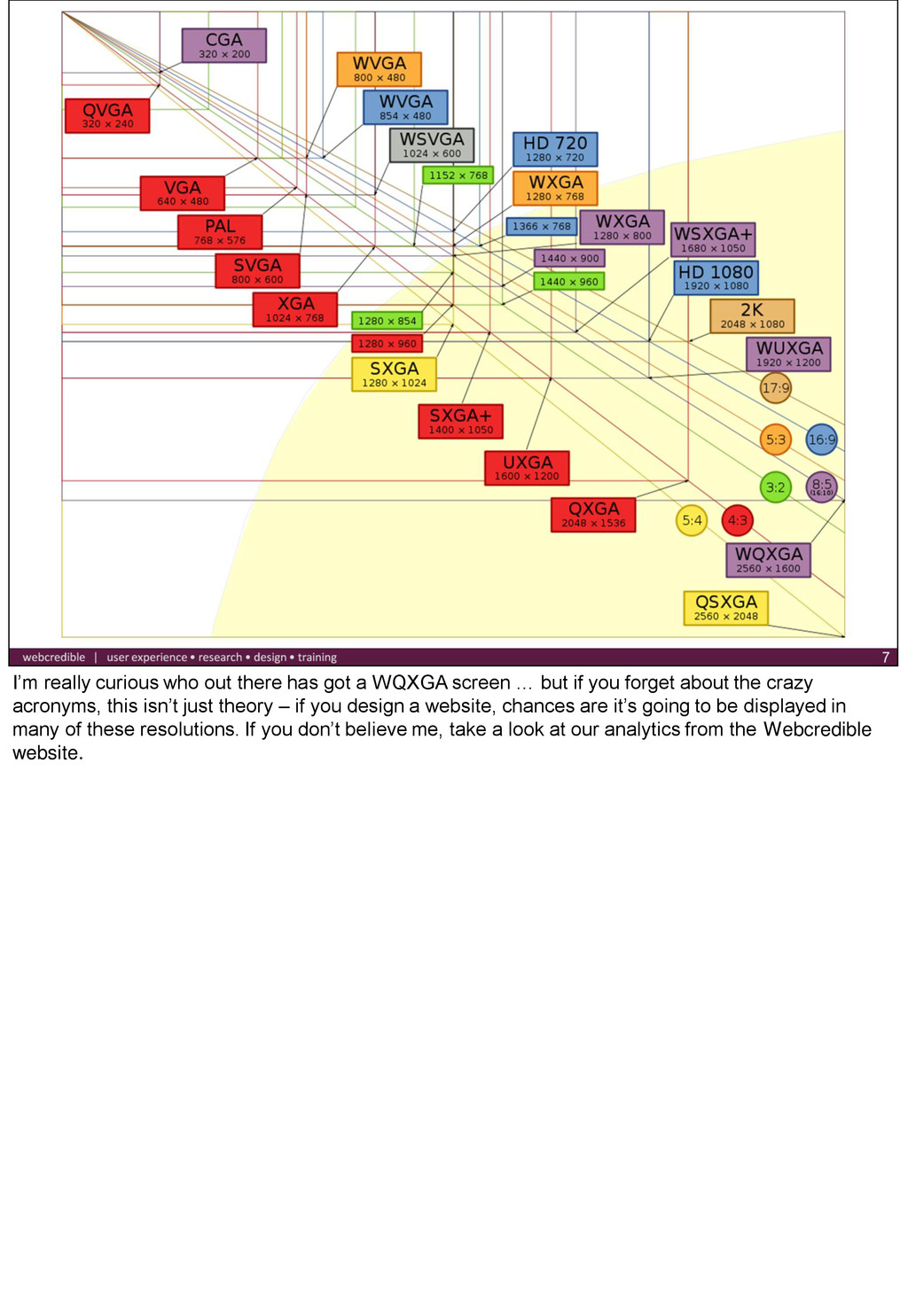
screen … but if you forget about the crazy acronyms, this isn’t just theory – if you design a website, chances are it’s going to be displayed in many of these resolutions. If you don’t believe me, take a look at our analytics from the Webcredible website.
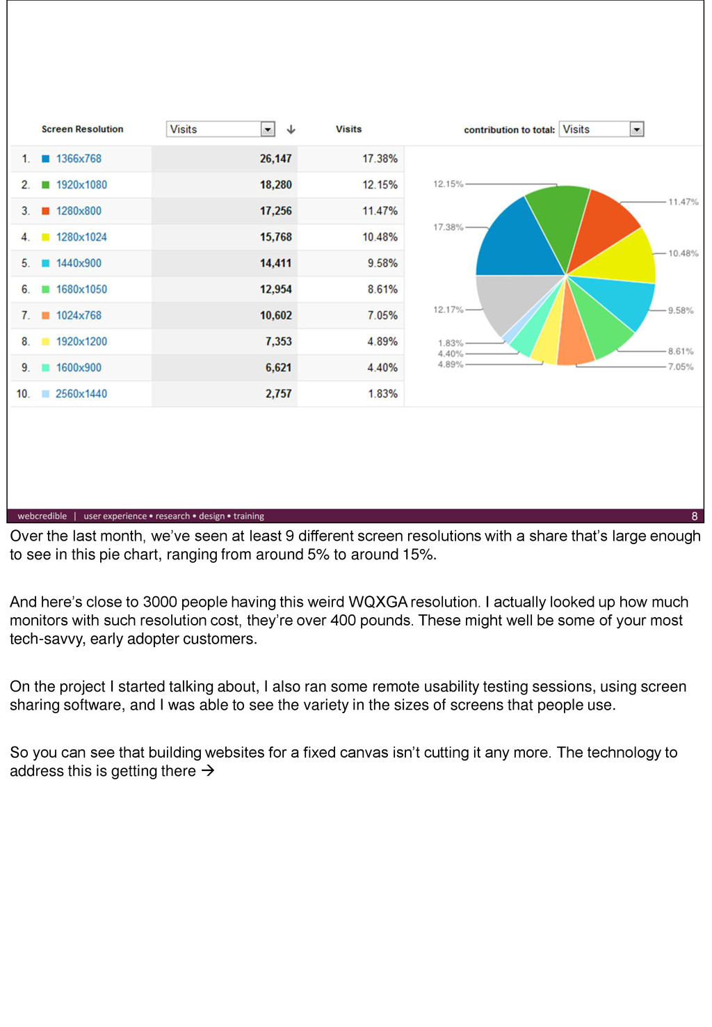
screen resolutions with a share that’s large enough to see in this pie chart, ranging from around 5% to around 15%. And here’s close to 3000 people having this weird WQXGA resolution. I actually looked up how much monitors with such resolution cost, they’re over 400 pounds. These might well be some of your most tech-savvy, early adopter customers. On the project I started talking about, I also ran some remote usability testing sessions, using screen sharing software, and I was able to see the variety in the sizes of screens that people use. So you can see that building websites for a fixed canvas isn’t cutting it any more. The technology to address this is getting there
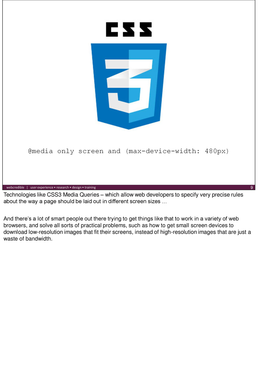
to specify very precise rules about the way a page should be laid out in different screen sizes … And there’s a lot of smart people out there trying to get things like that to work in a variety of web browsers, and solve all sorts of practical problems, such as how to get small screen devices to download low-resolution images that fit their screens, instead of high-resolution images that are just a waste of bandwidth.
that follow a responsive design – you probably just haven’t noticed as you don’t really go around resizing your screen, so here’s a quick demo. [2011 dConstruct website, 10K apart] So, all fine with the finished site, but what happens before we reach this stage?
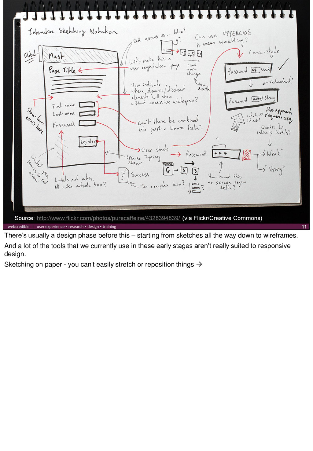
sketches all the way down to wireframes. And a lot of the tools that we currently use in these early stages aren’t really suited to responsive design. Sketching on paper - you can't easily stretch or reposition things
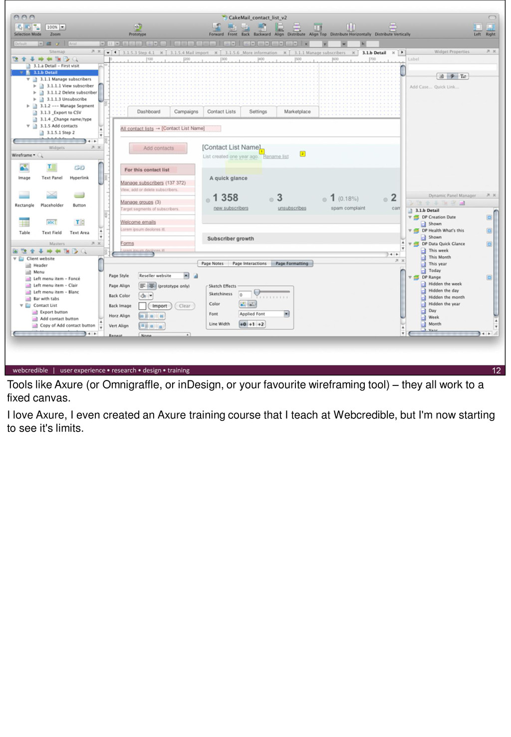
wireframing tool) – they all work to a fixed canvas. I love Axure, I even created an Axure training course that I teach at Webcredible, but I'm now starting to see it's limits.
can do to adapt content to different resolutions. This is something that needs to be designed, rather than determined by chance. You can't just continue designing to a fixed grid and hope that whoever builds the site comes up with a good way to make it responsive. So what can we do? There's a few solutions - I'll start from the ones that I’ve seen people proposing around the internet, and then I’ll move to a couple of things that I’m coming up with as I’m trying to integrate responsive design in my workflow.
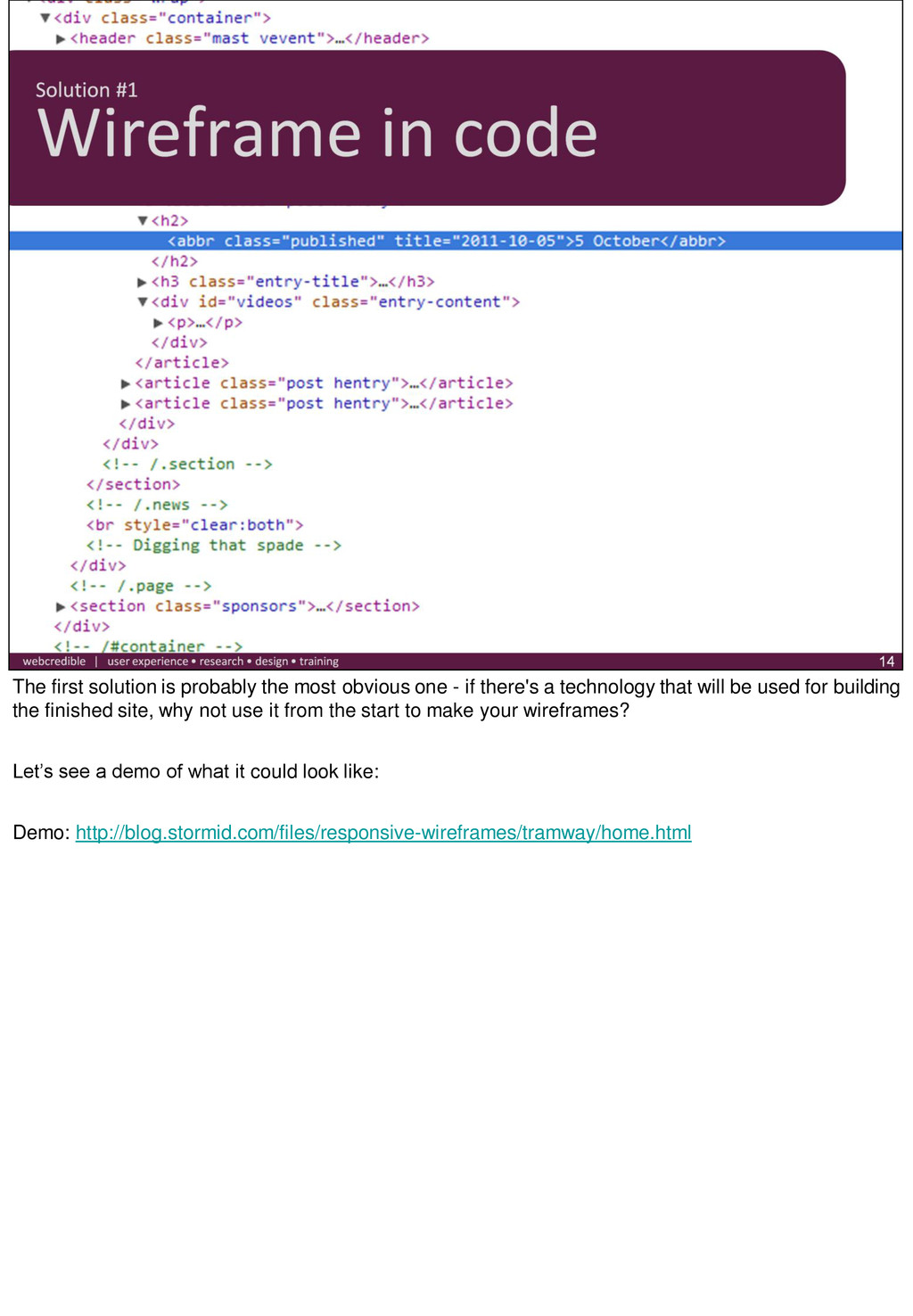
if there's a technology that will be used for building the finished site, why not use it from the start to make your wireframes? Let’s see a demo of what it could look like: Demo: http://blog.stormid.com/files/responsive-wireframes/tramway/home.html
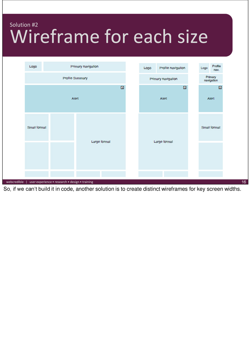
http://dropbox.headscapedev.com/projects/wireframes/demo.htm This is close to what we want and how we build it but I think the real trouble, especially on a content/data heavy website won't show up in the templates.
think we’ve found the best solution yet, but I've got a couple of ideas that I’d like to share with you today Going back to thinking responsively from the beginning of the design process. We often start from sketching on paper, and I love sketching because you put in the minimum possible effort in everything you try, there’s very little friction, and it you can easily tear it up and start again. Remember when I said paper isn't really a responsive medium - well that's not really true.
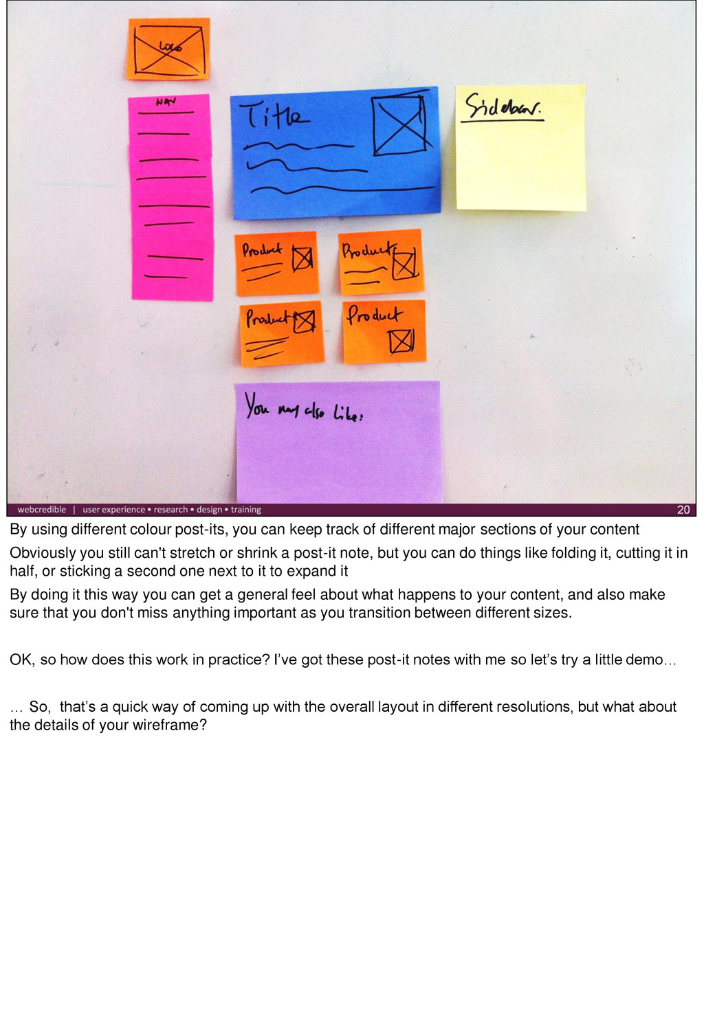
problems, is to use the power of post-it notes. To experiment with layouts for different screen sizes, instead of sketching on a blank piece of paper, use a separate post-it note for each part of your sketch. And there's a lot of different sizes of post-it notes you can use
different major sections of your content Obviously you still can't stretch or shrink a post-it note, but you can do things like folding it, cutting it in half, or sticking a second one next to it to expand it By doing it this way you can get a general feel about what happens to your content, and also make sure that you don't miss anything important as you transition between different sizes. OK, so how does this work in practice? I’ve got these post-it notes with me so let’s try a little demo… … So, that’s a quick way of coming up with the overall layout in different resolutions, but what about the details of your wireframe?
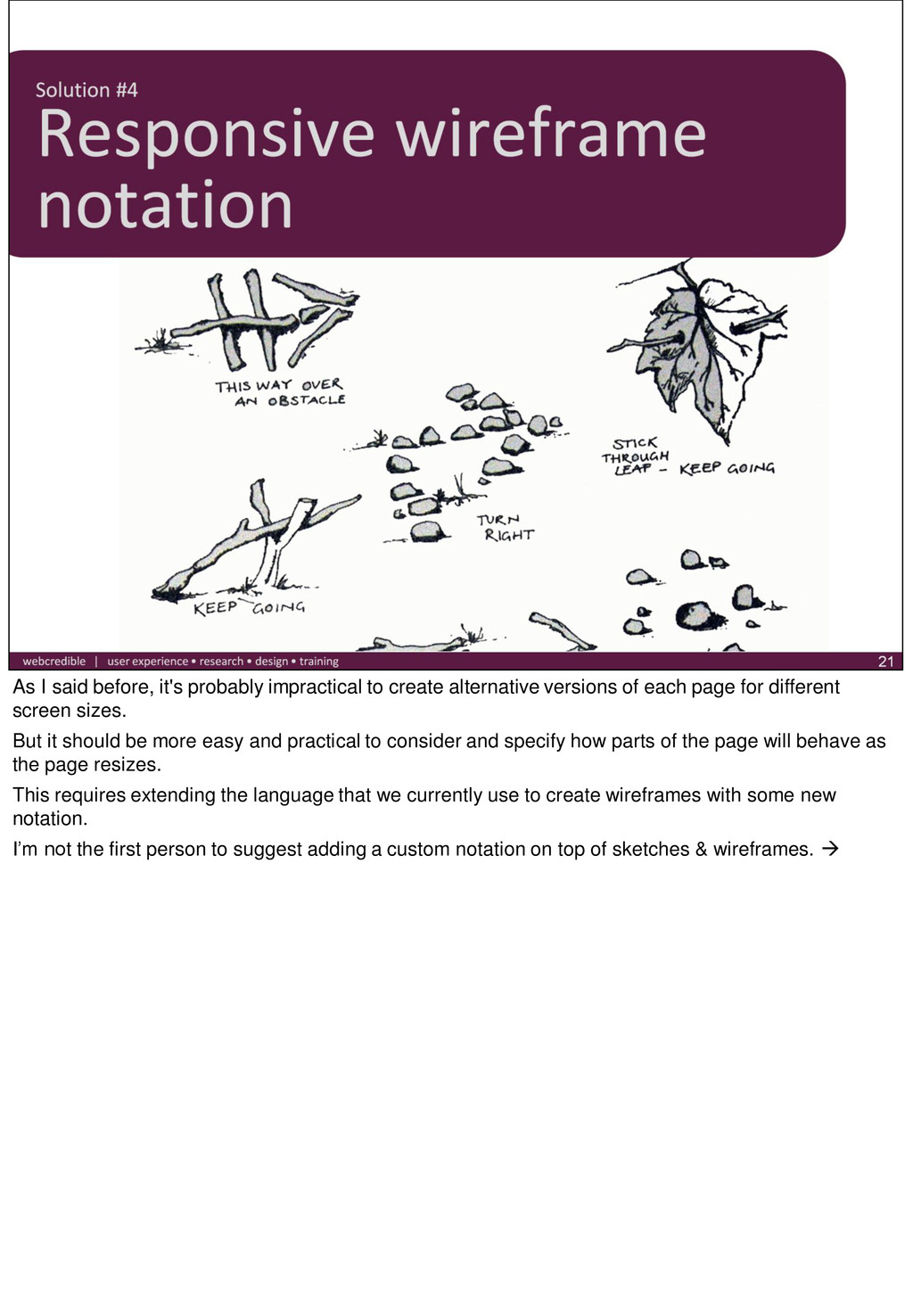
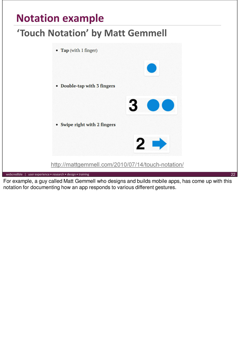
versions of each page for different screen sizes. But it should be more easy and practical to consider and specify how parts of the page will behave as the page resizes. This requires extending the language that we currently use to create wireframes with some new notation. I’m not the first person to suggest adding a custom notation on top of sketches & wireframes.
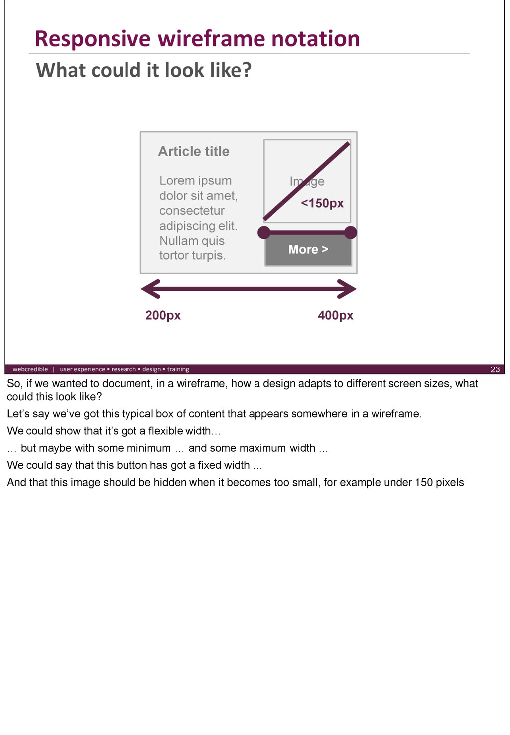
a design adapts to different screen sizes, what could this look like? Let’s say we’ve got this typical box of content that appears somewhere in a wireframe. We could show that it’s got a flexible width… … but maybe with some minimum … and some maximum width … We could say that this button has got a fixed width … And that this image should be hidden when it becomes too small, for example under 150 pixels
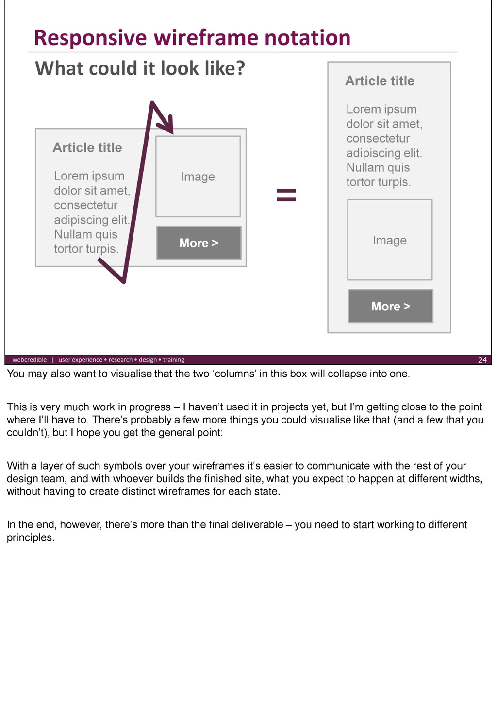
in this box will collapse into one. This is very much work in progress – I haven’t used it in projects yet, but I’m getting close to the point where I’ll have to. There’s probably a few more things you could visualise like that (and a few that you couldn’t), but I hope you get the general point: With a layer of such symbols over your wireframes it’s easier to communicate with the rest of your design team, and with whoever builds the finished site, what you expect to happen at different widths, without having to create distinct wireframes for each state. In the end, however, there’s more than the final deliverable – you need to start working to different principles.
 futureshape
 garyuten
 teba_eleven
 stmn
stmn
 ajstarks
 centou
 satosio
 bebe
bebe
 seto
seto
 atsushihomma
 sevendex
 lynteo
 nttcom
 tenderlove
 tmiket
 ianozsvald
 panda_program
 jnunemaker
 paigeccino
 geshan
 ryanjones
 inesmontani
 geoffreycrofte
 livdayseo
 jonrohan