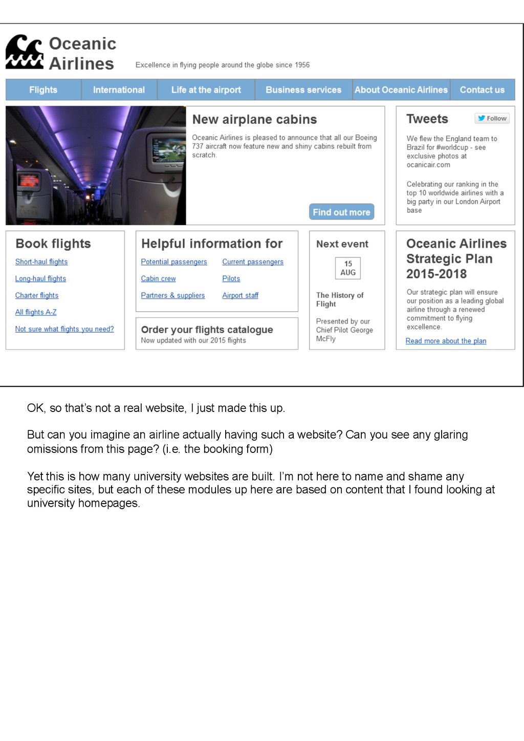
is Alex Baxevanis and I’m a Senior UX consultant at Webcredible. I know we’re talking about universities today, but I’d like to show you an example from another sector. Here’s a website from the airline industry.
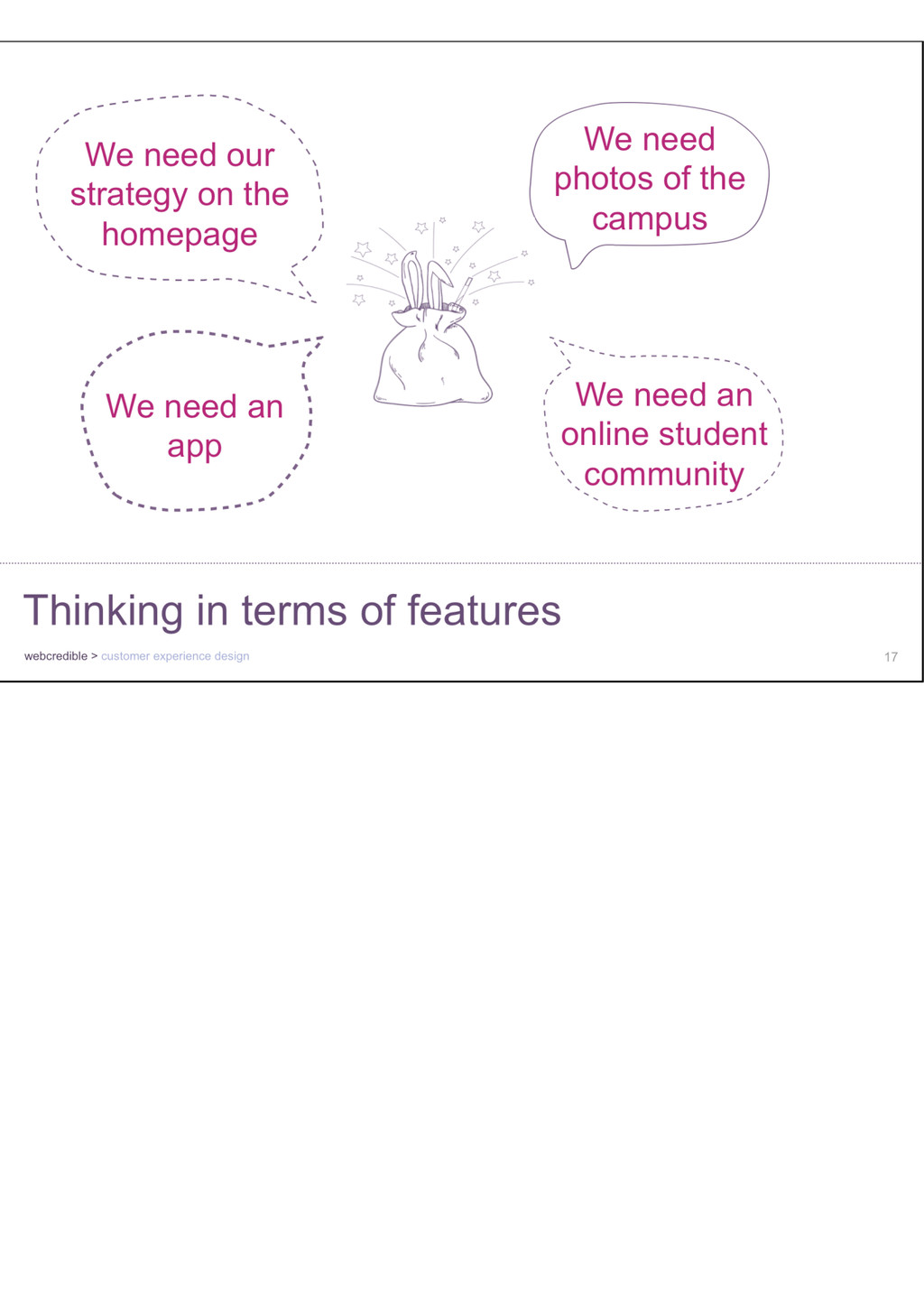
this up. But can you imagine an airline actually having such a website? Can you see any glaring omissions from this page? (i.e. the booking form) Yet this is how many university websites are built. I’m not here to name and shame any specific sites, but each of these modules up here are based on content that I found looking at university homepages.
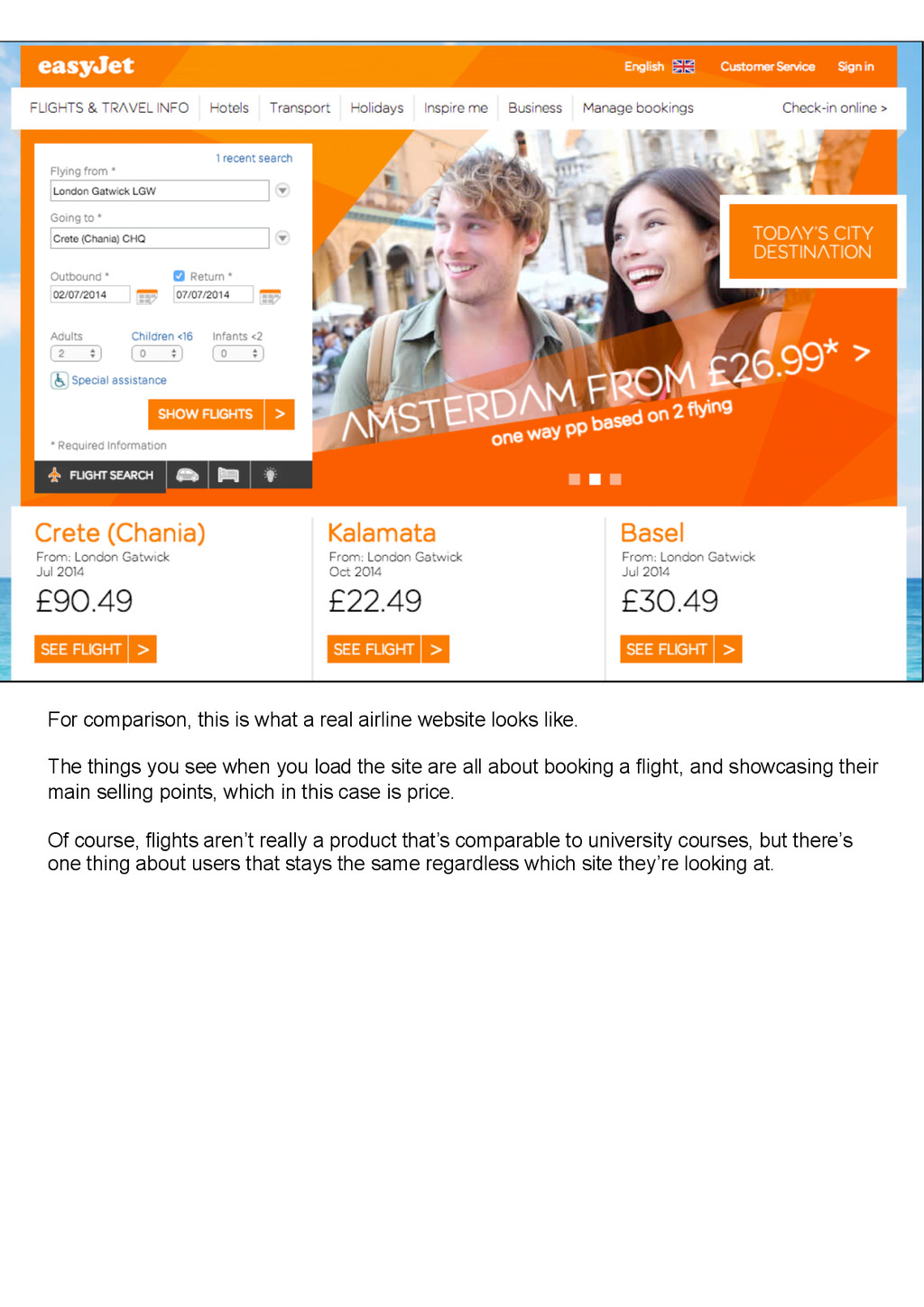
like. The things you see when you load the site are all about booking a flight, and showcasing their main selling points, which in this case is price. Of course, flights aren’t really a product that’s comparable to university courses, but there’s one thing about users that stays the same regardless which site they’re looking at.
for GOV.UK puts it. So your website is not really about you – it’s about what your most important customers need from you. So how do you find out what they need?
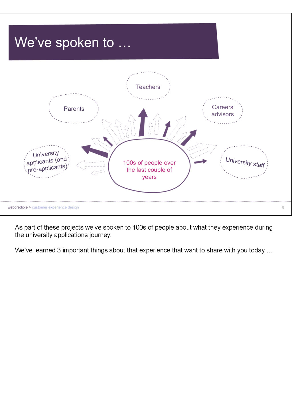
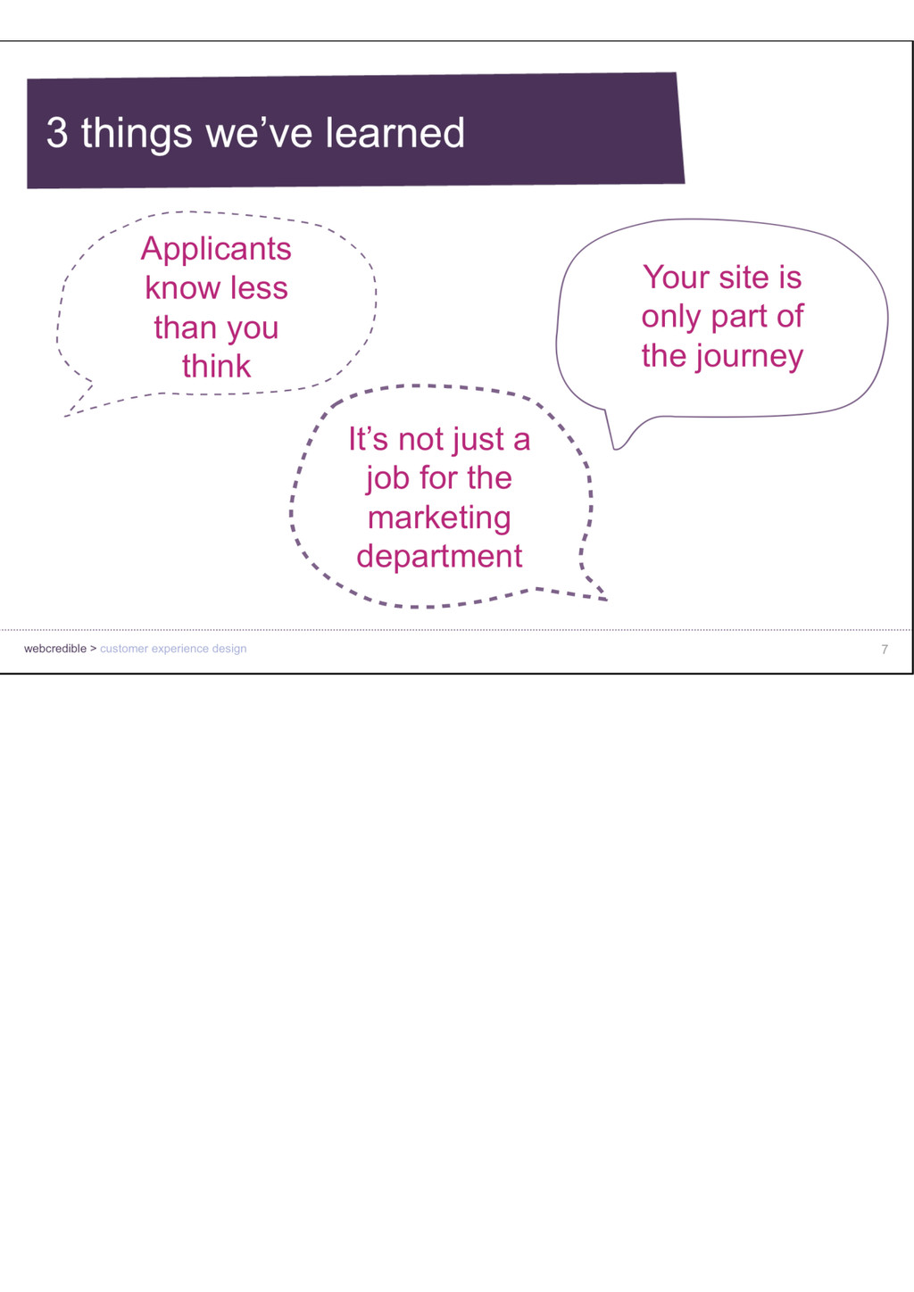
people about what they experience during the university applications journey. We’ve learned 3 important things about that experience that want to share with you today …
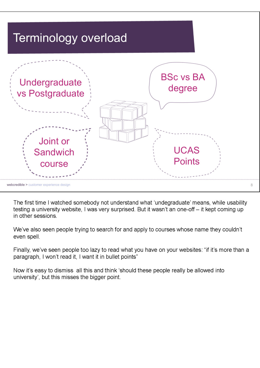
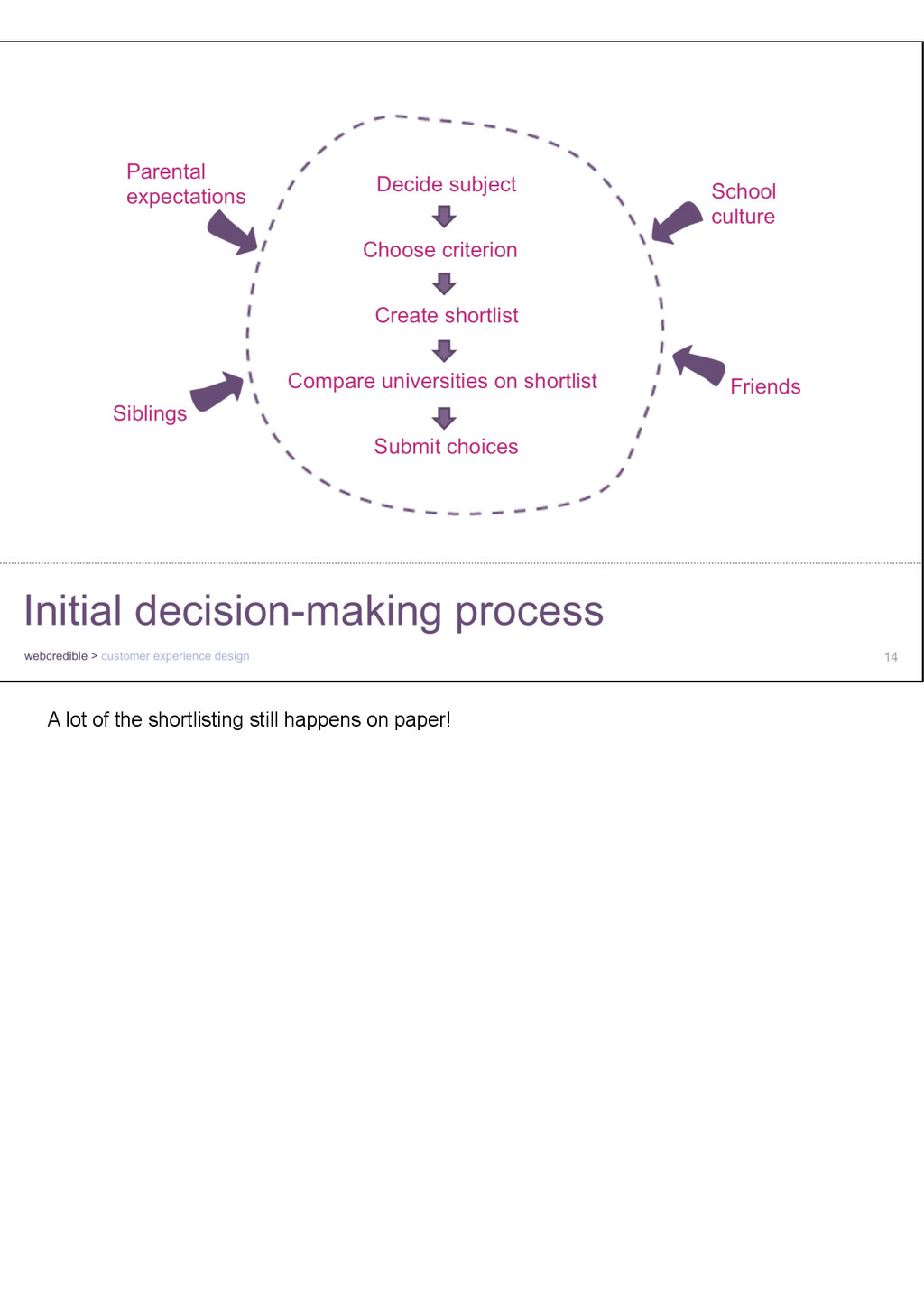
means, while usability testing a university website, I was very surprised. But it wasn’t an one-off – it kept coming up in other sessions. We’ve also seen people trying to search for and apply to courses whose name they couldn’t even spell. Finally, we’ve seen people too lazy to read what you have on your websites: “if it’s more than a paragraph, I won’t read it, I want it in bullet points” Now it’s easy to dismiss all this and think ‘should these people really be allowed into university’, but this misses the bigger point.
students life in their last year at school, it all adds up to a very overwhelming experience. This is even more important for applicants coming from abroad, who are unfamiliar with the UK application process and don’t speak English as a first language. Maybe it’s not only your job, but …
business – from banking to holidays and ecommerce. When somebody remembers you helped them, they’re more loyal, they want to pay your favour back. What does this mean in terms of recruiting students? I was part of the team that helped redesign the UCAS Track tool last summer.
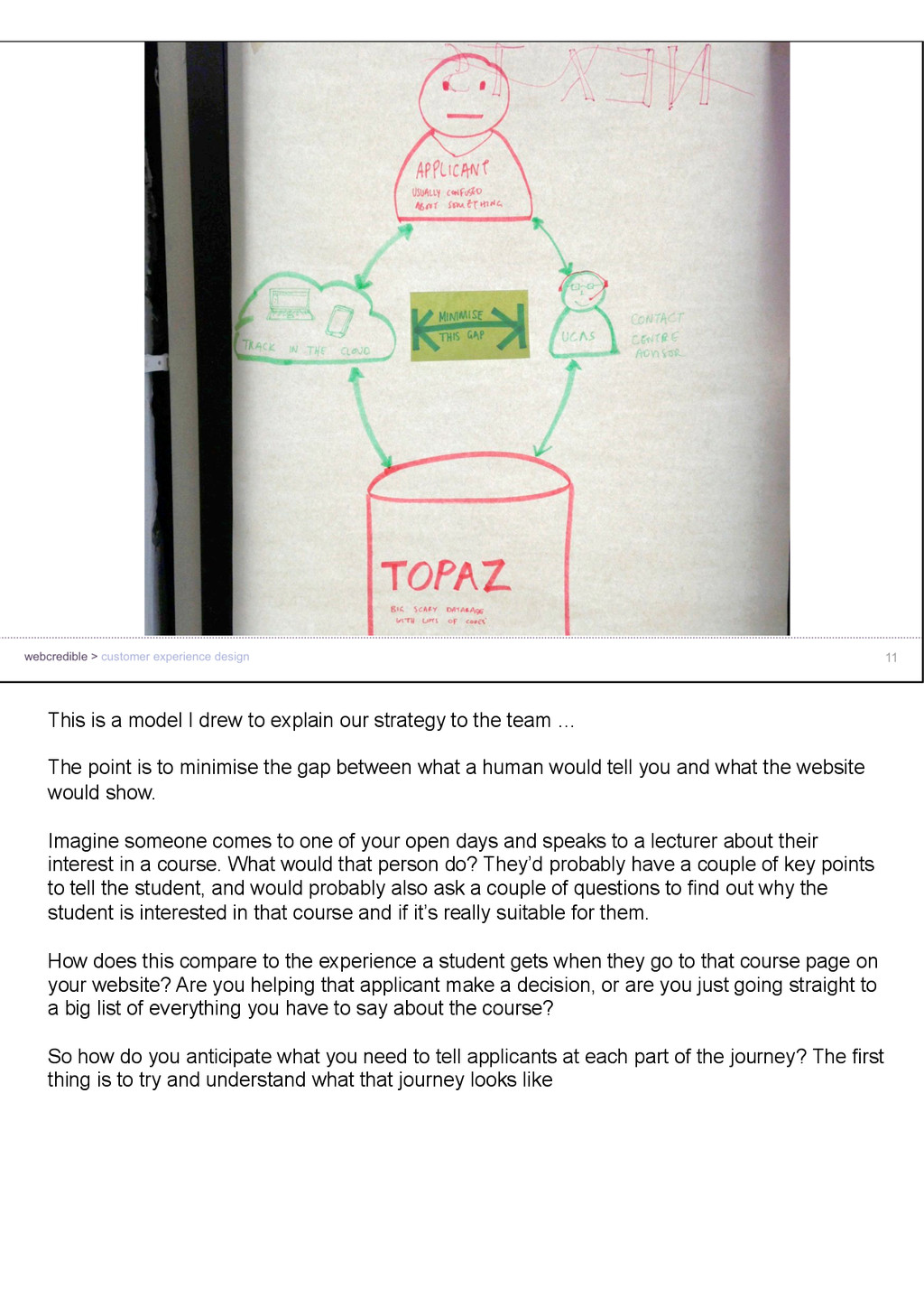
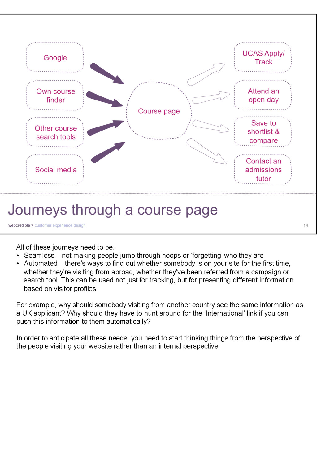
to the team … The point is to minimise the gap between what a human would tell you and what the website would show. Imagine someone comes to one of your open days and speaks to a lecturer about their interest in a course. What would that person do? They’d probably have a couple of key points to tell the student, and would probably also ask a couple of questions to find out why the student is interested in that course and if it’s really suitable for them. How does this compare to the experience a student gets when they go to that course page on your website? Are you helping that applicant make a decision, or are you just going straight to a big list of everything you have to say about the course? So how do you anticipate what you need to tell applicants at each part of the journey? The first thing is to try and understand what that journey looks like
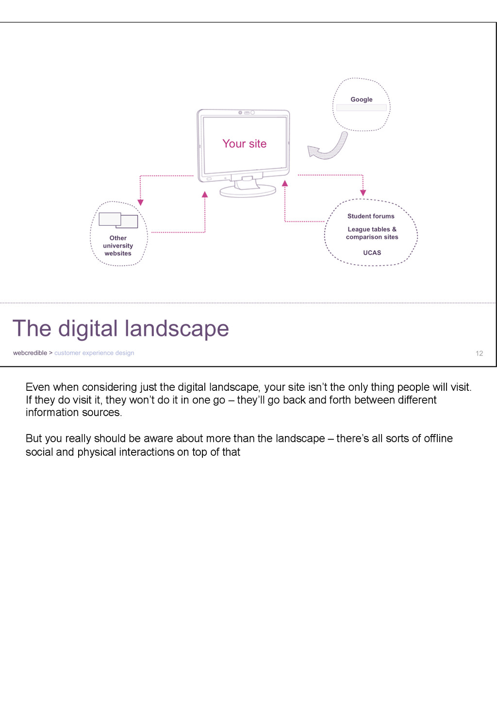
the only thing people will visit. If they do visit it, they won’t do it in one go – they’ll go back and forth between different information sources. But you really should be aware about more than the landscape – there’s all sorts of offline social and physical interactions on top of that
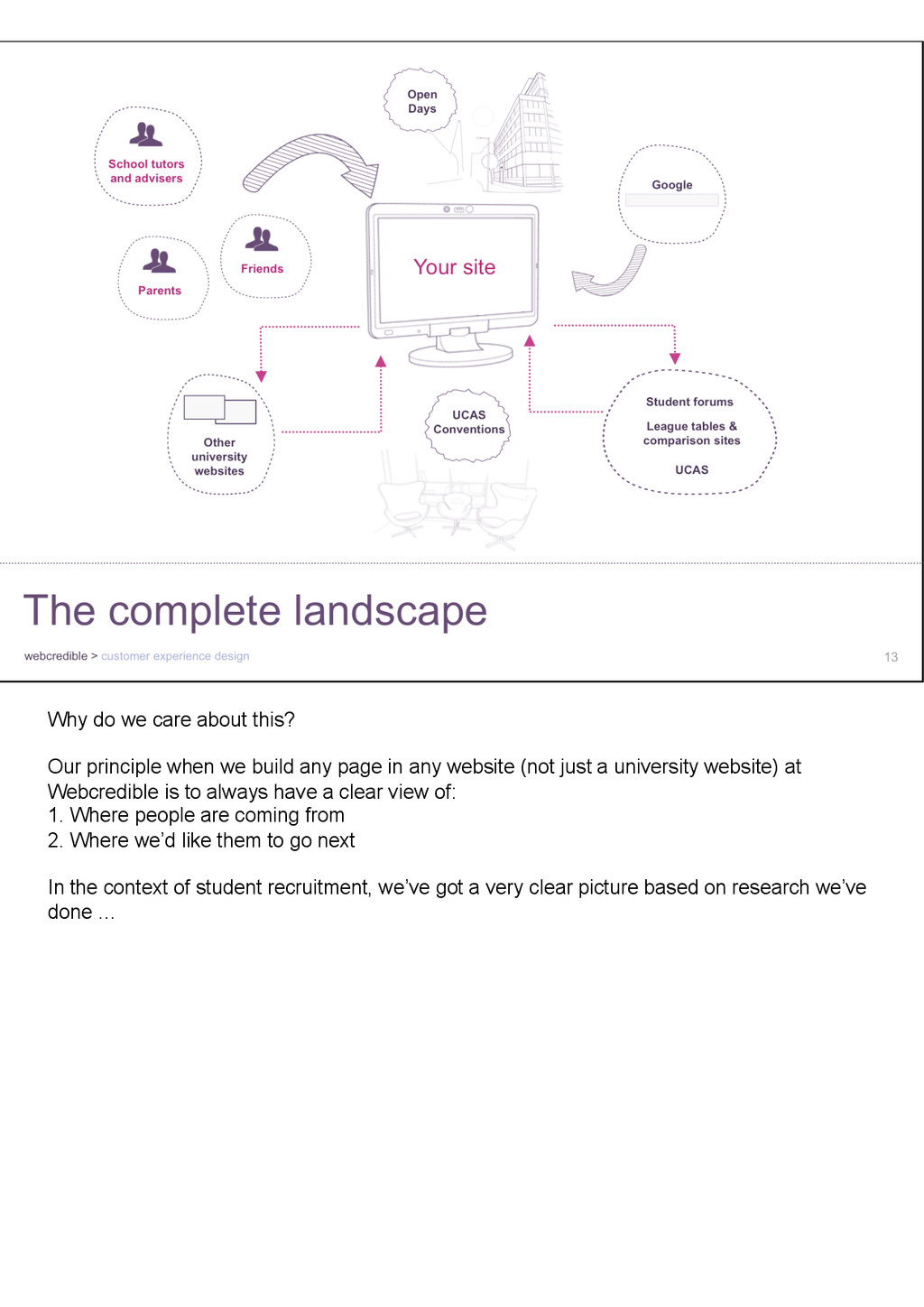
build any page in any website (not just a university website) at Webcredible is to always have a clear view of: 1. Where people are coming from 2. Where we’d like them to go next In the context of student recruitment, we’ve got a very clear picture based on research we’ve done …
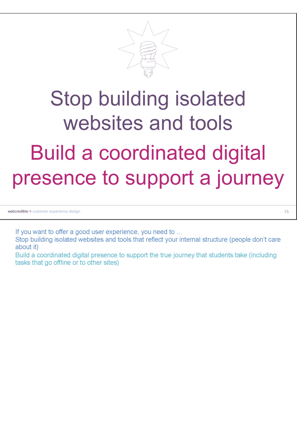
need to … Stop building isolated websites and tools that reflect your internal structure (people don’t care about it) Build a coordinated digital presence to support the true journey that students take (including tasks that go offline or to other sites)
not making people jump through hoops or ‘forgetting’ who they are • Automated – there’s ways to find out whether somebody is on your site for the first time, whether they’re visiting from abroad, whether they’ve been referred from a campaign or search tool. This can be used not just for tracking, but for presenting different information based on visitor profiles For example, why should somebody visiting from another country see the same information as a UK applicant? Why should they have to hunt around for the ‘International’ link if you can push this information to them automatically? In order to anticipate all these needs, you need to start thinking things from the perspective of the people visiting your website rather than an internal perspective.
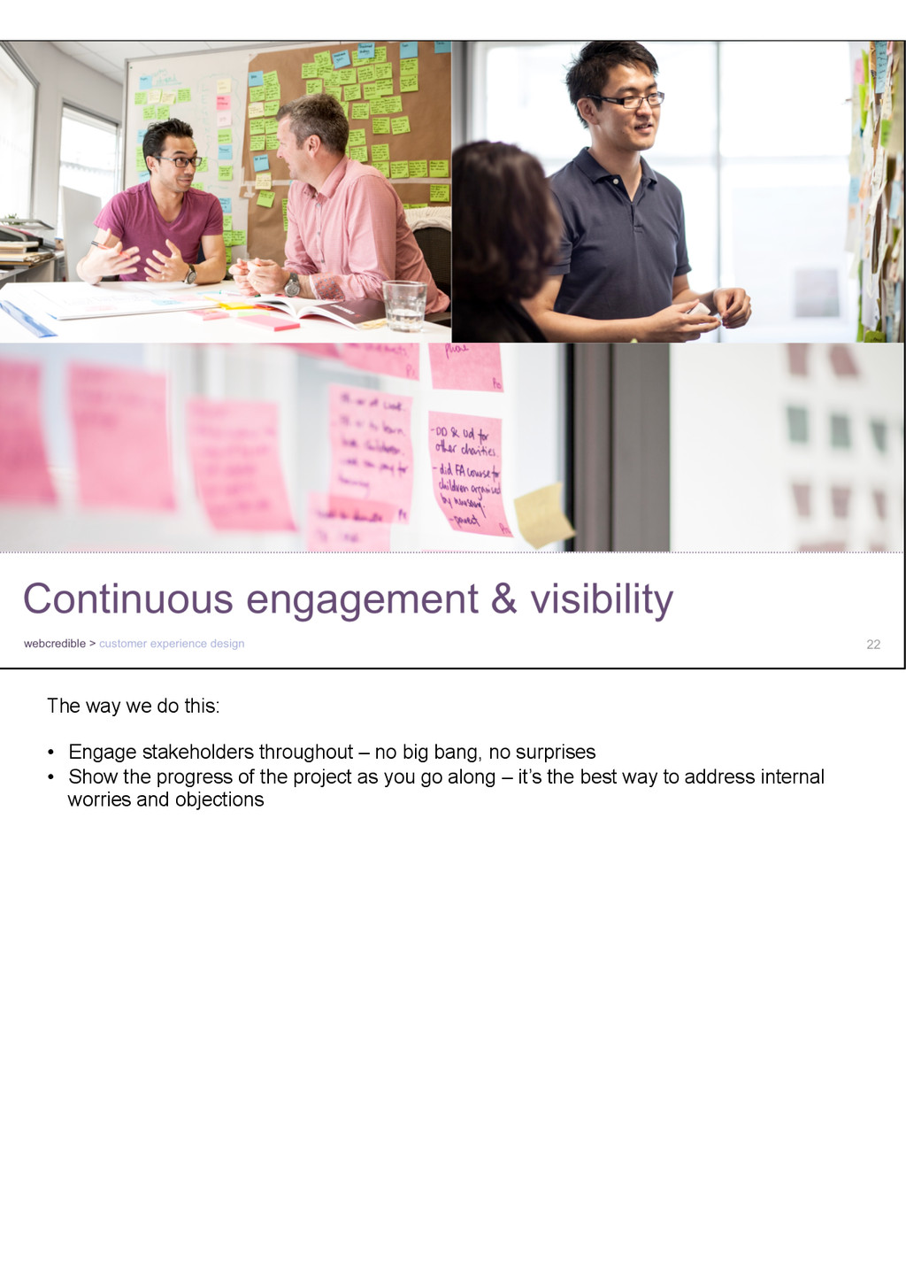
in a corner, produce some shiny new website designs or a set of new tools, and railroad them through the organisation. A new website won’t help if you haven’t thought about the processes that make it work, the people who need to contribute content and handle enquiries, and so on. You need to take everyone in your organization through a journey that will make them contribute to whatever you’re building.
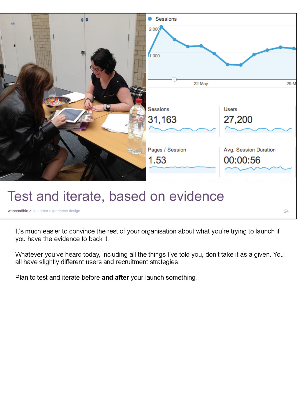
about what you’re trying to launch if you have the evidence to back it. Whatever you’ve heard today, including all the things I’ve told you, don’t take it as a given. You all have slightly different users and recruitment strategies. Plan to test and iterate before and after your launch something.