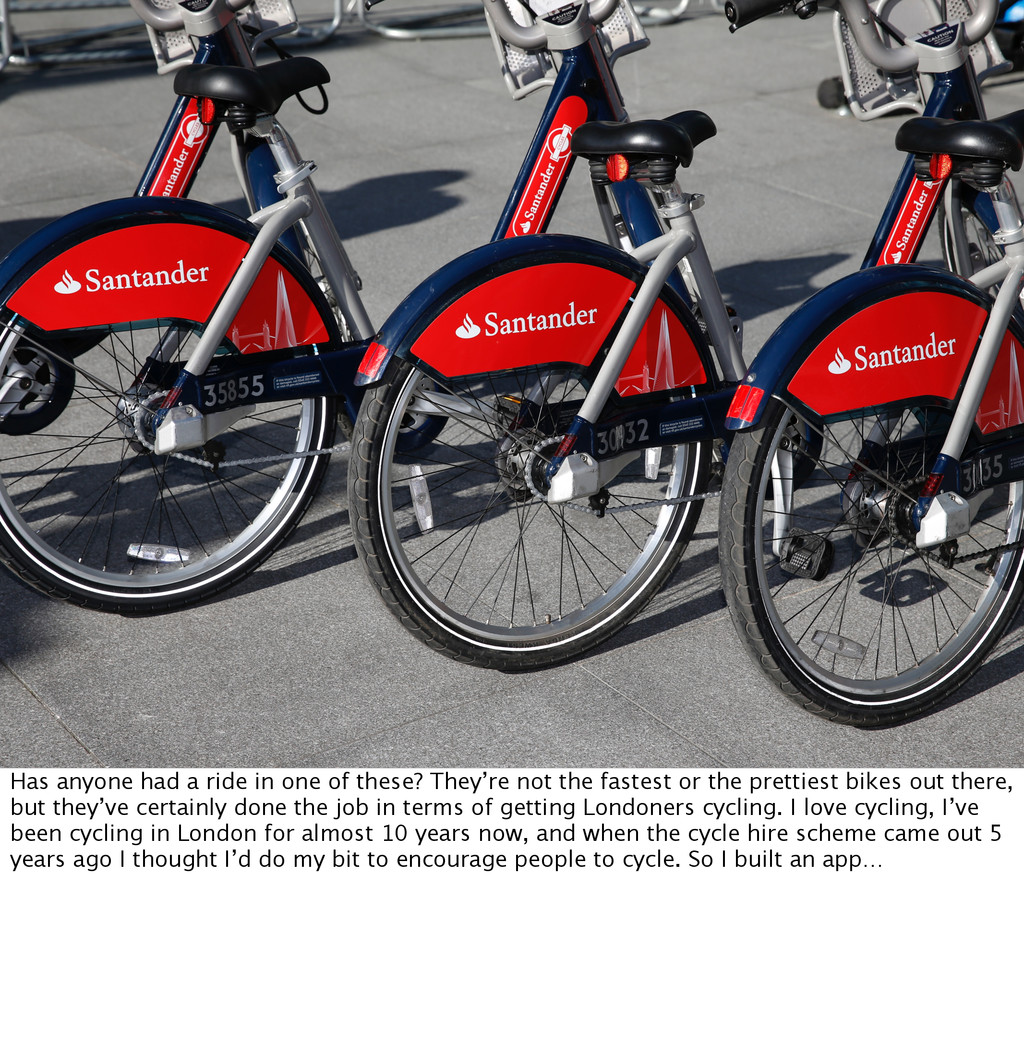
not the fastest or the prettiest bikes out there, but they’ve certainly done the job in terms of getting Londoners cycling. I love cycling, I’ve been cycling in London for almost 10 years now, and when the cycle hire scheme came out 5 years ago I thought I’d do my bit to encourage people to cycle. So I built an app…
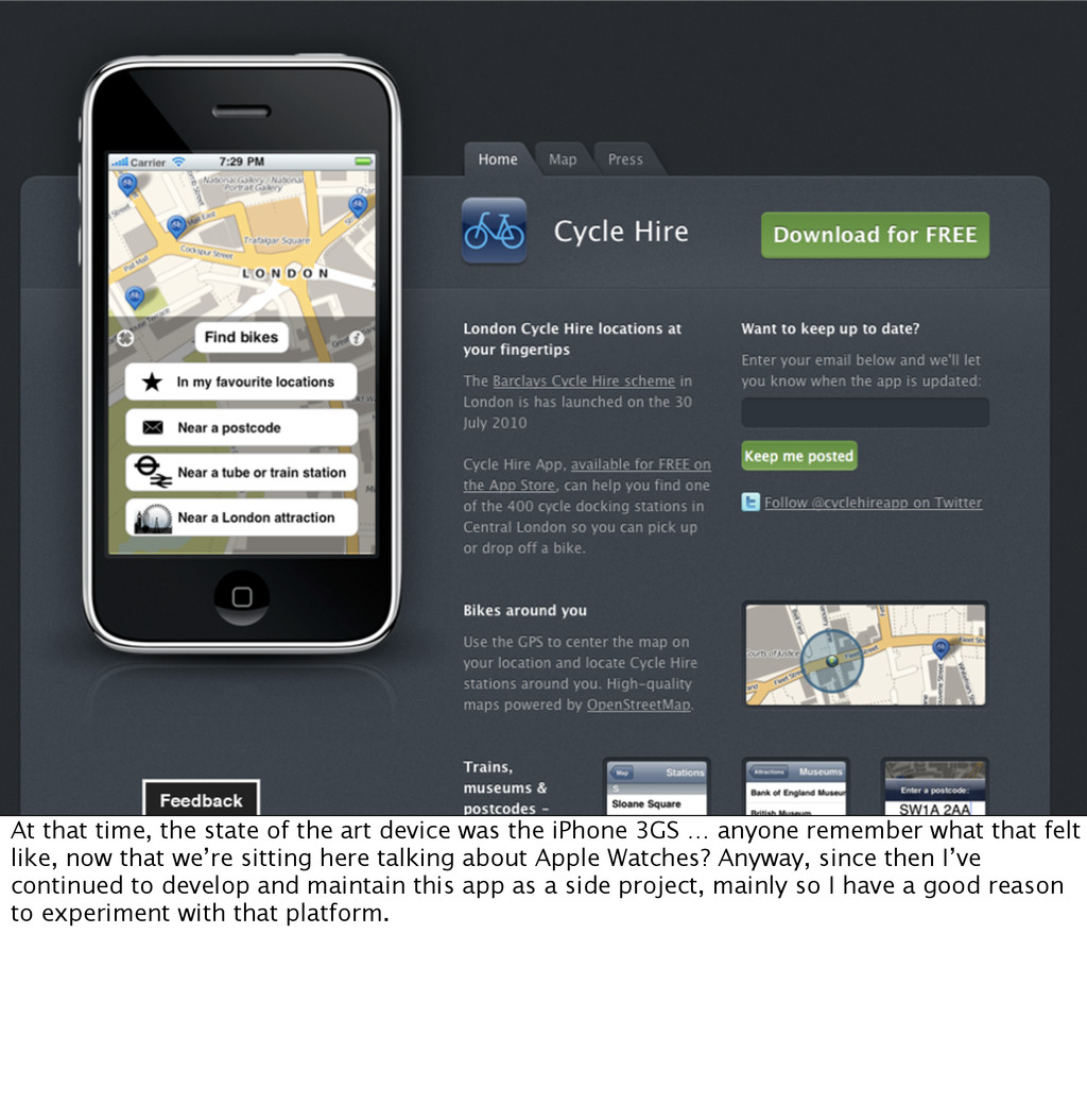
the iPhone 3GS … anyone remember what that felt like, now that we’re sitting here talking about Apple Watches? Anyway, since then I’ve continued to develop and maintain this app as a side project, mainly so I have a good reason to experiment with that platform.
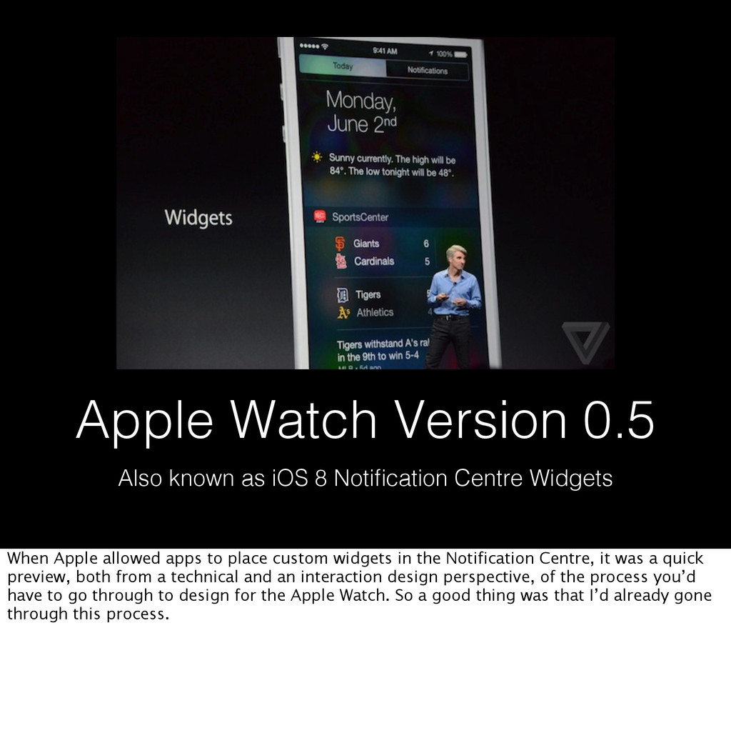
time 5 years later, here we are with a shiny thing on our wrist making apps for it. And it’s the first time Apple has really allowed or even encouraged developers to release apps without testing it on a real device first. Actually, if you were smart enough about making use of recent iOS technologies in your app, you could get a taste of designing for the Apple Watch much earlier. Let me show you Apple Watch version 0.5.
Centre Widgets When Apple allowed apps to place custom widgets in the Notification Centre, it was a quick preview, both from a technical and an interaction design perspective, of the process you’d have to go through to design for the Apple Watch. So a good thing was that I’d already gone through this process.
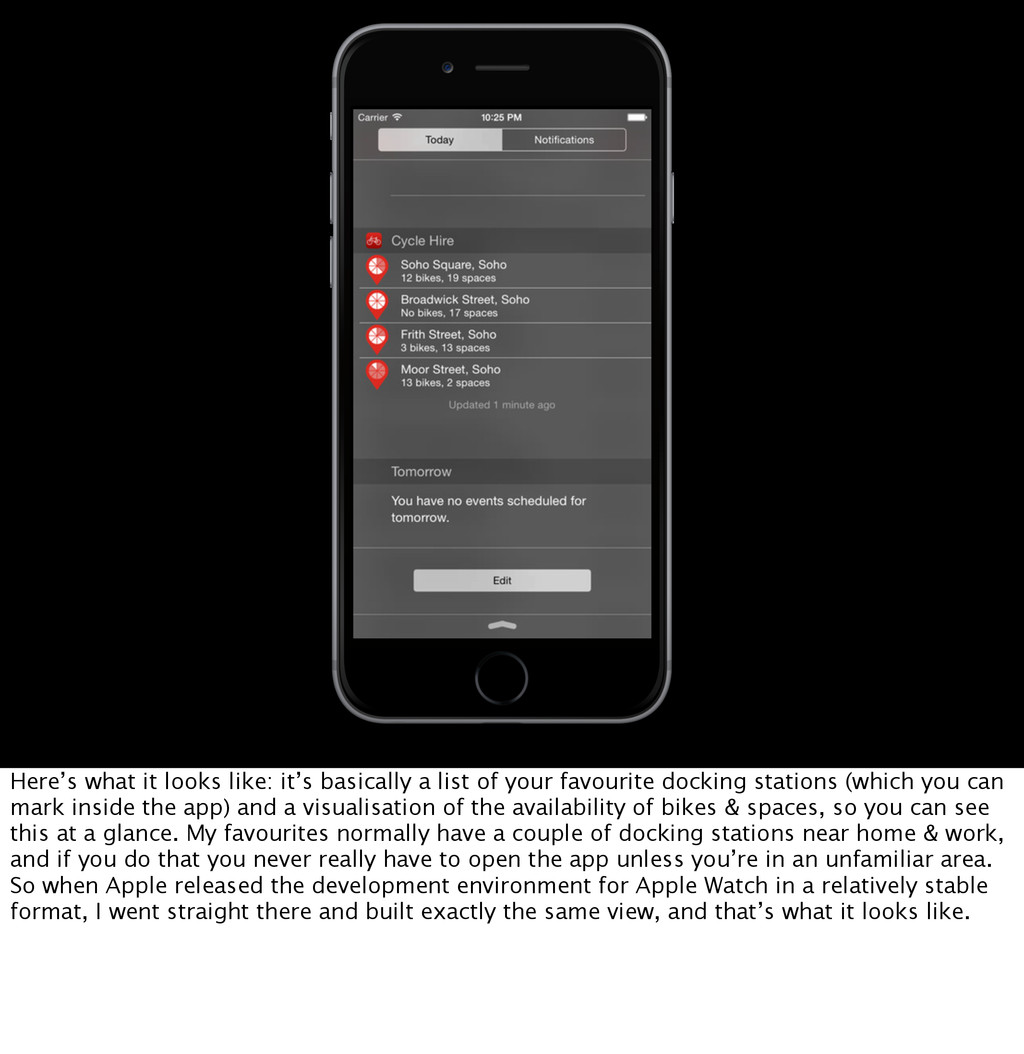
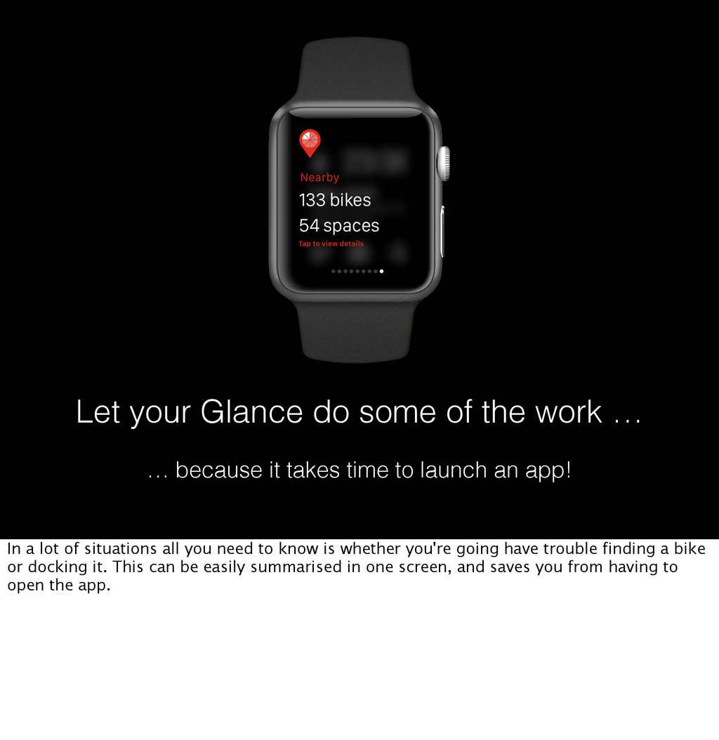
your favourite docking stations (which you can mark inside the app) and a visualisation of the availability of bikes & spaces, so you can see this at a glance. My favourites normally have a couple of docking stations near home & work, and if you do that you never really have to open the app unless you’re in an unfamiliar area. So when Apple released the development environment for Apple Watch in a relatively stable format, I went straight there and built exactly the same view, and that’s what it looks like.
less than a couple of hours to get to work. Now the eagle-eyed amongst you may have noticed that the Apple Watch app has got one further option - apart from showing you your favourite stations, you can also get it to show nearby stations [also, explain why this isn’t done on the Today widget]. And if you’ve gone to the length of reading the entire Apple Watch guidelines document, you may have noticed that I chose to use a non-standard control. I didn’t quite invent it from scratch, you’re probably familiar with it from the iPhone, but it’s not what Apple recommended.
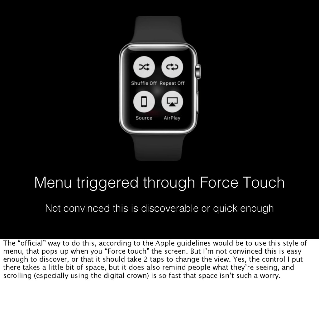
or quick enough The “official” way to do this, according to the Apple guidelines would be to use this style of menu, that pops up when you “Force touch” the screen. But I’m not convinced this is easy enough to discover, or that it should take 2 taps to change the view. Yes, the control I put there takes a little bit of space, but it does also remind people what they’re seeing, and scrolling (especially using the digital crown) is so fast that space isn’t such a worry.
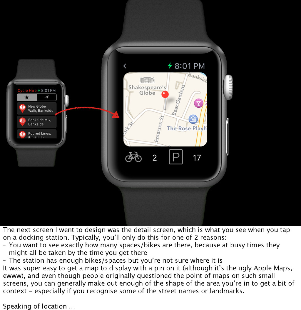
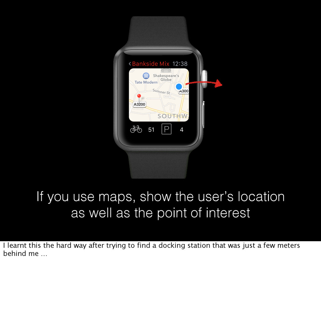
screen, which is what you see when you tap on a docking station. Typically, you’ll only do this for one of 2 reasons: - You want to see exactly how many spaces/bikes are there, because at busy times they might all be taken by the time you get there - The station has enough bikes/spaces but you’re not sure where it is It was super easy to get a map to display with a pin on it (although it’s the ugly Apple Maps, ewww), and even though people originally questioned the point of maps on such small screens, you can generally make out enough of the shape of the area you’re in to get a bit of context - especially if you recognise some of the street names or landmarks. Speaking of location …
HIRE 10:09 Why doesn’t this exist yet? You can only approve location access by opening the iPhone app :( One of the most frustrating things is that there is no way to authorise an app to use your location on the watch. Instead you have to show a message asking the user to open the iPhone app and authorise the location yet. That’s a pointless and very frustrating interaction if you want people to interact with an Apple Watch app as soon as they download it.
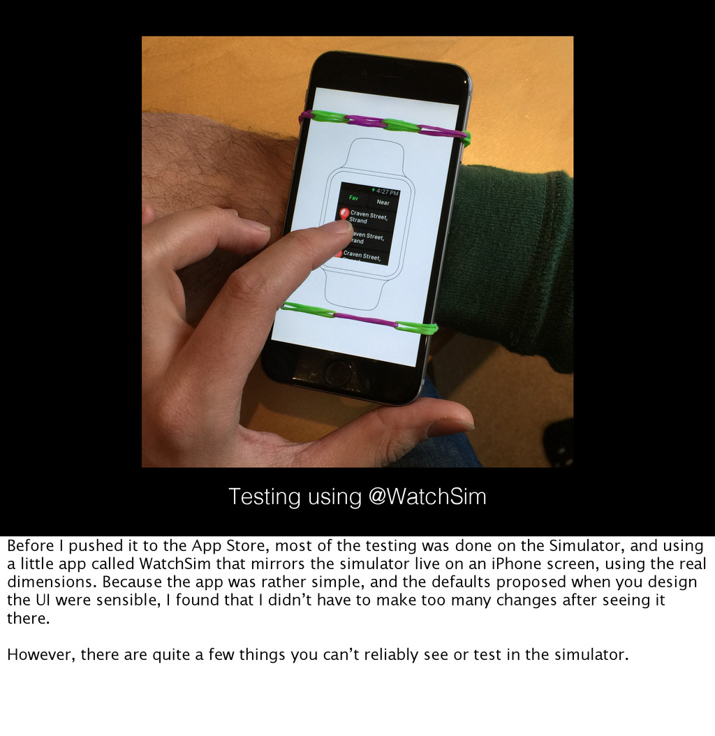
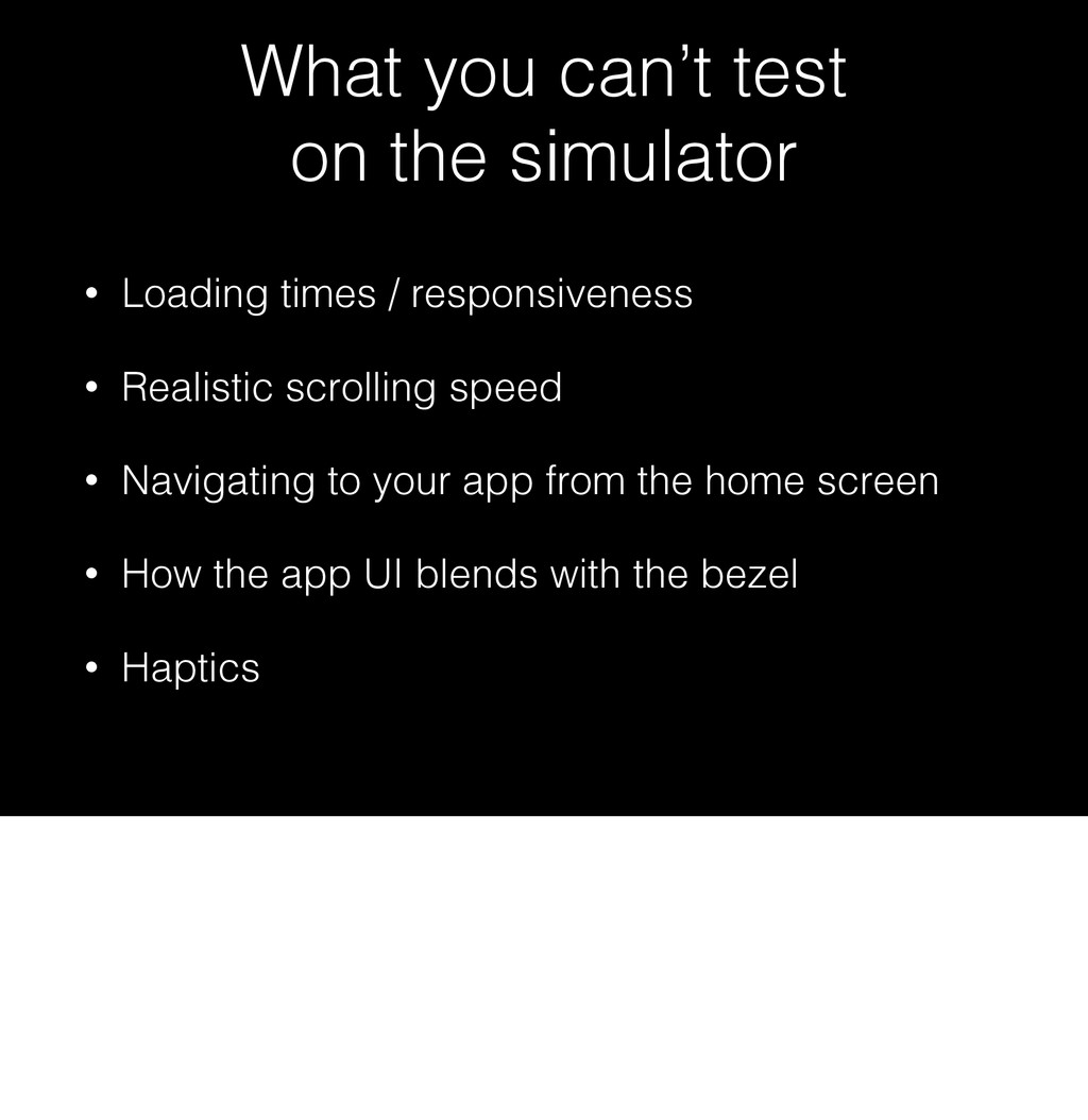
Store, most of the testing was done on the Simulator, and using a little app called WatchSim that mirrors the simulator live on an iPhone screen, using the real dimensions. Because the app was rather simple, and the defaults proposed when you design the UI were sensible, I found that I didn’t have to make too many changes after seeing it there. However, there are quite a few things you can’t reliably see or test in the simulator.
So as I said I was a bit apprehensive in releasing the app without any testing on the real watch, not least because I was also worried about technical issues. In the end my watch arrived as scheduled, and I had the chance to test on the real hardware. Here’s what I learnt.
because it takes time to launch an app! In a lot of situations all you need to know is whether you're going have trouble finding a bike or docking it. This can be easily summarised in one screen, and saves you from having to open the app.