Upgrade to Pro
— share decks privately, control downloads, hide ads and more …
Speaker Deck
Features
Speaker Deck
PRO
Sign in
Sign up for free
Search
Search
Shape Design with Material Components
Search
Sponsored
·
SiteGround - Reliable hosting with speed, security, and support you can count on.
→
umechanhika
September 27, 2019
Programming
270
3
Share
Embed
Copy iframe code
Copy JS code
Copy link
Start on current slide
Shape Design with Material Components
Material ComponentsのShapeのガイドラインと、Shapeを用いてアプリを角丸デザインにした実例をご紹介します。
umechanhika
September 27, 2019
More Decks by umechanhika
See All by umechanhika
My Workspace [2020/08版]
umechanhika
0
110
My Workspace [2020/06版]
umechanhika
0
57
Badging for Tabs and Bottom Navigation
umechanhika
0
390
Capture view and Register to gallery
umechanhika
0
70
Firebase MLKit AutoML Vision Edgeを触ってみた
umechanhika
3
590
Google Play Consoleの時間指定公開のハマりポイント
umechanhika
1
1.6k
UIテスト初心者のチームにUIテスト自動化を導入した話
umechanhika
0
120
GoogleI/Oアプリのようなフィルター機能を実装する
umechanhika
2
550
Jenkins + Bitbucketでアプリリリースを自動化してみた
umechanhika
1
690
Other Decks in Programming
See All in Programming
Haskell/Servantを通してWebミドルウェアを捉え直す
pizzacat83
1
600
act1-costs.pdf
sumedhbala
0
240
PHP に部分適用が来るぞ!……ところで何それ?おいしいの? #phpcon / phpcon-2026
shogogg
0
320
アルゴリズムは何を圧縮しているのか ─ Haskell から育った「圧縮代数」というメンタルモデル
naoya
16
3.6k
琵琶湖の水は止められてもNet--HTTPのリトライは止められない / You might be able to stop the water flow of Lake Biwa but you can't stop Net::HTTP retries
luccafort
PRO
0
420
AI時代の仕事技芸論〜ソフトウェア開発で「遊ぶように働く」職人的熟達のすすめ(スクフェス仙台 2026バージョン)
kuranuki
0
680
トークンをケチるな、設計しろ:GitHub Copilotを賢く使うコンテキスト戦略
ochtum
0
330
Built Our Own Background Agent at LayerX #aidevex_findy
layerx
PRO
7
2.8k
言語を使う側から、作る側へ。 自作 Lisp で得た新たな気づき。
andpad
0
130
act2-costs.pdf
sumedhbala
0
120
地域 SRE コミュニティ最前線 - ホンマでっかSRE勉強会
tk3fftk
0
270
なぜ型を書くのか? TSKaigi2026で改めて考える #tskaigi_smarthr
kajitack
0
400
Featured
See All Featured
Discover your Explorer Soul
emna__ayadi
2
1.2k
RailsConf & Balkan Ruby 2019: The Past, Present, and Future of Rails at GitHub
eileencodes
141
35k
VelocityConf: Rendering Performance Case Studies
addyosmani
333
25k
コードの90%をAIが書く世界で何が待っているのか / What awaits us in a world where 90% of the code is written by AI
rkaga
62
45k
SEO Brein meetup: CTRL+C is not how to scale international SEO
lindahogenes
1
2.8k
Principles of Awesome APIs and How to Build Them.
keavy
128
18k
Primal Persuasion: How to Engage the Brain for Learning That Lasts
tmiket
0
390
Winning Ecommerce Organic Search in an AI Era - #searchnstuff2025
aleyda
1
2.1k
Visualizing Your Data: Incorporating Mongo into Loggly Infrastructure
mongodb
49
10k
Jess Joyce - The Pitfalls of Following Frameworks
techseoconnect
PRO
1
310
Improving Core Web Vitals using Speculation Rules API
sergeychernyshev
21
1.5k
The AI Search Optimization Roadmap by Aleyda Solis
aleyda
1
6k
Transcript
Shape Design with Material Components
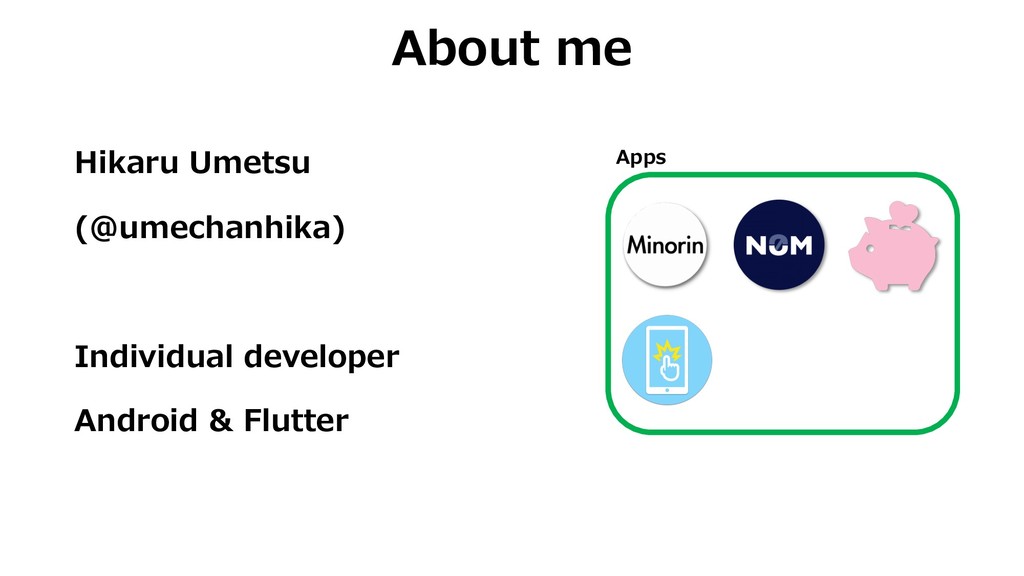
Hikaru Umetsu (@umechanhika) Individual developer Android & Flutter About me
Apps
The GOAL is to enable you to implement shape using
Material Components.
Introduction About shape Guideline How to implement Case study
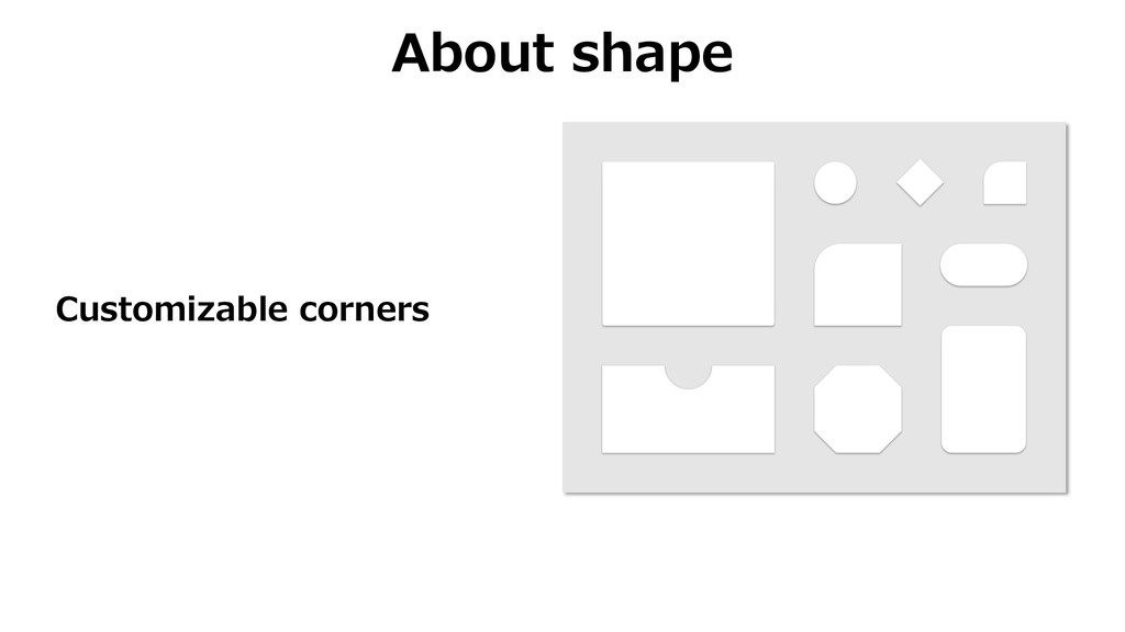
About shape Customizable corners
Guideline
Usage
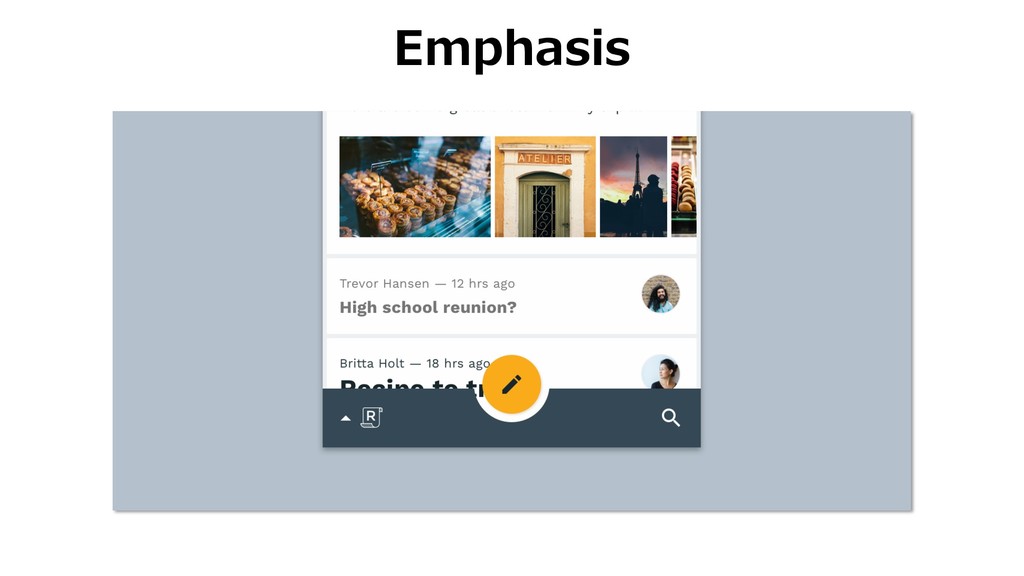
Emphasis
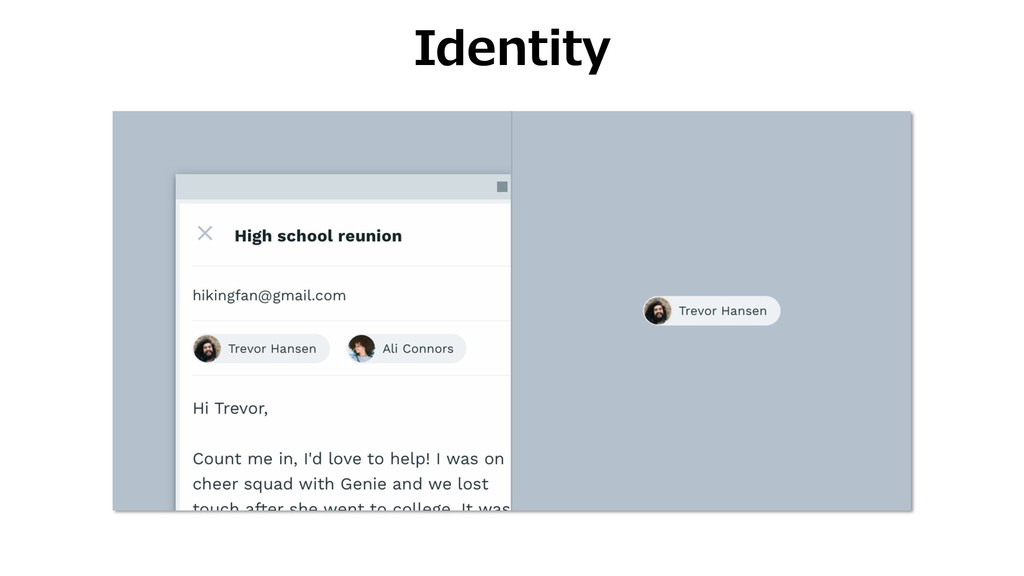
Identity
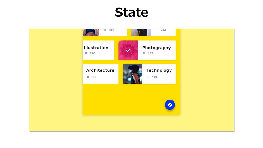
State
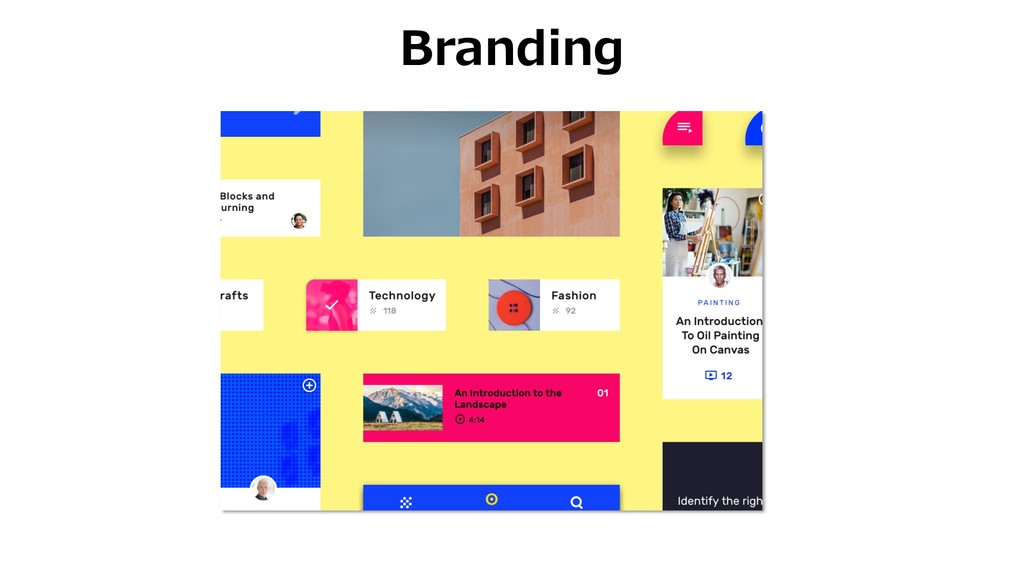
Branding
Attributes
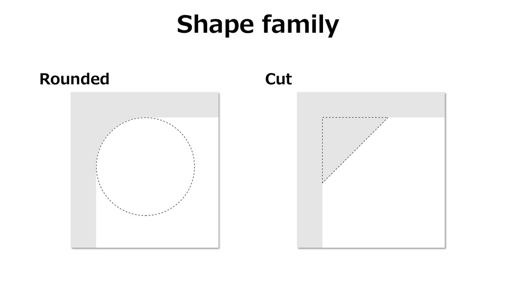
Rounded Cut Shape family
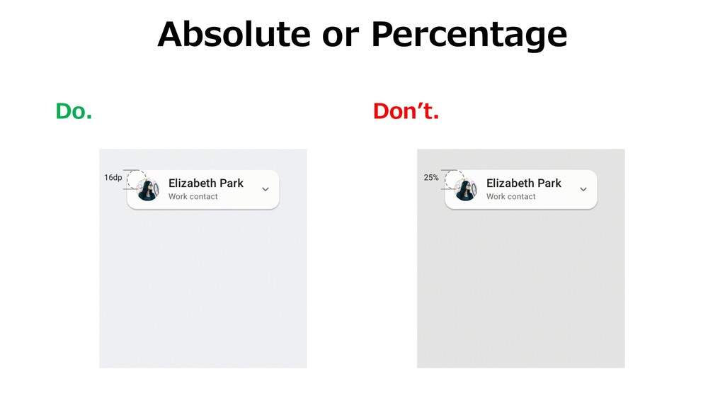
Absolute Percentage Shape size
Categories
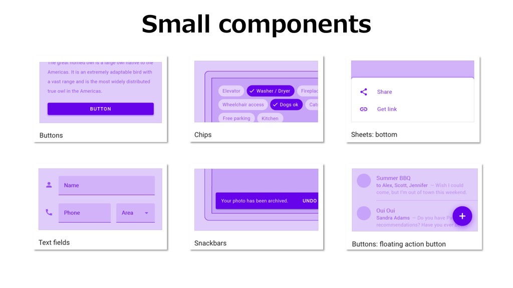
Small components
Medium components
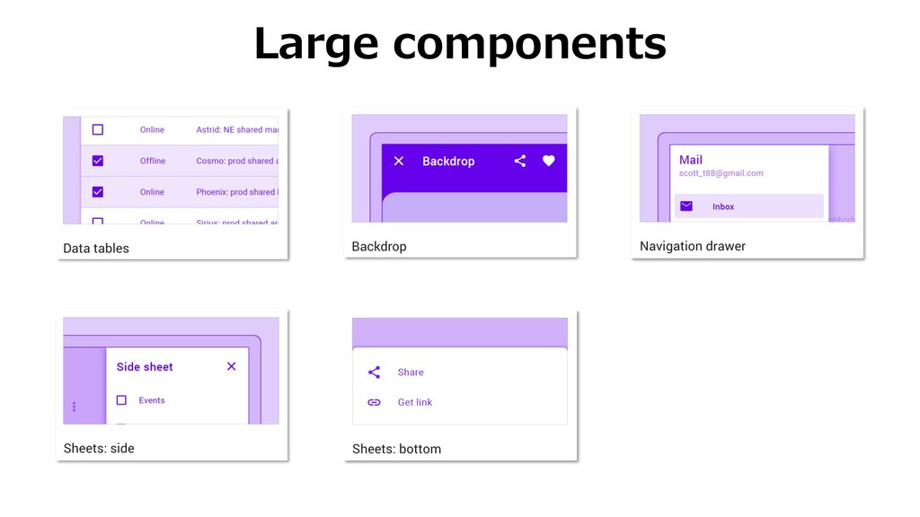
Large components
Caution
Do. Donʼt. Absolute or Percentage
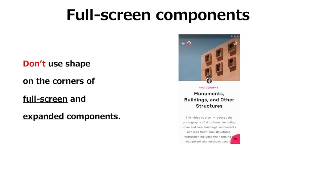
Full-screen components Donʼt use shape on the corners of full-screen
and expanded components.
How to implement
Apply categories <style name="SmallCompShapeAppearance" parent="ShapeAppearance.MaterialComponents.SmallComponent"> <item name="cornerFamily">cut</item> <item name="cornerSize">4dp</item> </style>
<style name="Theme.MyApp" parent="Theme.MaterialComponents.Light"> ... <item name="shapeAppearanceSmallComponent">@style/SmallCompShapeAppearance</item> ... </style>
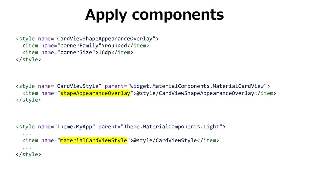
Apply components <style name="CardViewShapeAppearanceOverlay"> <item name="cornerFamily">rounded</item> <item name="cornerSize">16dp</item> </style> <style
name="CardViewStyle" parent="Widget.MaterialComponents.MaterialCardView"> <item name="shapeAppearanceOverlay">@style/CardViewShapeAppearanceOverlay</item> </style> <style name="Theme.MyApp" parent="Theme.MaterialComponents.Light"> ... <item name="materialCardViewStyle">@style/CardViewStyle</item> ... </style>
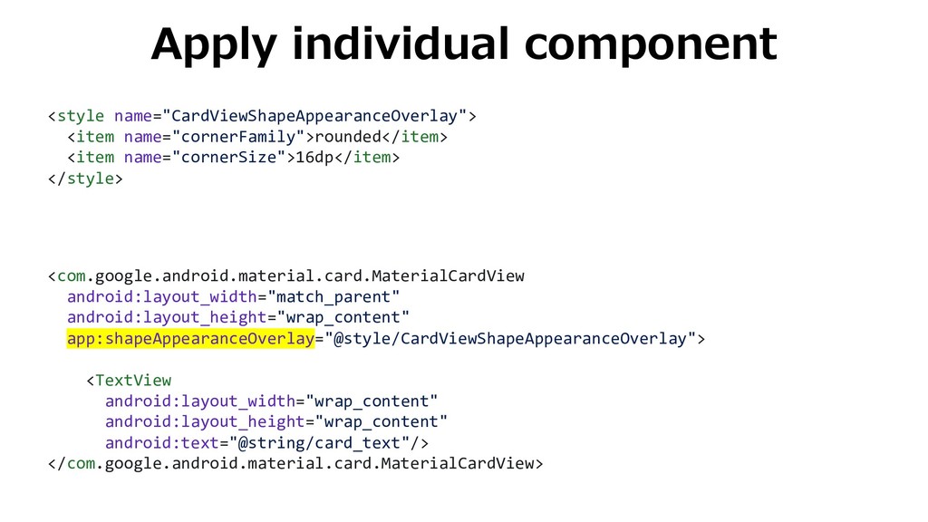
Apply individual component <style name="CardViewShapeAppearanceOverlay"> <item name="cornerFamily">rounded</item> <item name="cornerSize">16dp</item> </style>
<com.google.android.material.card.MaterialCardView android:layout_width="match_parent" android:layout_height="wrap_content" app:shapeAppearanceOverlay="@style/CardViewShapeAppearanceOverlay"> <TextView android:layout_width="wrap_content" android:layout_height="wrap_content" android:text="@string/card_text"/> </com.google.android.material.card.MaterialCardView>
Case study
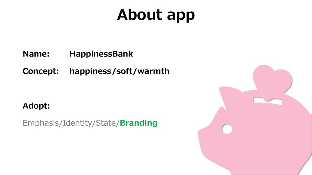
About app Name: HappinessBank Concept: happiness/soft/warmth Adopt: Branding
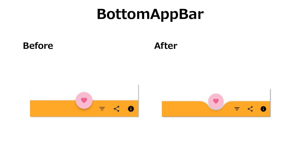
Before After BottomAppBar
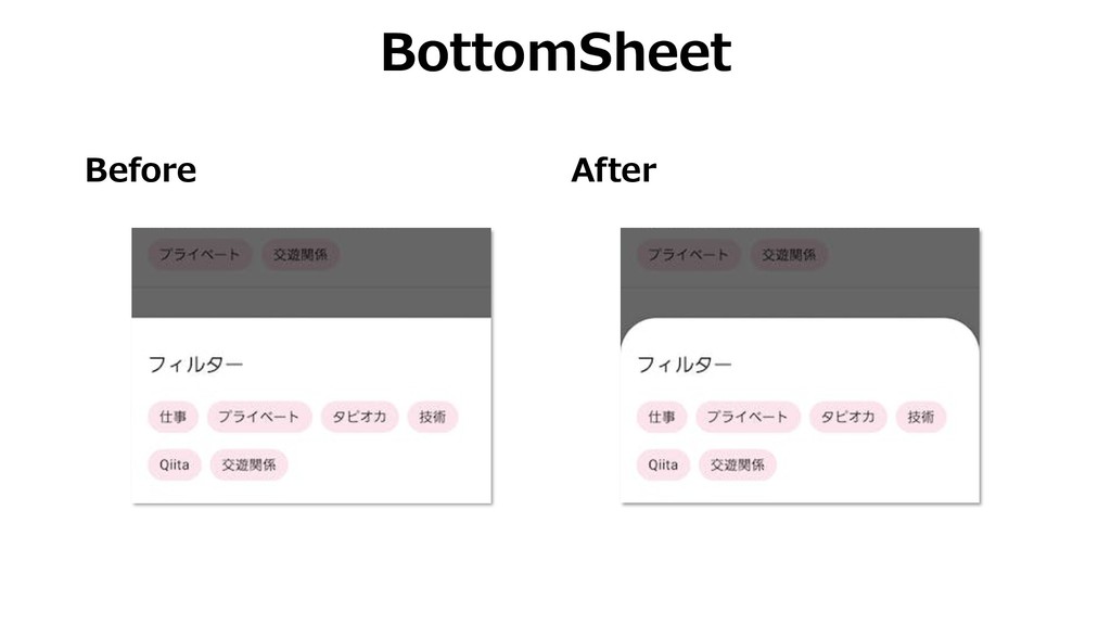
Before After BottomSheet
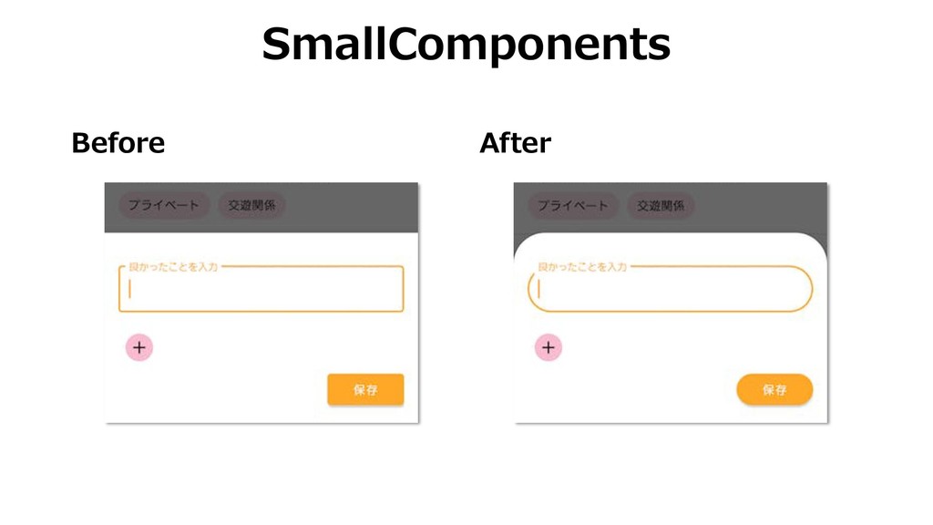
Before After SmallComponents
Summary Shape is the customizable corners. Usage of shape is
Emphasis, Identity, State, and Branding. You can customize it using styles.xml.
Thanks!
 SiteGround - Reliable hosting with speed, security, and support you can count on.
 umechanhika
 pizzacat83
 sumedhbala
 shogogg
 naoya
naoya
 luccafort
 kuranuki
 ochtum
 layerx
 andpad
 tk3fftk
 kajitack
 emna__ayadi
 eileencodes
 addyosmani
 rkaga
rkaga
 lindahogenes
 keavy
keavy
 tmiket
 aleyda
 mongodb
 techseoconnect
 sergeychernyshev