Presentation given at Environment for Human's .Edu Guru Summit 2013.
http://environmentsforhumans.com/2013/doteduguru-summit/
---
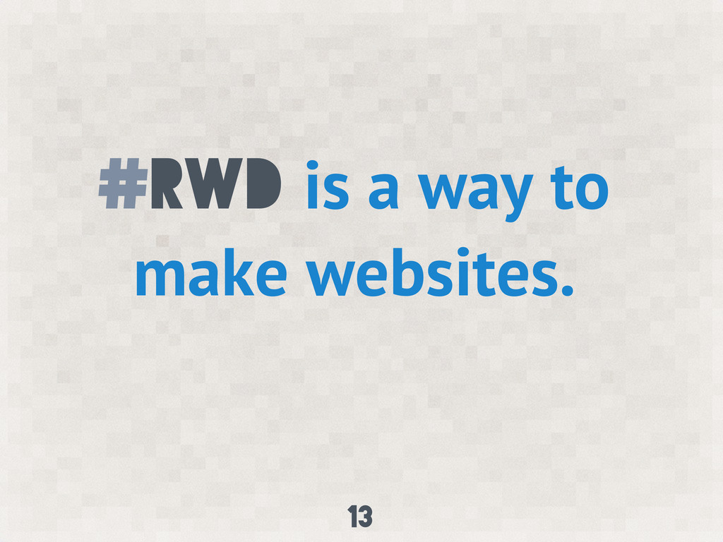
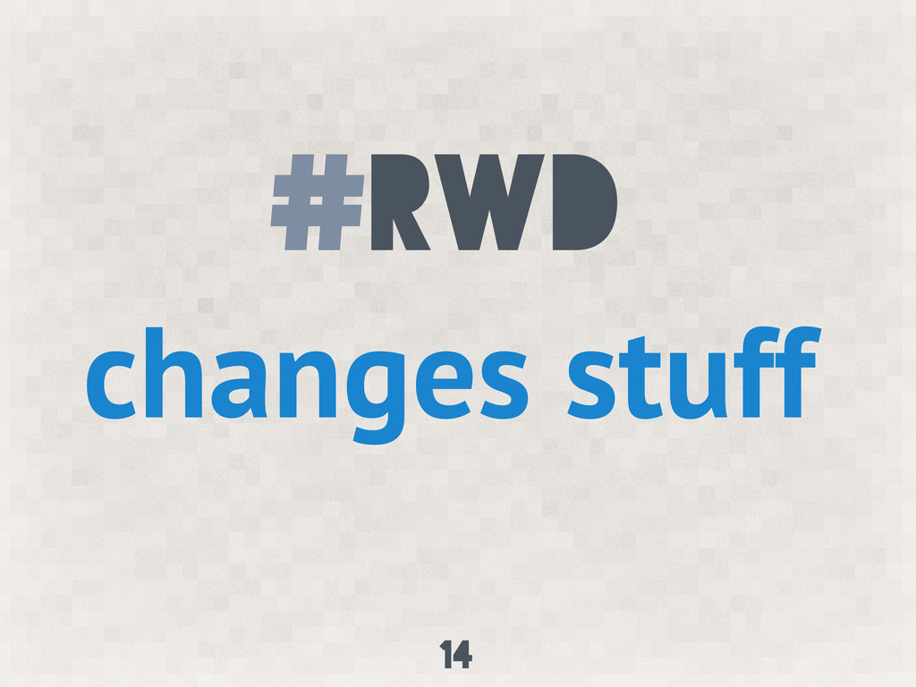
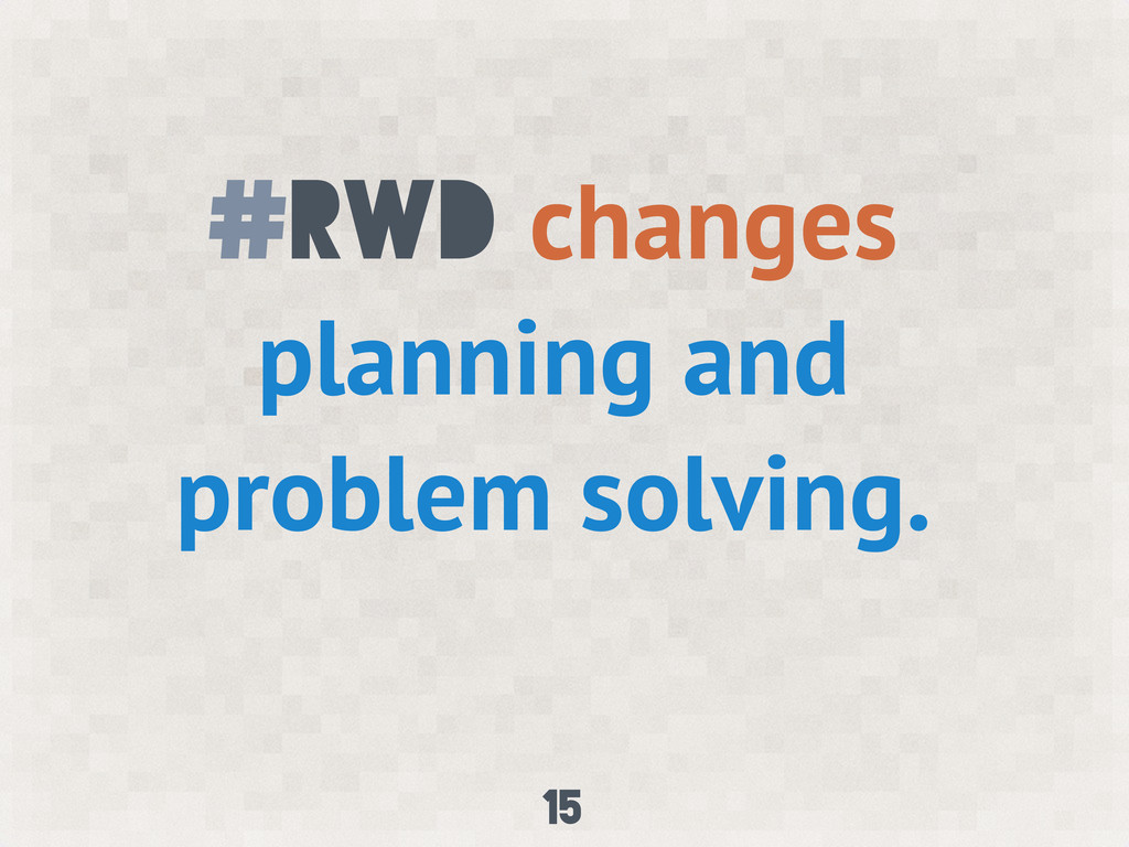
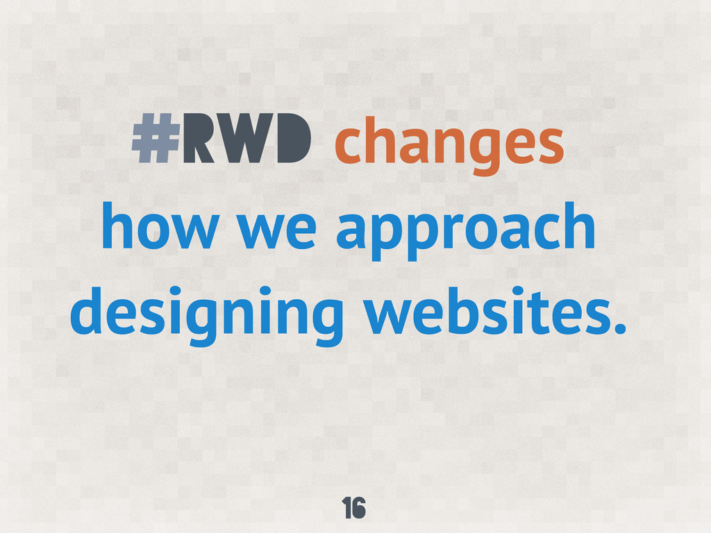
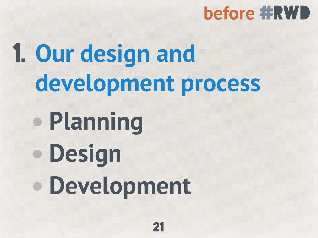
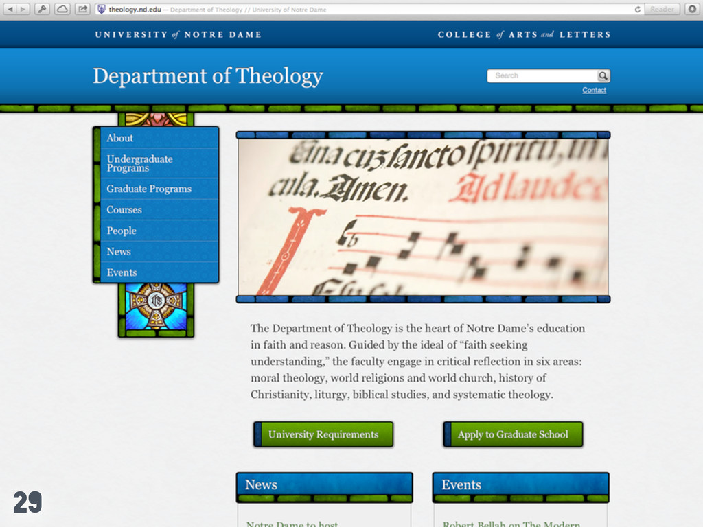
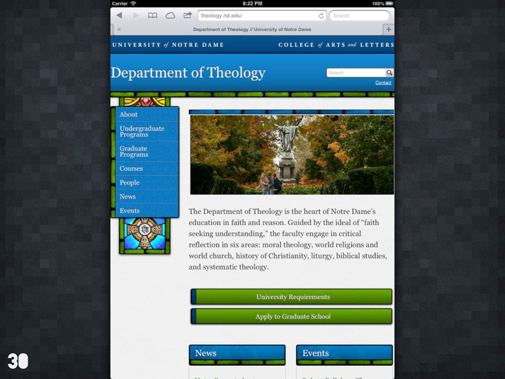
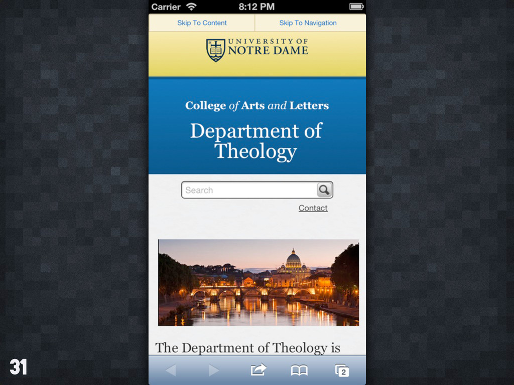
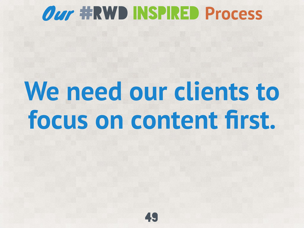
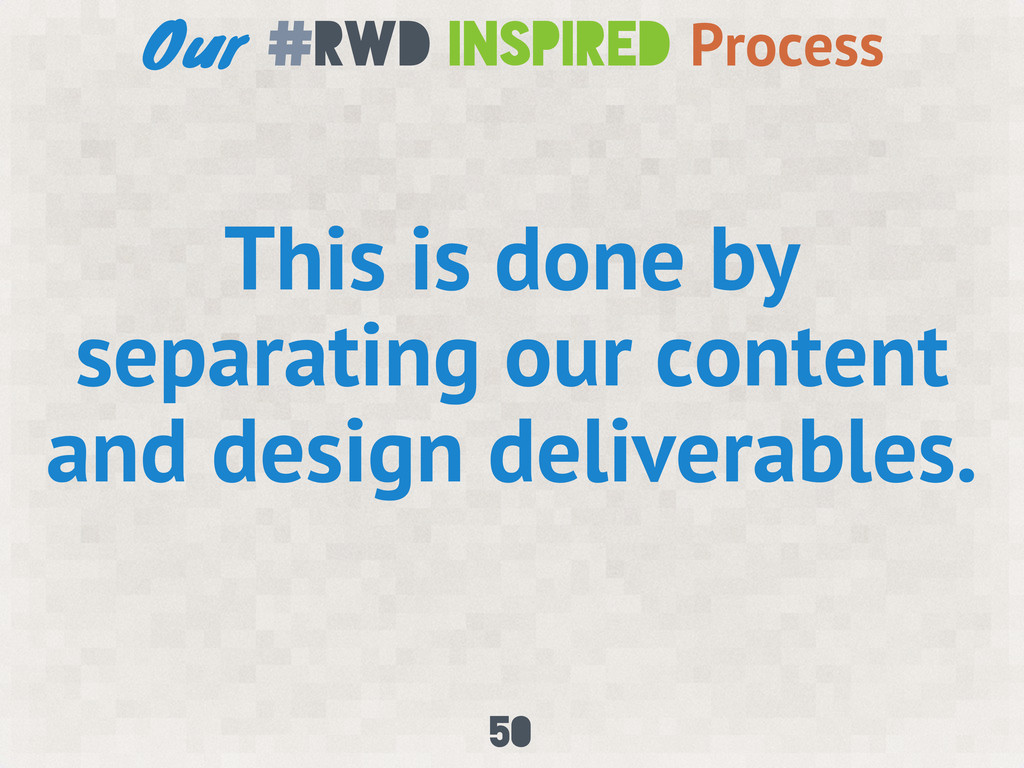
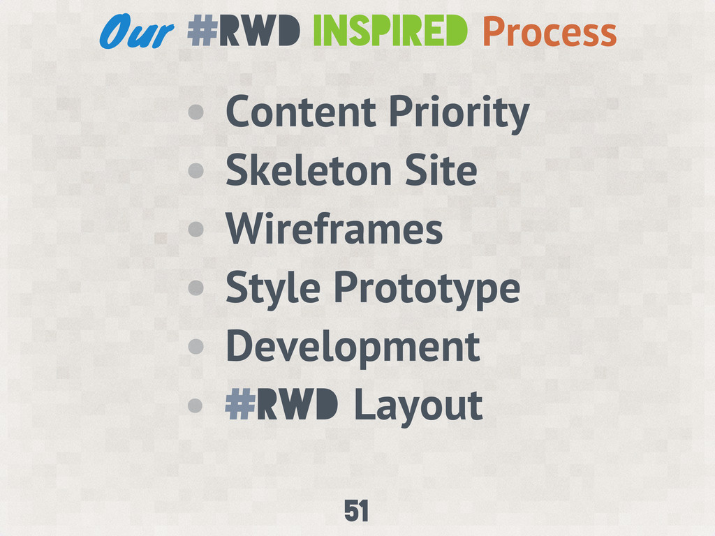
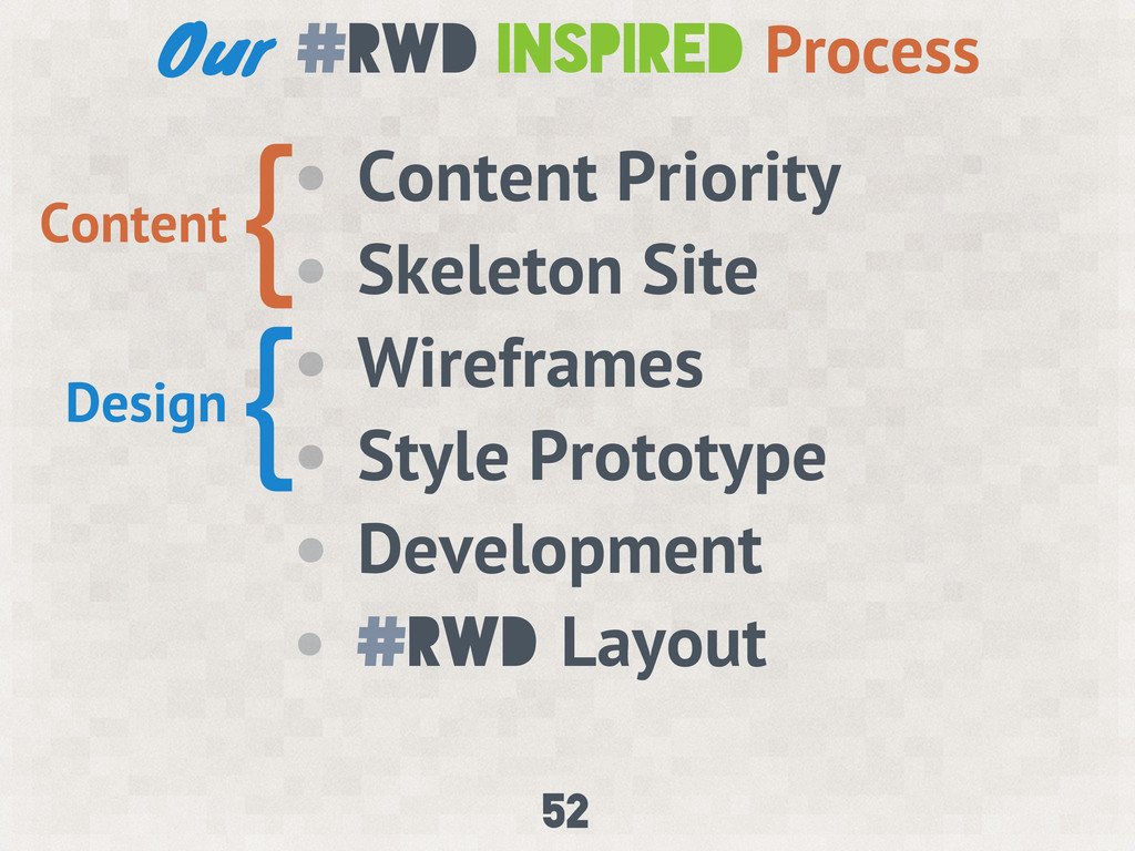
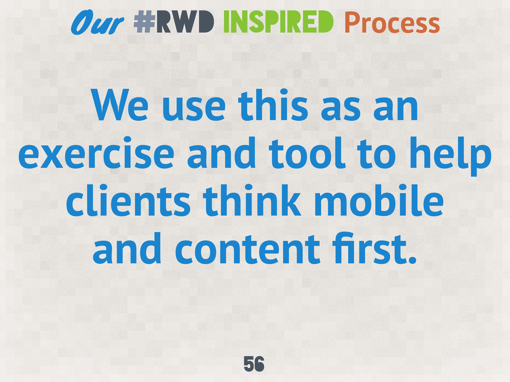
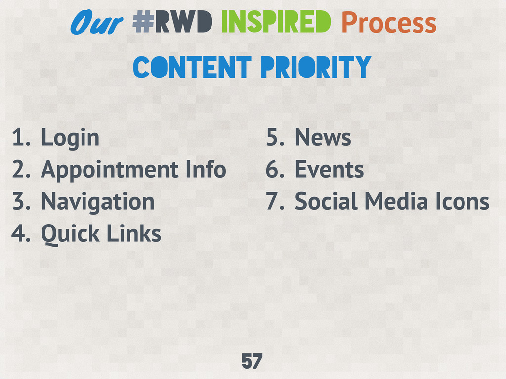
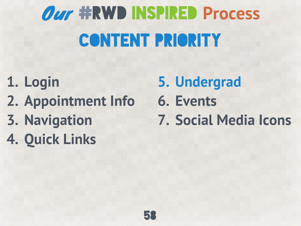
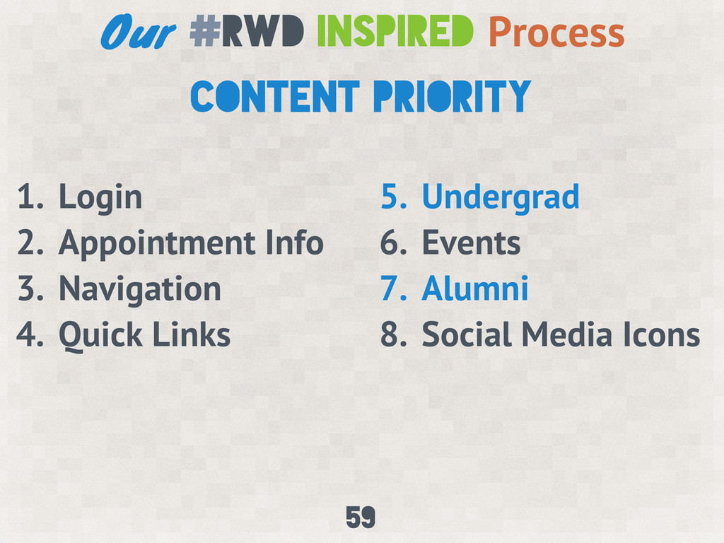
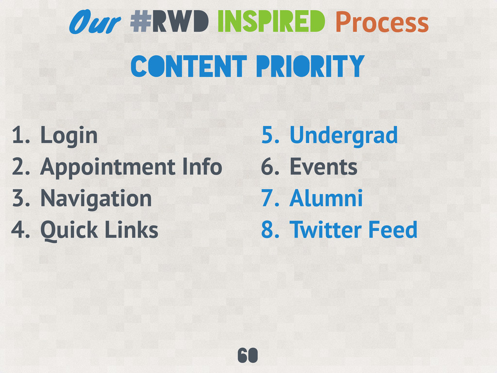
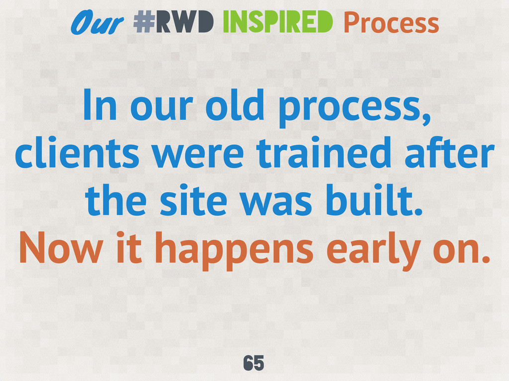
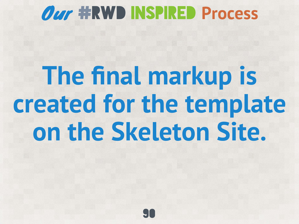
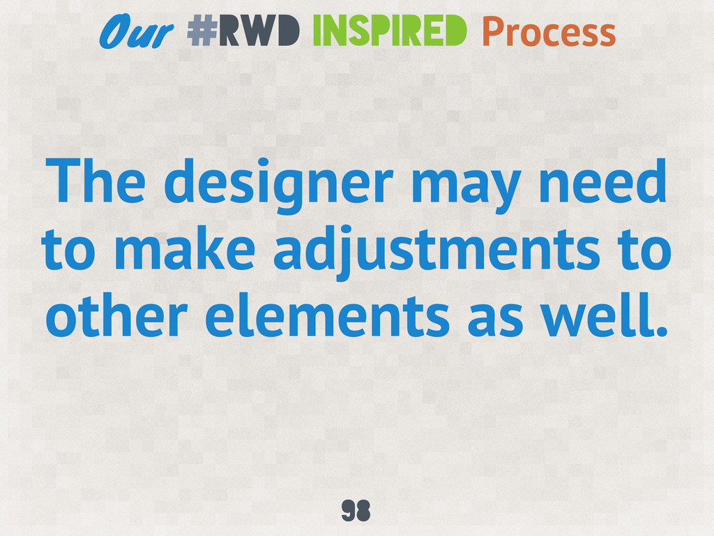
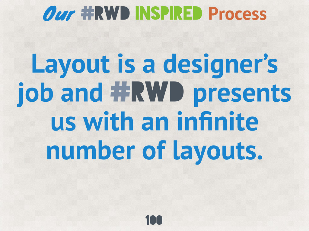
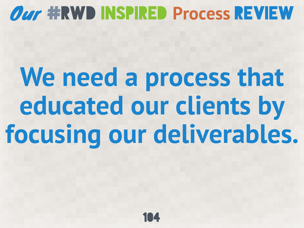
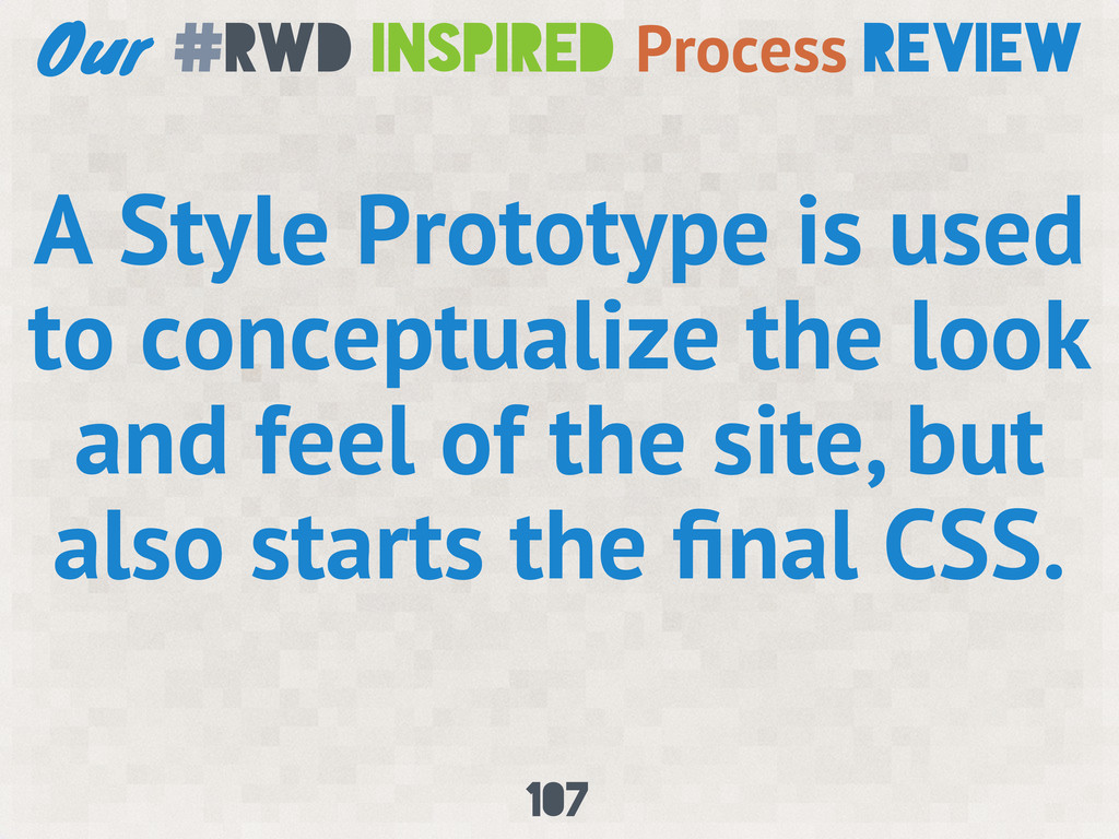
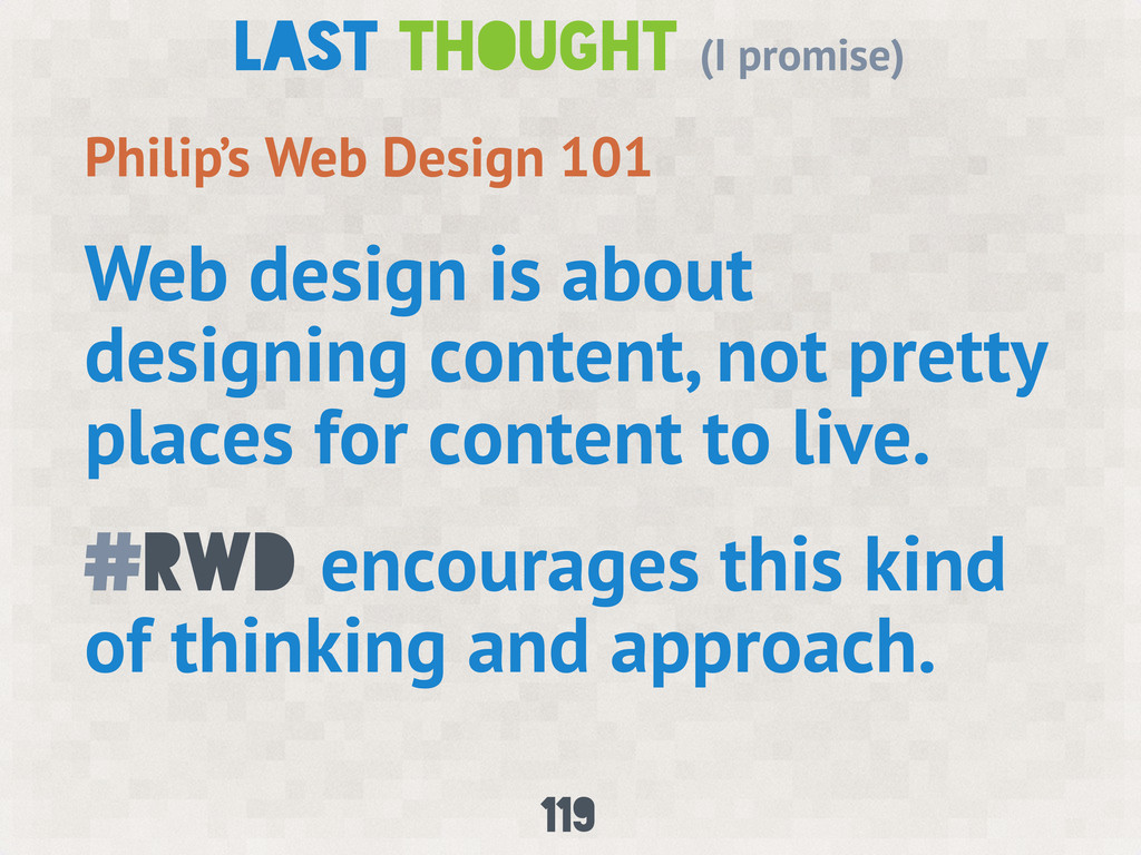
Responsive web design has revolutionized how we design sites at Notre Dame. Very early in our adoption of responsive web design, frustrations cropped up as we struggled with our typical design and development process.
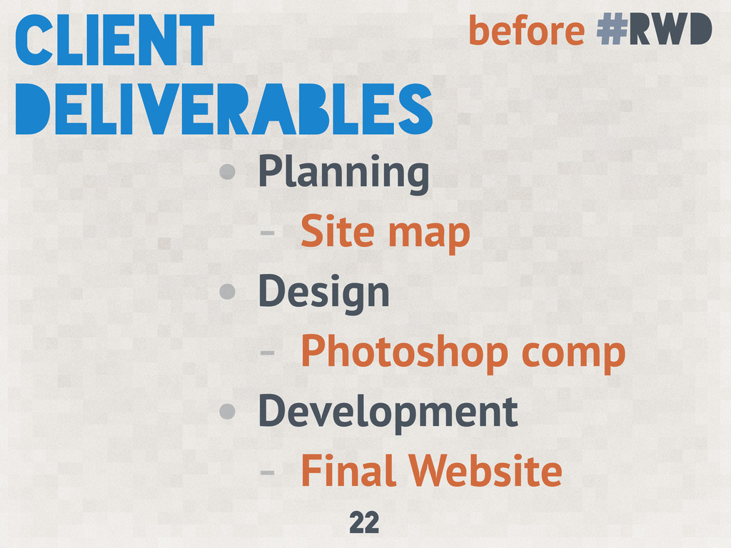
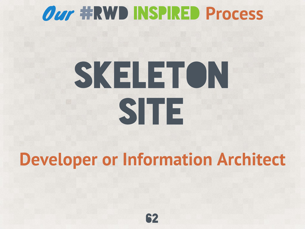
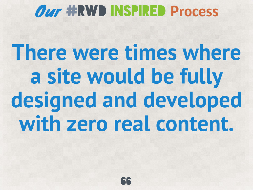
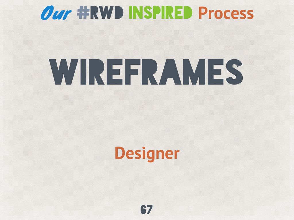
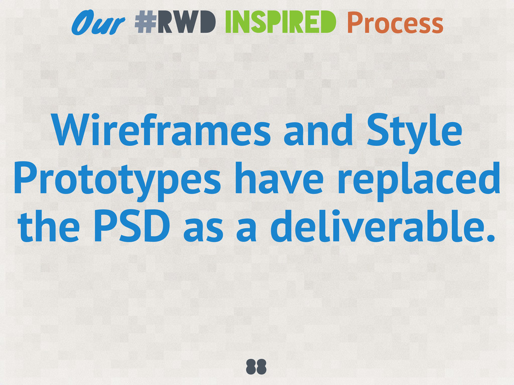
For years our team has had a silo approach to design and development: a designer entrenched in Photoshop created a design, then the Photoshop file was given to a developer to build the website. Taking a step back and looking at this process, it didn’t work.
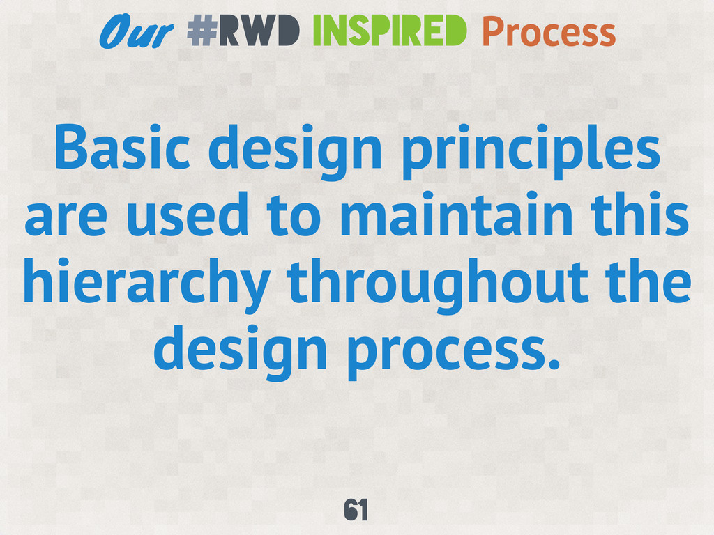
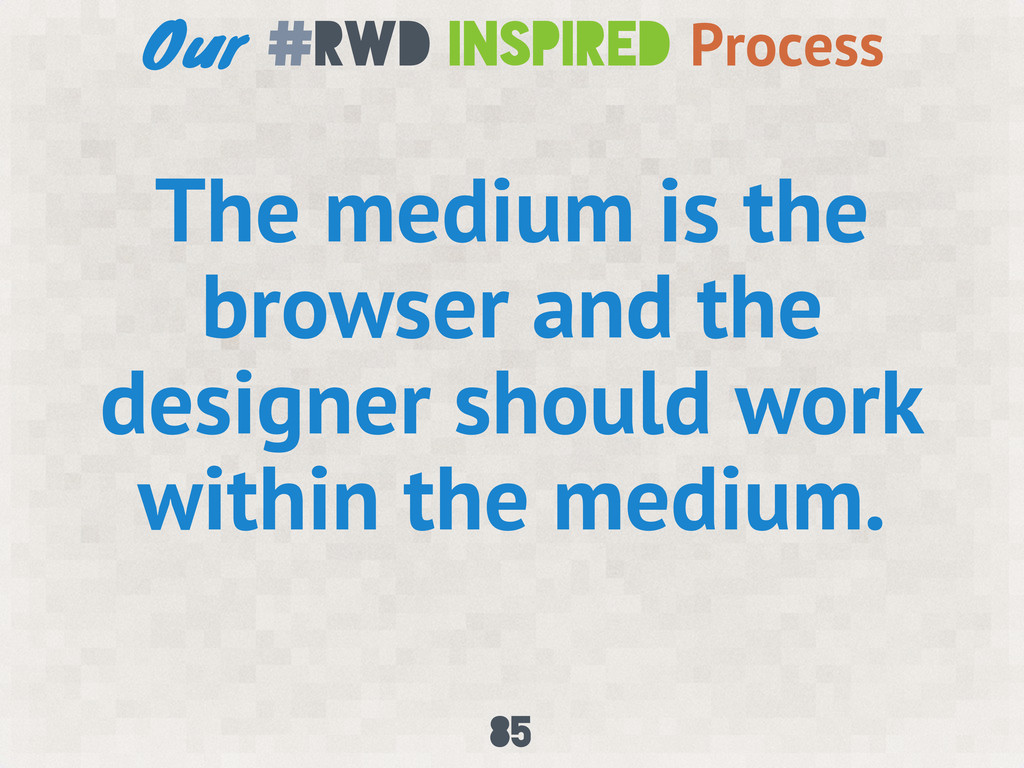
Responsive design requires an expanded understanding of our medium. The design process has to change, in a big way, to take advantage of the opportunities provided by responsive web design.
 zastrow
 yamamotoyuta
 lynteo
.jpg) iflection
iflection
 solmetts
 ncdc
ncdc
 garyuten
 hilokifigma
 kintone
 mcksmith
 connecre
 bitkey
 mukai_takeru
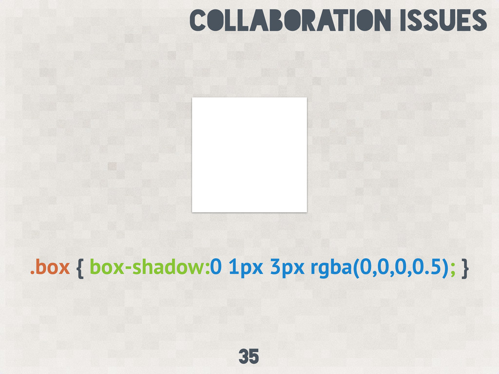
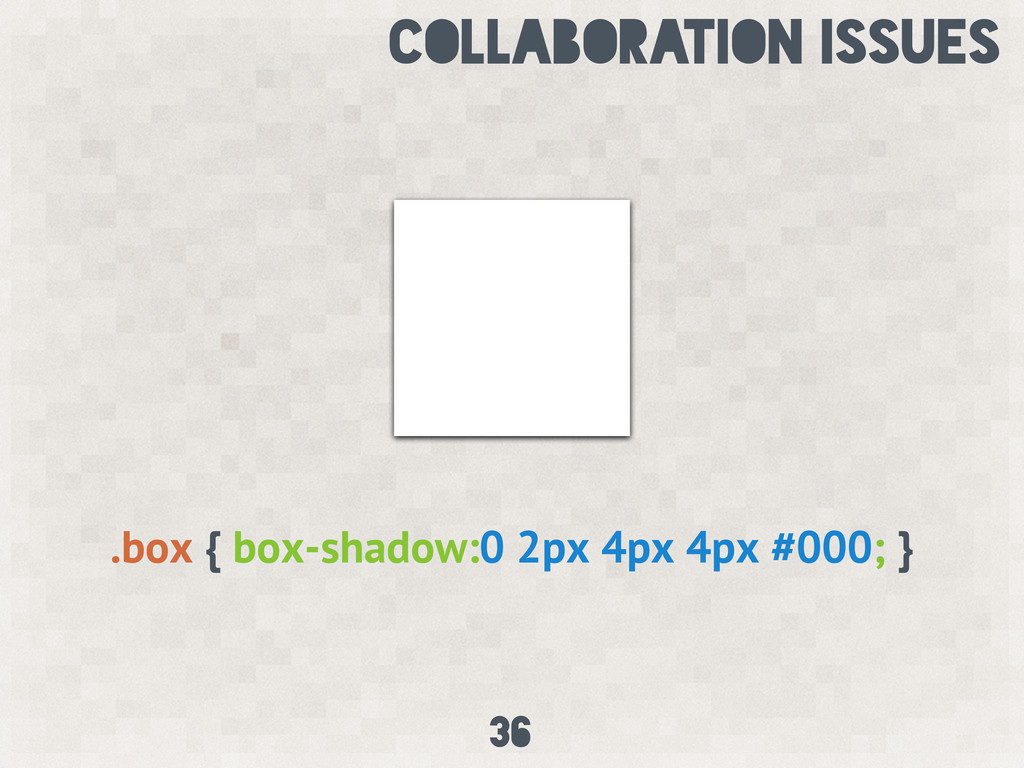
 akashhashmi
 honnibal
 colly
colly
 elsirapls
 rkaga
rkaga
 addyosmani
 marcduiker
 apolaine
 michaelherold
 marktimemedia
 charlesmeaden
 danielanewman