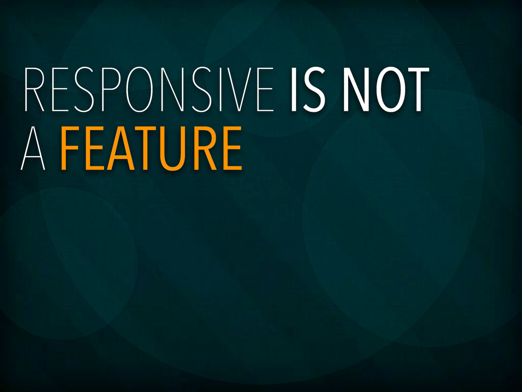
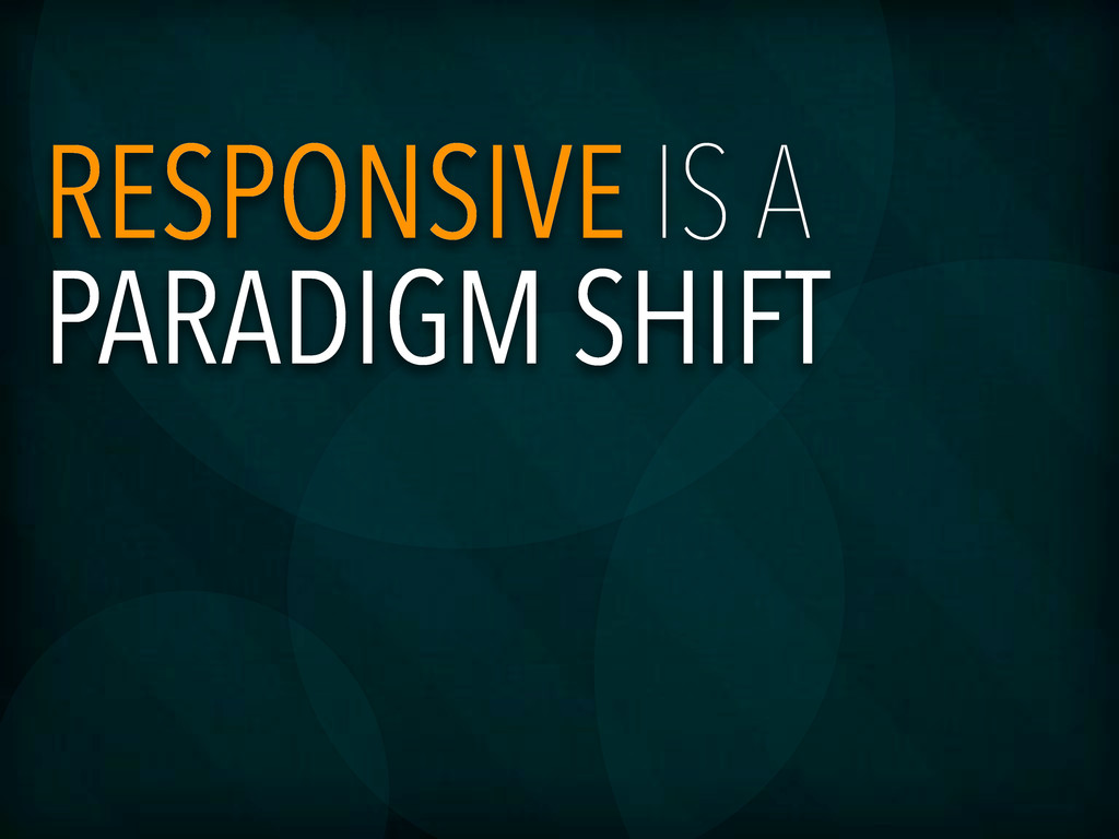
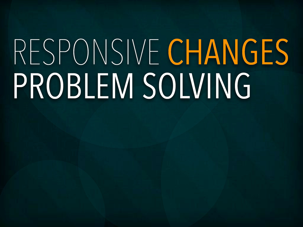
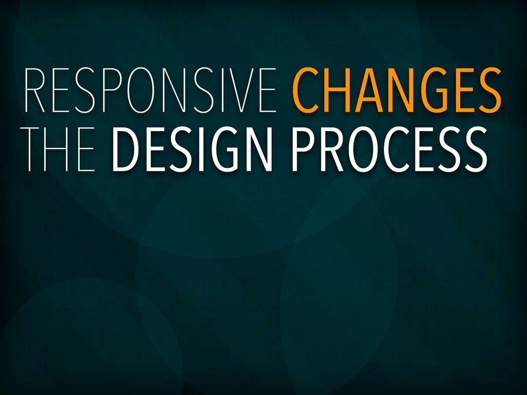
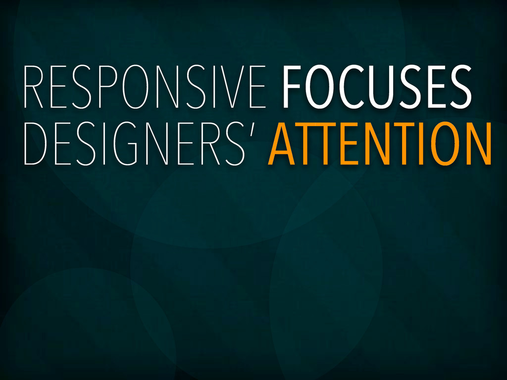
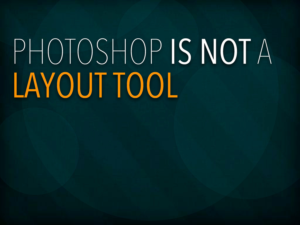
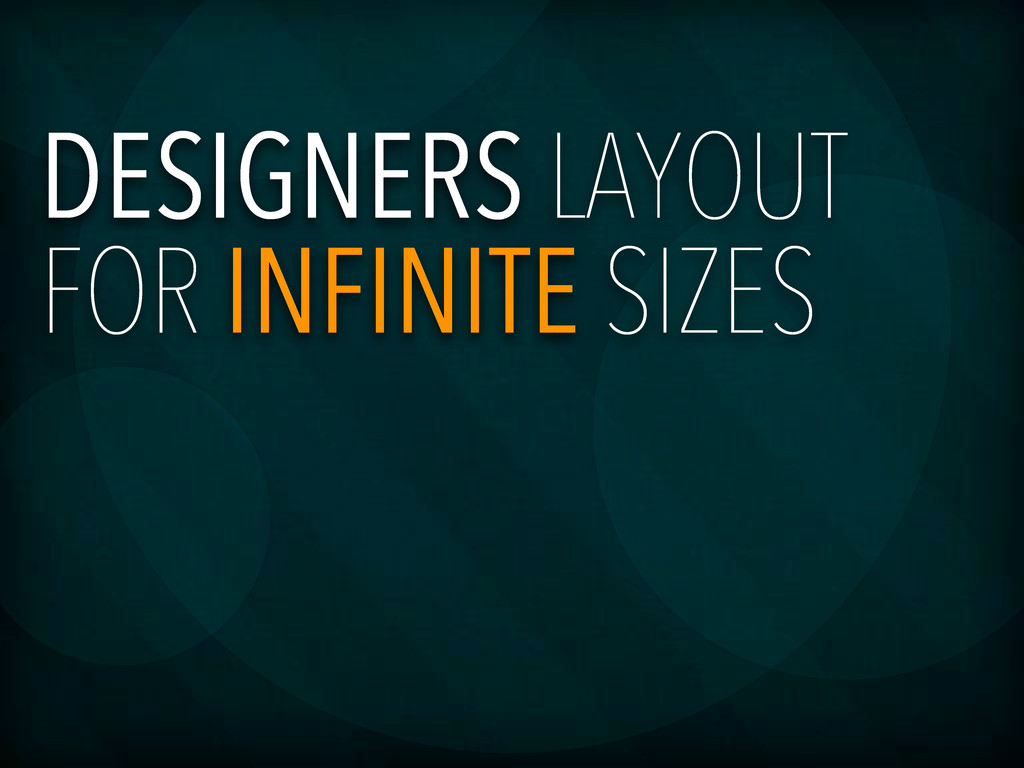
The web browser as a design medium is truly coming into its own. For years we web designers have created our designs in fixed widths, much like our paper-bound cousins. Wonderful methods like the 960 grid system have helped us refine our designs and communicate with developers. The rampant use of mobile devices, especially amongst our primary audience, no longer allows us a common window width to have as our standard. Our medium is now an unpredictable behemoth with screen sizes ranging from phones to HDTVs and beyond. Designers must begin modifying their work methods and incorporating newer tools into the design process.
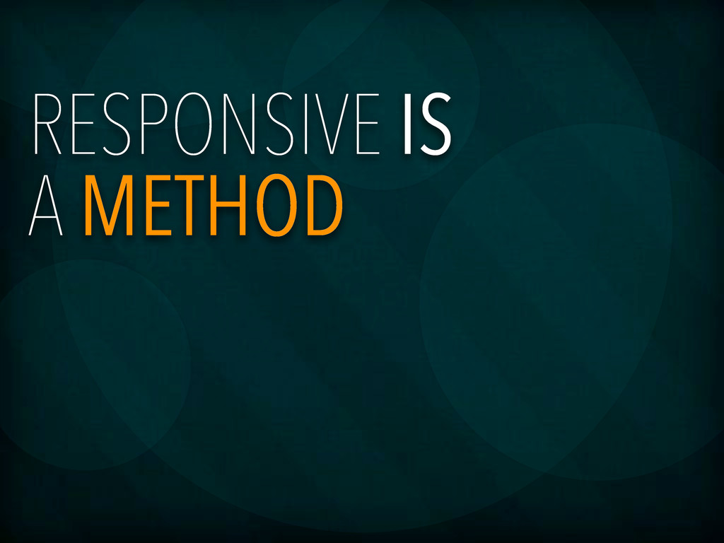
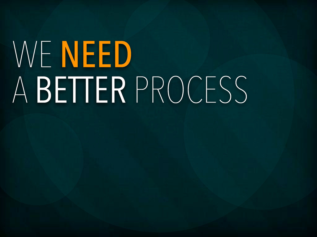
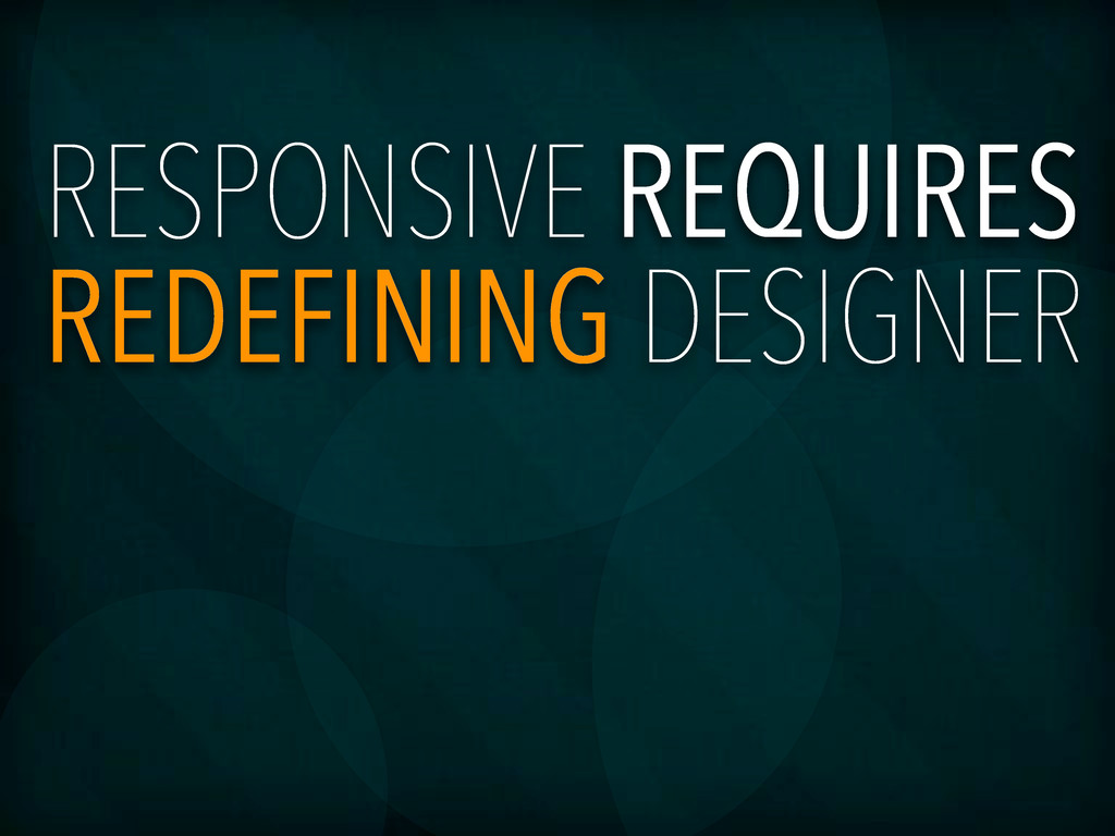
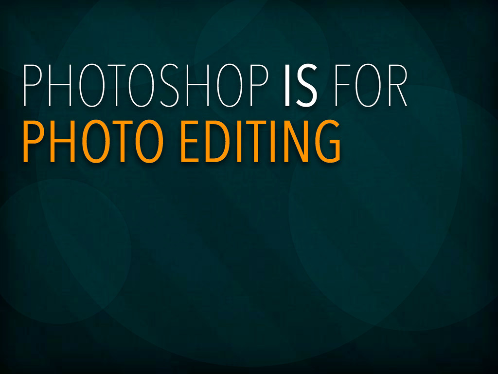
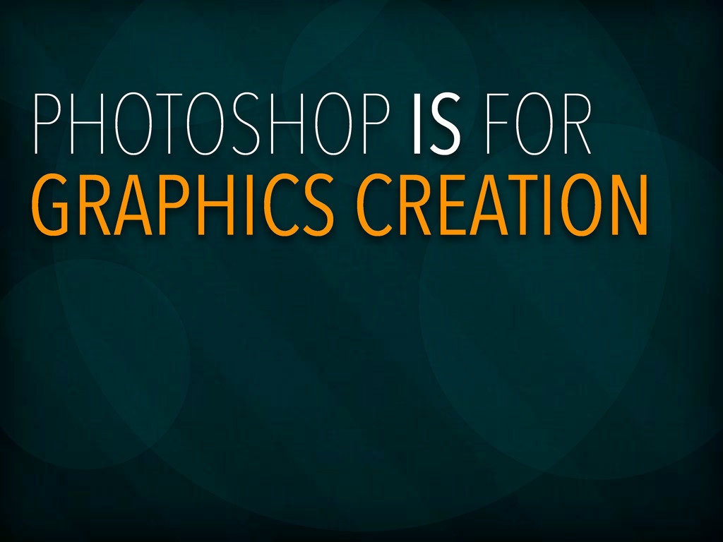
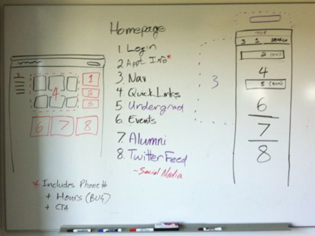
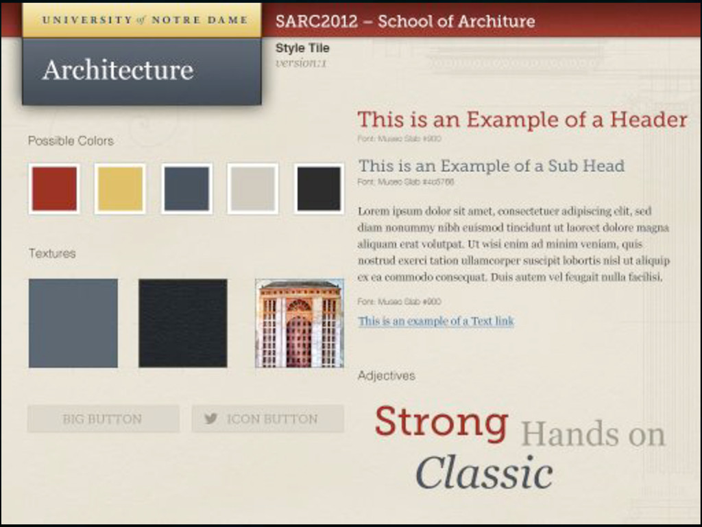
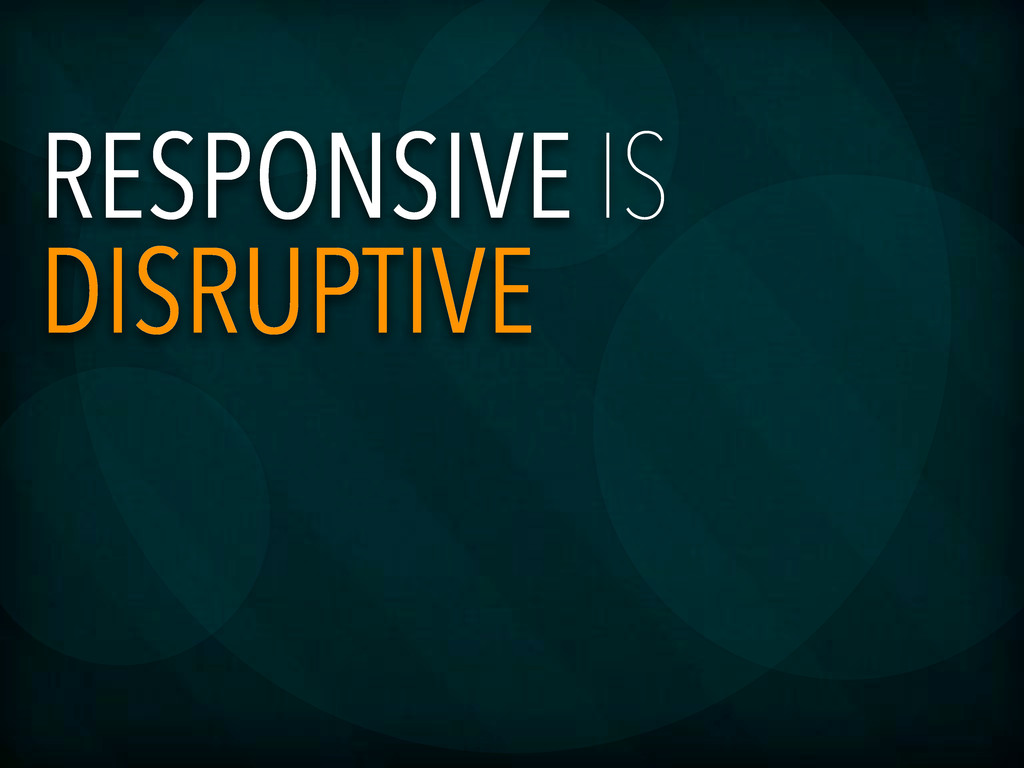
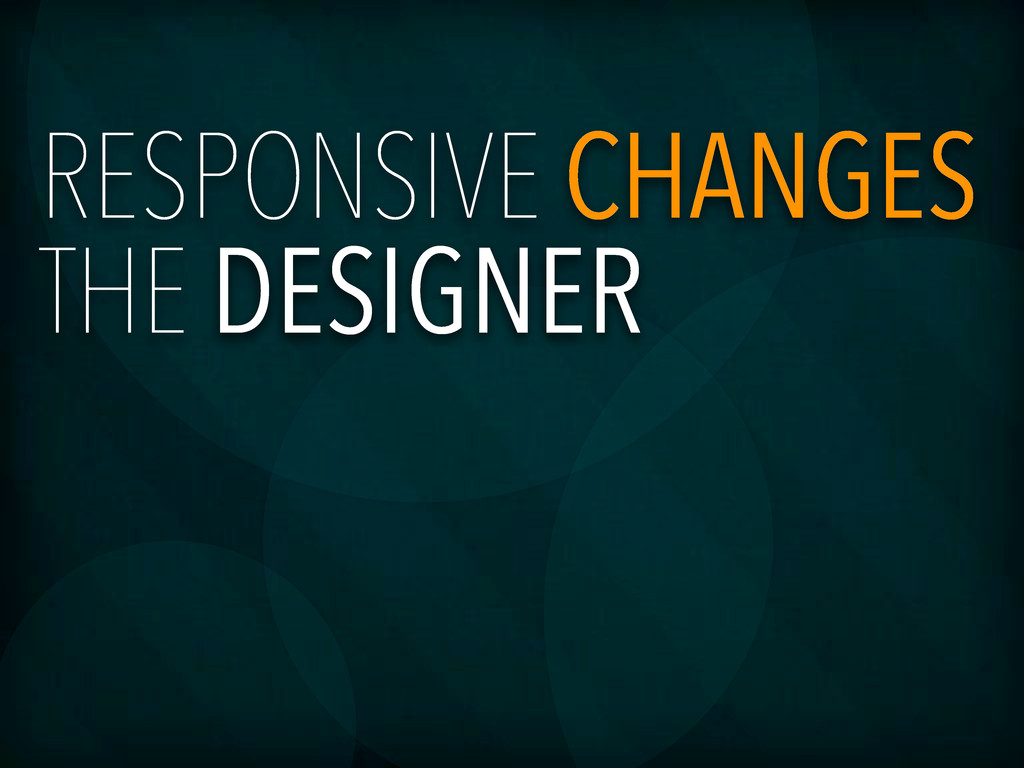
At Notre Dame, Photoshop has increasingly become a single tool, as opposed to the primary, in the process of creating a web design. For years our team has had a silo approach of design and development: a designer is entrenched in Photoshop creating a web design, then the PSD is given to a developer to cut into a website. However, as we have furthered our reach into Responsive Web Design the line between designer and developer is blurring. It is the designer who needs to take on the most and encroach into what is perceived as the developer's territory.
 zastrow
 yamasaku
 mottox2
.jpg) rwang05
rwang05
 kgsi
kgsi
 kenichiota0711
 calpin
 kakukoki
 toshihidemurata
 yuri_ohashi
 bebe
bebe
 usagimaru
 kitanosirokuma
 malarkey
 sferik
 bethany
 aleyda
 jonoalderson
 tamaranovitovic
 rkaga
rkaga
 aarron
.png) helenjbeal
helenjbeal
 yeseniaperezcruz
 bluesmoon
 iamctodd