Upgrade to Pro — share decks privately, control downloads, hide ads and more …

Tools for Uncovering Arrangement and Meaning

Tools for Uncovering Arrangement and Meaning

If we don’t understand the data, information, and content we’re working with, how can we attempt to explain it to others? Worse yet, how can we (and they) make informed decisions based on it if none of us really understands? I’ve spent the past year and a half finding and experimenting with tools to help solve some gnarly enterprise information architecture problems. I was immersed in a world of information that is often duplicated, stale, or untrustworthy, and I was asked to make sense of it. Traditional IA tools couldn’t provide the answers. I wasn’t trying to design a website or app, or produce a deliverable for its own sake — I was trying to understand the information piling up around me, and help others make decisions based on it.

Using my own work as an example, I’ll help you answer and explore questions like:

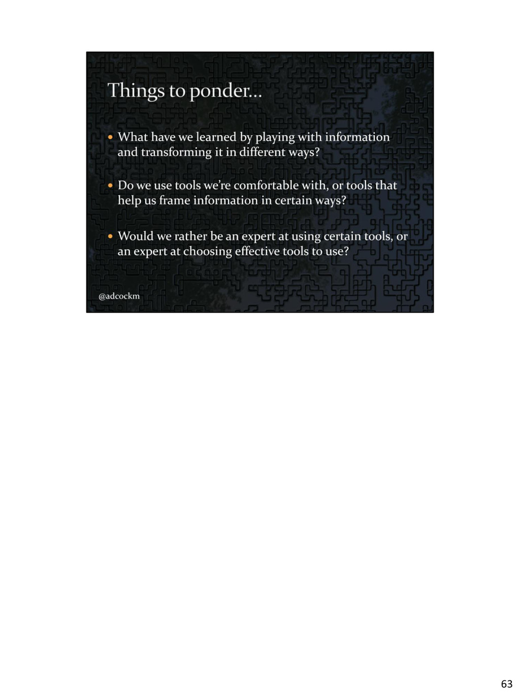
- Should we choose our tools not for what they produce, but for what we can learn from them?
- Where can we even start when we’ve got a large amount of data to figure out?
- What can we learn by playing with information and transforming it in different ways?
- How might we better understand the scope, limits, relationships, patterns, and structures in our information?

Finding useful tools can be difficult, and they can be found in unlikely places. We’ll look at several uncommon tools that have been valuable in my own work, including Gephi, Google Refine, and Tiddlywiki. I’ll share my successes and failures and discuss how I’ve learned to evaluate these tools. If they are unfamiliar, I’ll show you enough to get started using them immediately. After brief overviews and basic examples, you’ll be armed with ways to improve your own work, and new directions to explore!

Michael Adcock

March 29, 2014
Tweet

Other Decks in Technology

Transcript

  1. Note: all slide content is linked to resources and is

    clickable. Find me on Twitter: https://twitter.com/adcockm Background image: http://ingostan.deviantart.com/art/Frankly-my-Dear-I-m-puzzled- 265403017 1
  2. In late 2002 Andrew Hinton wrote up 25 Theses of

    Information Architecture. It came up again in a Twitter conversation last month… https://twitter.com/inkblurt/status/435428748562022400 2
  3. The entire list is still relevant today, but I just

    pulled out the tool-related items here… - We use whatever tools are necessary. - The tools we use come from many different disciplines. This is a good thing. - Some are old, some new, most are still waiting to be invented - Information Architecture as a practice is bigger than any set of tools. http://iainstitute.org/en/learn/research/25_theses.php 3
  4. Twelve years later, and folks are still talking about tools…

    Fred Beecher asked about qualitative analysis, but these kinds of exploratory tool questions seem to keep coming up. Incidentally, for Fred’s particular question, folks responded back with some alternatives to spreadsheets like SPSS, Nvivo, Dedoose, and ATLAS.ti SPSS - http://www-01.ibm.com/software/analytics/spss/ NVivo - http://www.qsrinternational.com/products_nvivo.aspx Dedoose - http://www.dedoose.com/ ATLAS.ti - http://www.atlasti.com/index.html https://twitter.com/fred_beecher/status/447021189471272960 4
  5. Abi Jones recently shared an article related to problems with

    interaction design tools. https://twitter.com/jonesabi/status/446721104552284160 5
  6. In that article, Pasquale D’ Silva says interaction design tools

    need to fit together better and mentions the problem with monolithic tools -- The Photoshop Kitchen Sink Effect™ https://medium.com/p/f755c6515368 6
  7. He also discusses existing tools based on HOW they work,

    rather than WHAT they produce. He’s specifically talking about animation tools for Interaction Design, but how he goes about it is interesting – he identifies three different patterns in the animation tools that exist today… Timeline, Signal Flow, and Code. https://medium.com/p/f755c6515368 7
  8. At the end of the article, Pasquale summed up the

    problem in a very IA-minded way. “We have a variety of contexts to think in, but no common bridge to connect the ideas together. Some problems are best served to be solved in a specific context, or a combination of contexts. We need to consider the option of using a spectrum of complementary tools, rather than just one. We need a toolbox.” https://medium.com/p/f755c6515368 8
  9. But… Haters gonna hate. Seriously, Dan Rubin brings up a

    very good point, and I think what Dan is saying here is that we shouldn’t care as much about using some mythical and perfect “right way” and instead THINK and CONSIDER what it is that we’re trying to do, and learn how to do that better. Each one of us needs to come up with our way (or our team’s way). The tools and other stuff here are a means to an end. Our goal shouldn’t be to become experts on a certain tool or set of tools, but instead to figure out how we can do better work, and do our work better! https://twitter.com/danrubin/status/446969322263830528 9
  10. Sometimes to know what tools to use, you should play

    with them first. Use some tools to play with the stuff. Then you’ll understand what you’re working with a bit better, and you’ll better understand what tools you need. We focus too much on step 4 -- making the thing. (Deliverables, etc.) Instead maybe we should be taking some time to explore and play, to understand what we’re trying to do first, and how best to approach it. https://twitter.com/fred_beecher/status/444863934705565696 10
  11. I had a quick chat with Abi after her earlier

    tweet, and time and process are clearly concerns too. Few of us have time to play, or maybe we’d rather be playing in other ways. 11
  12. MEANING, (arrangement of) PARTS, RULES (for interaction among the parts)

    (Dan focuses on MEANING, ARRANGEMENT, and INTERACTION.) From Dan Klyn’s presentation at UXPA 2013 – Understanding Information Architecture http://understandinggroup.com/2013/07/presentation-at-uxpa-2013-understanding- information-architecture/ 14
  13. Last Monday, Dan Klyn proposed that it’s FRAMES. We use

    frames to see information from different perspectives, in different contexts, and in different ways. That’s how we can find meaning that may already exist in information, and also how we can highlight meaning we want others to see. I think we need tools that help us frame information in different ways. http://1.bp.blogspot.com/- 9joyQkfciSg/TgoheG7jdRI/AAAAAAAAAVs/q6LHHnwIaeM/s1600/2011-05- 11+17.33.22.jpg https://vimeo.com/89986711 15
  14. In a workshop a few days ago, Karl Fast said

    “it’s not thinking then doing, it’s thinking THROUGH doing” The tools I’ll be talking about here are for figuring things out, not just for making things. They let us break data and information up into different kinds of chunks, discover relationships between them, arrange it in different ways, find meanings, and reframe things. And I think we’re currently lacking in these kinds of tools, in both quantity and quality. https://twitter.com/mjane_h/status/448883631843315713 16
  15. Abby’s original slide only had the understanding arrow, but I

    added the “tools” arrows. I’d like to propose that while sometimes we transition between these areas using just our wits, more often than not we need to rely on tools to help us get from data to information, and from information to knowledge. At the first overlap, we’re using tools to discover information in the data. We find patterns, we discover relationships, we look for clues given the context that we’re working in. I suspect that most of the time, we’re using tools here to figure stuff out on our own, or with our colleagues. The result may make sense to us, but only because we’re able to make the leap to knowledge in our own heads because we’ve internalized the stories around the information. At the second overlap, between information and knowledge, I think we’re using tools to present the information in a way that other people might understand. That leap we were making in our own heads needs to be shared through a conversation or story that others can relate to. We want to give them a chance to see what we see in the information, and hopefully be able to use that to accomplish their own goals. “Most of the word information contains the word inform, so I call things information only if they inform me, not if they are just collections of data, of stuff.” - RSW http://www.slideshare.net/AbbyCovert/make-sense-information-architecture-for- everybody 17
  16. And it turns out that organizing information can be difficult.

    Organizing information in a meaningful way can be really difficult! Wurman quotes from Dan Klyn’s Information Architecture course: http://si658.danklyn.com 18
  17. Though Wurman warned that understanding doesn’t mean simplification, we have

    to be able to simplify things so we can work with them. Our tools can help us simplify things, even if the final presentation or implementation is anything but simple. http://understandinggroup.com/2013/03/some-simple-models-for-user-context/ 19
  18. With appropriate tools, maybe we can have better conversations with

    the information we’re working with. And that could lead to better things that others could converse with and understand. http://understandinggroup.com/2014/03/cool-finds-bonus-richard-saul-wurman- interview-knowledge-management 20
  19. Wurman also talked about the difference between approaches in WHAT

    people and HOW people. Wurman quotes from Dan Klyn’s Information Architecture course: http://si658.danklyn.com 21
  20. Dan Klyn argues that Architecture is more concerned with the

    WHAT. Design is more concerned with the HOW. and that we should Put the WHAT before the HOW. http://www.slideshare.net/The_Understanding_Group/what-before-how-making-a- home-for-information-architecture 22
  21. First, we need a good text editor. Why? Because we’re

    often dealing with textual content. And we might need to do things like search and replace, reformatting data so we can get it into another tool, or simple kinds of analysis like line counts or word counts. Word processors are aimed at display and presentation of textual content, while text editors are for manipulation of textual content. http://notepad-plus-plus.org/ 25
  22. Some of the best editors have support for plugins and

    other functionality, to let you do simple analysis or more elaborate manipulations of the content. NotePad++ is Windows only, but TextMate and BBEdit are available on the Mac. There are lots of different text editors though, so picking one is more of a personal preference. http://notepad-plus-plus.org/ 26
  23. Data of various kinds often ends up in spreadsheets. While

    Excel or Pages let you do simple sorting or graphing, they don’t make it easy to explore the data. https://code.google.com/p/google-refine/ 27
  24. Google created a free tool a while back which has

    since been re-released as an open source tool under a different name. Even though it’s a web based app, you download and run the entire thing locally, and it works on all platforms. It provides some powerful functionality, like the ability to facet on values in a column with a couple of clicks. With each value you get a count. Once you’ve got one or more faceted views showing, you can pick a value and filter only on those rows. You can filter on different column facets at the same time to narrow down your results even more. With this sort of slicing and dicing, you can quickly get a feel for what you’re working with. And you can edit or manipulate the result in different ways. (Showing Facets) https://code.google.com/p/google-refine/ 28
  25. There are all sorts of ways to explore and modify

    tabular data in Google Refine, and while many things can be done quickly, there’s always the danger of messing up your data. Thankfully, it also provides a really nice undo feature. It’s not just a step-by- step undo. As you work, it automatically maintains a complete list of all the changes that have been made, with descriptions, and you can easily roll back (or forward) to any step in the process. It also saves after every change is made. (Showing Undo) https://github.com/OpenRefine/OpenRefine 29
  26. It’s fairly difficult to understand though. While it’s not like

    learning how to use macros or VLOOKUP in Excel, just knowing where to look in the menus, or what different operations are called can be confusing. Enough other people have found the tool to be equally useful and frustrating that there are several resources on the web like this blog that gives examples of how to do various things. I’ve found I can spot problems in spreadsheets more easily in Refine, and things that would take some major effort to do in Excel can be done quickly in Refine if you know where to look. The time you save might be worth the extra bit of research up front. http://googlerefine.blogspot.com/ 30
  27. I also find myself working with various blobs of text,

    and the relationships between them. This could be anything from a collection of thousands of articles of user documentation, to terms in a taxonomy or thesaurus, to a large collection of product configuration files. http://classic.tiddlywiki.com/ 31
  28. It turns out Tiddlywiki is an excellent platform and more

    targeted textual analysis tools can be built on top of it. The original creator of Tiddlywiki intended it to be a sort of personal note taking and mind mapping tool. But conceptually it’s like a database, with uniquely named chunks of content that can link to each other like a wiki, and also a tagging system and a dynamically generated timeline showing changes made to the content inside. Implementation-wise, it’s a single HTML file that contains your data and all the features and functionality implemented in Javascript. Edits you make get saved back to the file. Tiddlywiki also supports add- ons and extensions that are written in Javascript – lots of interesting extensions are available for the classic version. http://classic.tiddlywiki.com/ 32
  29. When I was in grad school, back in 2007 earning

    my MLIS degree, I took a course on thesaurus construction. We had a course long group project to construct a thesaurus. While collecting terms and doing some initial work in Excel was reasonable, it seems like it would be really cumbersome and error prone to copy the terms around between Excel, index cards, and then type them all up again in our final project report and in the classified and alphabetical schedules. http://michaeladcock.info/archive-UW/amateurastronomythesaurus/ 33
  30. There’s a lot of housekeeping tasks to keep track of

    too, like making sure that if a broader term points to a narrower term, that the narrower term points back. While there are large commercial tools for this sort of thing, we couldn’t find anything simple and free. So I adapted a Tiddlywiki to not only import our terms from Excel, but also to dynamically build the two schedules based on the relationships between the terms. I added some error checking tools to ensure the linkages between terms were correct, and if anything strange or missing was found we knew what we needed to fix. It took some effort to build up front, but it ended up saving us more time in the long run, and it made it easier to tweak and update the terms even later in the project because that didn’t generate any extra work for us. http://michaeladcock.info/archive-UW/amateurastronomythesaurus/ 34
  31. Just last year, I used a Tiddlywiki at work to

    analyze lots of client configuration files, so we could make informed decisions about migrating those configurations from one system to another. In this case I didn’t import the data into the Tiddlywiki, but instead built the Tiddlywiki around the data. Since it’s just a single HTML file, I figured out where the data was stored, and what format it was in, and built a new file by writing some Perl script to insert the configuration data into the right place in the empty file. The timeline of changes appeared for free since I included metadata about when the configurations had changed. The graphs, charts, and other analysis tools were built using plugins and some custom code, but they are all data driven by the configurations in the file. http://charts.tiddlyspace.com/recipes/charts_public/tiddlers.wiki 35
  32. Tiddlywiki also provides a full text search feature. And it

    can be extended with some powerful plugins. https://github.com/abego/YourSearchPlugin 36
  33. The newest version of Tiddlywiki is in beta, and has

    been rewritten from the ground up using HTML5 and JQuery. It can also be run via Node.js, has some touch input features, is responsive to different screen sizes ad layouts, and performs better than the classic version. The one thing it’s currently missing is many add-ons, though they will probably appear in time. http://tiddlywiki.com/ 37
  34. There’s also some documentation appearing for the newest verion, including

    sites like this one that show various tip and tricks. So while it can be used as a note taking tool or personal without effort, I think the true value of this tool is as a platform to build textual analysis and text-driven exploration tools. http://www.giffmex.org/tw5mall.htm 38
  35. We’re often interested in the connections between things we’re working

    with, and in the patterns and groupings that naturally exist because of those connections. https://gephi.org 39
  36. Gephi is a network visualization and analysis tool for exploring

    graphs. But really, you can look at anything as long as you can get your data into the form of a list of nodes and a list of connections between those nodes. If your data fits that pattern, you can start to explore it visually with Gephi. https://gephi.org 40
  37. A year or so ago, I worked on a project

    to analyze the online documentation we provided to customers at ProQuest. It wasn’t hosted in a content management system, but instead in a CRM system that also could host documentation. Because of that, the system was missing some features like the ability to check for broken links. I extracted all the articles, wrote some code to identify and record all the links between articles, and then generated a node and edge list that could be fed into Gephi. I also included some metadata for each article, so we’d know what we were looking at. This screenshot shows a web based exploration tool that can be generated with an extension in Gephi, once you’ve got your data loaded and analyzed. Being able to see these connections and play with them a bit led to all sort of insights beyond just finding dead links. And this didn’t even look at usage data which we also had and took a look at separately. https://marketplace.gephi.org/plugin/gexf-js-web-viewer/ 41
  38. Sometimes I have the luxury of experimenting for the sake

    of experimenting, and this was one of those cases. Years ago I had seen a cool video that graphically showed changes over time in a source control system. I wondered if it might be used for other types of information. https://code.google.com/p/gource/ 42
  39. The data format was pretty simple, with just a timecode,

    a name for the person who made the change, what type of change was made, and some other things like the color to use for the marker. Since I still had that documentation metadata lying around, I got it into the correct format and fed it into Gource. While it made a nice video, I didn’t realize it could be useful until I showed it to the manager who was responsible for that documentation. As he watched, he started noticing major events that had happened in the evolution of the system, and the conversation we had revealed a number of things I wouldn’t have known about the system. That came in handy when it came time to migrate the content to a completely different system this year. In this case the tool didn’t help me understand anything directly, but it prompted someone else to share useful information. 43
  40. Sometimes you can learn more about your data by creating

    a visualization from it. While some of these could be shared with others and used to explain things, visualizations can be useful for figuring out patterns and trends in the data you have. http://d3js.org/ 44
  41. Though more of a framework and almost like a software

    development kit, it’s possible to use the extensive library of D3 examples without creating a new visualization from scratch or writing much, if any, Javascript. http://d3js.org/ 45
  42. There are lots of examples available, so if you can

    find a visual framing of your data that seems to make sense, you might be able to adapt a sample to look at your data instead. Usually some amount of editing is needed though. http://christopheviau.com/d3list/gallery.html 46
  43. RAW is another visualization tool that requires no coding at

    all. You simply copy your data into the web based tool, and you can play with different types of visualizations using the same data set. It uses D3 to show its visualizations. http://raw.densitydesign.org/ 47
  44. Sometimes you might want to know more about a chunk

    of English language text, like how clear it is in terms of language. http://www.hemingwayapp.com/ 48
  45. Hemingway is a relatively new tool, but it seems to

    be filling a gap no one had really noticed before. While it may not be as good as a human editor, the readability analysis score, counts, and highlighting provide a different way to think about and improve writing. http://www.hemingwayapp.com/ 49
  46. I’d also like to take a look at a few

    tools for storytelling, which I’ll show by way of a story. As many of you may know, World IA Day took place last month, in 24 cities around the world. http://2014.worldiaday.org/ 50
  47. …asked if I would put together a video that could

    be used during World IA Day. (Some of you might know I have a little bit of a reputation for things like that.) https://www.youtube.com/watch?v=f07GnVV19YM https://vimeo.com/86360044 52
  48. Goals: Show the global nature of the event but also

    highlight each local focus. Show how all the local efforts address the theme. Make the video fun & interesting. 53
  49. Idea: show the WIAD logo moving between the host cities

    to show it’s a global event; zoom in on each host city 54
  50. Idea: create a survey and collect responses from each local

    site; show their response in context 55
  51. I wanted to tell this story with maps, so I

    needed to find a tool that would let me script a path through various locations on a map, and have full control over the timings and movement. http://www.animaps.com/ 56
  52. Free, browser based. Lots of rough edges and plenty of

    bugs. But it was easier and quicker than figuring out how to use the Google Maps API and building a custom website. While you can play back the recording inside the tool, there’s no way to export it as a video. (Guess I’ll need another tool for that!) http://www.animaps.com/ 57
  53. Since we collected submissions from the host cities, we had

    plenty of audio to work with, but it was in different formats and at different volume levels. Some of it needed to be edited down so it would fit within time limits in the video. http://audacity.sourceforge.net/ 58
  54. Free on (Windows, Mac, Linux) For clipping and rearranging audio

    samples, normalizing the volume, and doing minor cleanup. http://audacity.sourceforge.net/ 59
  55. Since Animaps didn’t have a way to save video, and

    I needed to be able to add overlays and other things on top of the animated map anyway, I had to find a video tool. http://www.techsmith.com/camtasia.html 60
  56. Not free. (Windows, Mac) Camtasia allowed me to capture the

    web animation from Animaps, and layer on top all the extra things like pictures, transcripts, and audio. http://www.techsmith.com/camtasia.html 61
  57. As its name implies, this website called alternativeTo allows you

    to search for a particular application and then find alternatives to it. So if you know about a potentially useful tool for one platform, you might be able to find a similar tool on another platform by seeing what comes up. The relationships this site often reveal related tools rather than replacements. But that’s great too, because if you have a tool that almost does what you need, you might be able to find a slightly different replacement for it that does what you need. http://alternativeto.net/ 62
  58. 63