$30 off During Our Annual Pro Sale. View Details »

The Evolution and Design of a Visualization Project

Scott Murray
December 04, 2013

The Evolution and Design of a Visualization Project

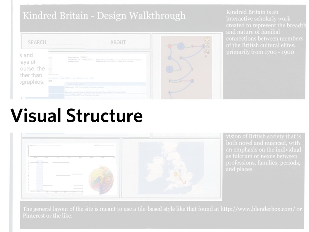
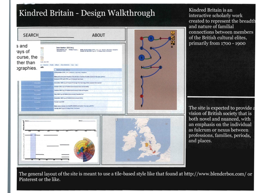
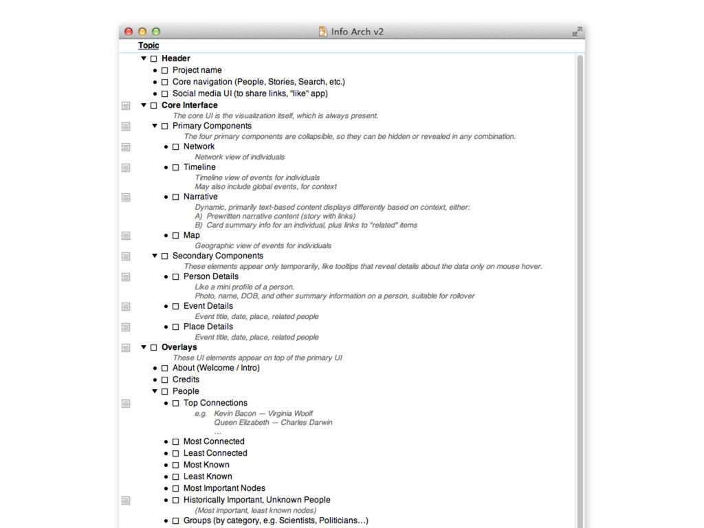
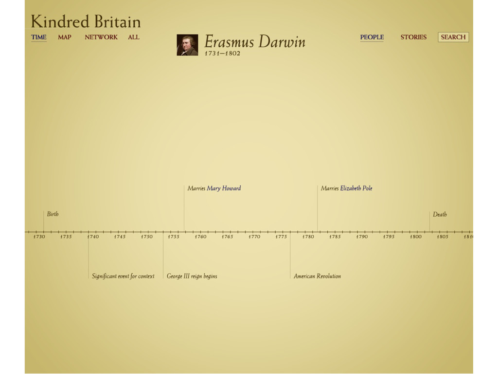
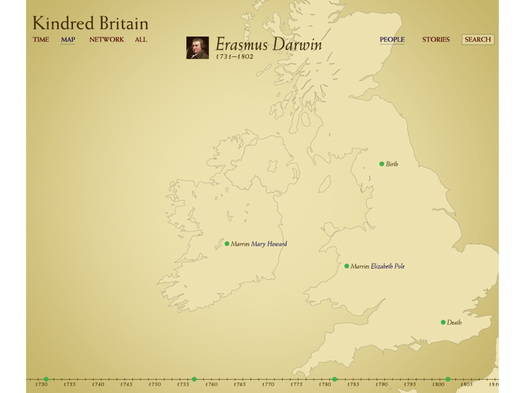
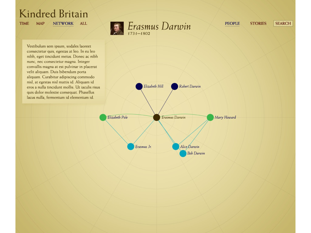
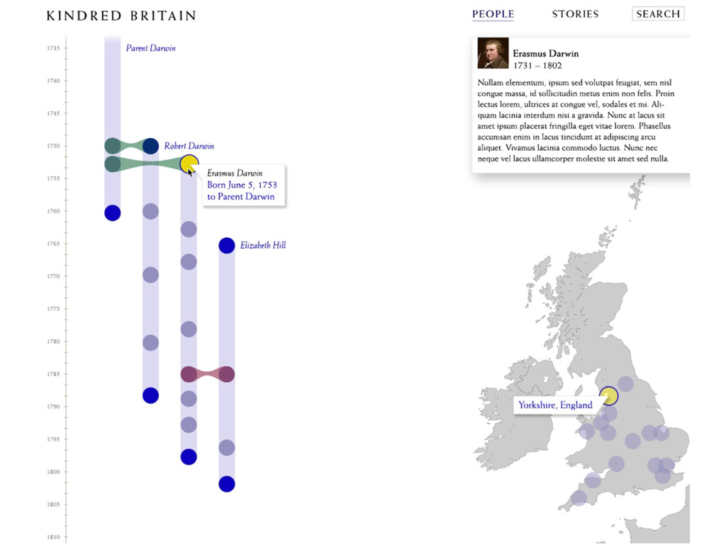
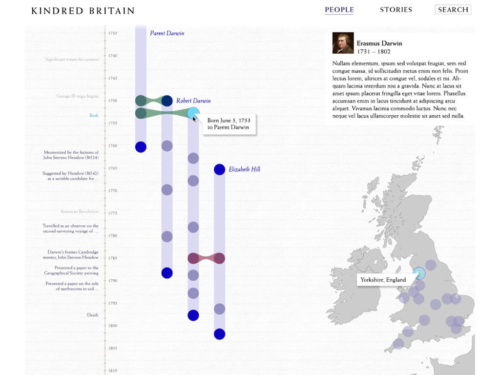
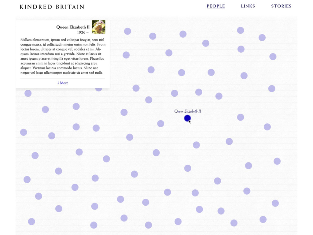
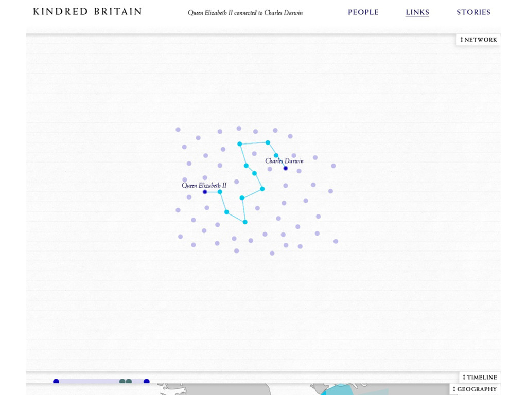
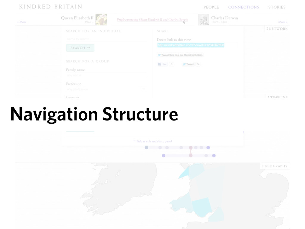
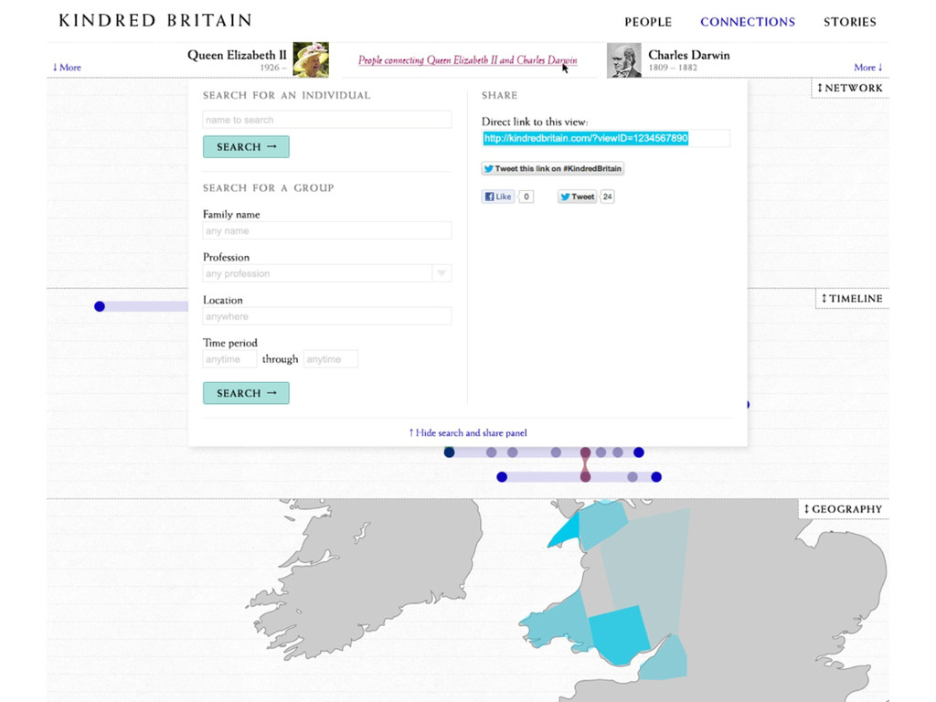
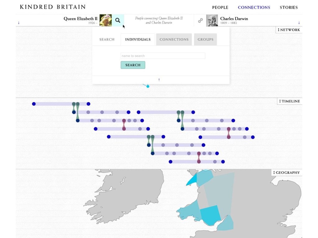
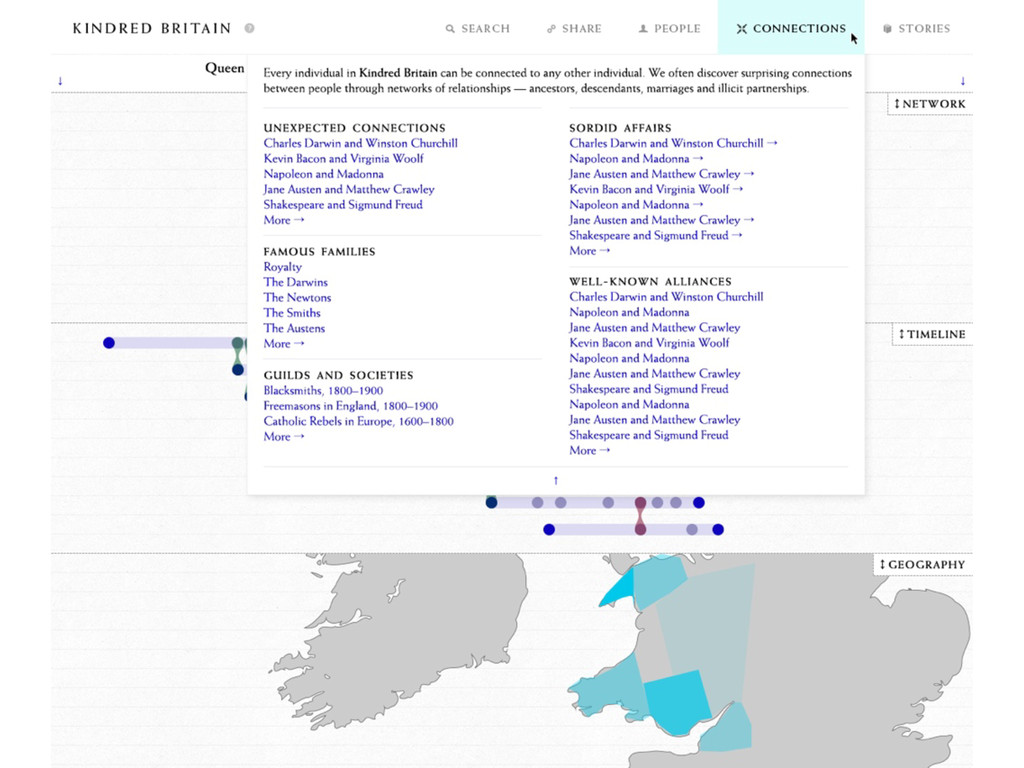
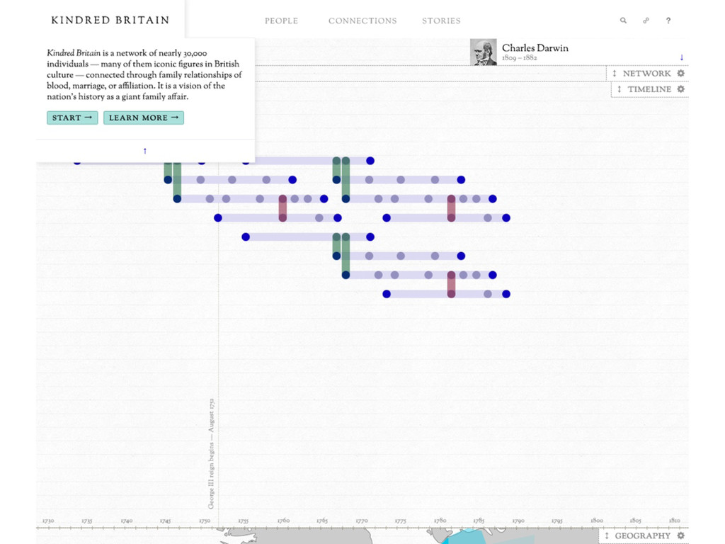
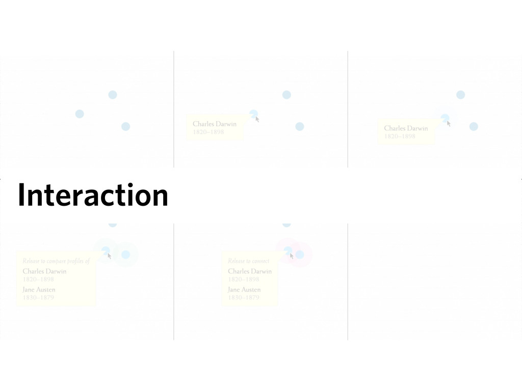
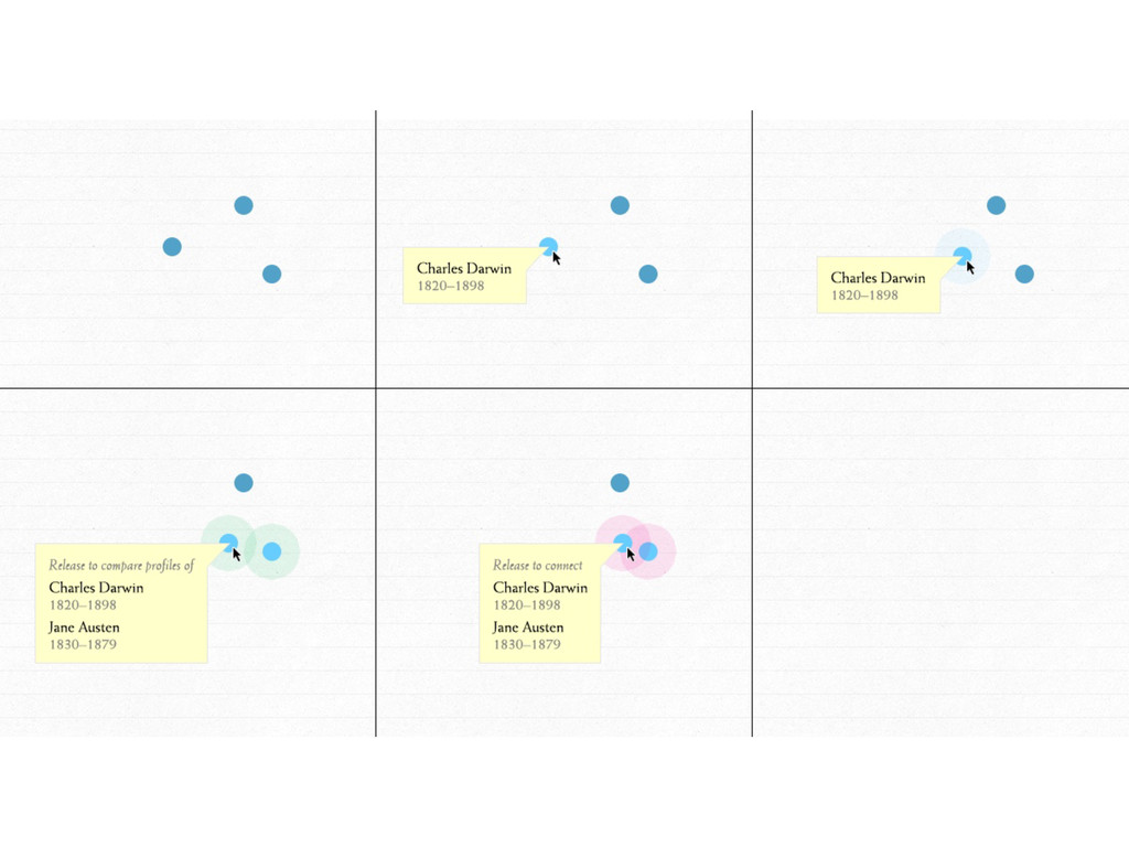
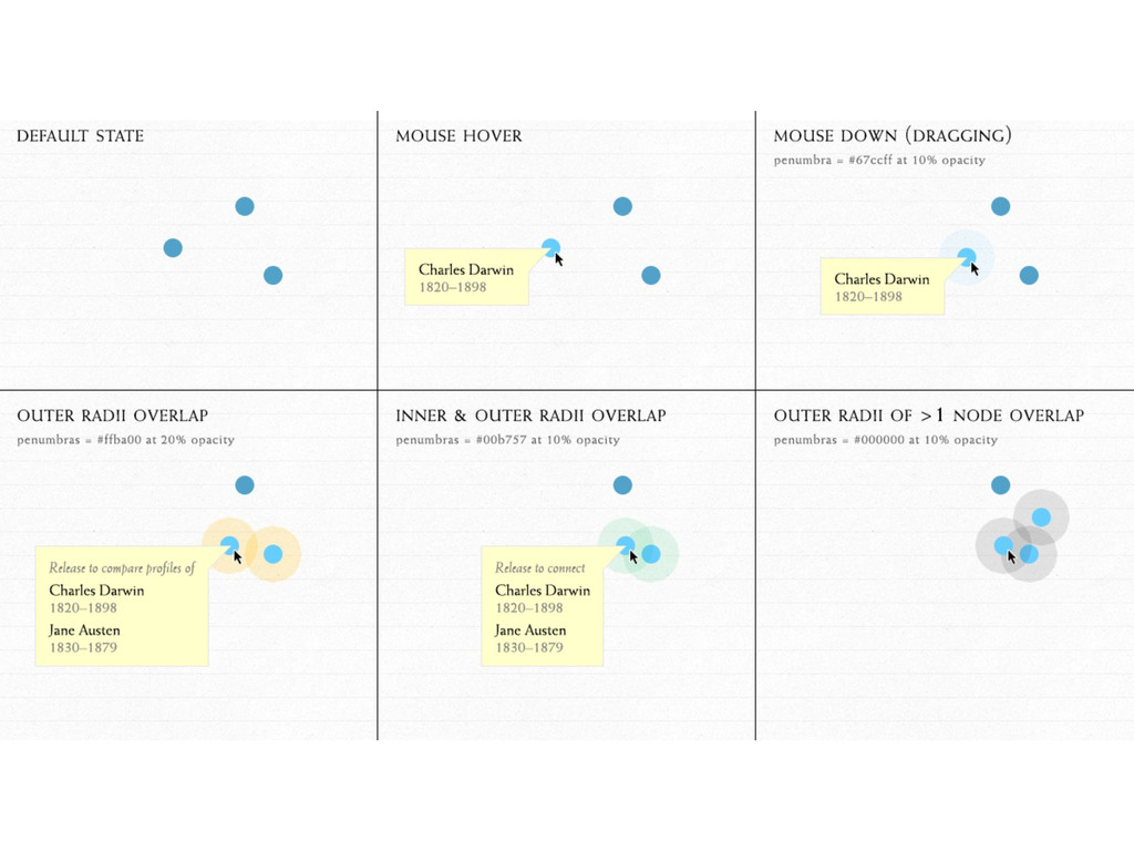
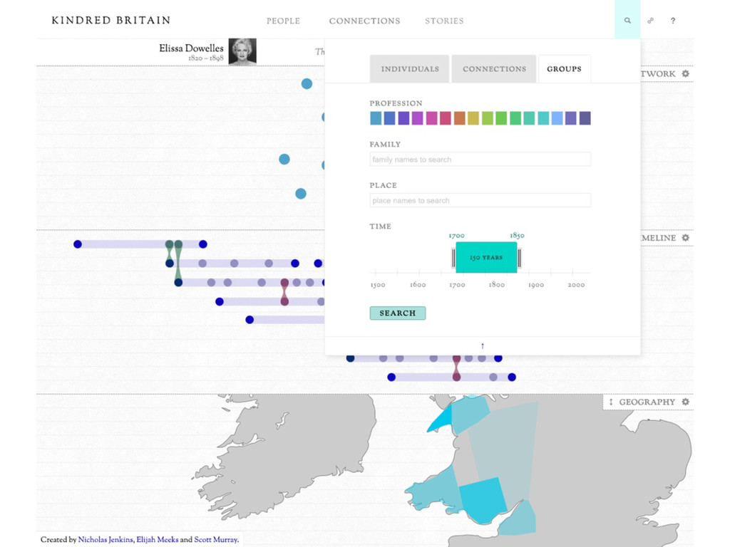
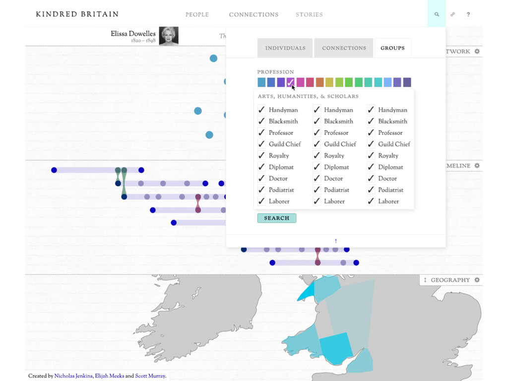
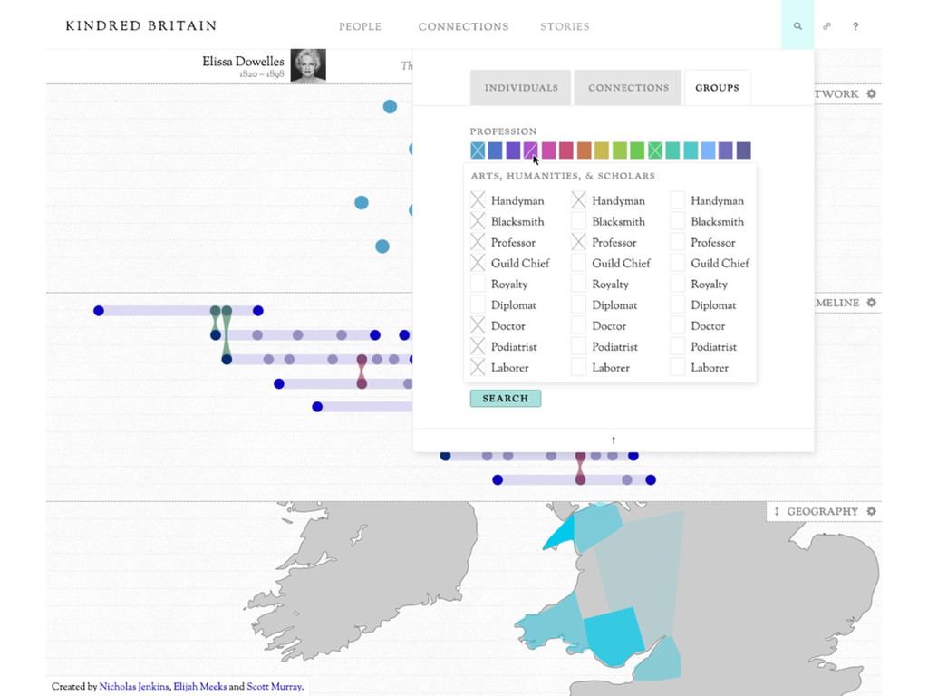
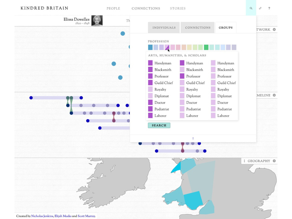
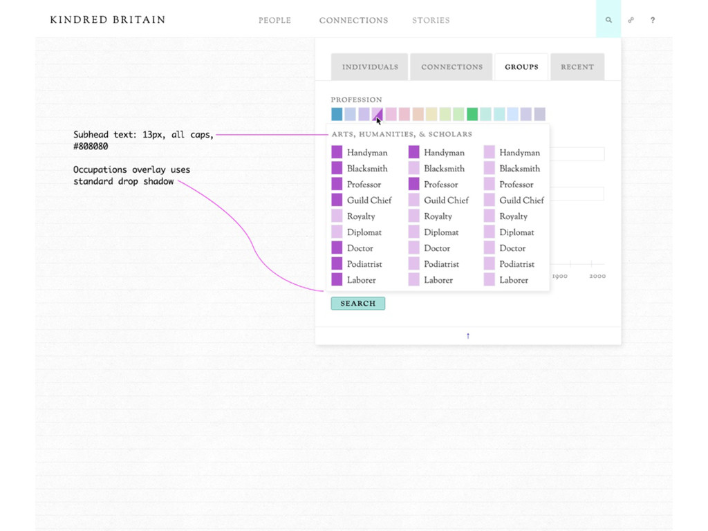
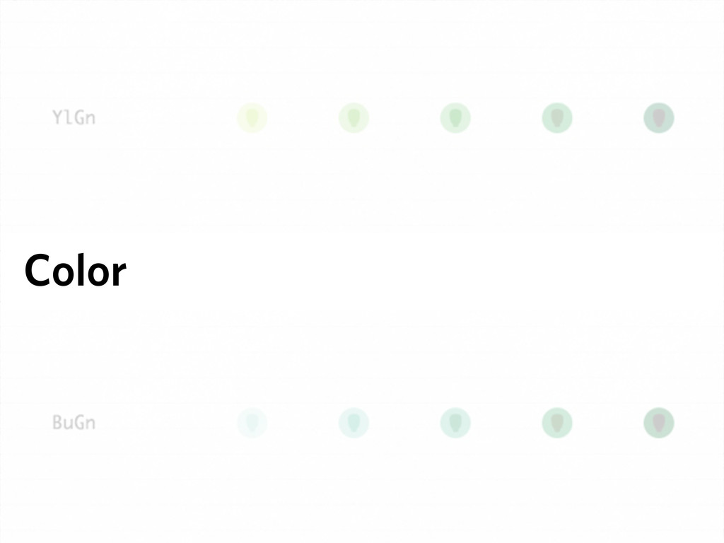
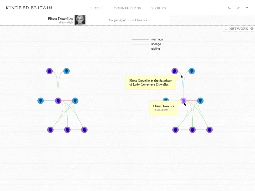
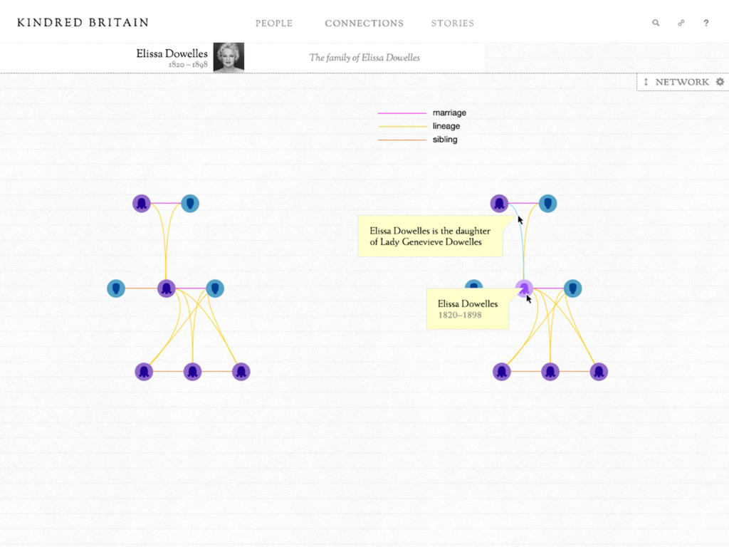
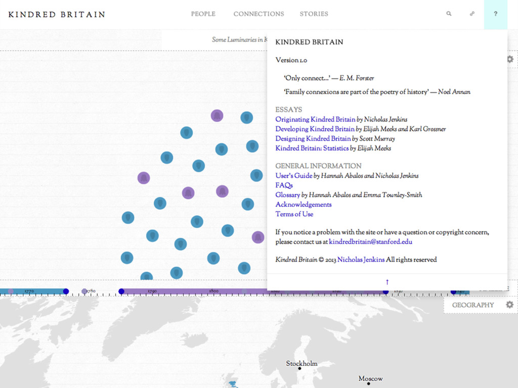
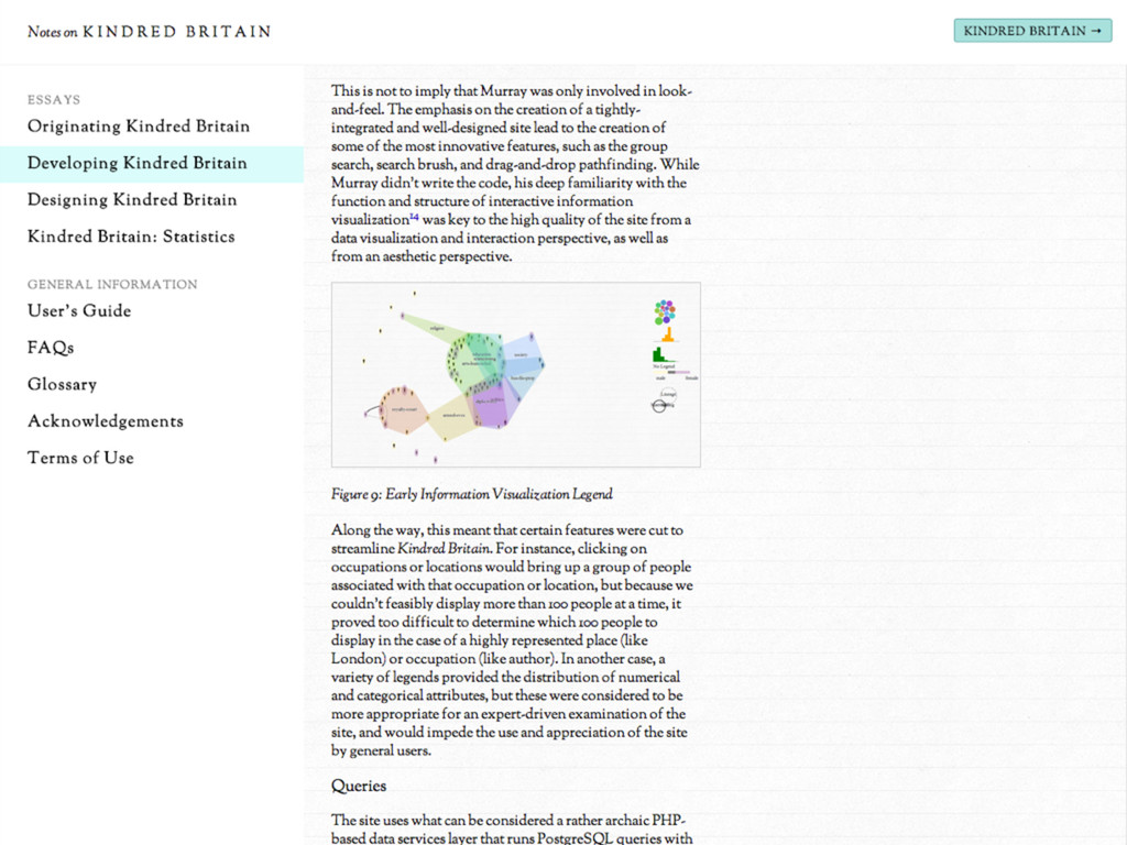
A discussion of the design process behind Kindred Britain (kindred.stanford.edu), an interactive network visualization and digital humanities project, made with Nicholas Jenkins and Elijah Meeks of Stanford University. The talk highlighted five core elements of the design process: visual structure, navigation structure, interaction, color, and authorship.

Scott Murray

December 04, 2013
Tweet

More Decks by Scott Murray

Other Decks in Design

Transcript

  1. Scott Murray
    Assistant Professor, Design
    University of San Francisco
    Primary Identity —Full Name Logos
    University of San Francisco’s primary visual
    identification uses the university’s full name
    spelled out. This logo should be used as the
    first identification where appropriate in all
    external communications, whether print, web,
    or electronic materials, and merchandising
    items.
    Note: Use the tagline logo with discretion as to
    context. Do not use the tagline logo if “Change
    the world from here” has an unintended
    associated meaning, for instance on a student
    comedy night poster or a bookstore
    promotion, in which case use the full name
    logo without tagline, see next page.
    The Full Name Logo with Tagline 2-Lines is the
    recommended identification. Use this version
    whenever possible.
    Alternates: Use the Full Name Logo with
    Tagline 1-Line for applications where space
    parameters dictates an extreme horizontal
    format.
    The Full Name Centered Logo with Tagline is
    advisable for vertical or square formats.
    All Full Name Logos are available as 3-color
    logo— USF Green, USF Yellow, and USF Gray;
    2-color logo—USF Green and USF Yellow; or
    one-color logo—black and white.
    FULL NAME LOGO WITH TAGLINE 1-LINE
    FOR EXTREME HORIZONTAL SPACE RESTRICTIONS
    RECOMMENDED: FULL NAME LOGO WITH TAGLINE 2-LINES
    PRIMARY LOGO, VARIATIONS:
    FULL NAME LOGO WITH TAGLINE CENTERED
    FOR SQUARE FORMAT SPACE RESTRICTIONS
    The Evolution and Design
    of a Visualization Project

    View Slide

  2. K I N D R E D B R I TA I N
    kindred.stanford.edu
    Nicholas Jenkins
    Associate Professor, English
    Stanford University
    Elijah Meeks
    Digital Humanities Specialist
    Stanford University

    View Slide

  3. Visual Structure

    View Slide

  4. View Slide

  5. View Slide

  6. View Slide

  7. View Slide

  8. View Slide

  9. View Slide

  10. View Slide

  11. View Slide

  12. View Slide

  13. View Slide

  14. View Slide

  15. View Slide

  16. View Slide

  17. Navigation Structure

    View Slide

  18. View Slide

  19. View Slide

  20. View Slide

  21. View Slide

  22. Interaction

    View Slide

  23. View Slide

  24. View Slide

  25. View Slide

  26. View Slide

  27. View Slide

  28. View Slide

  29. View Slide

  30. View Slide

  31. View Slide

  32. View Slide

  33. View Slide

  34. Color

    View Slide

  35. “...avoiding catastrophe becomes the first
    principle in bringing color to information:
    Above all, do no harm.”
    —Edward Tufte, Envisioning Information

    View Slide

  36. “Position is everything.
    Color is difficult.”
    —Moritz Stefaner

    View Slide

  37. View Slide

  38. View Slide

  39. View Slide

  40. View Slide

  41. View Slide

  42. View Slide

  43. View Slide

  44. Authorship

    View Slide

  45. View Slide

  46. View Slide

  47. View Slide

  48. View Slide

  49. View Slide

  50. View Slide

  51. View Slide