$30 off During Our Annual Pro Sale. View Details »

Interface Design Considerations for Data Visualization

Scott Murray
March 12, 2014

Interface Design Considerations for Data Visualization

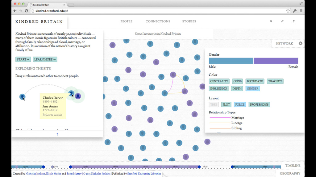
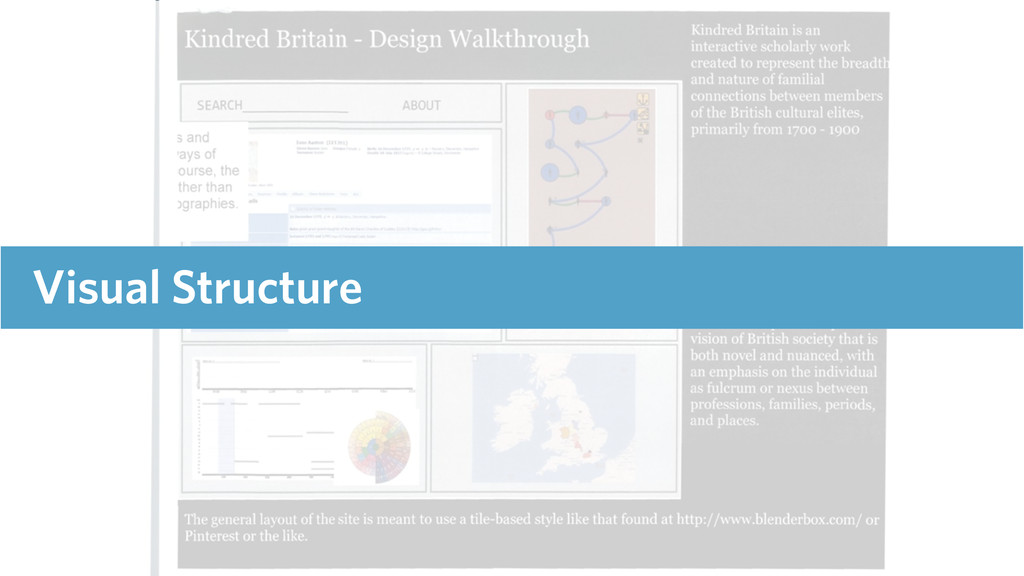
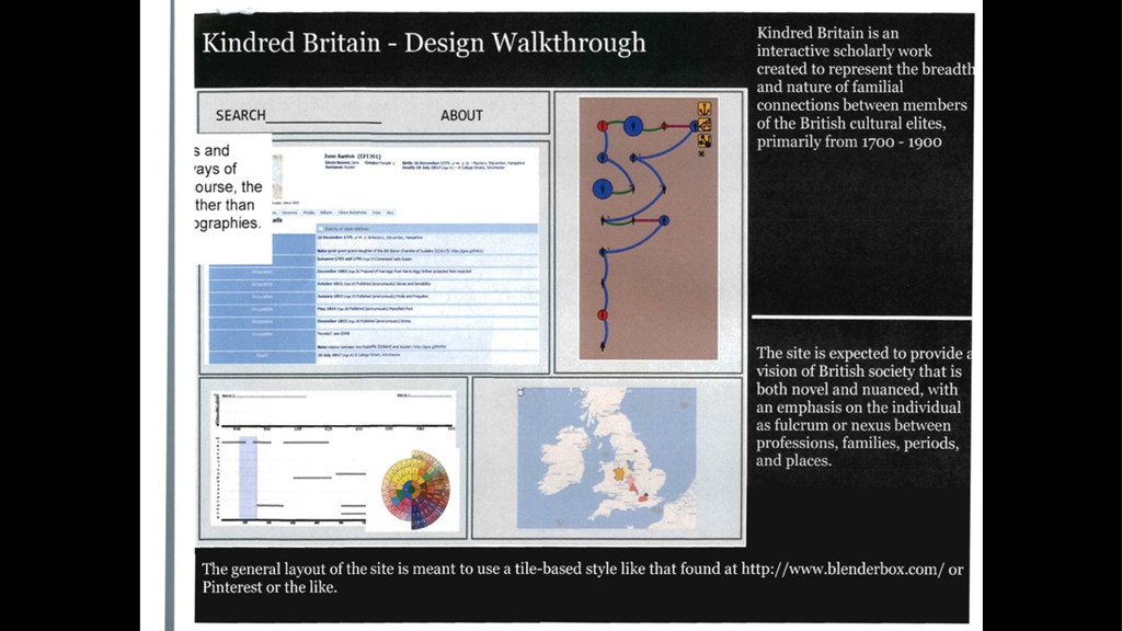
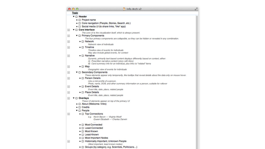
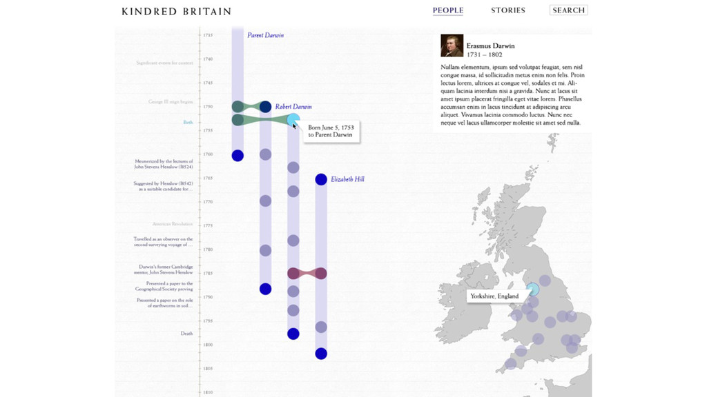
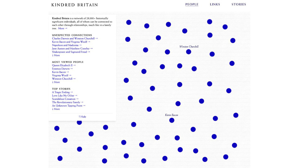
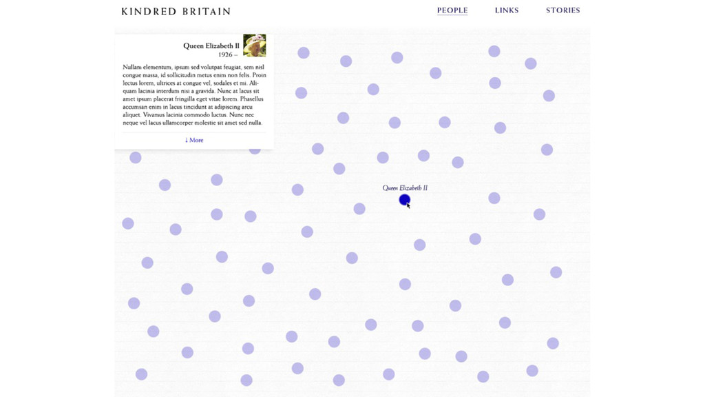
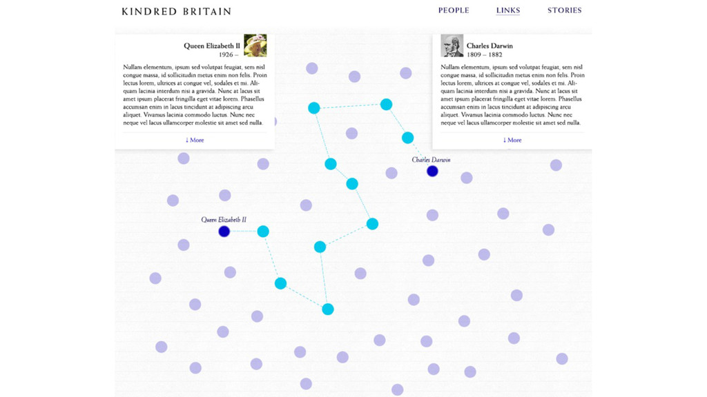
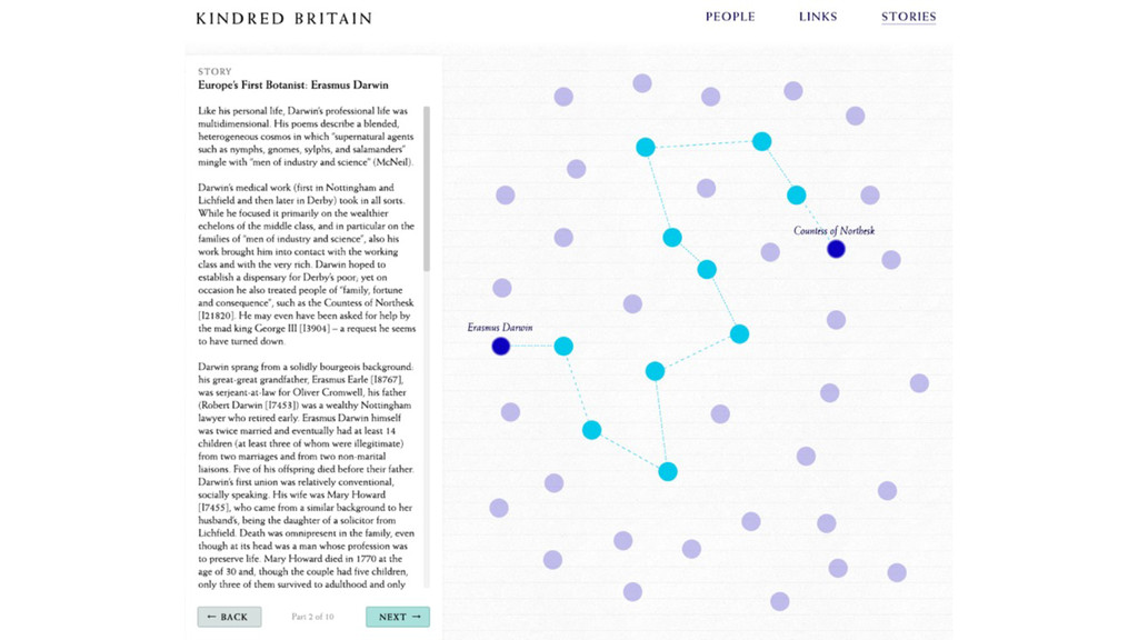
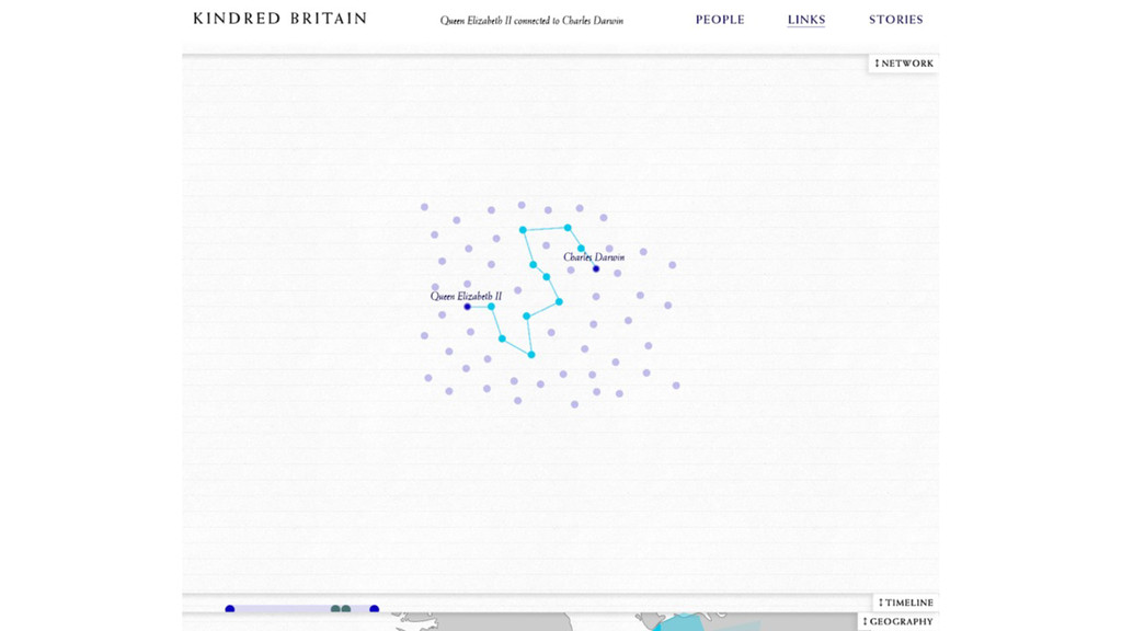
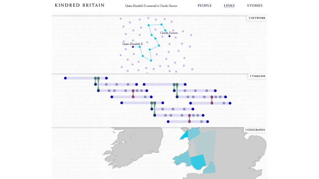
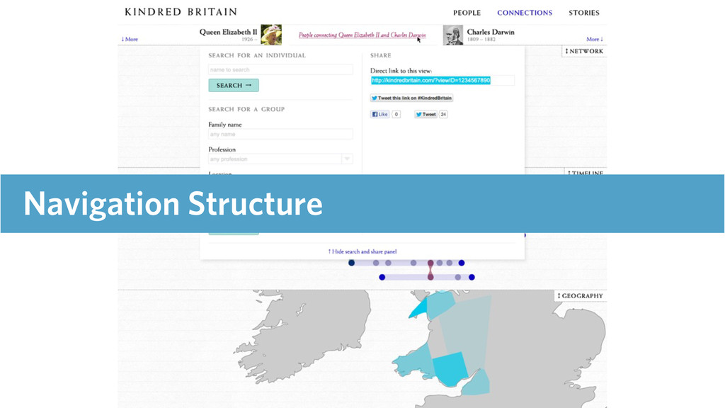
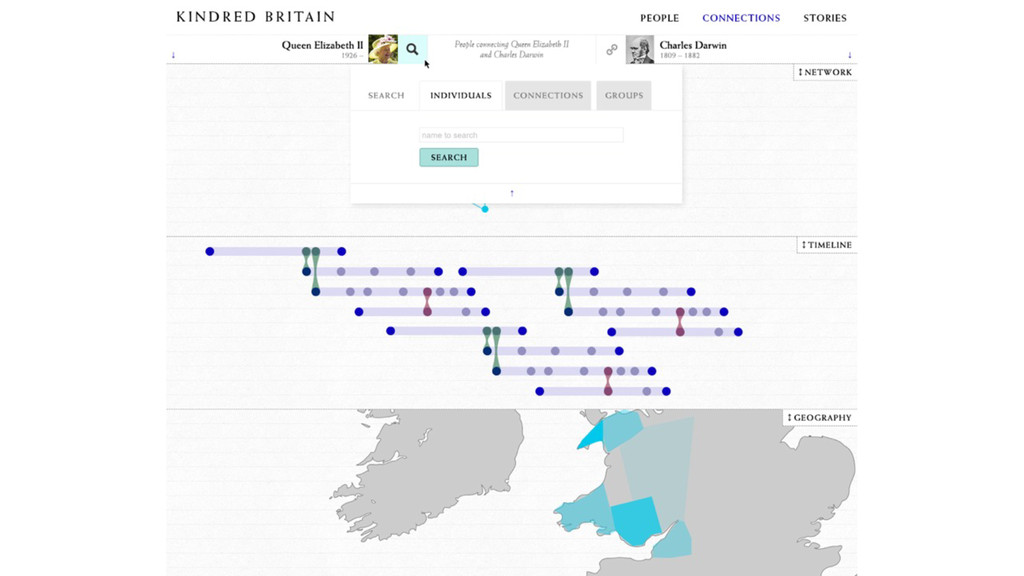
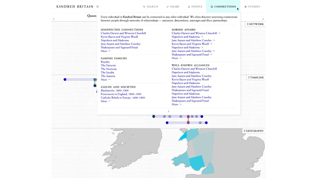
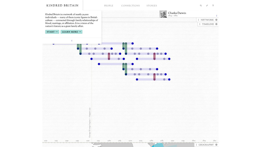
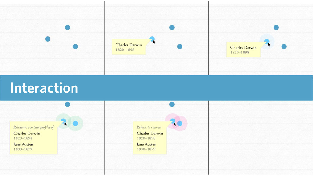
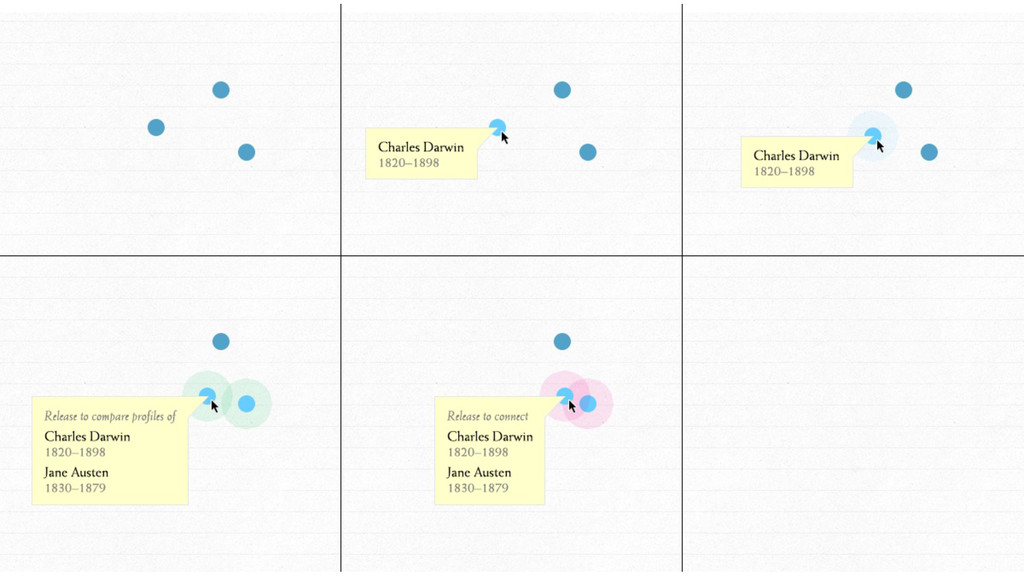
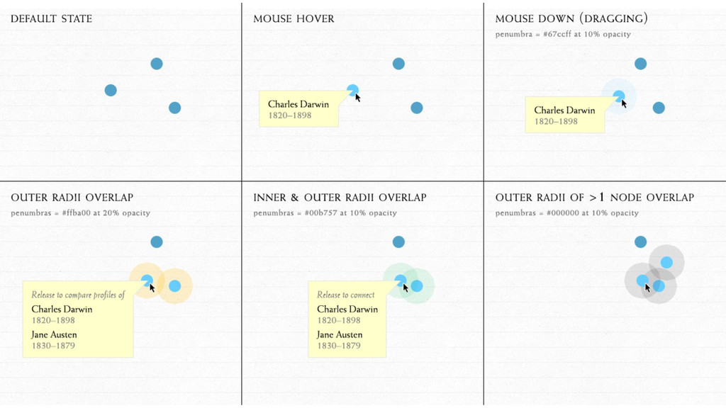
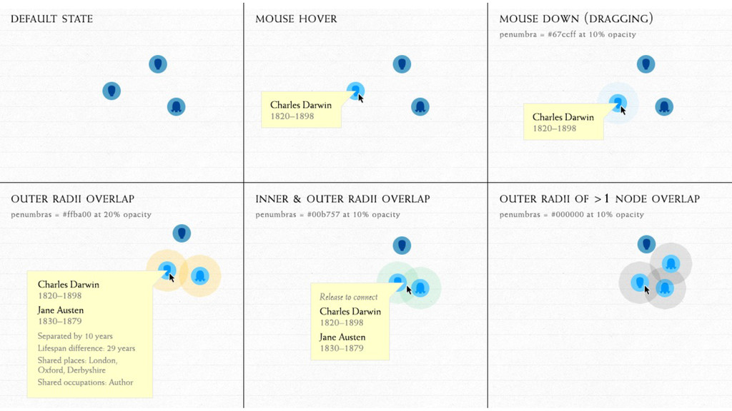
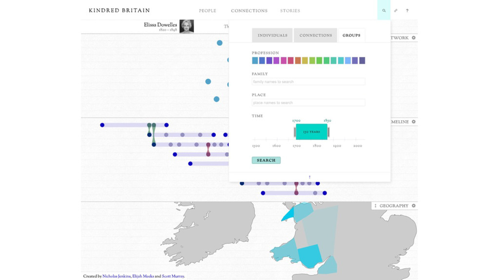
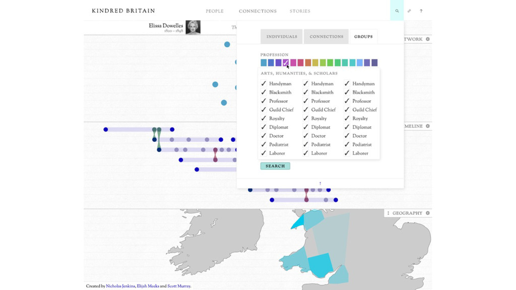
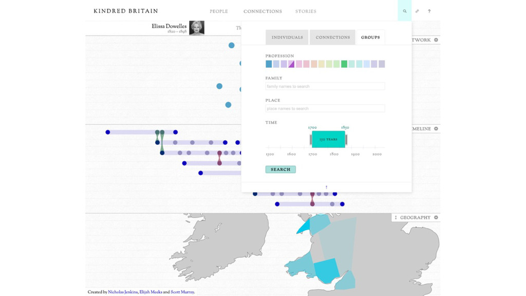
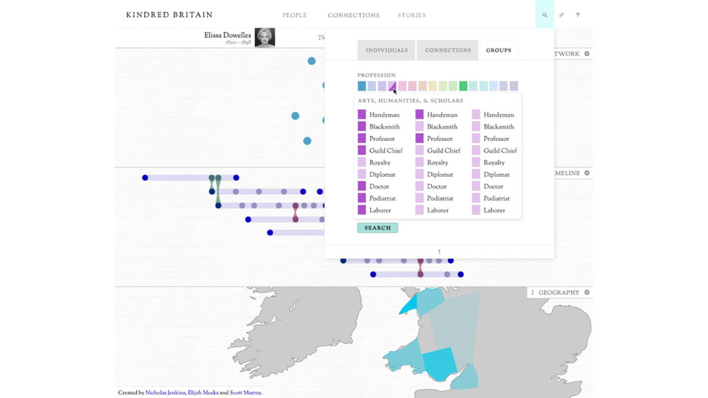
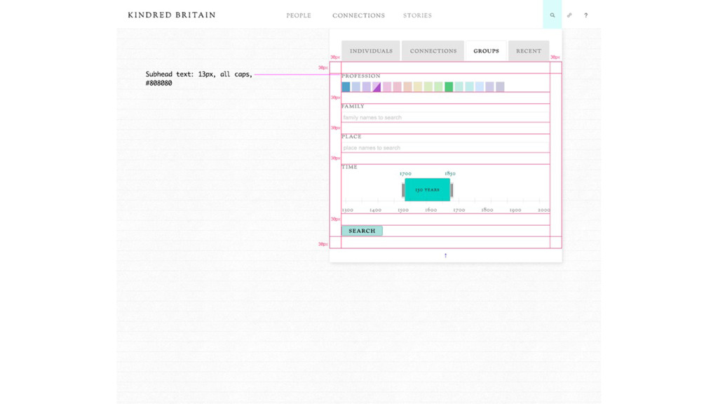
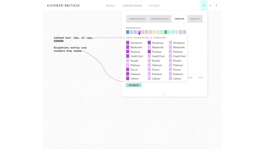
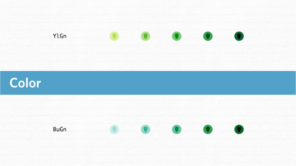
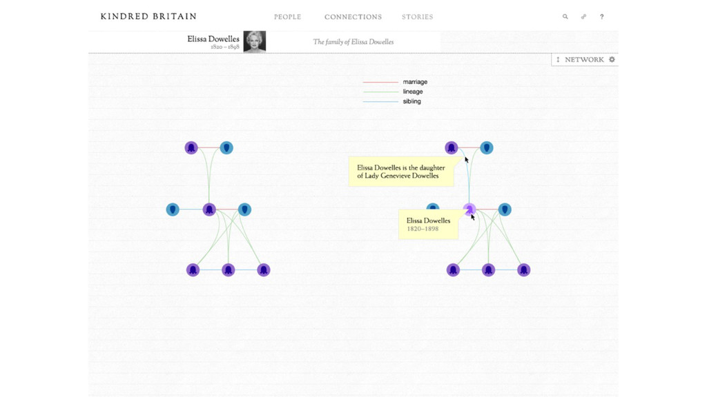
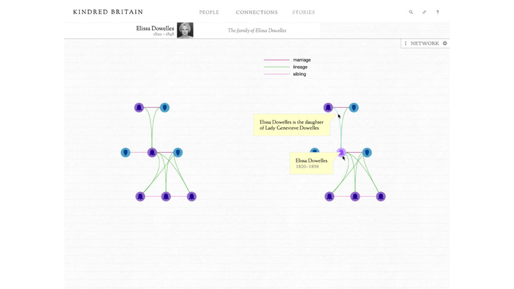
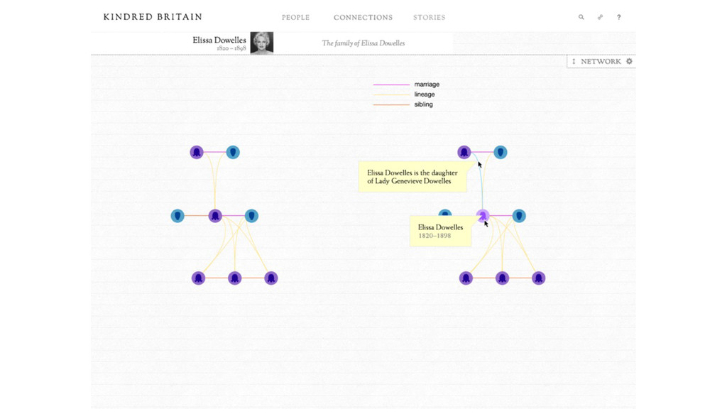
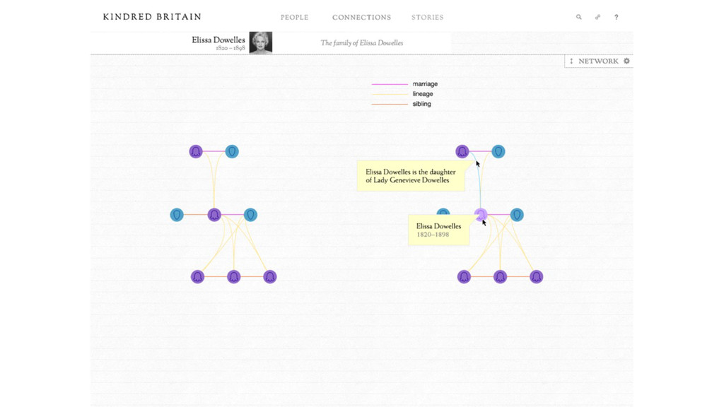
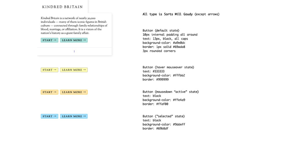
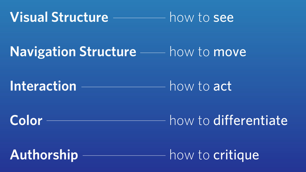
This talk illustrates the design process behind Kindred Britain (kindred.stanford.edu), an interactive network visualization and digital humanities project, made with Nicholas Jenkins and Elijah Meeks of Stanford University. I'll discuss interface and visual design considerations critical to any visualization, framed in the context of five core elements we faced with Kindred Britain: visual structure, navigation structure, interaction, color, and authorship.

Scott Murray

March 12, 2014
Tweet

More Decks by Scott Murray

Other Decks in Design

Transcript

  1. Primary Identity —Full Name Logos
    FULL NAME LOGO WITH TAGLINE 1-LINE
    FOR EXTREME HORIZONTAL SPACE RESTRICTIONS
    RECOMMENDED: FULL NAME LOGO WITH TAGLINE 2-LINES
    PRIMARY LOGO, VARIATIONS:
    FULL NAME LOGO WITH TAGLINE CENTERED
    FOR SQUARE FORMAT SPACE RESTRICTIONS
    An Introduction to Designing With D3
    Scott Murray
    Interactive Data
    Visualization
    for the Web
    Interface Design Considerations
    for Data Visualization
    Scott Murray
    @alignedleft
    alignedleft.com
    Assistant Professor, Design
    University of San Francisco
    Author, Interactive Data
    Visualization for the Web

    View Slide

  2. K I N D R E D B R I TA I N
    kindred.stanford.edu
    Nicholas Jenkins
    Associate Professor, English
    Stanford University
    Elijah Meeks
    Digital Humanities Specialist
    Stanford University

    View Slide

  3. View Slide

  4. Visual Structure

    View Slide

  5. View Slide

  6. View Slide

  7. View Slide

  8. View Slide

  9. View Slide

  10. View Slide

  11. View Slide

  12. View Slide

  13. View Slide

  14. View Slide

  15. View Slide

  16. View Slide

  17. View Slide

  18. Navigation Structure

    View Slide

  19. View Slide

  20. View Slide

  21. View Slide

  22. View Slide

  23. Interaction

    View Slide

  24. View Slide

  25. View Slide

  26. View Slide

  27. View Slide

  28. View Slide

  29. View Slide

  30. View Slide

  31. View Slide

  32. View Slide

  33. View Slide

  34. View Slide

  35. Color

    View Slide

  36. ...avoiding catastrophe becomes the first
    principle in bringing color to information:
    Above all, do no harm.”
    —Edward Tufte, Envisioning Information
    “ Position is everything.
    Color is difficult.”
    —Moritz Stefaner

    View Slide

  37. View Slide

  38. View Slide

  39. View Slide

  40. View Slide

  41. View Slide

  42. View Slide

  43. View Slide

  44. Authorship

    View Slide

  45. View Slide

  46. View Slide

  47. View Slide

  48. View Slide

  49. View Slide

  50. View Slide

  51. Visual Structure
    Navigation Structure
    Interaction
    Color
    Authorship
    how to see
    how to move
    how to act
    how to differentiate
    how to critique

    View Slide

  52. An Introduction to Designing With D3
    Scott Murray
    Interactive Data
    Visualization
    for the Web
    Scott Murray
    @alignedleft
    alignedleft.com

    View Slide