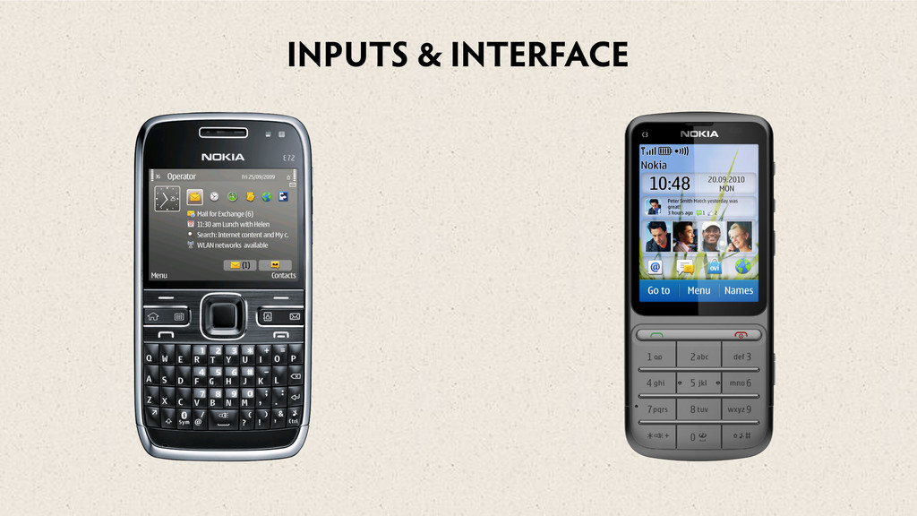
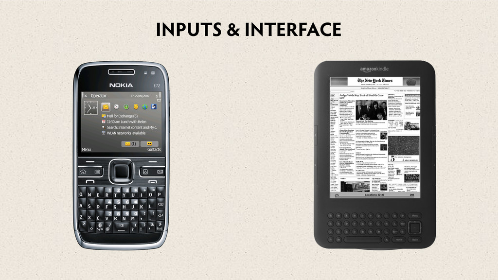
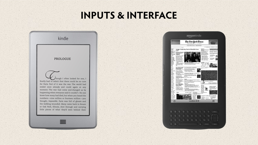
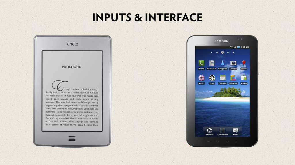
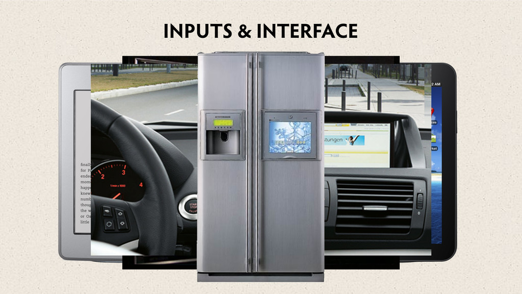
Please won't somebody think of the internet connected fridge
A talk on various topics of the web. From the reality of the different devices connecting to your sites, the theory of Responsive Design, the awesomeness and failings of media queries ... and the fabled internet connected fridge.
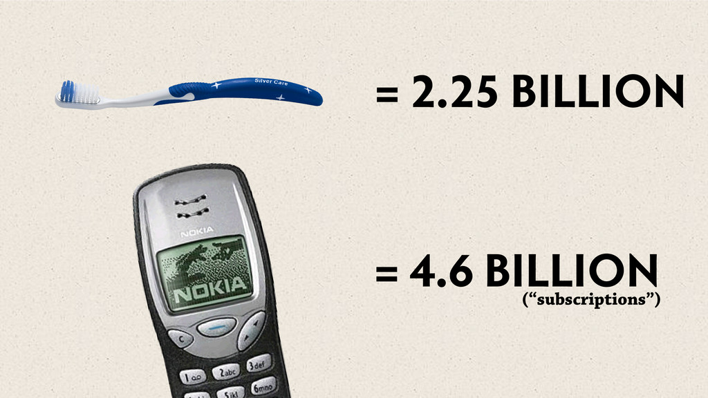
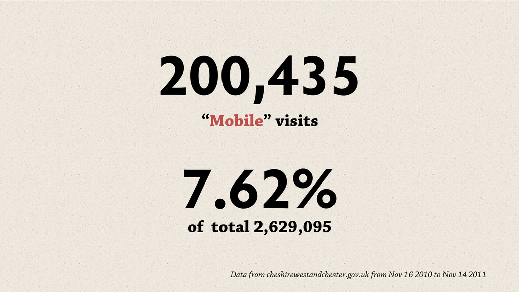
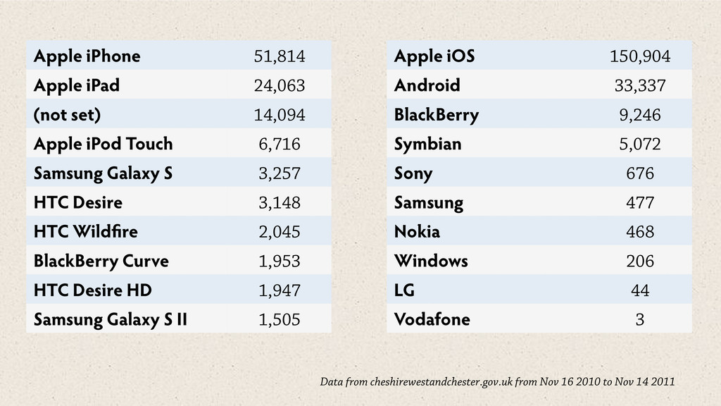
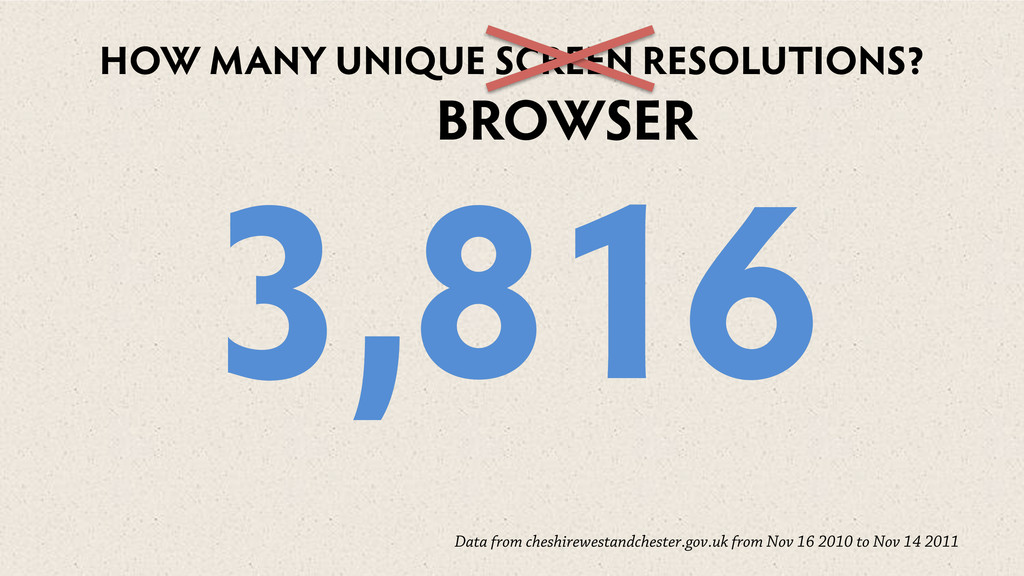
2011 Apple iPhone 51,814 Apple iPad 24,063 (not set) 14,094 Apple iPod Touch 6,716 Samsung Galaxy S 3,257 HTC Desire 3,148 HTC Wild re 2,045 BlackBerry Curve 1,953 HTC Desire HD 1,947 Samsung Galaxy S II 1,505 Apple iOS 150,904 Android 33,337 BlackBerry 9,246 Symbian 5,072 Sony 676 Samsung 477 Nokia 468 Windows 206 LG 44 Vodafone 3
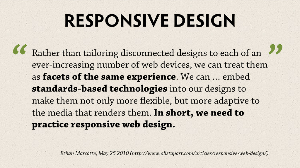
an ever-increasing number of web devices, we can treat them as facets of the same experience. We can … embed standards-based technologies into our designs to make them not only more exible, but more adaptive to the media that renders them. In short, we need to practice responsive web design. Ethan Marcotte, May 25 2010 (http://www.alistapart.com/articles/responsive-web-design/) “ ”
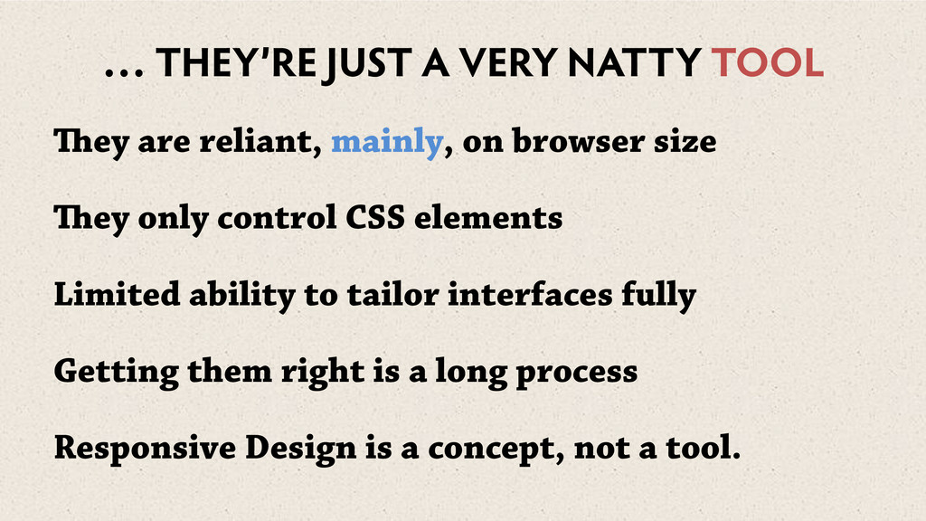
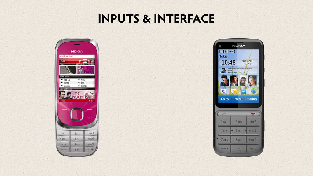
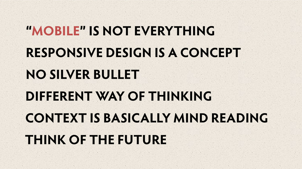
mainly, on browser size ey only control CSS elements Limited ability to tailor interfaces fully Getting them right is a long process Responsive Design is a concept, not a tool.
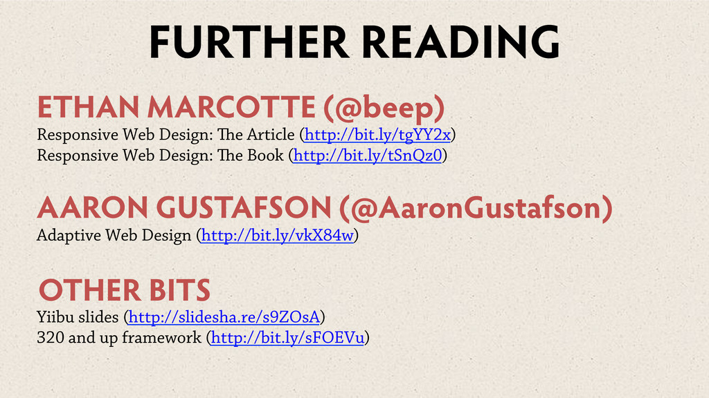
(http://bit.ly/tgYY2x) Responsive Web Design: e Book (http://bit.ly/tSnQz0) AARON GUSTAFSON (@AaronGustafson) Adaptive Web Design (http://bit.ly/vkX84w) Yiibu slides (http://slidesha.re/s9ZOsA) 320 and up framework (http://bit.ly/sFOEVu) OTHER BITS
 anthony_casey
 sonic
sonic
 asei
asei
 findy_eventslides
 ks91
ks91
 kozy4324
 edeandrea
 yanzm
yanzm
 iotengineer22
 tomokusaba
 ysuzuki
 gotok365
 iamctodd
 quramy
 axbom
axbom
 vanstee
 kastner
 chriscoyier
 cassininazir
 lara
lara
 sstephenson
 3n
3n
 aleyda
 davidcarrasco