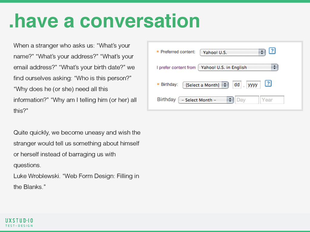
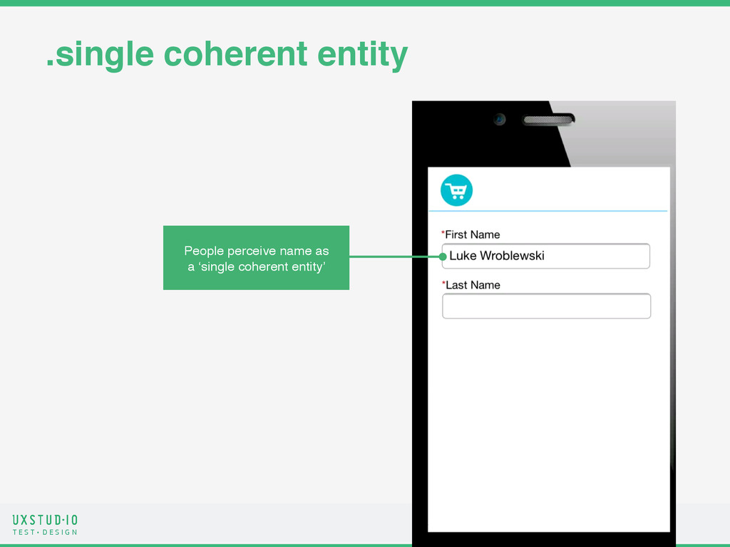
.have a conversation When a stranger who asks us: “What’s your name?” “What’s your address?” “What’s your email address?” “What’s your birth date?” we find ourselves asking: “Who is this person?” “Why does he (or she) need all this information?” “Why am I telling him (or her) all this?” ! Quite quickly, we become uneasy and wish the stranger would tell us something about himself or herself instead of barraging us with questions. Luke Wroblewski. “Web Form Design: Filling in the Blanks.”
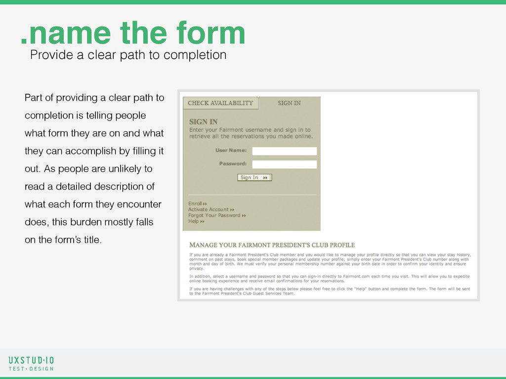
Part of providing a clear path to completion is telling people what form they are on and what they can accomplish by filling it out. As people are unlikely to read a detailed description of what each form they encounter does, this burden mostly falls on the form’s title. .name the form Provide a clear path to completion
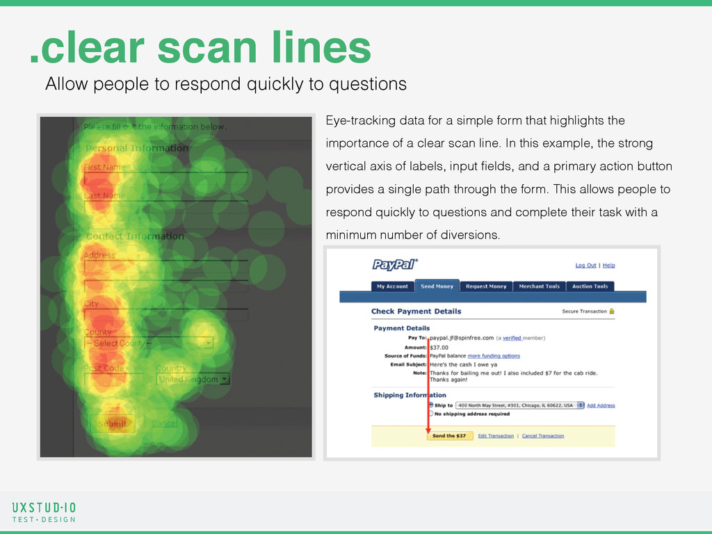
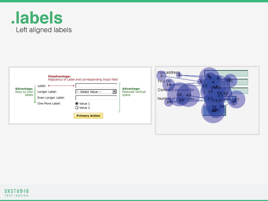
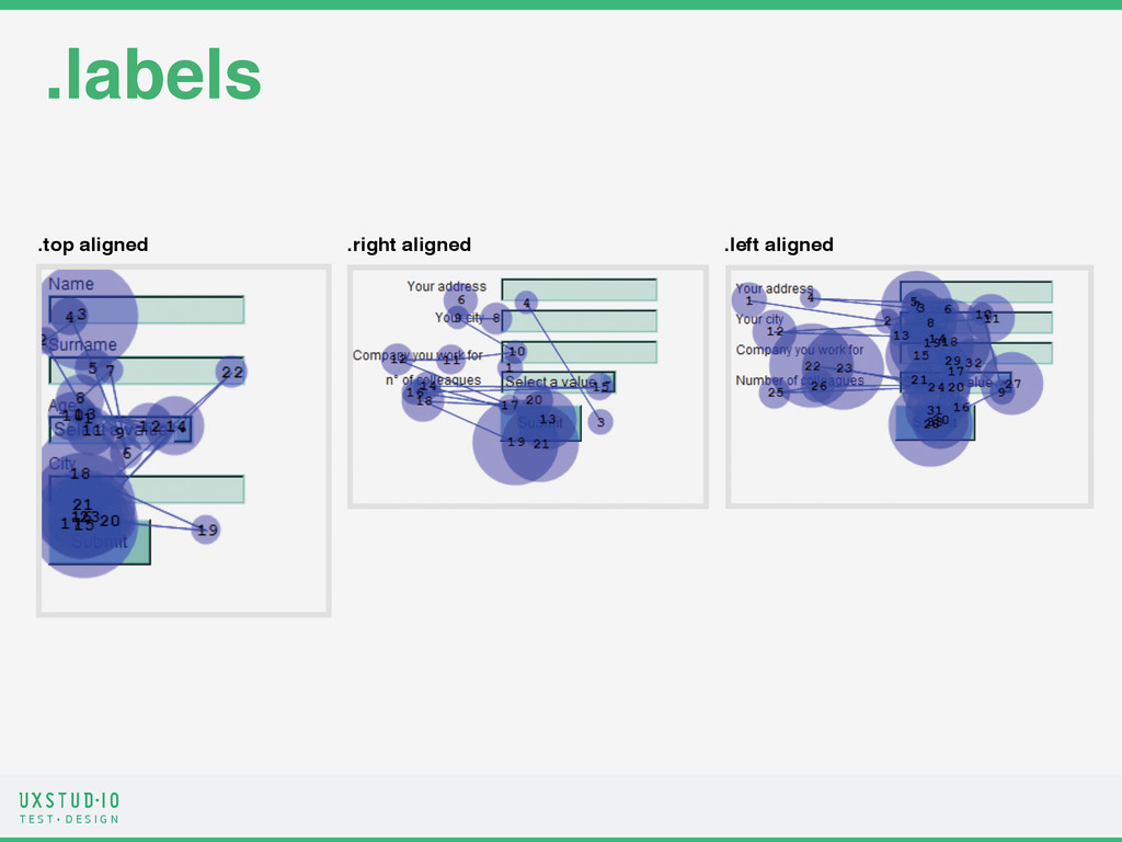
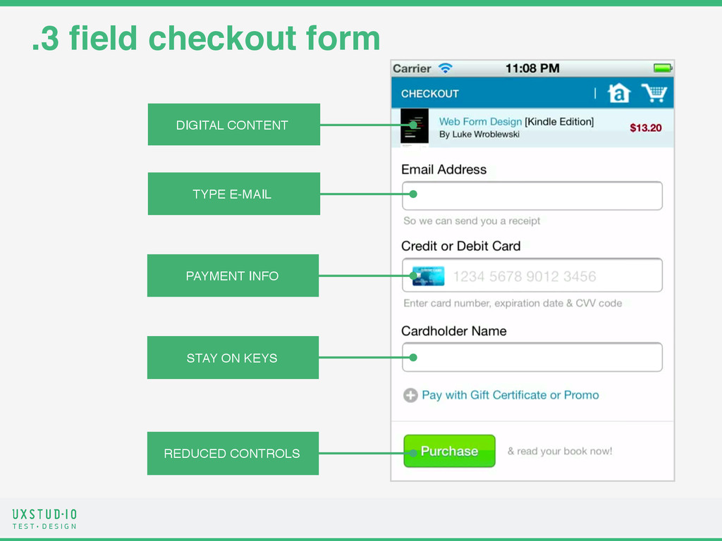
.clear scan lines Eye-tracking data for a simple form that highlights the importance of a clear scan line. In this example, the strong vertical axis of labels, input fields, and a primary action button provides a single path through the form. This allows people to respond quickly to questions and complete their task with a minimum number of diversions. Allow people to respond quickly to questions
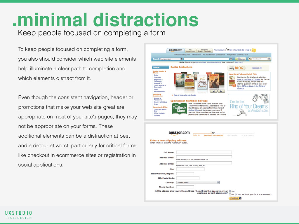
.minimal distractions To keep people focused on completing a form, you also should consider which web site elements help illuminate a clear path to completion and which elements distract from it. ! Even though the consistent navigation, header or promotions that make your web site great are appropriate on most of your site’s pages, they may not be appropriate on your forms. These additional elements can be a distraction at best and a detour at worst, particularly for critical forms like checkout in ecommerce sites or registration in social applications. Keep people focused on completing a form
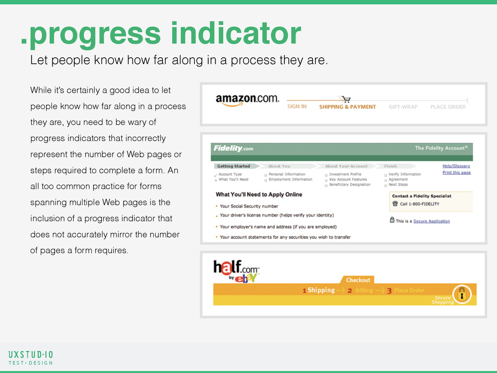
.progress indicator While it’s certainly a good idea to let people know how far along in a process they are, you need to be wary of progress indicators that incorrectly represent the number of Web pages or steps required to complete a form. An all too common practice for forms spanning multiple Web pages is the inclusion of a progress indicator that does not accurately mirror the number of pages a form requires. Let people know how far along in a process they are.
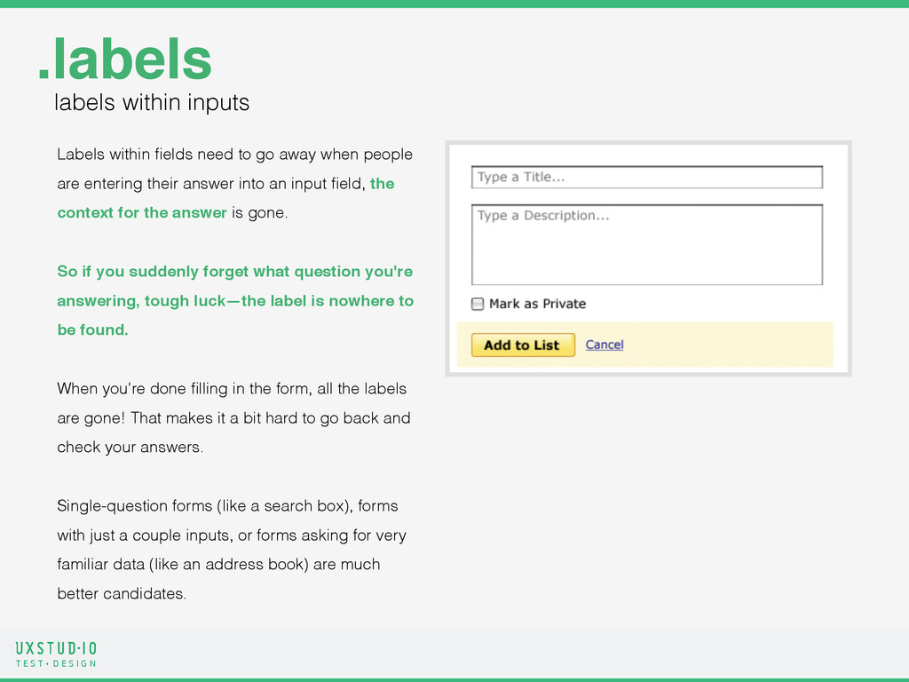
.labels labels within inputs Labels within fields need to go away when people are entering their answer into an input field, the context for the answer is gone. ! So if you suddenly forget what question you're answering, tough luck—the label is nowhere to be found. ! ! When you're done filling in the form, all the labels are gone! That makes it a bit hard to go back and check your answers. ! Single-question forms (like a search box), forms with just a couple inputs, or forms asking for very familiar data (like an address book) are much better candidates.
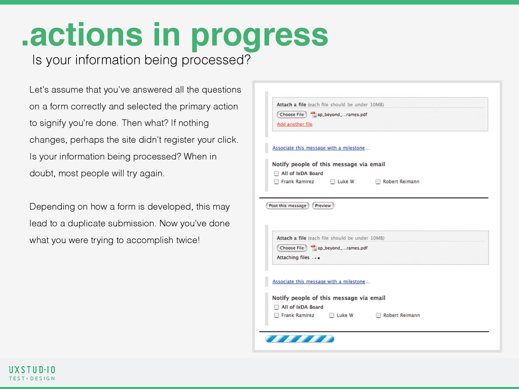
.actions in progress Let's assume that you've answered all the questions on a form correctly and selected the primary action to signify you're done. Then what? If nothing changes, perhaps the site didn't register your click. Is your information being processed? When in doubt, most people will try again. ! Depending on how a form is developed, this may lead to a duplicate submission. Now you've done what you were trying to accomplish twice! Is your information being processed?
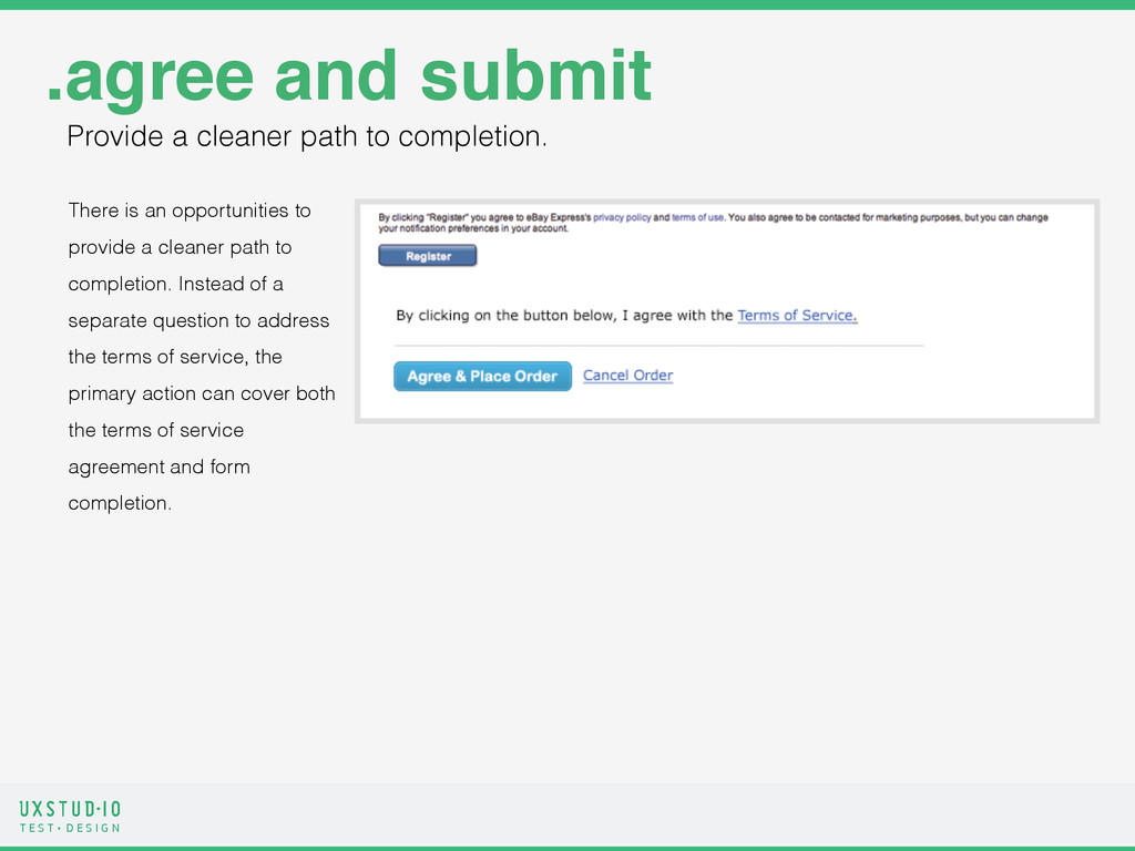
There is an opportunities to provide a cleaner path to completion. Instead of a separate question to address the terms of service, the primary action can cover both the terms of service agreement and form completion. .agree and submit Provide a cleaner path to completion.
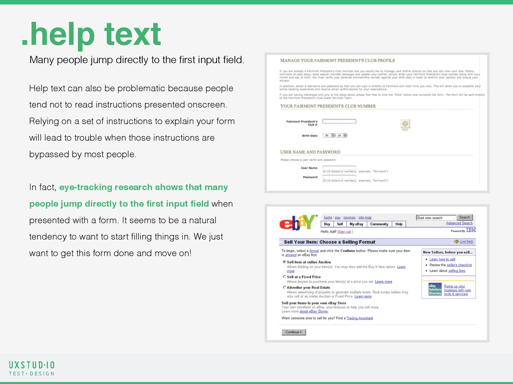
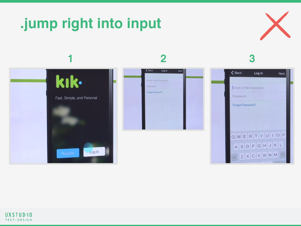
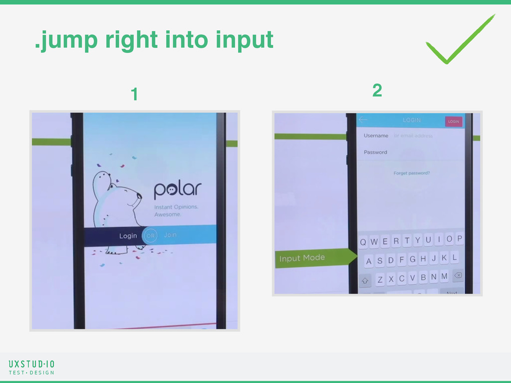
.help text Help text can also be problematic because people tend not to read instructions presented onscreen. Relying on a set of instructions to explain your form will lead to trouble when those instructions are bypassed by most people. ! In fact, eye-tracking research shows that many people jump directly to the first input field when presented with a form. It seems to be a natural tendency to want to start filling things in. We just want to get this form done and move on! Many people jump directly to the first input field.
.help text - When forms ask for unfamiliar data: What's a PAC code?! - When people question why they are being asked for specific data: Why do you need to know my date of birth?! - When people may be concerned about the security or privacy of their data: Is my credit card number safe here?! - When there are recommended ways of providing data: Separate your tags with commas, please. - When asking for sensitive information, consider including actionable help text that allows people to confirm that their information is safe. The cases when instructional text is appropriate.
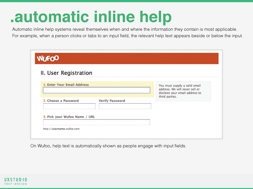
.automatic inline help Automatic inline help systems reveal themselves when and where the information they contain is most applicable. For example, when a person clicks or tabs to an input field, the relevant help text appears beside or below the input. On Wufoo, help text is automatically shown as people engage with input fields.
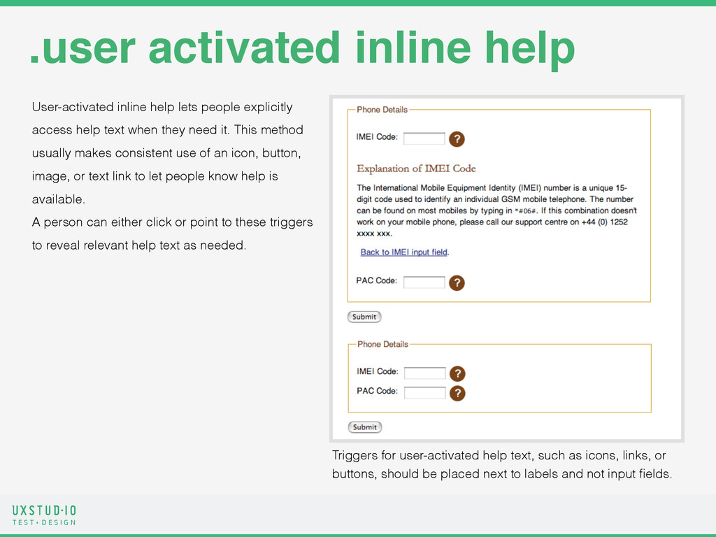
.user activated inline help User-activated inline help lets people explicitly access help text when they need it. This method usually makes consistent use of an icon, button, image, or text link to let people know help is available. A person can either click or point to these triggers to reveal relevant help text as needed. Triggers for user-activated help text, such as icons, links, or buttons, should be placed next to labels and not input fields.
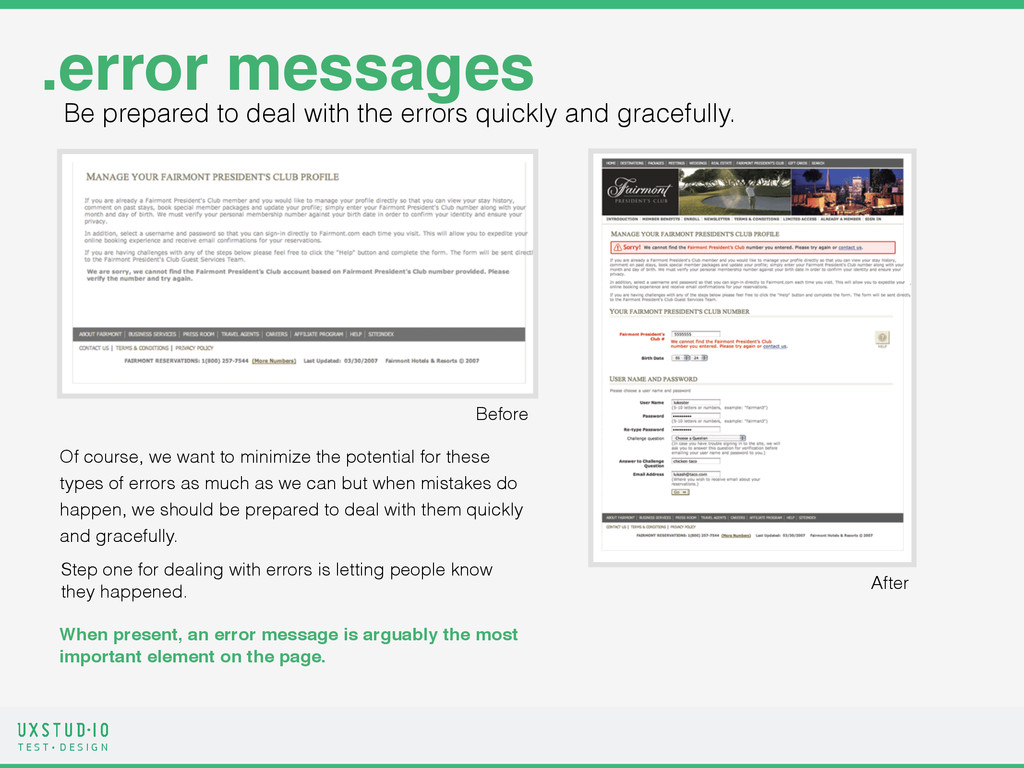
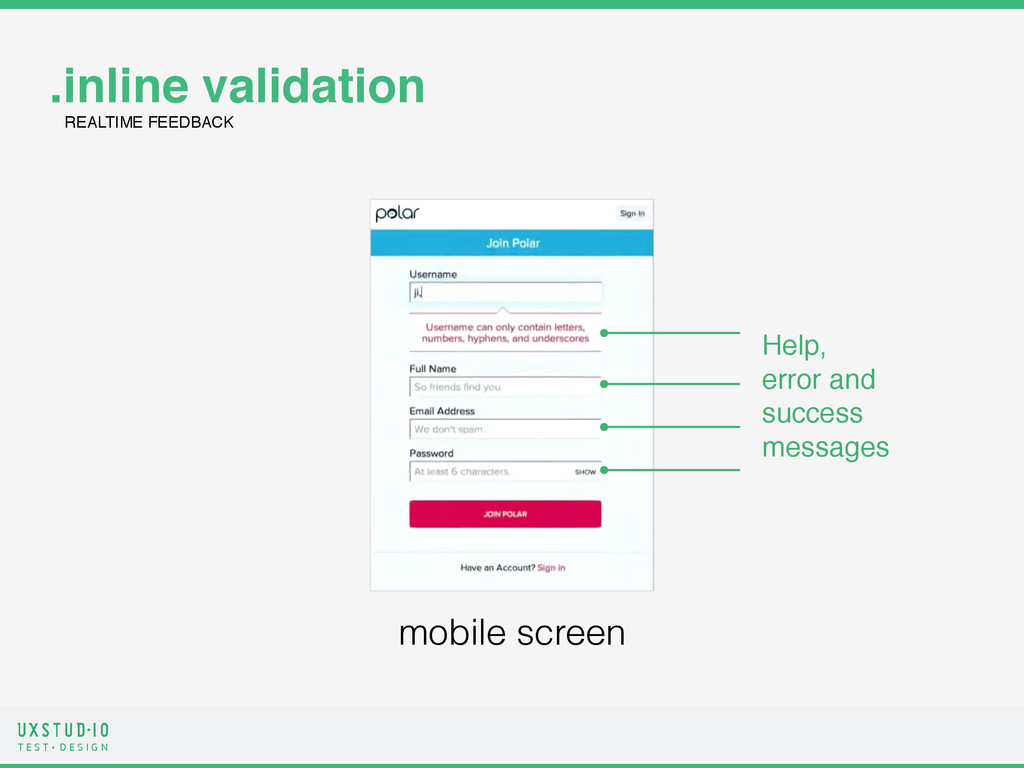
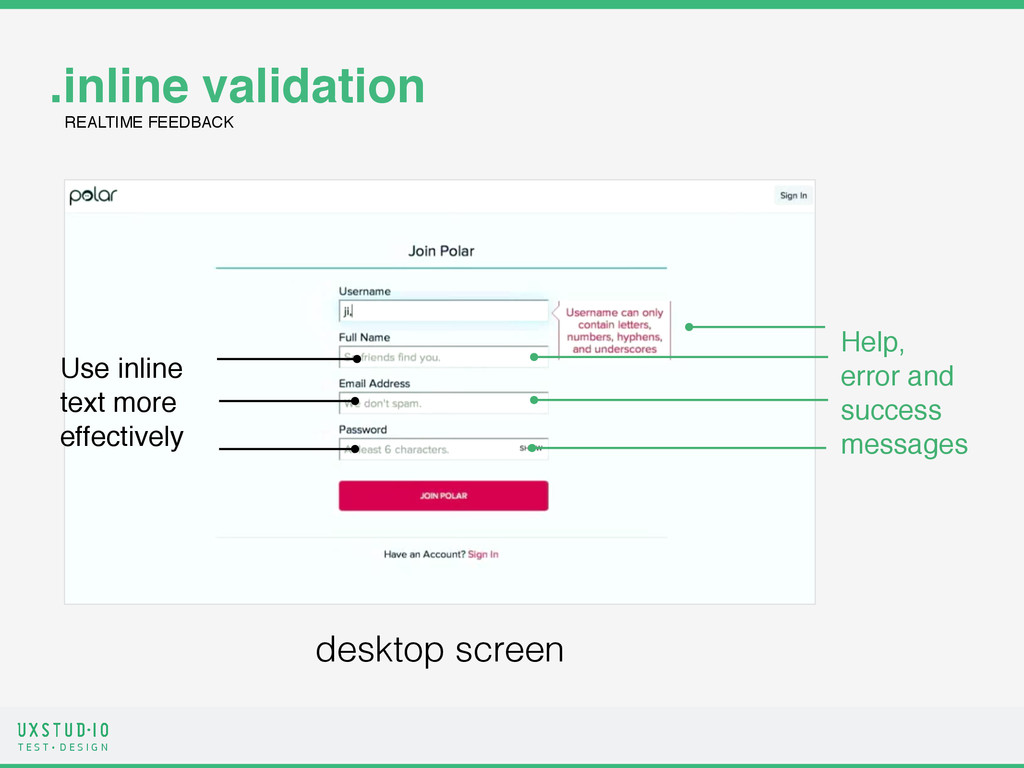
.error messages Of course, we want to minimize the potential for these types of errors as much as we can but when mistakes do happen, we should be prepared to deal with them quickly and gracefully. Step one for dealing with errors is letting people know they happened. When present, an error message is arguably the most important element on the page. Before After Be prepared to deal with the errors quickly and gracefully.
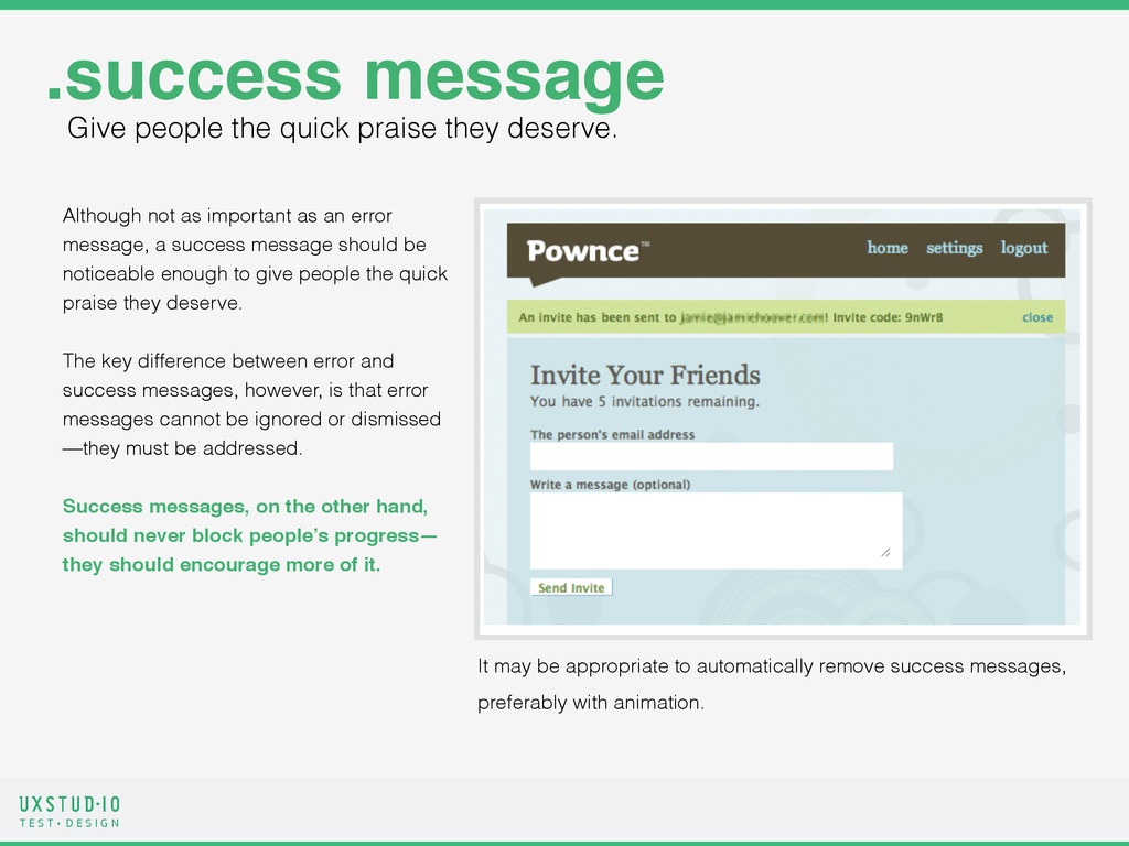
.success message Although not as important as an error message, a success message should be noticeable enough to give people the quick praise they deserve. ! The key difference between error and success messages, however, is that error messages cannot be ignored or dismissed —they must be addressed. ! Success messages, on the other hand, should never block people’s progress— they should encourage more of it. It may be appropriate to automatically remove success messages, preferably with animation. Give people the quick praise they deserve.
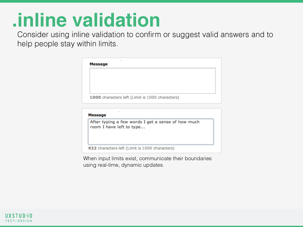
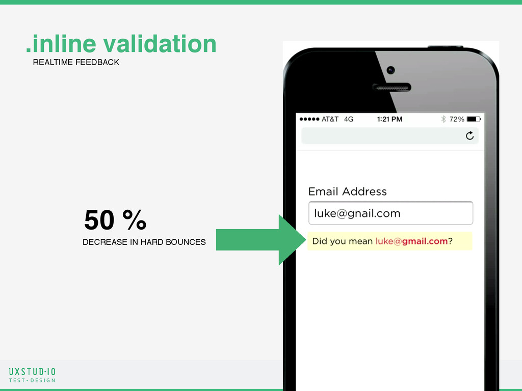
.inline validation Consider using inline validation to confirm or suggest valid answers and to help people stay within limits. When input limits exist, communicate their boundaries using real-time, dynamic updates.
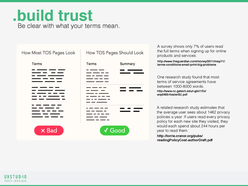
.build trust Be clear with what your terms mean. One research study found that most terms of service agreements have between 1000-8000 words. http://www.cc.gatech.edu/~gte115v/ wip0483-fieslerSC.pdf http://lorrie.cranor.org/pubs/ readingPolicyCost-authorDraft.pdf A related research study estimates that the average user sees about 1462 privacy policies a year. If users read every privacy policy for each new site they visited, they would each spend about 244 hours per year to read them. A survey shows only 7% of users read the full terms when signing up for online products and services. http://www.theguardian.com/money/2011/may/11/ terms-conditions-small-print-big-problems