Share
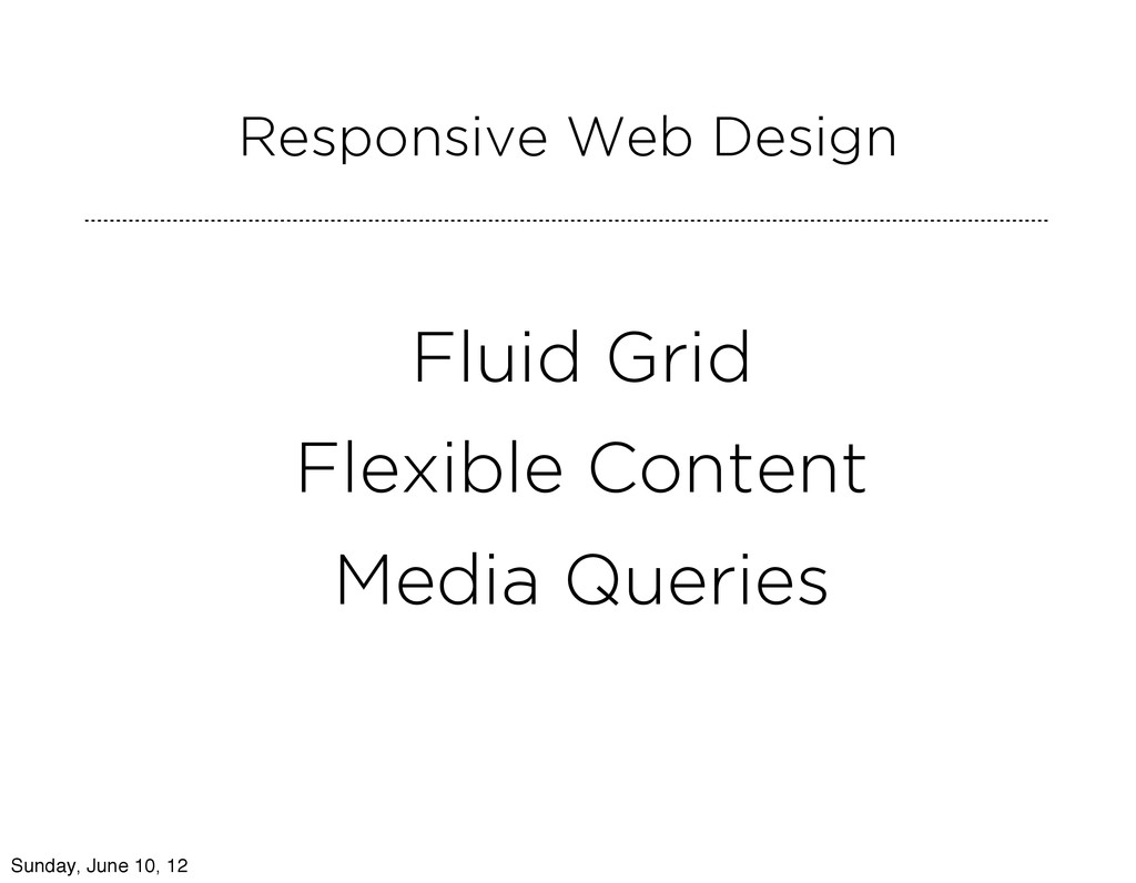
Ben Callahan of Sparkbox and Dan Oshinsky of stry.us discuss the pros and cons of responsive web design in journalism.
 bencallahan
 bebe
bebe
 kakukoki
 hilokifigma
 securecat
 abokadotyann
 shotamatsuo
 yuri_ohashi
 videlvequio
 uxman
uxman
 a2k
a2k
 saki822
 eileencodes
 bkeepers
 tamaranovitovic
 addyosmani
 lauravandoore
 charlesmeaden
 tessaabrams
 takai
takai
 thirion
 techseoconnect
 soudai