Upgrade to Pro
— share decks privately, control downloads, hide ads and more …
Speaker Deck
Sign up for free
Menu
Search
Features
All features
Private URLs
Password Protection
Custom URLS
Scheduled publishing
Remove Branding
Restrict embedding
Deck Collections
Notes
Features
All features
Private URLs
Password Protection
Custom URLS
Scheduled publishing
Remove Branding
Restrict embedding
Deck Collections
Notes
Explore
Featured decks
Featured speakers
Programming
Technology
Storyboards
Explore
Featured decks
Featured speakers
Programming
Technology
Storyboards
Pricing
Search
Sign in
Sign up for free
CSS3 Animations & Transitions
Search
Patrick Rauland
April 15, 2013
Technology
840
0
Share
Embed
Copy iframe code
Copy JS code
Copy link
Start on current slide
CSS3 Animations & Transitions
A deck about CSS Animations and Transitions for the Web920 Meetup group.
Patrick Rauland
April 15, 2013
More Decks by Patrick Rauland
See All by Patrick Rauland
Google Analytics for Clients
bftrick
0
180
Black Friday 2020: Your Biggest Sales Day Yet
bftrick
1
130
10 Uncommon (& Weird) Ways to Prevent Fights
bftrick
0
270
WooCommerce and You - A Love Story - WordCamp Minneapolis 2018
bftrick
0
120
Live Your Life Like a Supervillain
bftrick
0
200
Ninja Gravity Form 7
bftrick
0
120
Are Robots Coming for Your Job?
bftrick
0
130
Scoping eCommerce Projects
bftrick
0
340
Accounting basics you need to get to a $1M+ seller
bftrick
0
170
Other Decks in Technology
See All in Technology
組み立てて楽しむ AWS Blocks 入門
kmiya84377
0
230
AI駆動開発、viviONの1年 ── うまくいったこと・いかなかったこと
vivion
0
290
3つのアプローチで目指す チームを強くするAI駆動開発
thkt
0
150
全PRの83%が AIレビューだけでマージできるようになった開発組織は その後どうなったか @2026/10
athug
0
140
AI時代に必要な脅威モデリング― 変化の速度に負けない理解とリスク判断
masakane55
5
1.3k
Cognition AI Japan - ウェビナー2_テストQA_運用監視
cogakira
0
130
生成AIで高い生産性を求められて、 悩み、乗り越えた話
mot_techtalk
2
160
並行性の問題を防げ!実践トランザクション入門
occhi
0
280
OSC2026on_the-world-is-waiting-for-your-voice.pdf
naruoga
0
370
Running Kotlin + Quarkus with Lambda
nealle
1
410
[AWS 秋のクラウドオペレーション祭り 2026]AWS DevOps Agentで変わる リリースと運用対応 ~リリース管理機能と Directed actions のご紹介~
furuton
4
1.2k
Datadog の学び方 - あるいは、オブザーバビリティを学ぶとは何か
mananyuki
1
540
Featured
See All Featured
More Than Pixels: Becoming A User Experience Designer
marktimemedia
3
560
Efficient Content Optimization with Google Search Console & Apps Script
katarinadahlin
PRO
1
920
[Rails World 2026] Durable orchestration on Rails: from continuation to workflow
palkan
1
710
The Power of CSS Pseudo Elements
geoffreycrofte
82
6.6k
Jamie Indigo - Trashchat’s Guide to Black Boxes: Technical SEO Tactics for LLMs
techseoconnect
PRO
0
700
The Language of Interfaces
destraynor
162
27k
Agile Actions for Facilitating Distributed Teams - ADO2019
mkilby
0
300
Leading Effective Engineering Teams in the AI Era
addyosmani
9
2.7k
Believing is Seeing
oripsolob
1
240
Are puppies a ranking factor?
jonoalderson
2
4k
Docker and Python
trallard
47
4.2k
We Are The Robots
honzajavorek
0
390
Transcript
Web 920 CSS3 Animations & Transitions Patrick Rauland @bftrick
About Me
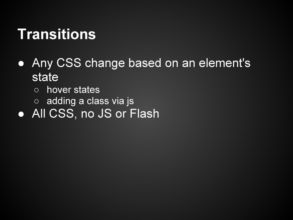
Transitions • Any CSS change based on an element's state
◦ hover states ◦ adding a class via js • All CSS, no JS or Flash
Transitions #my-element { transition: all 2s linear; }
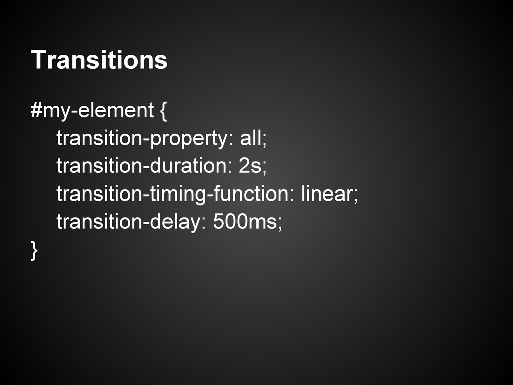
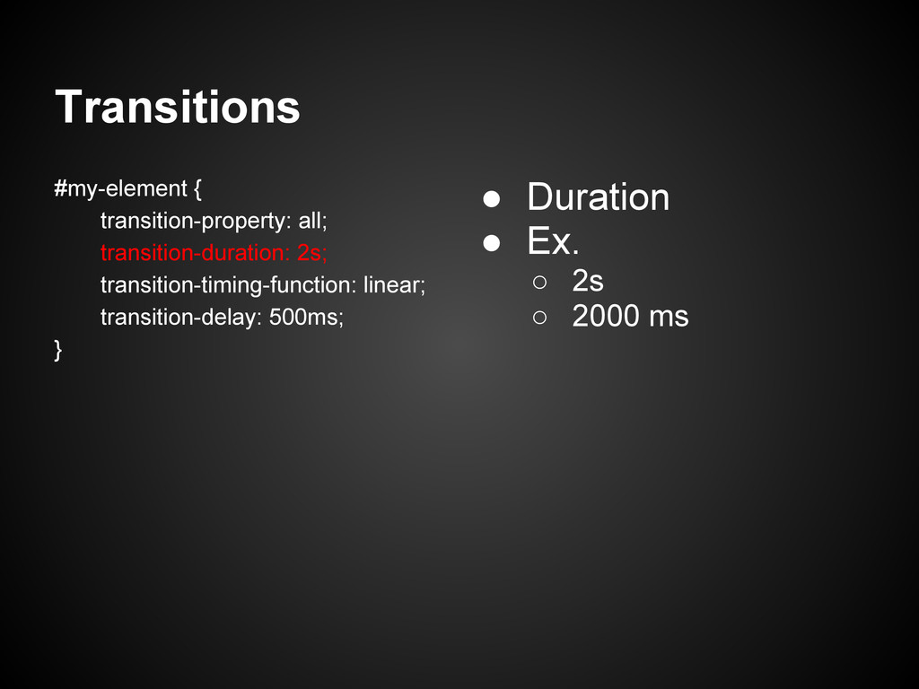
Transitions #my-element { transition-property: all; transition-duration: 2s; transition-timing-function: linear; transition-delay:
500ms; }
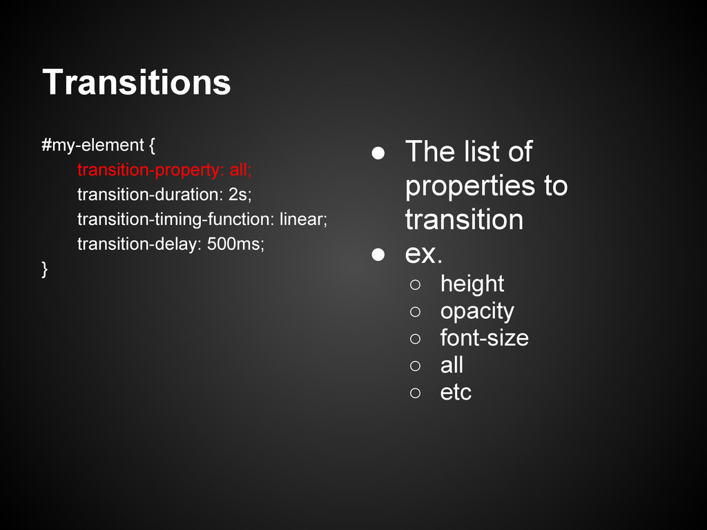
Transitions #my-element { transition-property: all; transition-duration: 2s; transition-timing-function: linear; transition-delay:
500ms; } • The list of properties to transition • ex. ◦ height ◦ opacity ◦ font-size ◦ all ◦ etc
Transitions #my-element { transition-property: all; transition-duration: 2s; transition-timing-function: linear; transition-delay:
500ms; } • Duration • Ex. ◦ 2s ◦ 2000 ms
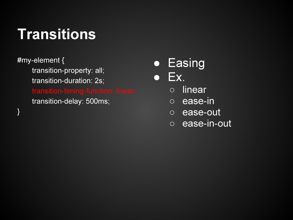
Transitions #my-element { transition-property: all; transition-duration: 2s; transition-timing-function: linear; transition-delay:
500ms; } • Easing • Ex. ◦ linear ◦ ease-in ◦ ease-out ◦ ease-in-out
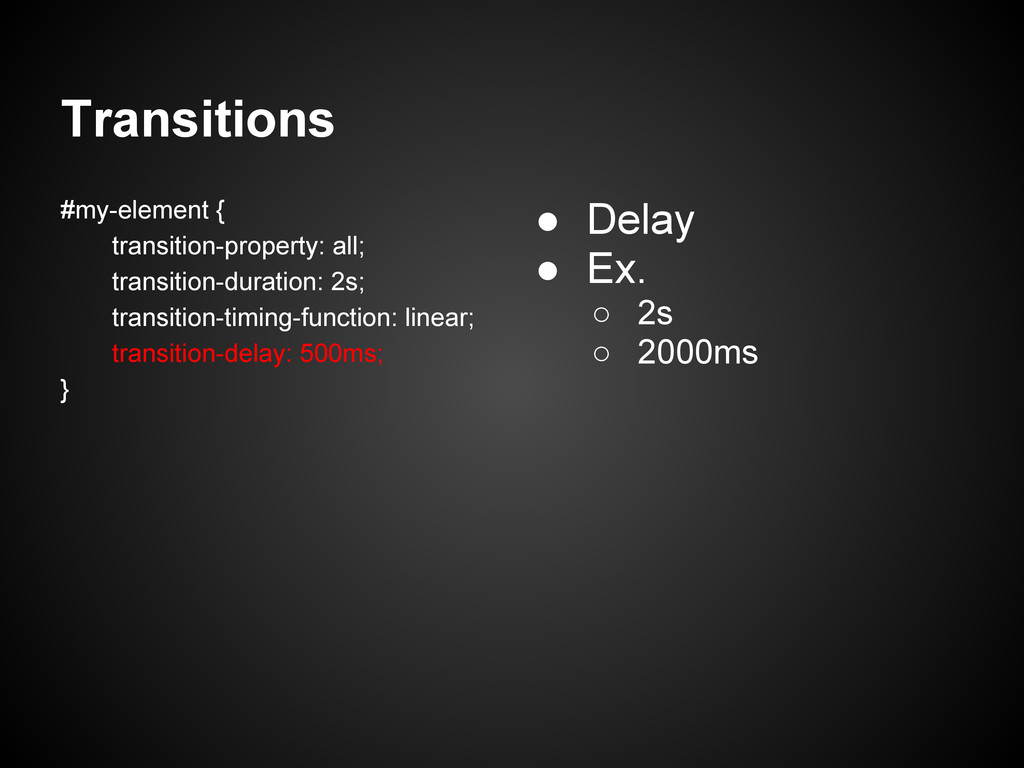
Transitions #my-element { transition-property: all; transition-duration: 2s; transition-timing-function: linear; transition-delay:
500ms; } • Delay • Ex. ◦ 2s ◦ 2000ms
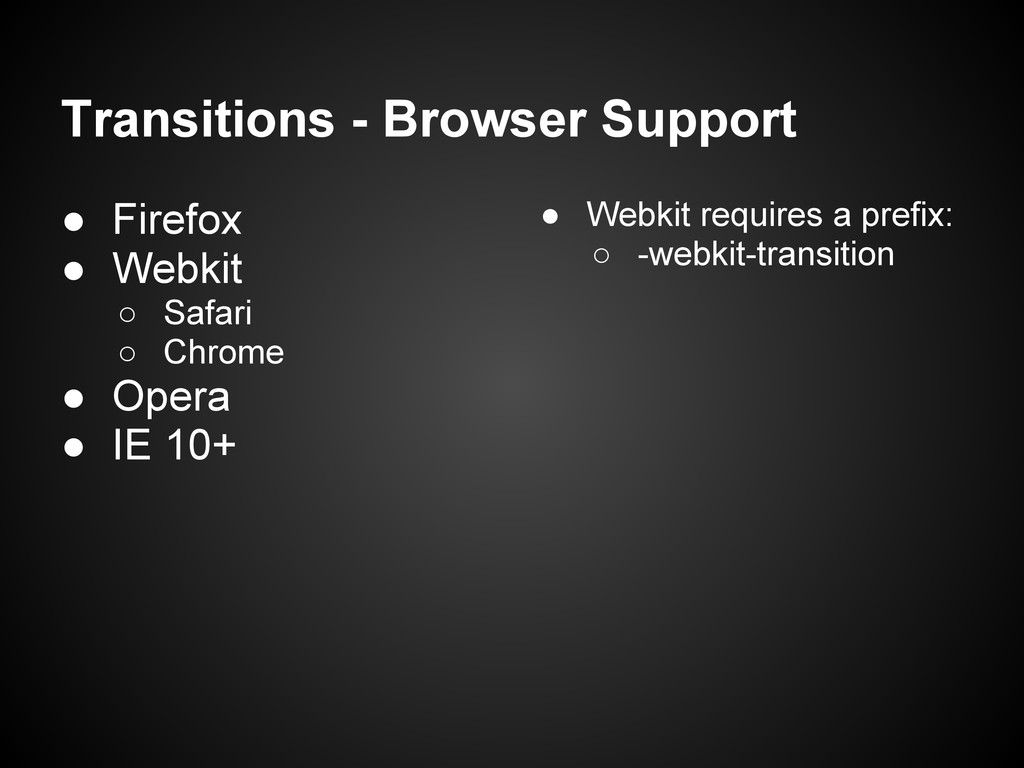
Transitions - Browser Support • Firefox • Webkit ◦ Safari
◦ Chrome • Opera • IE 10+ • Webkit requires a prefix: ◦ -webkit-transition
Transitions - Examples • http://burnhamrichards.com/ • http://optimalweb.biz/
Animations • A set of CSS states (keyframes)
Madmanimation http://stuffandnonsense.co. uk/content/demo/madmanimation/
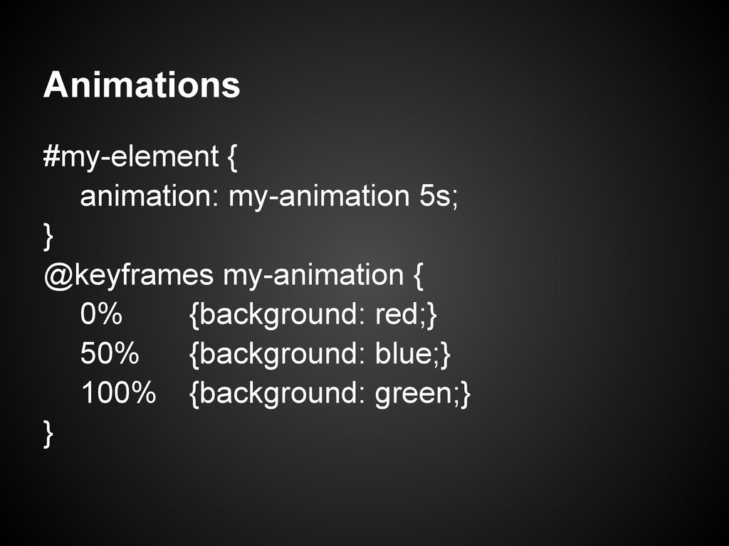
Animations #my-element { animation: my-animation 5s; } @keyframes my-animation {
0% {background: red;} 50% {background: blue;} 100% {background: green;} }
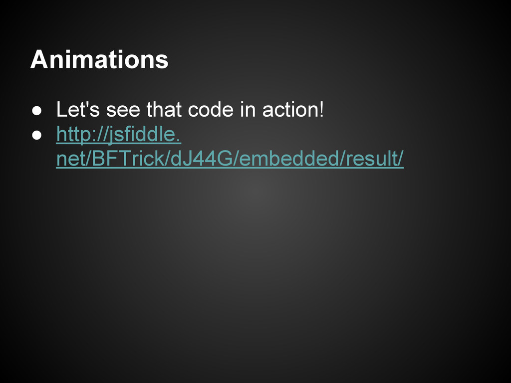
Animations • Let's see that code in action! • http://jsfiddle.
net/BFTrick/dJ44G/embedded/result/
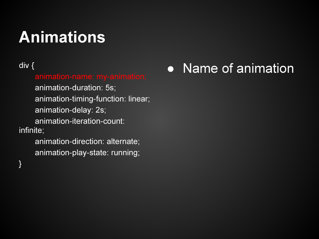
Animations div { animation-name: my-animation; animation-duration: 5s; animation-timing-function: linear; animation-delay:
2s; animation-iteration-count: infinite; animation-direction: alternate; animation-play-state: running; } • Name of animation
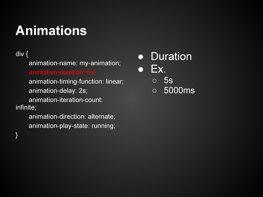
Animations div { animation-name: my-animation; animation-duration: 5s; animation-timing-function: linear; animation-delay:
2s; animation-iteration-count: infinite; animation-direction: alternate; animation-play-state: running; } • Duration • Ex. ◦ 5s ◦ 5000ms
Animations div { animation-name: my-animation; animation-duration: 5s; animation-timing-function: linear; animation-delay:
2s; animation-iteration-count: infinite; animation-direction: alternate; animation-play-state: running; } • Easing • Ex. ◦ linear ◦ ease-in ◦ ease-out ◦ ease-in-out
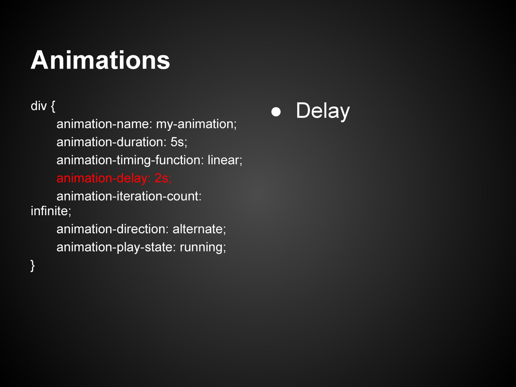
Animations div { animation-name: my-animation; animation-duration: 5s; animation-timing-function: linear; animation-delay:
2s; animation-iteration-count: infinite; animation-direction: alternate; animation-play-state: running; } • Delay
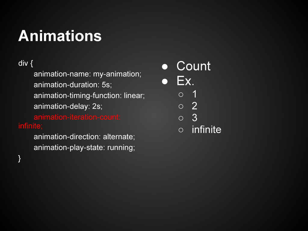
Animations div { animation-name: my-animation; animation-duration: 5s; animation-timing-function: linear; animation-delay:
2s; animation-iteration-count: infinite; animation-direction: alternate; animation-play-state: running; } • Count • Ex. ◦ 1 ◦ 2 ◦ 3 ◦ infinite
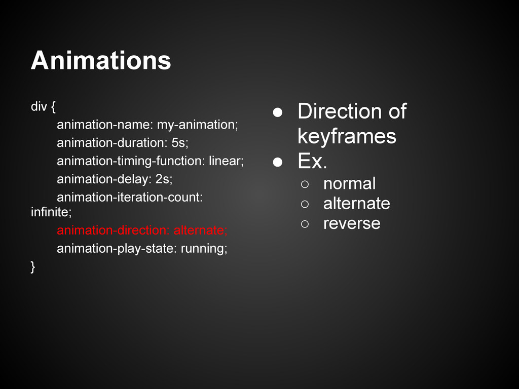
Animations div { animation-name: my-animation; animation-duration: 5s; animation-timing-function: linear; animation-delay:
2s; animation-iteration-count: infinite; animation-direction: alternate; animation-play-state: running; } • Direction of keyframes • Ex. ◦ normal ◦ alternate ◦ reverse
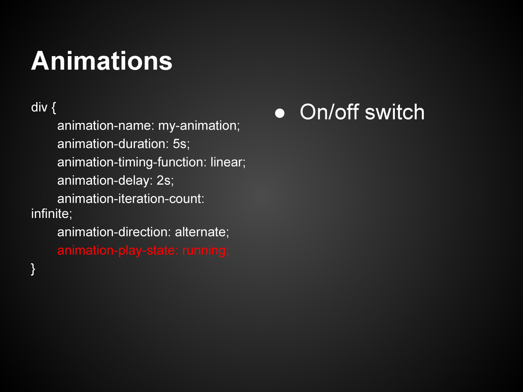
Animations div { animation-name: my-animation; animation-duration: 5s; animation-timing-function: linear; animation-delay:
2s; animation-iteration-count: infinite; animation-direction: alternate; animation-play-state: running; } • On/off switch
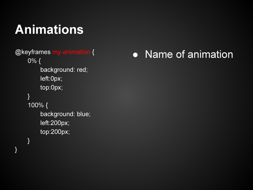
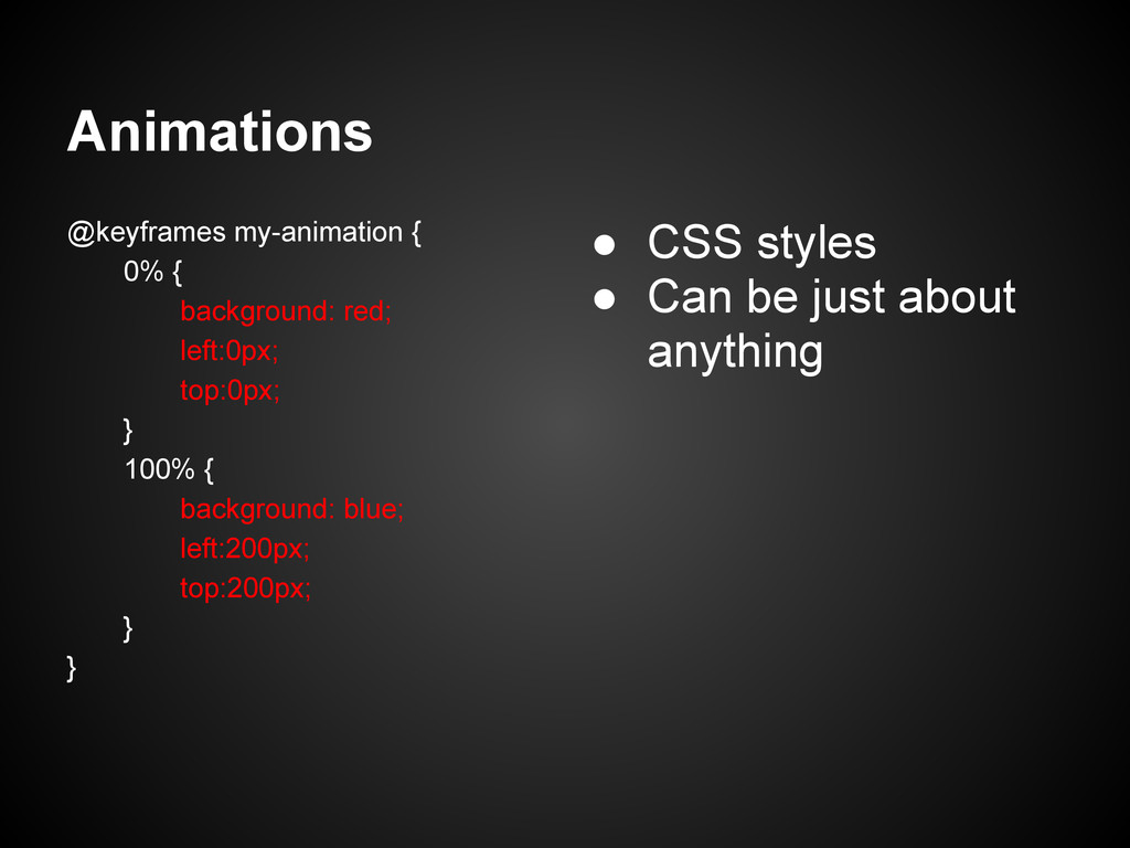
Animations @keyframes my-animation { 0% { background: red; left:0px; top:0px;
} 100% { background: blue; left:200px; top:200px; } } • Name of animation
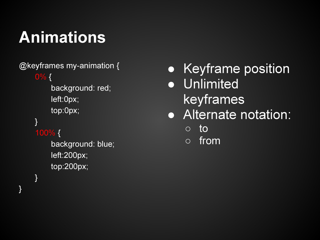
Animations @keyframes my-animation { 0% { background: red; left:0px; top:0px;
} 100% { background: blue; left:200px; top:200px; } } • Keyframe position • Unlimited keyframes • Alternate notation: ◦ to ◦ from
Animations @keyframes my-animation { 0% { background: red; left:0px; top:0px;
} 100% { background: blue; left:200px; top:200px; } } • CSS styles • Can be just about anything
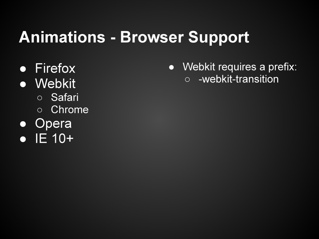
Animations - Browser Support • Firefox • Webkit ◦ Safari
◦ Chrome • Opera • IE 10+ • Webkit requires a prefix: ◦ -webkit-transition
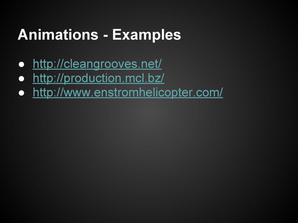
Animations - Examples • http://cleangrooves.net/ • http://production.mcl.bz/ • http://www.enstromhelicopter.com/
Animations - Code Samples • http://daneden.me/animate/ • http://www.spritely.net/
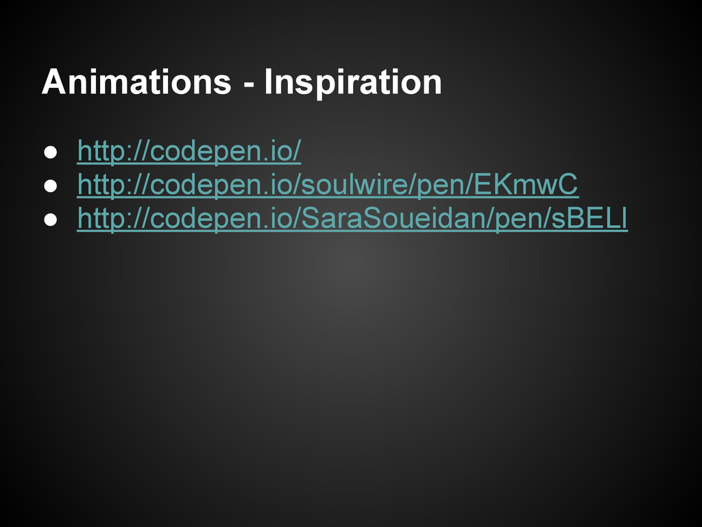
Animations - Inspiration • http://codepen.io/ • http://codepen.io/soulwire/pen/EKmwC • http://codepen.io/SaraSoueidan/pen/sBELl


 bftrick
 kmiya84377
 vivion
 thkt
thkt
 athug
athug
 masakane55
 cogakira
 mot_techtalk
 occhi
occhi
 naruoga
 nealle
 furuton
 mananyuki
 marktimemedia
 katarinadahlin
 palkan
 geoffreycrofte
 techseoconnect
 destraynor
 mkilby
 addyosmani
 oripsolob
 jonoalderson
 trallard
 honzajavorek