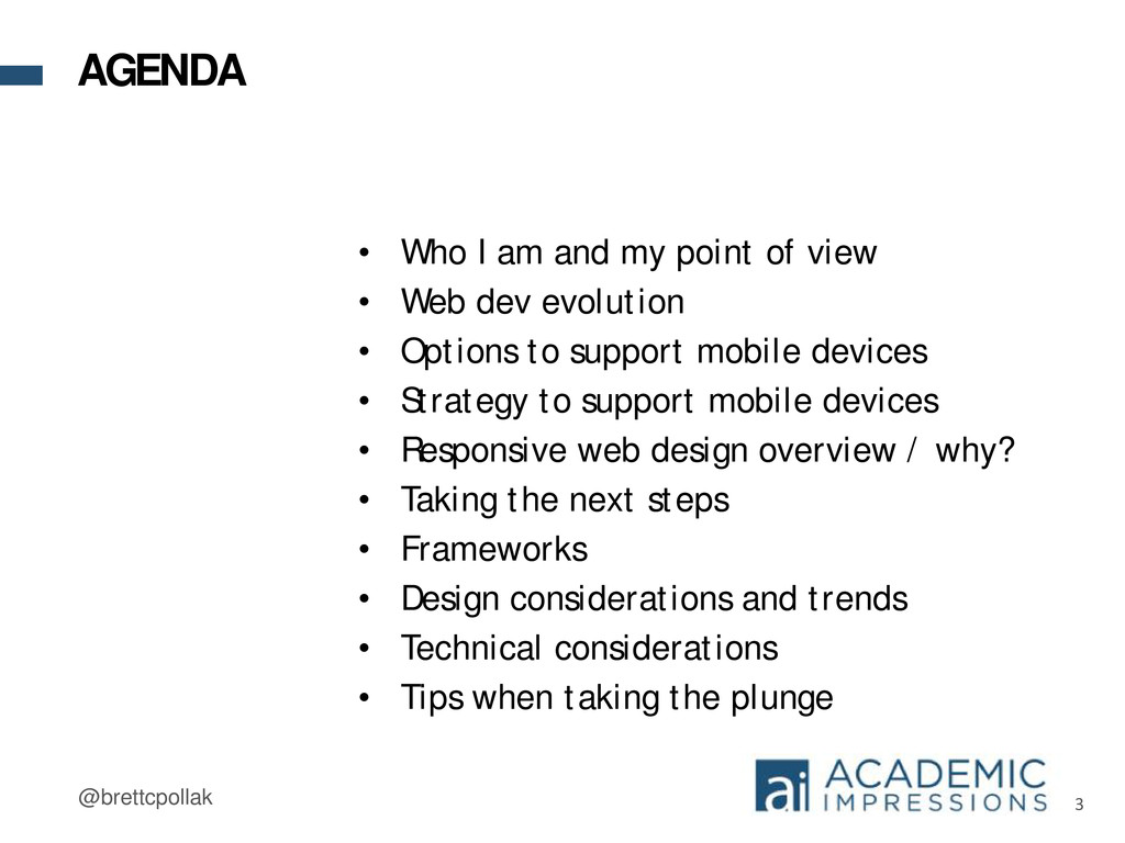
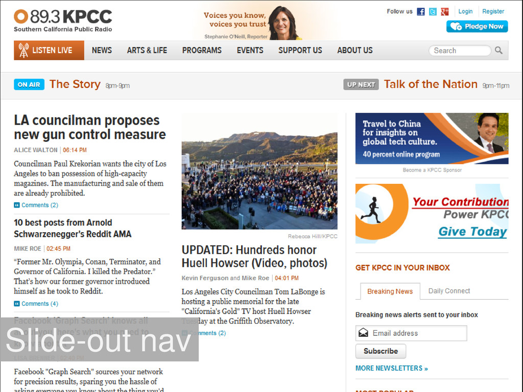
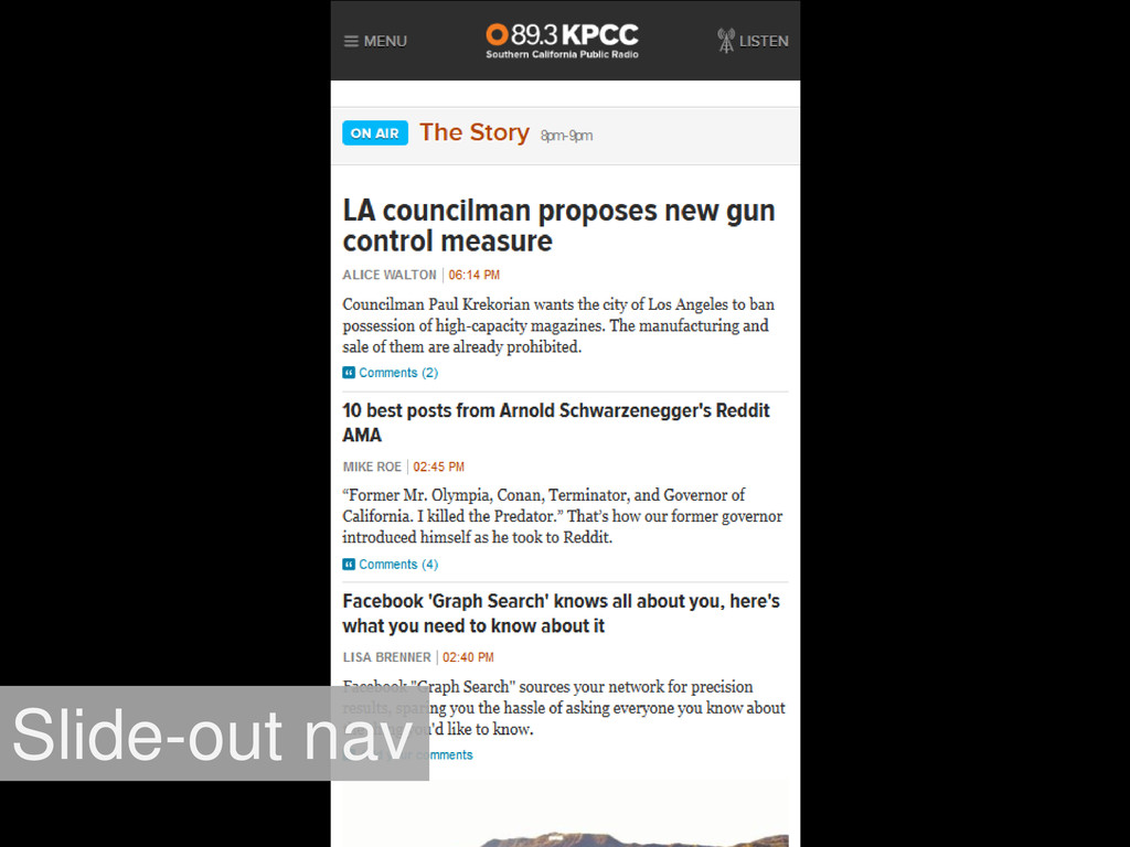
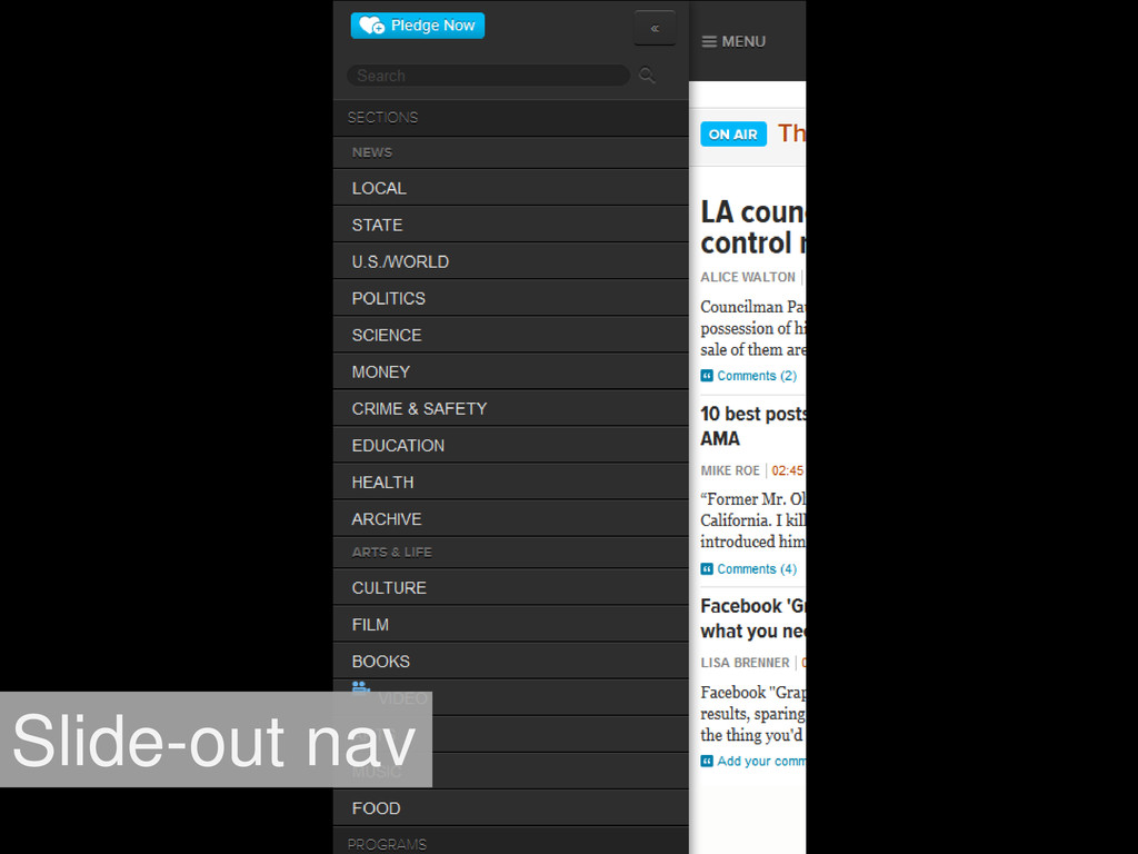
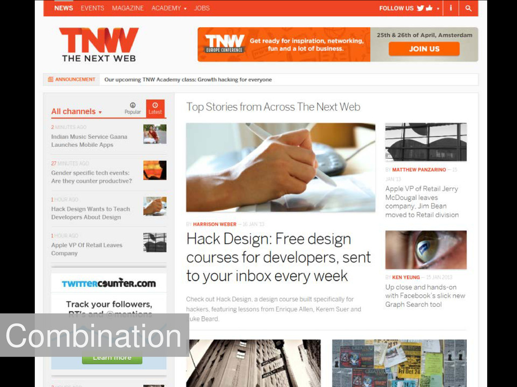
view • Web dev evolution • Options to support mobile devices • Strategy to support mobile devices • Responsive web design overview / why? • Taking the next steps • Frameworks • Design considerations and trends • Technical considerations • Tips when taking the plunge AGENDA
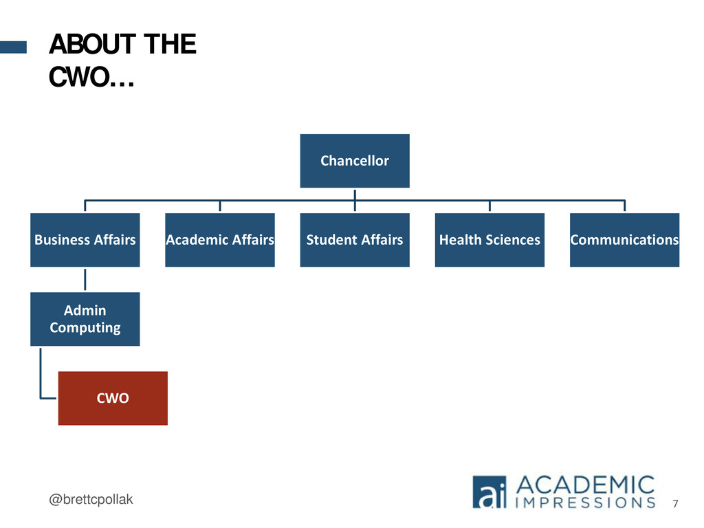
state money - No recharge • Emphasis on self-service, self-sustaining technology • We provide the tools, training, and frameworks • Clients provide the content and maintenance ABOUT THE CWO…
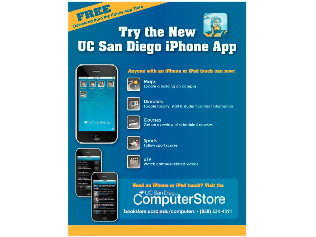
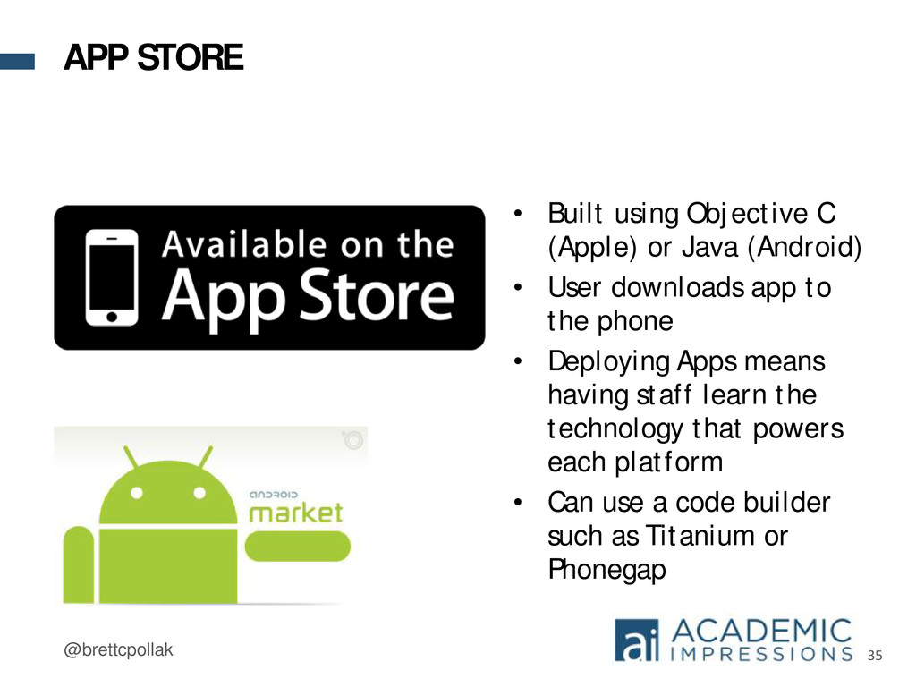
(Android) • User downloads app to the phone • Deploying Apps means having staff learn the technology that powers each platform • Can use a code builder such as Titanium or Phonegap APP STORE
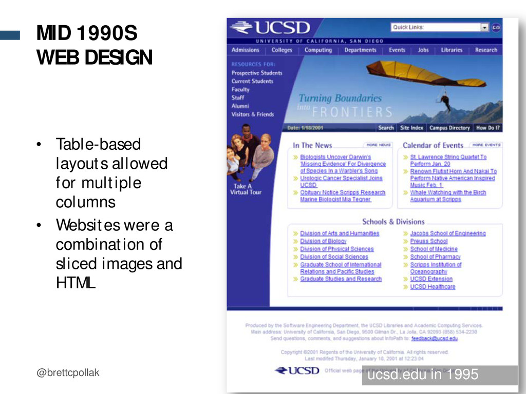
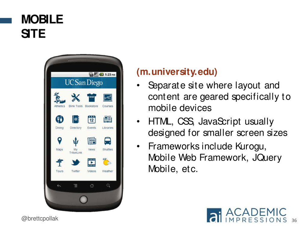
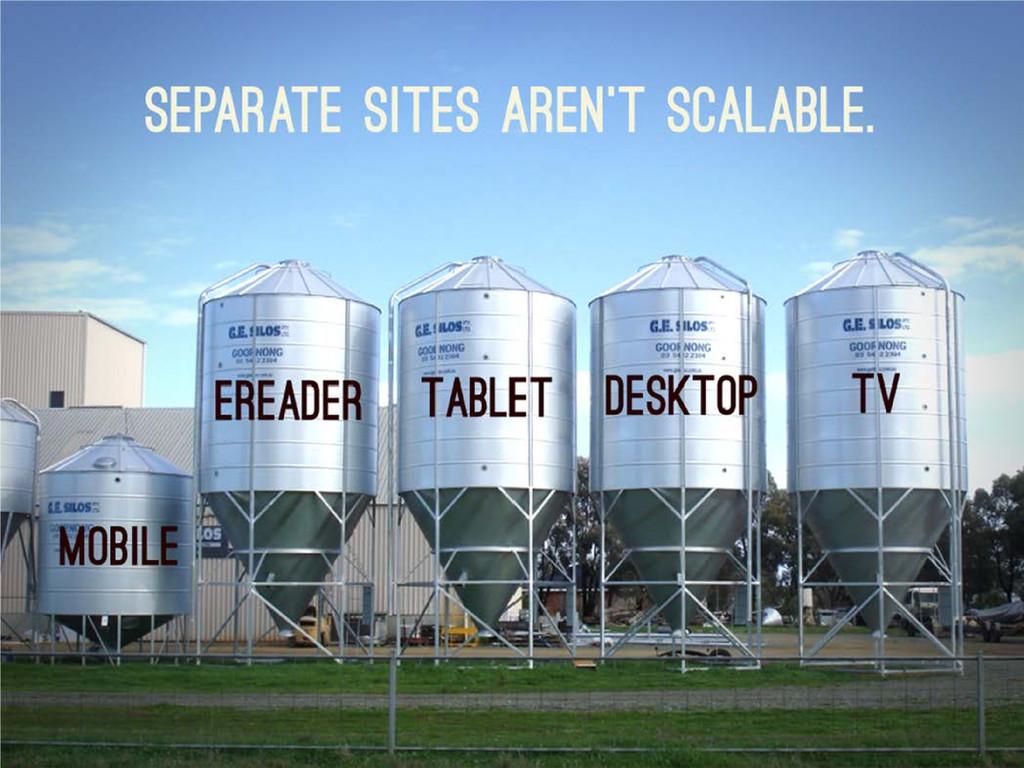
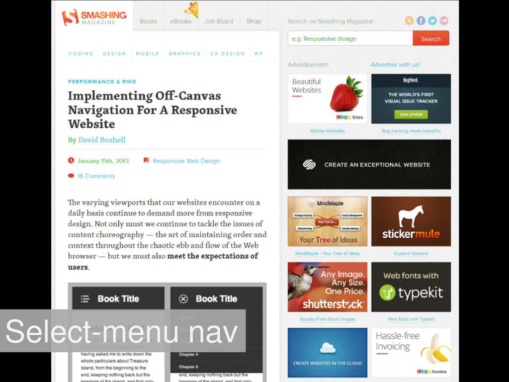
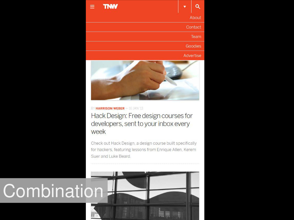
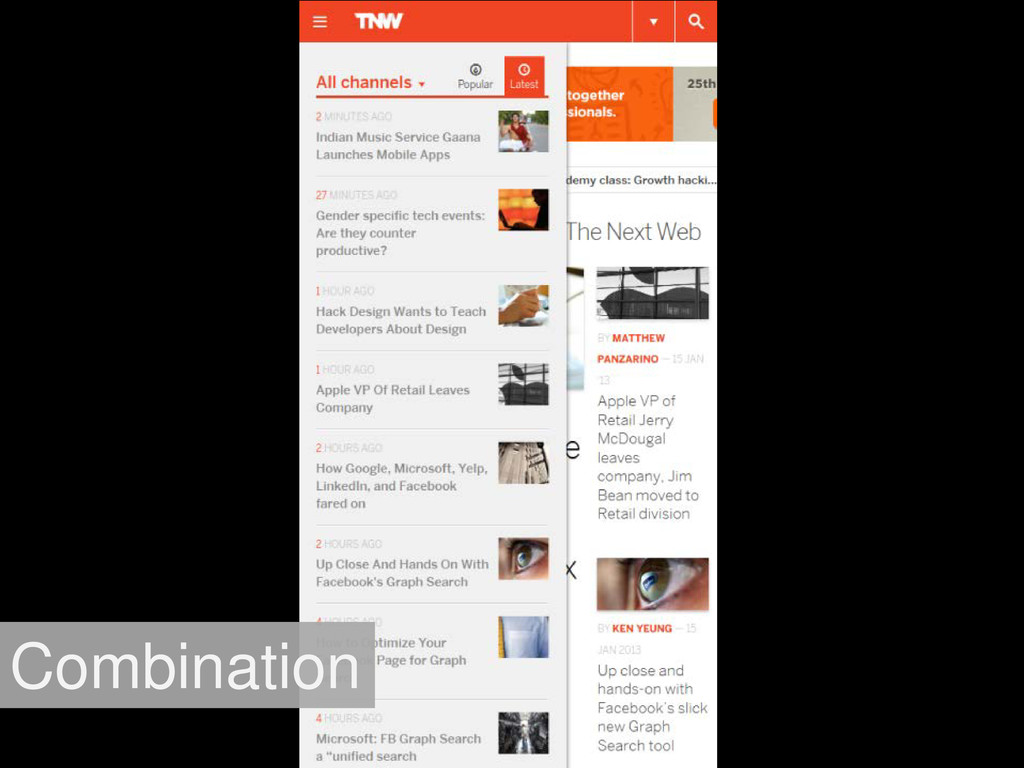
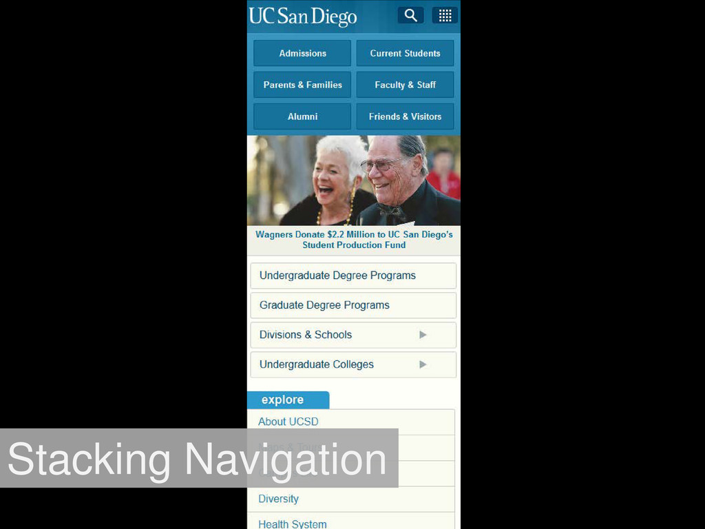
are geared specifically to mobile devices • HTML, CSS, JavaScript usually designed for smaller screen sizes • Frameworks include Kurogu, Mobile Web Framework, JQuery Mobile, etc. MOBILE SITE
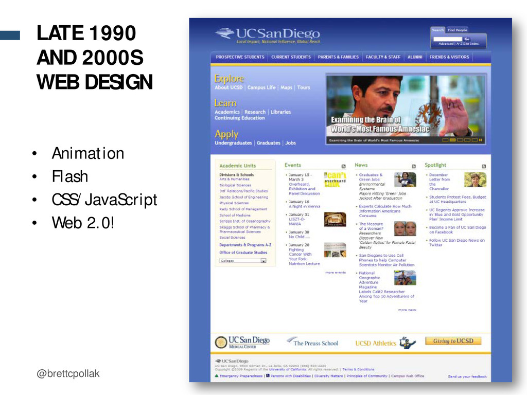
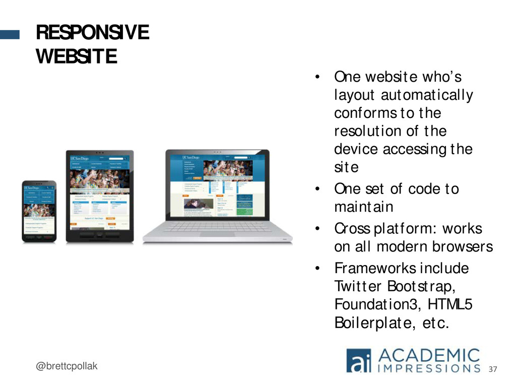
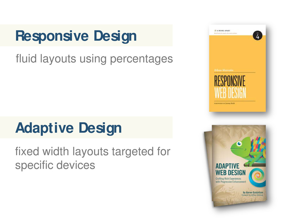
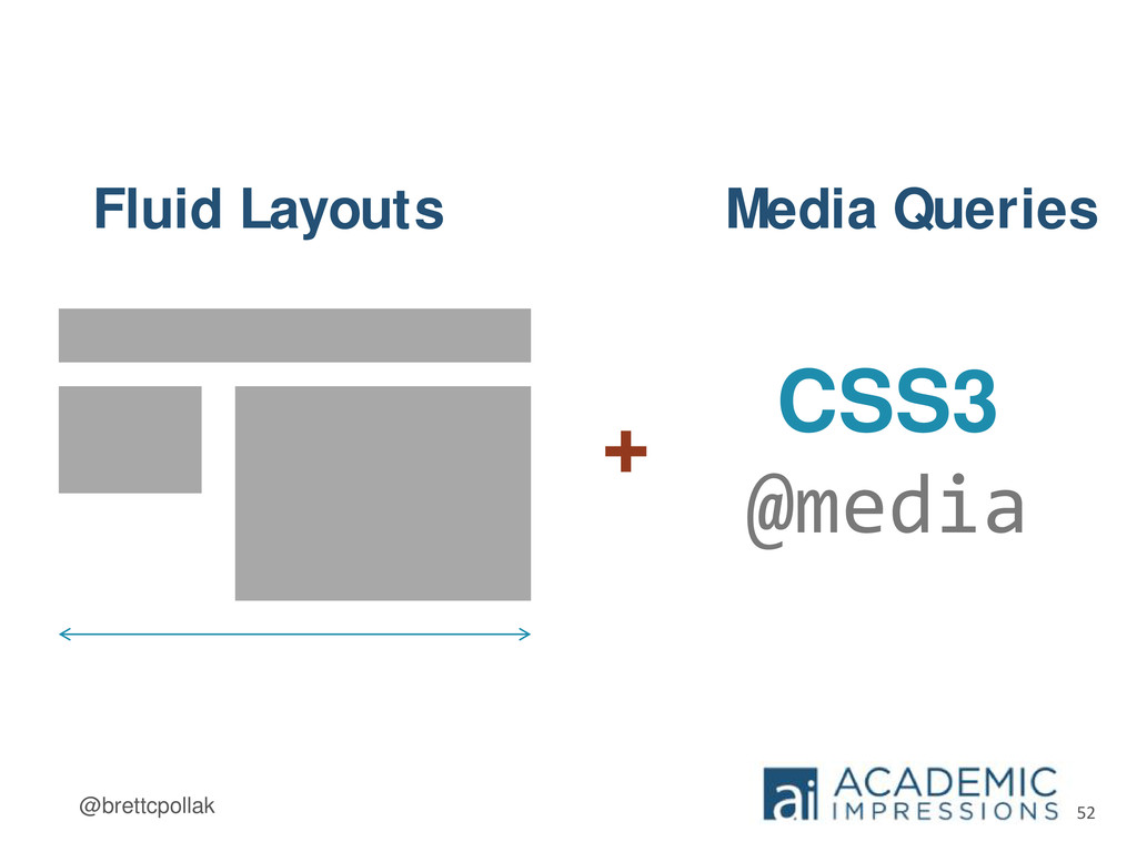
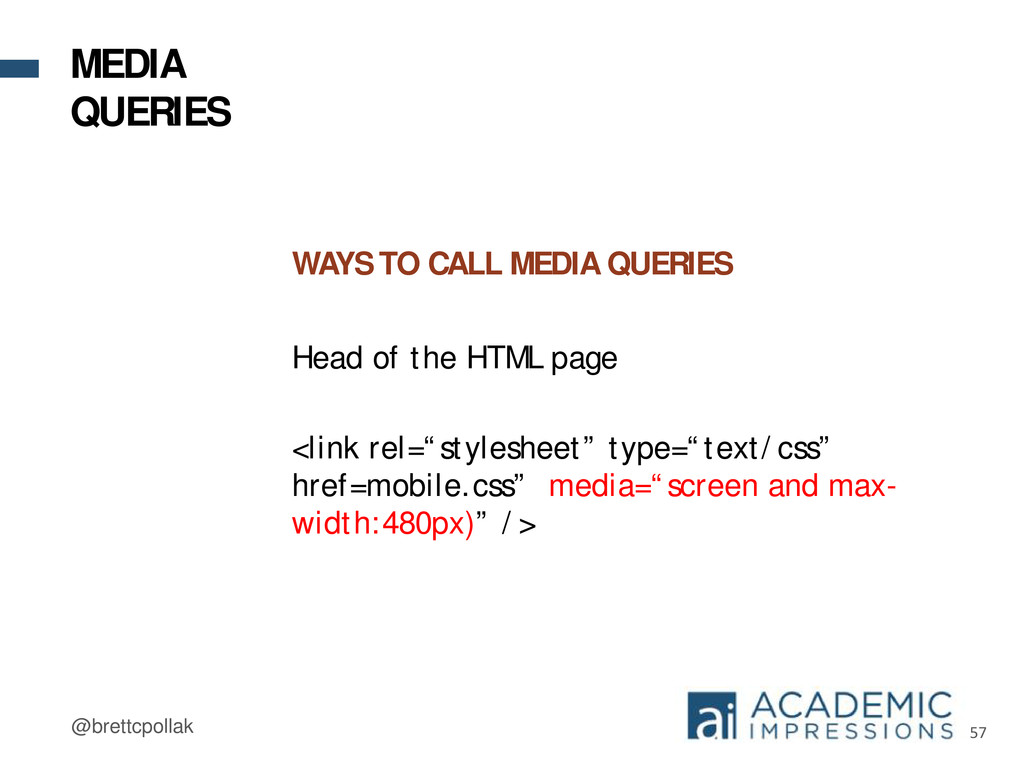
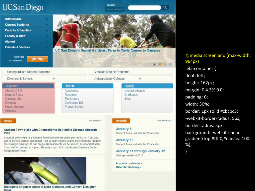
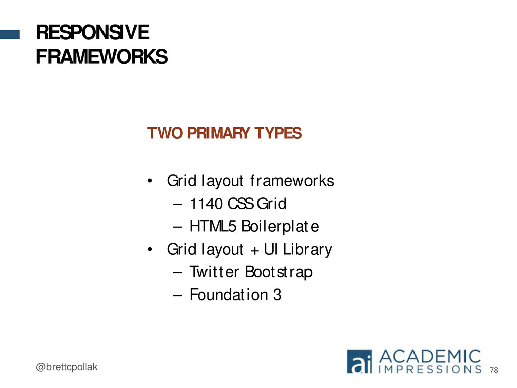
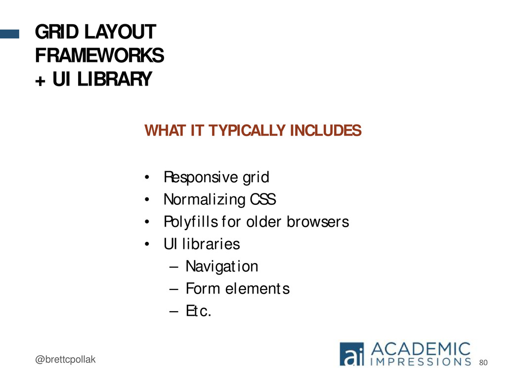
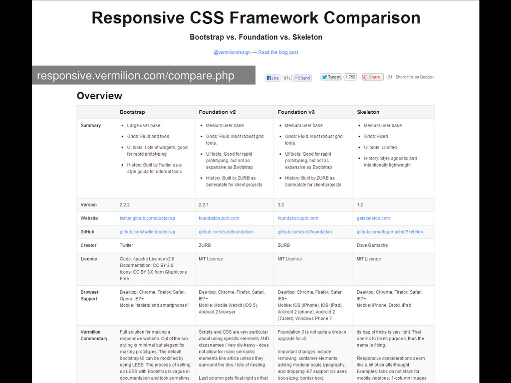
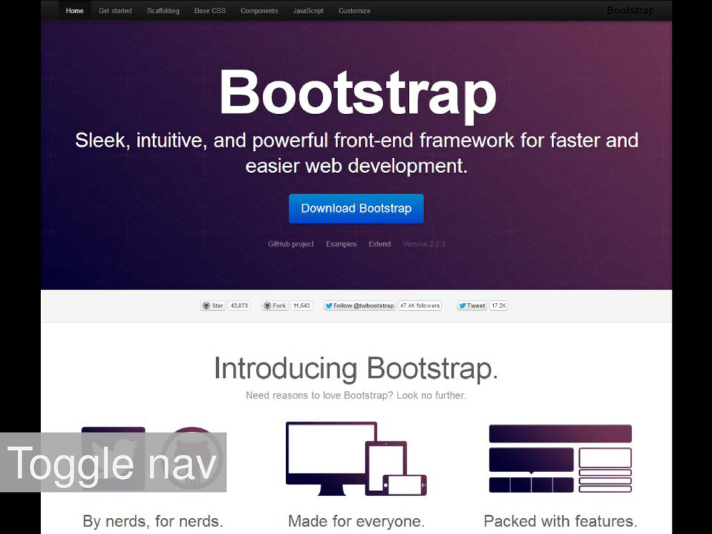
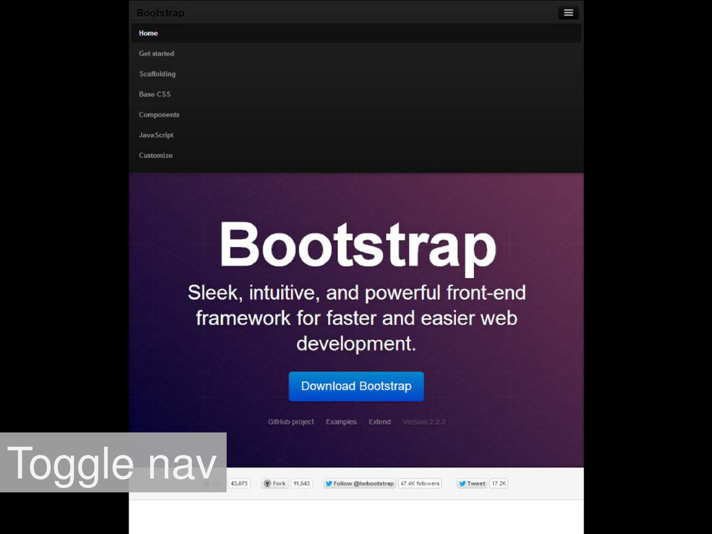
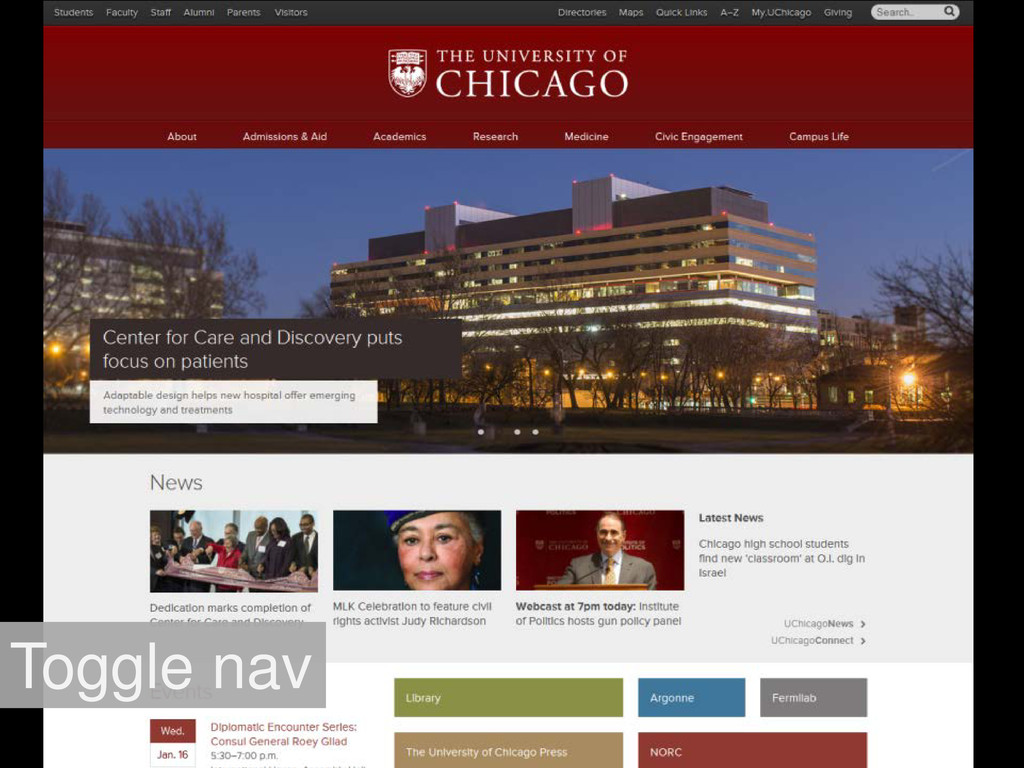
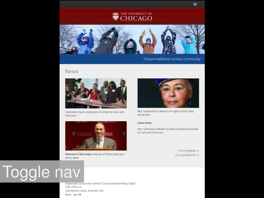
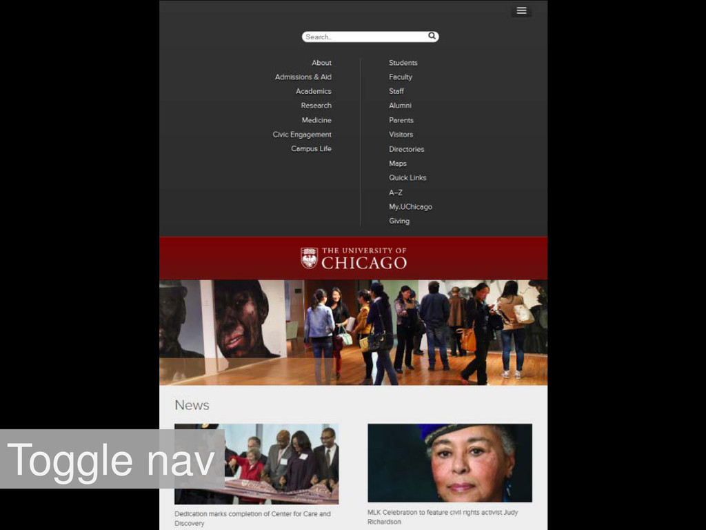
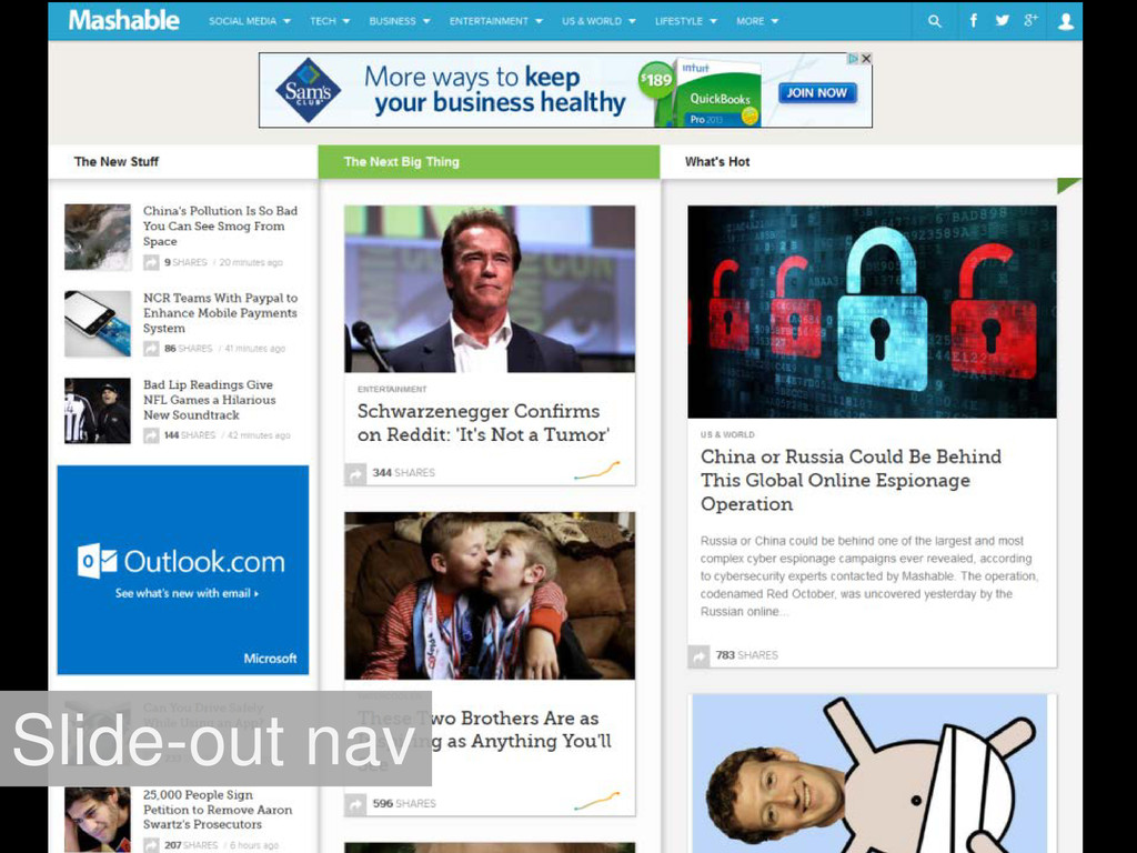
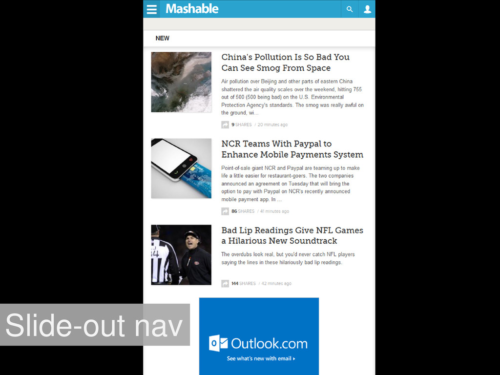
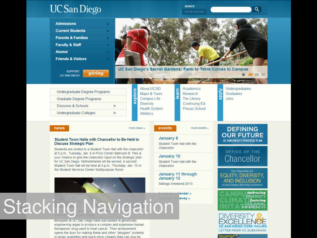
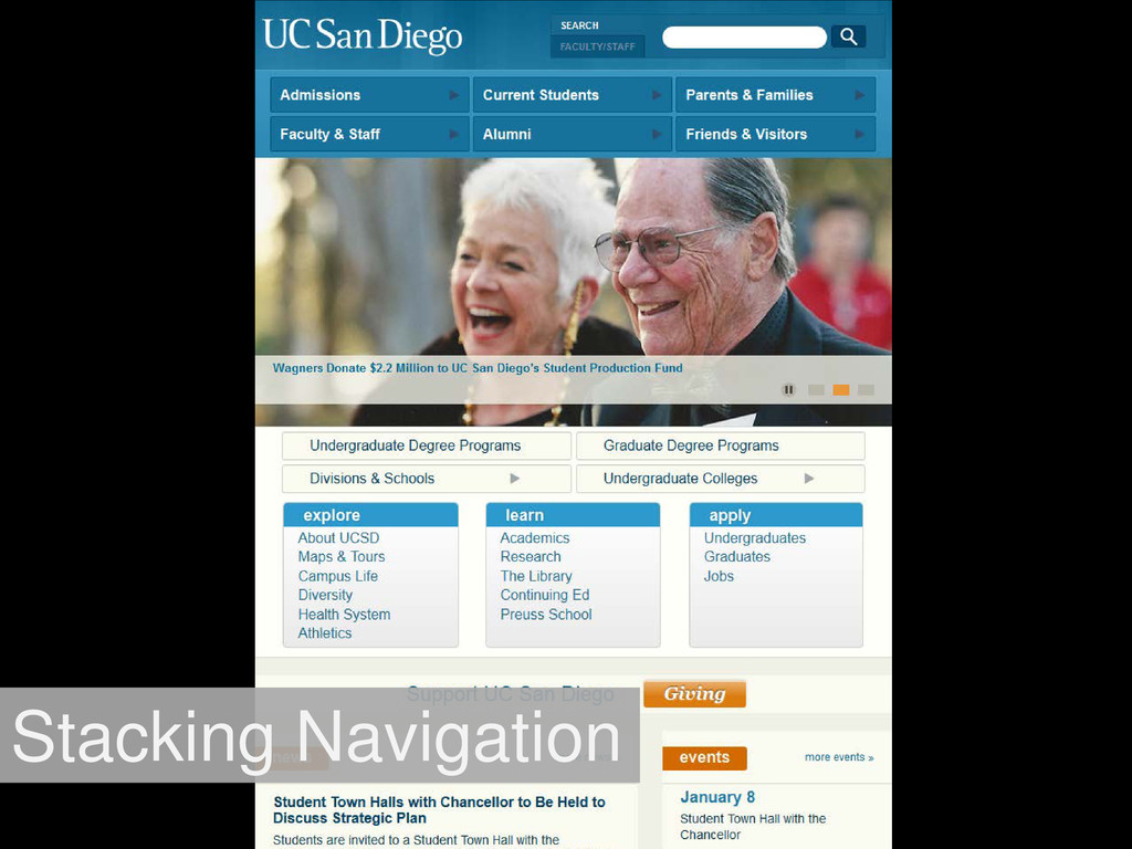
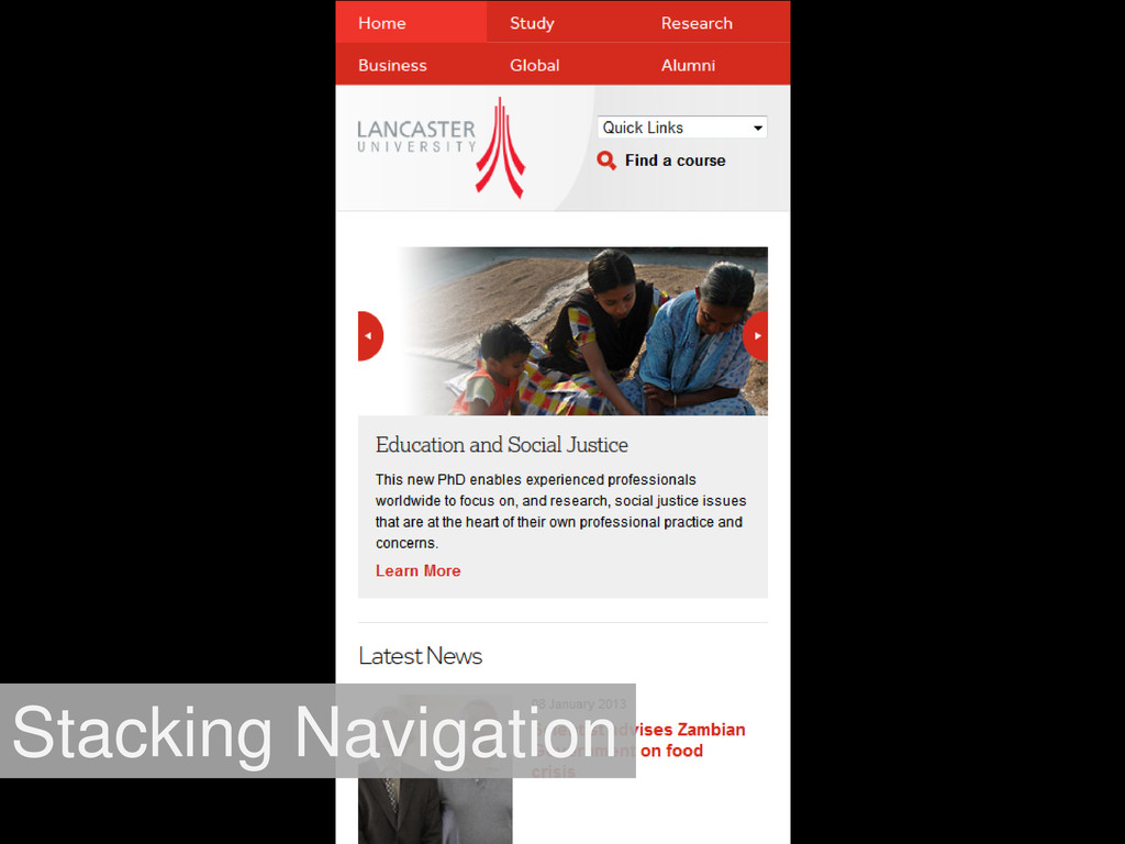
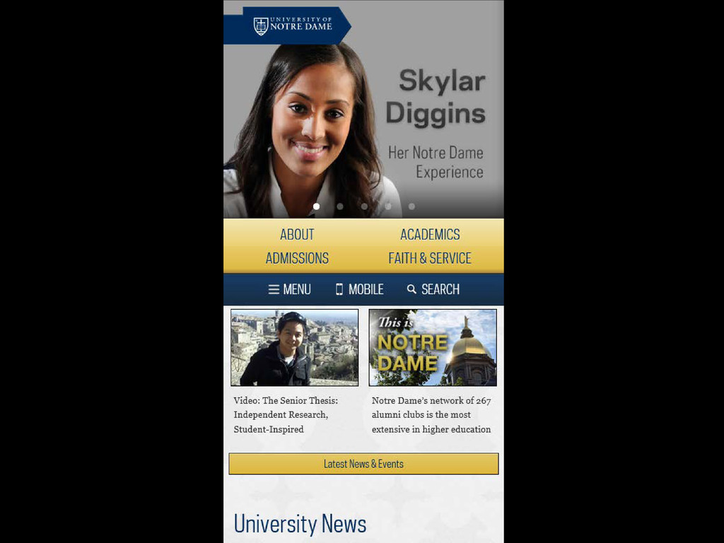
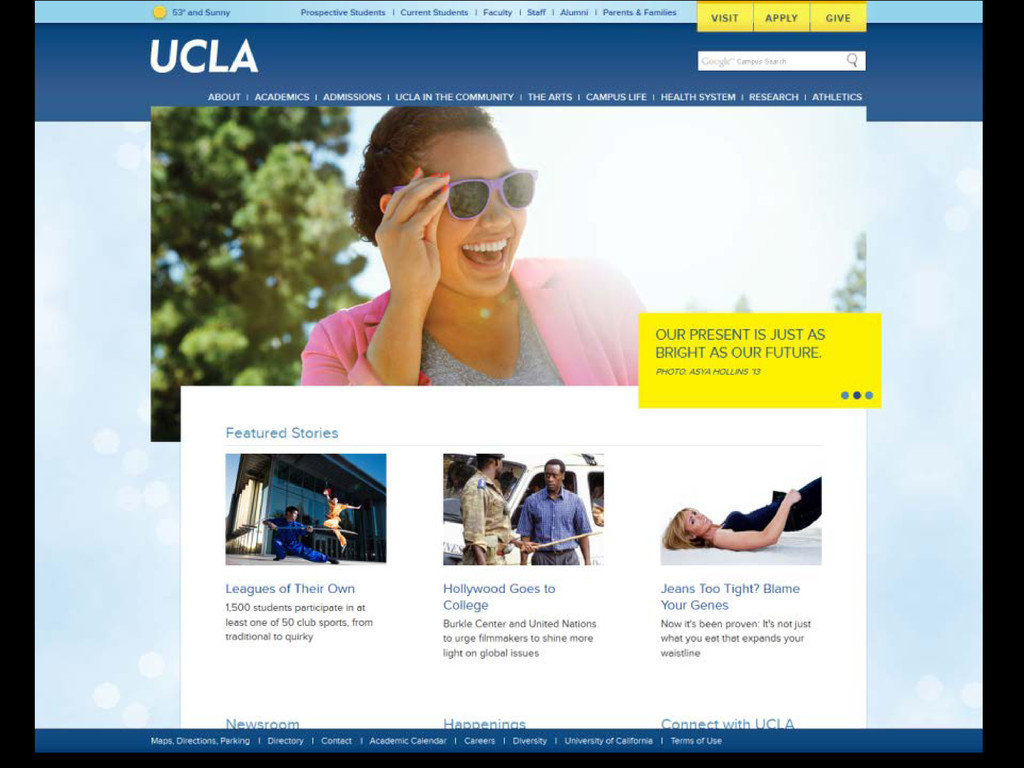
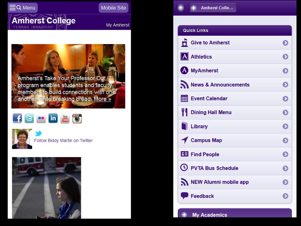
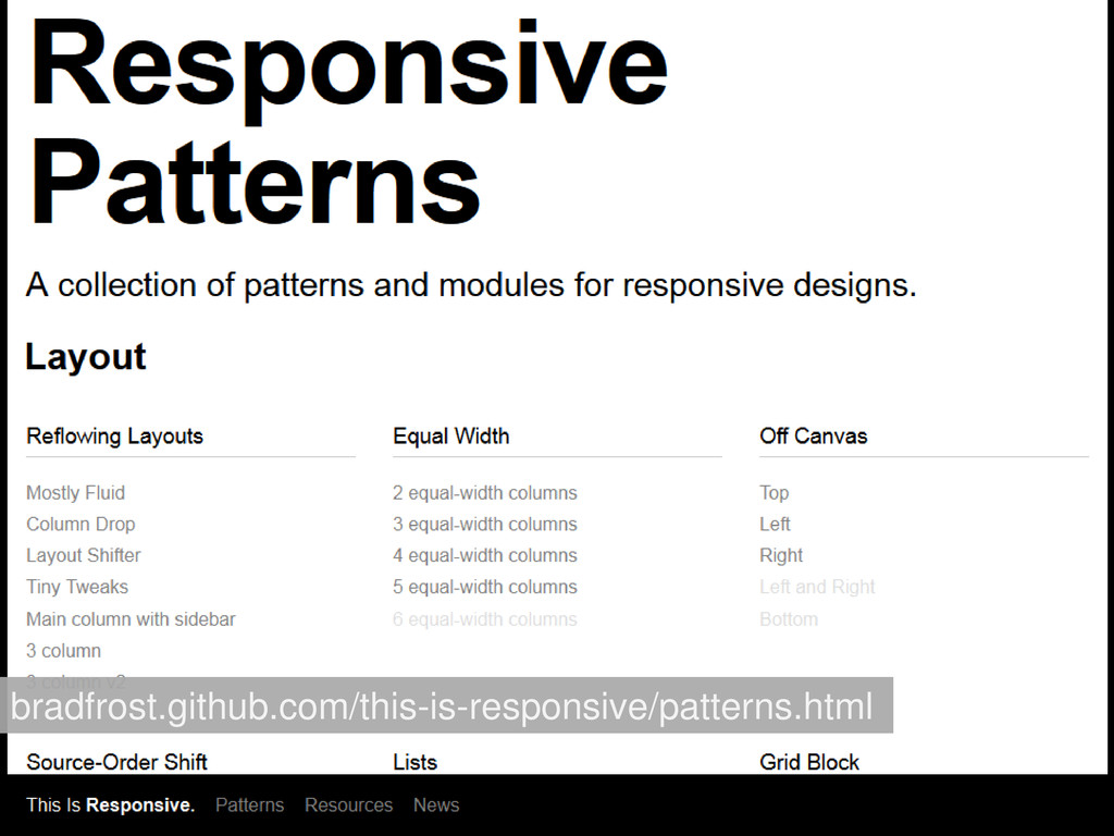
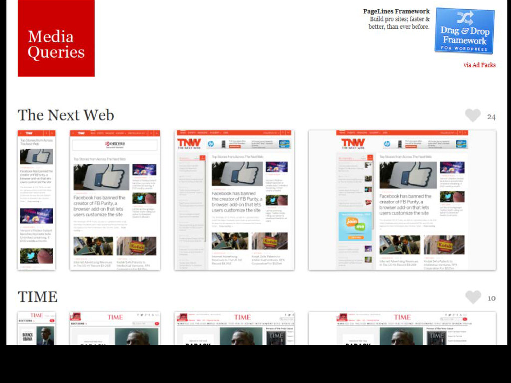
the resolution of the device accessing the site • One set of code to maintain • Cross platform: works on all modern browsers • Frameworks include Twitter Bootstrap, Foundation3, HTML5 Boilerplate, etc. RESPONSIVE WEBSITE
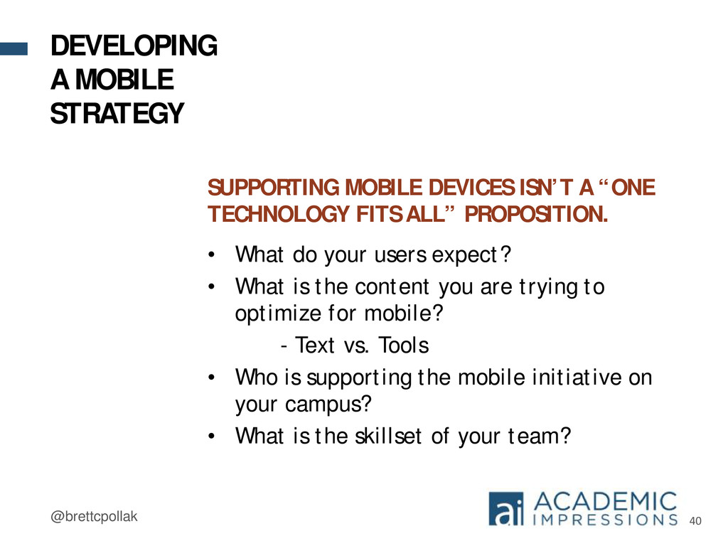
ALL” PROPOSITION. • What do your users expect? • What is the content you are trying to optimize for mobile? - Text vs. Tools • Who is supporting the mobile initiative on your campus? • What is the skillset of your team? DEVELOPING A MOBILE STRATEGY
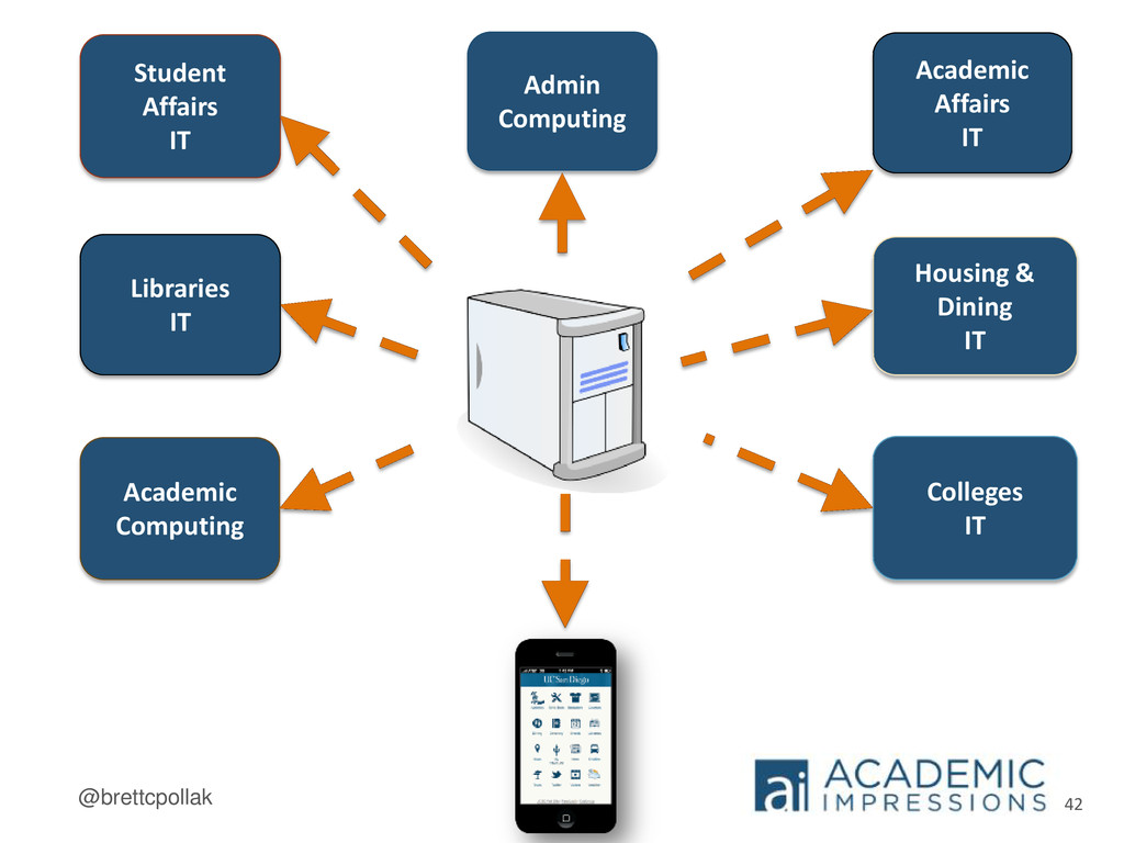
so our users expect an App • Distributed IT structure lends itself to a self services model for building mobile Apps • Each IT shop has a different technology preference (Java, .NET, PHP, etc.) • Mobile Web Framework (MWF) for building mobile Web Apps DEVELOPING A MOBILE STRATEGY
like with mobile site • Link friendly: sending or sharing links are optimized for the device the recipient uses • Optimizes website not just for mobile but for larger screens RESPONSIVE WEBSITE
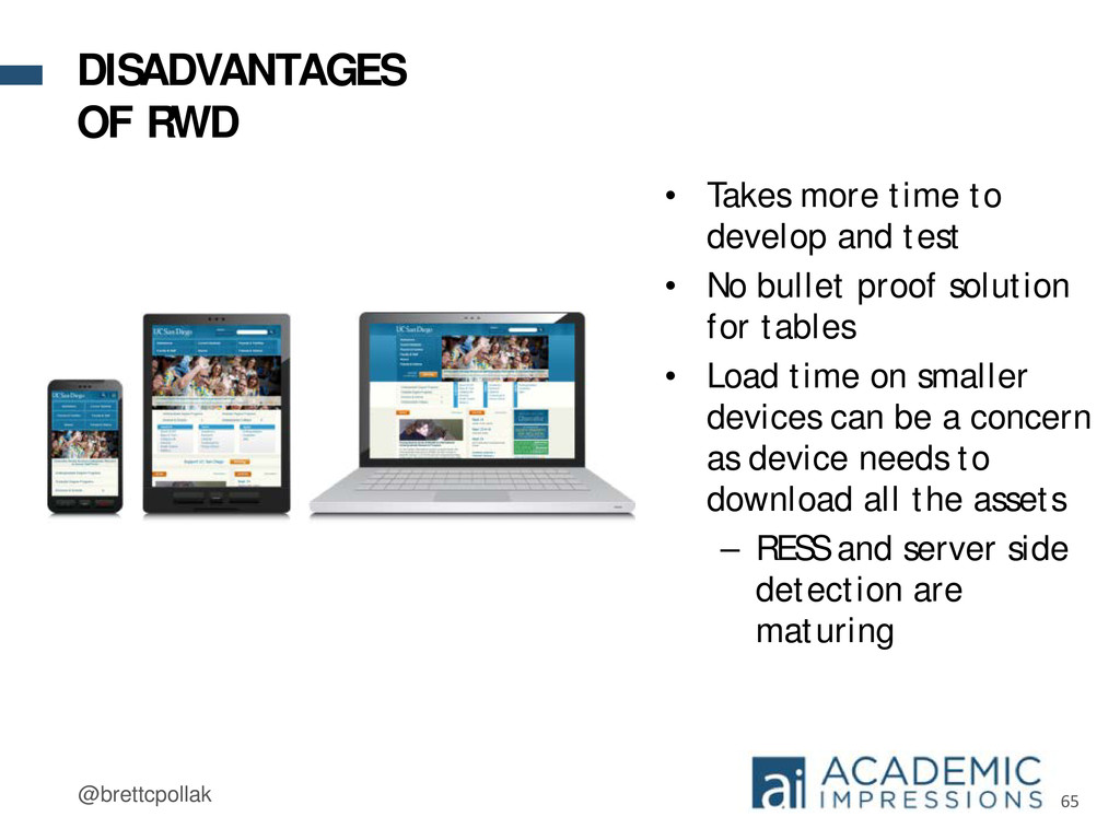
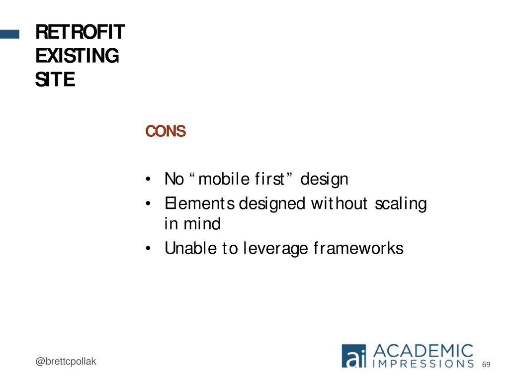
• No bullet proof solution for tables • Load time on smaller devices can be a concern as device needs to download all the assets – RESS and server side detection are maturing DISADVANTAGES OF RWD
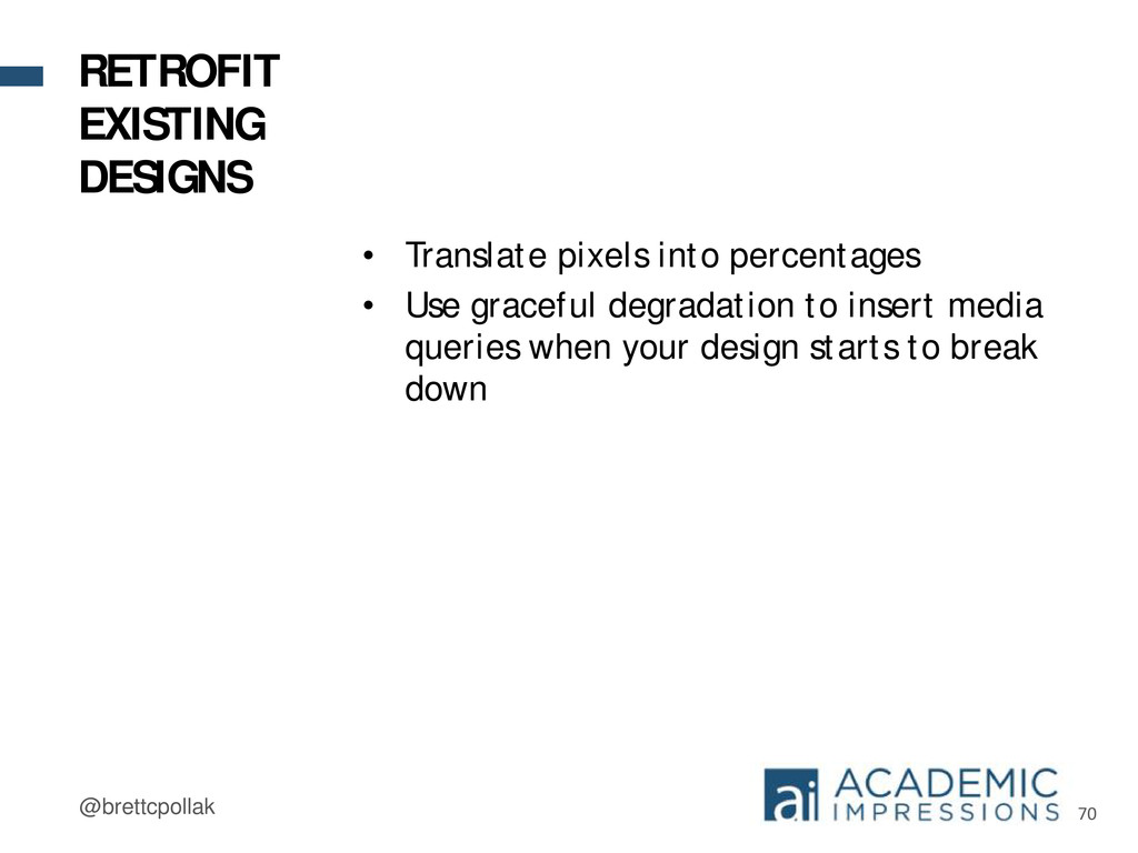
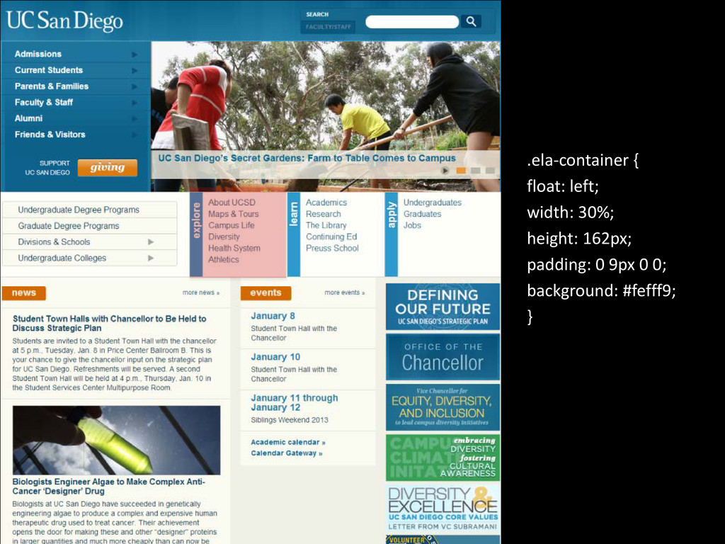
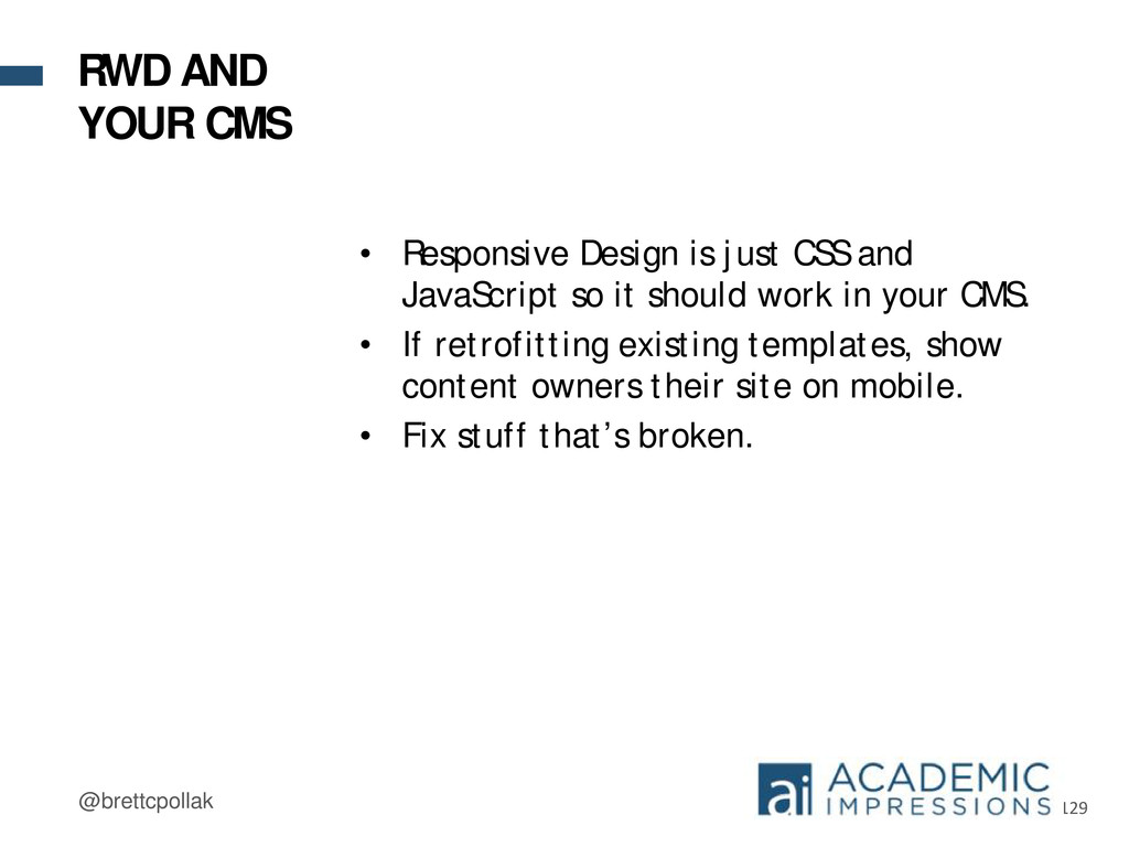
so it should work in your CMS. • If retrofitting existing templates, show content owners their site on mobile. • Fix stuff that’s broken. RWD AND YOUR CMS
 bpollak
 sugitak
 news_it_enj
 genda
genda
 tatsuya1970
 ks91
ks91
 hatahata021
 nek0128
 rakus_dev
 k8yasuma
 shibuiwilliam
 legalontechnologies
 nttcom
 helmedeiros
 reverentgeek
 scottboms
 tonyrice
 csswizardry
 khoart
 marktimemedia
 palkan
.png) helenjbeal
helenjbeal
 tammyeverts
 samanthasiow
 sabderemane