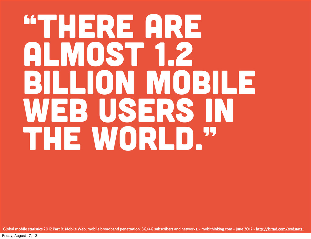
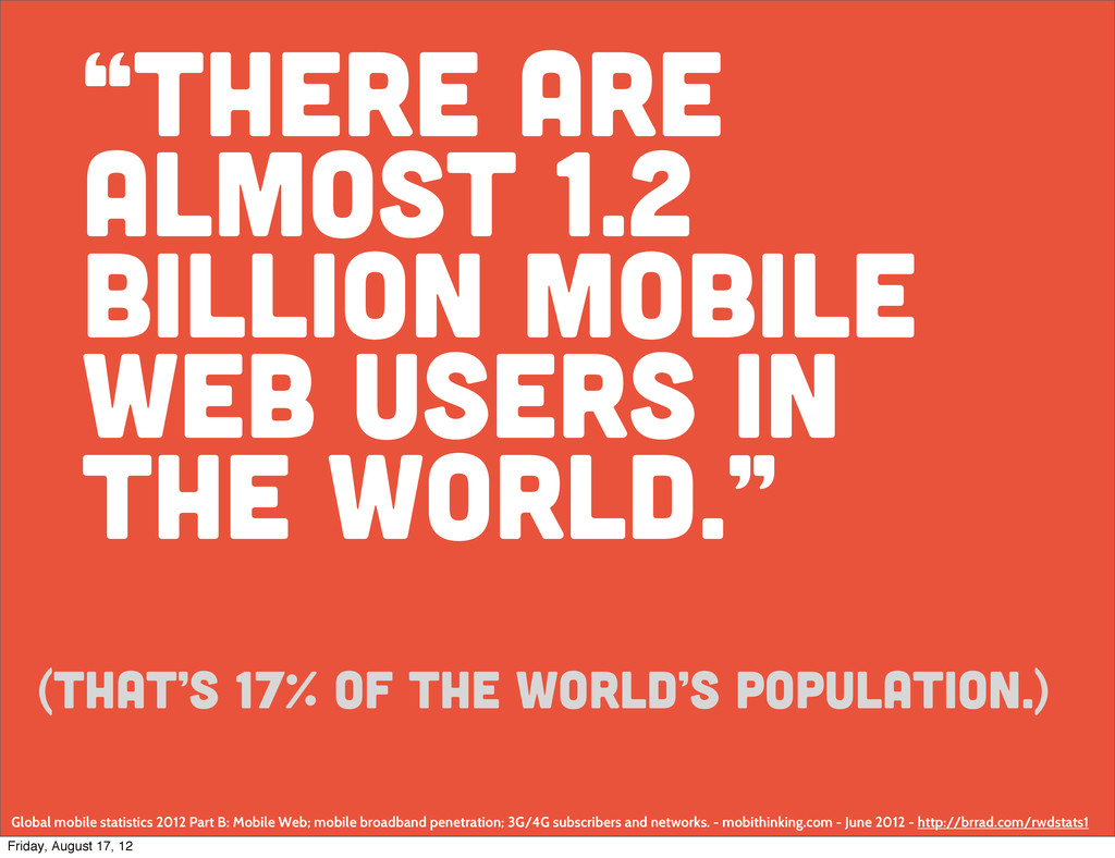
world.” Global mobile statistics 2012 Part B: Mobile Web; mobile broadband penetration; 3G/4G subscribers and networks. - mobithinking.com - June 2012 - http://brrad.com/rwdstats1 Friday, August 17, 12
world.” Global mobile statistics 2012 Part B: Mobile Web; mobile broadband penetration; 3G/4G subscribers and networks. - mobithinking.com - June 2012 - http://brrad.com/rwdstats1 (That’s 17% of the World’s population.) Friday, August 17, 12
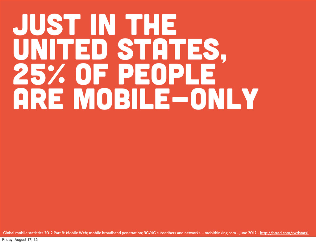
Global mobile statistics 2012 Part B: Mobile Web; mobile broadband penetration; 3G/4G subscribers and networks. - mobithinking.com - June 2012 - http://brrad.com/rwdstats1 Friday, August 17, 12
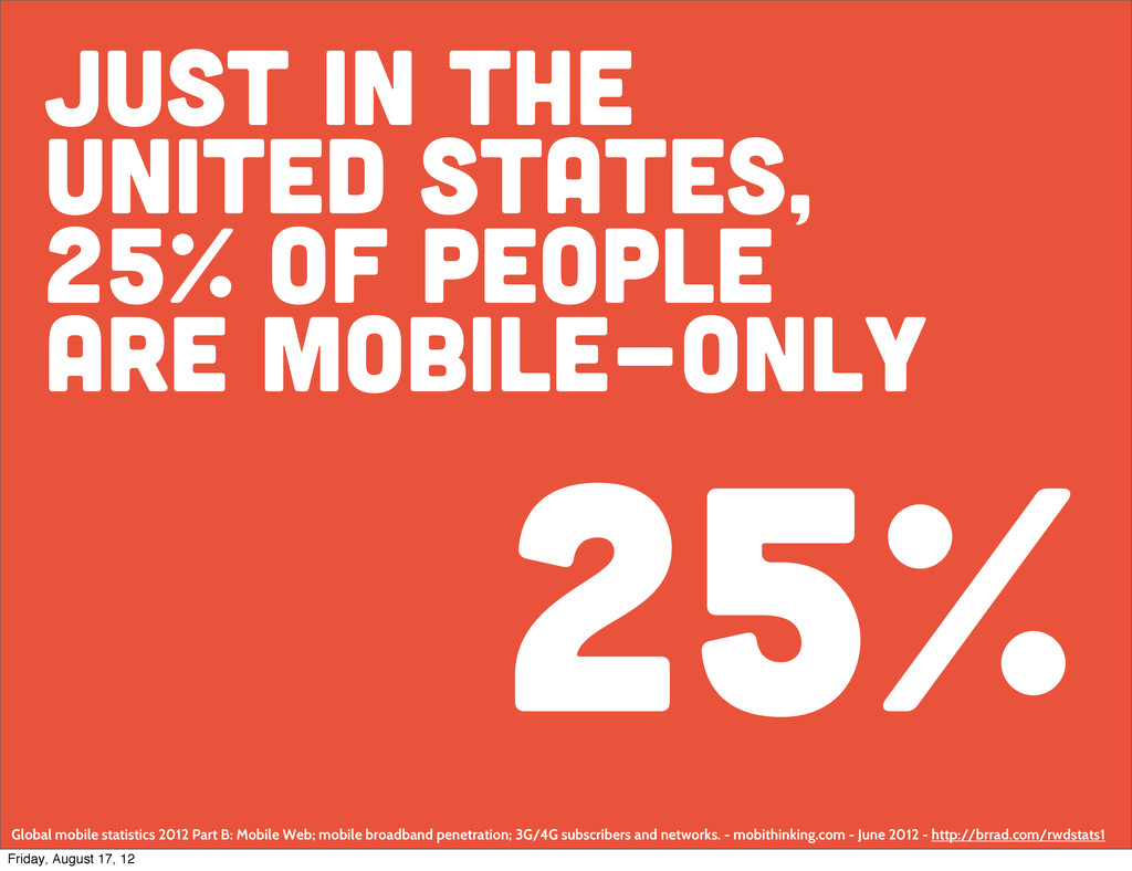
Global mobile statistics 2012 Part B: Mobile Web; mobile broadband penetration; 3G/4G subscribers and networks. - mobithinking.com - June 2012 - http://brrad.com/rwdstats1 25% Friday, August 17, 12
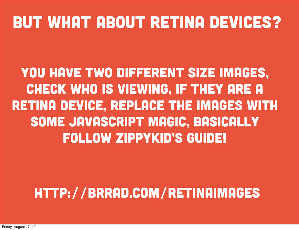
size images, check who is viewing, if they are a retina device, replace the images with some javascript magic, basically follow zippykid’s guide! Friday, August 17, 12
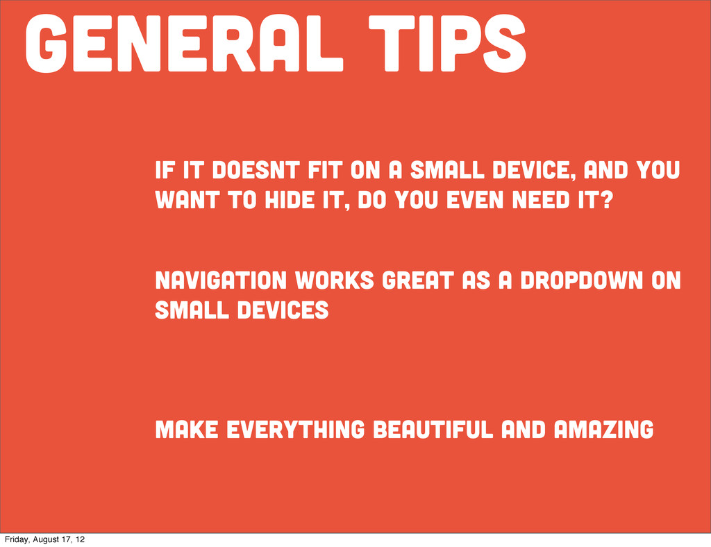
and you want to hide it, do you even need it? navigation works great as a dropdown on small devices make everything beautiful and amazing Friday, August 17, 12
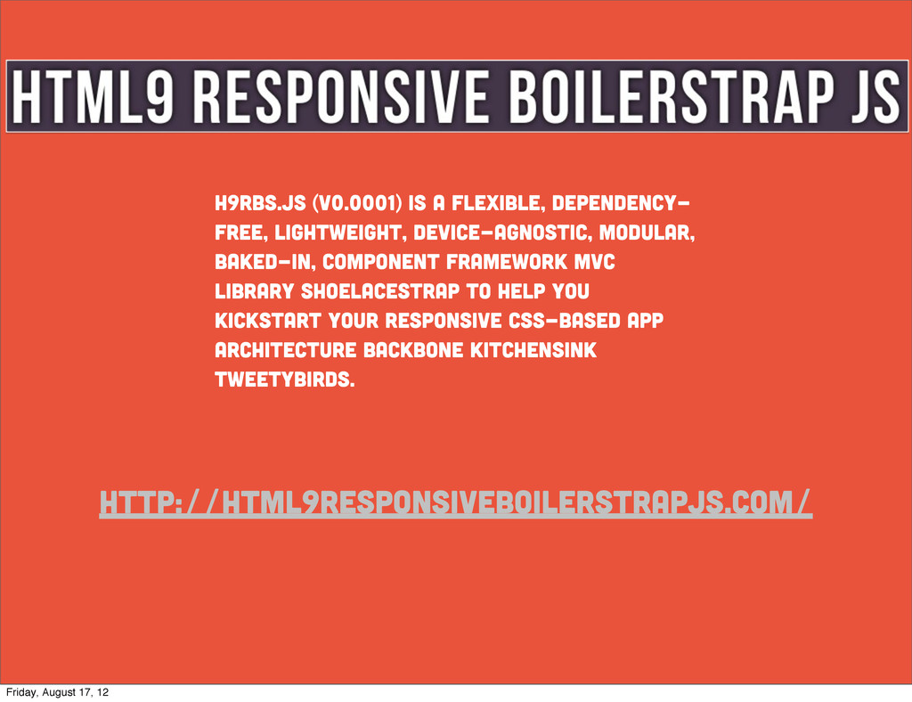
modular, baked-in, component framework MVC library shoelacestrap to help you kickstart your responsive CSS-based app architecture backbone kitchensink tweetybirds. Friday, August 17, 12
 bradp
bradp
 ioki
ioki
 tk3fftk
 andpad
 chobishiba
 d0riven
 akihisaikeda
 yusukebe
 chiroruxx
 har1101
 y0hgi
y0hgi
 tonkotsuboy_com
 nilpe
nilpe
 baasie
 eileencodes
 sstephenson
 addyosmani
 inesmontani
 retrage
 bcantrill
 jct
jct
 dugsong
 mfonobong
 cassininazir
![who am i? [email protected] @bradparbs bradparbs.com internet rockstar; Brad parbs](https://files.speakerdeck.com/presentations/502e4f2615c66a000204180f/slide_1.jpg)