Upgrade to Pro — share decks privately, control downloads, hide ads and more …

WordCamp Providence - Responsive Web Design

Brad Parbs
October 27, 2012

WordCamp Providence - Responsive Web Design

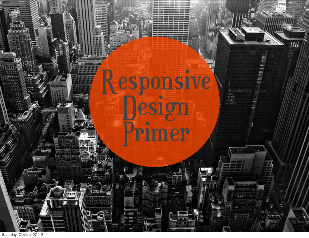
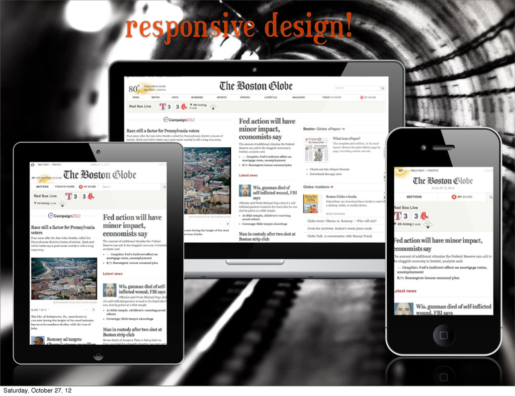
Responsive Design Primer: Want to learn what Responsive Design is? Learn the history of web design, what RWD is, why you should care, how you can get started using it, and some great tips for anyone who uses WordPress.

Brad Parbs

October 27, 2012
Tweet

More Decks by Brad Parbs

Other Decks in Design

Transcript

  1. Responsive
    Design
    Primer
    Saturday, October 27, 12

    View Slide

  2. Brad Parbs
    Plugin Developer
    Worked on over 100 WP sites
    C
    ore contributor for 3.5
    wrote the book “How to be Awesome”
    WordPress Designer
    Saturday, October 27, 12

    View Slide

  3. @BradParbs
    BradParbs.com
    Brad BradParbs.com
    @
    Saturday, October 27, 12

    View Slide

  4. Who are you?
    * Run a WordPress Blog
    * Created 
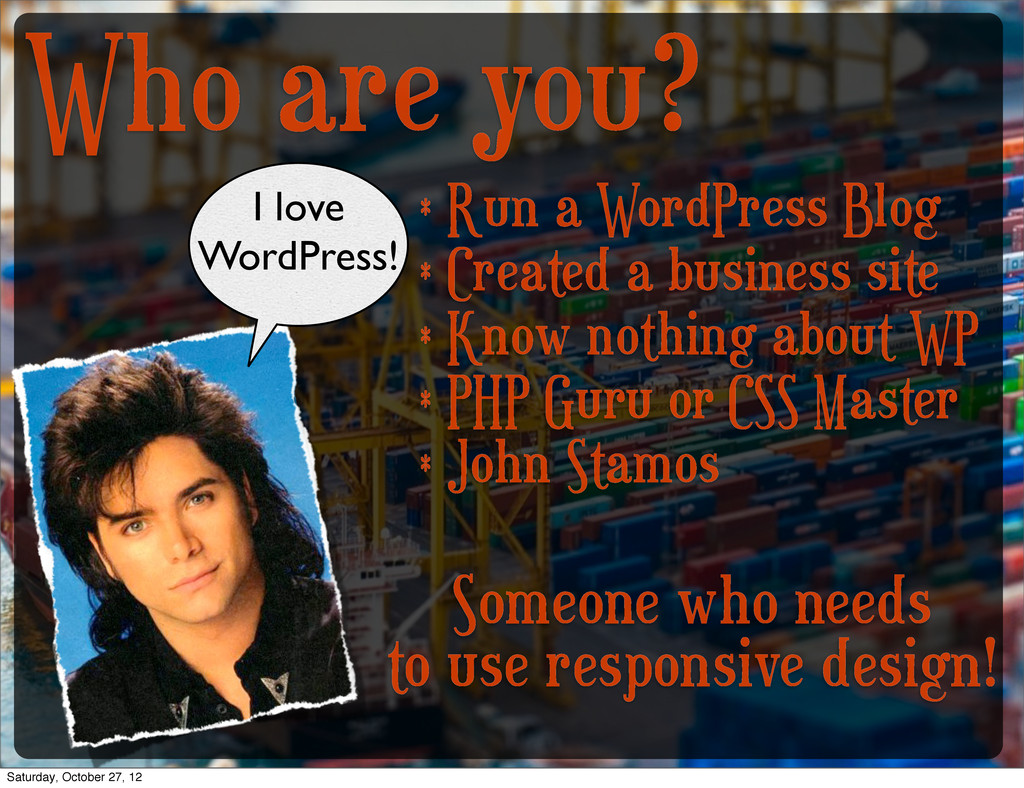
a business site
    * Know nothing about WP
    * PHP Guru or CSS Master
    * John Stamos
    I love
    WordPress!
    Someone who needs
    to use responsive design!
    Saturday, October 27, 12

    View Slide

  5. Why do we need Responsive Design?
    Over 1.2 billion
    mobile web users
    In the USA, 25%
    only use a mobile
    device
    Saturday, October 27, 12

    View Slide

  6. Well, that’s nice.
    But I don’t care
    about stats.
    Responsive design is the future.
    Saturday, October 27, 12

    View Slide

  7. What makes up a theme?
    Saturday, October 27, 12

    View Slide

  8. Saturday, October 27, 12

    View Slide

  9. the magic of CSS!
    Saturday, October 27, 12

    View Slide

  10. A little history on website design
    Saturday, October 27, 12

    View Slide

  11. “Building a website with tables
    is like building a website in Excel.
    Using a spreadsheet. It’s dumb.
    Really dumb.”
    -Bill C
    osby (not really)
    Saturday, October 27, 12

    View Slide

  12. 100% Flash sites
    Saturday, October 27, 12

    View Slide

  13. fluid grid systems
    Saturday, October 27, 12

    View Slide

  14. responsive design!
    Saturday, October 27, 12

    View Slide

  15. Saturday, October 27, 12

    View Slide

  16. Saturday, October 27, 12

    View Slide

  17. https://status.heroku.com/
    http://www.bostonglobe.com/
    Saturday, October 27, 12

    View Slide

  18. http://robot-or-not.com/
    http://colly.com/
    Saturday, October 27, 12

    View Slide

  19. http://thinkvitamin.com/
    http://www.pelicanfly.co.uk/
    Saturday, October 27, 12

    View Slide

  20. http://stuffandnonsense.co.uk/projects/320andup/
    http://hellofisher.com/
    Saturday, October 27, 12

    View Slide

  21. So what actually makes up RWD?
    1. Fluid/Flexible Grid System
    2. Responsive/Adaptive media
    3. Media Queries!
    Saturday, October 27, 12

    View Slide

  22. flexible grid system
    Breaks the site content in blocks that can be moved around.
    Sized using ‘ems’ or percentages NOT pixel widths.
    pxtoem.com
    Figure out your widths:
    Saturday, October 27, 12

    View Slide

  23. adaptive media
    Images and Videos that resize themselves
    wordpress.org/extend/plugins/wp-fluid-images/
    WP 
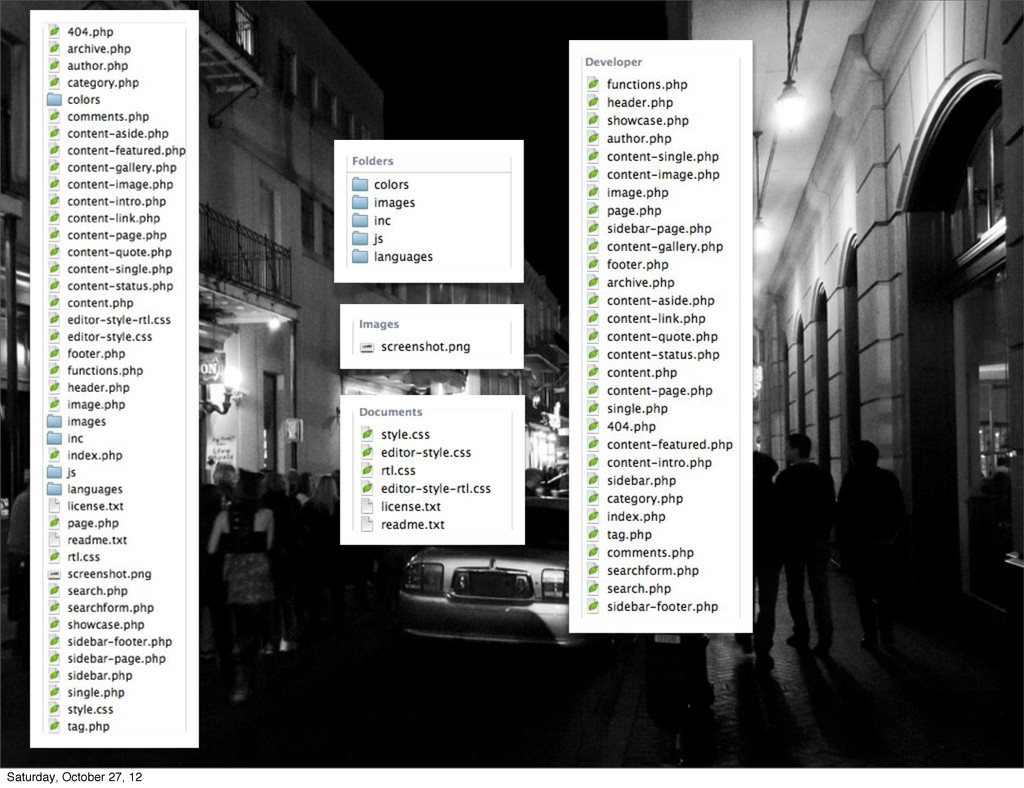
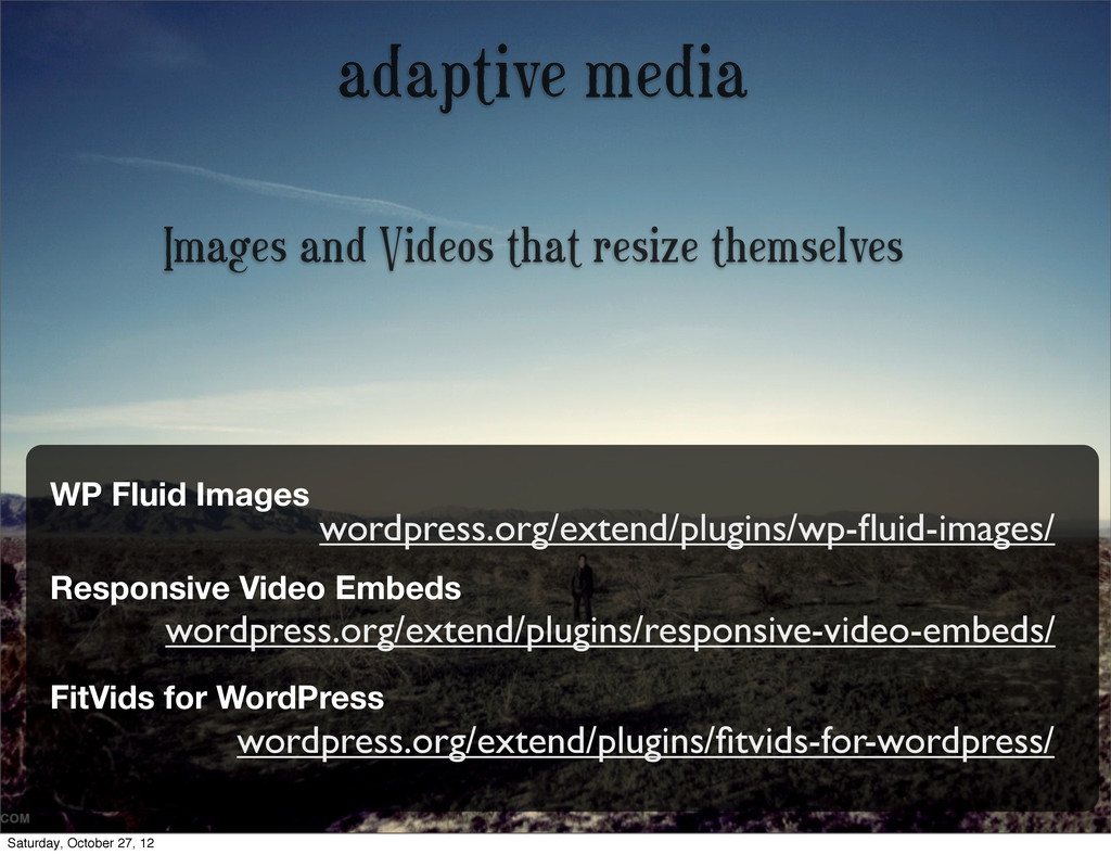
Fluid Images
    Responsive Video Embeds
    wordpress.org/extend/plugins/responsive-video-embeds/
    FitVids for WordPress
    wordpress.org/extend/plugins/fitvids-for-wordpress/
    Saturday, October 27, 12

    View Slide

  24. media queries
    CSS that gets applied for specific cases
    C
    an target device widths, rotation, etc
    Reformat sites and move things around
    Saturday, October 27, 12

    View Slide

  25. http://brrad.com/queries
    clear your floats
    change font size
    float things left
    change your nav
    Saturday, October 27, 12

    View Slide

  26. Saturday, October 27, 12

    View Slide

  27. Saturday, October 27, 12

    View Slide

  28. Saturday, October 27, 12

    View Slide

  29. Saturday, October 27, 12

    View Slide

  30. everything float: none;
    Saturday, October 27, 12

    View Slide

  31. everything float: left;
    margins, padding,
    width adjusted
    Saturday, October 27, 12

    View Slide

  32. float: right;
    float: left;
    Saturday, October 27, 12

    View Slide

  33. Saturday, October 27, 12

    View Slide

  34. Saturday, October 27, 12

    View Slide

  35. how the #%&! do I test on all of these?
    Saturday, October 27, 12

    View Slide

  36. Some things to think about...
    * L
    ook at stats, optimize for
    those devices first
    * Simplify your site for all
    devices, desktop, and mobile
    * Don’t be afraid to go test at
    the AT&T store
    Saturday, October 27, 12

    View Slide

  37. always strive to make your site
    beautiful, no matter what
    Saturday, October 27, 12

    View Slide

  38. Struggling with integrating this?
    Ask for help on WordPress.org
    Talk to people here!
    L
    ook how other themes do it
    Google!
    Saturday, October 27, 12

    View Slide

  39. More useful plugins!
    wordpress.org/extend/plugins/responsive-select-menu/
    Responsive Select Menu
    WP Orbit Slider
    wordpress.org/extend/plugins/wp-orbit-slider/
    Meteor Slides
    wordpress.org/extend/plugins/meteor-slides/
    Saturday, October 27, 12

    View Slide

  40. Things to
    think about
    Saturday, October 27, 12

    View Slide

  41. So, let’s recap.
    Media queries rock!
    L
    ots of cool 
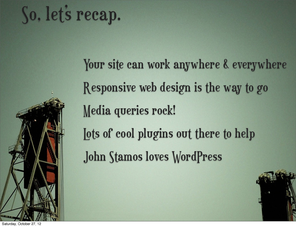
plugins out there to help
    Responsive web design is the way to go
    Your site can work anywhere & everywhere
    John Stamos loves WordPress
    Saturday, October 27, 12

    View Slide

  42. @BradParbs
    BradParbs.com
    [email protected]
    Go make your site
    responsive
    right meow!
    Slides:
    brrad.com/pvd
    Saturday, October 27, 12

    View Slide