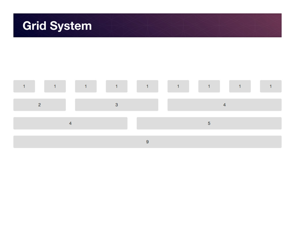
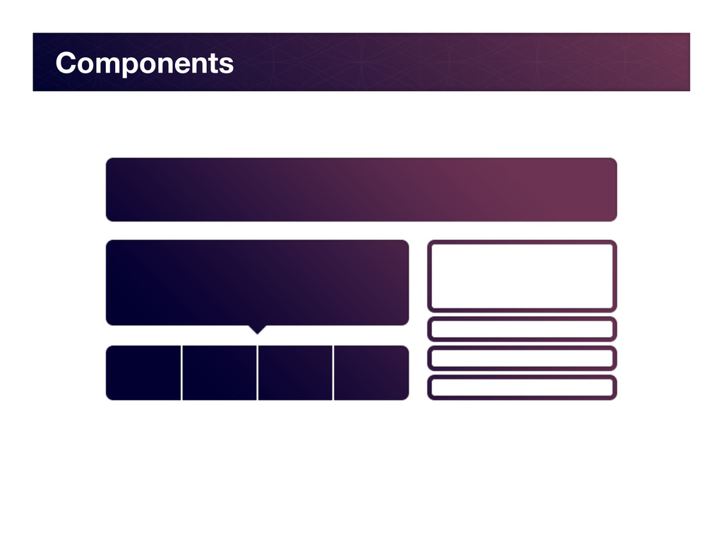
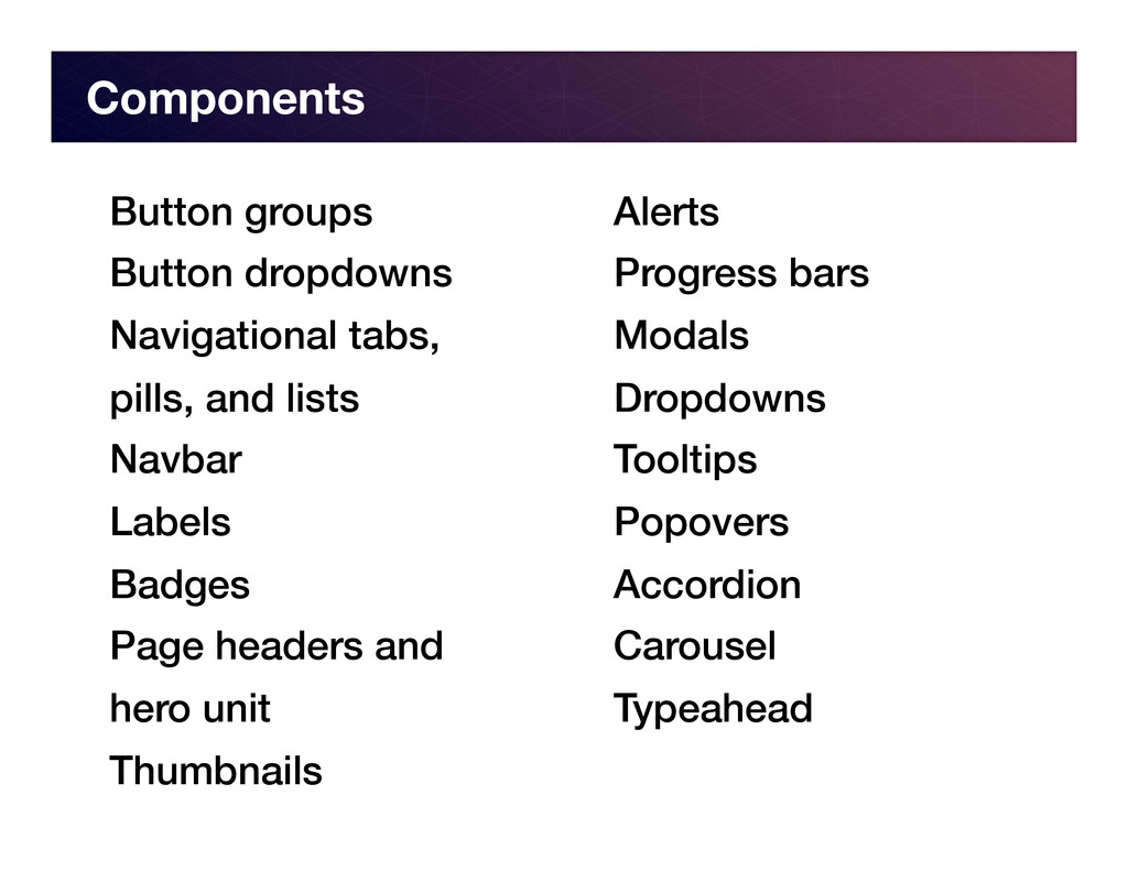
of web apps and sites. It provides an easy-‐to-‐implement 960 pixel grid for efficient layout, as well as expertly craHed styles for typography, navigaIon, tables, forms, bu"ons, and more.
quick, clean and highly usable applicaIons … providing a clean and uniform soluIon to the most common, everyday interface tasks developers come across. -‐ @mdo (co-‐creator)
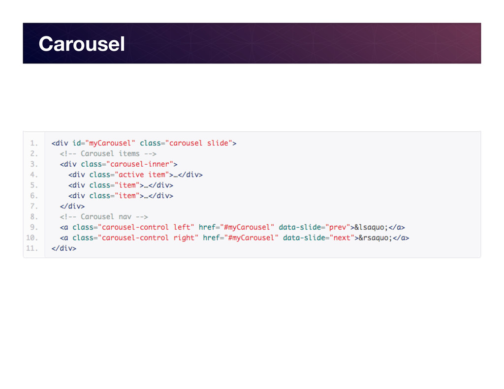
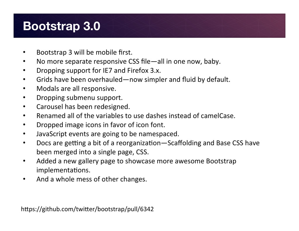
• No more separate responsive CSS file—all in one now, baby. • Dropping support for IE7 and Firefox 3.x. • Grids have been overhauled—now simpler and fluid by default. • Modals are all responsive. • Dropping submenu support. • Carousel has been redesigned. • Renamed all of the variables to use dashes instead of camelCase. • Dropped image icons in favor of icon font. • JavaScript events are going to be namespaced. • Docs are geang a bit of a reorganizaIon—Scaffolding and Base CSS have been merged into a single page, CSS. • Added a new gallery page to showcase more awesome Bootstrap implementaIons. • And a whole mess of other changes. h"ps://github.com/twi"er/bootstrap/pull/6342
 chrisgriffith
 vtryo
vtryo
 ysknsid25
 sansantech
 kozotaira
 shift_evolve
 kanny
kanny
 kobayashiyorimitsu
 nwiizo
 hiroyaonoe
 sugupoko
 chmikata
 nealle
 livdayseo
 kneath
 eitanlees
 aemeredith
 marcduiker
 sugarenia
 jct
jct
 davidcarrasco
 panda_program
 swwweet
 sabderemane
 kristinabergwall1
![Thanks! chris.griffi[email protected] @chrisgriffith h"p://chrisgriffith.wordpress.com/](https://files.speakerdeck.com/presentations/e4176080805901302c9a22000a1c8a5a/slide_44.jpg)