Lecture slides for Week 02, Lecture 02b of the Saint Louis University Course Quantitative Analysis: Applied Inferential Statistics. These slides cover the basics of the R package ggplot2.
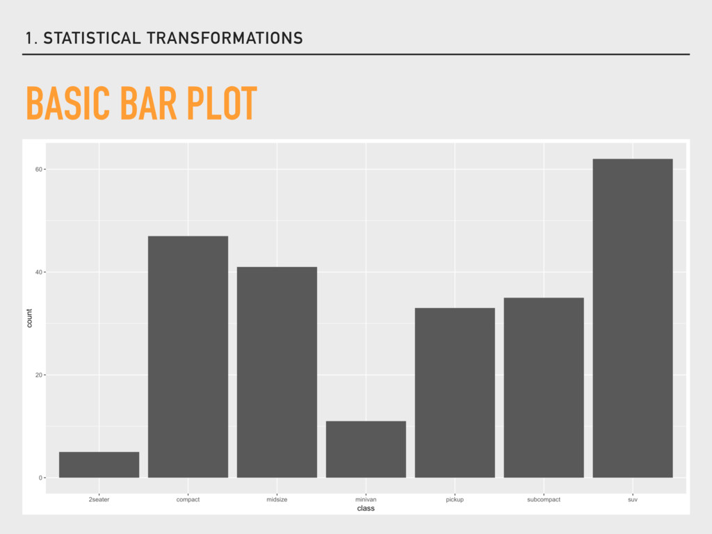
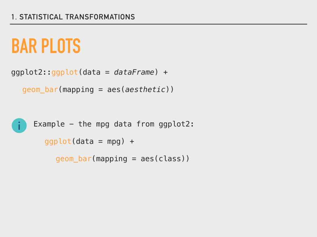
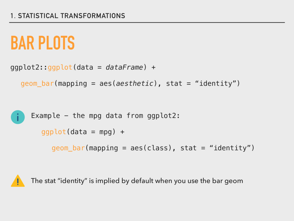
= aes(aesthetic), stat = “identity”) Example - the mpg data from ggplot2: ggplot(data = mpg) + geom_bar(mapping = aes(class), stat = “identity”) The stat “identity” is implied by default when you use the bar geom
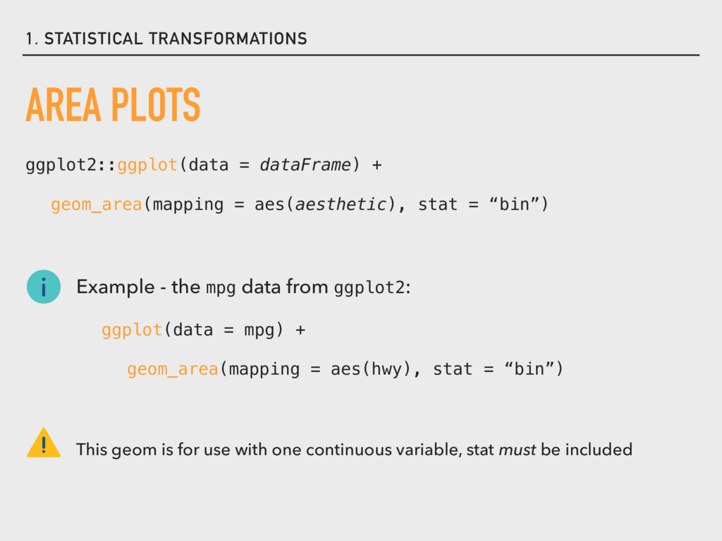
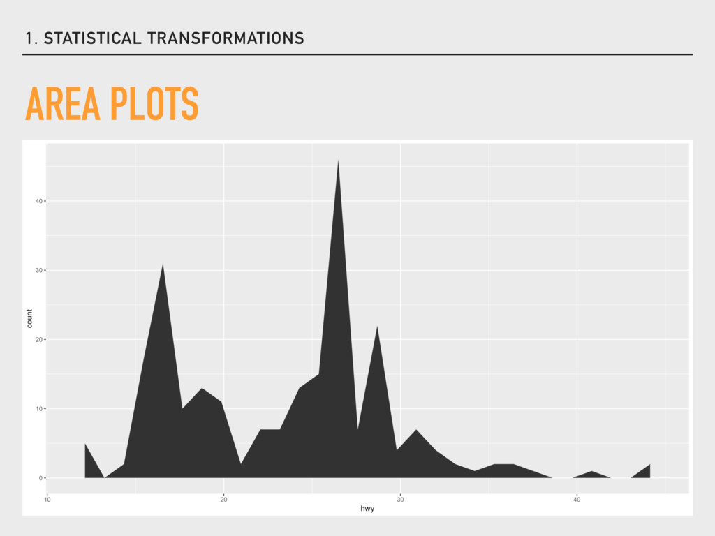
= aes(aesthetic), stat = “bin”) Example - the mpg data from ggplot2: ggplot(data = mpg) + geom_area(mapping = aes(hwy), stat = “bin”) This geom is for use with one continuous variable, stat must be included
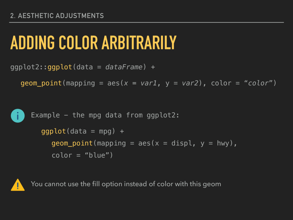
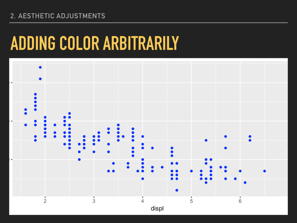
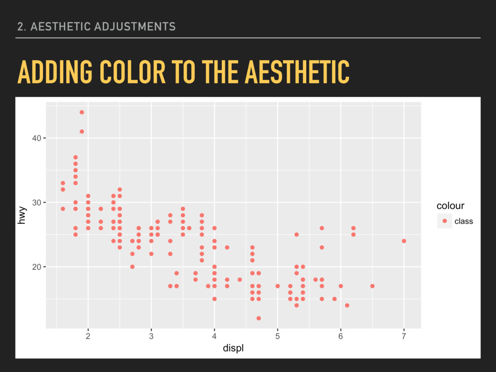
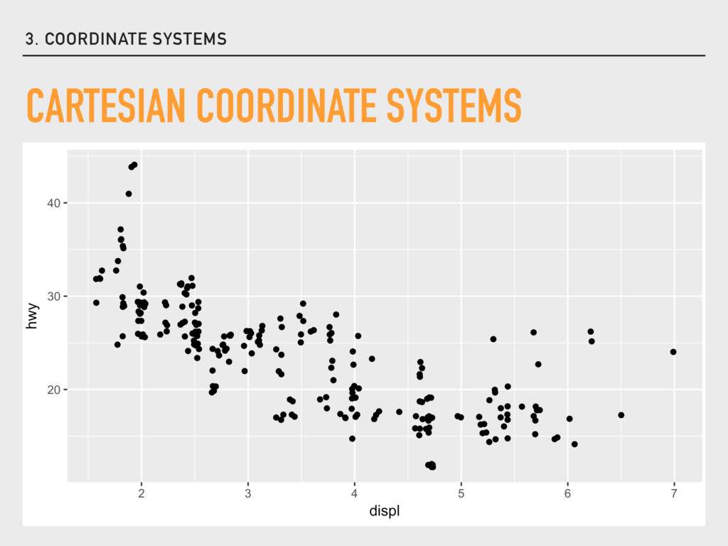
= var2), color = “color”) Example - the mpg data from ggplot2: ggplot(data = mpg) + geom_point(mapping = aes(x = displ, y = hwy), color = “blue”) You cannot use the fill option instead of color with this geom 2. AESTHETIC ADJUSTMENTS ADDING COLOR ARBITRARILY
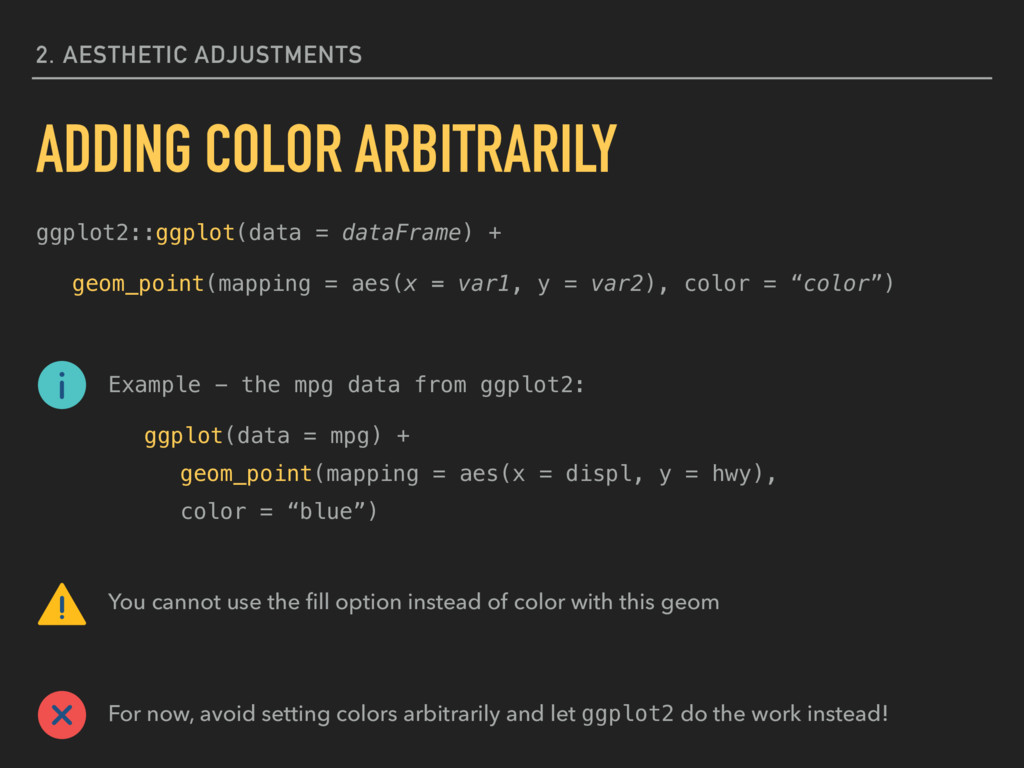
= var2), color = “color”) Example - the mpg data from ggplot2: ggplot(data = mpg) + geom_point(mapping = aes(x = displ, y = hwy), color = “blue”) You cannot use the fill option instead of color with this geom For now, avoid setting colors arbitrarily and let ggplot2 do the work instead! 2. AESTHETIC ADJUSTMENTS ADDING COLOR ARBITRARILY
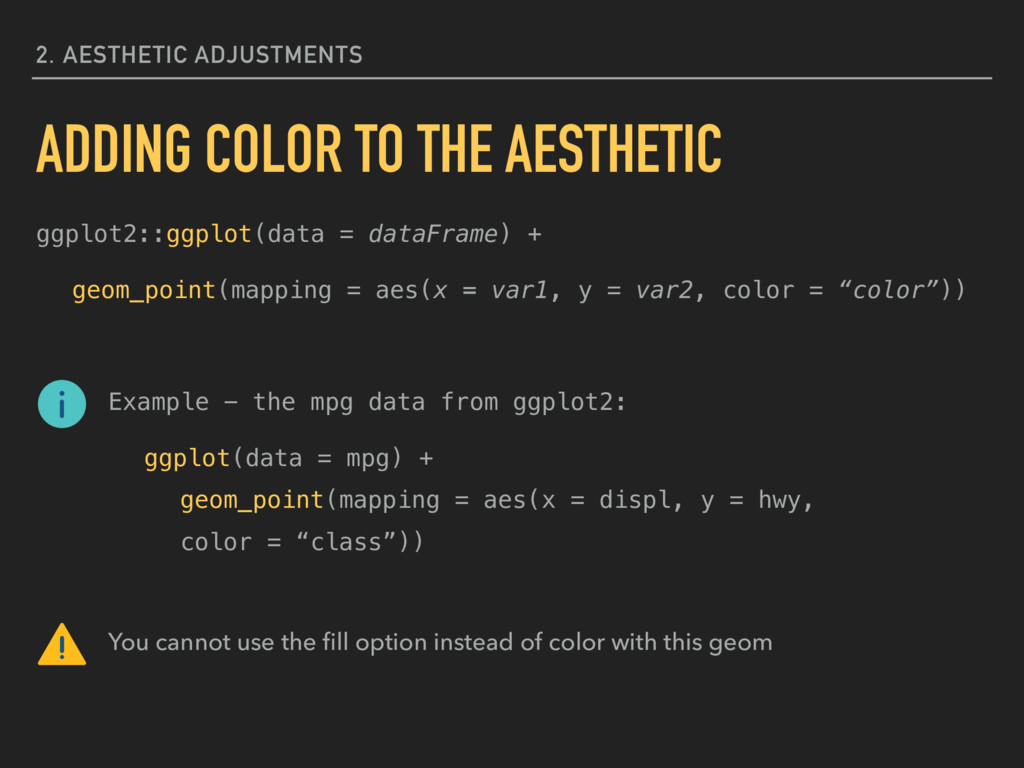
= var2, color = “color”)) Example - the mpg data from ggplot2: ggplot(data = mpg) + geom_point(mapping = aes(x = displ, y = hwy, color = “class”)) You cannot use the fill option instead of color with this geom 2. AESTHETIC ADJUSTMENTS ADDING COLOR TO THE AESTHETIC
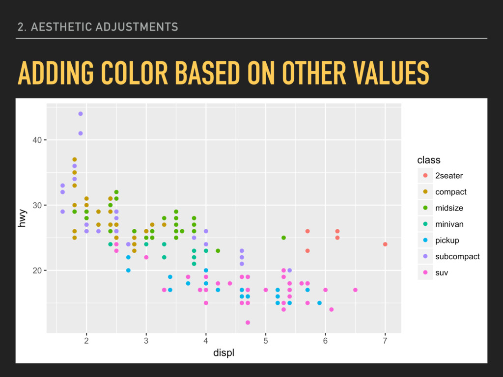
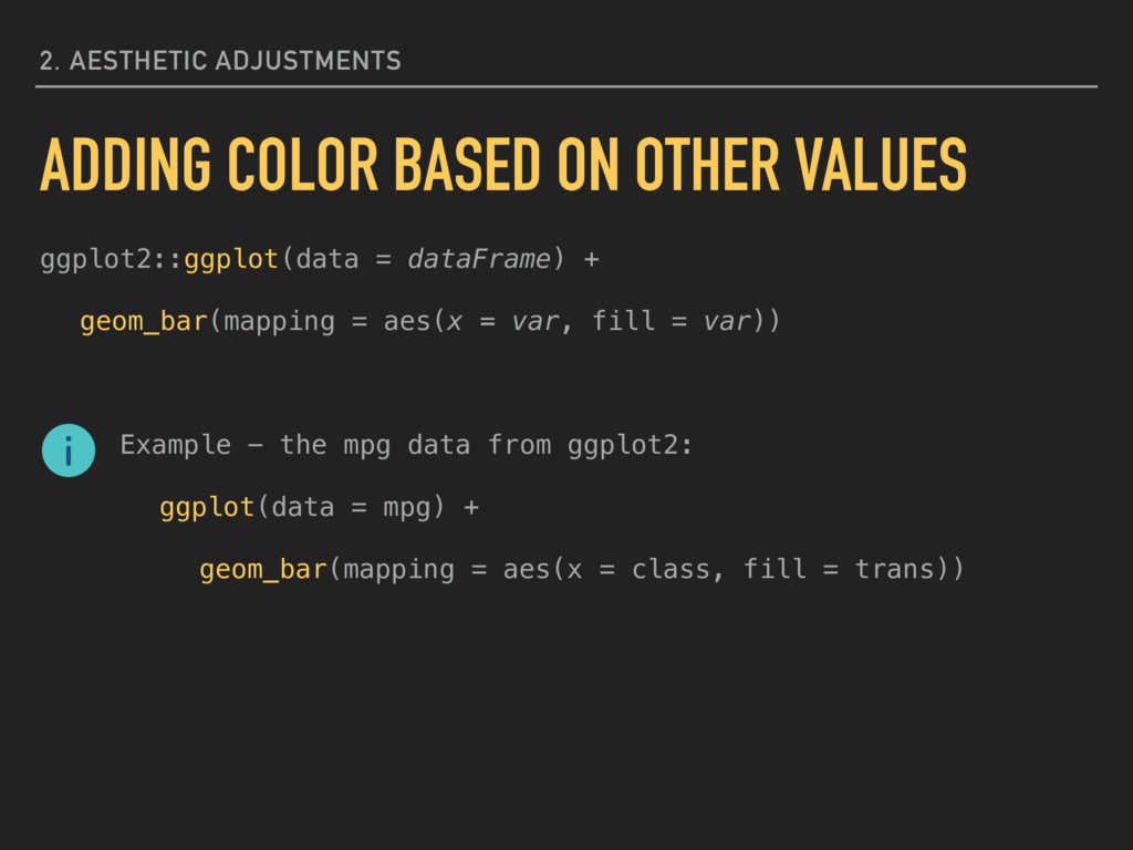
= var2, color = var3)) Example - the mpg data from ggplot2: ggplot(data = mpg) + geom_point(mapping = aes(x = displ, y = hwy, color = class)) You cannot use the fill option instead of color here 2. AESTHETIC ADJUSTMENTS ADDING COLOR BASED ON OTHER VALUES
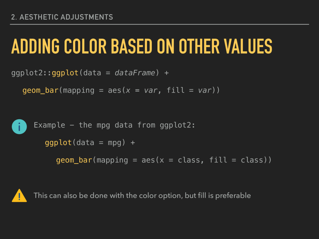
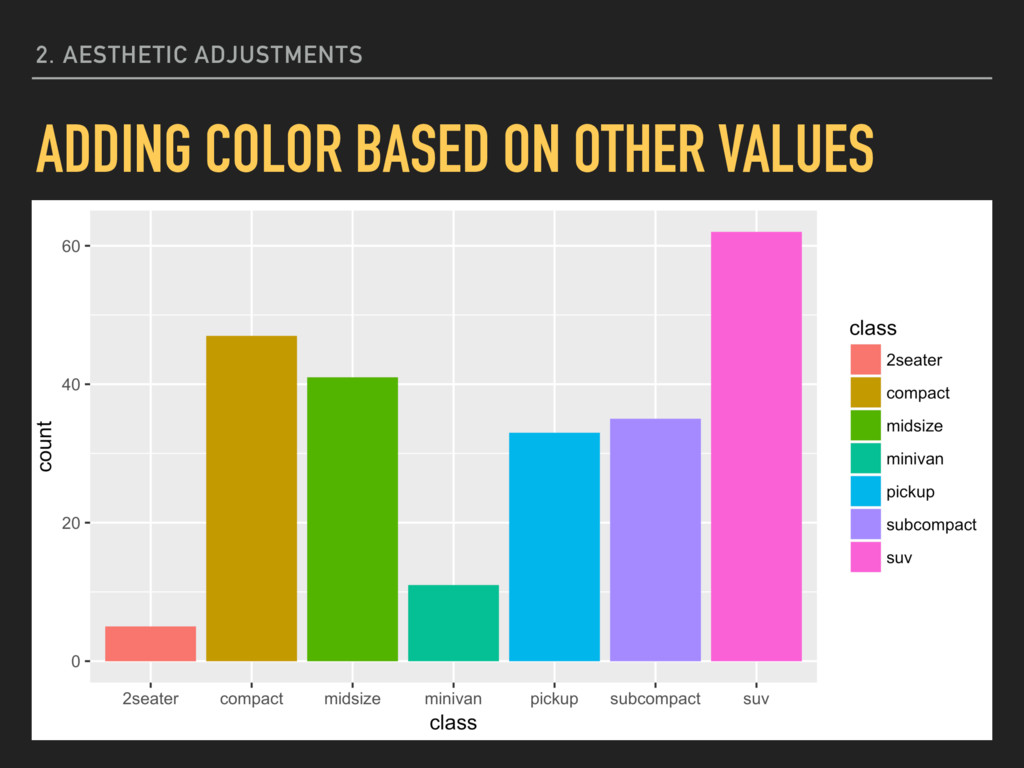
= var)) Example - the mpg data from ggplot2: ggplot(data = mpg) + geom_bar(mapping = aes(x = class, fill = class)) This can also be done with the color option, but fill is preferable 2. AESTHETIC ADJUSTMENTS ADDING COLOR BASED ON OTHER VALUES
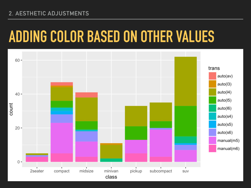
= var)) Example - the mpg data from ggplot2: ggplot(data = mpg) + geom_bar(mapping = aes(x = class, fill = trans)) 2. AESTHETIC ADJUSTMENTS ADDING COLOR BASED ON OTHER VALUES
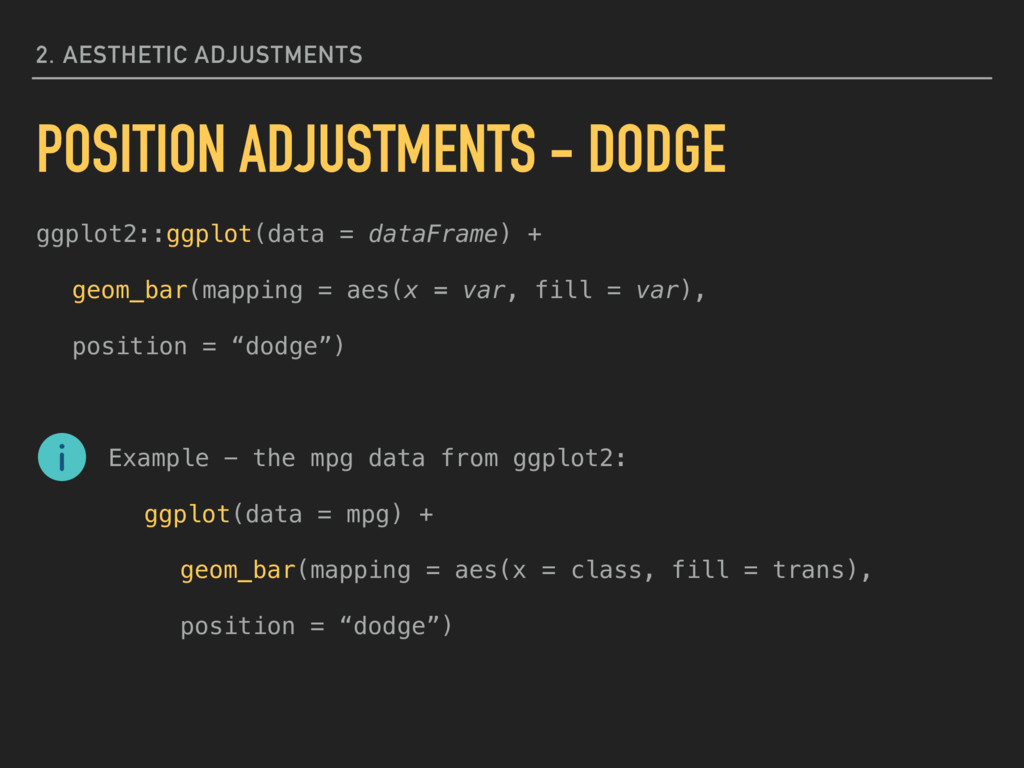
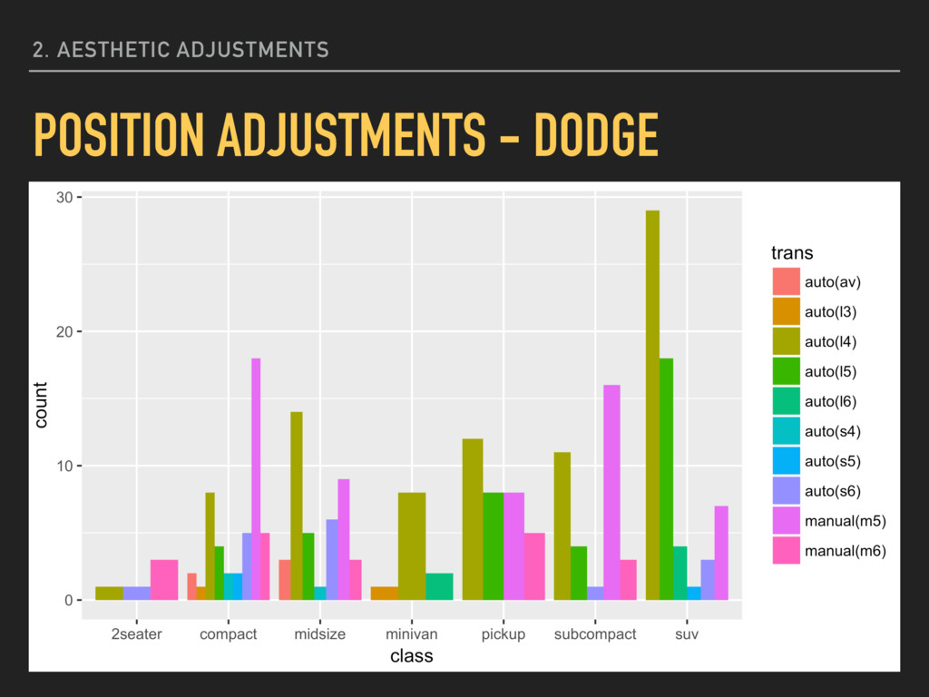
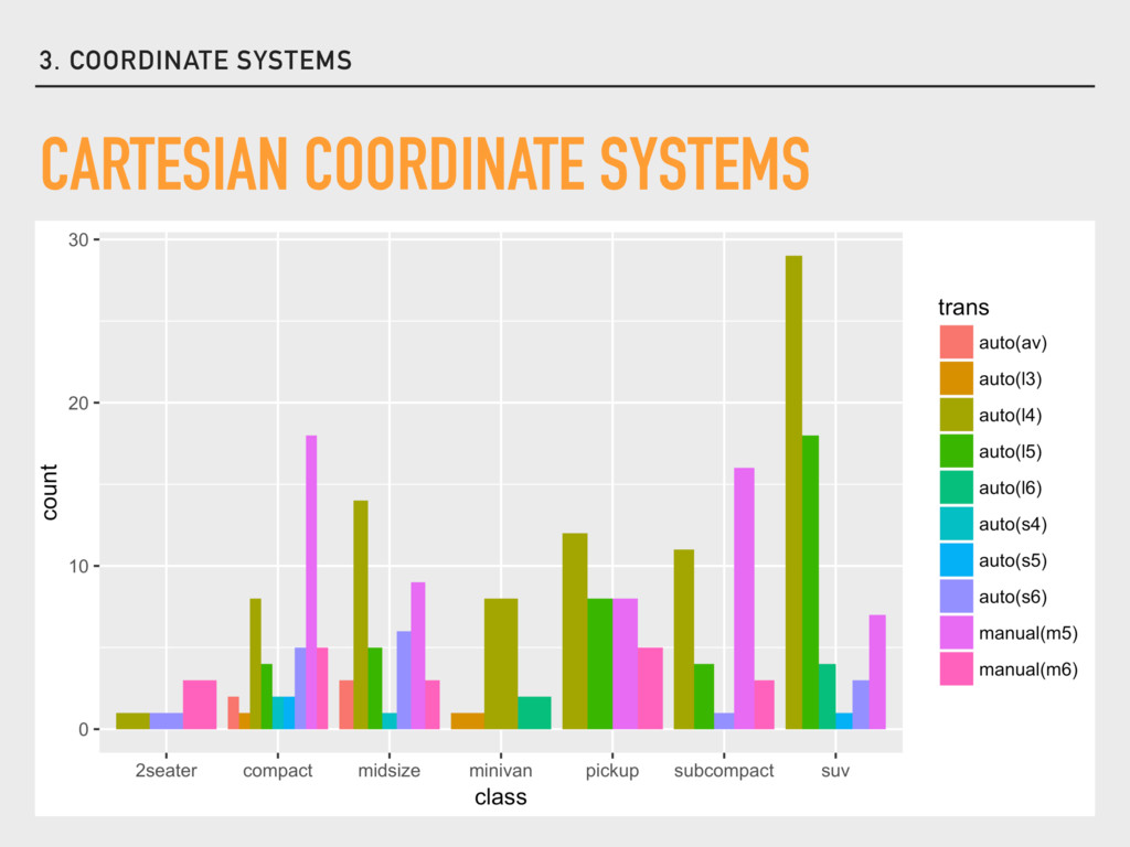
= var), position = “dodge”) Example - the mpg data from ggplot2: ggplot(data = mpg) + geom_bar(mapping = aes(x = class, fill = trans), position = “dodge”) 2. AESTHETIC ADJUSTMENTS POSITION ADJUSTMENTS - DODGE
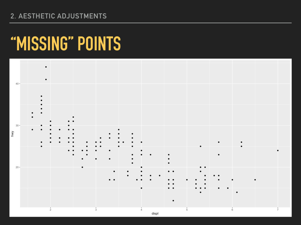
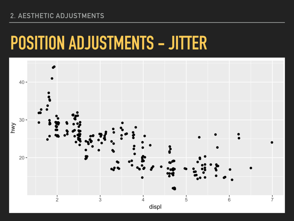
= var2), position = “jitter”) Example - the mpg data from ggplot2: ggplot(data = mpg) + geom_point(mapping = aes(x = displ, y = hwy), position = “jitter”) 2. AESTHETIC ADJUSTMENTS POSITION ADJUSTMENTS - JITTER
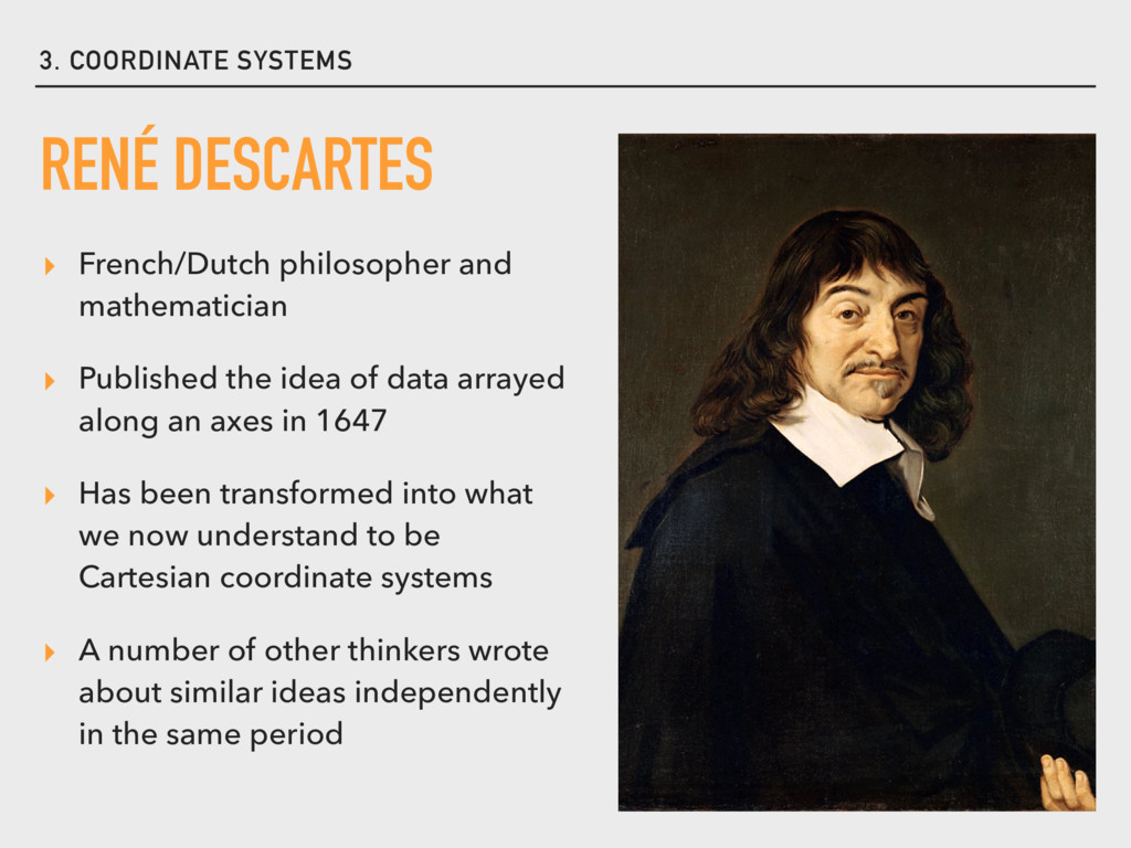
the idea of data arrayed along an axes in 1647 ▸ Has been transformed into what we now understand to be Cartesian coordinate systems ▸ A number of other thinkers wrote about similar ideas independently in the same period RENÉ DESCARTES
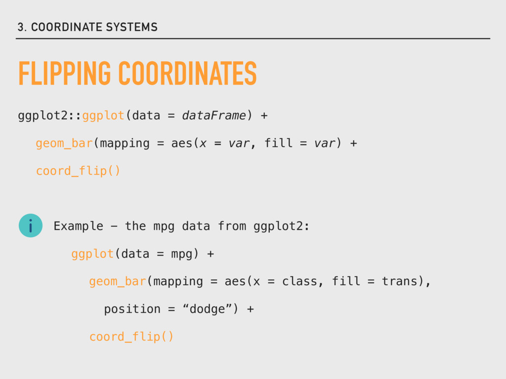
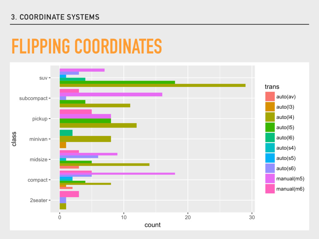
= aes(x = var, fill = var) + coord_flip() Example - the mpg data from ggplot2: ggplot(data = mpg) + geom_bar(mapping = aes(x = class, fill = trans), position = “dodge”) + coord_flip()