Upgrade to Pro — share decks privately, control downloads, hide ads and more …

Design for Success with React and Storybooks

Chris Saylor
February 15, 2018

Design for Success with React and Storybooks

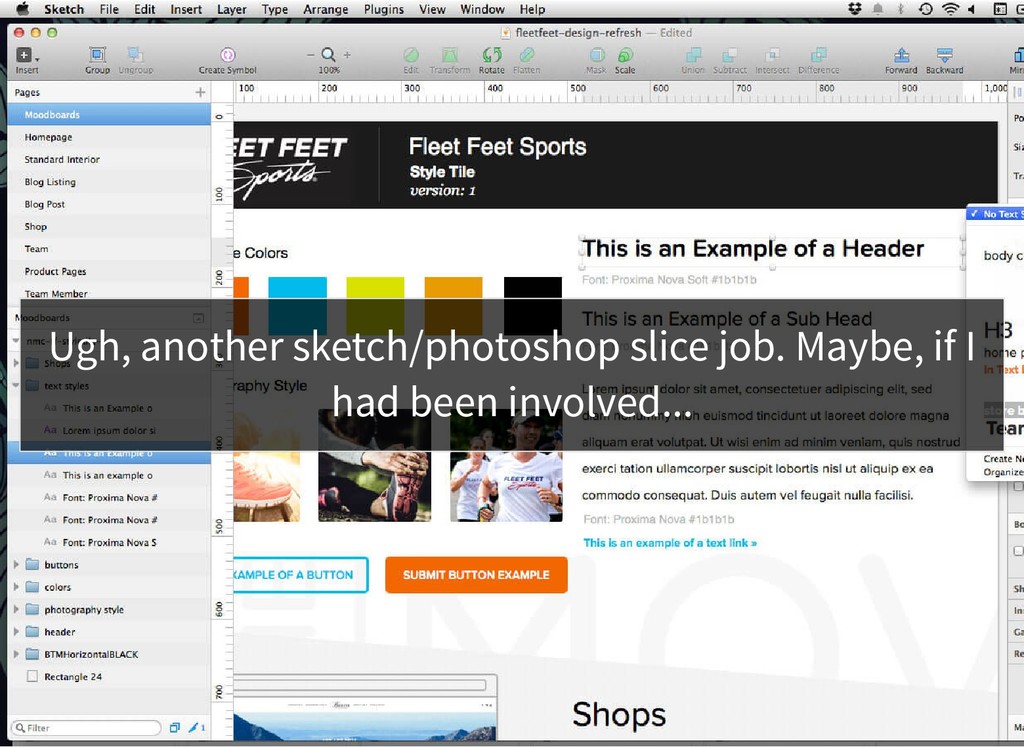
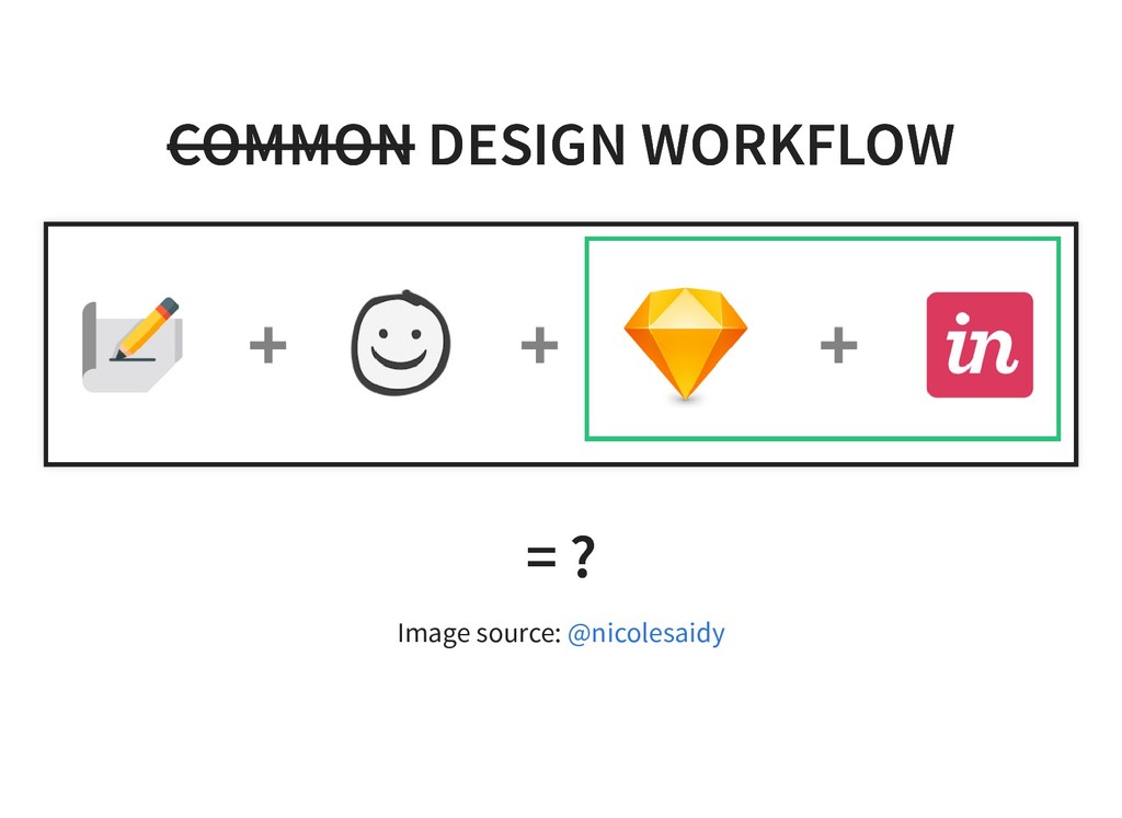
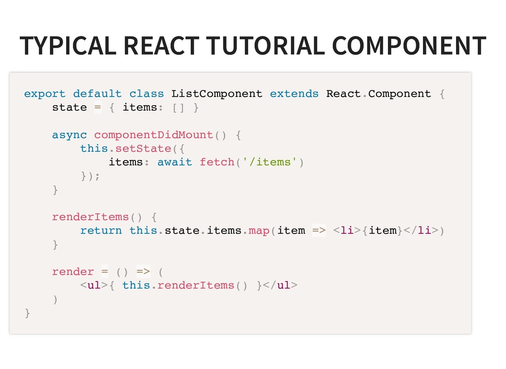
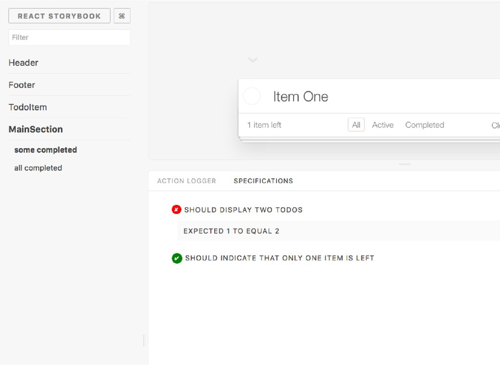
Too often developers are not involved with front end design descussions and end up struggling to get a sketch design to fit into a website. Many of these tools do not offer good ways of communicating animations or different states of the various components and in the end, there still has to be a translation into something that is functional.

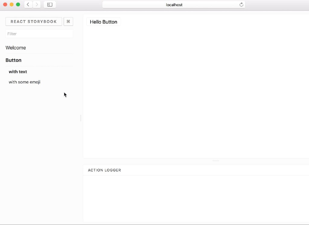
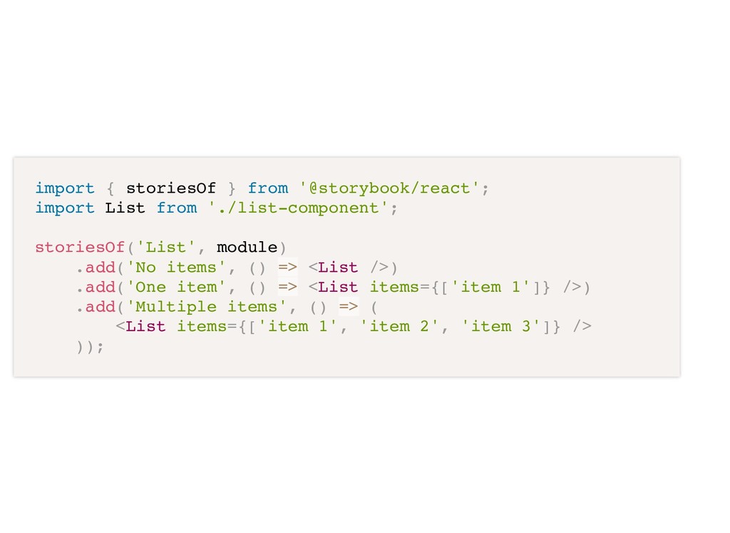
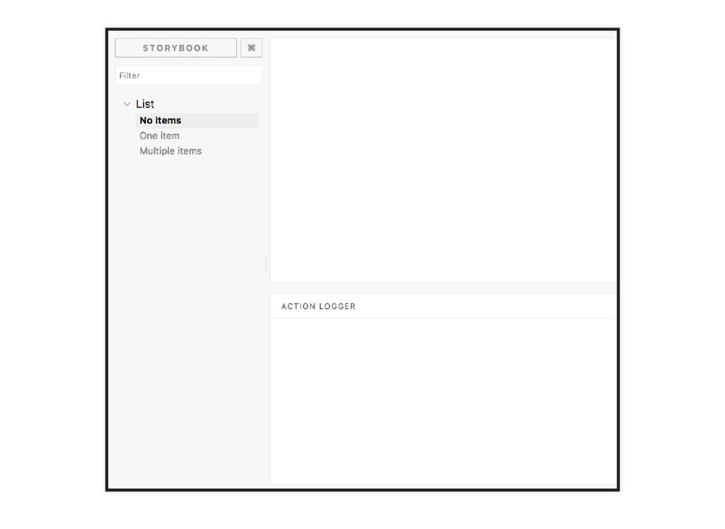
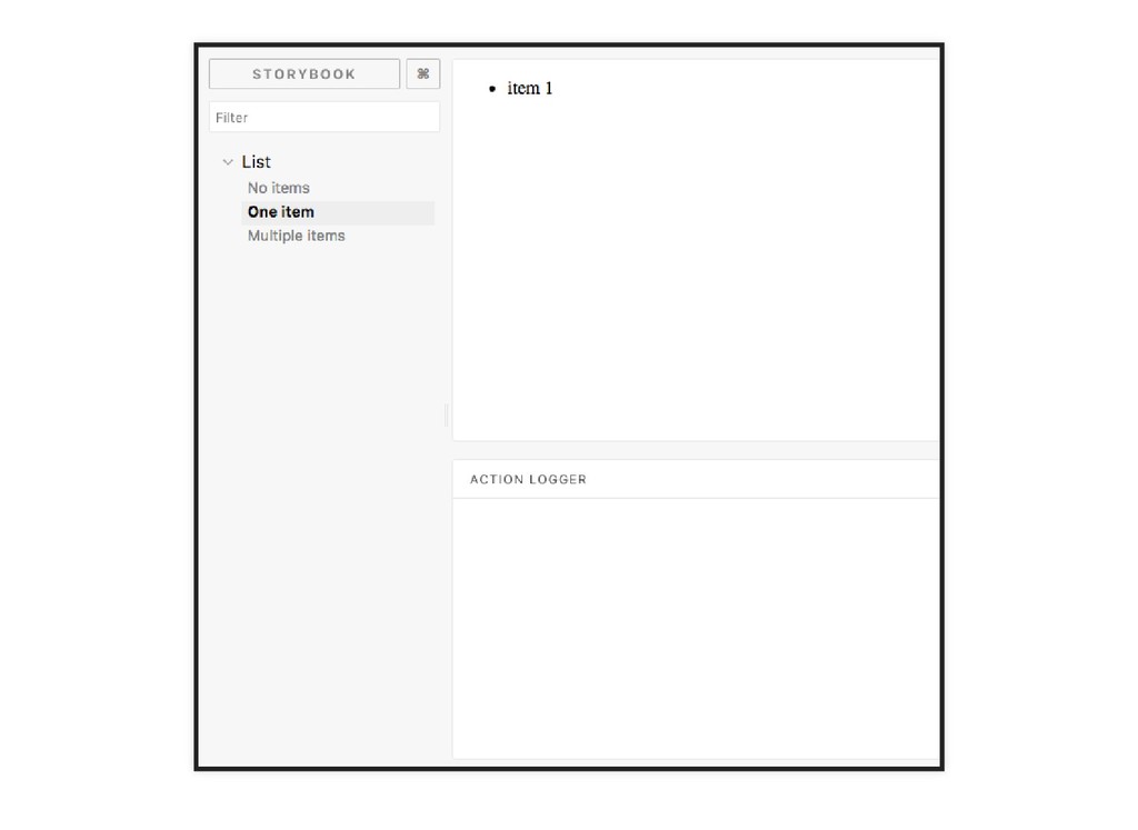
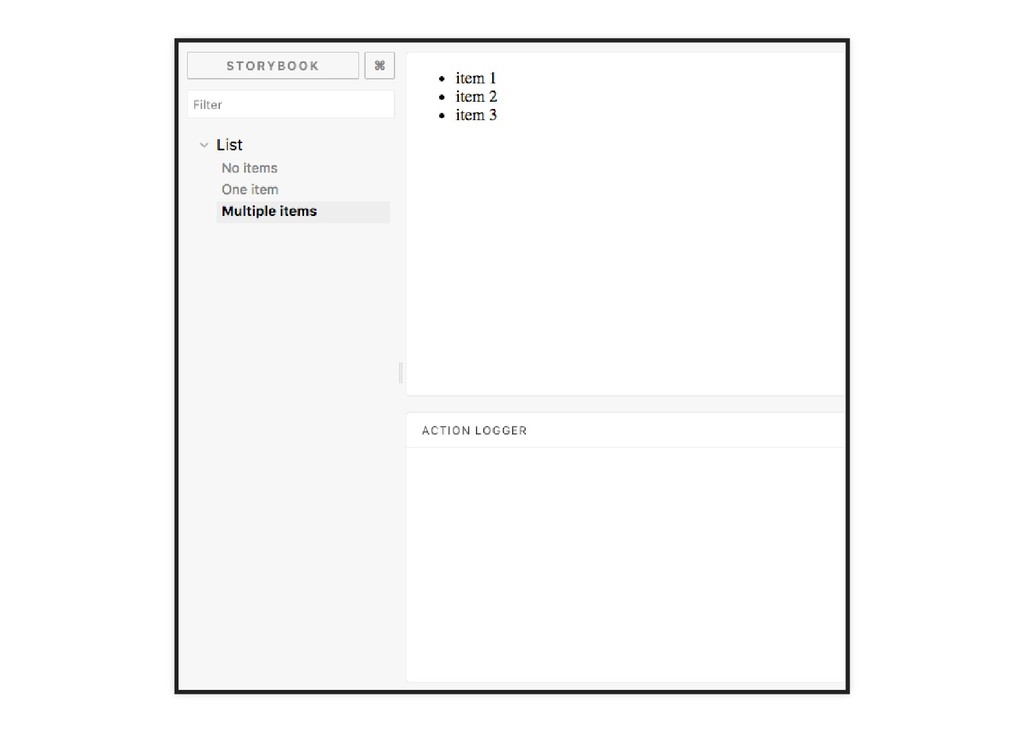
This talk aims to change that. We will be looking at Storybook as a tool that facilitates developers and designers working hand-in-hand to codify designs in React components. We will also cover some strategies of React component building that enabled taking advantage of tools like Storybook.

Chris Saylor

February 15, 2018
Tweet

More Decks by Chris Saylor

Other Decks in Design

Transcript

  1. WHY DO WE DO IT? WHY DO WE DO IT?

    No code involved, so designers can work autonomously Developers usually viewed as "bad" designers Developers say no too o en
  2. WHY SHOULD WE CARE ABOUT DESIGN? WHY SHOULD WE CARE

    ABOUT DESIGN? Bad UX designs makes us susceptible to disruption.
  3. WHY NOT JUST CREATE AN HTML WHY NOT JUST CREATE

    AN HTML STYLEGUIDE? STYLEGUIDE? Gets stale almost immediately. The language barrier between designers and developers makes it hard to reference.
  4. WHY STORYBOOK.JS? WHY STORYBOOK.JS? Integrates with React, Vue.js, and Angular

    Immediate feedback of changes Easily see history of changes At the end of the design phase, we have functional components!
  5. TYPICAL REACT TUTORIAL COMPONENT TYPICAL REACT TUTORIAL COMPONENT export default

    class ListComponent extends React.Component { state = { items: [] } async componentDidMount() { this.setState({ items: await fetch('/items') }); } renderItems() { return this.state.items.map(item => <li>{item}</li>) } render = () => ( <ul>{ this.renderItems() }</ul> ) }
  6. USE PROPS TO DISPLAY USE PROPS TO DISPLAY export default

    class ListComponent extends React.Component { renderItems = () => { return (this.props.items || []) .map(item => <li>{item}</li>) } render = () => <ul>{ this.renderItems() }</ul> }
  7. PASS THE STATE DATA TO THE VIEW PASS THE STATE

    DATA TO THE VIEW import List from './list-component'; export default class ListContainer extends React.Component { state = { items: [] } async componentDidMount() { this.setState({ items: await fetch('/items') }); } render = () => <List items={this.state.items}/> }
  8. import { storiesOf } from '@storybook/react'; import List from './list-component';

    storiesOf('List', module) .add('No items', () => <List />) .add('One item', () => <List items={['item 1']} />) .add('Multiple items', () => ( <List items={['item 1', 'item 2', 'item 3']} /> ));
  9. ADD A CLICK ACTION ADD A CLICK ACTION export default

    class ListComponent extends React.Component { onClick = (e) => { this.props.onItemClicked(e.target.innerText); } renderItems = () => { return (this.props.items || []) .map(item => ( <li onClick={this.onClick}>{item}</li> )); } render = () => <ul>{ this.renderItems() }</ul> }
  10. ADD THE "ACTIONS" ADDON ADD THE "ACTIONS" ADDON This is

    what is responsible for showing the action panel $ npm install @storybook/addon-actions // addons.js import '@storybook/addon-actions/register';
  11. MODIFY OUR STORY FOR THE ACTION MODIFY OUR STORY FOR

    THE ACTION import { storiesOf } from '@storybook/react'; import { action } from '@storybook/addon-actions'; import List from './list-component'; storiesOf('List', module) .add('Multiple items', () => { return ( <List onItemClicked={action('Item clicked!')} items={['item 1', 'item 2', 'item 3']} /> ); });
  12. ADD THE "KNOBS" ADDON ADD THE "KNOBS" ADDON This is

    what is responsible for showing the panel $ npm install @storybook/addon-knobs // addons.js import '@storybook/addon-knobs/register';
  13. MODIFY THE STORY MODIFY THE STORY import { storiesOf }

    from '@storybook/react'; import List from './list-component'; import { action } from '@storybook/addon-actions'; import {withKnobs, array} from '@storybook/addon-knobs'; storiesOf('List', module) .addDecorator(withKnobs) .add('Multiple items', () => ( <List onItemClicked={action('Item clicked!')} items={ array('Items', [ 'item 1', 'item 2', 'item 3' ]) } /> ));
  14. PROTOTYPING PROTOTYPING No backend required Get a feel for the

    product before investing in backend integration
  15. CONCLUSION CONCLUSION Getting involved in the design process doesn't have

    to be scary Start fresh or add to existing React/VueJS app Hit the ground running when designs are finished Version control designs and their stories