Upgrade to Pro — share decks privately, control downloads, hide ads and more …

2013-02-05 UXDesignForMobileApps

2013-02-05 UXDesignForMobileApps

UX design for mobile apps

CocoaHeads Tricity

February 05, 2013
Tweet

More Decks by CocoaHeads Tricity

Other Decks in Design

Transcript

  1. KAMIL ZIĘBA Co-founder & Head of Product @ UXPin PREVIOUSLY:

    Freelancer & UI/UX Designer Grupa Nokaut S.A.
  2. All the aspects of how people use an interactive product:

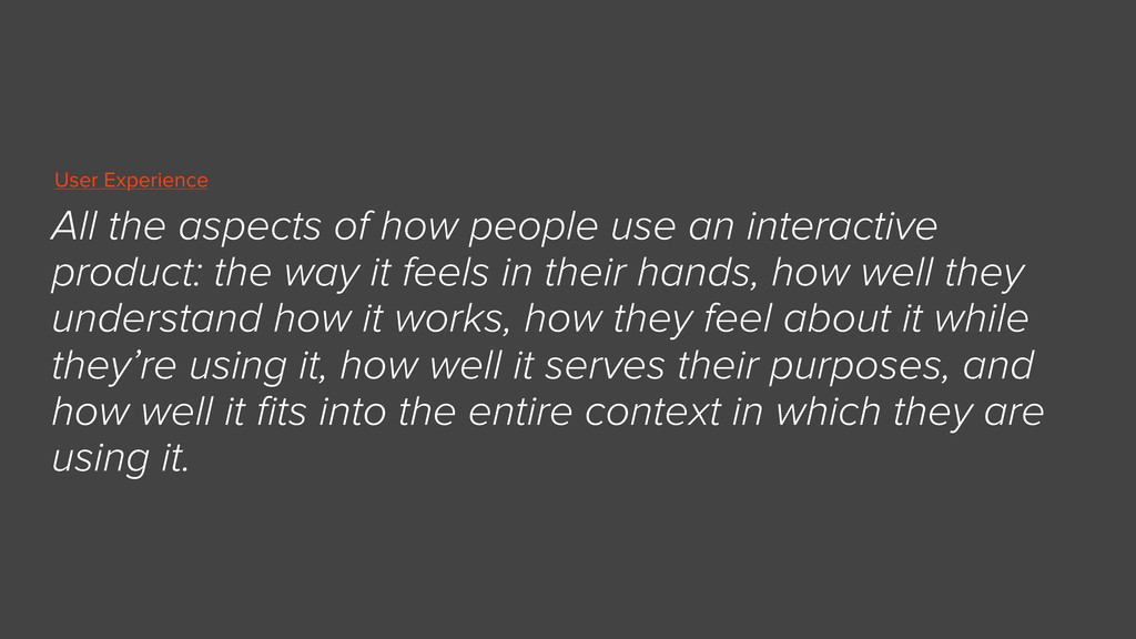
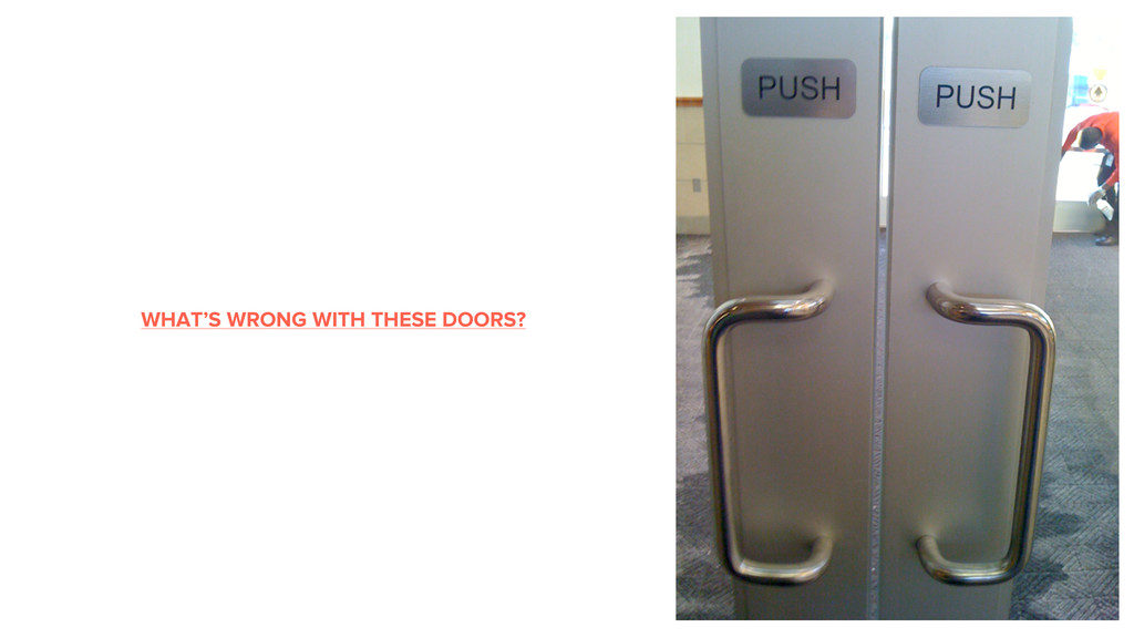
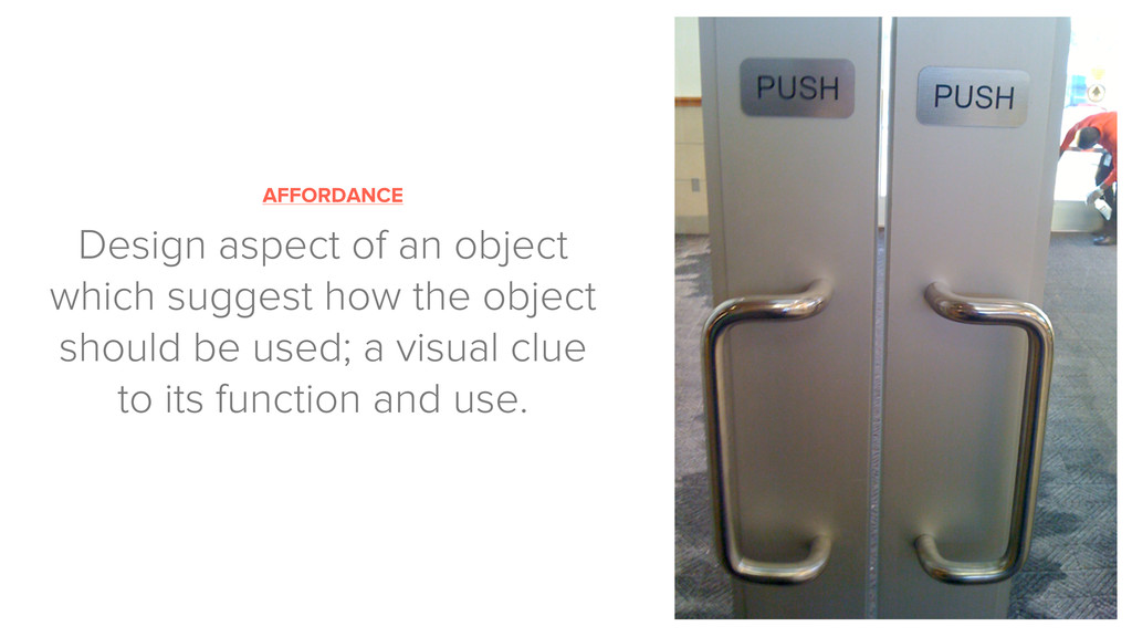
    the way it feels in their hands, how well they understand how it works, how they feel about it while they’re using it, how well it serves their purposes, and how well it fits into the entire context in which they are using it. User Experience
  3. “App users have a big app appetite, downloading about 10

    apps per month on average, but they rarely use these apps frequently or for long.” Josh Clark “Tapworthy: Designing Great iPhone Apps”
  4. THINK ABOUT THE CONTEXT OF USE A mobile device can

    be used at anytime, anywhere. Context affects the interaction between the people and the interface.
  5. KEEP IT SAFE Default buttons in alert boxes should favor

    the safest option* CANCEL DELETE ALL
  6. MAKE IT BRIEF AND CLEAR Keep alerts brief and clear,

    explain them what happened and what they can do next.
  7. USE DESIGN PATTERNS Follow conventions and patterns to reduce the

    learning curve and to make the experience more intuitive.
  8. “When it comes to mobile forms, be brutally efficient and

    trim, trim, trim.” — Luke Wroblewski, “Mobile First” (2011)
  9. DESIGN FOR TOUCH Areas of interaction shouldn’t be smaller than

    44pt. Smaller elements = bigger distance between them.
  10. YOUR ICON IS YOUR BUSINESS CARD “Make your icon colorful,

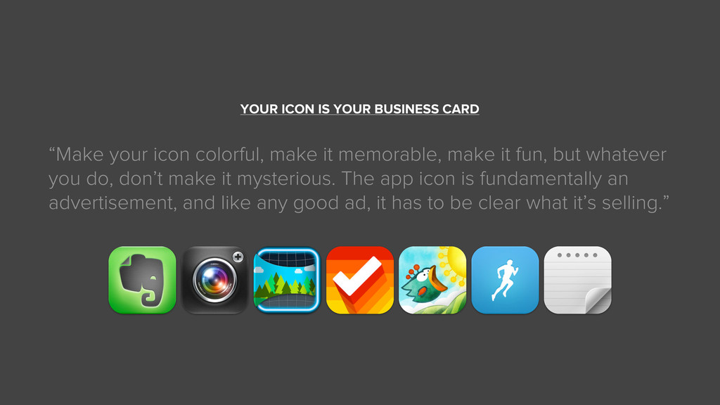
    make it memorable, make it fun, but whatever you do, don’t make it mysterious. The app icon is fundamentally an advertisement, and like any good ad, it has to be clear what it’s selling.”
  11. AFFORDANCE Design aspect of an object which suggest how the

    object should be used; a visual clue to its function and use.
  12. DESIGN FOR EFFICIENCY Enable people to navigate to the most

    important content and functionality in as few steps as possible. 1 2 3
  13. DESIGN FOR EMOTION “It is not enough that we build

    products that function, that are understandable and usable, we also need to build products that bring joy and excitement, pleasure and fun, and, yes, beauty to people’s lives.” — Don Norman — —
  14. Don’t try to solve a problem if there isn’t one.

    WHAT’S THE PROBLEM WE’RE TRYING TO SOLVE?