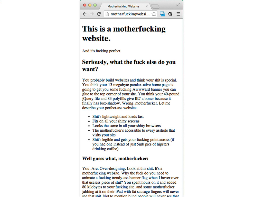
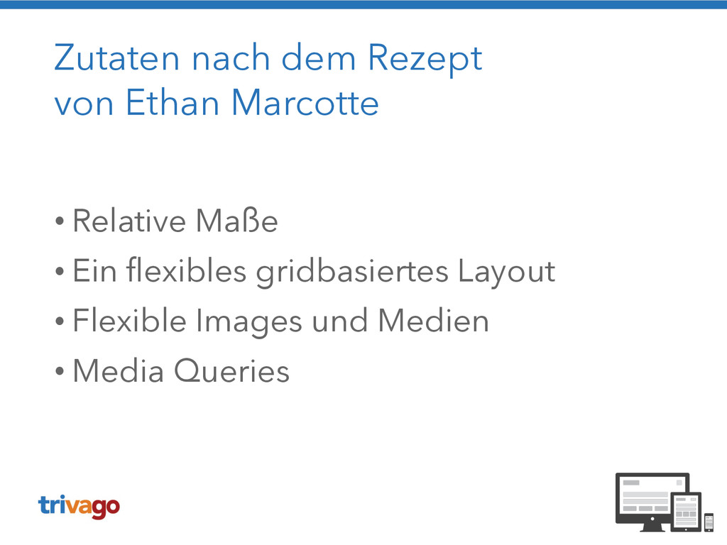
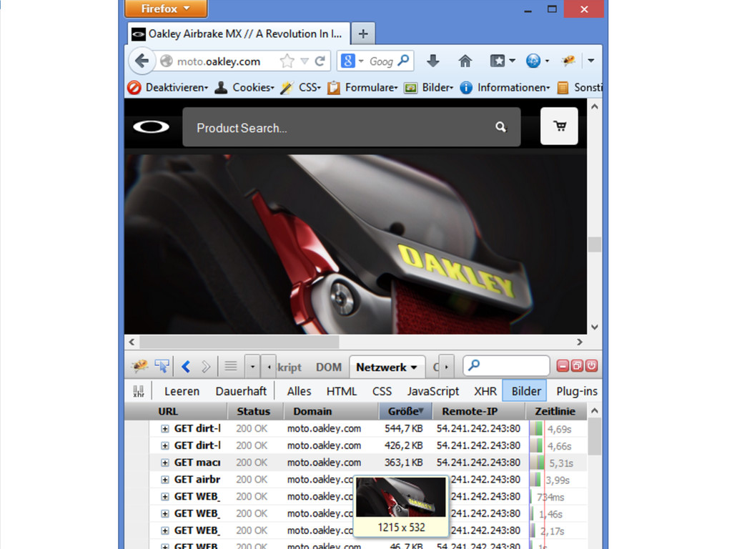
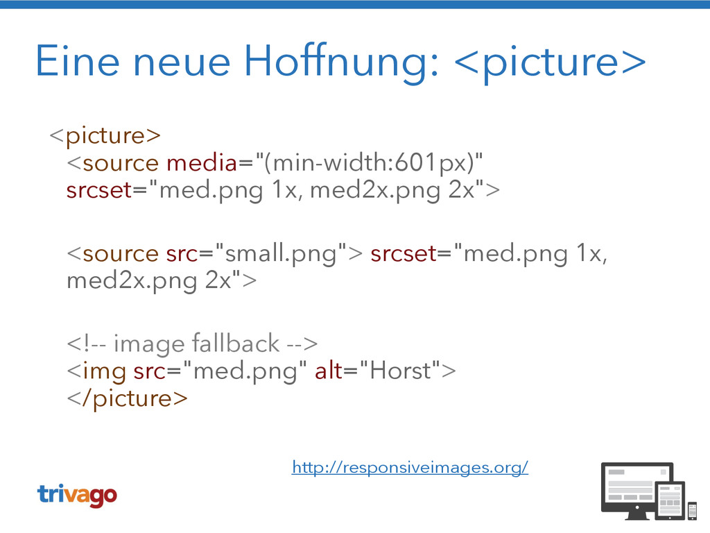
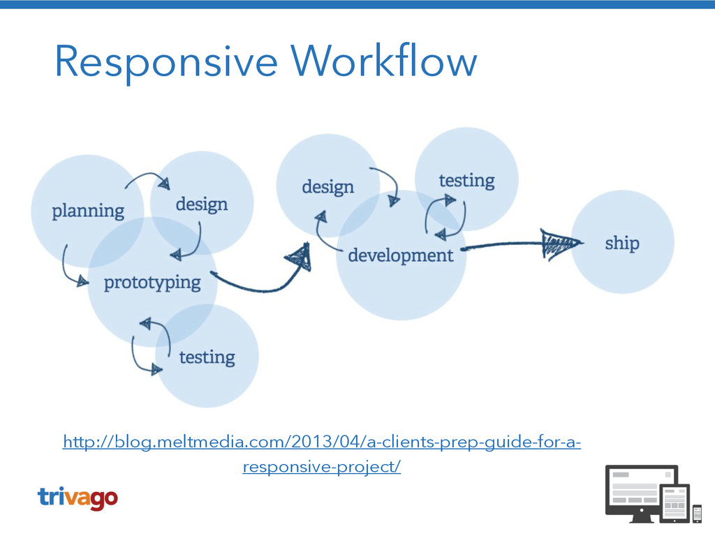
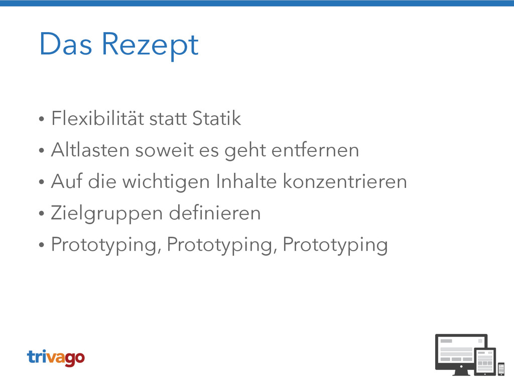
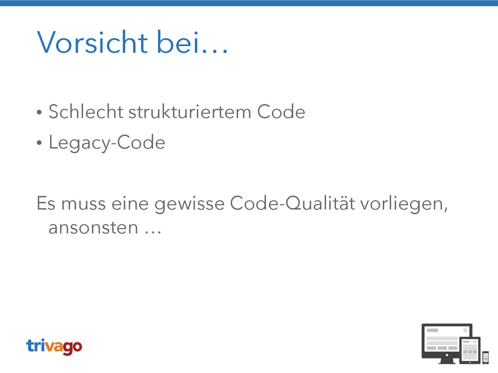
& CSS statt Photoshop • Es gibt keine statischen Entwürfe mehr • Content First: Die Layouts zeigen echte Inhalte • Keine Bilder von Webseiten erstellen
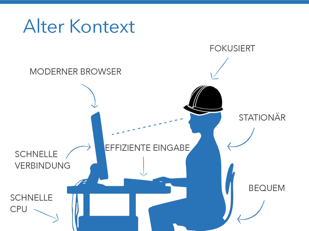
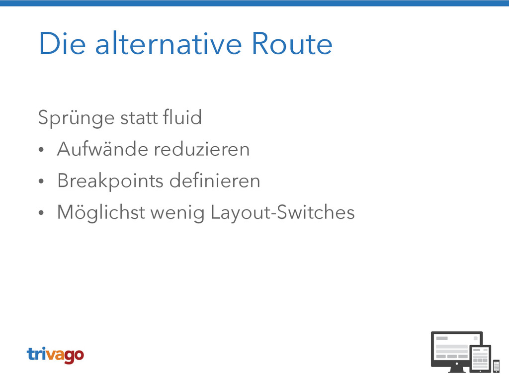
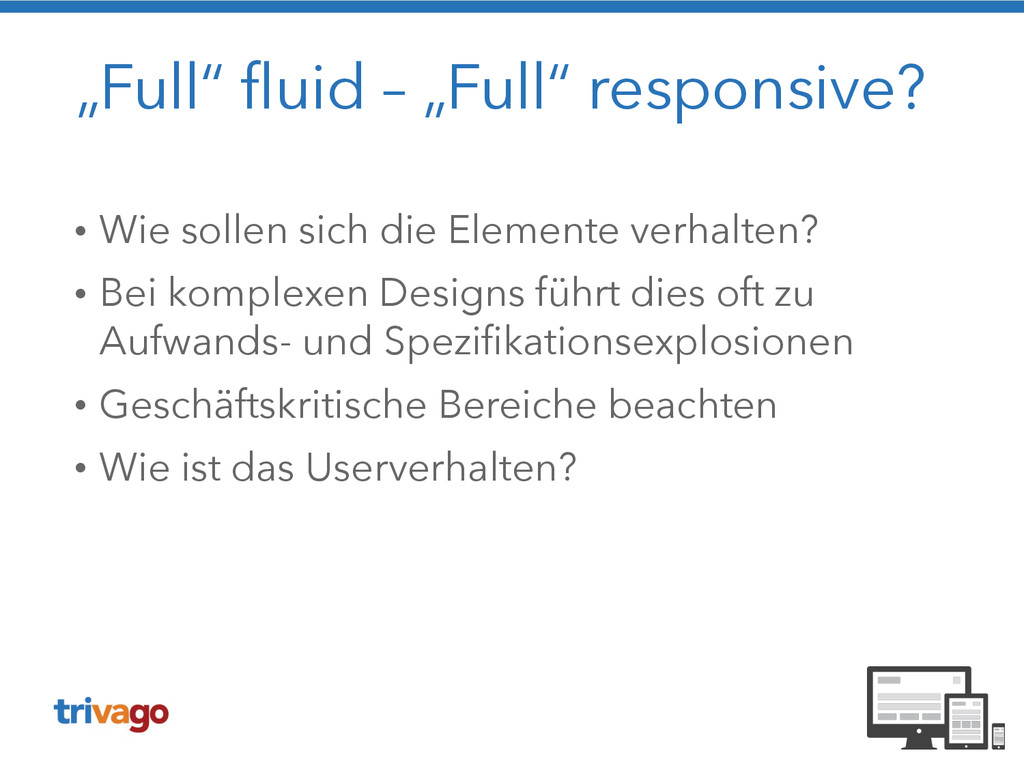
Elemente verhalten? • Bei komplexen Designs führt dies oft zu Aufwands- und Spezifikationsexplosionen • Geschäftskritische Bereiche beachten • Wie ist das Userverhalten?
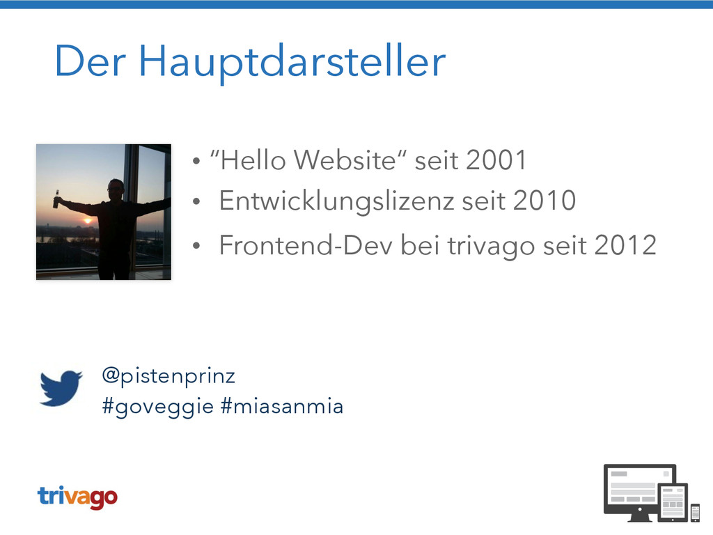
 creinartz
 grimoh
 fossamagna
 minorun365
 masayoshimaezawa
 miyukichi_ospf
 oprstchn
 hayama17
 eitarosuda
 kozotaira
 poropinai1966
 askul
askul
 shinyasaita
 tammyeverts
 eileencodes
 marketingsoph
 stephenakadiri
 elsirapls
 3n
3n
 inesmontani
 mza
mza
 chriscoyier
 mfonobong
 maggiecrowley
 katarinadahlin