Upgrade to Pro
— share decks privately, control downloads, hide ads and more …
Speaker Deck
Features
Speaker Deck
PRO
Sign in
Sign up for free
Search
Search
QCMerge 2012 - I am Designer (and so can you!)
Search
Justine
May 11, 2012
Design
350
9
Share
Embed
Copy iframe code
Copy JS code
Copy link
Start on current slide
QCMerge 2012 - I am Designer (and so can you!)
Design workshop for the QCMerge in Cincinnati, Ohio.
Justine
May 11, 2012
More Decks by Justine
See All by Justine
I am Designer (and so can you!) -- Ruby User Group Berlin
ctrlaltjustine
1
180
Ruby Conf Argentina - Put Away The Knives: We Can Work Together!
ctrlaltjustine
0
140
Eurucamp - Put Away the Knives: We Can Work Together
ctrlaltjustine
1
450
CCAD College Preview Talk
ctrlaltjustine
2
190
I Am Designer (and so can you!)
ctrlaltjustine
6
300
Ruby Conf Uruguay - I Am Designer (and so can you!)
ctrlaltjustine
11
550
CodeMash 13 - I am Designer and so can you!
ctrlaltjustine
5
300
Transitioning from Print to Web
ctrlaltjustine
1
250
ScotRubyConf 2012 - I am Designer (and so can you!)
ctrlaltjustine
13
740
Other Decks in Design
See All in Design
セブンデックス プロジェクト事例 / innovation Scenes
sevendex
1
1.3k
ClaudeCodeでマーケターの課題を解決する
kenichiota0711
11
14k
エンジニアがAI活用してスライドデザインできる世界が来たよ!
kaikou
1
330
Decksh keywords
ajstarks
0
110
もう迷わない!“なんとなく”を卒業するフォントの選び方【村田俊英】
toshihidemurata
0
720
CULTURE DECK/Marketing Director
mhand01
0
1.4k
From the Visible Crossroads: Turning Outputs into Outcomes
takaikanako
2
1.4k
設計と制作 意図を形に表す / Design and Making: Intent Made Form
usagimaru
3
2k
kintone開発におけるライターの役割の変化〜AI活用を添えて〜 / Changes in the Role of Writers in Kintone Development
keroyama
0
130
全員がアウトプットを出せる時代、 誰を採用する?
nishame
0
600
絵や写真から学ぶ、要素がもたらす副作用
kspace
0
420
広い関与の可能性に どう向き合うのか? 私たちは。|Timee MarketingDesign 2026-06-18
bebe
0
240
Featured
See All Featured
Designing Powerful Visuals for Engaging Learning
tmiket
1
440
Intergalactic Javascript Robots from Outer Space
tanoku
273
27k
Connecting the Dots Between Site Speed, User Experience & Your Business [WebExpo 2025]
tammyeverts
11
960
How to Think Like a Performance Engineer
csswizardry
28
2.7k
My Coaching Mixtape
mlcsv
0
170
Producing Creativity
orderedlist
PRO
348
40k
The Power of CSS Pseudo Elements
geoffreycrofte
82
6.3k
The Director’s Chair: Orchestrating AI for Truly Effective Learning
tmiket
1
210
Art, The Web, and Tiny UX
lynnandtonic
304
22k
Fashionably flexible responsive web design (full day workshop)
malarkey
408
66k
How To Speak Unicorn (iThemes Webinar)
marktimemedia
1
500
How to make the Groovebox
asonas
2
2.3k
Transcript
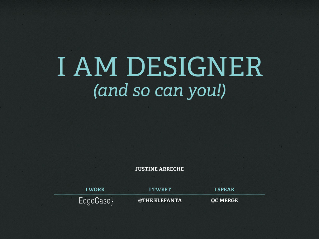
I am Designer (and so can you!) Justine Arreche I
work I tweet I speak @The Elefanta QC MERGE
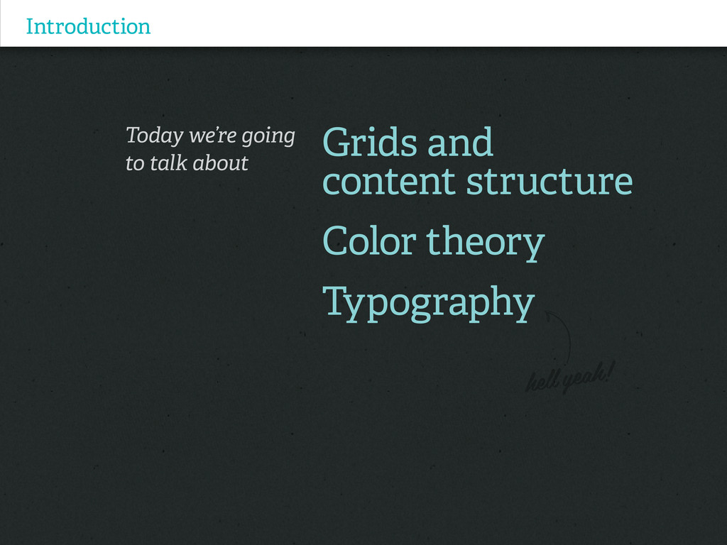
Introduction Today we’re going to talk about Grids and content
structure Color theory Typography
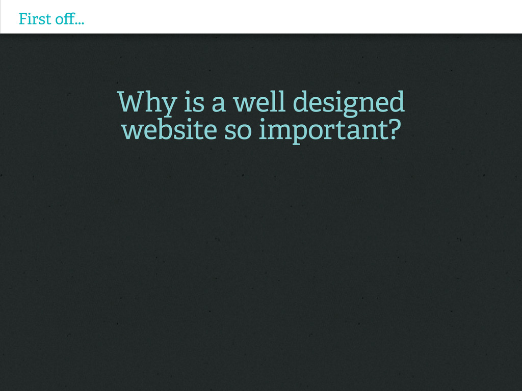
First off... Why is a well designed website so important?
First off... Why is a well designed website so important?
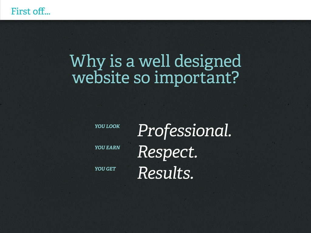
You look Professional. You earn Respect. You get Results.
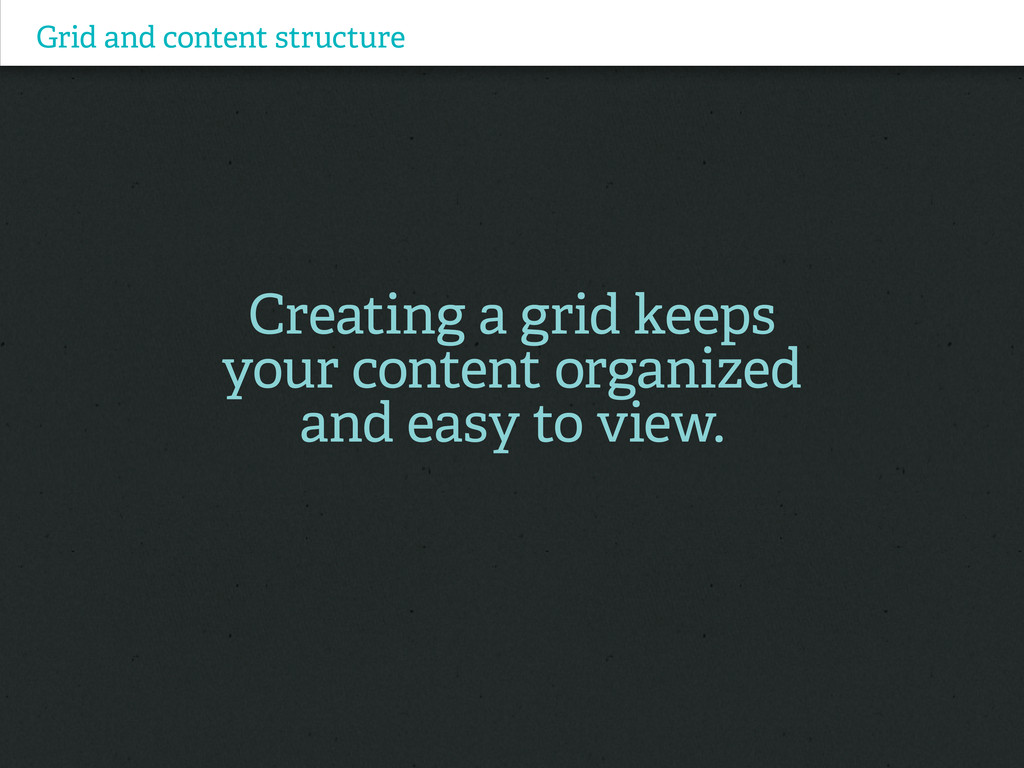
Grid and content structure Creating a grid keeps your content
organized and easy to view.
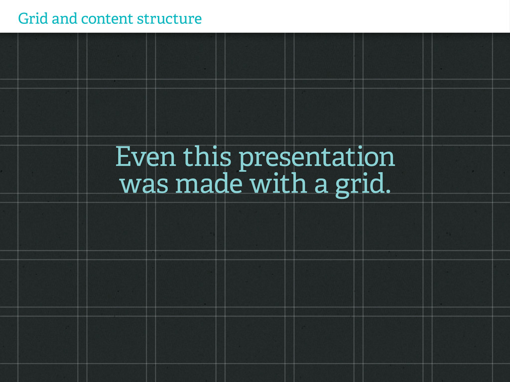
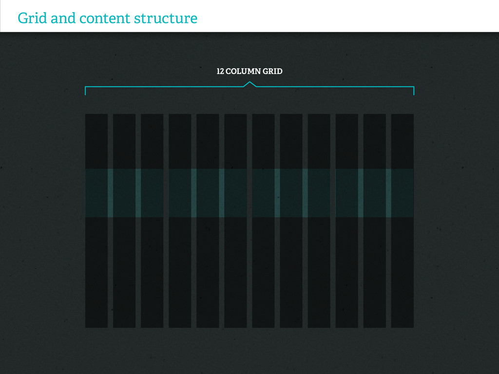
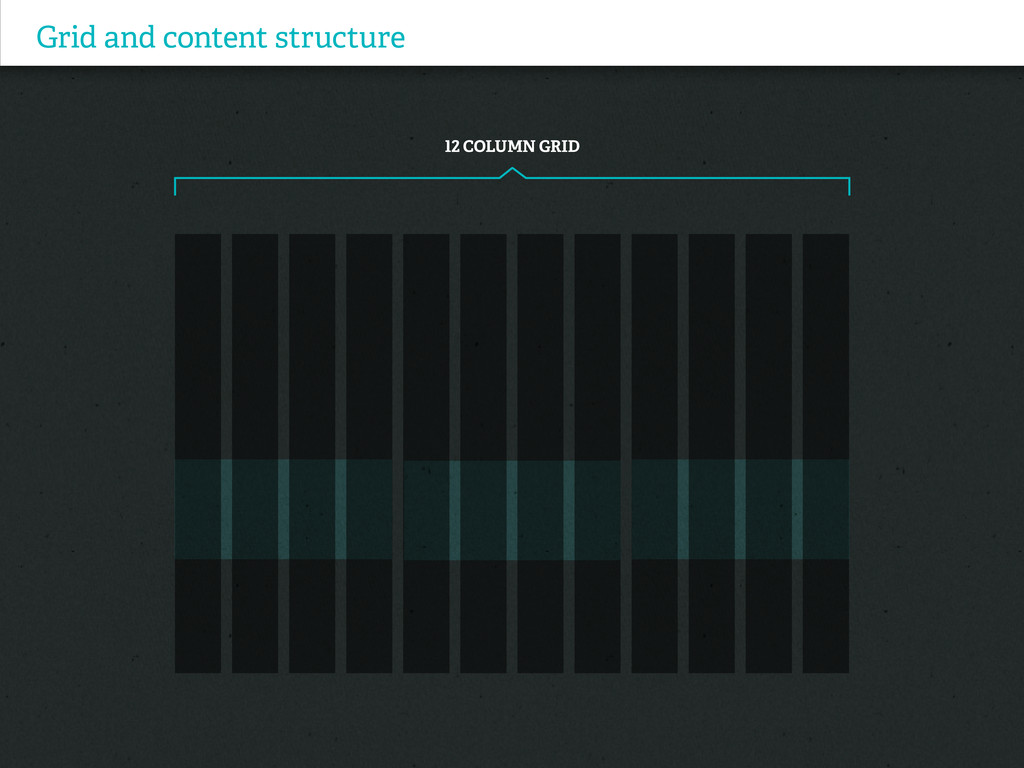
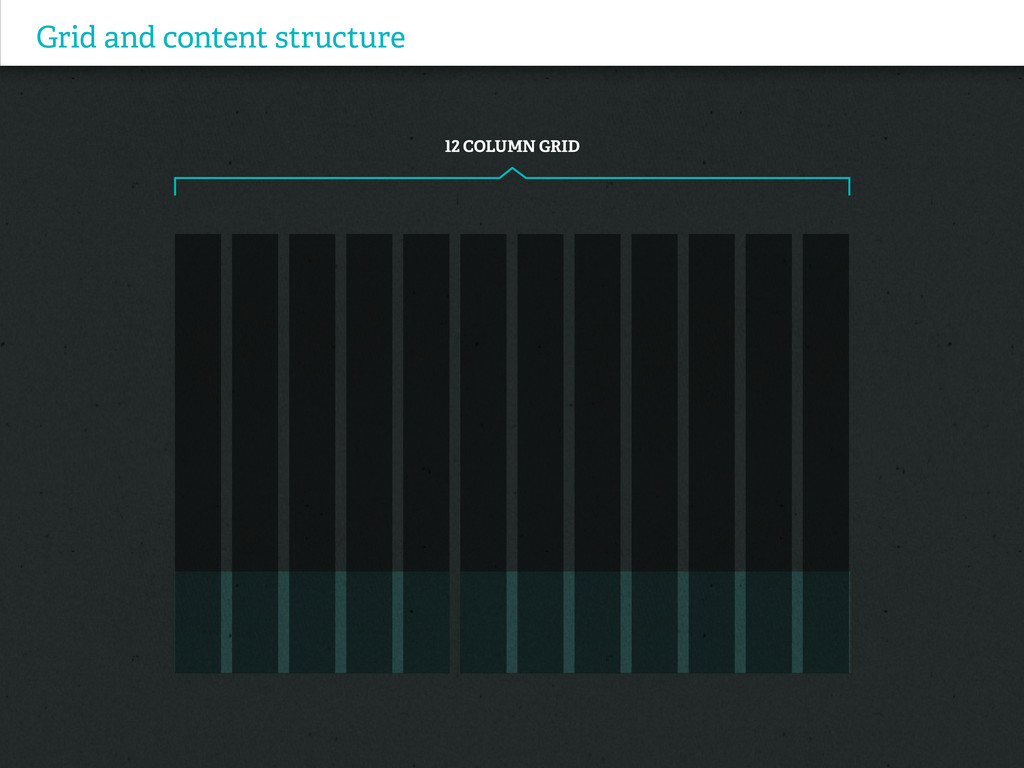
Grid and content structure Even this presentation was made with
a grid.
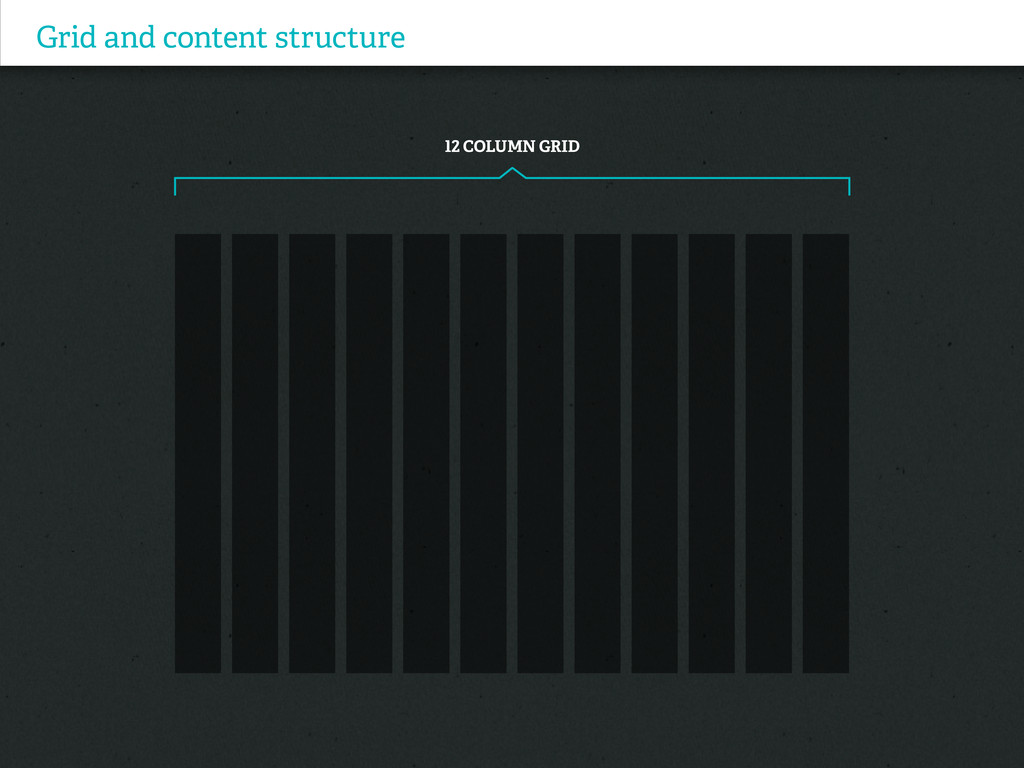
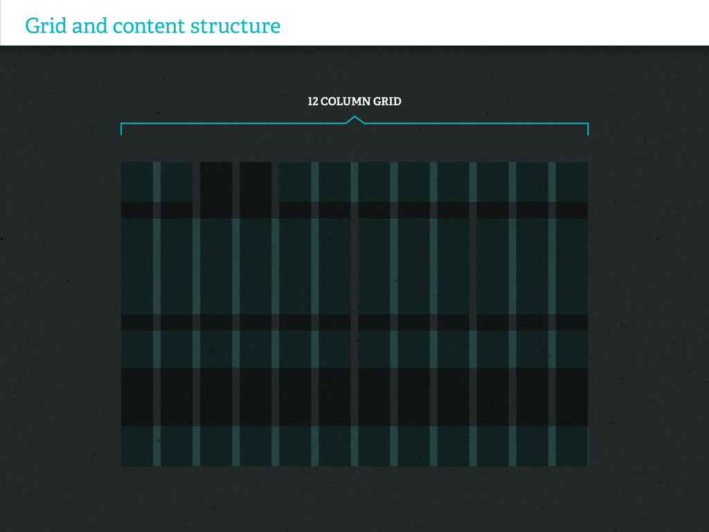
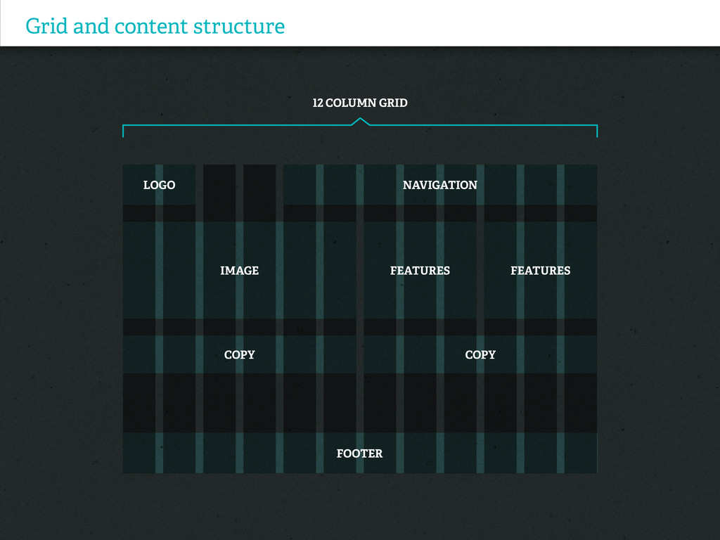
Grid and content structure 12 Column Grid
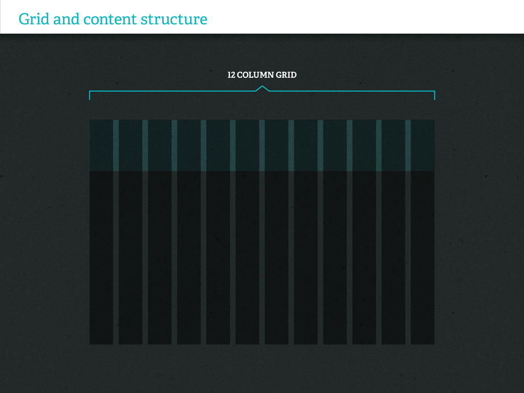
Grid and content structure 12 Column Grid
Grid and content structure 12 Column Grid
Grid and content structure 12 Column Grid
Grid and content structure 12 Column Grid
Grid and content structure 12 Column Grid
Grid and content structure 12 Column Grid LOGO IMAGE COPY
COPY FEATURES FEATURES NAVIGATION FOOTER
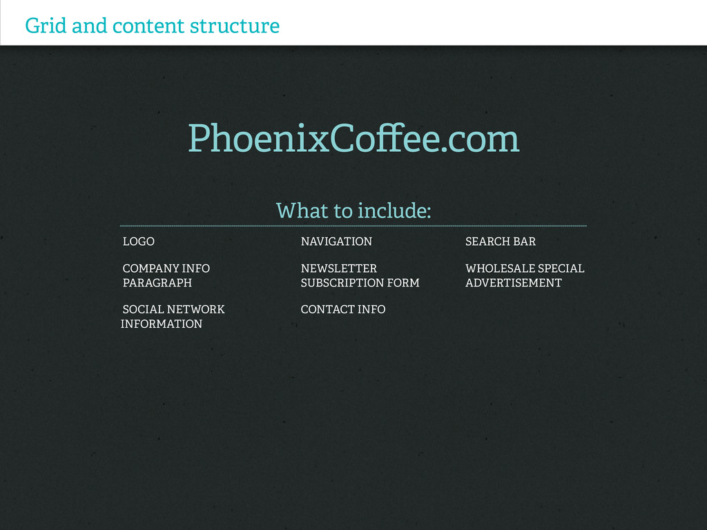
Grid and content structure PhoenixCoffee.com What to include: Logo Navigation
Search bar Company info Newsletter Wholesale special paragraph subscription form advertisement Social Network Contact info Information
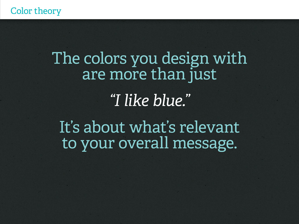
Color theory The colors you design with are more than
just “I like blue.” It’s about what’s relevant to your overall message.
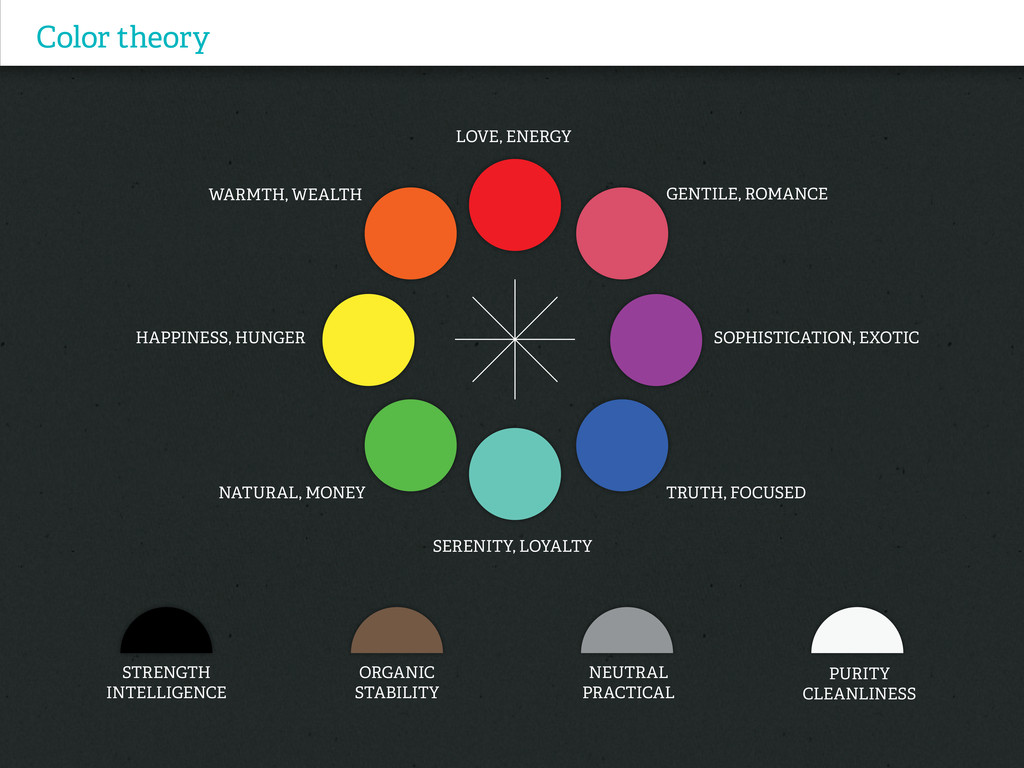
Color theory PURITY CLEANLINESS LOVE, ENERGY SERENITY, LOYALTY TRUTH, FOCUSED
Gentile, Romance WARMTH, WEALTH HAPPINESS, HUNGER Sophistication, Exotic Natural, Money STRENGTH INTELLIGENCE Organic STABILITY NEUTRAL Practical
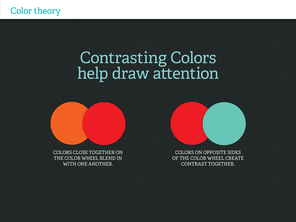
Contrasting Colors help draw attention Color theory COLORS CLOSE TOGETHER
ON THE COLOR WHEEL blend in with one another. Colors on opposite sides of the color wheel create contrast together.
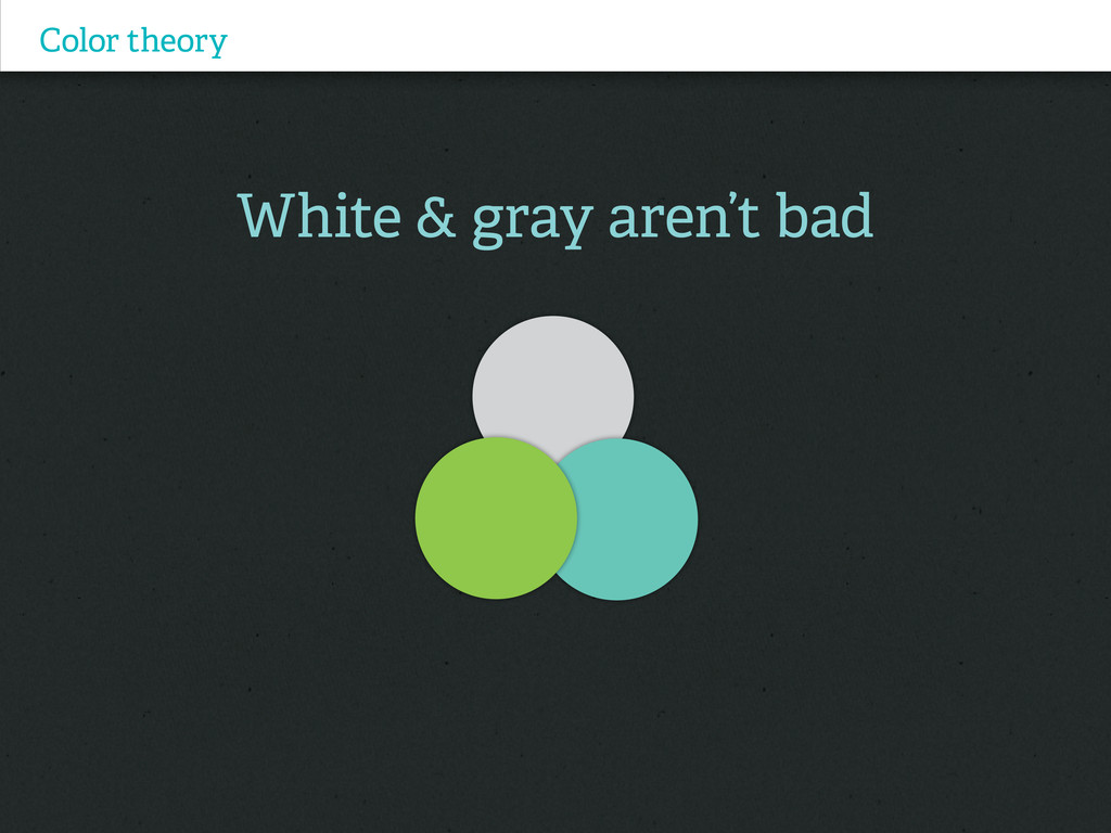
White & gray aren’t bad Color theory
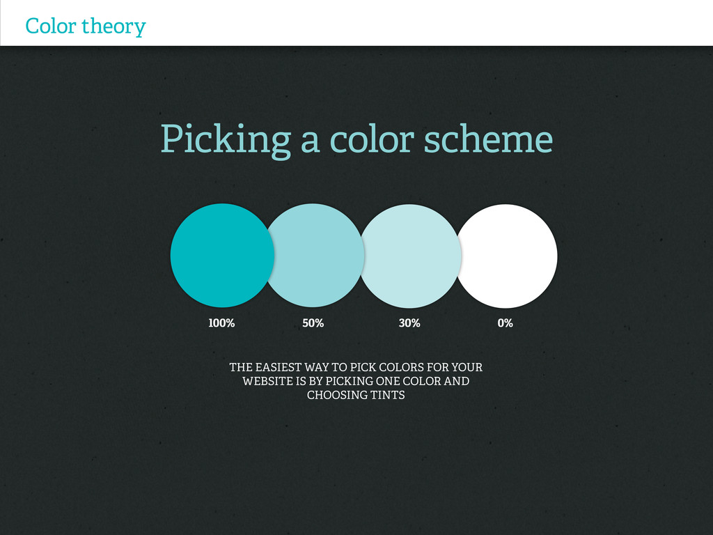
Picking a color scheme Color theory The easiest way to
pick colors for your website is by picking one color and choosing tints 100% 50% 30% 0%
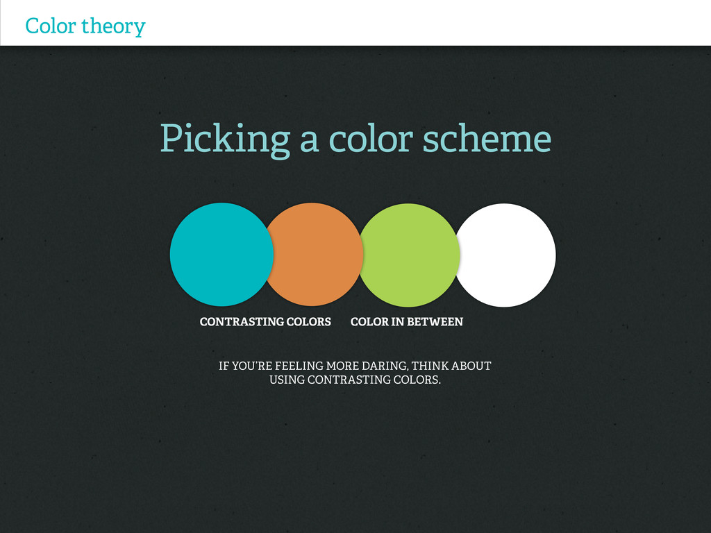
Picking a color scheme Color theory If you’re feeling more
daring, think about using contrasting colors. CONTRASTING COLORS COLOR IN BETWEEN
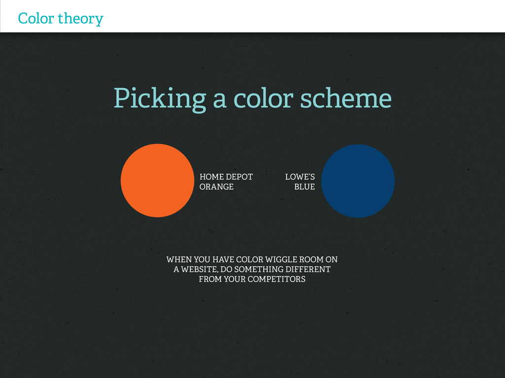
Picking a color scheme Color theory When you have color
wiggle room on a website, do something different from your competitors HOME DEPOT ORANGE Lowe’s Blue
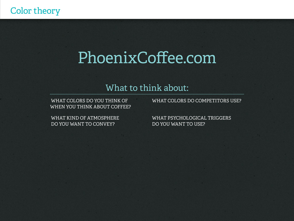
Color theory PhoenixCoffee.com What to think about: What colors do
YOU Think of What colors do competitors use? WHEN you think about coffee? What kind of atmosphere What psychological triggers do you want to convey? Do you want to use?
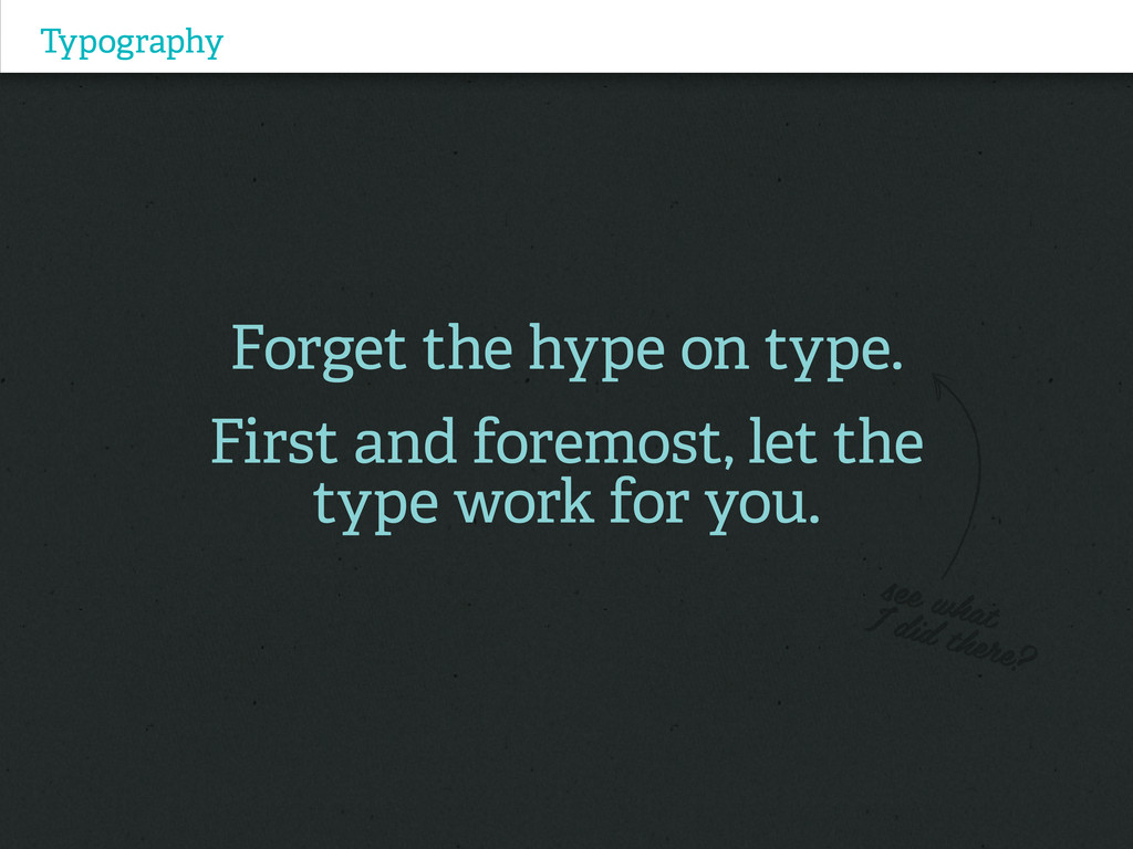
Typography Forget the hype on type. First and foremost, let
the type work for you.
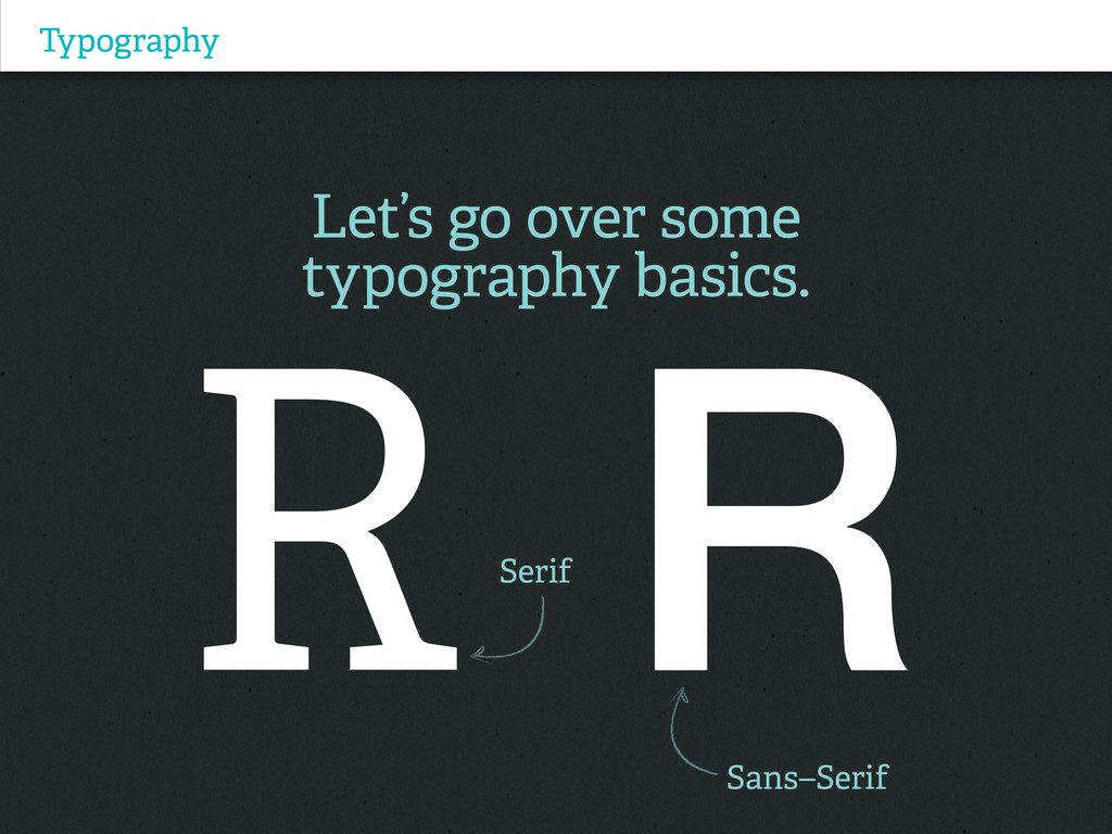
Typography Let’s go over some typography basics. Serif Sans–Serif
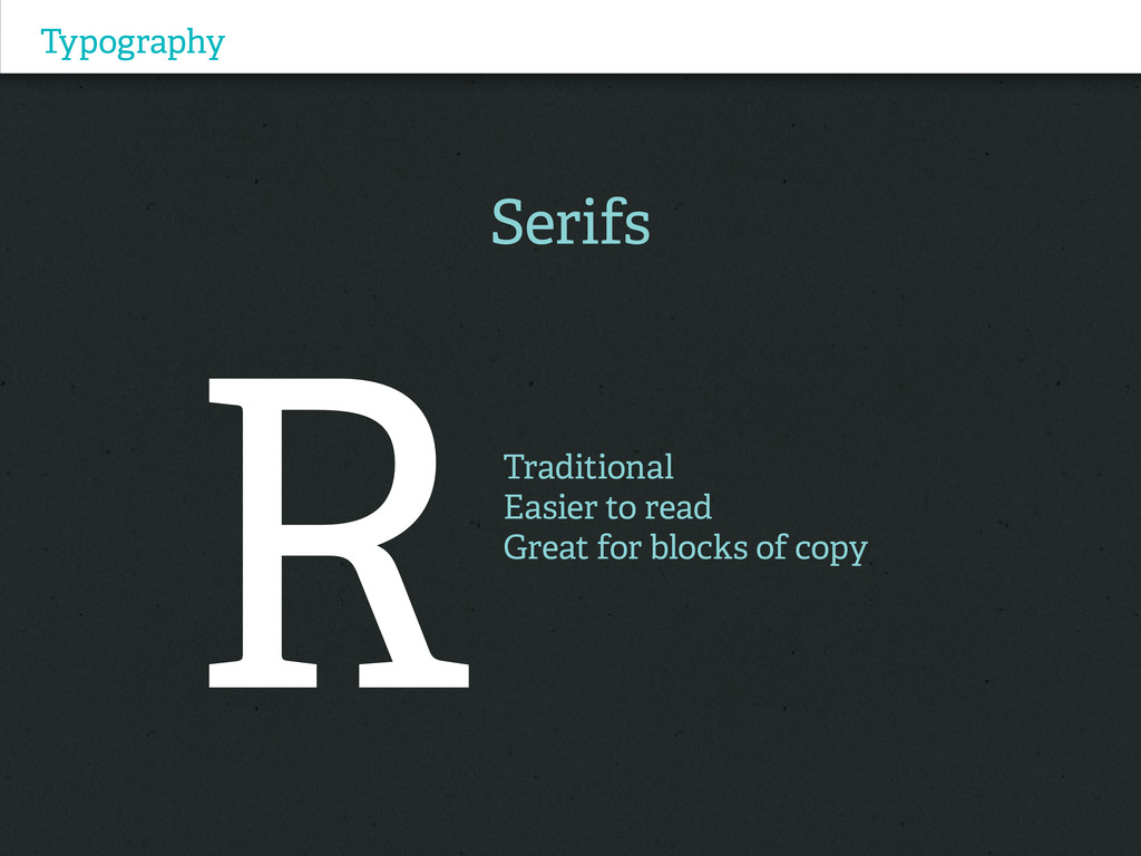
Typography Serifs Traditional Easier to read Great for blocks of
copy
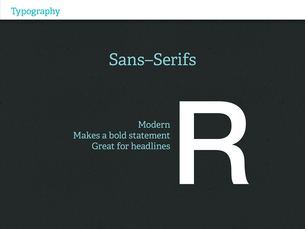
Typography Sans–Serifs Modern Makes a bold statement Great for headlines
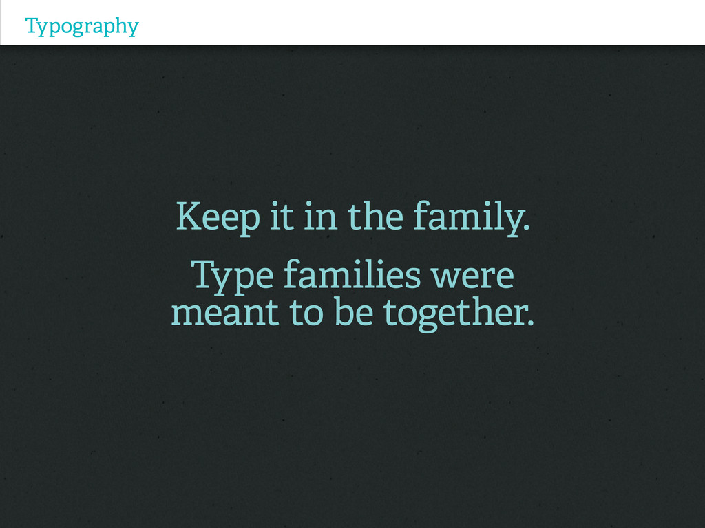
Typography Keep it in the family. Type families were meant
to be together.
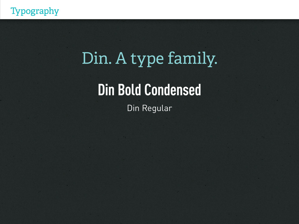
Typography Din. A type family. Din Bold Condensed Din Regular
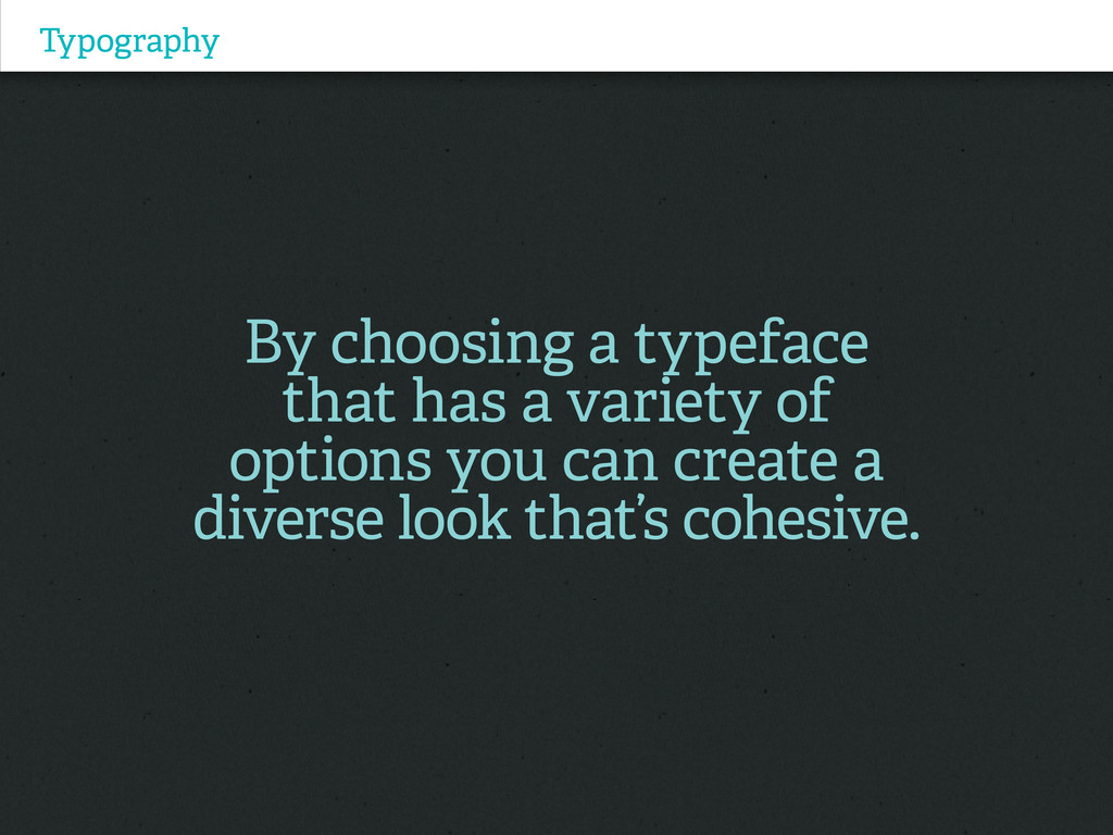
Typography By choosing a typeface that has a variety of
options you can create a diverse look that’s cohesive.
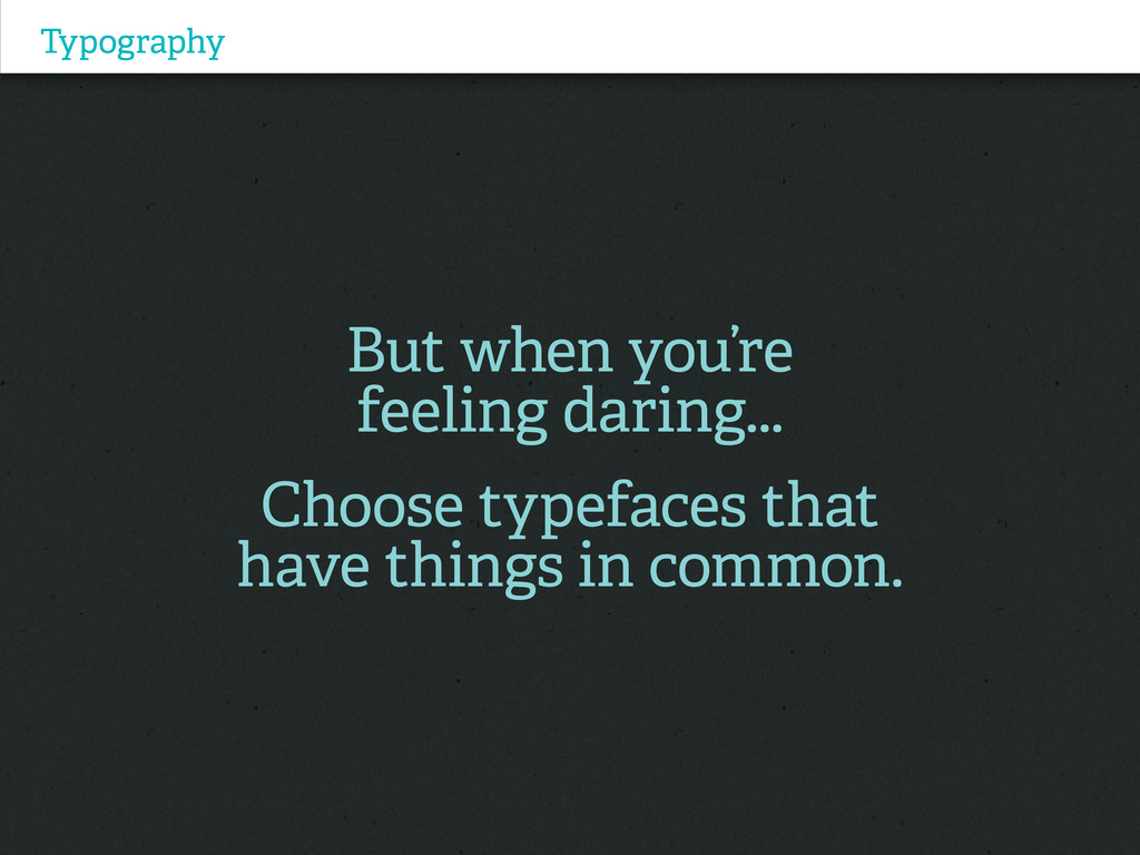
Typography But when you’re feeling daring... Choose typefaces that have
things in common.
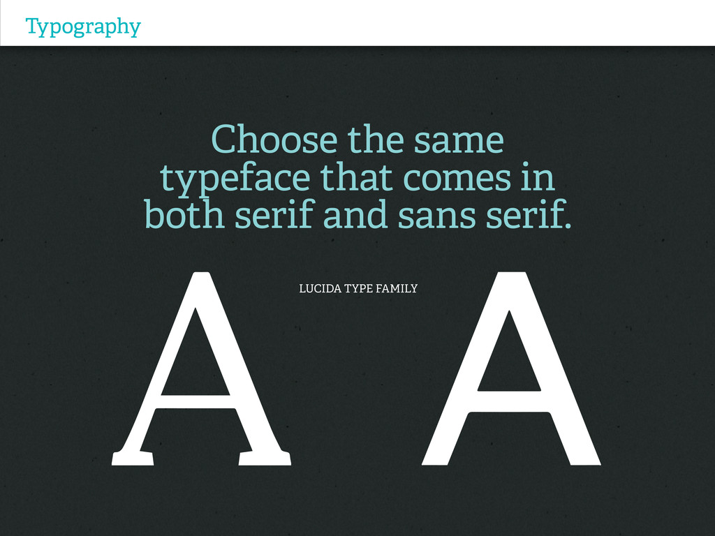
Typography Choose the same typeface that comes in both serif
and sans serif. LUCIDA TYPE FAMILY
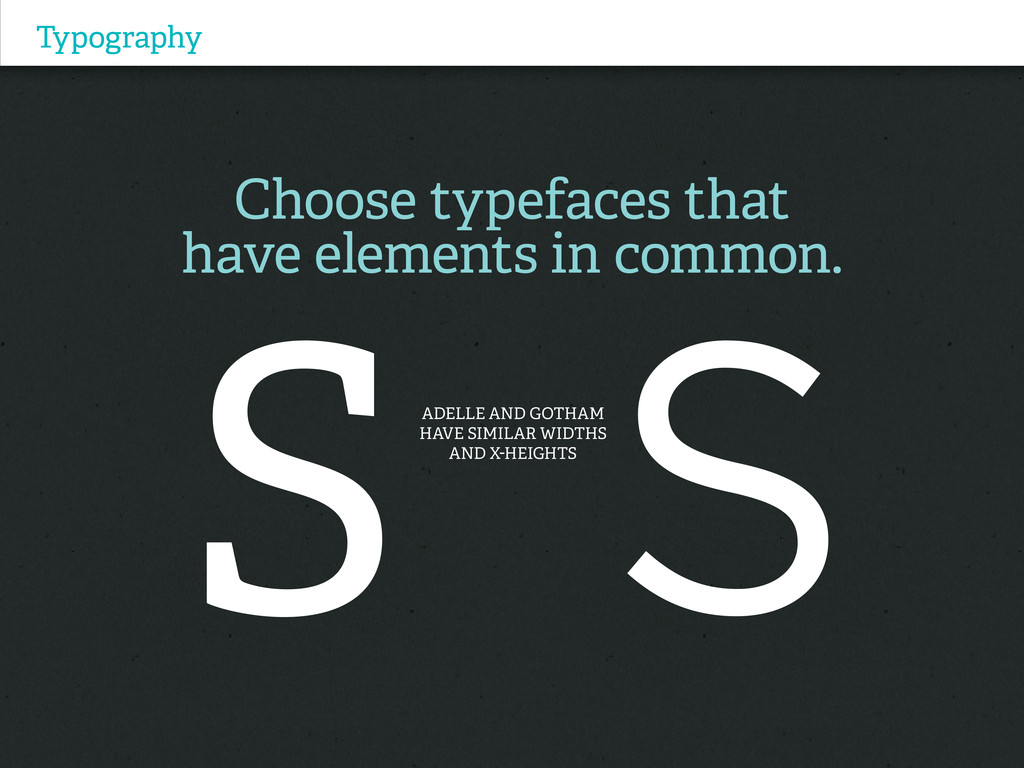
Typography Choose typefaces that have elements in common. ADelle and
Gotham have SIMILAR WIDTHS and x-heights
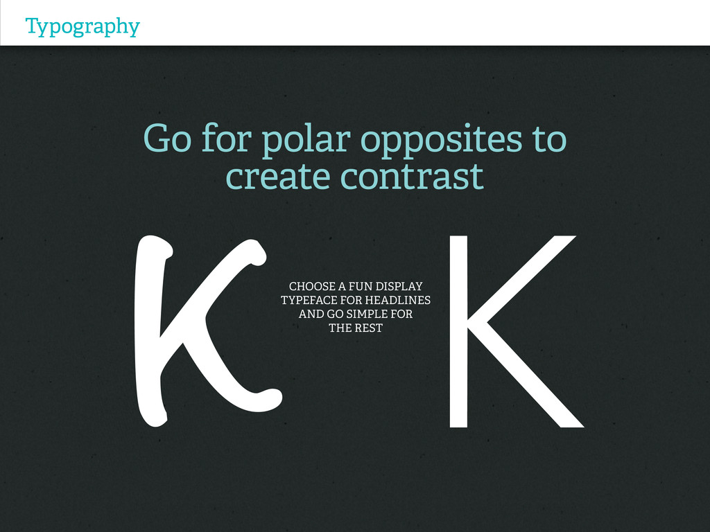
Typography Go for polar opposites to create contrast Choose a
fun display typeface for headlines and go simple for the rest
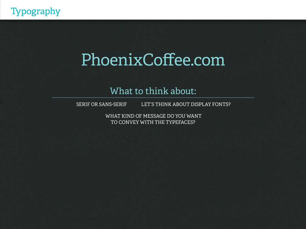
Typography PhoenixCoffee.com What to think about: Serif or Sans-serif Let’s
think about display fonts? What kind of message do you want to convey with the typefaces?
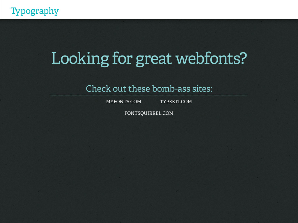
Typography Looking for great webfonts? Check out these bomb-ass sites:
myfonts.com typekit.com Fontsquirrel.com
Thanks (you’re the bomb diggity) Justine Arreche I work I
tweet I Design @The Elefanta The Elefanta.com