Upgrade to Pro — share decks privately, control downloads, hide ads and more …

Android Drawable XML

Daniel Lew
October 04, 2011

Android Drawable XML

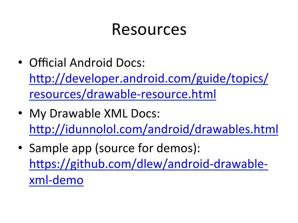
A short talk about the wonderful world of Android's XML-based Drawables, given at a local Android meetup (the now retired AUG.mn).

Daniel Lew

October 04, 2011
Tweet

More Decks by Daniel Lew

Other Decks in Programming

Transcript

  1. Basic  Graphic  Assets   •  Flat  colors  (#ARGB,  #AARRGGBB)  

    •  StaGc  images  (JPG,  PNG)   •  9-­‐Patches  (stretchable  images)  
  2. Advantages   •  TransformaGon  of  drawables  (states,   animaGon)  

    •  Mix  mulGple  drawables  into  one  drawable   •  Simple  shapes  support   •  Fewer  asset  demands   •  Reduces  APK  size  
  3. <shape>  basics   •  Allows  you  to  draw  shapes  –

     rectangles,  ovals,   lines  or  rings.   <?xml  version="1.0"  encoding="u/-­‐8"?>   <shape    xmlns:android="h7p://schemas.android.com/apk/res/android"    android:shape="rectangle">    <solid      android:color="@android:color/black"  />   </shape>  
  4. <shape>  with  <stroke>   •  Add  borders  with  <stroke>  

    <?xml  version="1.0"  encoding="u/-­‐8"?>   <shape    xmlns:android="h5p://schemas.android.com/apk/res/android"    android:shape="rectangle">    <solid        android:color="@android:color/transparent"/>    <stroke      android:width="5dp"      android:color="@android:color/black"      android:dashWidth="10dp"      android:dashGap="5dp"  />   </shape>  
  5. <shape>  with  <corners>   •  Rounded  corners  with  <corners>  

    <?xml  version="1.0"  encoding="u/-­‐8"?>   <shape    xmlns:android="h5p://schemas.android.com/apk/res/android"    android:shape="rectangle">    <solid      android:color="@android:color/black"  />    <corners      android:radius="20dp"  />   </shape>  
  6. <shape>  gradients   •  Can  define  a  solid  color  with

     <shape>  or  a   gradient  with  <gradient>   <?xml  version="1.0"  encoding="u/-­‐8"?>   <shape    xmlns:android="h5p://schemas.android.com/apk/res/android"    android:shape="rectangle">    <gradient      android:startColor="#F00"      android:endColor="#00F"  />   </shape>  
  7. <layer-­‐list>   •  Lets  you  layer  drawables  on  top  of

     each  other.   <layer-­‐list    xmlns:android="h5p://schemas.android.com/apk/res/android">    <item  android:drawable="@drawable/shape_corners"  />    <item      android:top="10dp”  android:right="10dp”  android:bo7om="10dp”  android:le^="10dp">      <shape        android:shape="rectangle">        <solid  android:color="#F00"  />      </shape>    </item>    <item      android:drawable="@drawable/shape_ring"      android:top="20dp”  android:right="20dp”  android:bo7om="20dp”  android:le^="20dp"  />   </layer-­‐list>  
  8. <selector>   •  Define  a  set  of  drawables  to  be

     used  when   Views  are  in  different  states.  
  9. <selector>  bu7on   <selector  xmlns:android="h7p://schemas.android.com/apk/res/android">          <item

     android:state_window_focused="false"  android:state_enabled="true"                  android:drawable="@drawable/btn_default_normal"  />          <item  android:state_window_focused="false"  android:state_enabled="false"                  android:drawable="@drawable/btn_default_normal_disable"  />          <item  android:state_pressed="true"                    android:drawable="@drawable/btn_default_pressed"  />          <item  android:state_focused="true"  android:state_enabled="true"                  android:drawable="@drawable/btn_default_selected"  />          <item  android:state_enabled="true"                  android:drawable="@drawable/btn_default_normal"  />          <item  android:state_focused="true"                  android:drawable="@drawable/btn_default_normal_disable_focused"  />          <item                    android:drawable="@drawable/btn_default_normal_disable"  />   </selector>  
  10. Level-­‐based  drawable  XML   •  Drawables  have  levels   • 

    <clip>,  <rotate>,  <scale>  -­‐  dynamic  changes   based  on  level   <clip>    <shape>      <corners        android:radius="5dip"  />      <gradient        android:startColor="#ffffd300"        android:centerColor="#ffK600"        android:centerY="0.75"        android:endColor="#ffffcb00"        android:angle="270"  />    </shape>   </clip>  
  11. <level-­‐list>  drawables   •  <level-­‐list>  -­‐  Explicit  list  of  drawables

     for  each   level.   <level-­‐list  xmlns:android="h5p://schemas.android.com/apk/res/android">          <item  android:maxLevel="2"  android:drawable="@android:drawable/ stat_sys_ba5ery_0"  />          <item  android:maxLevel="7"  android:drawable="@android:drawable/ stat_sys_ba5ery_5"  />          […]          <item  android:maxLevel="97"  android:drawable="@android:drawable/ stat_sys_ba5ery_95"  />          <item  android:maxLevel="100"  android:drawable="@android:drawable/ stat_sys_ba5ery_100"  />   </level-­‐list>  
  12. AnimaGon  Drawables   •  <transiGon>  -­‐  Cross-­‐fades  between  two  

    drawables.   •  <animaGon-­‐list>  -­‐  Frame-­‐by-­‐frame  animaGons.  
  13. <bitmap>  and  <nine-­‐patch>   •  Both  let  you  adjust  how

     the  image  is  rendered   •  <bitmap>  -­‐  gives  opGons  for  gravity  or  Gling.   <?xml  version="1.0"  encoding="u/-­‐8"?>   <bitmap    xmlns:android="h5p://schemas.android.com/apk/res/android"    android:src="@android:drawable/star_on"    android:GleMode="repeat"  />    
  14. Odds  and  Ends   •  <inset>  -­‐  insets  a  drawable

      •  <color>  -­‐  a  flat  color   •  <animated-­‐rotate>  -­‐  Unsupported  
  15. Notable   •  Compound  drawables  can  mix  and  match  any

      number  of  other  drawable  XML   •  All  drawable  XML  also  has  a  code   representaGon  –  e.g.,  a  gradient  is  a   GradientDrawable  
  16. Resources   •  Official  Android  Docs:   h7p://developer.android.com/guide/topics/ resources/drawable-­‐resource.html  

    •  My  Drawable  XML  Docs:   h7p://idunnolol.com/android/drawables.html   •  Sample  app  (source  for  demos):   h7ps://github.com/dlew/android-­‐drawable-­‐ xml-­‐demo