Upgrade to Pro — share decks privately, control downloads, hide ads and more …

Design Patterns, Metaphors and Visualisation

Ed de Quincey
October 17, 2013

Design Patterns, Metaphors and Visualisation

Ed de Quincey

October 17, 2013
Tweet

More Decks by Ed de Quincey

Other Decks in Design

Transcript

  1. Design Patterns,
    Metaphors and
    Visualisation
    Dr Ed de Quincey
    @EddeQuincey

    View Slide

  2. View Slide

  3. View Slide

  4. View Slide

  5. What is usability?
    “Usability is a quality attribute that
    assesses how easy user interfaces are
    to use. The word "usability" also refers
    to methods for improving ease-of-use
    during the design process.”

    (Nielsen, 2003)

    View Slide

  6. The user/human part
    Useful human strengths and weaknesses to consider include:
    •  Memory - people can remember 7 (plus or minus 2) “chunks” of
    information.
    •  Visual perception e.g. colour blindness
    •  Motor skills e.g. mouse skills
    •  Learning and skill acquisition
    •  Motivation
    •  User’s conceptual models
    •  Population stereotypes
    •  Human diversity e.g. accessibility issues for disabled users

    View Slide

  7. http://www.vischeck.com/examples/

    View Slide

  8. http://www.youtube.com/watch?v=xKdOMgu0C5Q

    View Slide

  9. View Slide

  10. Banner Blindness: Old and New
    Findings
    Jakob Nielsen
    http://www.useit.com/alertbox/banner-blindness.html

    View Slide

  11. View Slide

  12. View Slide

  13. View Slide

  14. View Slide

  15. View Slide

  16. Creating interface
    designs on “feeling”
    What is that feeling?

    View Slide

  17. Golden Section/Divine Proportion (?)

    View Slide

  18. View Slide

  19. View Slide

  20. View Slide

  21. http://www.markboulton.co.uk/journal/comments/ ve-simple-steps-to-designing-grid-systems-preface

    View Slide

  22. Grids
    http://www.markboulton.co.uk/journal/comments/ ve_simple_steps_to_designing_grid_systems_part_1/

    View Slide

  23. View Slide

  24. View Slide

  25. View Slide

  26. The effects of screen ratio and order on information retrieval in web pages
    Paul van Schaik, Jonathan Ling (2004)
    “According to Fechner who was the first to examine the GS from a
    psychological perspective, individuals will have a preference for
    rectangles that have a ratio of 1:1.618 for their width to height”
    however …
    “… the current research failed to support the idea that the GS is an
    important factor in aesthetic judgements. In fact, of all the ratios
    presented to participants we found that the GS was least preferred”

    View Slide

  27. “The present findings indicate that
    the best ratio is 28:72 for aesthetic
    value and 23:77 for performance.
    Given the lesser impact on aesthetic
    measures of 23:77, we recommend
    that this ratio be used.”
    The effects of screen ratio and order on information retrieval in web pages
    Paul van Schaik, Jonathan Ling (2004)

    View Slide

  28. Grid Layouts

    View Slide

  29. “The grid is the conceptual embodiment of the design
    program [13]. It allows the discovered determinants to
    be codified and propagated consistently across a series
    of screens in a GUI. A grid is the geometrical division
    of a space into precisely measured columns, spaces and
    margins; it is the backbone of screen design.
    Composing and designing spaces with a grid have
    become an essential tool for the practicing designer
    [14]. Jude [15] states that ‘the primary purpose of the
    grid is to create order out of chaos; it is an aid to
    readability, recognition, and understanding.”
    Eugene Ch’ng, David Chek Ling Ngo (2003)
    Screen design: a dynamic symmetry grid based approach

    View Slide

  30. View Slide

  31. http://www.1kbgrid.com/

    View Slide

  32. The basic configuration is a 12 column grid system spread out
    over 960 pixels. Each column is 60 pixels wide with a 20 pixel
    gutter in between.
    http://www.usabilitypost.com/2009/05/29/the-1kb-css-grid-part-1/

    View Slide

  33. View Slide

  34. View Slide

  35. View Slide

  36. View Slide

  37. http://books.alistapart.com/products/css3-for-web-designers

    View Slide

  38. .multiplecolumns {
    -moz-column-width: 130px;;
    -webkit-column-width: 130px;
    -moz-column-gap: 20px;
    -webkit-column-gap: 20px;
    -moz-column-rule: 1px solid #ddccb5;
    -webkit-column-rule: 1px solid
    #ddccb5;
    }

    View Slide

  39. Design Patterns

    View Slide

  40. “Design patterns were first described
    in the 1960s by Christopher
    Alexander, an architect who noticed
    that many things in our lives happen
    according to patterns.”
    http://uxdesign.smashingmagazine.com/2009/06/23/10-ui-
    design-patterns-you-should-be-paying-attention-to/

    View Slide

  41. View Slide

  42. “design patterns are solutions to
    recurring problems. By extension,
    UI design patterns are solutions to
    common user interface problems.”
    http://uxdesign.smashingmagazine.com/2009/06/23/10-ui-
    design-patterns-you-should-be-paying-attention-to/

    View Slide

  43. Lazy Registration
    Users can use all of the service’s functions to edit their photos online.
    They are asked to register only before saving their work.

    View Slide

  44. Progressive Disclosure

    View Slide

  45. “Google Maps allows users to search by city, street, zip
    code and even latitudinal and longitudinal values.”
    Forgiving Format

    View Slide

  46. Breadcrumbs

    View Slide

  47. Subscription Plans

    View Slide

  48. Auto-Complete
    http://uxdesign.smashingmagazine.com/2012/04/10/ui-patterns-for-mobile-apps-search-sort- lter/

    View Slide

  49. http://developer.yahoo.com/ypatterns/

    View Slide

  50. http://developer.yahoo.com/ypatterns/
    http://developer.yahoo.com/yui/paginator/
    “When searches return too many results to display on a single
    page, separate the information into a sequence of pages.
    Provide pagination control, as a row of links, to enable the user
    to browse through more results than can be displayed on a
    single page.”

    View Slide

  51. View Slide

  52. http://www.smashingmagazine.com/2008/07/04/web-form-design-patterns-sign-up-forms/

    View Slide

  53. View Slide

  54. Web form design
    guidelines: an
    eyetracking study
    http://www.cxpartners.co.uk/thoughts/web_forms_design_guidelines_an_eyetracking_study.htm

    View Slide

  55. Form Design Guidelines
    •  Use a simple vertical layout with labels above the input elds.
    •  If vertically aligned labels are not possible, make them bold and left-aligned.
    •  If you put more than one eld on a row (e.g. rst and last name) make them look like
    a single piece of information.
    •  Emphasize section headings (via color or shading) if you want people to read them.
    •  Only ask for required information. Identify optional elds rather than required elds
    (don't use asterisks).
    •  Use a single input eld for numbers and postal codes, and allow input in various
    forms.
    •  Avoid displaying unnecessary information and make sure important information
    stands out.
    •  Real time feedback may be distracting — good implementation is key.
    •  Place instructions to the side of the eld.
    •  For multi-page forms tell users how many steps remain before completion.

    View Slide

  56. The user/human part
    Useful human strengths and weaknesses to consider include:
    •  Memory - people can remember 7 (plus or minus 2) “chunks” of
    information.
    •  Visual perception e.g. colour blindness
    •  Motor skills e.g. mouse skills
    •  Learning and skill acquisition
    •  Motivation
    •  User’s conceptual models
    •  Population stereotypes
    •  Human diversity e.g. accessibility issues for disabled users

    View Slide

  57. Icons and
    Metaphors

    View Slide

  58. View Slide

  59. View Slide

  60. View Slide

  61. “The physical appearance of objects
    such as icons can significantly affect
    navigational performance.
    For example, Rogers (1987) found that icons with abstract
    but simple symbols that represented concrete objects
    resulted in the fewest number of errors and requests for
    help. In addition, Byrne (1993) found that large and simple
    icons outperformed complex ones by a significant margin.
    Byrne suggests that icons need to be simple, large, and easy
    to discriminate in order to be effective.”
    Bernard, M. (2006) Criteria for optimal web design (designing for usability)
    http://uwf.edu/ddawson/d3net/documents/web_usability/optimal%20web%20design.pdf

    View Slide

  62. Tips for using icons in interface design
    http://www.icon nder.com/blog/4/

    View Slide

  63. View Slide

  64. View Slide

  65. vs

    View Slide

  66. “Each icon presents us
    with a mini-story with an
    intertwined plot. The
    problem is that in small
    size you are unable to
    work out what is depicted.
    Even in larger sizes, it is
    not always that easy to
    decipher the icons.”
    10 Mistakes in Icon Design
    http://turbomilk.com/blog/cookbook/
    icon_design/10_mistakes_in_icon_design/

    View Slide

  67. View Slide

  68. Principles of Icon Design
    http://hicksdesign.co.uk/speaking/principles-of-icon-design
    Icon Design Explained (Quickly)
    http://hicksdesign.co.uk/speaking/icon-design-explained-quickly

    View Slide

  69. View Slide

  70. http://www.ajaxload.info/

    View Slide

  71. Showing Hyperlink Cues with CSS
    a[href $='.pdf'] {
    padding-right: 18px;
    background: transparent
    url(icon_pdf.gif) no-repeat center right;
    }
    http://askthecssguy.com/articles/showing-hyperlink-cues-with-css/

    View Slide

  72. 15 Great Icon Sets for Web & Mobile Apps
    http://designfestival.com/15-great-icon-sets-for-web-mobile-apps/

    View Slide

  73. 12 Fantastic, Fresh and Free Icon Sets
    http://designshack.net/articles/freebies/wf-free-icons-2012/

    View Slide

  74. http://www.delicious.com/eddequincey/icons

    View Slide

  75. Visualisation

    View Slide

  76. “Visualisation concerns the graphical
    (or semi-graphical) representation of
    information in order to assist human
    comprehension of and reasoning
    about that information”
    Petre, M., de Quincey, E. (2006) A gentle overview of software visualization.
    Computer Society of India Communications. August, 6-11. ISSN 0970-647X
    Available at: http://www.ppig.org/newsletters/2006-09.html

    View Slide

  77. View Slide

  78. A A A

    View Slide

  79. View Slide

  80. Pattern Matching
    A A A

    View Slide

  81. View Slide

  82. Charles Joseph Minard's 1861 diagram of
    Napoleon's March
    http://en.wikipedia.org/wiki/Information_design

    View Slide

  83. View Slide

  84. Sparklines by Edward Tufte
    http://thedoublethink.com/2009/08/tufte%E2%80%99s-principles-for-visualizing-quantitative-information/

    View Slide

  85. View Slide

  86. http://www.edwardtufte.com/bboard/q-and-a-fetch-msg?msg_id=0001yB&topic_id=1

    View Slide

  87. Data journalism at the Guardian: what is it and how do we do it?
    http://www.guardian.co.uk/news/datablog/2011/jul/28/data-journalism

    View Slide

  88. Data visualisation DIY: our top tools
    http://www.guardian.co.uk/news/datablog/2012/mar/28/data-visualisation-tools-free

    View Slide

  89. http://visual.ly/

    View Slide

  90. Google Chart Tools
    https://developers.google.com/chart/

    View Slide

  91. IBM Many Eyes
    http://www-958.ibm.com/software/data/cognos/manyeyes/

    View Slide

  92. Visualisation of a collection of tweets that contain the word
    hayfever collected in June and July 2012
    http://www-958.ibm.com/software/data/cognos/manyeyes/visualizations/visualisation-of-tweets-containing

    View Slide

  93. My Heatmap
    http://www.myheatmap.com

    View Slide

  94. View Slide

  95. The top 20 data visualisation tools
    http://www.netmagazine.com/features/top-20-data-visualisation-tools

    View Slide

  96. Pinterest
    http://pinterest.com/eddequincey/infographics-and-visualisations/

    View Slide

  97. Patent: Rugg and de Quincey (Wo2010015829) Method Of And
    Apparatus For Analysing Data Files

    View Slide

  98. www.SearchVisualizer.com

    View Slide

  99. Search Visualisation of:
    http://academic.research.microsoft.com/Author/5199116/ed-de-quincey

    View Slide

  100. Icons and Metaphors
    + Visualisation

    View Slide

  101. View Slide

  102. View Slide

  103. View Slide

  104. !

    View Slide

  105. View Slide

  106. View Slide

  107. View Slide

  108. LEARNING ANALYTICS
    & DASHBOARDS
    IDENTIFYING POTENTIAL SOURCES OF DATA AND METAPHORS
    Dr Ed de Quincey & Dr Ray Stoneham, University of Greenwich

    View Slide

  109. RETENTION AND THE MEASUREMENT OF STUDENT
    ENGAGEMENT ARE LONG STANDING PROBLEMS

    View Slide

  110. LOOKS SET TO BE A KEY CONCERN WITH THE RAPID
    DEVELOPMENT OF MOOCS WITHIN HE WORLDWIDE

    View Slide

  111. TRADITIONALLY A STUDENT’S PROGRESS AND LEVEL OF
    ENGAGEMENT HAS BEEN MEASURED BY ASSESSMENT

    View Slide

  112. HOW ELSE CAN WE MEASURE ENGAGEMENT
    AND PROGRESS IN REAL-TIME?

    View Slide

  113. LEARNING ANALYTICS (LA)
    Explicit & Implicit data collection and analysis

    View Slide

  114. Learning Analytics
    has been de ned as a method for
    “deciphering trends
    and patterns from
    educational big data
    … to further the
    advancement of a
    personalized,
    supportive system
    of higher education.”
    (Johnson et al., 2013)
    Co-authorship network map of physicians publishing on hepatitis C (detail)
    Source: http://www. ickr.com/photos/speedo ife/8274993170/

    View Slide

  115. View Slide

  116. PRESENTING STUDENT DATA BACK TO STUDENTS and LECTURERS,
    USING USER CENTRIC FORMATS and METAPHORS

    View Slide

  117. OVERVIEW of the CMS INTRANET
    WHAT DATA are we COLLECTING?

    View Slide

  118. View Slide

  119. View Slide

  120. We have collected the usage data
    of 3,576 students across the
    School (UG and PG) since
    September 2011. During
    this time there have been
    7,899,231 interactions
    with the student intranet.

    View Slide

  121. We also have stored in our
    systems, detailed attendance
    data, programme and
    course information and
    coursework marks.

    View Slide

  122. PERIOD UNDER STUDY: September 1st 2012 to May 29th 2013
    2,544,374 interactions with
    65 different le types from 2,634 students.
    2,131,278
    18,974
    157,607
    128,676
    6,368
    66,129
    1,851
    19,561

    View Slide

  123. COMP1314: Digital Media, Computing and Programming
    1st Year Course with 53 students
    Correlation between Average Mark and Attendance % = 0.638
    0  
    10  
    20  
    30  
    40  
    50  
    60  
    70  
    80  
    90  
    100  
    0   10   20   30   40   50   60   70   80   90   100  
    A"endance  %  
    Average  Mark  

    View Slide

  124. COMP1314: Digital Media, Computing and Programming
    1st Year Course with 53 students
    Correlation between Average Mark and Intranet Activity = 0.601
    0  
    500  
    1000  
    1500  
    2000  
    2500  
    3000  
    3500  
    0   10   20   30   40   50   60   70   80   90   100  
    Number  of  interac7ons  with  Intranet  
    Average  Mark  

    View Slide

  125. COMP1314: Digital Media, Computing and Programming
    1st Year Course with 53 students
    Correlation
    Intranet  interac4ons/Average  mark 0.601614385
    Overall  [email protected]/Average  mark 0.637771689
    Intranet  interac4ons/Overall  [email protected] 0.438059389
    COMP1314  Intranet  interac4ons/Average  mark 0.627753051
    Lecture/tutorial  slide  views/Average  mark 0.480171638
    Lecture  slide/tutorial  views/Overall  [email protected] 0.45670929
    Coursework  specifica4on  views/Average  mark 0.229025047

    View Slide

  126. COMP1640: Enterprise Web Software Development
    3rd Year Course with 109 students
    Correlation
    Intranet  interac4ons/Average  mark 0.168484881
    Overall  [email protected]/Average  mark 0.418583626
    Intranet  interac4ons/Overall  [email protected] 0.234846724
    COMP1640  Intranet  interac4ons/Average  mark 0.188256752
    Lecture/tutorial  slide  views/Average  mark -0.067577432
    Lecture  slide/tutorial  views/Overall  [email protected] 0.183237816
    Coursework  specifica4on  views/Average  mark 0.378425564

    View Slide

  127. View Slide

  128. Average Mark Attendance %
    Total Intranet
    Interactions
    Intranet Files
    Downloaded
    COMP1314
    Intranet
    Interactions
    COMP1314
    Lecture/Tutorial
    Views
    COMP1314 CW
    Speci cation
    Views
    86   75  
    5.3  per  day  
    1,439  
    213   278   103   8  
    Average “First” Student on COMP1314
    Average Mark Attendance %
    Total Intranet
    Interactions
    Intranet Files
    Downloaded
    COMP1314
    Intranet
    Interactions
    COMP1314
    Lecture/Tutorial
    Views
    COMP1314 CW
    Speci cation
    Views
    21   40  
    2.6  per  day  
    696  
    121   118   52   5  
    Average “Failing” Student on COMP1314
    from September 1st, 2012 to May 29th, 2013

    View Slide

  129. “First” Students vs “Failing” Students
    COMP1314 Average Intranet Interactions  
    0  
    10  
    20  
    30  
    40  
    50  
    60  
    Sep   Oct   Nov   Dec   Jan   Feb   Mar   Apr   May  
    Average  Number  of  Intranet  Interac7ons  
    First  Logs  
    Fail  Logs  

    View Slide

  130. Reading
    Barry, N. (2009) How To Use Icons To Support 
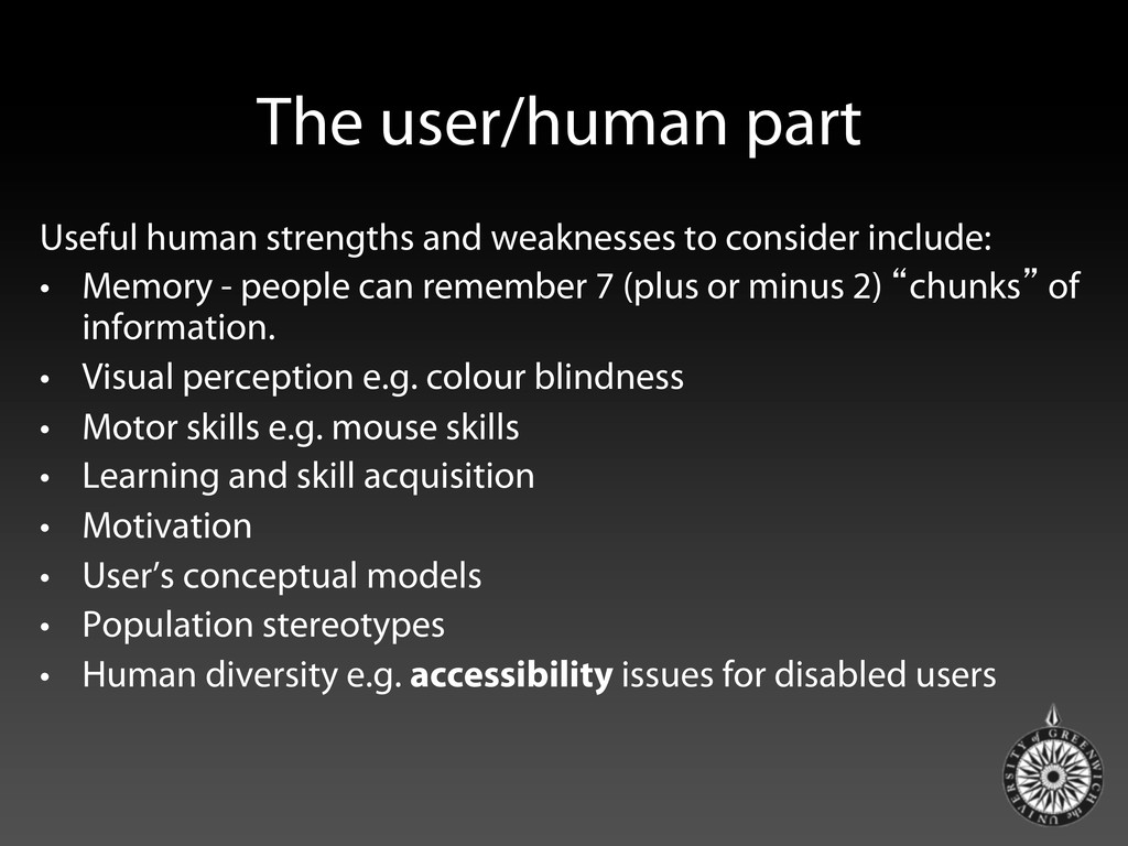
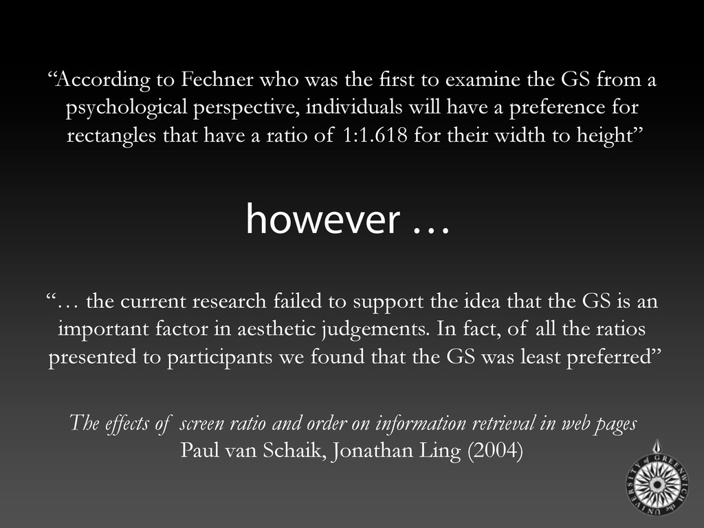
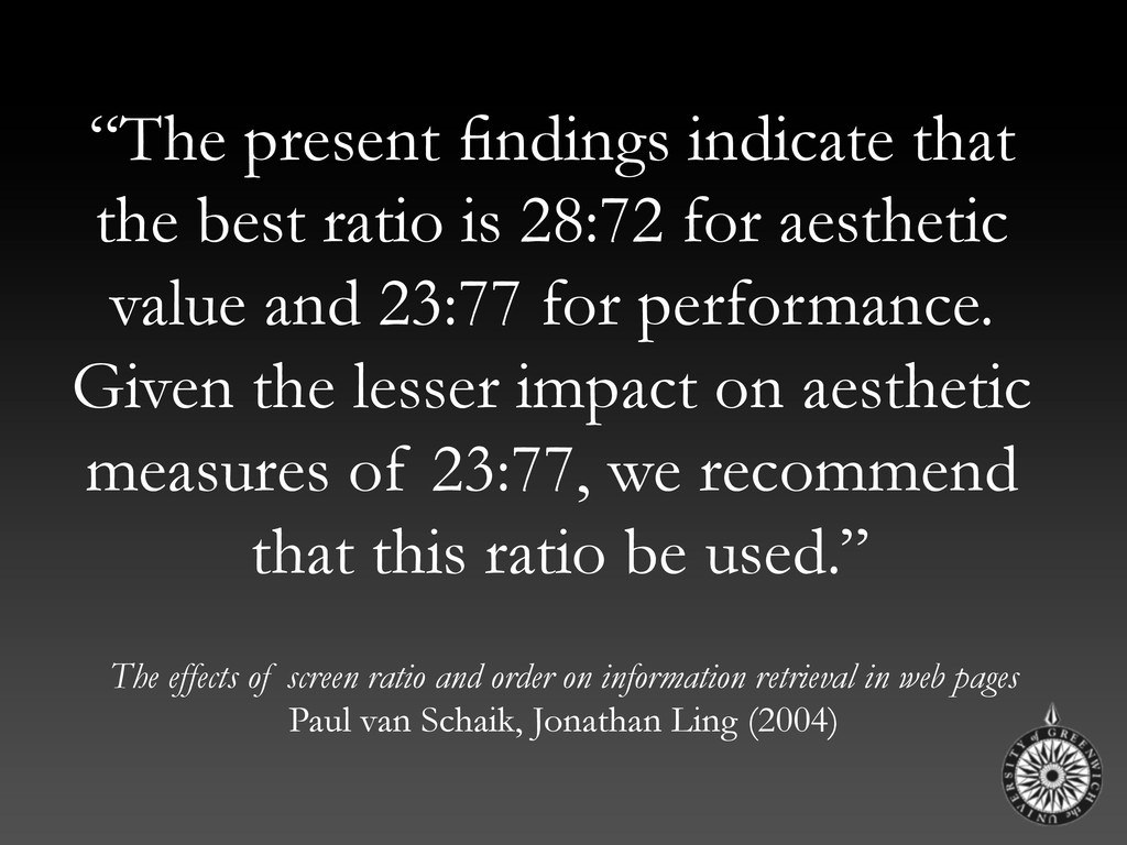
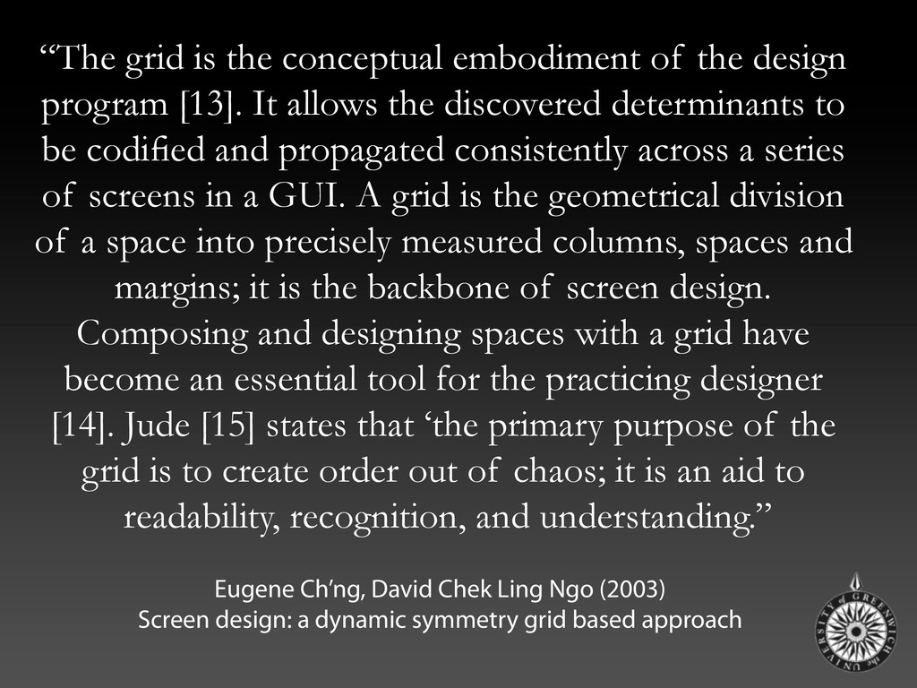
Content In Web Design. Smashing Magazine.
    Carayon, P. (2007) Handbook of Human Factors and Ergonomics in Health Care and Patient Safety (Human Factors and Ergonomics Series)
    (Human Factors and Ergonomics Series). L. Erlbaum Assoc. Inc., Hillsdale, NJ, USA.
    Card, S.K., Mackinlay, J.D. and Shneiderman, B. (Eds.) (1999) Readings in Information Visualization: Using Vision to Think. Morgan Kaufmann
    Publishers Inc., San Francisco, CA, USA.
    Charles, T., Bustard, D., Black, M. (2009) ELEGANT: Enhanced eLearning Engagement using Game Absorption Techniques. In Novel Approaches
    to Promoting Student Engagement. HEA Subject Centre for Information & Computer Sciences.
    Choemprayong, S., Oh, S., Sheble, L (2006). Interfaces for the personal pregnancy health records (PregHeR) system: Facets in time. Annual
    symposium of the American Medical Informatics Association.
    Dibben, C., Watson, J., Smith, T., Cox, M., Manley, D., Perry, I., Rolfe, L., Barnes, H., Wilkinson, K., Linn, J., Liu, L., Sims, A., and Hill, A. (2008)
    The Health Poverty Index. The NHS Information Centre. Leeds, UK.
    de Quincey, E., Kostkova, P., Farrell, D. (2009) Visualising web server logs for a Web 1.0 audience using Web 2.0 technologies: eliciting attributes
    for recommendation and profiling systems. In the Proceedings of the Workshop on Adaptation and Personalization for Web 2.0 in connection with
    UMAP 2009, June 22-26, 2009, Trento, Italy
    Esterhay Jr., R.J. (1994) User metaphors for health care professional workstations. International Journal of Bio-Medical Computing, Volume 34,
    Issues 1-4, The Health Care Professional Workstation, January 1994, Pages 95-113
    Garner, R. (2005) Humor, Analogy, and Metaphor: H.A.M. it up in Teaching. Radical Pedagogy, Vol. 6, No. 2, Winter 2005.
    Glenn, R. (2002) Brain research: Practical Applications for the classroom. Teaching for Excellence, 21(6), 1-2.
    Marcus, A. (1995) Metaphor design in user interfaces: how to effectively manage expectation, surprise, comprehension, and delight.
    In Conference companion on Human factors in computing systems (CHI '95), I. Katz, R. Mack, and L. Marks (Eds.). ACM, New York, NY, USA,
    373-374.
    Marcus, A. (2003) Icons, symbols, and signs: visible languages to facilitate communication. interactions 10, 3 (May 2003), 37-43.
    Hallett, C., Power, R. and Scott, D. (2006). Summarisation and visualisation of e-Health data repositories. In: UK E-Science All-Hands Meeting,
    18-21 Sept 2006, Nottingham, UK.
    Krieger, J., Parrott, R., Nussbaum, J. (2010) Metaphor Use and Health Literacy: A Pilot Study of Strategies to Explain Randomization in Cancer
    Clinical Trials. Journal of Health Communication, 2010; 1
    Petre, M., de Quincey, E. (2006) A gentle overview of software visualisation. Computer Society of India Communications (CSIC)
    Rugg, G., Petre, M. (2006) A Gentle Guide to Research Methods. Open University Press
    Shneiderman, B. (1983) Direct manipulation: a step beyond programming languages, Computer, 16, 8, pp. 57-60, Aug. 1983.
    Tufte, E. (2001) Envisioning Information. Cheshire, CT: Graphics Press, 2001.
    Ward, M.C. (2002) Systematic selection and implementation of graphical user interface metaphors. Comput. Educ. 38, 4 (May 2002), 385-397.
    Young, P., and Munro, M. (2003) Visualising software in virtual reality. IEEE First International Workshop on Visualizing Software for
    Understanding and Analysis. IEEE Computer Society Press.
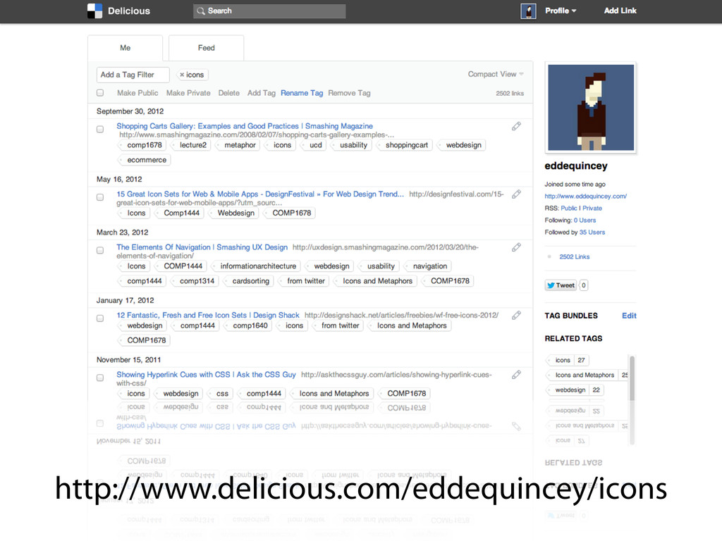
    View Slide

  131. de Quincey, E., Kostkova, P., Farrell, D. (2009) Visualising web server logs for a Web 1.0 audience
    using Web 2.0 technologies: eliciting attributes for recommendation and pro ling systems. In
    the Proceedings of the Workshop on Adaptation and Personalization for Web 2.0 in
    connection with UMAP 2009, June 22-26, 2009, Trento, Italy.
    Available at: http://sunsite.informatik.rwth-aachen.de/Publications/CEUR-WS/Vol-485/

    View Slide